Blog posts tagged “Data”
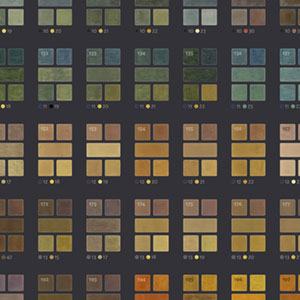 Making of 17th Century Watercolors
- June 18, 2022
Way back in 2014, a Dutch manuscript from about mixing watercolors from 1692 made a splash in the blogosphere, because while it was centuries old, few had given it much attention and it was such a beautifully preserved thorough account of how watercolors were mixed back then. Ever since then, I thought it had potential as a fun project but avoided creating one due to language barriers and other reasons that turned out to be unfounded.
 Making of Iconographic Encylopædia
- February 6, 2022
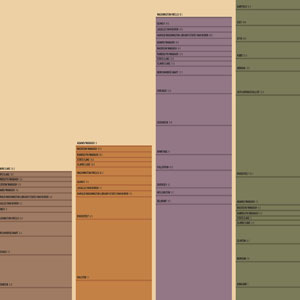
The digital edition of Iconographic Encyclopædia from 1851 was by far, the largest and longest project I’ve undertaken. Comprising 500 plates, more than 13,000 illustrations, 1.6 million words, and spanning 13 months, it was a wonderful exercise in creativity and patience.
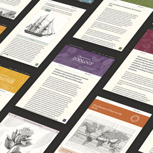
 Making of A Brief Visual Exploration of A Dictionary of Typography
- December 16, 2020
Not many people read a dictionary cover to cover, let alone analyze every word, but I did and found it fascinating. During research phases for my past restoration projects, I often came across a surprising number of antique dictionaries and always overlooked them. For this project, I actively sought out an interesting one to explore and ended up finding two to create A Brief Visual Exploration of A Dictionary of Typography.
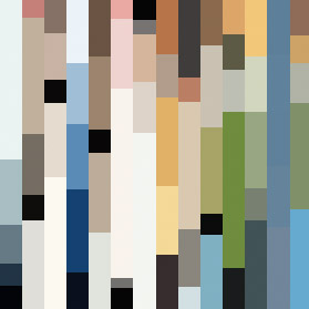 Making of Color Palettes of The New Yorker
- March 26, 2017
Generating color palettes of more than 4,600 covers of The New Yorker was a challenging task but when I get an idea stuck in my head I stubbornly like to see it through. What follows is a breakdown of how I made my Color Palettes of The New Yorker project including early ideas, methodologies, and technical details.
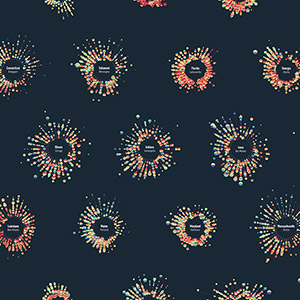
 Making of A Year of Scrabble
- February 2, 2017
When Shirley and Nadieh asked me to make a guest post for Data Sketches, I jumped at the opportunity but immediately panicked a little because I had agreed to the daunting task of creating something like their wonderful projects over the past six months. Whether or not that happened will be left to the reader but below is the story of how it came to be.
 Making of Literary Constellations
- January 15, 2017
Literary Constellations is a series of posters designed to resemble constellation maps but instead of being based on real stars, the shapes are based on first sentences from chapters of short classic stories.
 Making of Off the Staff
- September 6, 2016
I can’t read music but I can parse it. The talent of reading music has always escaped me which is a little ironic considering I grew up in a musical family. However, I’ve always enjoyed how sheet music looks so I took a shot at visualizing the notes from musical scores and the result is a series of posters called Off the Staff.
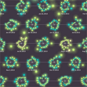
 Making of the Weather Portraits poster
- November 21, 2015
With so many options available for visualizing weather, settling on one for my Weather Portraits poster was a challenge, but a fun one. Over the course of three weeks, I experimented with dozens of ideas—most of which are documented here for people like me who like that sort of thing and to hopefully spark some future ideas for others.
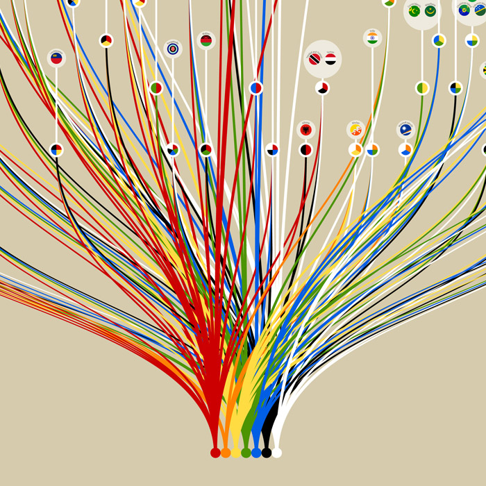 Making of the Colors of World Flags poster
- May 25, 2015
During the few weeks it took to create my Colors of World Flags poster, I went through several iterations and ideas before settling on the final product. Experimenting with these ideas was as much fun as working on the end result and I thought others would enjoy seeing the path I took.
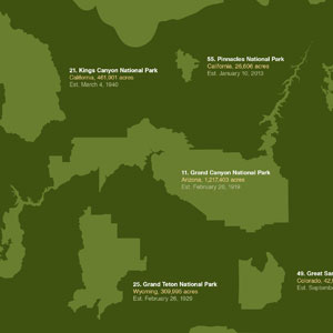 Making of the National Parks of the United States poster
- November 23, 2013
I've been overwhelmed by the positive reaction to my National Parks of the United States poster. I want to thank everyone for such kind words. I also want to thank everyone who shared it with others. Several people have asked how I made it so I'll outline process, list my sources and show a few early prototypes as an extra bonus.
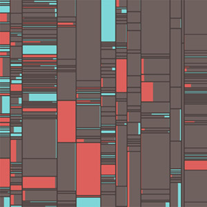
 Transit charts: fun with public data
- September 4, 2012
Continuing my latest obsession with data visualization, I had some fun with public transportation data. In an attempt to play around with a new color palette and put a different face on old data, I wound up creating what I call Transit Charts.
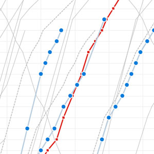 Visualizing Metra
- August 14, 2011
When I heard that Metra was planning to cut 46 trains from its service in 2012 to make up for high operating costs, I wanted to see just how much of an impact that would have on their schedules—using a technique from 1885. How the final result came about was a mixture of curiosity and fun with a pinch of obsession.