Making of the Colors of World Flags poster
By Nicholas Rougeux, posted on May 25, 2015 in Art, Data
During the few weeks it took to create my Colors of World Flags poster, I went through several iterations and ideas before settling on the final product. Experimenting with these ideas was as much fun as working on the end result and I thought others would enjoy seeing the path I took.
Data
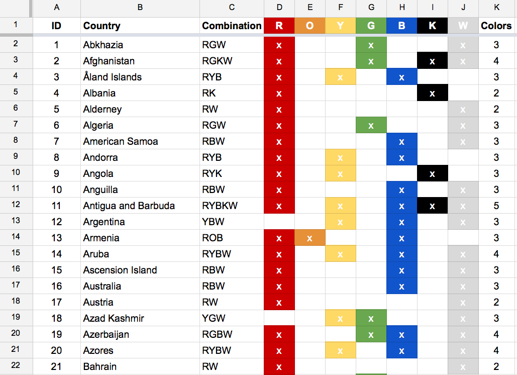
Being a data-driven project, the data had to come first. After getting inspired by a page on Wikipedia listing flags by color combination, I collected my own data in a Google Spreadsheet complete with built-in color formatting so I could see if the data were interesting enough to make anything. They looked promising after analyzing just a few dozen. For those wondering, flags analyzed included sovereign states, dependent territories, and other autonomous regions. Many more flags could be included but I limited myself to the major ones.
Raw
I wanted to see what other visual forms the data could take so I plugged into Density Design’s Raw, a quick-and-dirty data visualizer. The alluvial diagrams were the most interesting. The following diagrams show connections from the seven basic colors used in all flags (left) to the combinations using those colors (right).
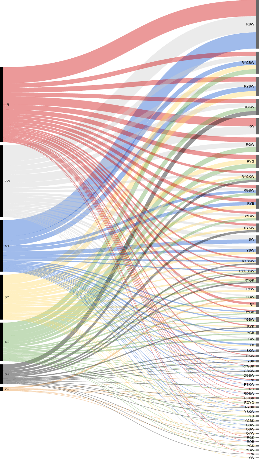
Alluvial diagram with default sorting by frequency of use
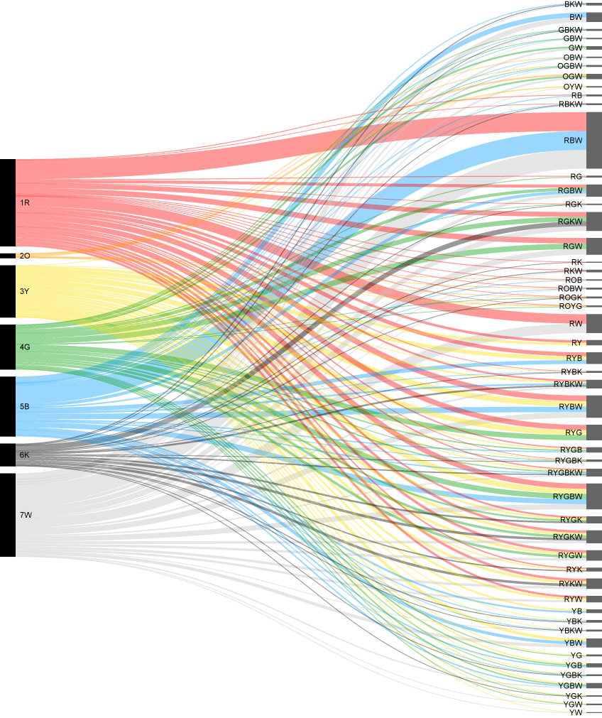
Alluvial diagram sorted by color on the left and alphabetically by color combination code on the right
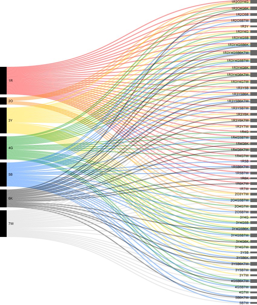
Alluvial diagram sorted by color on the left and right. Custom codes like 1R, 2O, 3Y were used so Raw would sort them alphabetically and in the color order I wanted. The codes on the right are code combinations for the same sorting.
Raw is great for quickly experimenting but I wanted more control over the visualization.
Network diagram
After playing with Raw, I was fairly sure the interesting parts of the data were the different color combinations more than the flags themselves. After reworking the original data, I used Cytoscape to visualize the connections between the seven base colors and all the different combinations. The result was less than appealing. There may still be an interesting way of exploring this route farther but I chose to stick with the alluvial diagrams.
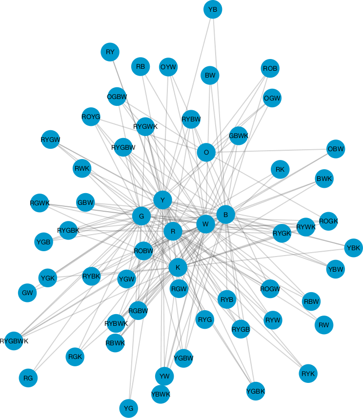
Network diagram of color combinations
NodeBox
I recently discovered NodeBox, an very clever open source tool that allows for visualizing data and designing creating generative art without code. I found it a fantastic way to explore the data without getting bogged down with the frustration of coding. However, if I were to create something like this as an interactive visualization, D3.js would be the tool of choice.
NodeBox is powerful and an excellent tool for quickly experimenting with a lot of data. I found the learning curve to be a little steep but worth the time to overcome it. The tutorials on their site and the examples built into the program are a great way to learn how it works. Essentially, it can take data (or generate them) and manipulate them by passing them through different types of nodes that modify position, size, color, or the data themselves. The result can then be exported as an SVG, PNG, PDF, or video.
I loaded the data into NodeBox to explore what I could make with them. I stacked the color combinations with the most used at the top and sized proportionately based on how often they’re used.
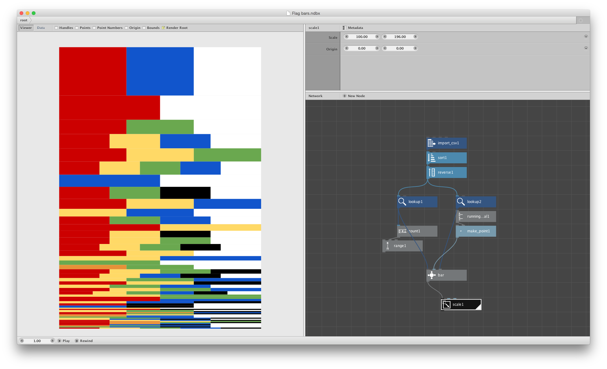
Screenshot of NodeBox showing color combinations as stripes sized based on how many flags used them
I wanted to recreate the alluvial diagrams I found in Raw. After a healthy amount of trial and error, I got a rough result.
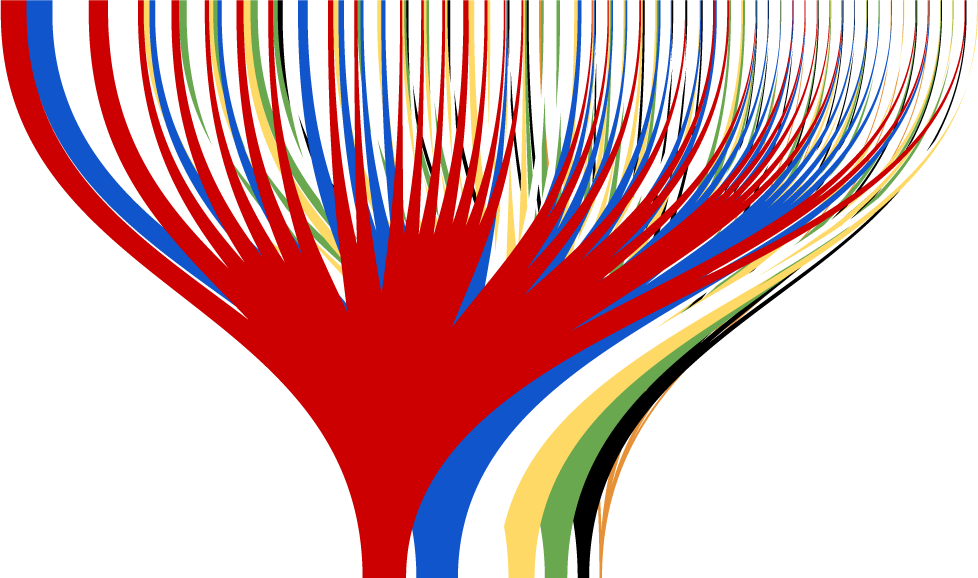
First attempt at creating my own alluvial diagram with NodeBox
With some more adjustments to soften the colors and clean up the shapes, it was looking promising but I wasn’t pleased with it enough yet.
Translucent alluvial diagram
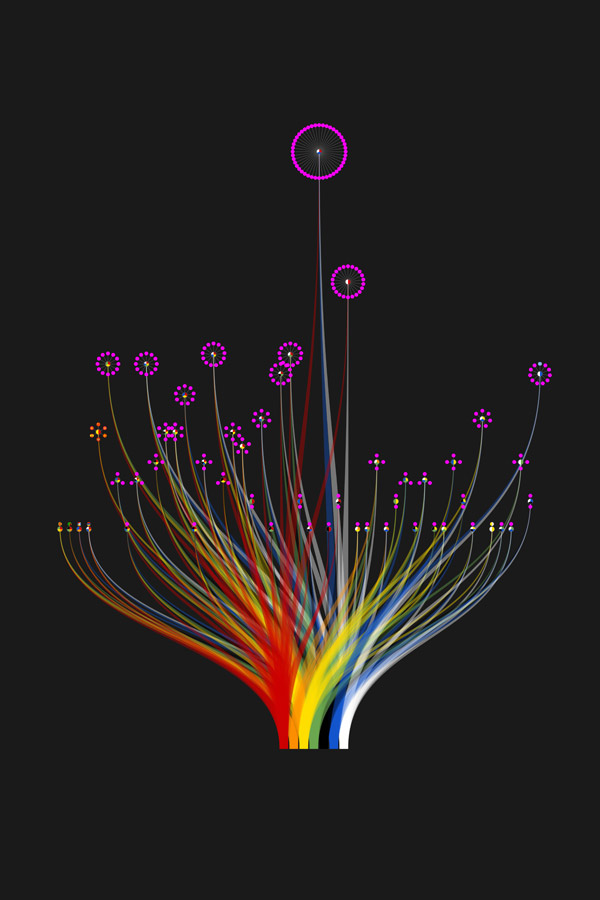
Rather than using the size of the endpoints to show how often they’re used, I combined the lines at each end into single points and sorted the lines by color. Once I offset the combinations in the top half of the diagram by how many flags show those colors, I knew I had something promising.
Combinations Sorted by color and offset by frequency. (Note: color combinations slightly off due to data updates)
I knew the logical question anyone would have (myself included) would be about which flags corresponded with which color combinations so I set out to find a way to show them in the same diagram. I added placeholders for each one with the plan of adding the flags themselves later in InDesign. I found the best way to save space and represent color combinations equally was to use tiny pie charts with smaller circles branching off from them. Numbers were added next to each for reference to correspond with a list I planned on making elsewhere on the poster.
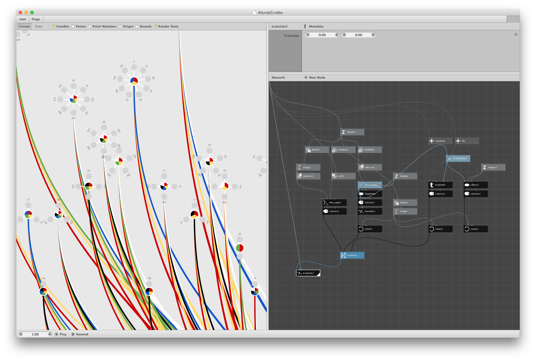
Closeup of combinations represented by small pie charts. (Note: color combinations slightly off due to data updates)
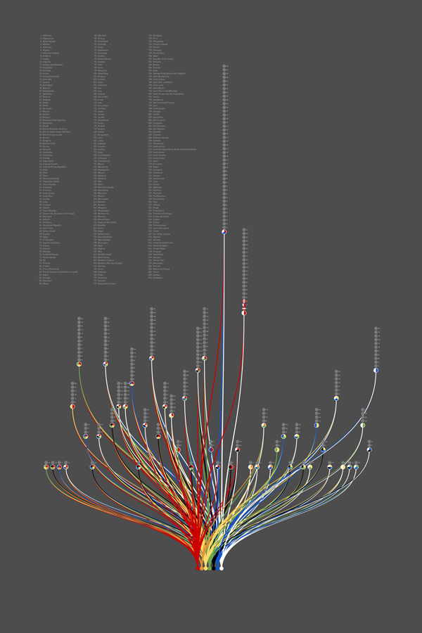
This worked for the most part but a few areas showed overlapping and the flags would have been too small to identify as shown in the first attempt at adding them in InDesign. I still enjoy the look of the flower-like shapes of this early iteration.
First version of the final poster with a few individual flags added
I also tried simply stacking the flags above each combination but the result would have been too tall and the original organic alluvial diagram would have been overshadowed by the long lists of the most-used combinations.
Flag placeholders stacked above combinations
Sidetracked
Frustration set in because I couldn’t figure out a way to show the flags at a decent size without overlapping or an egregious amount of extra work in InDesign. I knew I wanted to use the shape from NodeBox and have it easily updatable if I need to make corrections but also wanted to explore the idea of just showing the flags grouped by color combination. I started creating a different poster showing these groups.
Early concept of a poster showing just groups of flags by color combinations
I wanted to use the concept of circle packing to group the flags rather than a more structured layout and arrange them randomly on the poster. I found Packomania to be a valuable resource because this site showed all the tightest packings of circles within a variety of shapes which was a helpful guide when arranging the flags.
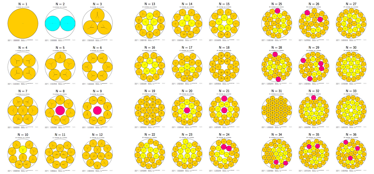
Packed circle diagrams from Packomania
I enjoyed this poster but got inspired to combine its concept with the original poster. I may still revisit it in the future.
Putting it all together
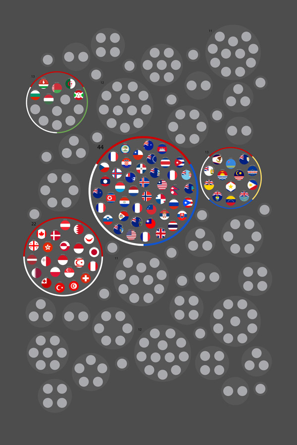
Finally, I found that combining the packed-circle groupings of flags with the alluvial diagram worked well. This step and including the actual flags needed to be done in InDesign because I don’t think NodeBox can do circle packing and prevent overlapping without a lot of extra coding, if at all.
Initial attempt at combining packed circles with the alluvial diagram
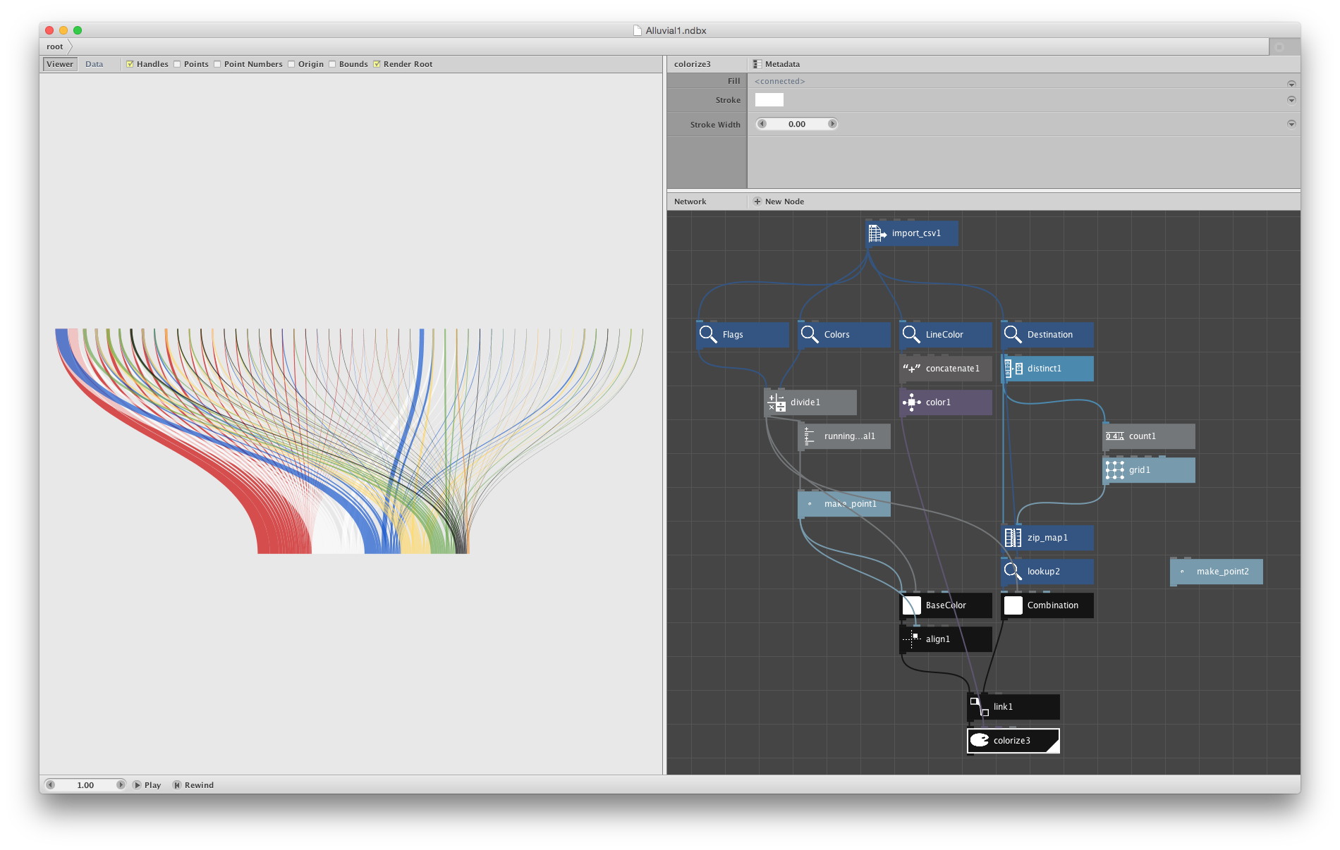
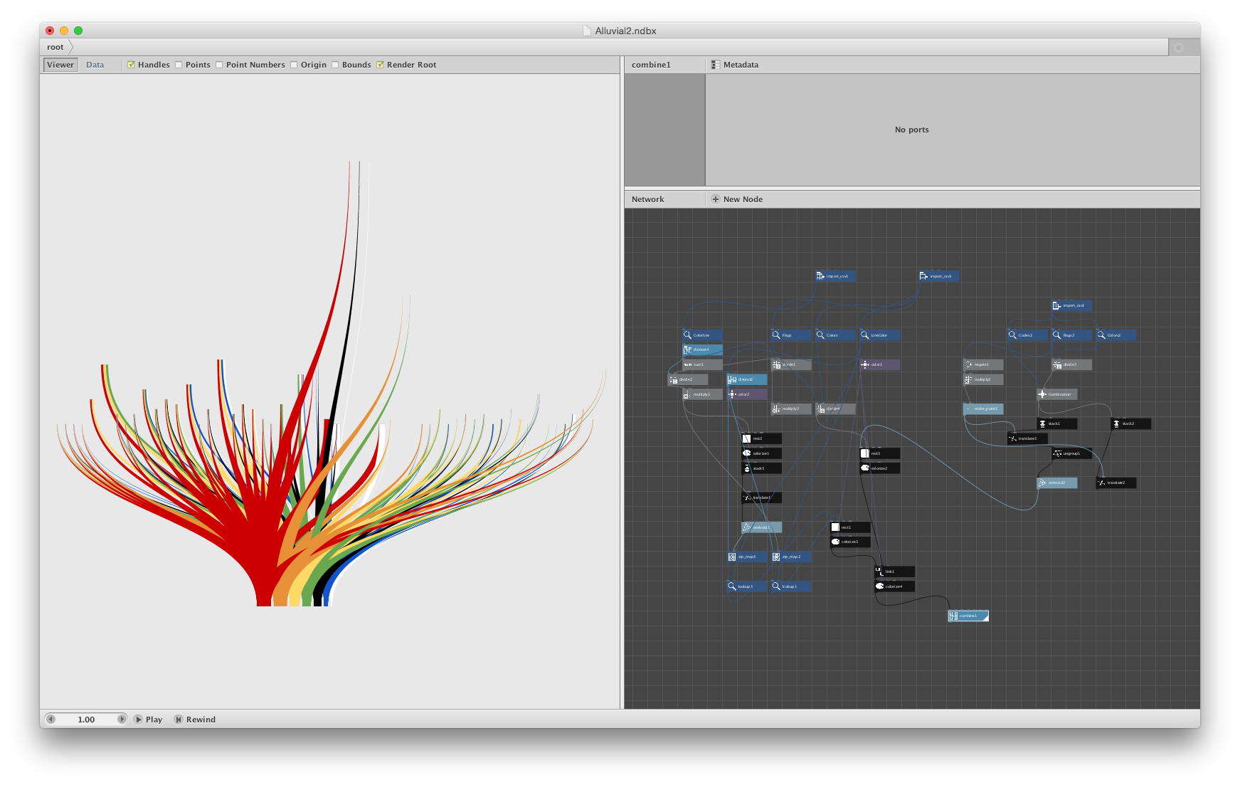
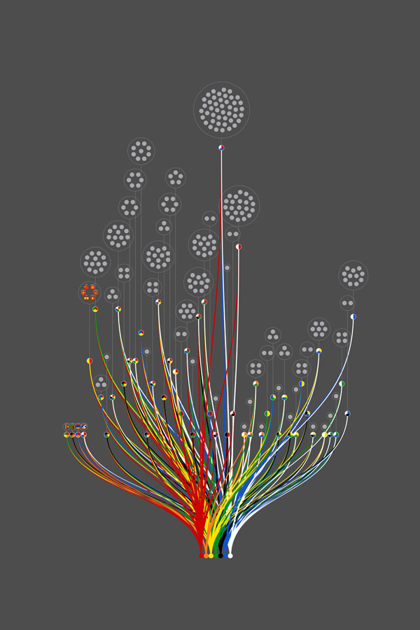
The final diagram in NodeBox is likely more complex than it needs to be since it’s my first but it worked and I learned a lot about how the program works while creating it.
Screenshot of the final alluvial diagram in NodeBox
For the end result, I chose a lighter theme so the colors would be more visible and included a key for how to read it. Flags were included individually and some were reformatted a little to better fit within a circular frame rather than a rectangle.
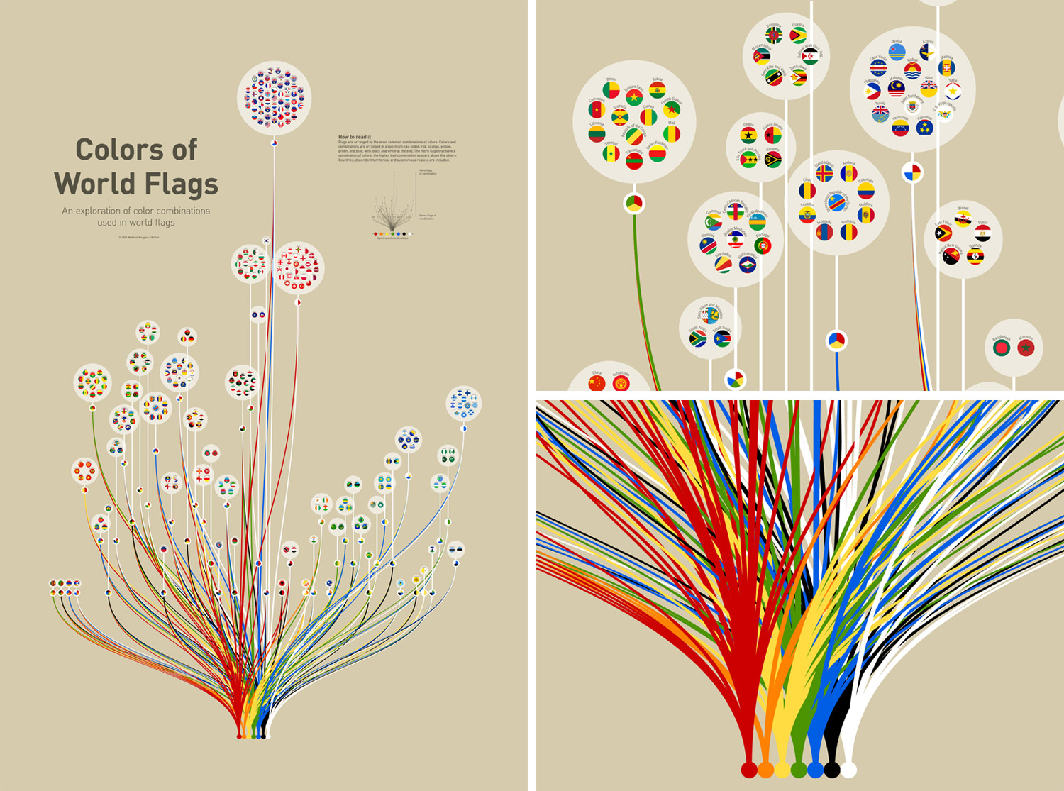
Final poster and closeups
I’m pleased with the result and really enjoyed the process of getting there. A larger version is available in my portfolio and posters are available to purchase from Zazzle.
Update, March 26, 2016: Check out Flag Stories for more intriguing comparisons between flags.