Making of the Weather Portraits poster
By Nicholas Rougeux, posted on November 21, 2015 in Art, Data
With so many options available for visualizing weather, settling on one for my Weather Portraits poster was a challenge, but a fun one. Over the course of three weeks, I experimented with dozens of ideas—most of which are documented here for people like me who like that sort of thing and to hopefully spark some future ideas for others.
Inspiration
Inspiration for the poster came from Kim Dembrosky's colorful Weather Series: Meditations on Climate. loved the idea of creating something colorful with a data to which everyone can relate. Everyone experiences weather every day and probably has a few stories to tell about their experiences with it. Living in Chicago has given me more than a few. Kim's work is such a simple concept and beautifully crafted. I'd be remiss if I didn't give her credit for sparking my interest.
Concept
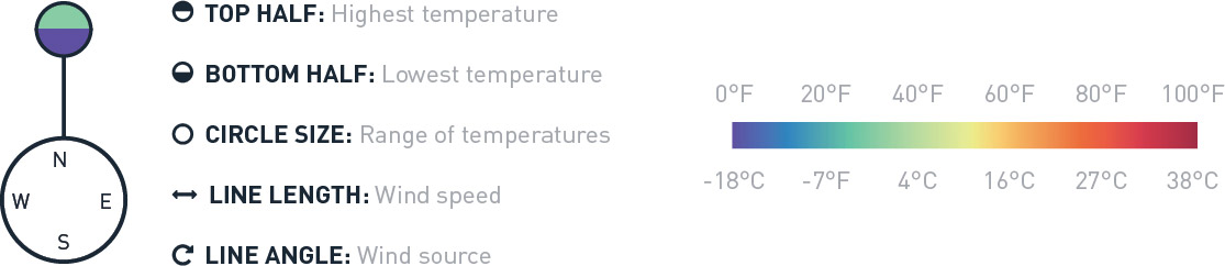
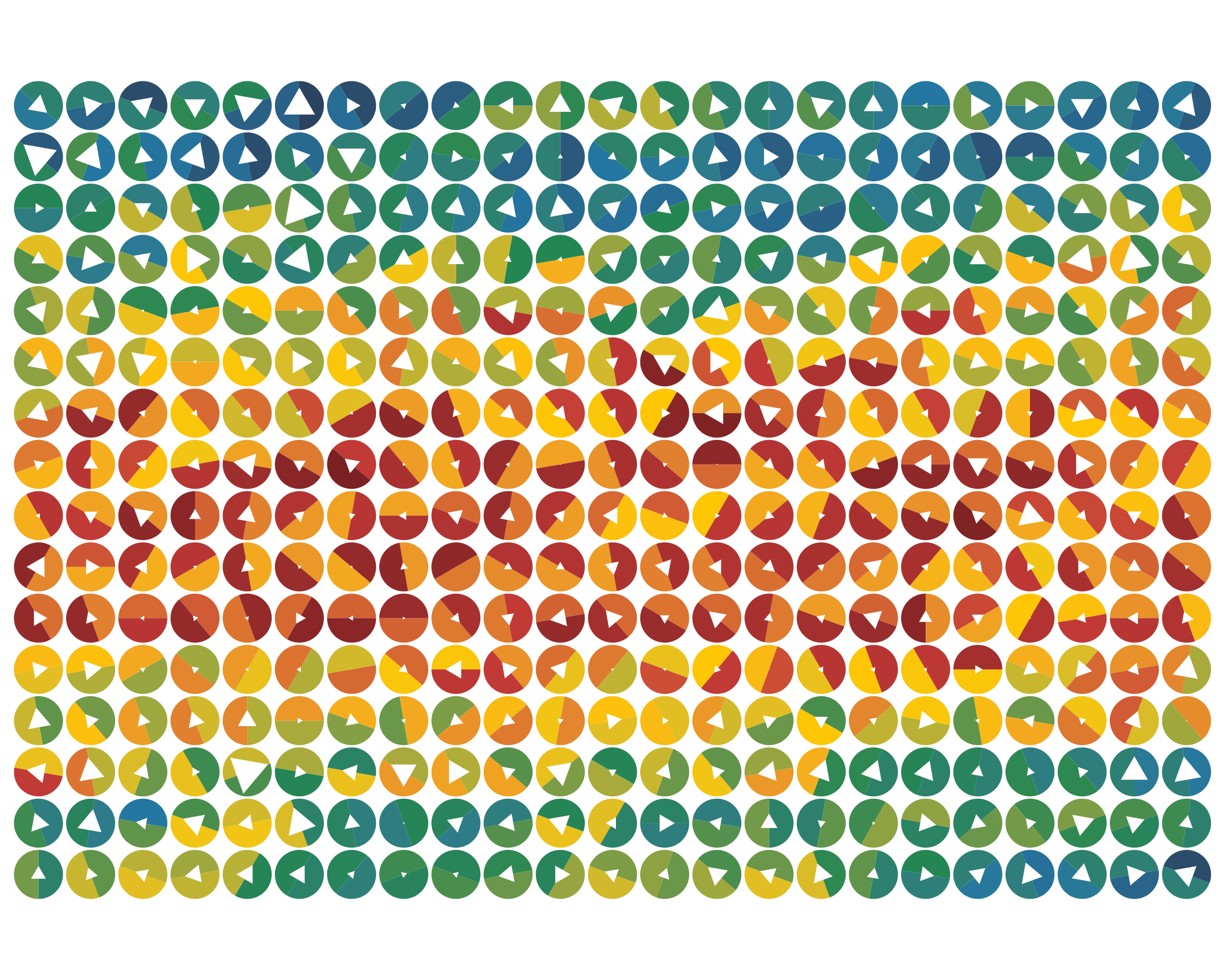
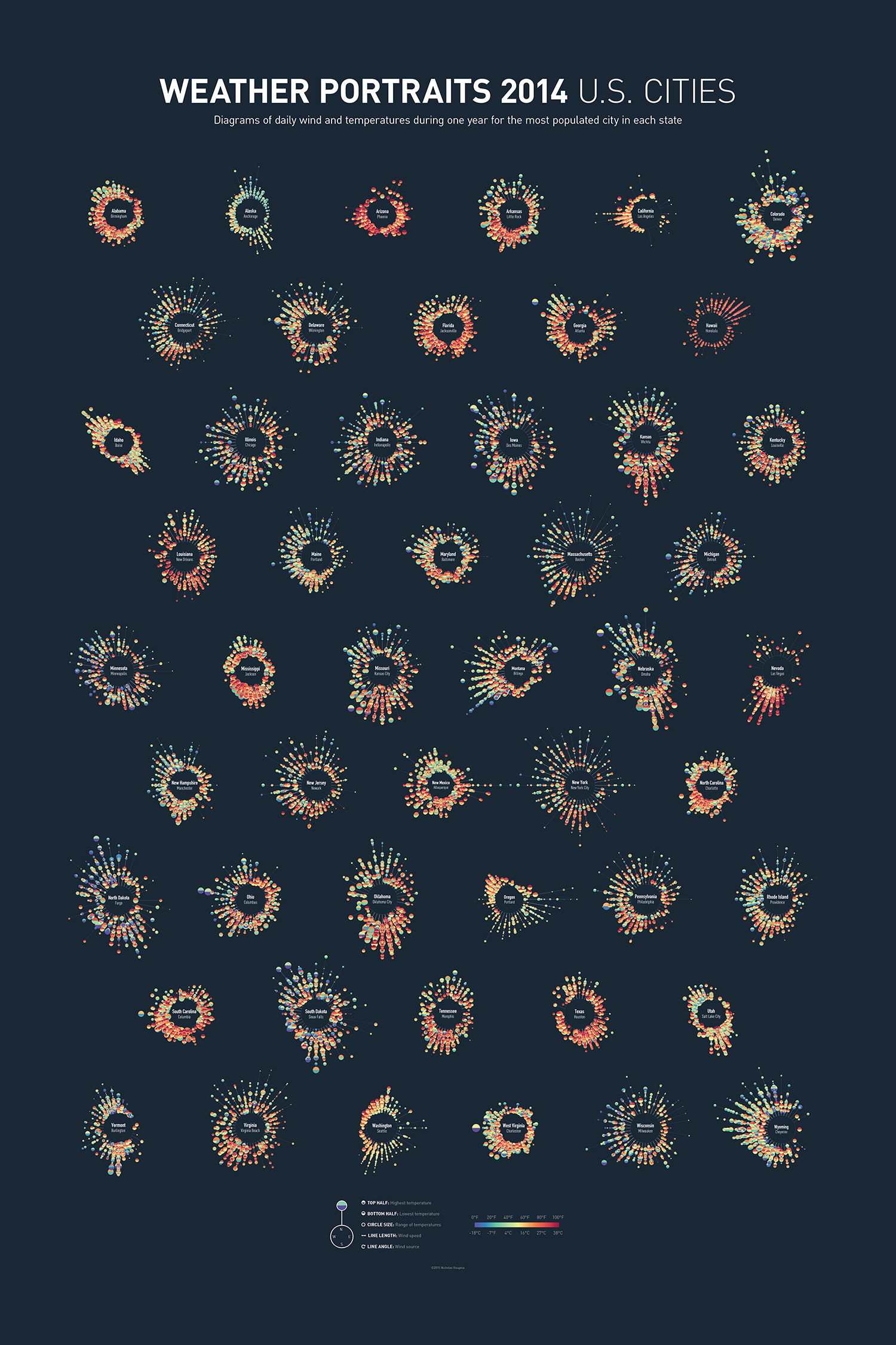
The poster shows diagrams of daily wind and temperatures during one year for the most populated city in each state. Each diagram includes five daily measurements for an full year in a city: wind direction, wind speed, high temperature, low temperature, and range of temperatures.
The goal was not to present specific findings based on analysis but to paint unique portraits of each city using data in creative and unusual ways. Wind and temperatures are often noticed only during disasters or during extreme conditions. Every-day occurrences can look interesting on their own when viewed in the right light.
The trickiest part was to find a way to show weather data that didn't illustrate the standard trends: cold at the beginning of the year, hot in summer, then cold at the end (at least in the northern hemisphere). In a sense, I wanted to put the data on equal footing. I didn't want one aspect to out weigh another because of its nature. For example, if shapes were sized and color-coded based on temperature, reds and oranges would dominate over greens and blues because they would be larger but greens and blues are important round out the palette. While the temperatures are still color-coded, the sizes of circles containing them are based on the range of temperatures felt during that day. The wide variance in range of temperatures from day to day kept a nice balance between all the colors. Similarly, the strength and direction of the wind didn't fit any one pattern for all cities. Combining both wind and temperature in a type of wind rose plot resulted in each city having a unique portrait.
Data
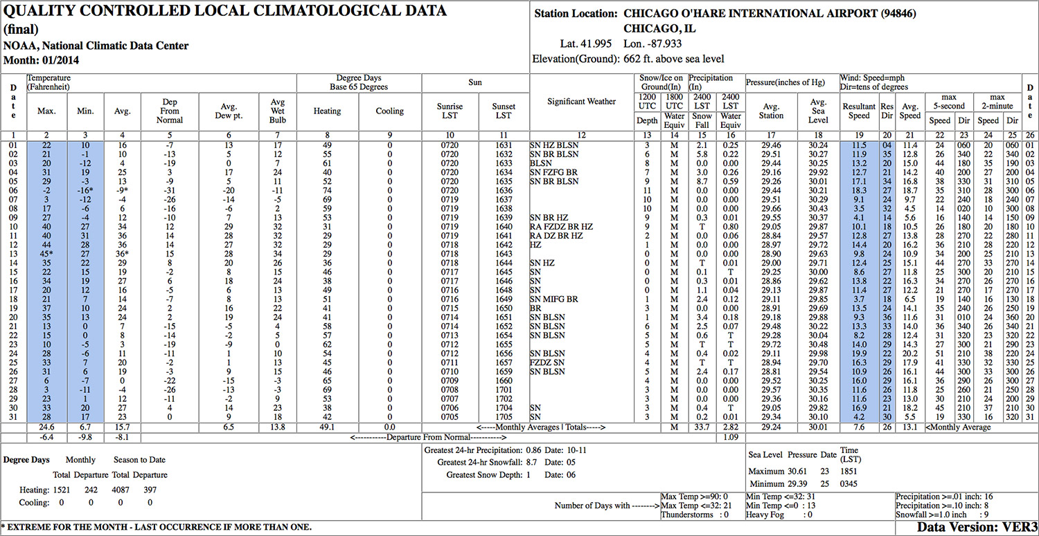
The data were collected from the Quality Controlled Local Climatological Data (QCLCD), freely provided by NOAA. NOAA has an API available for collecting data programmatically but I opted to download the data for each city because figuring out how to use the API would have taken me longer. Data for each city was taken from the main airport for that city (e.g. O'Hare in Chicago, LAX in Los Angeles, etc). These data were the most reliable because it was marked as the final edited data on the QCLCD site.
Early designs
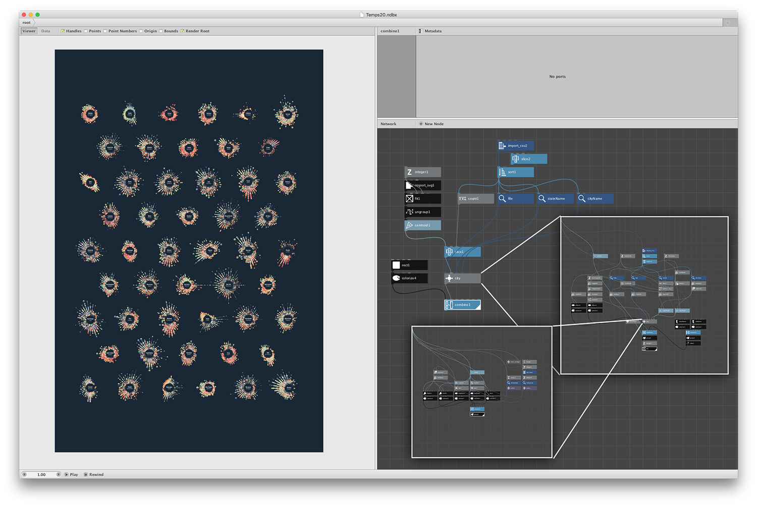
I used NodeBox to explore many different ways of visualizing the data. NodeBox is a free fantastic tool for exploring data because no coding is required, it handles large amounts of data efficiently, and can export PNGs along with SVGs.
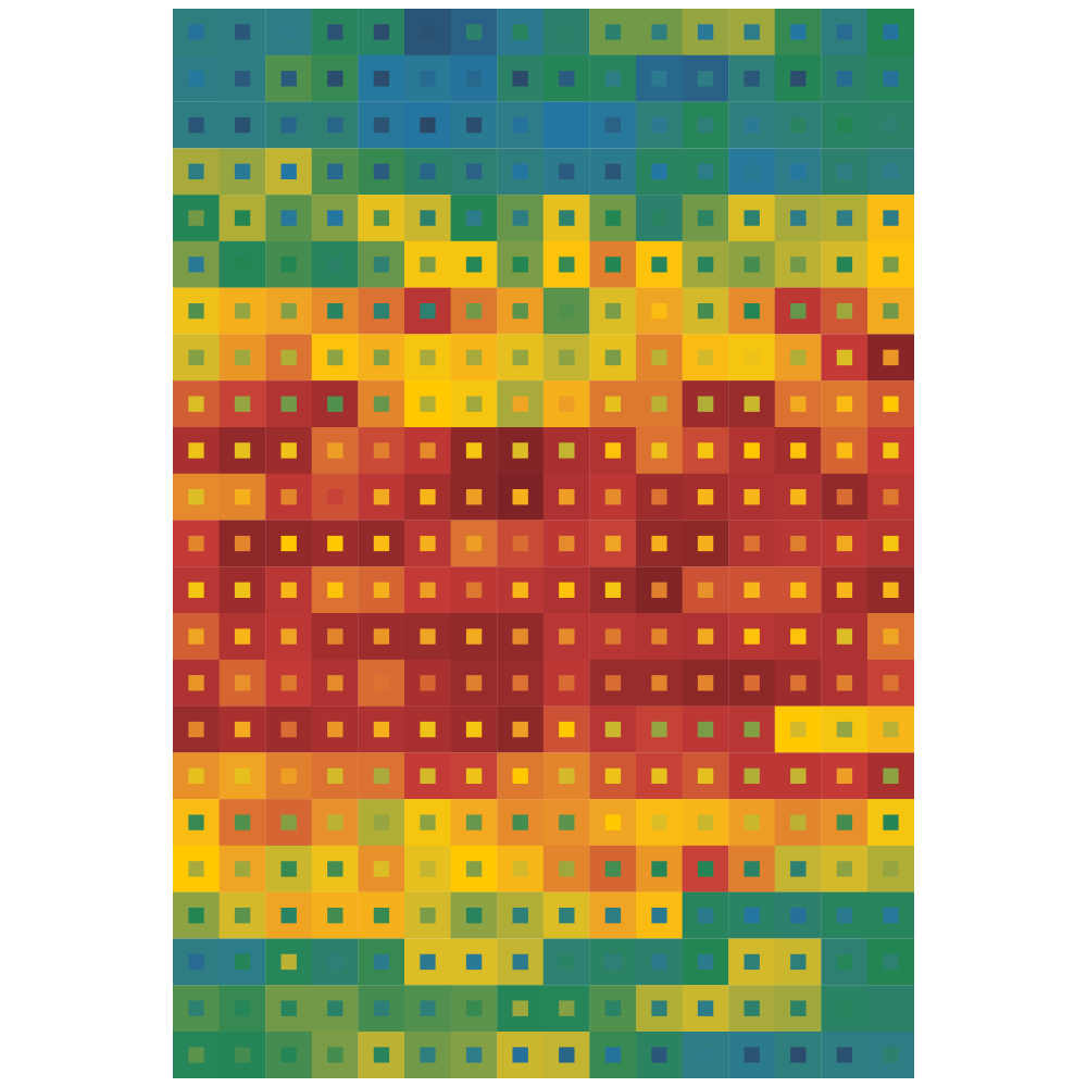
Version 1: I started with Chicago data from 2014 and experimented with some options directly inspired by Kim Dembrosky's work. Each set of squares shows color-coded temperatures (large square = high, small square = low).
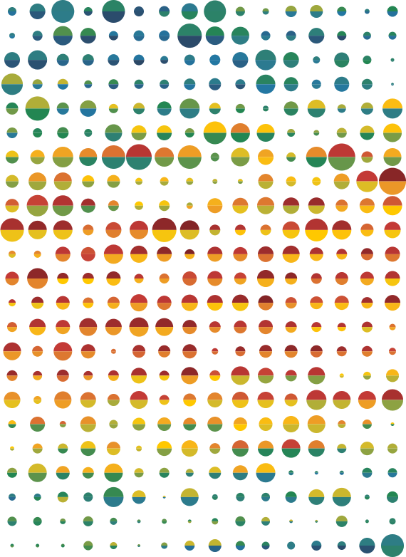
Version 2: Each circle shows color-coded temperatures (top half = high, bottom half = low) and range of temperatures felt (size of circle)
Version 3: Another earlier design was inspired by the Weather Radials poster by Raurif with temperature ranges color-coded by highs.

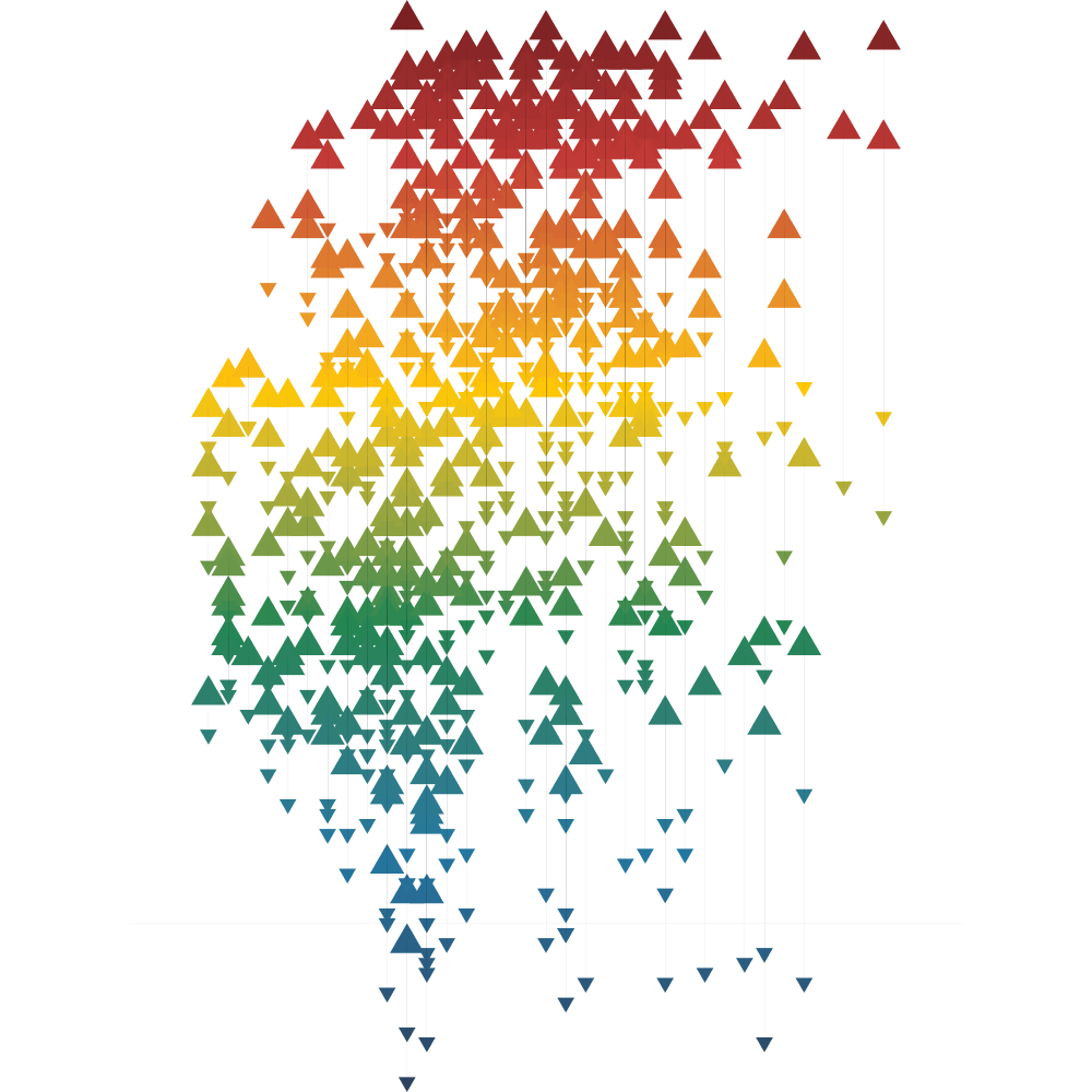
Version 4: The fourth design was the first I posted to Twitter and was more abstract. Upward-pointing triangles are highs connected to downward-pointing triangles and each was color-coded and plotted based on their temperature vertically. They were plotted horizontally based on how large the temperature range was (smaller ranges on the left, larger ranges on the right).
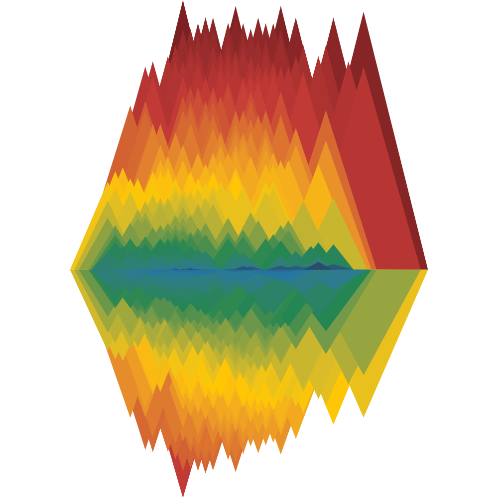
Version 8: Skipping ahead, another attempt was similar to the fourth—built on the triangle aspect but grouped the shapes more closely together to make the colors more vibrant. Top triangles are highs and bottom triangles are lows. Widths of triangles are based on the range of temperatures and height is based on highs and lows. They were plotted horizontally based on how large the temperature range was (smaller ranges on the left, larger ranges on the right). Larger pairs are in back with smaller pairs in front.
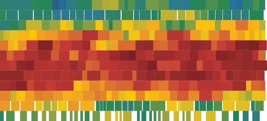
Version 9: After getting tired of working with just temperatures, I experimented with wind data—first simply plotting which direction (measured in tens of degrees) the wind blew and at what speed (thickness of lines). Starting in the upper left with January 1, this version is read from right to left, top to bottom, ending with December 31 the lower right.

Versions 10 and 11: The first two designs combining both wind and temperatures was similar to the earliest designs with semicircles but with white shapes marking the direction of the wind. Some were more interesting than others. Version 10 shows each circle shows color-coded temperatures (top half = high, bottom half = low) rotated based on wind direction (white triangle). Version 11 shows pairs of semicircles on top of each other with white dots indicating the direction of the wind.
Version 13: Illustrating the range of temperatures was an interesting concept I wanted to explore more so the next set of designs showed each full color-coded range—creating a blend between the low and high of each day. For example, if the low for a day was 15°F and the high was 20°F, 6 squares were created—one for each degree (15, 16, 17, 18, 19, 20). The result was an interesting waterfall pattern but after creating one for Anchorage and Honolulu in addition to Chicago's, I found it less interesting. There may still be some potential for an intriguing design. Upper left starts with the low temperature for January, continuing down and back up to the next column showing the color-coded ranges from the low to the high for each day.
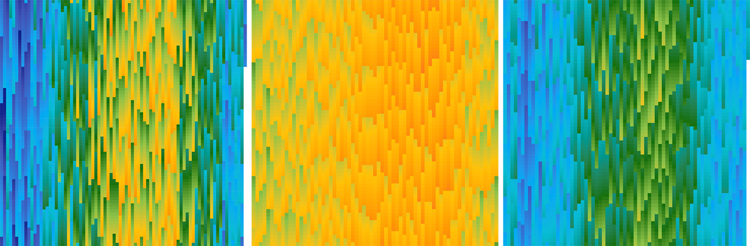
Left to right: Chicago, Anchorage, Honolulu
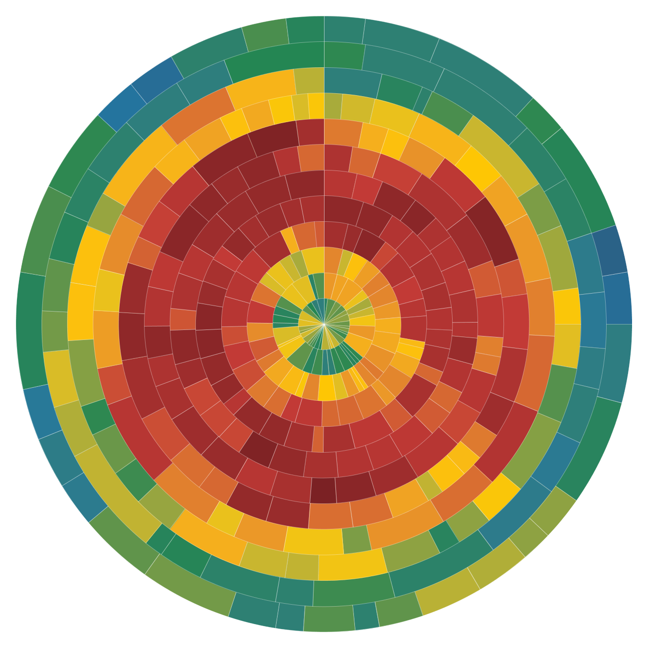
Version 14: The next was a departure in the color palette to a more traditional set of data visualization colors and was more closely related to a wind rose diagram. While simple, this was the first time I noticed that speed and direction created unique shapes when plotted around a central point. The size of each slice is based on the speed of the wind for each day and its rotation is based on the direction from which the wind blew.
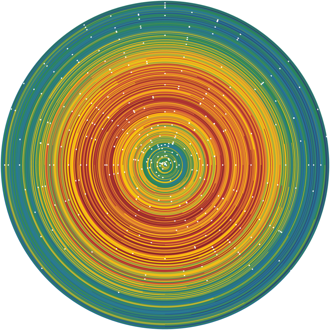
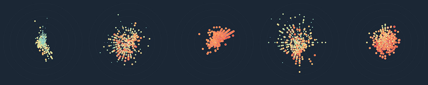
Version 15: The next design was one of my favorites. After accidentally combining a few nodes in NodeBox while playing wi running totals, I produced a spiral of highs and lows that resembled a solar system or electron diagram. Circles of color-coded highs and lows were spaced out by how strong the wind was. The angle at each day was based on which direction the wind blew in tenths of degrees. The dark background was added for fun to make it look more like a solar system diagram. I liked the dark background and kept it for future versions. Colors were also changed from the bland rainbow palette to a more vibrant one based on ColorBrewer's palettes.
Versions 16 and 17: Going back to trying to illustrate ranges, the following two designs were attempts to do so with subdivisions by months with concentric circles and rows. Both misrepresented the data by forcing each month into the same sizes.
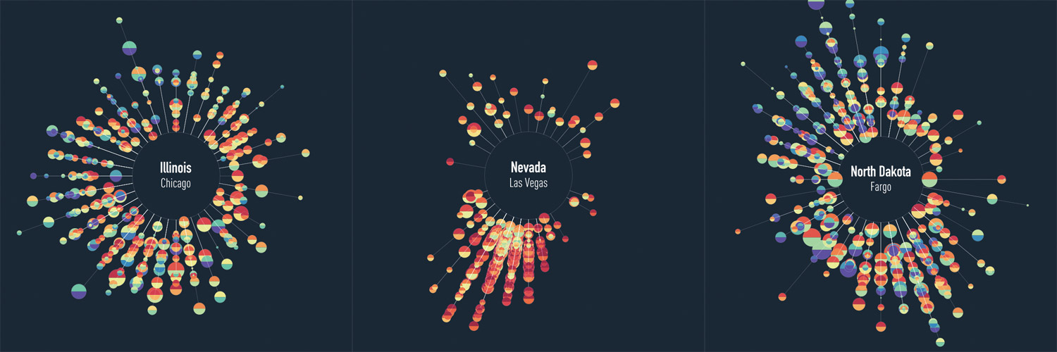
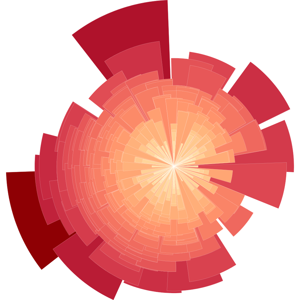
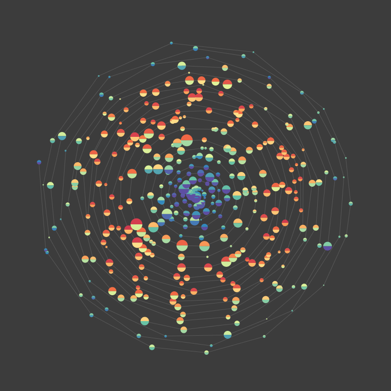
Versions 18 and 19: These versions proved to be the most interesting—using elements from several previous versions to really give the data intriguing shapes. Version 18 kept all data anchored to a central point and 19 created a gap in the middle for the location label.
Left to right: Anchorage, Chicago, Honolulu, New York City, Orlando
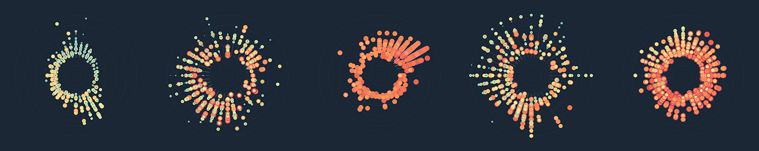
Left to right: Anchorage, Chicago, Honolulu, New York City, Orlando
Final
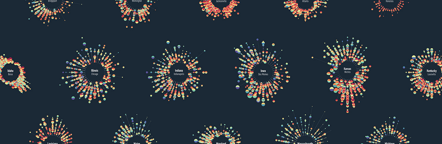
The final version introduced the full collection of cities from all 50 states arranged in a honeycomb pattern. After the title and legend were added in InDesign, the poster was complete. The poster is available for purchase and a larger version is available in my portfolio.
See large version and order poster »
The final NodeBox configuration ended up being very complex. Over 90 thousand shapes were rendered at once, with countless calculations determining position, size, color, etc. I may do another post going into detail about how it was constructed.
I had a lot of fun using NodeBox to experiment with the data and hope this description of the process inspires others to try new things with their own data.
This post was also crossposted to Visualoop.