Making of the National Parks of the United States poster
By Nicholas Rougeux, posted on November 23, 2013 in Art, Data
I've been overwhelmed by the positive reaction to my National Parks of the United States poster. I want to thank everyone for such kind words. I also want to thank everyone who shared it with others. Several people have asked how I made it so I'll outline process, list my sources and show a few early prototypes as an extra bonus.
Inspiration
Muir Way's beautiful park posters piqued my interest in national park data. If you haven't checked them out, they're worth more than a few minutes of your time.
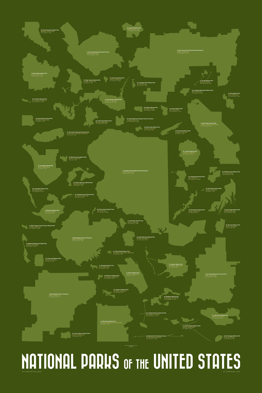
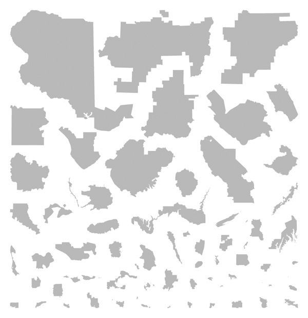
I started thinking about the great shapes of each park's boundaries and how iconic they were. When I researched the parks, I found plenty of maps of each park and maps showing their locations in the US but little comparing their sizes beyond each park's acreage on Wikipedia. That got me wondering about how their shapes would look at the same scale without the distance between them. That sounded like an interesting poster.
Data
After recent experience with GIS data for my Routelines posters, I assumed I could find individual shapefiles of each park but that was easier said than done. After a fair amount of hunting, I found some sources but none as accurate or complete as what I wanted. Some sources had outlines of parks that were too rough and many were missing the newest park—Pinnacles—that was established in January 2013. I tried unsuccessfully to get GIS data from the National Park Service's GIS source. I'm sure it's possible but my limited knowledge of GIS data and their site left me stumped.
Then I started noticing the official NPS park maps. Most maps follow the same visual style, were more detailed than the GIS data, and were vector-based—which meant the park shapes could be extracted and resized without losing any quality. Plus, since they were from the National Park Service's website, the data were in the public domain according to their disclaimer.
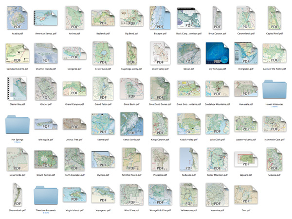
I downloaded each Park's map and using Illustrator, extracted the boundary shape to its own SVG file to start. To help others out, I've made them available in a single zip file: Download US National Park boundary SVG files.
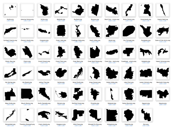
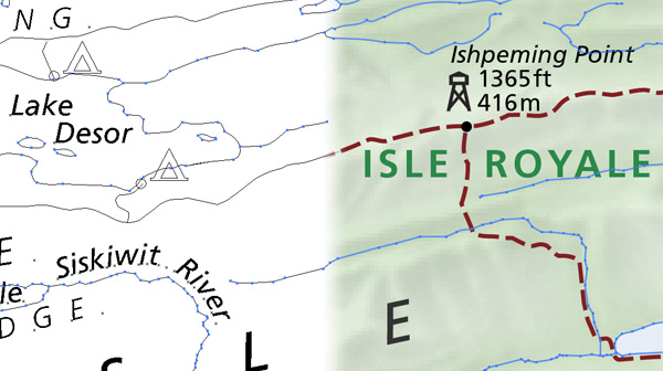
Many were straightforward but several with detailed boundaries like Isle Royale in Michigan and Kenai Fjords in Alaska required careful adjustments to isolate the all the right parts and combine them into a single set of boundaries.
I wasn't able to find vector-based versions of official maps for Hawaii Volcanoes, Hot Springs, and Theodore Roosevelt parks so I had to hunt a little more for individual KML files of each. Once I found them, I used the free tool GPS Visualizer to convert them into SVG files—a fantastic tool.
Technical note: The result is an SVG file with every segment as a separate object. Opening the SVG in Illustrator, selecting all line objects and joining them creates a single object. Some minor touchups are sometimes needed.
Design
Once I had shapes of all 59 parks, I brought them into Illustrator and resized them individually to the same scale based on the scales in each of their maps. My original plan was to have the largest parks at the top and the smallest at the bottom.
I initially preferred this because the poster had some structure but while it had its own appeal, the top looked too blocky and the bottom looked too sparse. The original plan also resulted in a more square layout rather than the standard poster layout, which is what I wanted. Plus, there wasn't room for the labels. I probably could have made it work but I like it less the more I looked at it.
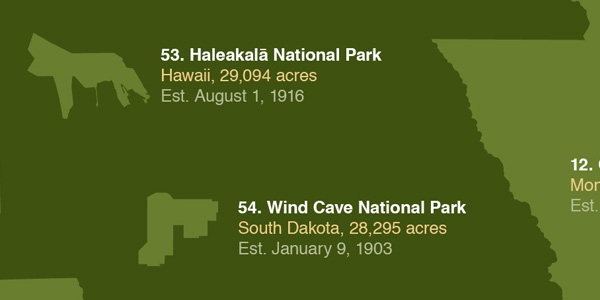
At this point, I decided to balance the poster visually by filling the poster evenly with park shapes instead of adhering to a strict structure. The lack of structure lessens its usefulness as a tool but I felt it increased its visual appeal and encourages the eye to explore it more. My intent shifted from informational to artistic. Labels were also added with each park's name, acreage, location, date of designation, and rank in acreage from largest to smallest.
As a final touch, I chose the Bazar typeface for the title because it had some character and had a retro feel.
I'm very pleased with the result. The entire project took about a week and was a fun experiment. Some have commented that I should attempt do something with all 401 units of the US National Park System which include individual monuments, forests, massive trails, and much more. While comparing sizes of these may not be work, some interesting opportunities do present themselves.