Since 1925, a unique illustration has been created for the cover of each issue of The New Yorker. Below is an analysis of the top five colors used in each cover. The pixels of each cover were divided into five groups of colors based a formula that determines how similar they are to each other.
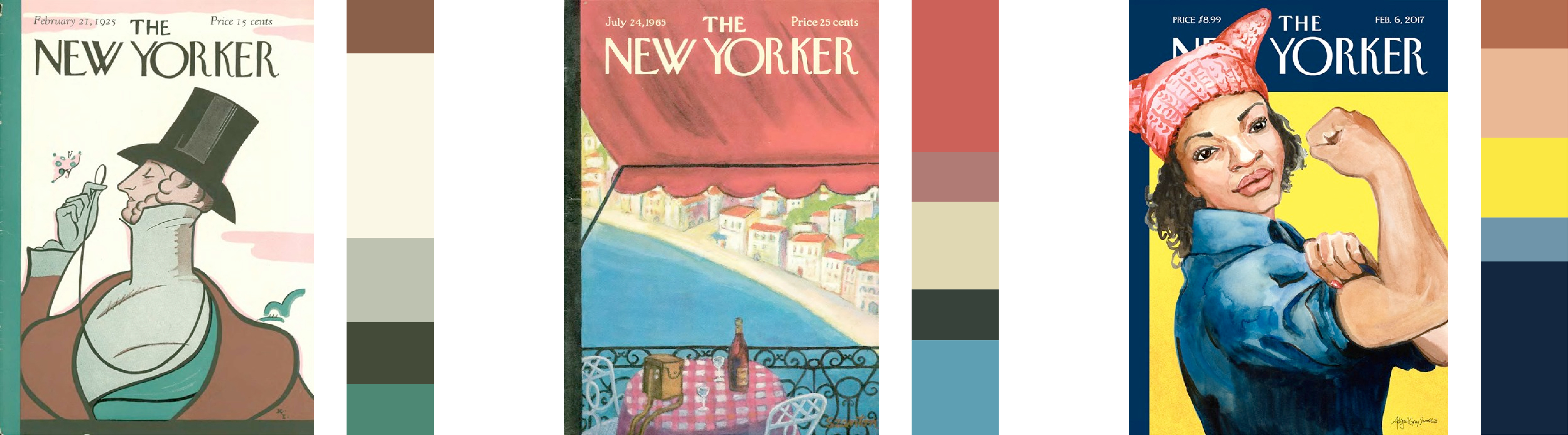
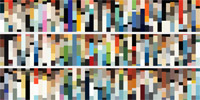
Sample covers showing color distribution. Colors are sized by how often they're used and sorted by hue.
Shifts in color palettes over the decades can be seen by scrolling through the years or switching to the big timeline. Limited and muted palettes were used the 1920s—possibly due to printing limitations, darker greens were more common in the 1940s, lighter palettes were used in the 1970s and 1980s, louder contrasting palettes were popular in the 1990s and more well-rounded palettes started being used since the 2000s.
Disclaimer: This project contains copyrighted material, the use of which has not been endorsed by Condé Nast, the copyright owner of the The New Yorker. I am making such material available as part of a curiosity for exploring color palettes. I believe this constitutes a “fair use” of any such copyrighted material as provided for in section 107 of the US Copyright Law. I do not claim ownership of any images and no images are for sale. The cover images shown are copyright by the original publisher.
How it was made plus early experiments »
 Yearly timelines
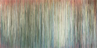 One big timeline
Hover/tap to see covers Scroll to explore
Press
- 92 Years of New Yorker Covers Visualized by Color, March 31, 2017, Mental Floss
- Stories we're talking about this week: April 4, April 4, 2017, Vox Media Storytelling Studio
- Showcase, September 22, 2017, Information is Beautiful Awards 2017
Published March 26, 2017