Color me Textured
By Nicholas Rougeux, posted on March 17, 2005 in Art, Fractals
When I became interested in fractal art and started researching it, I found plenty to keep me occupied for quite a while. What grabbed my attention and has yet to let it go is the level of detail the fractal artists put into their work and how "real" it made their images look. That's what intially drew me to this form of art and I wanted to do it too. What's possible still amazes me but now I've developed my own methods of detailing my work.
It's the simple things in life that amaze people, including myself. The methods I use aren't highly complex by any means (besides the formulas themselves). For those of you who are familiar with Photoshop, you'll recognize some of the terminology I will be using. This is because, as with Photoshop, layers in Ultra Fractal play a major part in any design. If you want to try what I'll be describing, download a demo of Ultra Fractal. With that said, let's dive in.
I was recently asked by fellow fractal artist, Jeffrey (Aeires) how I "keep the colors from going screwy" when many layers are added to a fractal. This was one of my questions when looking at all that great art out there and still is in some cases. Typically, the standard fractal that everyone recognizes is a spiral with rainbow colors. If made in Ultra Fractal, these images usually comprise one or two layers. Once you start adding more layers with more color and playing with the Merge Mode of each one, the colors can get muddy or too intense.
To fix this, my suggestion is to only have one or two layers with color and leave the rest in greyscale. For the few layers with color, choose colors that are a bit desaturated and not as vibrant as you want them to be. For example, let's say you wanted a nice vibrant green in your final image. To start, you could choose an olive shade.

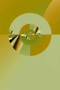
Figure 1: Composite of Tactile's three base layers
Take a look at Figure 1. This is what the base layers of my Tactile fractal look like without any enhancements. Dull isn't it? There are three layers in this image:
- Basic shapes in greyscale
- Same shapes but with a simple gradient including white and a dull orange applied with its Merge Mode set to Darken
- Same shapes again but with green used in place of orange in the same gradient and the gradient is rotated a bit
(Keep in mind that layers in the actual program are in reverse order. #3 is on top of #2 which is on top of #1.)
Once you have your base colors, it's time to play with textures. What are textures? I call those other greyscale layers texture layers because they are what create the details and add the realism to our fractals. Here's how you create those textures:
- Create a new layer
- Set the colors to greyscale (just a simple two-node black and white gradient will do—you can adjust it later if you want)
- Find a outside coloring algorithm or different base formula altogether (usually something that looks very busy like lots of stripes, a grid, or whatever you like)
- Set the Merge Mode to Overlay
- Set the Opacity to a low value like 7-10%
That's it. The most work involved is choosing which formula and settings to use to get your texture. Making it a texture is as easy as setting the Merge Mode and Opacity. Why did I choose Overlay? I like the effect it has on both light and dark colors when used at low opacity. It's pretty basic but can have a nice effect. Photoshop Blending Modes is a good page that describes what each of the Merge Modes do. Since Blending Modes in Photoshop are the same as Merge Modes in Ultra Fractal, that site is just fine for explaining them. Photoshop just has more of them. See your Photoshop and Ultra Fractal help sections for more information. I wouldn't mind seeing some more in Ultra Fractal but there are enough to make do just fine. Maybe in future versions?

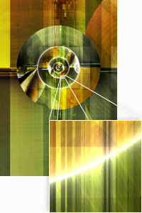
Figure 2: Close up of textures on Tactile
As you add more texture layers, the underlying color layers will be enhanced and the combination of texture layers on top of each other add some great deatils. Figure 2 shows a close up of an area from the final version of Tactile at its original poster size of 5200px × 7800px and the textures that were combined to create it. Sometimes I get carried away with textures and end up using more than I ever intended but I enjoy working with them so much that I don't mind. Sure, it increases the render time significantly but it's always worth the wait. By the time I finished Tactile, I had used three color layers, seventeen texture layers, and four for masking. (I'll cover masking in a later article. For a preview of the example, take a look at Observation.)
This is certainly not the only method of managing your colors in Ultra Fractal. There is no rule that says you can only have a few layers of color at the bottom of your layer stack. This is just one method that I've found very useful and produces great effects. I'll talk about other methods their effects in future articles.
