Transit charts: fun with public data
By Nicholas Rougeux, posted on September 4, 2012 in Art, Data
Continuing my latest obsession with data visualization, I had some fun with public transportation data. In an attempt to play around with a new color palette and put a different face on old data, I wound up creating what I call Transit Charts.
I became a bit of an amateur transit geek since I created the Metra schedule charts—though I've been more interested in the artistic potential of transit data.
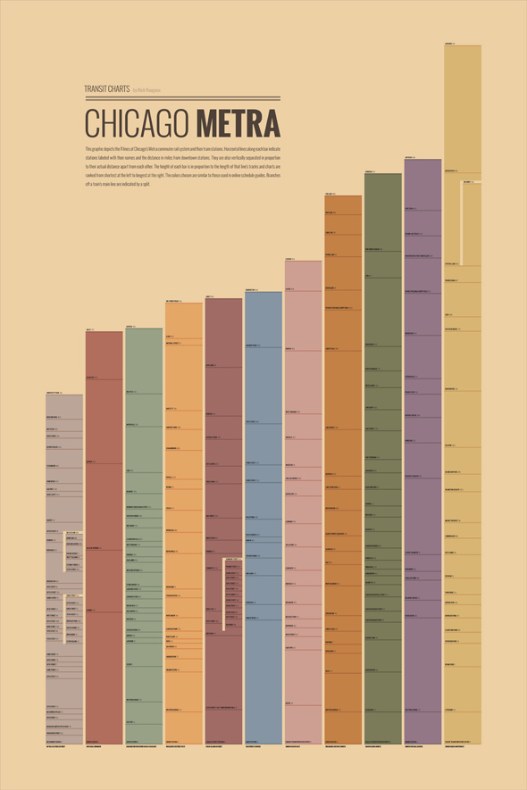
I wanted to see what was possible with local data again so I focused on Chicago's Metra system. From previous research for the schedule charts, I knew Metra had a table in their 2012 Budget and Program Book (page 68) that listed the distance of each station from the downtown station on each line. I've been wanting to do something with that for a while because it felt unique enough to produce something interesting.
I copied the data into Excel and created a basic scatter chart with lines and added the colors from Metra's site for fun.
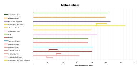
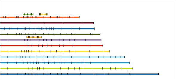
For more graphical freedom, I wanted to get the chart into InDesign, which meant exporting to a PDF, extracting the shapes in Illustrator, then copying into InDesign. However, Excel handles exporting charts to a vector-based format poorly and split the lines based on their nodes into separate objects. This was a pain to work with so I recreated the chart in LibreOffice which was able to export PDFs with the shapes in tact. I added some Y error bars to indicate the stations and ranked them. Shorter lines between main lines indicate branches used as spacing guides in the final design.
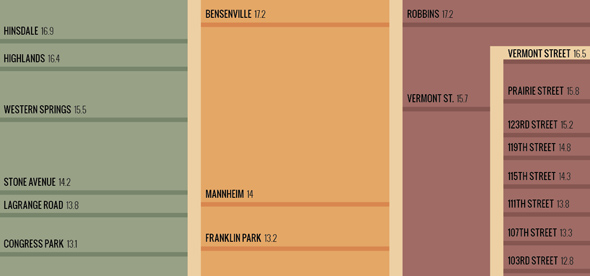
Once I had the shapes in a manageable format, they needed some cleanup in Illustrator and final design in InDesign. The name of each station and distance from the downtown station were added manually in InDesign. The lines along the middle of the Metra Electric, Rock Island, and Union Pacific Northwest lines indicate the branches off the main line. The colors chosen are similar to those used on Metra's site but staying in a midtone palette to keep the poster feeling warm:
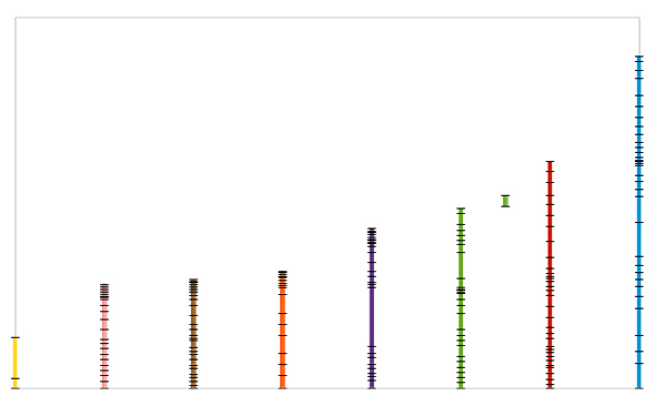
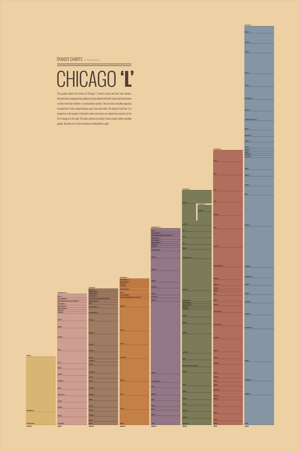
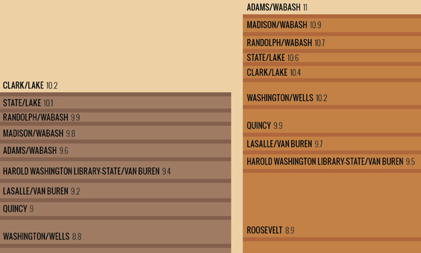
Of course, Metra isn't the only transit system in Chicago so I was curious to see what data for the ‘L’ system produced. Chicago has geographic coordinates for each station on their data portal so I determined the distance between them using an excellent formula for calculating the distance between two points. I don't presume to fully understand how it works but spot checking the results with online calculators always matched so I assumed it was accurate. Following the same process as with the Metra data, I plotted the information in LibreOffice, added corresponding colors for clarity, and switched to a vertical chart to save a step in InDesign.
I was pleased with the end result. Again, colors are similar to those used on the CTA's site but within the same midtones palette:
I may do more transit systems in other cities in the near future.