Making of Color Palettes of The New Yorker
By Nicholas Rougeux, posted on March 26, 2017 in Art, Data, Web

Generating color palettes of more than 4,600 covers of The New Yorker was a challenging task but when I get an idea stuck in my head I stubbornly like to see it through. What follows is a breakdown of how I made my Color Palettes of The New Yorker project including early ideas, methodologies, and technical details.
Inspiration
My project was inspired by several projects that visualized color frequency had seen over the years including 50 Years of “Avengers” Comic Book Covers by the Wall Street Journal, Front Page Fingerprint by Derek Chan, and the art and design of Arthur Buxton. Each time I saw one of these projects, I wanted to create one of my own. After recently discovering the extensive archive of The New Yorker issues, and not finding any evidence of others creating a project based on their covers, I knew I found the data I wanted to use.
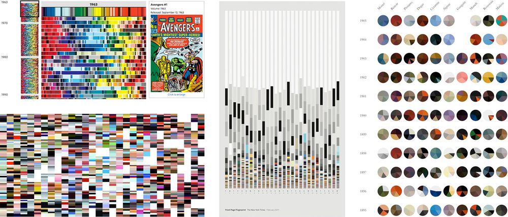
Top left: 50 Years of “Avengers” Comic Book Covers by the Wall Street Journal, Bottom left: Vogue Covers Covered by Arthur Buxton, Middle: Front Page Fingerprint by Derek Chan, Right: Ten Artists: Ten Years by Arthur Buxton.
Data and tools
The New Yorker archives are great because they house high-resolution images of every page from every issue that’s been published. However, I didn’t initially have a way to analyze the colors to see if they would yield interesting results.
I stumbled on Martin Krzywinski’s Image Color Summarizer which analyzes images to find the top colors used in any image. This turned out to be the perfect tool for me because I wasn’t keen on trying to use complex code libraries to get results. The Image Color Summarizer can analyze images by uploading a file, using a URL of an image already online, by using a simple API, or by using a command line tool for Windows.
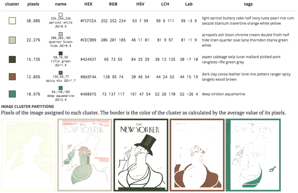
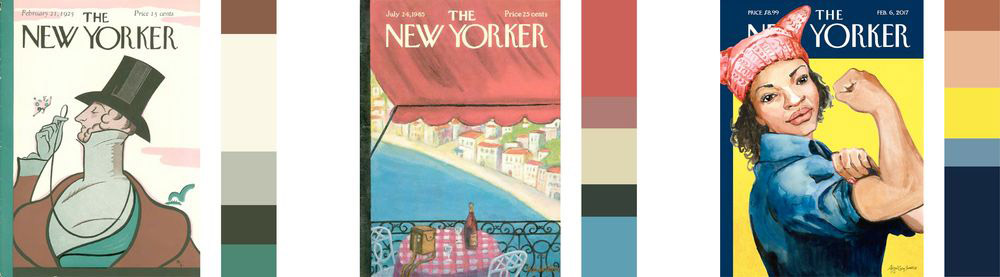
Color summary of the first issue cover of The New Yorker from February 21, 1925.
The color summary results of several issues proved interesting so the next challenge was finding a way to analyze all 4,600+ issues. I only needed to do this once so I was willing to do some manual work to organize the data. The URLs of the cover images of The New Yorker archives were structured in a predictable format:
http://images.archives.newyorker.com/rvimageserver/Conde Nast/New Yorker/1925_02_21/page0000001.jpg?type=3&width=718&quality=70&v=v2
However, the URL above is only part of a cover—possibly as a way to protect the images or for performance reasons. Removing the querystring allowed for direct access to the high-resolution image:
http://images.archives.newyorker.com/rvimageserver/Conde Nast/New Yorker/1925_02_21/page0000001.jpg
Knowing this, all I needed to do was know the date of every issue and save each image for analysis. I did this in a roundabout way because I was more interested in getting the data than writing code to make it happen efficiently. I ended up doing the following:
- Manually copy the issue dates by browsing year-by-year in the archives. This was a little tedious but there were only 92 years to copy and paste.
- Create a simple HTML page with links to each issue substituting the “1925_02_21” in the URL above with the appropriate date. A list of links was created using a spreadsheet with dates in one column and a simple concatenation formula in another to build the HTML for each link.
- Use the DownloadThemAll! Firefox add-on to crawl that page and save the cover images with the names of their dates (e.g. 1925-02-21.jpg). This took about an hour or so because each image was large. But, the add-on provided a nice progress indicator to let me know how much was complete. The ability to format the names of the files after downloading automatically was a great feature.
- The images were then resized using XnViewMP to a smaller size of 200 pixels wide for the color summarizer to analyze.
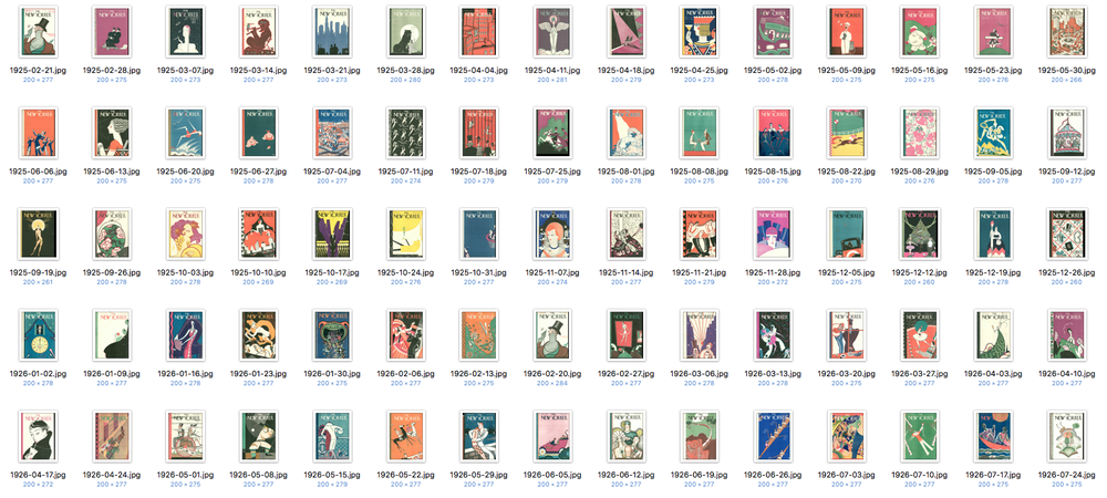
Screenshot of covers of the first 75 issues.
Next, I used the color summarizer command line tool to analyze the entire folder of covers. This took some experimentation because there is limited documentation on how to use it. I had to analyze images in batches of 10 years because analyzing the entire folder at once maxed out the memory of my Windows virtual machine. Each batch of 10 years took about an hour to run. I did this using the configuration file included in the download and outputting the results in a text file:
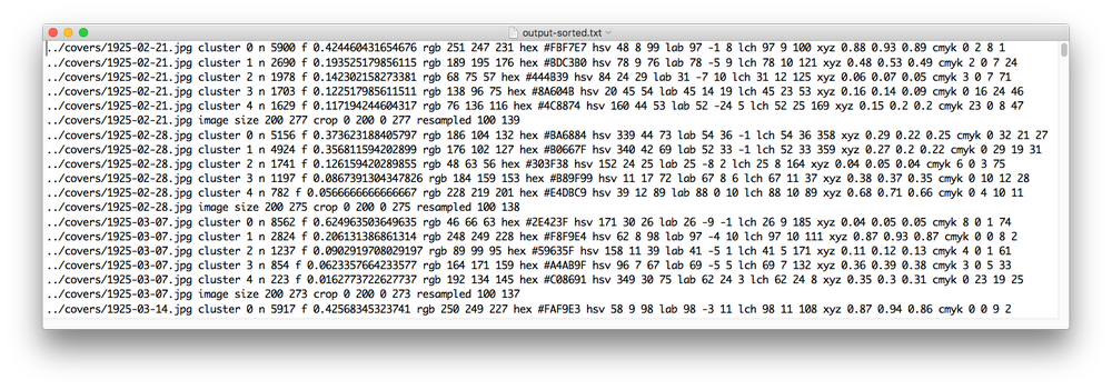
Beginning of raw data from the color summarizer
Using RegExr, I used some regular expressions to extract the data I needed (date, frequency, and colors) to generate a CSV file. I also needed to extracted the date in several formats like year, decade, and datestamp because I need it for experimenting with design ideas using tools that couldn’t parse dates.
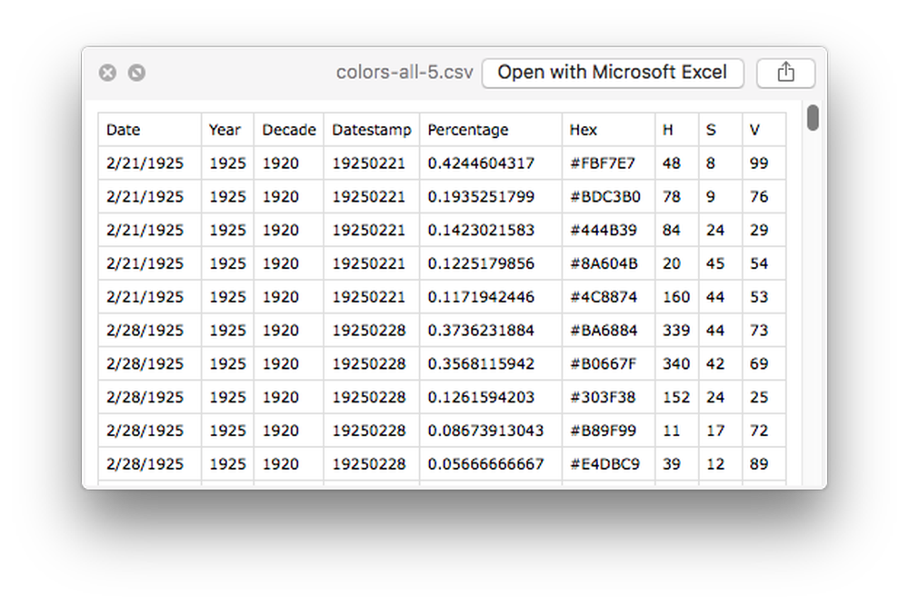
Beginning of CSV generated from raw data
Finally, I needed to transform the CSV into nested JSON to build the interactive diagrams. I could have written some code to do this but I’m more familiar with regular expressions so I opted to use RegExr again to take multiple passes to generate the JSON.
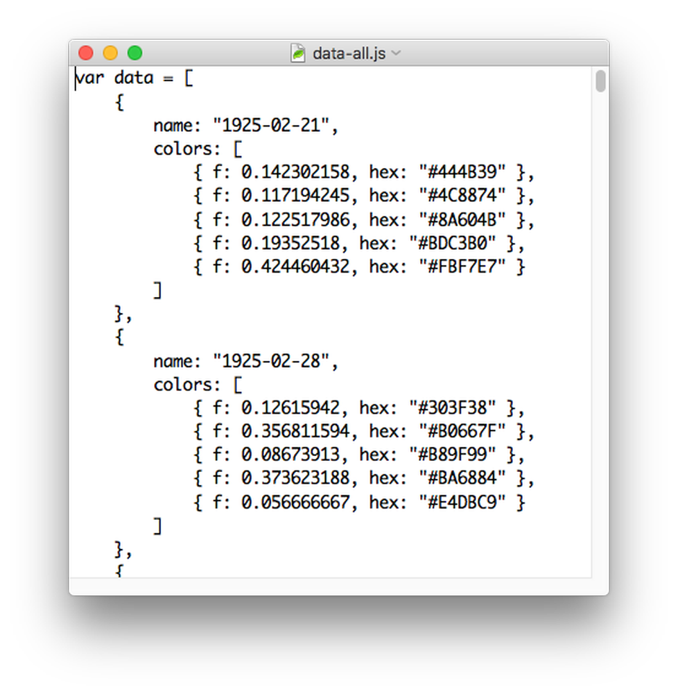
Beginning of JSON generated from CSV
Design evolution
Before I did any major data manipulation, I started by manually collecting the data from the color summarizer for just a few of the most recent issues to see if the results yielded anything interesting. I used NodeBox to quickly see results without needing to write any code.
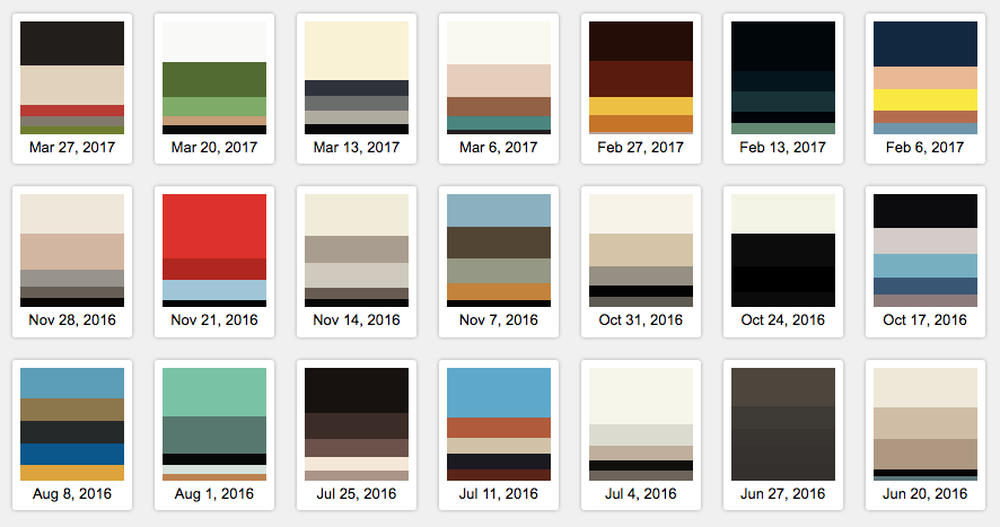
I first wanted to imitate the Marvel project from the Wall Street Journal by stacking the colors of each issue on top of each other. I analyzed the top 5 and the top 10 colors:

Top 5 (left) and top 10 (right) colors of issues from Nov 14, 2016 to March 13, 2017 (read bottom to top).
I was very pleased with the results and preferred the five-color analysis because it was simpler so I experimented with several other different methods:
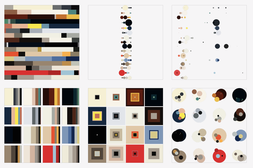
Early experiments with the same 16 recent issues as mentioned above.
Another early experiment with the covers shown for comparison. The position of each cover (left) corresponds to the position of each group of squares (right).
Top five colors of every issue (as of writing) from 2000 to 2017 (top to bottom) arranged as groups of squares sized by color frequency and positioned randomly in each group.
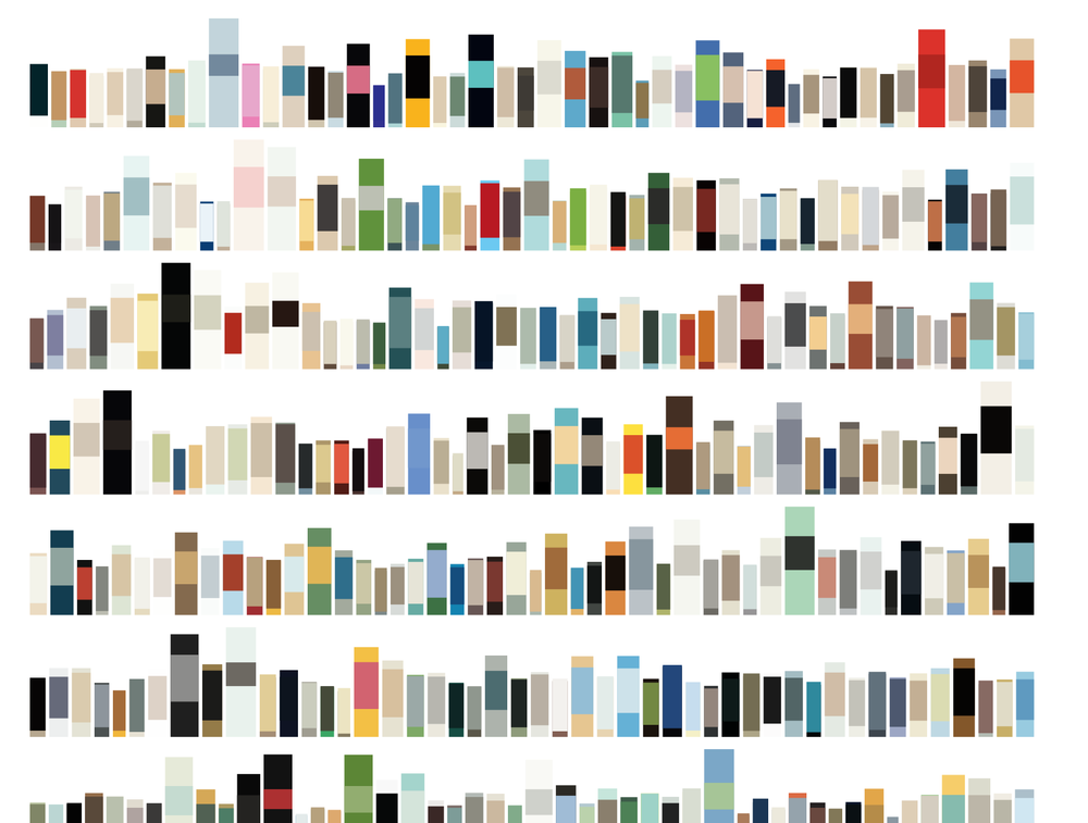
Top two colors of a selection of covers resembling rows of books spines. Size and position of rectangles is based on how often the color is used in a cover, and color properties like hue, saturation, and vibrance.
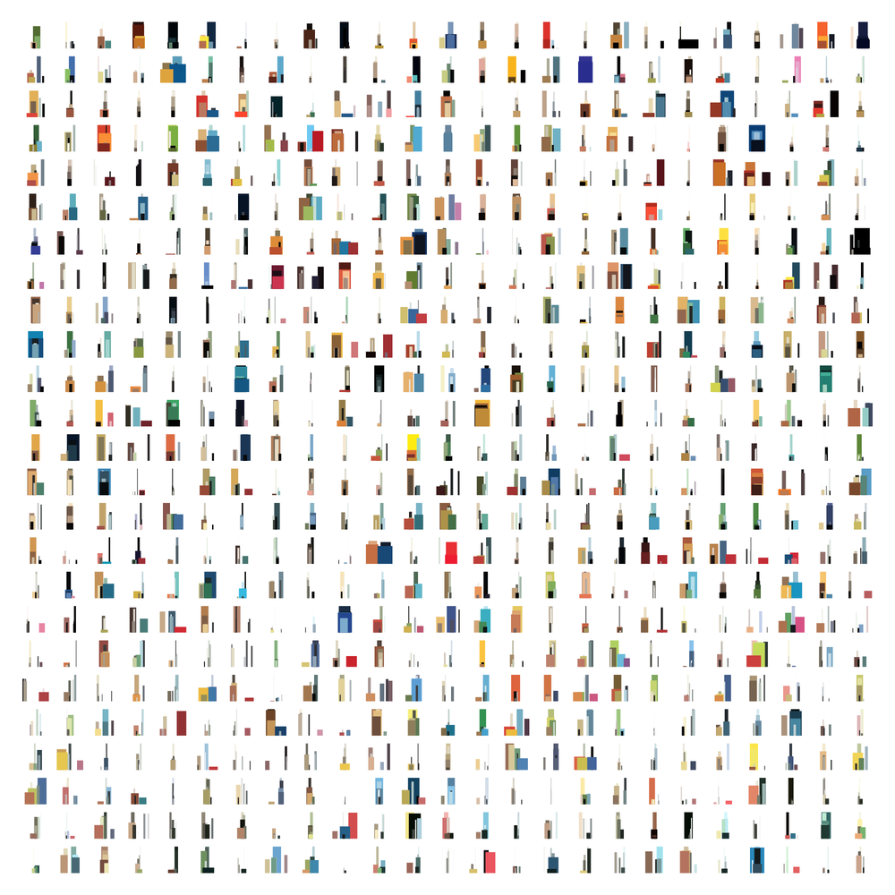
Top five colors of a selection of covers resembling small city skylines. Size and position of rectangles is based on how often the color is used in a cover, and color properties like hue, saturation, and vibrance.
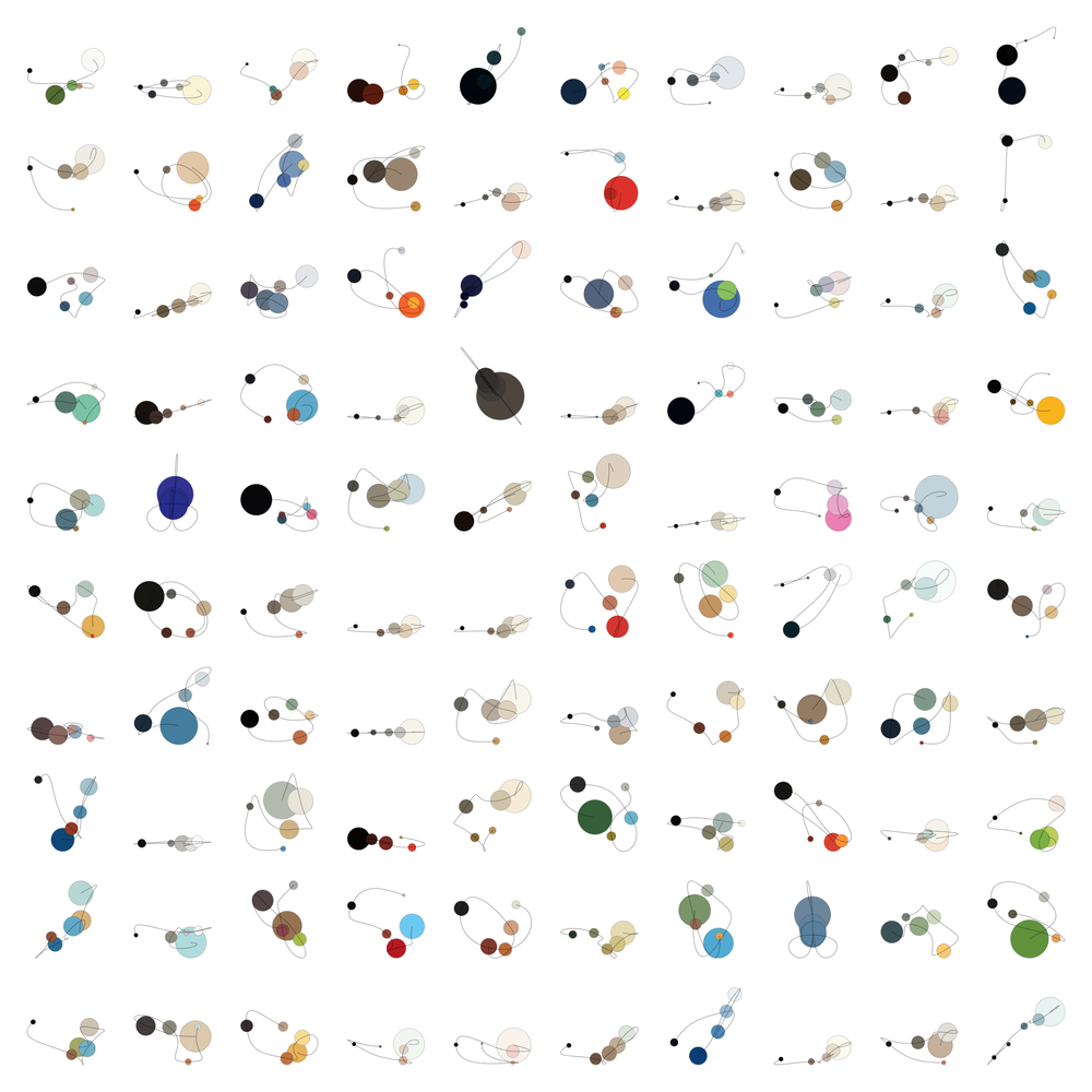
Top five colors of a selection of covers resembling abstract diagrams. Size and position of circles is based on how often the color is used in a cover, and color properties like hue, saturation, and vibrance. Lines connect circles from most used color to least used for each issue.
These early experiments were for exploring how the colors of each issue stood on their own as a type of visual identity and contributed to a larger family of color palettes.
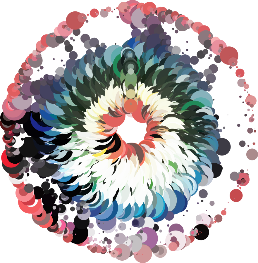
In between these experiments, I worked with the entire set of 4,600+ issues and plotted all the colors to see which were common in the spectrum:
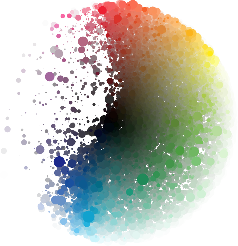
Top five colors of every issue plotted on a color wheel. Dots are plotted around a circle based on hue, distance from the center is based on saturation, and size of the dot is based on how much that color was used in an issue.
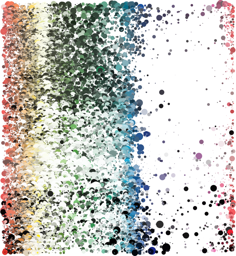
Top five colors of every issue plotted on a vertical timeline. Each row of dots is one issue. Dots are placed horizontally based on hue, vertically based on issue (oldest at the top, newest at the bottom), and sized based on how much that color was used in an issue.
Same as above but arranged as a circle. Each issue is a spoke on the wheel starting from the 12 o’clock position and reading clockwise.
There were definitely some trends that appeared. The gaps in purple and pink are due to the medium. Printing neon purples and pinks from the RGB color space used on screens just isn’t possible with CMYK color space.
I even took a cue from Stefanie Posevec’s Writing without Words project and plotted all the colors by drawing one continuous line—making a right turn after each color, drawing each segment with the color used and making its length based on how often it was used in a cover. The result was muddy but still interesting.
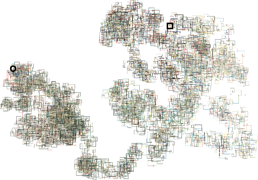
One continuous line of colors. Starting at the black circle and ending at the black square, a line is drawn for each color of a cover starting with the oldest issue and most used color. The length of each segment is based on how much it was used in a cover.
I also created a few collages of all the covers (at the time of this writing) organized by color with the use of ImageSorter and by time by organizing all the images in an HTML page.
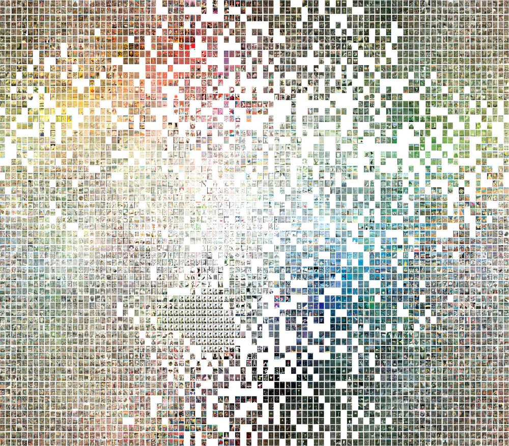
Every issue organized by color similarity. Note: repeated images appear around the lower left of the middle because The cover of the first issue is republished each year on the date closest to The New Yorker’s anniversary.
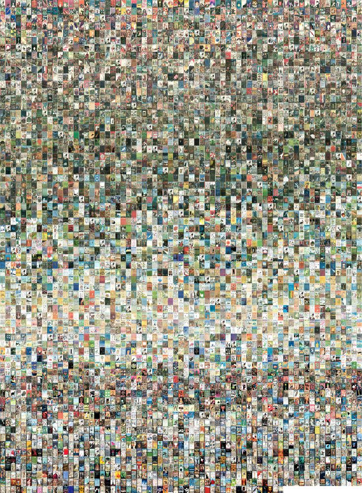
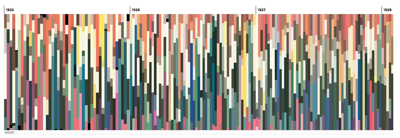
Every issue organized by date (oldest at the top).
Gradual shifts in color palettes over the decades definitely stand out. Limited and muted palettes were used the 1920s—possibly due to printing limitations, darker greens were more common in the 1940s, lighter palettes were used in the 1970s and 1980s, louder contrasting palettes were popular in the 1990s and more well-rounded palettes started being used since the 2000s.
I really enjoyed looking around the collages of all the issues to explore all the different covers. This lead me to creating the interactive timelines in the final result which allows for exploring all the colors and covers by year or as one large timeline.
Building the visualizations
Many of my projects result in posters to sell but I wanted to make this project interactive because selling copyrighted work clearly isn’t an option, and I really wanted to have a fun way of exploring the colors used in each cover. I needed to assemble all the covers into one coherent interactive piece.
My skill level of coding is far from advanced so my lofty goals of using D3.js to create an elaborate visualization were unrealistic so I stuck to the basics—starting with some simple jQuery and HTML/CSS to explore basic proofs of concept.
I quickly countered the challenge of efficiently loading and displaying the large amount of color data. At 5 colors per issue, about 47 issues per year, and 92 years (as of writing), there were over 21,000 shapes I needed to generate and display. Plus, I wanted to keep updating the project as new issues came out and have the flexibility of making updates so I didn’t want to generate static images of the visualizations.
An early attempt with D3.js lead to a wall of colors similar to a hardware store’s paint chip wall. I liked this but seeing the color shifts over the years was difficult with all the extra space and text. It was too busy and in a way, too informative.
Each issue shown as a collection of “paint chips” with colors sorted by how often they’re used from top to bottom.
Similarly, a grid of circles made seeing changes even more difficult.
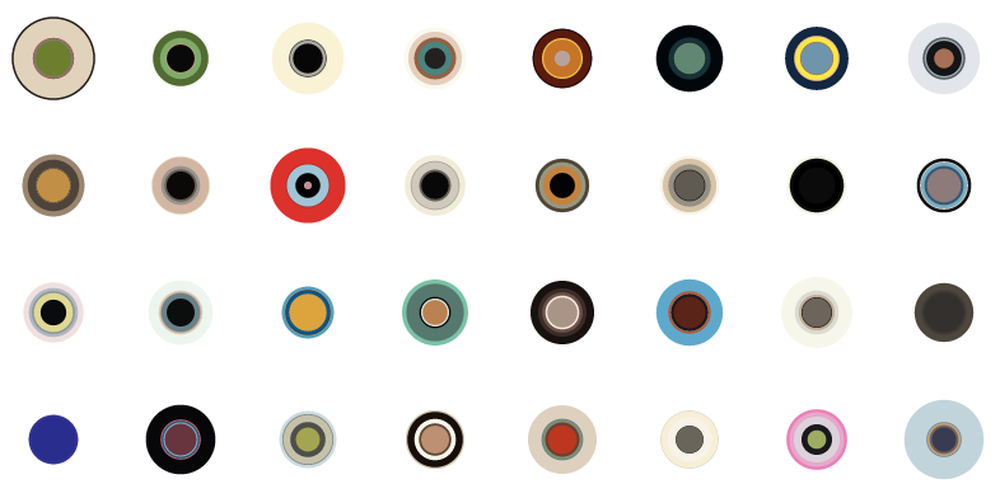
Issues shown as concentric circles sized based on color usage.
Treemaps seemed like an interesting approach but also seemed too busy. Plus, I couldn’t find an efficient way of creating them without the use of D3 plugins that would severely slow down loading time.
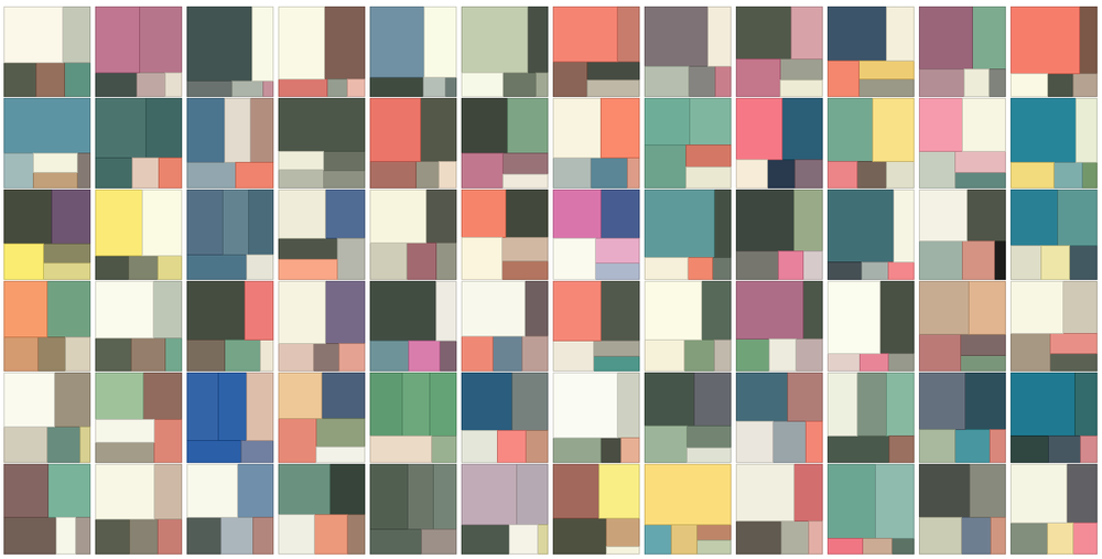
A selection of issues shown as treemaps. Colors are sized based on how often they’re used in each cover.
Final result
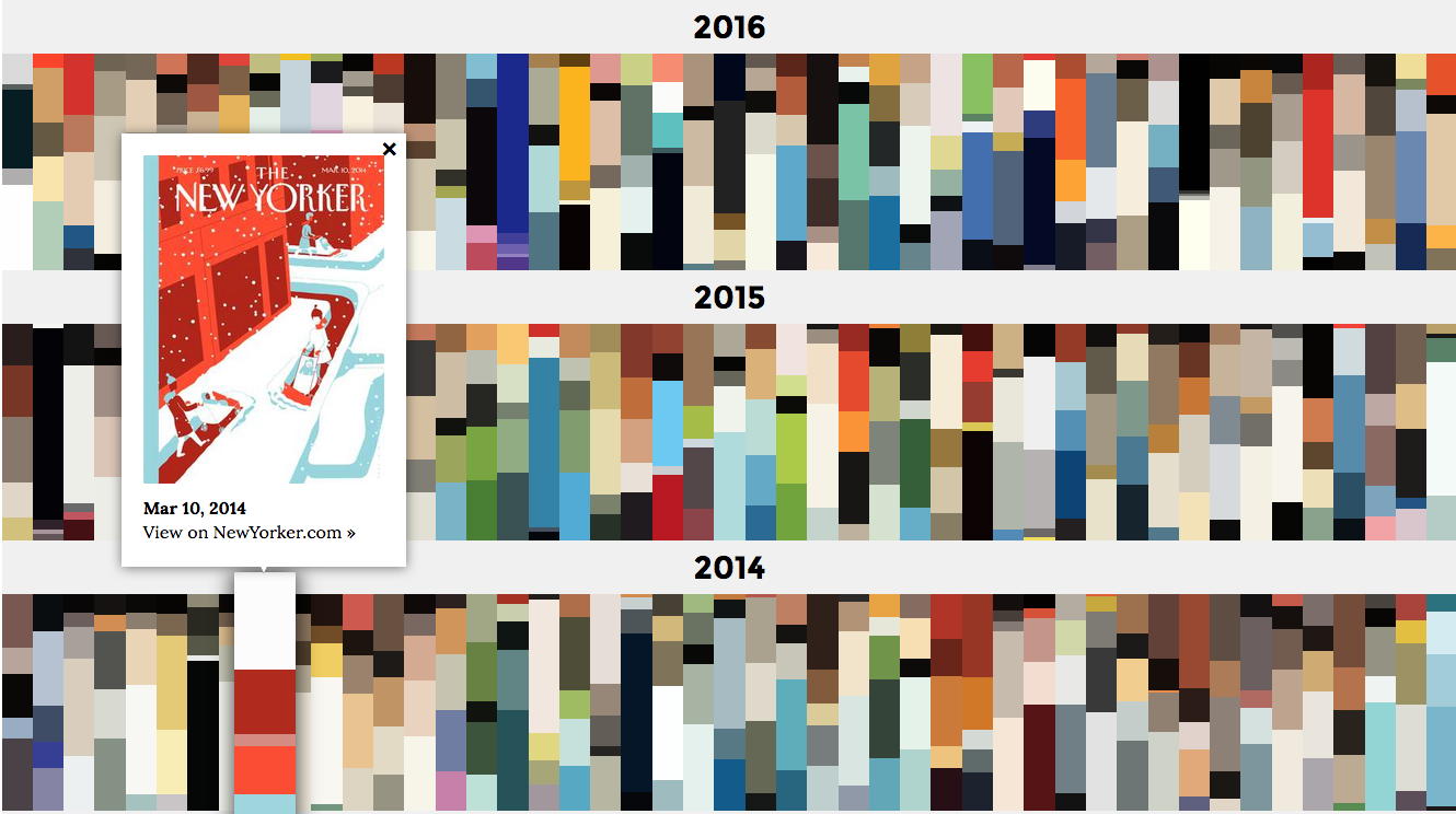
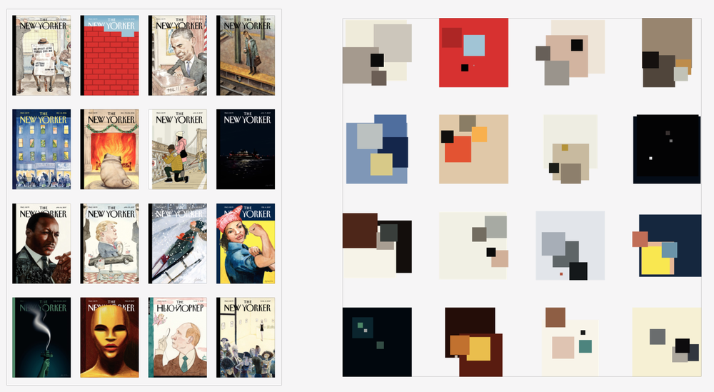
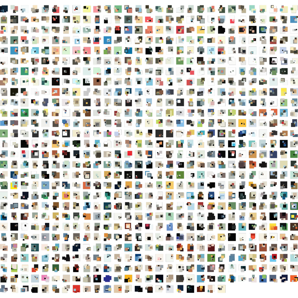
Ultimately, I chose to keep the final result relatively simple—showing colors from every issue are organized by year and allowing the original cover to be viewed by hovering over each column. Additionally, I added links to The New Yorker archive for each issue to see the full size version and for reading the issue (subscription required).
Colors for each issue are organized by hue from top to bottom and each color is sized by how often it’s used in the cover.