Making of Æsop Blooms
By Nicholas Rougeux, posted on February 21, 2018 in
Inspiration for Æsop Blooms was sparked by an offhand remark about someone learning Æsop’s fables in school. As with most projects, little did I know about the rabbit hole I was about to go down learning about them.

You’ve probably heard of the classic fables like the The Hare and the Tortoise, the The Goose and the Golden Egg, and others but have you heard about or The Fisherman and the Little Fish or The Frogs and the Ox (data for which are pictured above)? I hadn’t. I knew many of the morals but not their stories and had no idea there were so many of them.
At first, I thought fables would be a great source of simple data since they had been around forever and there was probably a standard set of wording for them. I was right about the first part. Æsop’s fables are mostly from ancient Greece but there were no official records of them back then so no official list or wording exists. I was surprised to find that hundreds of fables have been attributed to Æsop in many different collections—most of which are detailed on the Aesopica.
Data
With so many collections, the first challenge was to pick a source. My criteria were that it had to be well known, in the public domain, and a solid collection of verifiable fables—meaning I could reference the original text if need be. I narrowed my choices down to The Fables of Aesop by William Caxton from 1484, Baby’s Own Æsop by Walter Crane from 1887, and The Æsop for Children with pictures by Milo Winter from 1919.
Caxton’s version is the oldest printed English edition and the old style spellings would be fun to reproduce but would have made reading the fables more difficult. Crane’s version tells fables with limericks but they were too short and too consistent in length to make something as varied as I was hoping.
I chose The Æsop for Children because the fables were easily accessible on Project Gutenberg, the original book was available for reference on Google Books, and the length of the fables varied nicely—ranging from a few sentences to several paragraphs with dialogue—so the end result would have a nice mixture of variation.
Data were stored in two places: individual text files for each fable and a spreadsheet for the metadata like title, colors, sequence, etc.
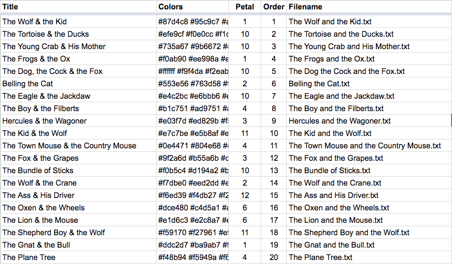
Screenshot of the first 20 fables listed in the spreadsheet showing title, color, petal shape, sequence, and name of text file.
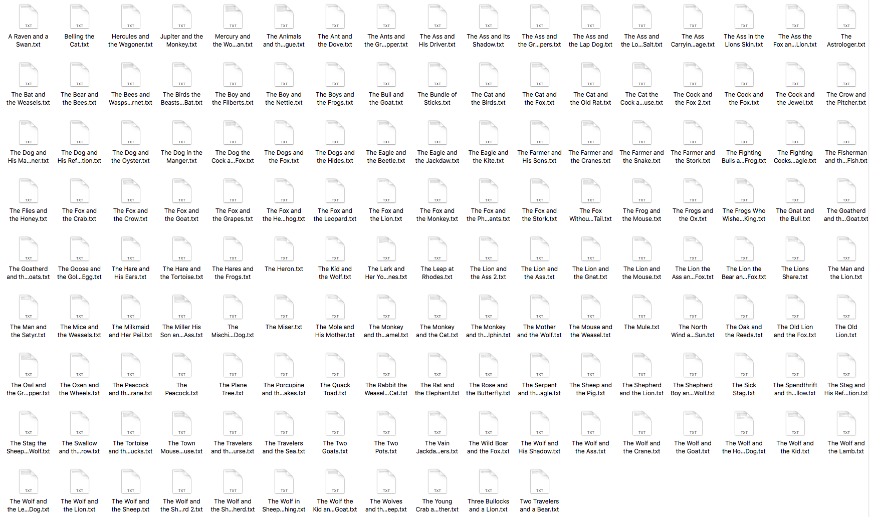
Screenshot of all 147 fable text files.
I built a small tool to “clean” the text for each fable so it didn't include punctuation. This allowed me to count just characters in a word and not quotation marks, periods, question marks, etc. for a more accurate representation of the text.
Storing the data in these formats allowed me to feed it into NodeBox to generate the shapes needed for the final posters as described below.
Interesting findings
While collecting the data, I discovered a few interesting things about the original text of The Æsop for Children:
- The Cock and the Fox is labeled as “The Fox and the Cock” in the table of contents. I chose to use the title as reflected in the text.
- A few titles were shared between fables. The Cock and the Fox is the title of two fables, The Wolf and the Shepherd is shared between two, and The Lion and the Ass is shared between two more. However, each has their own separate story.
- The table of contents doesn’t list The Sick Stag but it appears later in the book.
Design
Every design starts with the experimenting with data and this was no different but what was different was that my first idea ended up being the one I used with for the final result: fables as flowers. Below is a sampling of some early, not-so-great ideas representing fables as flowers, fireworks, solar systems, topographical diagrams, clouds, and more abstract ideas. I may revisit these in ideas in future projects.
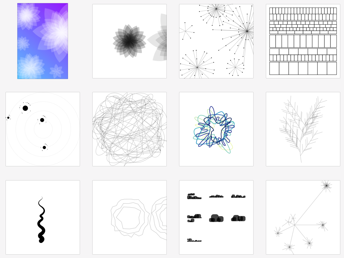
After about a dozen different attempts, I explored the flower idea in more detail and found that the results were pretty interesting.
My original plan was to create flowers based on each paragraph in a fable and the petals were based on the words and I stuck with this plan in the final result. How they were arranged started out differently. Originally, I wanted to arrange the flowers so they didn’t overlap and were rotated randomly so they best fit an available space like a packing problem. I had also planned on randomly rotating the petals around the center to give the flowers a more natural look. This proved problematic on several fronts: packing problems are notoriously difficult to solve, I didn’t know how to code a way to find a solution, and the randomness aspect felt like an empty cop out to finding a more meaningful representation.
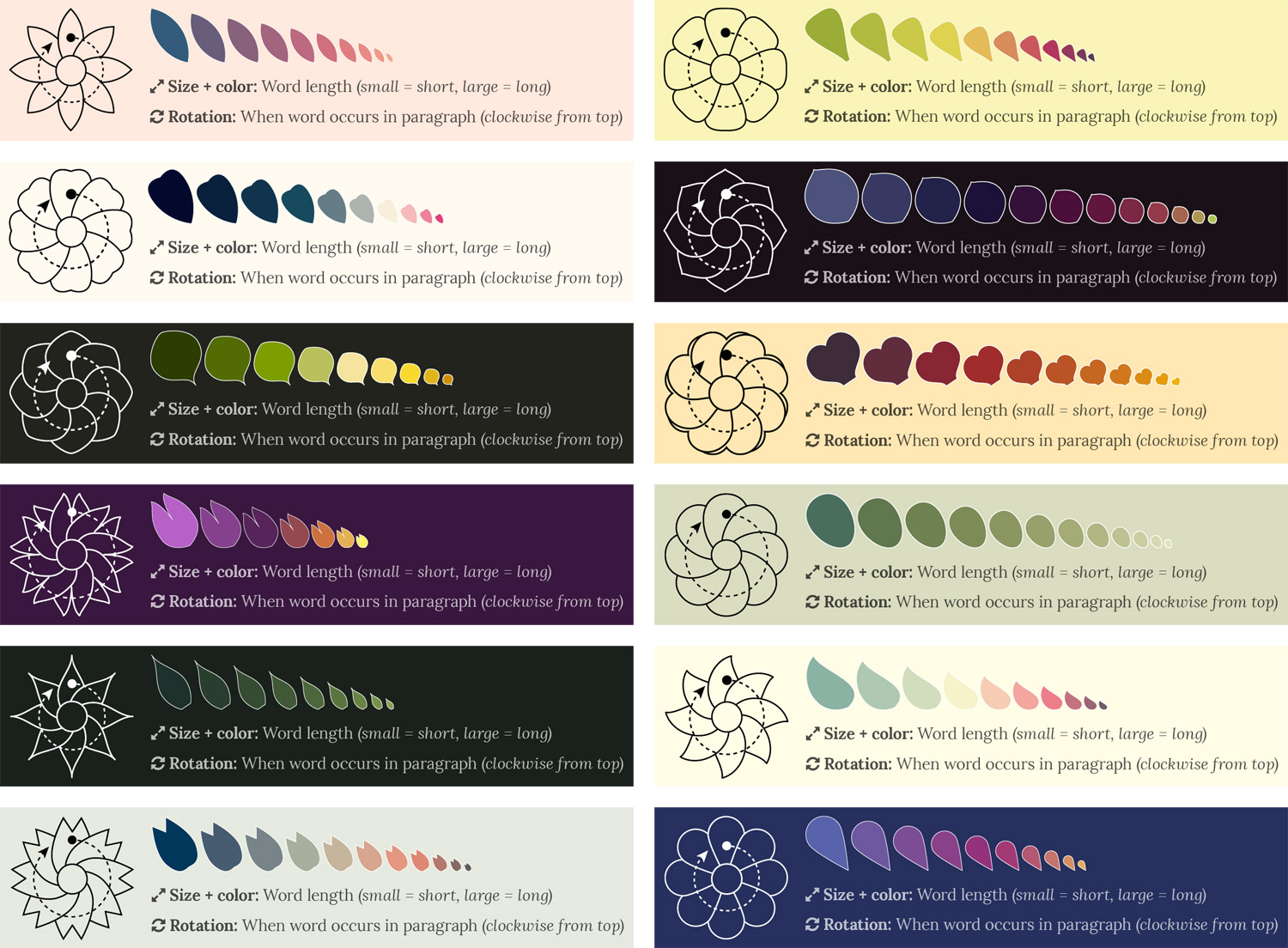
Instead, I chose to manually arrange the flowers on each poster so I had room to include the entire fable for reference. I also found that rotating the petals around the center based on when words occurred in a paragraph provided the same, if not better variation than randomness and added an extra dimension to each flower. Combined with basing the size of petals on the length of the word, no two flowers looked alike. To ensure that all the petals are visible, the smaller petals are always in front and the larger ones are in back as shown below in the flower for the moral from The Fisherman & the Little Fish.

I created twelve petal shapes to add more variety to the posters. The petal shapes were only loosely based on real flowers but were varied enough so even if the same shape was used on two posters, the combination of color, size, and position kept posters from looking too similar.
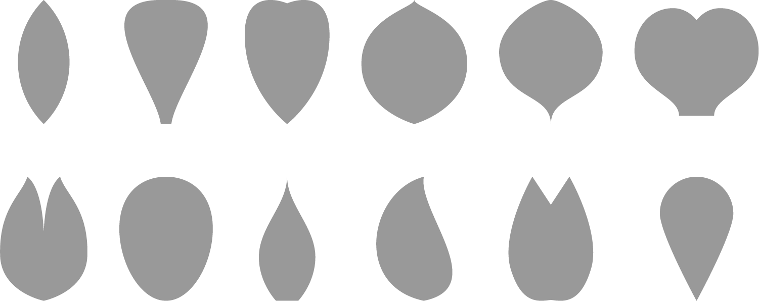
The twelve petal shapes used.
Each poster was assembled manually because each I wanted to make sure the fable was formatted nicely and the flower arrangement was unique. Assembling each poster involved a three-step process:
Step 1: Generate graphics with NodeBox
I created a NodeBox file that pulled in data from the spreadsheet and used the filename from each row to pull in text from the text files.
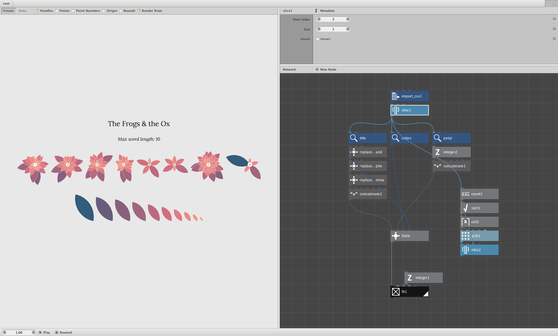
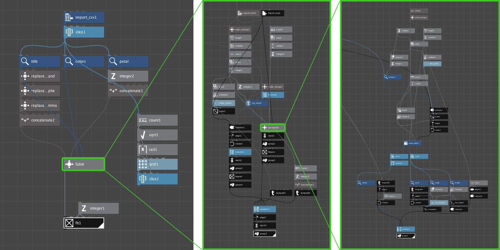
My NodeBox setup included three parts as shown above:
- importing the data and building the graphics to be exported (left)
- combining flowers with a legend, title, and calculated maximum word length (middle), and
- building each flower based on word length (right)
I used NodeBox to calculate maximum word lengths for each fable instead of including them in the data because this was easier than building a separate script to find it. Based on that, I used the Chroma.js Color Scale Helper to generate the number of color codes based on that maximum word length. Colors were sampled from photos of flowers and landscapes found on Google Images and Pinterest. For example, a palette of 5 colors can be split into 10 as shown below.
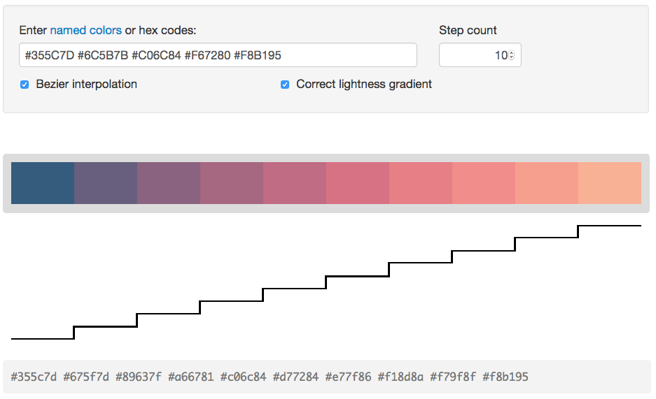
An SVG was exported from NodeBox for each fable to arrange in Illustrator and use later in InDesign.
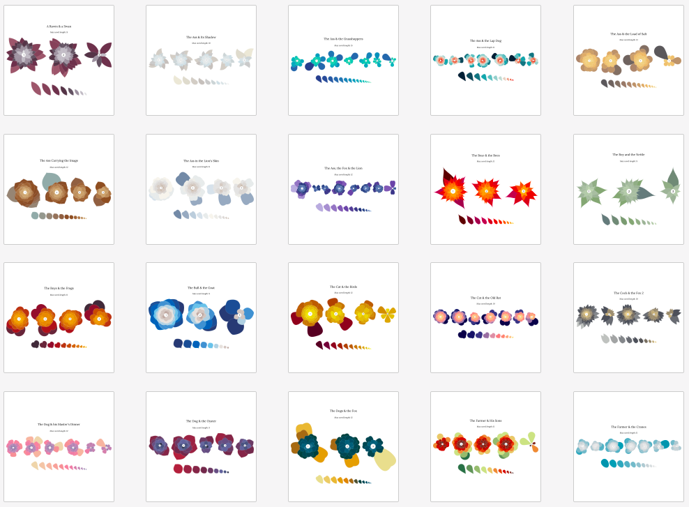
Sample of exported SVG files for 20 fables
Step 2: Arrange in Illustrator
Each SVG was split into two files with Illustrator: one with the flowers arranged, leaving a gap for the fable to be added later and another for the row of leaves to be added to the legend under each fable on the final posters.
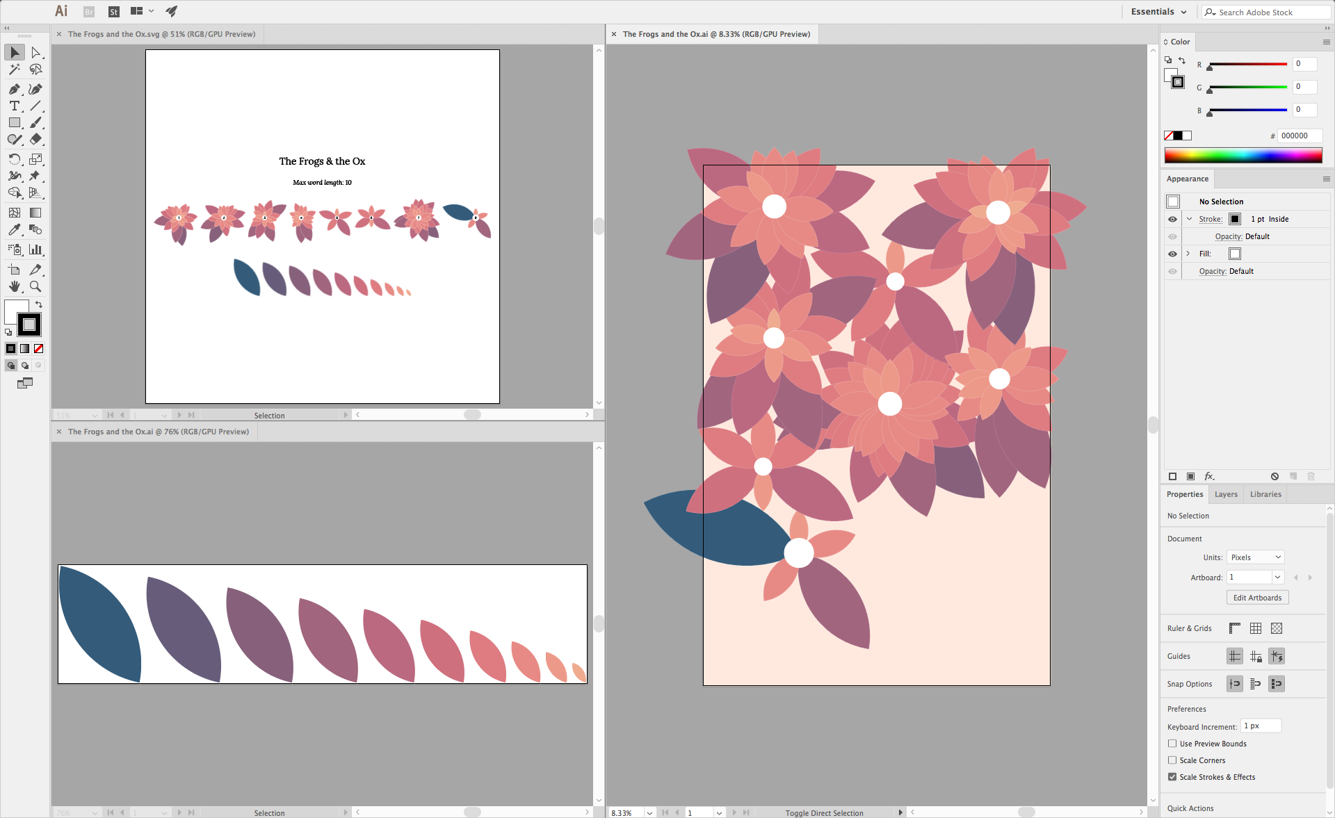
Illustrator screenshot showing exported SVG for The Frogs & the Ox (top left), legend (bottom left) and arranged flowers (right)
Step 3: Combine in InDesign
Everything was brought together in InDesign where the text elements were added including the fable itself, the legend, and the numbering on each flower corresponding to the numbered paragraphs in the fable.
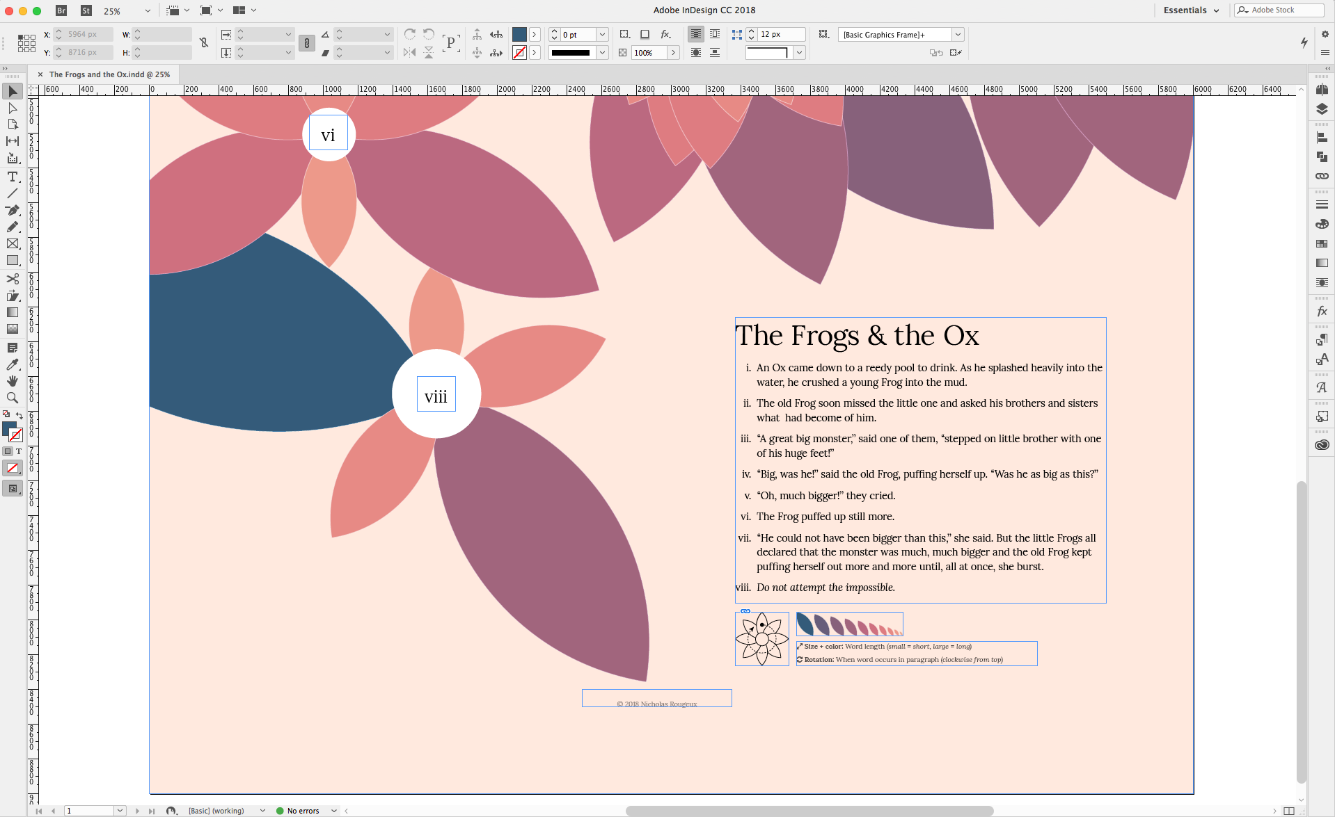
InDesign screenshot showing close up of elements from The Frogs & the Ox
Rather than using a generic legend, each poster has a customized legend based on the petal shape and colors used on the poster:
Final result
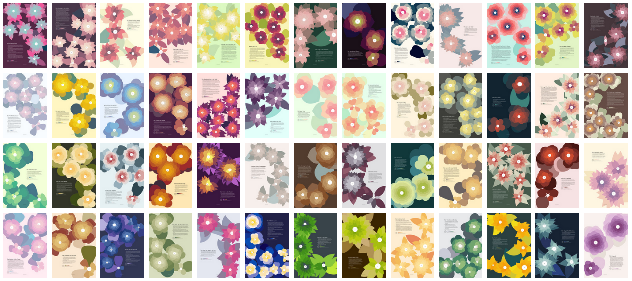
After about three weeks of work, I created a poster for each of the 147 fables from The Æsop for Children. Even though all the posters are based on the same set of data and basic technique, each poster is unique.
Bonus
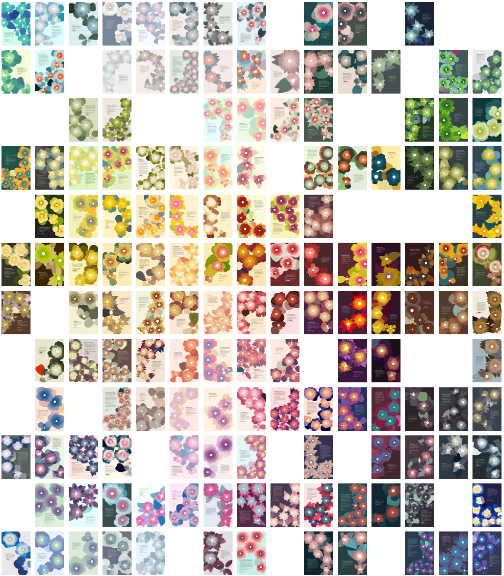
While the colors were sampled from real photos, I did not choose them based on any real criteria such as making sure there weren’t more of one color than the other. To my surprise, there was a pleasant balance of color choice overall. Below is a composite of all the posters organized by color using ImageSorter by Pixelution that shows this. It’s also a fun way to look at the entire collection of posters.
