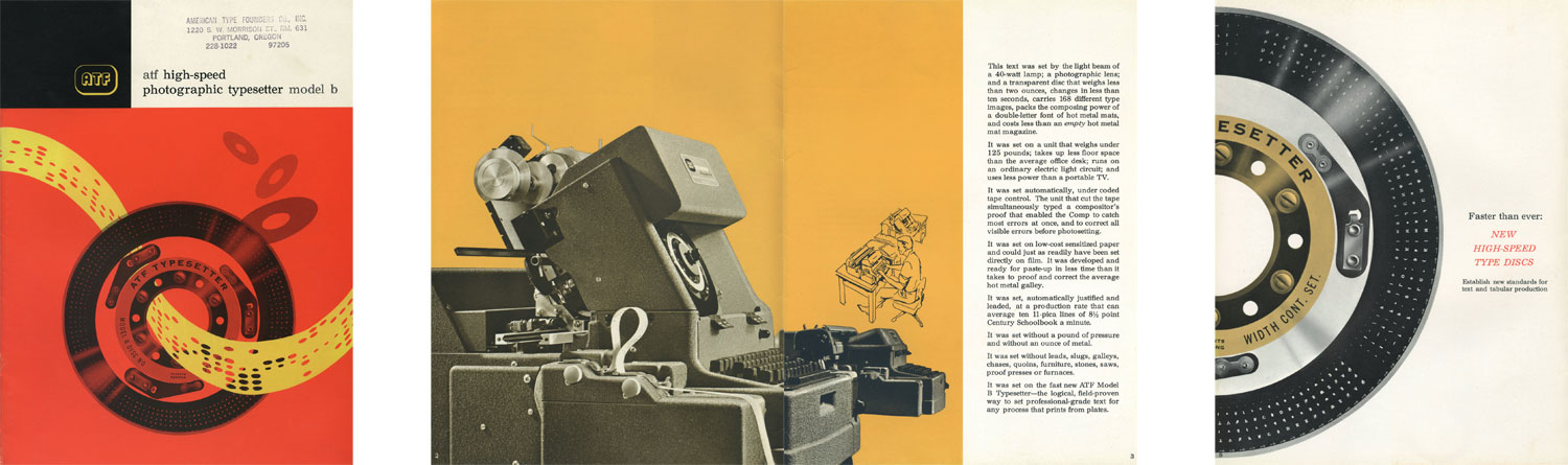
Making of ATF Typesetter Model B
By Nicholas Rougeux, posted on February 12, 2020 in Art, Web
If you’ve ever found a tiny piece of obscure history and had it strike something in you that made you obsess over it for weeks, that’s how I felt when I found the brochure for the ATF Typesetter Model B. This small 16-page brochure from 1963 for an obsolete piece of typographical machinery piqued my interest so much that I wound up converting it into a one-page website as an exercise in design and technology. Plus, it was just plain fun.
American Type Founders
American Type Founders (ATF) was created in 1892 when 23 type foundries comprising 85% of the manufactured type in the United States merged into one business. In the 1950s and 1960s, ATF ventured into photocomposition by creating the Typesetter Models A and B. The Model B became the popular of the two and comprised two units: a keyboard unit which allowed compositors to generate encoded long strips of encoded control tape which could then be fed into a photographic unit which produced the final product by reading the tape and projecting light through interchangeable discs with fonts on them.
As technology advanced, photocomposition and manual typesetting became obsolete and ATF’s assets were eventually sold off when it went bankrupt.
Inspiration
Last year, a selection of old materials from ATF were uploaded to the Internet Archive including catalogs, specimens, price lists, and the brochure for the Typesetter Model B. I discovered these from a mention in Coudal Partners’ Fresh Signals and was immediately drawn in by the bold colors and beautiful imagery of the old machinery—particularly the type disc.
The brochure’s design reminded me of some modern web designs with its big images, large blocks of text, and elegant typography. I knew there was no practical reason to reproduce it as a website but I felt compelled to make one nonetheless—partly to pay tribute to ATF’s design and also because it would be a fun design exercise.
My goal was to reproduce it in its entirety but also to make it responsive so it worked well on devices of all sizes: wide screens, laptops, tablets, and phones. I often work on designs that don’t make use of all the space available on the screen at larger sizes because the material lends itself best to long one-column layouts (like this blog post). However, this brochure made me wonder if I could play with more creative layouts and technologies to reproduce it.
While recreating it, I had a lot of fun playing with modern HTML/CSS techniques that I could have only dreamt about 20 years ago when I first started building websites. To get a sense of writing CSS was like back in the old days, check out reading Old CSS, new CSS.
This post isn’t like my other typical “Making of” posts where I dig into my design process and showcase all my early iterations. This post will detail the HTML/CSS layout techniques I used to generate each section of the brochure with code examples, screenshots, and technical explanations. Prior knowledge of CSS is recommended but isn’t required to enjoy the explanations.
Laying the groundwork
Ownership
Before any work began, I did some research to learn more about ATF and the Typesetter Model B. Specifically, I wanted to know if the brochure was truly in the public domain as stated on the Internet Archive so I could sell some posters based on its design.
The Wikipedia page detailed ATF’s history and how it was sold off to Kingsley Machines which later renamed to Kingsley/ATF. Remaining ATF designs were sold to Kingsley Holding Corporation which went defunct in 1991 according to the Corporate Wiki and New York State Department of State Division of Corporations Entity Information (search “Kingsley Holding”). I wasn’t able to find any known ownership or copyright of the original ATF brochure so it appeared it was truly in the public domain.
To my surprise, there was little information to be found about the Typesetter Model B itself beyond the original brochure. Even additional pictures were difficult to come by.
Typography
To lay the technical groundwork, I started by examining the structure of the brochure and its design elements starting with typography. Determining the typeface was easy because the last page stated that Century Schoolbook was used but what wasn’t mentioned was the use of Spartan on the examples and specimens pages. Plus, the specimens page listed 22 different typefaces. Loading that many different typefaces, only to use each one once seemed overkill so I decided to stick with loading only Century Schoolbook and the closest match to Spartan: Futura. Adobe has the Schoolbook and Futura PT fonts which aren’t exact matches but were close enough for what I needed.
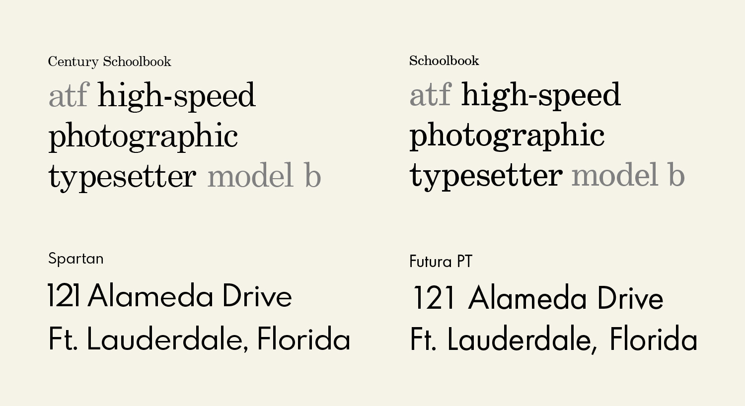
Next, I wanted to set the rules for font sizes. The brochure states that text was set in 10 and 12pt, though several headings appear even larger. Those sizes are too small for the web so I chose a larger base font size of 22px for the largest sizes and scaled it down to 16px on the smallest screens.
Colors
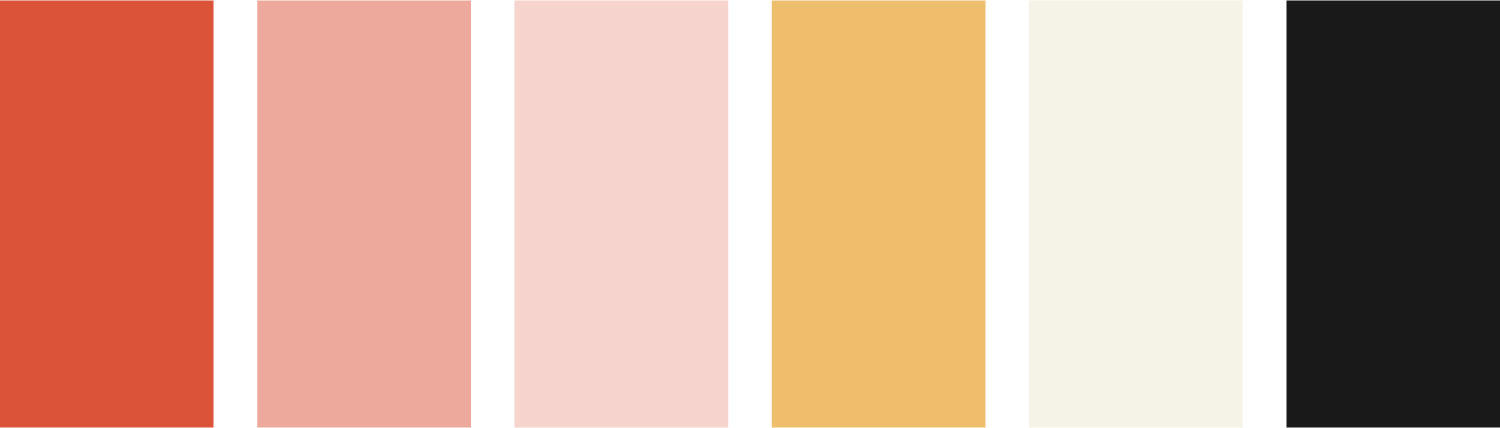
One thing I love about older publications is their limited use of color. Color printing has typically been more expensive than black and white and fewer colors has historically meant lower printing costs. This brochure uses two main colors (red and yellow) along with black. The red appears in three distinctly different shades. The yellow also appears in three shades but likely due to aging. For the purposes of consistency, I chose to only use one shade. Colors were sampled from the scans on the Internet Archive and came up with a palette of six colors including off-white and dark grey/black rather than pure white and black to stay consistent with other aged colors.
Layouts
Each page of the brochure roughly adheres to a common 8-column grid. I designed each section that typically corresponds to a two-page spread to adhere to a 16-column grid. I used a grid without gutters but with consistent spacing within each area.
I designed layouts of each page and at three sizes before doing any coding to ensure that I had flexible designs and so I had a blueprint for building out the site. The final result evolved a bit from the original but stayed true to the original design for the most part.
After learning a bit of history, defining the typography, picking colors colors, and planning the grid, I was ready to start building.
Building sections
Cover
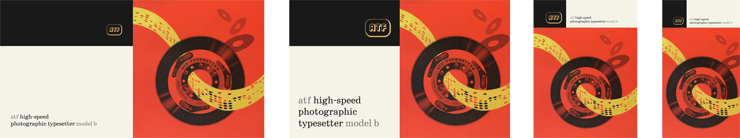
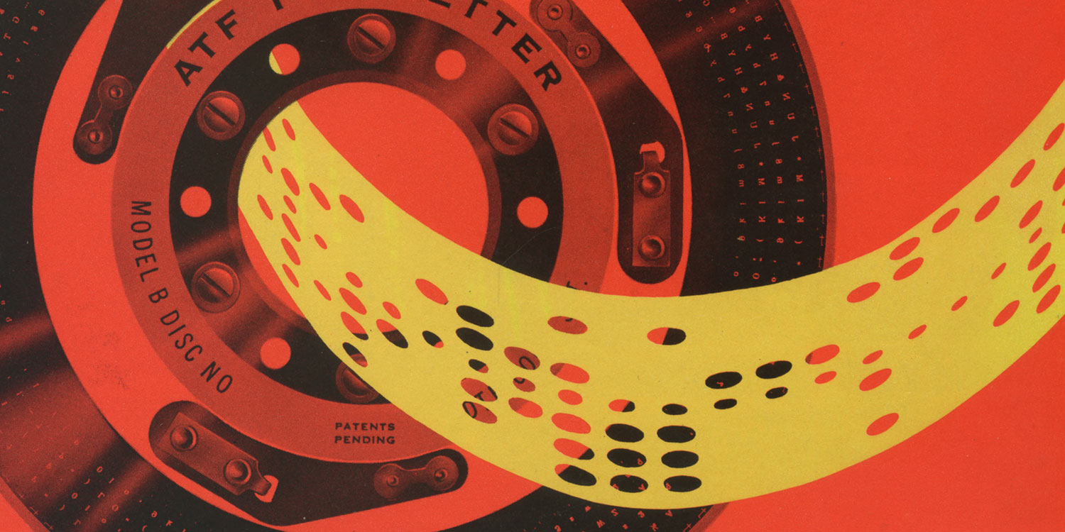
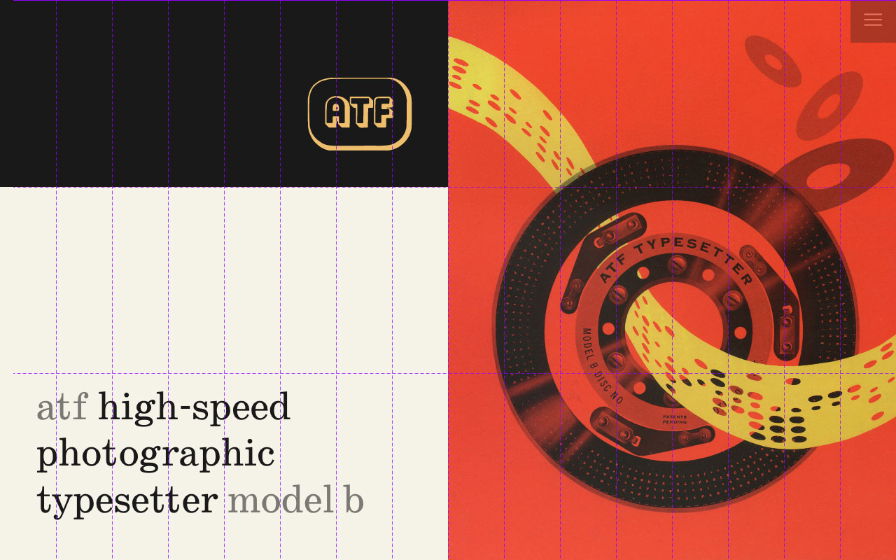
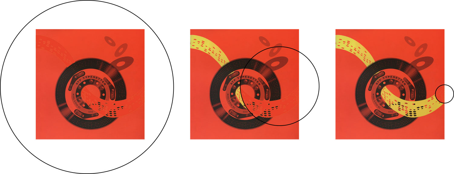
We’re all famously told not to judge a book by its cover but we all do it anyway. The brochure’s cover immediately drew me in with its striking composition of yellow control tape flying through a type disc. I knew this had to look great on any screen to make a good first impression. For some added flair, I thought it would be fun to animate the tape.
The cover is set on a 16 × 3 grid at large sizes and 16 × 4 on smaller sizes and always fills the viewport. The main image always proportionately fills any available space on the right/bottom half of the viewing area thanks to object-fit: cover:
.cover {
    display: grid;
    grid-template-columns: repeat(16, 1fr);
    grid-template-rows: repeat(3, 1fr); height: 100vh;
}

.cover-image {
    background: var(--red);
    grid-column: 9 / span 8;
    grid-row: 1 / span 3;
    position: relative;
}

.cover-image img {
    display: block;
    height: 100%;
    object-fit: cover;
    width: 100%;
}
To animate the yellow control tape, I layered a second image on top of the original with the tape colored red to match the background and animated a clipping path of a circle to “reveal” the yellow tape. Once the page has loaded, a go class is added to trigger the animation. Using forwards ensures the animation plays once and stays at the end frame with the red tape now invisible and yellow tape under it visible. I had to use the -webkit vendor prefix to make the animation work in Safari.
HTML:
<div class="cover-image">
    <img alt="Cover" src="cover.jpg" />
    <img alt="Tape" class="cover-mask" src="cover-mask.png" />
</div>
CSS:
.cover-mask {
    height: 100%;
    left: 0;
    position: absolute;
    top: 0;
    width: 100%;
}

.cover-mask.go { animation: mask-reveal ease-in-out 2s forwards; }

@keyframes mask-reveal {
    0% { -webkit-clip-path: circle(100%); clip-path: circle(100%); }
    100% { -webkit-clip-path: circle(0% at 120% 60%); clip-path: circle(0% at 120% 60%); }
}
How it was typeset
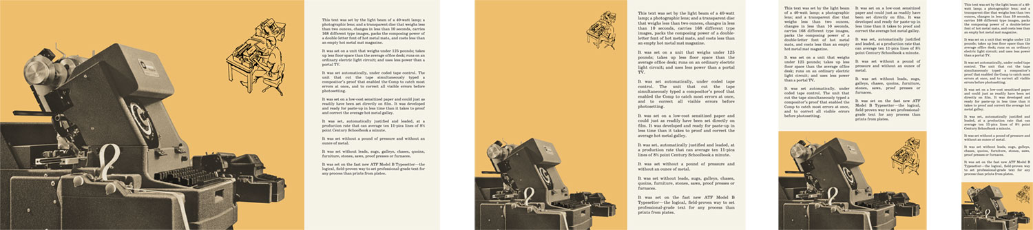
This section has a simpler layout compared to the others with a photo of the model units on the left and copy on the right. The original was spread across two pages so the challenge was stitching together the two parts of the photo. Both pages had different shades of yellow as a background color and the photo colors didn’t match. To solve this, I used Photoshop to carefully stitch them together and then convert to greyscale to unify the colors and apply a gradient map to add the faint yellow hue back.
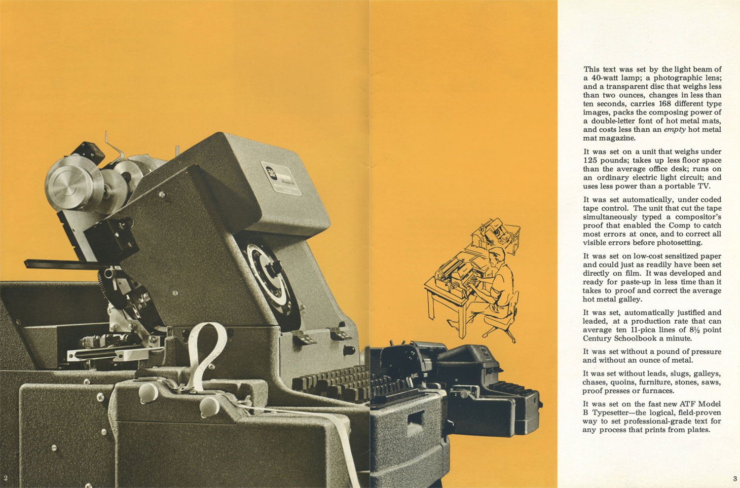
On larger screens, the layout is based on a 16-column grid with the photo spanning the first 11 and the copy on the right spanning the remaining 5. On slightly smaller screens like laptops, the photo spans 9 and the copy 7.
The padding around the copy is also four percent of the overall width (4vw) so it scales with browser resolutions. This was stored in the variable --gap so it could be reused throughout the site.
Steps to use
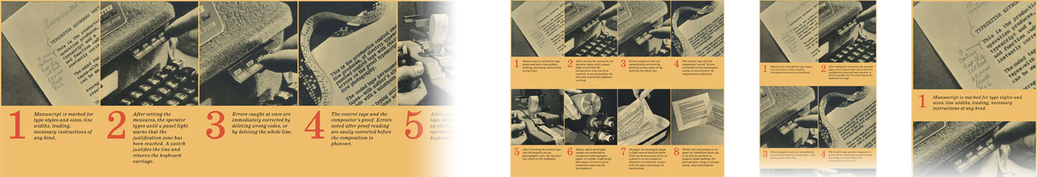
This section illustrating the eight steps involved with using the Typesetter Model B was spread across the top of two pages in one long row. The steps are split into two, four, and eight rows at progressively smaller sizes.
Originally, I thought about styling the numbers via the new ::marker selector but it’s only supported by Firefox so I added the numbers in the HTML:
<ol>
    <li>
        <img alt="Step 1" data-src="step1.jpg" />
        <p>
            <span class="steps-num">1</span>
            <span class="steps-copy">Manuscript is marked for type styles and sizes, line widths, leading, necessary instructions of any kind.</span>
        </p>
    </li>
    …
</ol>
Model units
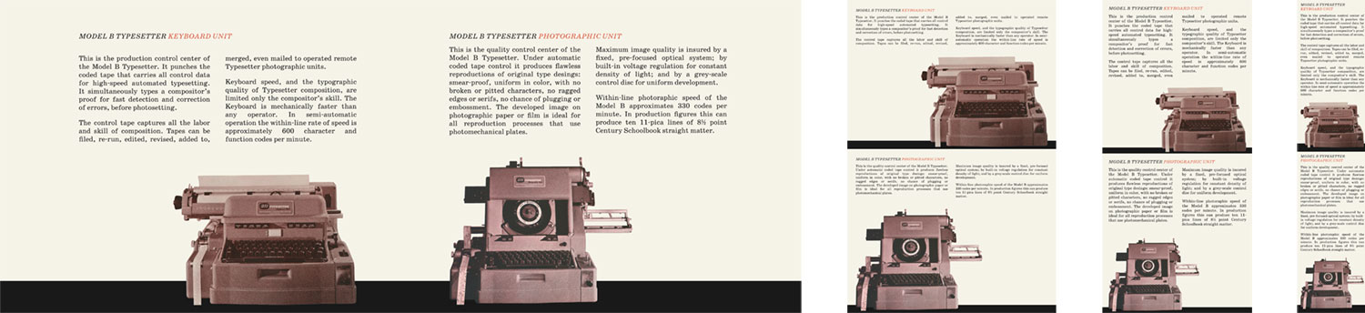
This section appeared below the steps on the two-page spread in the original brochure with photos of the keyboard and photographic unit in full view. It’s also the first instance of text appearing in columns. Typically, columns of text doesn’t work great online because scrolling up and down to read through text is a chore and counterintuitive. However, with such small portions of text, the entirety of each one is always visible on the screen so multi-column text seemed okay. However, when there isn’t room to comfortably display the columns, they’re combined into one. While working on this, I learned about the column-span property. I didn’t know this was so widely supported so I was excited to learn I didn’t need any extra HTML to make the headings span the columns.
On wider screens, photos of both units needed to be aligned at the bottom so I could make them overlap the black stripe. After aligning them to the underlying grid horizontally, I used flexbox to control the vertical alignment with justify: space-between so the images stayed aligned at the bottom. Incidentally, the black border at the bottom is the same height as the padding in areas with text like in the aforementioned “How it was typeset” section. To ensure the images overlapped consistently regardless of screen size, the negative margin was calculated based on the gap variable: margin-bottom: calc(-1 * (var(--gap) * 0.75)).
Width control
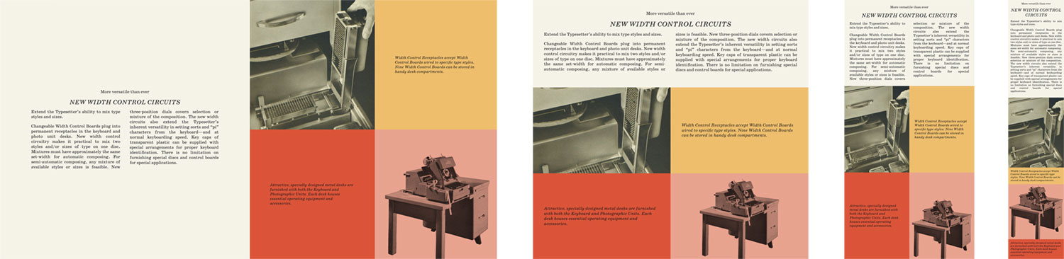
This and the following section were the ones that deviated the most from the original design because there was too much content to comfortably display both side-by-side. Instead of displaying the images and captions in one column, I used a two-by-two grid, relying on the original colors clearly indicate which caption went with which image. On phones, the images and captions are once again stacked in one column.
The entire section as a minimum height of 100% of the viewport (min-height: 100vh). The image of the width control is cropped as necessary to fit the available space thanks to object-fit: cover but the photo of the desk uses a several additional properties on a single image element to ensure it looks like the original:
.accessories-desk img {
    /* Match the background color */
    mix-blend-mode: multiply;

    /* Ensure entire image is always visible */
    object-fit: contain;

    /* Move image to bottom center */
    object-position: 50% 100%;

    /* Add space around image based on relative spacer */
    padding: calc(var(--gap) / 2) calc(var(--gap) / 2) 0;
}
Adding these properties to a single image makes me think about the hacks and workarounds I used to have to write to do something like this during the early years of CSS. This was really satisfying to write.
I think the result is one that breathes well with the extra space and works well on any screen size.
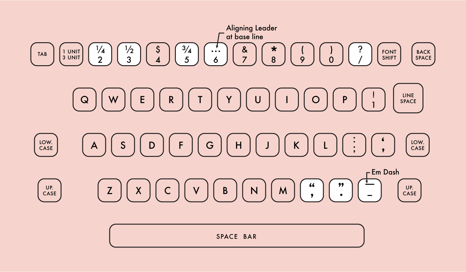
Keyboard layouts
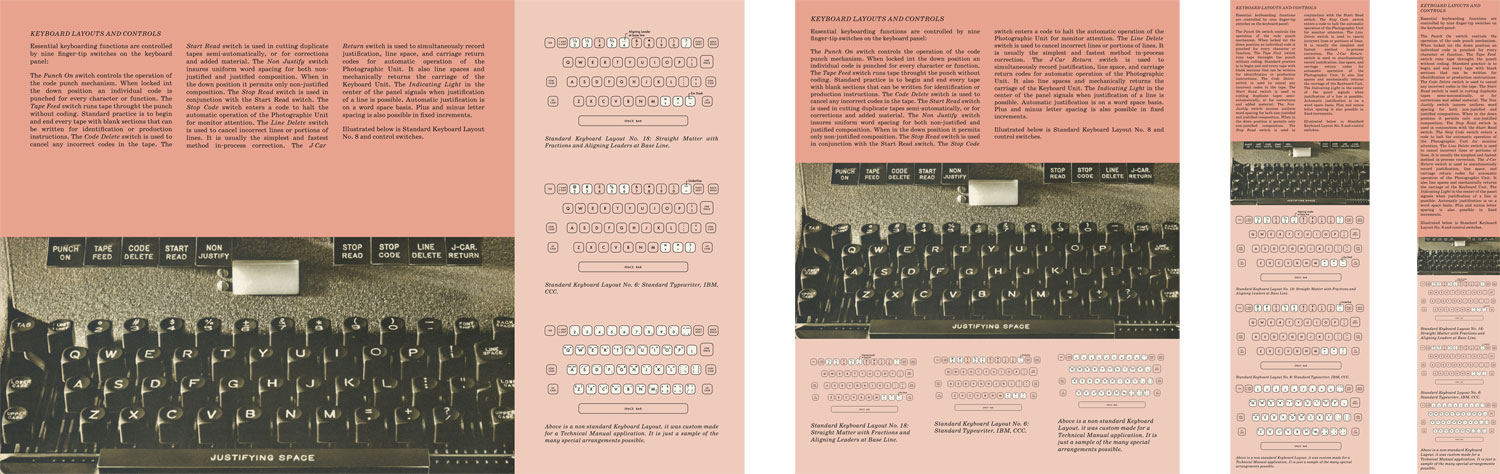
The most interesting part of this section to create was the keyboard layouts. While the scans of the original brochure were very large, they weren’t large enough for me to extract the images of the keyboard layouts from them. Instead, I decided to recreate them from scratch.
I first tried recreating them in HTML/CSS and had good plans on making it all happen but ran into issues with the key shapes scaling based on their parent container without adding a lot of unnecessarily complicated calc() statements. Instead, I still created them from scratch but as separate SVG files so they still scale appropriately but as natural SVGs rather than convoluted HTML/CSS shapes.
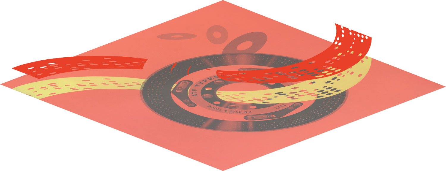
Type discs
This was easily my favorite section of the brochure. The photo of the type disc is best described as “delicious.” The original is huge and incredibly detailed. It’s position on the left and filling the height of the page/screen is very satisfying and is a great job at showing the craftsmanship that went into producing them. I only wish there was another view that showed the entire disc.
On small screens there wasn’t enough room to show the the disc with the text to the right like on larger screens so I repositioned and rotated it to appear at the top which has the same dramatic effect.
.speed-disc img {
    left: 0;
    height: 100vw;
    position: absolute;
    top: 0;
    transform: translate(50%, -25%)
    rotate(90deg);
    width: 50vw;
}
Note that the height is 100vw and the width is 50vw. This is because they’re applied to the image before it’s rotated so the height appears as the width and the width appears as the height.
Composition examples
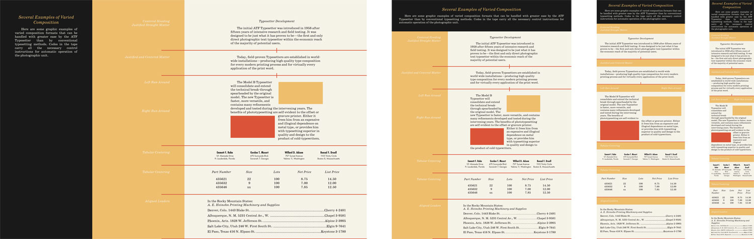
This section presented several interesting challenges—chief among them was the layout. I needed to have the labels appear before for each composition in the markup so they could be displayed on top of each other on small screens but I didn’t want to add any extra markup to create the large areas of color.
After some trial and error, I ended up creating the three main areas of color by applying the yellow to the main section element, then positioning the introduction with the black background and the examples with the white background based on a four-column grid.
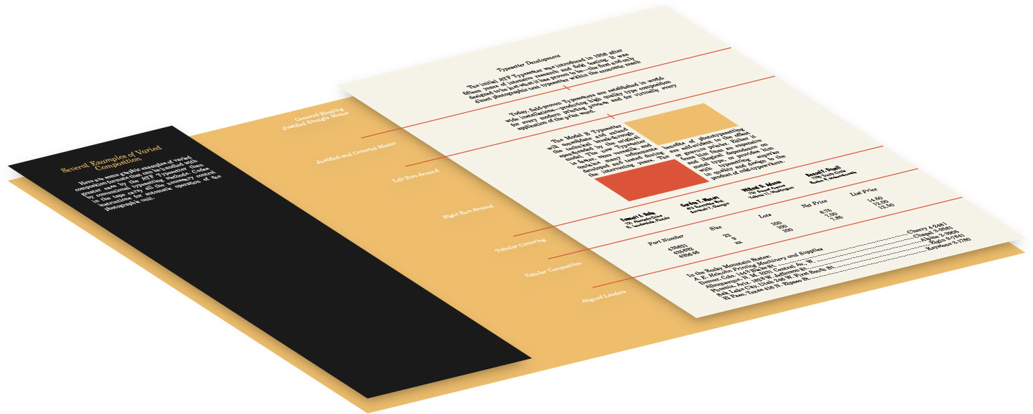
To position the white labels of each composition, I used negative margins and absolute positioning based on percentages to push them to the left beyond their parent container. To create the red lines below each composition, I used the ::after selector to create an extra empty element that was wider than its parent so it spilled over the left like the original brochure.
Typesetter faces
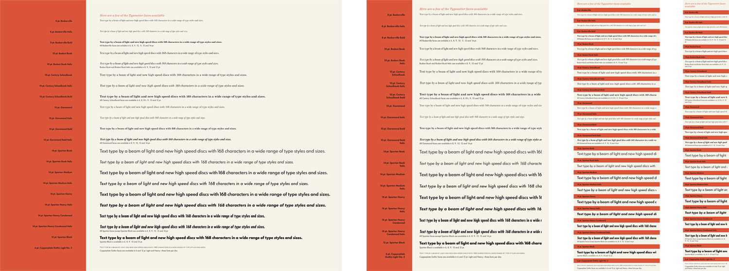
This section contains 22 different typefaces and on a long page with several large images, I didn’t want to load almost two dozen more typeface files for a single use on the site, let alone pay the high cost for licensing them to use online. Instead, I took a cue from how Hoefler&Co. displays their samples on their home page and created SVGs out of each one.
Assuming the base font size of 12pt = 22px, I scaled them appropriately based on the sizes mentioned in the brochure. For example, 10pt. Garamond was changed to 18.3px ((10/12) × 22 = 18.3). The SVGs were also set along the same baseline and have the same viewbox dimensions so when I applied sizing via CSS, they scaled proportionately to each other.
Finally, the benefit of using SVGs also meant I could clip them on the right if they get too long by simply using preserveAspectRatio="xMinYMid slice" which makes the shapes align to the left center of the SVG container but get clipped instead of shrinking to fit if they get too large. The smaller sizes also needed to have a little negative margin added to the top so they aligned with the labels to the left.
Some of the typefaces included a note about available sizes to ensure equal spacing between each typeface, a height was set. Normally, setting a height on elements containing text isn’t a great plan because the text will grow beyond it but in this scenario, where text rarely wrapped, I could choose a height that wouldn’t cause any problems.
Spartan Condensed was the only typeface I couldn’t find online anywhere so I used Futura Condensed for the two condensed specimens.
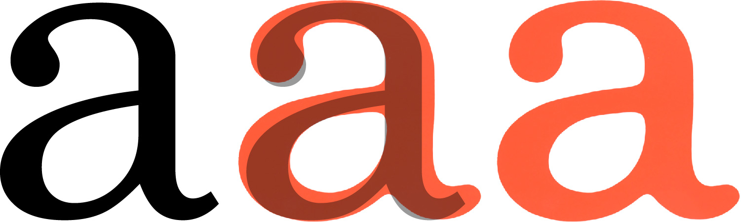
Clarity and versatility
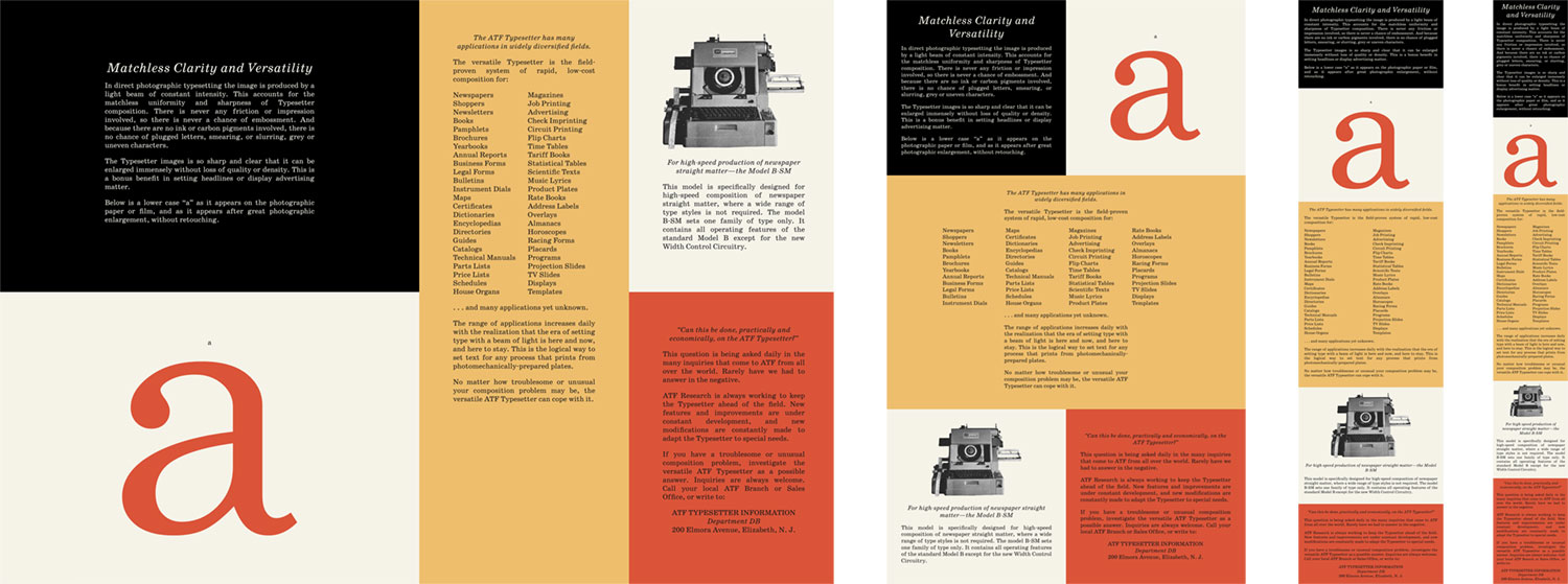
The defining characteristic of this section is the giant red letter “a” that was added to showcase the typesetter’s ability to enlarge type without losing clarity. My initial goal was to use a regular “a” and scale it up with CSS but chose to use an SVG because it would scale naturally as its parent container scaled and the huge leading was causing some spacing issues.
Comparing the large “a” from the brochure to the modern equivalent I used in the design illustrates the subtle differences between the original and modern typefaces.
The layout is relatively simple—adhering to a 4 × 2 grid on large screens and changing to a 2 × 3 grid on smaller ones.
Q&A
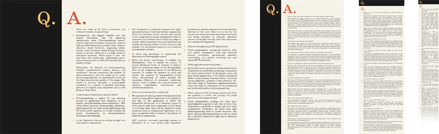
This section appears simple enough with nothing but text but has a few creative elements worth mentioning. The giant “Q. A.” heading is nothing more than an h2 with a few abbreviation elements:
<h2>
    <abbr title="Questions">Q.</abbr>
    <abbr title="Answers">A.</abbr>
</h2>
Then, with some creative positioning with CSS, the letter appears appear within their respective boxes:
.qa h2 {
    background: var(--black);
    flex: 0 0 auto;
    font-size: 11.875rem;
    font-style: normal;
    line-height: 1;
    margin: 0;
    padding: var(--gap) calc(var(--gap) / 2) var(--gap) var(--gap);
    position: relative;
    text-align: right;
    width: 25%;
}

.qa h2 abbr:nth-child(1) { color: var(--yellow); }

.qa h2 abbr:nth-child(2) {
    color: var(--red);
    left: calc(100% + calc(var(--gap) / 2));
    position: absolute;
    top: var(--gap);
}
The list of questions and answers is a simple definition list and the “Q.” and “A.” that appears next to each are generated via the content property so they didn’t need to be added to the markup.
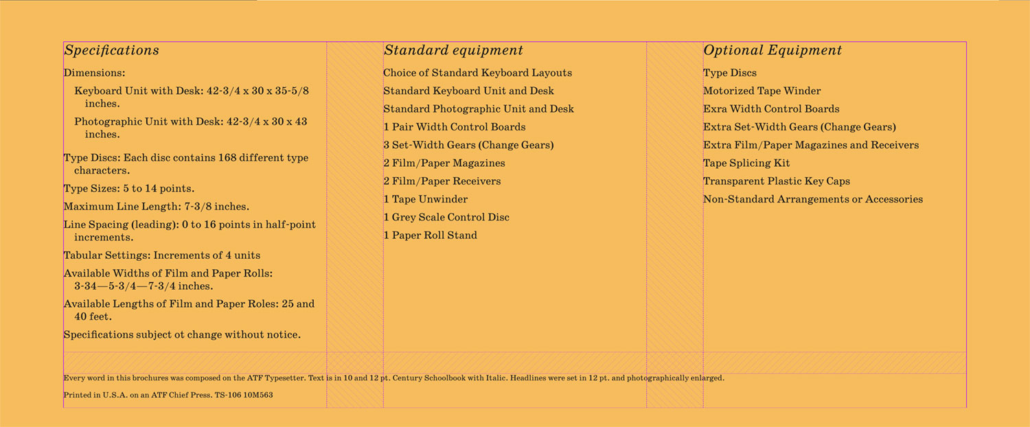
Specifications
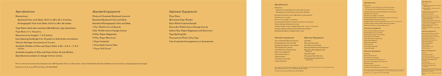
This was a relatively simple section to lay out thanks to CSS grid. Like other sections, it was based on a 16-column grid but the spacing was controlled by using a three-column grid with a 6.25% column gap and a 6.25% gap around the entire area. This gives the appearance of a 16-column grid without actually specifying one.
ATF offices
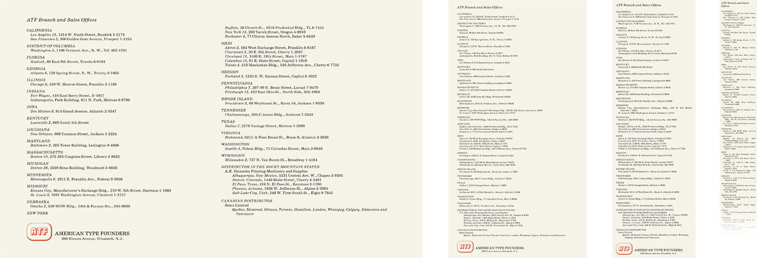
The final section from the original brochure, the list of ATF branch and sales offices was another relatively simple section. The older method for writing addresses was interesting to see and not one I had seen before.
Posters
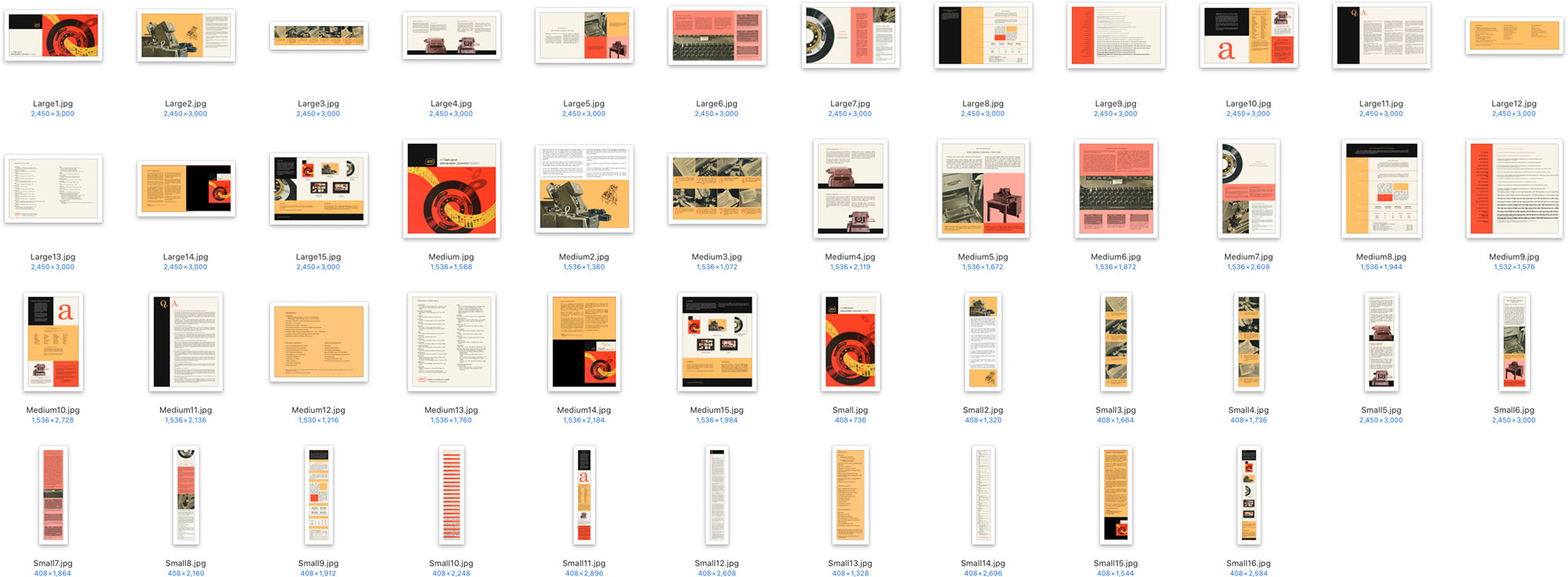
I’ll admit, creating posters was a strong motivation for working on this project. Several of the original page designs are so great on their own that I wanted to make them into posters. Plus, the original scans were high enough resolution that they could be made into reasonably-sized posters.
I created five posters: three based on the layouts of individual pages (cover, typesetting units, and type disc), one showcasing all the page spreads, and another with a data-driven design based on the top colors used on each page.
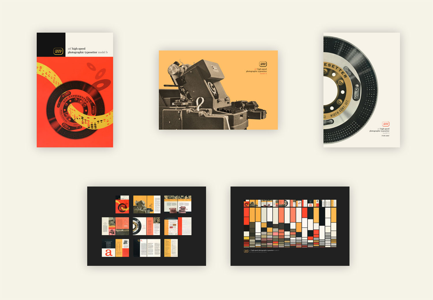
Check out the posters and order some for yourself or one of your typophile friends
Final thoughts
This was very much a passion project in the sense that there was no practical reason to create a website based on a 57-year-old brochure about an obsolete piece of machinery. But when inspiration struck, I had to follow it. I learned about some new web design techniques and had a great time transforming the old brochure and hope that others will enjoy exploring both the original and web versions.