Making of Lilies & Roses of P.J. Redouté
By Nicholas Rougeux, posted on November 3, 2024 in Art, Web
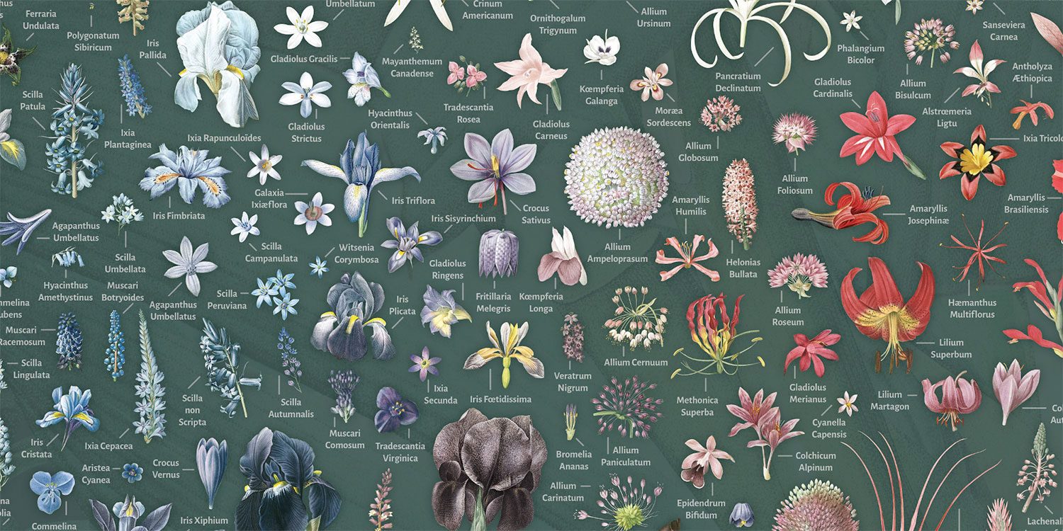
“Patience” was this project’s theme. Breathing new life into Les Liliacées and Les Roses—two of Pierre-Joseph Redouté’s most well known collections—taught me a lot about it during the 11 months this project took to complete.
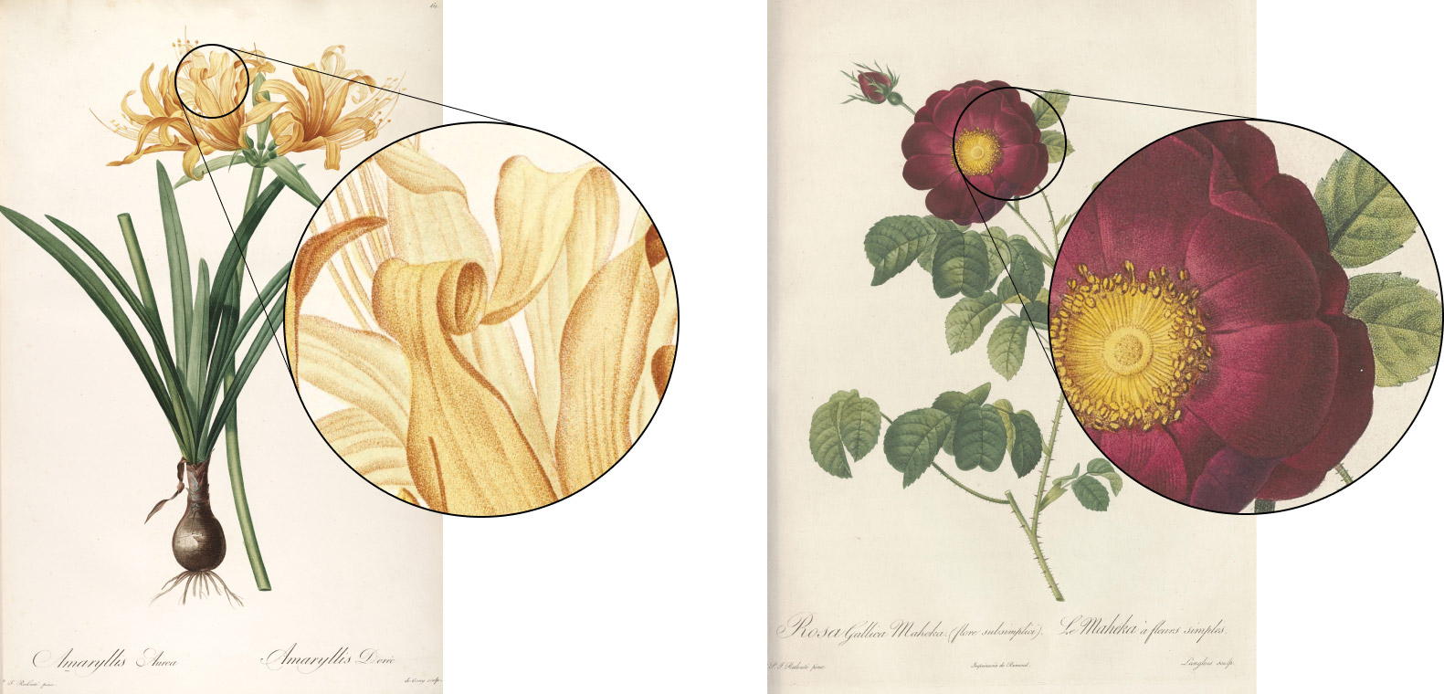
Simply put, Redouté’s illustrations are stunning. His attention to detail in stippling and watercolor has earned him the title “the Raphael of Flowers” and is considered the greatest botanical illustrator of all time. By restoring his illustrations, I had the opportunity to become intimately familiar with his techniques and develop a deeper appreciation for his efforts.
Redouté’s work has crossed my path a number times over the years but it didn’t catch my attention until I was researching source material for Illustrations of the Natural Orders of Plants several years prior. The main deterrent then was that it was only available in French and I was limited myself to only English-based projects at the time. Since then, I wanted to find a way to create a project based on his works—but one that was a little different than just posting scans online and selling them like so many have already done.
Structurally, Les Liliacées and Les Roses are relatively simple and similar to other collections of scientific illustrations—both showcase large illustrations paired with brief descriptions about their characteristics and nomenclature. Les Liliacées comprised 486 plates of 476 lilies published in 8 volumes between 1802 and 1816 while Les Roses comprised 169 roses published in 3 volumes between 1827 and 1833. The title, Les Liliacées is slightly misleading because it includes representatives of the lily such as amaryllis, orchids, irises, and more.
Each illustration depicts a single lily or rose (with a few exceptions) posed to accentuate the bold, yet delicate nature of the flowers and the stems supporting them adorned with leaves of all shapes and sizes. Most lilies include a detailed root system at the bottom and have a couple of greyscale sketches of enlarged parts of the flower such as pistils, petals, stamens, etc. Most roses are only depicted from the stem upward. Below each is the Latin and French names written in beautiful calligraphy. While the leaves take up the most space in most illustrations, the flowers are the focal points—exploding with color from impossibly thin stems, nestled within enormous leaves, or sprinkled throughout delicate branches. These would be the focus for this project.
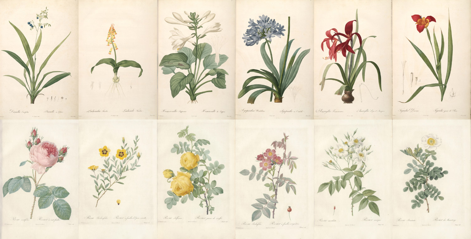
The beginning of the video below from the Joel Oppenheimer Gallery provides a nice overview of two of Redouté’s illustrations and discusses the techniques he used.
Finding good source material
Since Redouté is so well known, his illustrations are readily available on many sites that appreciate his work. After some digging, I found the best results on the Internet Archive contributed by the Biodiversity Heritage Library and the Library of Congress. They had the best quality scans by far and at resolutions larger than any I’ve worked with on previous projects—averaging at around 4500×6700 pixels. Links to each are included below.
Note: At the time of this writing, the Internet Archive is recovering from an attack that took down their services so their links may not work correctly and their scans may not appear on the Biodiversity Heritage Library’s site.
Les Liliacées:
- All volumes: Biodiversity Heritage Library
- Volume 1: Internet Archive / Biodiversity Heritage Library
- Volume 2: Internet Archive / Biodiversity Heritage Library
- Volume 3: Internet Archive / Biodiversity Heritage Library
- Volume 4: Internet Archive / Biodiversity Heritage Library
- Volume 5: Internet Archive / Biodiversity Heritage Library
- Volume 6: Internet Archive / Biodiversity Heritage Library
- Volume 7: Internet Archive / Biodiversity Heritage Library
- Volume 8: Internet Archive / Biodiversity Heritage Library
Les Roses:
- All volumes: Library of Congress
- Volume 1: Library of Congress
- Volume 2: Library of Congress
- Volume 3: Library of Congress
My sincerest thanks and appreciation goes to these websites. Their willingness to make their collections freely available to the public is invaluable.
Designing the digital edition
How do you design a site that highlights such monumental work? By letting it speak for itself. A guiding principal I had early on was “grand elegance.” I wanted to create a design that lets the beauty of Redouté’s work shine while the rest gets out of the way. Most online galleries include small thumbnails of each illustration, showcasing the full compositions but diminish the beautiful colors of each flower. Others show only a subset of plates and none include the original descriptions.

These collections are perfectly fine in their own right. They provide a wealth of information about each plate and serve their audiences well. I wanted to do something bigger and bolder—something that focused on the flowers and their colors.
My site structure was simple by design: a home page, a page for each plate where it can shine, clear and interesting ways to browse the two collections, a page about the posters for sale, and a page about the project. The plate, home, and browsing pages have a lot of interesting details. The others are relatively standard.
Plate pages
The first page I designed is where visitors would spend most of their time examining each plate and its accompanying description. My plan was to create a template that would work with every plate but showcase them in a way so each page stands on its own with strong imagery. I also wanted to display the plate as large as possible, essentially hitting visitors over the head with each illustration’s beauty. Early inspiration came from the National Audubon Society’s gallery of birds drawn by John Audubon himself. On large resolutions, the focal point of each illustration fills the screen, followed by the original description and a link to view the full plate.
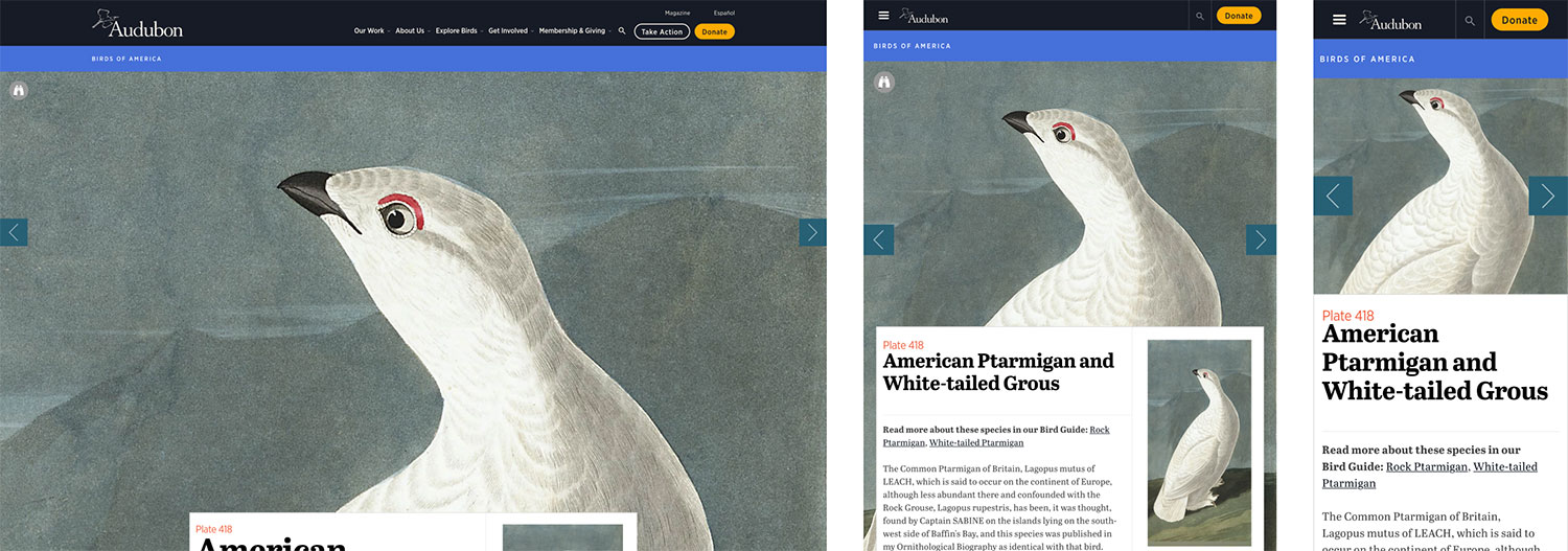
The layout is simple but effective. I liked the large images but they are a little jarring with a bird’s large eyes staring back at me. Still, the idea struck a chord and inspired me to try a few of my own variations.
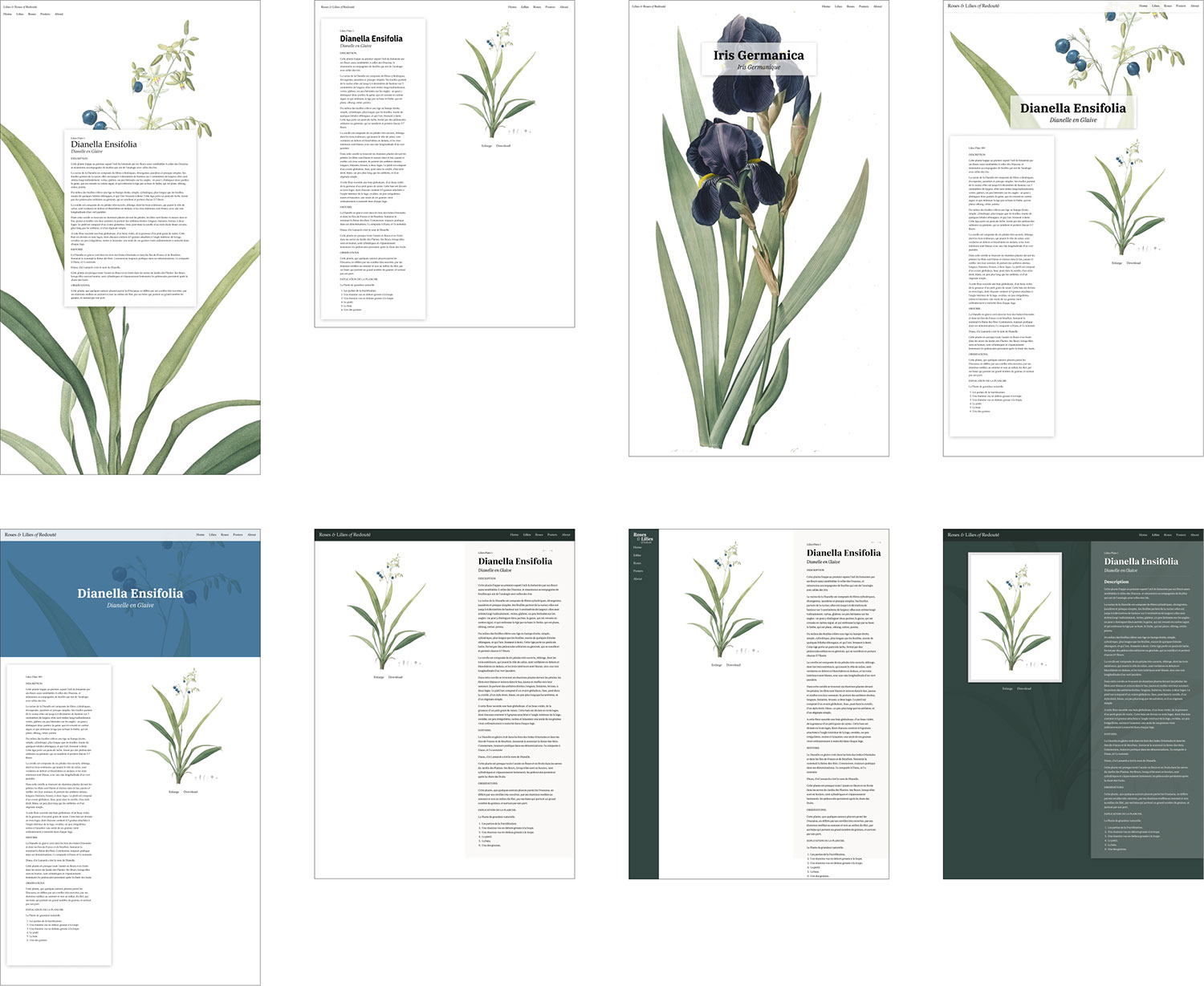
My first attempts (top row above) were rough, as most usually are. I took cues from the Audubon Society and my own earlier projects but the results didn’t live up to my vision yet. I liked the idea of filling the screen with the full illustration but there wasn’t a one-size-fits-all solution for framing the flowers nicely across all plates. The fourth iteration (top right) was the spark of an idea that I ended up using in the final design. I found that I particularly enjoyed seeing the scientific name of each flower in a large serif typeface so I incorporated that into the next several iterations.
The next few designs (bottom row) introduced a darker palette to make the page feel more welcoming with a dark forest green since some shade of it appeared in every illustration’s leaves. The darker colors added a much-needed contrast to the main areas of the page. The eighth version (lower right) is when things really started to click. Using varying shades of green and subtle shadows created layers of content and added a nice sense of depth without looking tacky. Using a large version of the illustration as a subtle page background texture also served as a nice way to add visual variety to the page template.

During these experiments, I discovered the typeface I would use for the project—Google’s Literata. I’m a sucker for large bold serif typography and Literata worked well for the modern, yet classic look I was developing. It’s easy to read at small sizes for body copy, has a lot of character in its italics style, and has a healthy amount of contrast in the bold weight at large sizes—perfect for this project.
There was still the problem of showcasing each illustration’s flower. Showing the full plate diminished it too much. The white background also didn’t help because the small flowers became hard to see. That’s when I got the idea to try a dark background and work on an all-dark design. I hadn’t created a dark design from scratch for some time—the last one being for Mathematical Instruments in 2022. As a test, I spent a little time roughly replacing the white background with a very dark grey color and thought the result looked great. (Little did I realize what I was getting myself into. More on that later.)
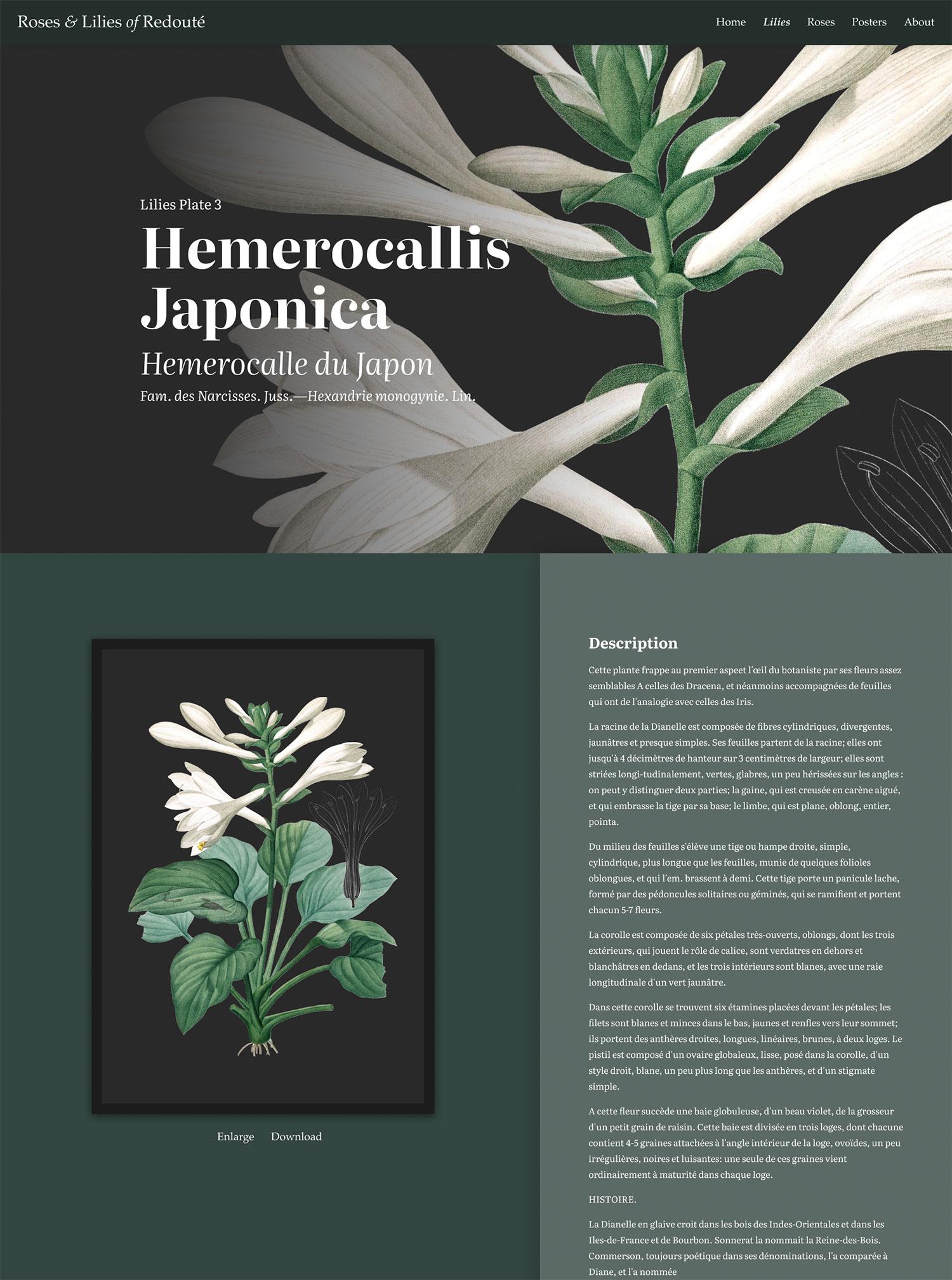
The last experiment finally gave me the “wow” moment. Adding a hero image with a dark background brought it to life. I loved the cropped look and the large title with a faded overlay. That immediately struck me with the flower’s beauty and Redouté’s attention to detail and encouraged me as a viewer to want to see more, so having the full view with the accompanying description below it felt very natural. There was also a nice balance to the page with the positions of the image and text swapped in the bottom half from their positions in the hero.
The final design came to life over the course of building out the rest of the project. After the dark background was added to each image, I determined the best position for it to be placed in the hero area to frame the flower(s). The one-size-fits all solution I was looking for only needed a little customization for each hero image.
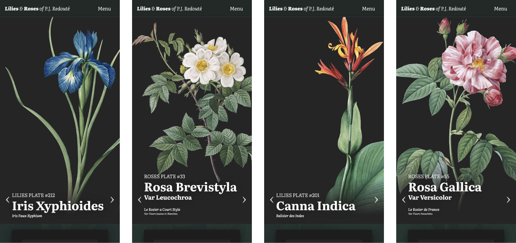
I was so pleased with the result that I looked forward to seeing how each hero image would look and still enjoy browsing through them. They also work very well on all screen sizes. Below are a handful of full page screenshots and hero images.
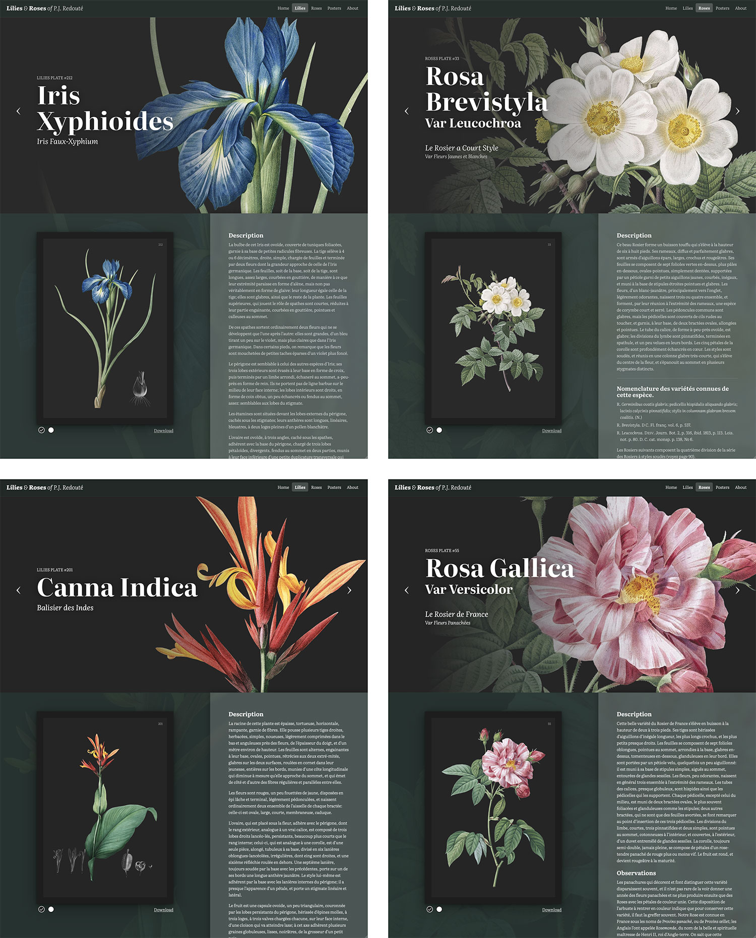
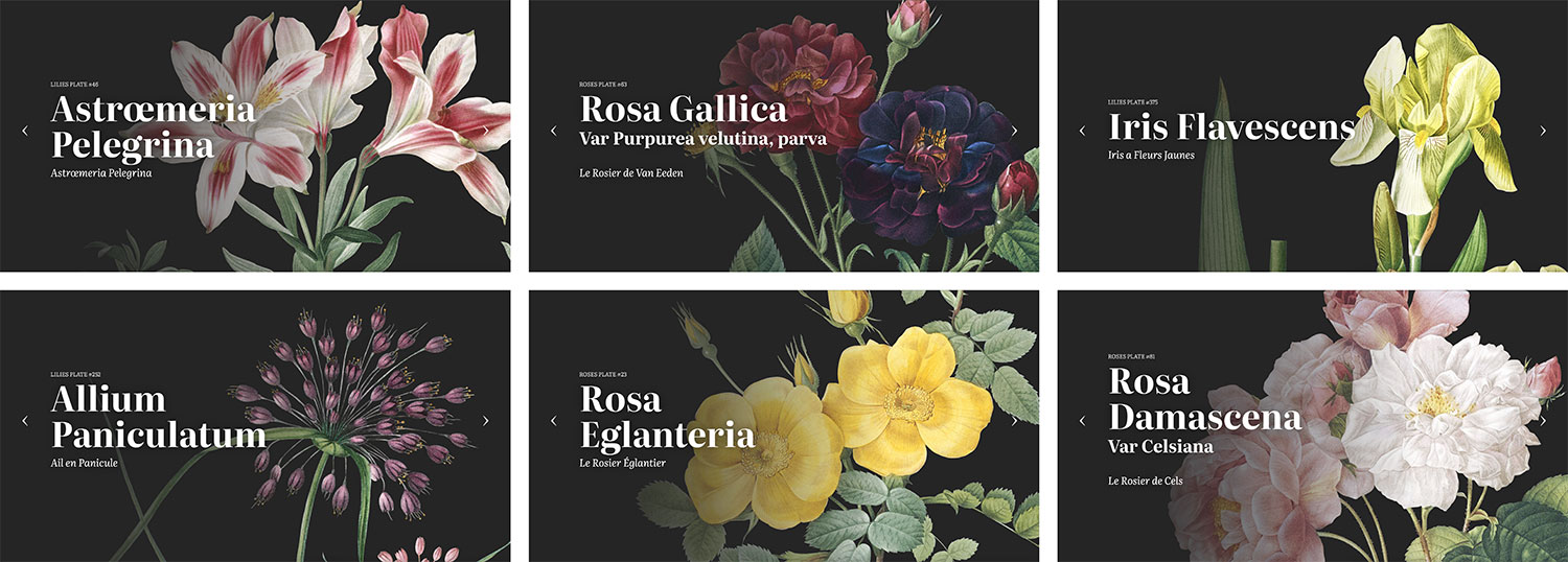
There are four key elements to the final design: hero area, full plate, description, and background:
The hero area showcases a magnified, cropped view of the overall plate on the right with its names and plate number overlaid on the left. Both Latin and French names are included like in Redouté’s descriptions. The Latin name is written in large bold type to complement, but not overshadow the character of each flower. A subtle gradient between the text and the image ensures legibility. On narrower resolutions, the overlay appears toward the bottom since horizontal space is at a premium and it anchors the cropped image nicely. To the left and right of the title are links to navigate to the previous and next plates in numerical order. The full-resolution image is loaded as a background image for the display rather than a crop to save on the need for creating multiple versions of the same image. It’s “cropped” with a simple combination of background-position and background-size.
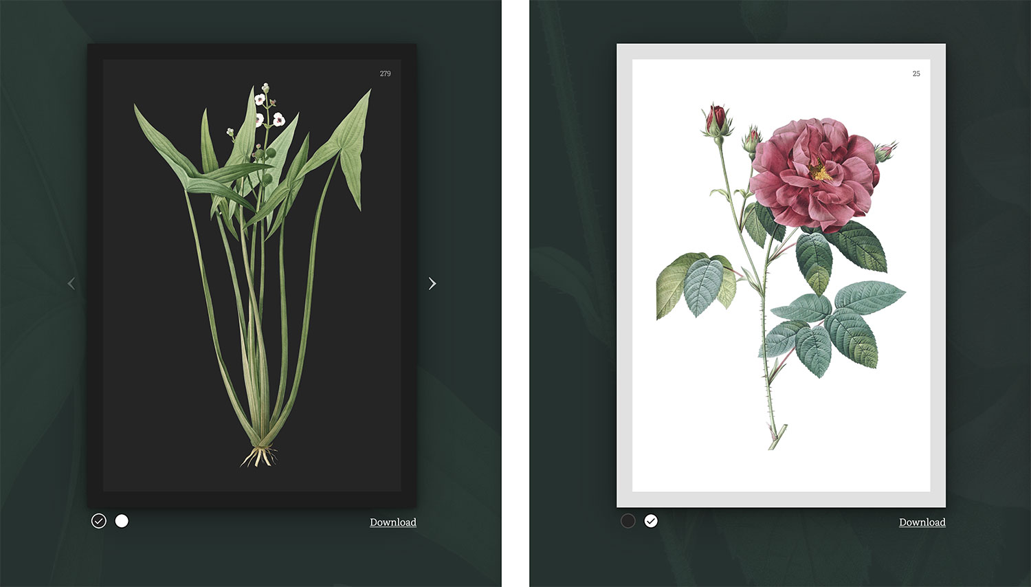
The full plate is available in two colors in the left bottom half of the page. Each plate was restored and made available with both light and dark backgrounds (more on those later). Every plate can be magnified to see the high resolution version. Several lilies were represented with multiple plates (e.g., Pitcairnia latifolia and Sagittaria sagittifolia) where one plate showed with the entire plant and the other a magnified version, a few plates included two smaller lilies, and one was spread across two plates with a third used for a large greyscale sketch of its bulb (Amaryllis josephinæ). All roses were only illustrated on one plate each. In cases where multiple plates were used for a single flower, links were provided to switch between the plates.
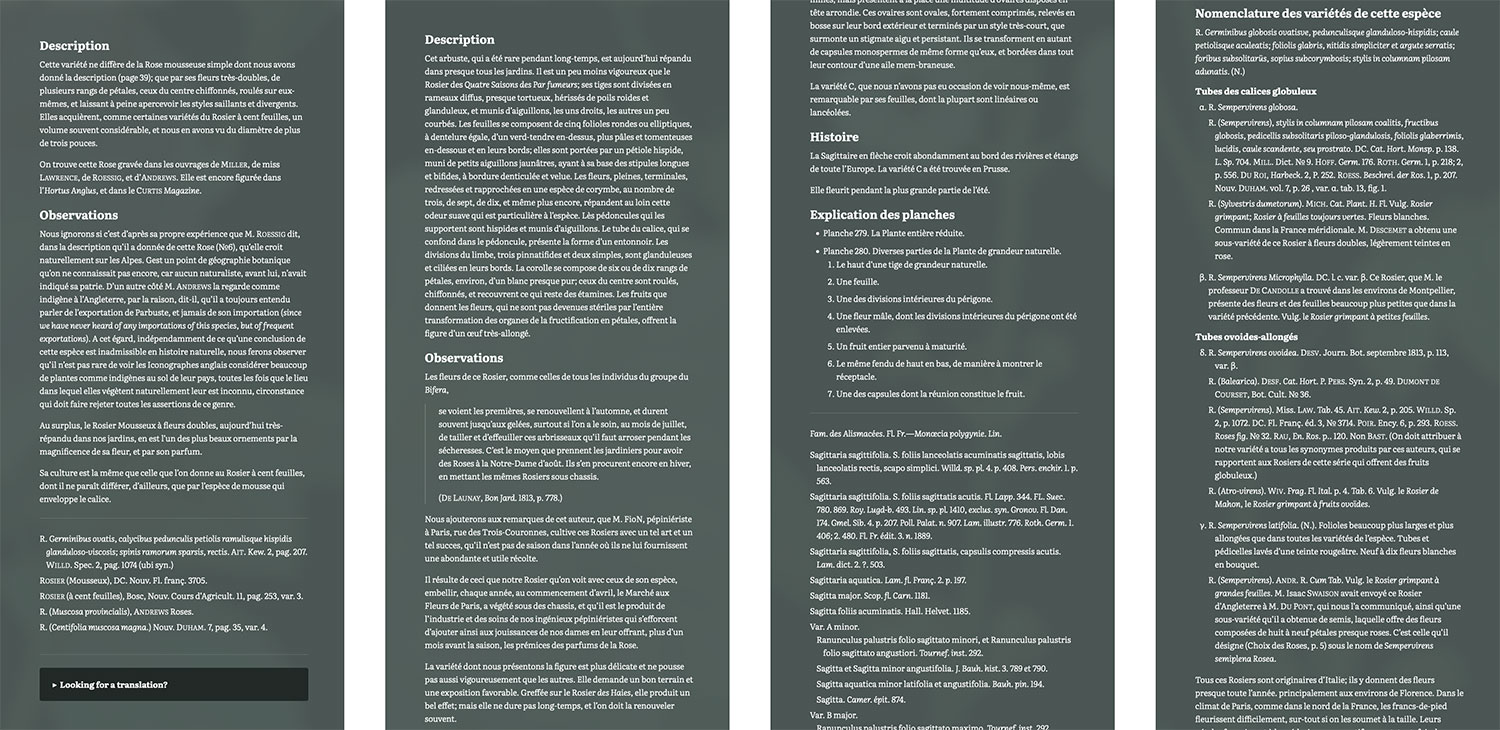
The description for each flower was transcribed from the original scans and kept in French as it was written. I didn’t have the resources to have them translated to English and didn’t want to rely on an automated translation service because the latter is often prone to errors. However, at the bottom of each description is a link to translate it into other languages if readers want to read it in their own language. While scrolling through the description, the full plate remains in view so it can be referenced.

Finally, the background is another enlarged version of the high-resolution plate and adds a nice subtle texture variation to the pages. The full plate and description are elevated above it with shadows and the description has a translucent lighter background color that blurs the background image under it to ensure legibility.
In an effort to save time and resources, the same full-size original image is used three ways on these pages (hero, full plate, and background) rather than creating multiple versions of the same file. This saved on server calls and eliminated the need to crate multiple versions of the same image. The full-size images can be fairly large, but they’re the only image loaded on each page so it was a nice compromise.
Browsing plates
The gateways to each plate are the browsing pages. From the beginning I wanted to create collages of lilies and roses arranged by color as a fun way to explore them. Rough versions of each were created as a quick test. They were hastily cropped, pixelated, and the background was removed with a subpar quick-and-dirty method, but they were just tests and confirmed that collages were worth exploring.
Before restoring images in earnest, I had to figure out how to build the collages. The approach I took with British & Exotic Mineralogy was too heavy-handed because while the collages were a big part of this project, they weren’t the sole focus. The advanced zooming and panning capabilities weren’t needed and I didn’t want to generate the plethora of images needed for those features. Instead, I opted for a simpler approach—one large scrolling collage for each set of flowers. On smaller screens like tablets and phones, the browser’s native zooming and panning capabilities allow for detailed exploration.
The hover effect would be achieved with SVG shapes acting as masks to expose selected parts of a second image that showed the hover state. I made a rough proof of concept which I included below.
See the Pen Collage POC by Nick Rougeux (@rougeux) on CodePen.
The example above is includes just two images: one with seven blue circles representing what will eventually be flowers and a second image with those circles as light grey, representing the hover state of the eventual flowers positioned on top of the first. A hidden SVG comprises paths outlining the hotspots of each circle. A small bit of JavaScript dynamically applies the mask-image property to the hover state image so only the area outlined by the SVG path is shown, creating a faux hover state. This way, only two images need to be loaded for the collage to work instead of an image for every circle.
With the collage functionality figured out, I turned my attention to the more utilitarian grid views. The collages couldn’t be designed in earnest until flowers were extracted from all 600+ plates and collages couldn’t be the only method of browsing so, I focused on designing the grid views. In addition to color, I wanted visitors to be able to browse plates alphabetically, by the order in which they were published (timeline), and by scientific classification. Only lilies had details on different classification methods so browsing by classification is not available for roses.
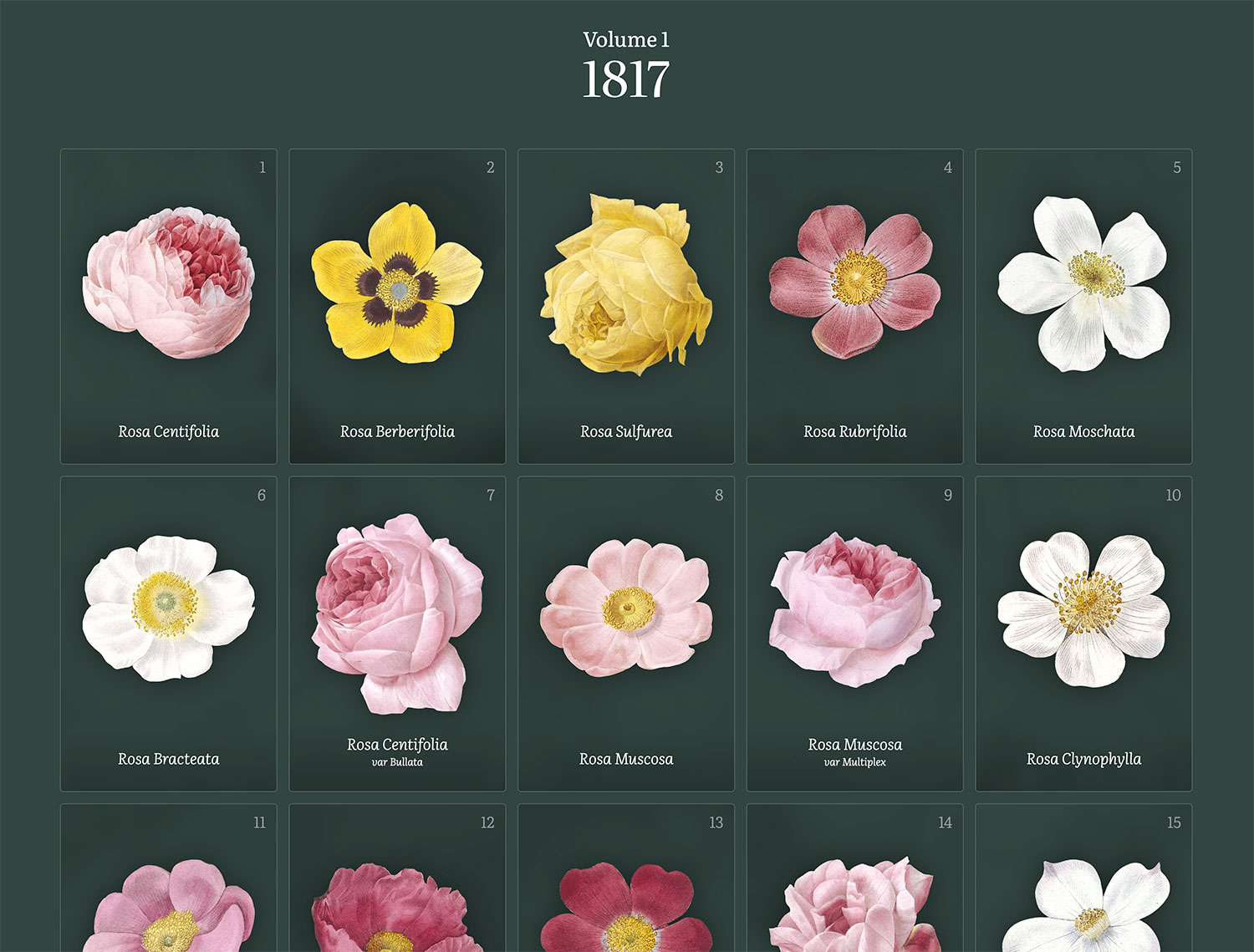
Designing a nice grid view may seem easy but there are nuances to making it enjoyable without being overly repetitive. Unlike the other online galleries, the flowers were the focus and not the full plates. My initial idea was to keep it simple and show nothing more than flowers with titles.
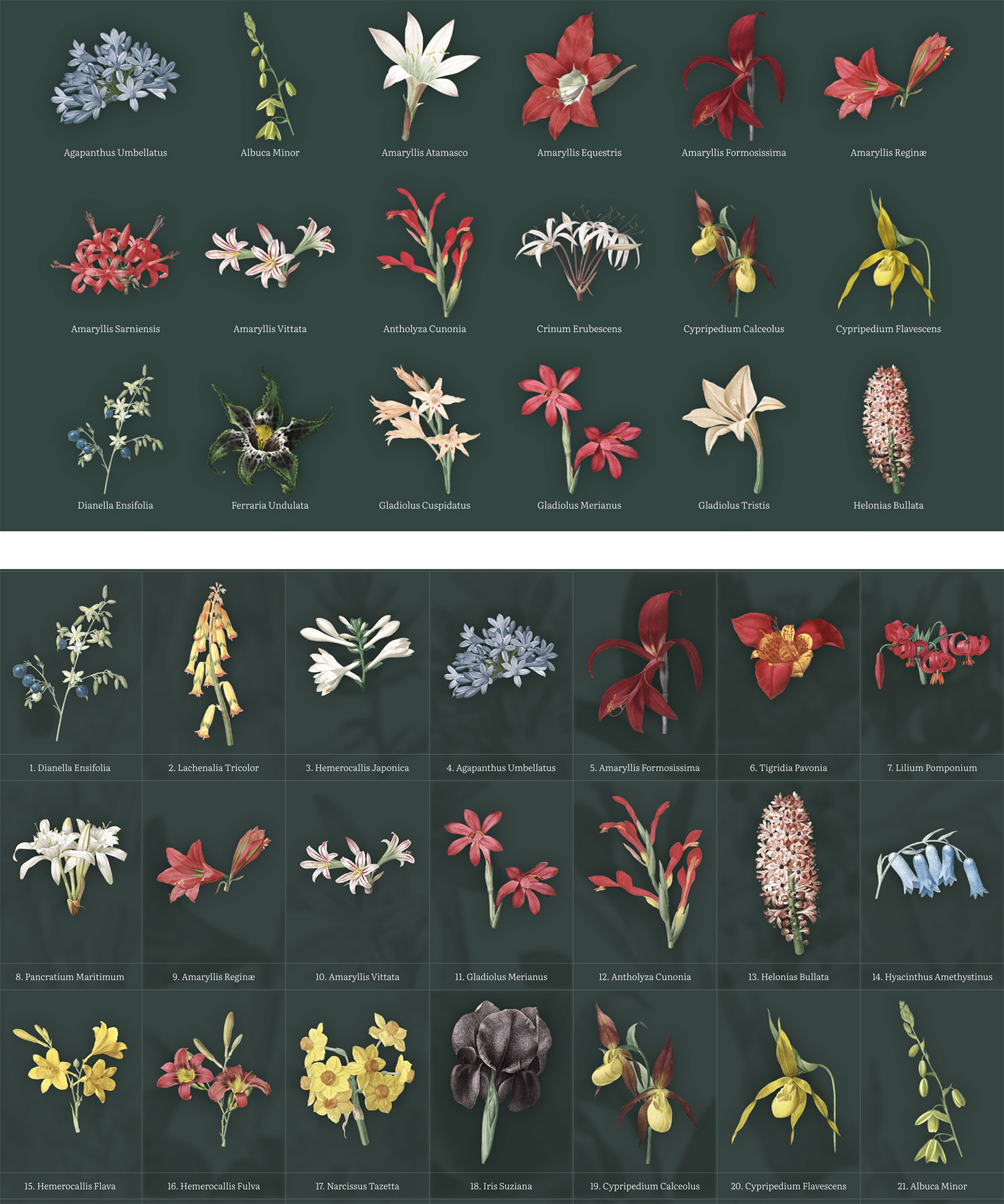
Setting aside how much work would be required to extract all the flowers, the first result was lackluster. The flowers popped visually but felt plain with all the whitespace. Normally, I’m fan of whitespace but this design didn’t fit the grand elegance theme I was striving for with this site. Nonetheless, I used this design while I restored each plate—constantly tweaking sizes and spacing. Another design filled the whitespace with borders and background textures but this felt too heavy-handed and not as inviting to exploration. There was too much visual noise.
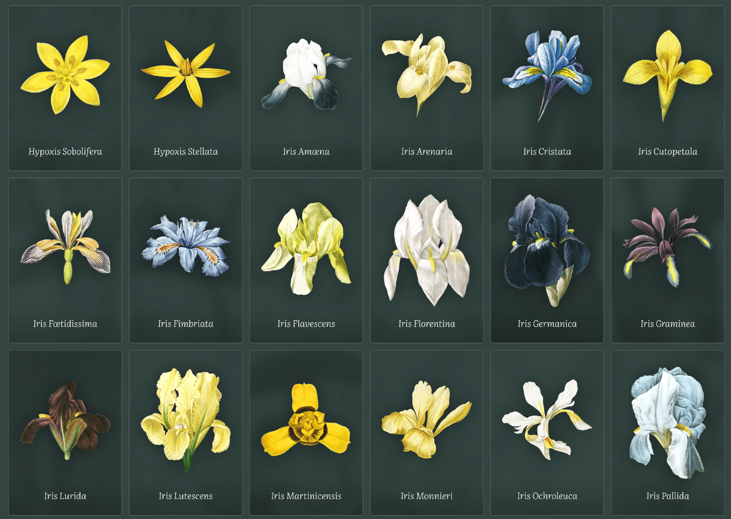

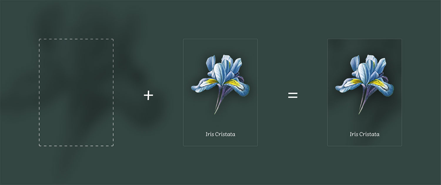
The final design was a mixture of the earlier ones—simple cards with clear delineations between them. Large shadows below each flower made them jump off the screen and the blurred backgrounds on each card added a nice sense of variety to the repetitive grid pattern. Plus, the backgrounds didn’t require extra imagery or code to generate. Each card’s background is the same image of the flower, but magnified, blurred, color adjusted, and made semi-transparent using CSS. The card itself has overflow: hidden applied so I was able to achieve a similar “cropped” effect as the hero on plate pages.
In the timeline view, flowers are grouped by volume and include a number (or numbers) of the plates illustrating them. Each volume shows the years during which the plates were created. The descriptions of lilies included additional classification methods as outlined by Antoine Laurent de Jussieu, Jean-Baptiste Lamarck, and Carl Linnaeus, indicated by a line under the Latin title. Lamarck’s name was used occasionally in place of De Jussieu’s so I allowed for browsing classification by De Jussieu/Lamarck and Linnaeus.
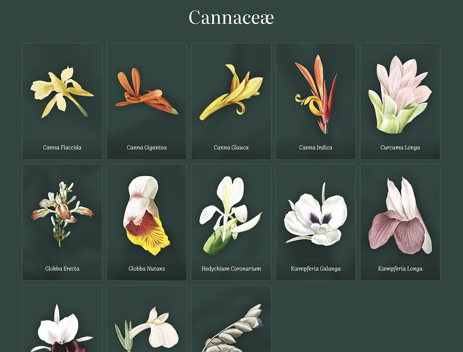
The pages for browsing and plates were the first pages I coded quickly after only attempting a few rough mockups. I’ve learned from other projects that building and starting to use the digital edition as soon as possible rather than perfecting mockups has two strong benefits:
- Using the site as a real user lets me discover nuances and make improvements to the experience throughout the timeline of the project rather than waiting until the very end. I am my own beta tester and it helps tremendously.
- Testing new ideas is often easier in code than in mockups. For example, adjusting the design of the browsing experience and plate pages (spacing, image size, etc.) is a lot more efficient in a browser at multiple sizes than crafting clever mockups in Figma with components, variables, etc.
I acknowledge that I’m a team of one and this workflow doesn’t always work for larger teams. Still, for passion projects like this, shortening the path to a working version as much as possible is a big win.
I restored illustrations by alternating between volumes of lilies and roses. First I worked on volume one of Les Liliacées, then volume one of Les Roses, followed by volume two of each, and so on. Since there were eight volumes of lilies and only three of roses, the entire collection of roses was finished first, and as a result, that was the first collage I made. I’ve become no stranger to making collages—specifically those arranged by color—considering I made them for hummingbirds and minerals, but the challenge of the packing problem always comes back to haunt me. I developed a decent methodology that I described in my blog post about making the minerals collage, but that didn’t work well with the collages for this project.
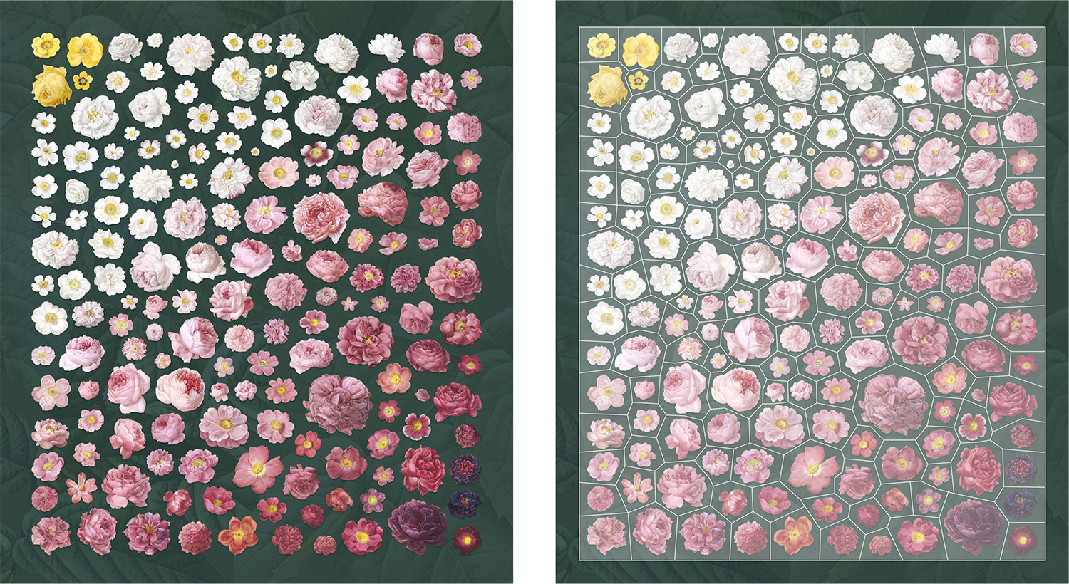
The main challenge is determining the tightest arrangement of irregularly shaped images without overlaps and arrange them by color. The last part is the trickiest. Without that, arranging the images of roses would have been relatively easy: place the largest ones spaced out nicely, then fill in the gaps with the smaller ones. Arranging them by color throws a nice wrench into that. First, I had to figure out how the main groups of colors could be nicely arranged. Then, position the largest of each group evenly spaced out but also roughly where I think their color group would appear. This was a big guessing game and required countless adjustments.
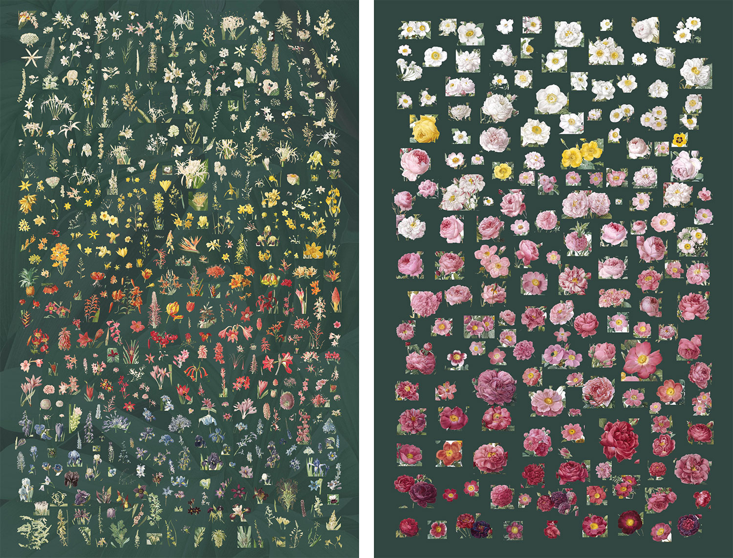
As I restored each image, I kept track of the main color for each of them and kept a running log of this to see how the final groups ended up in the end. There were four main groups of rose colors: yellow, white, pink, and purple. However, the pink could be split into subgroups so I ended up with six total groups: yellow, white, light pink, pink, dark pink, and purple.
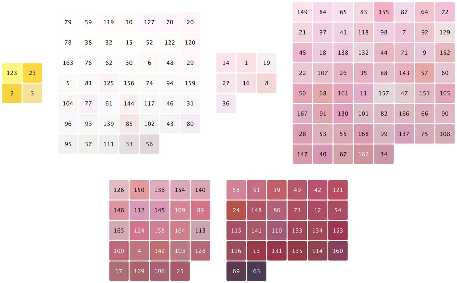
Out of 169 roses, only 4 were yellow and yellow didn’t blend well with white, pink, or purple so I knew it needed to be on one end of the collage’s spectrum. There were also only a handful of purple, or darker-colored roses so they were going to be on the other end of the spectrum. The majority would be white and shades of pink. Once I had a nice arrangement, I added a subtle background comprising a second collage of large leaves from a few rose plates. The leaves add a nice texture to the final result. A hotspot for each rose was created in Illustrator and exported as SVG paths for masking.
The same approach was taken for the lilies collage but it was more challenging because it contained 476 images—nearly three times the amount in the roses collage. There were nine main color categories: white, yellow, orange, vermillion, red, pink, blue, purple, and green.
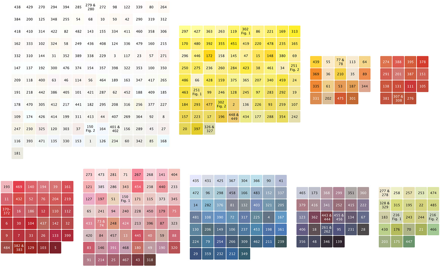
Even though, white lilies dominated the collage, there were a healthy mix of other colors so I could arrange them in a nice gradation from top to bottom.
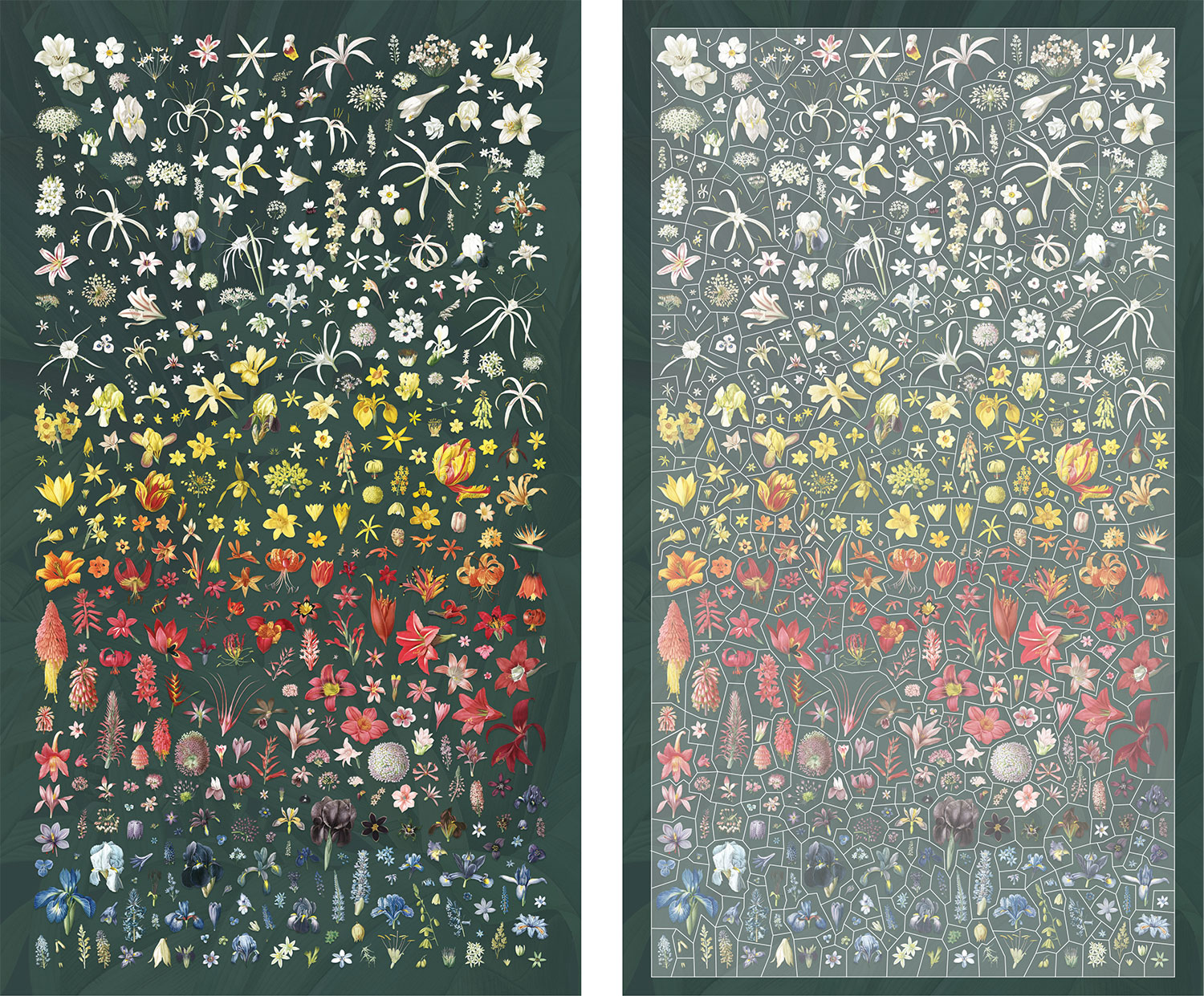
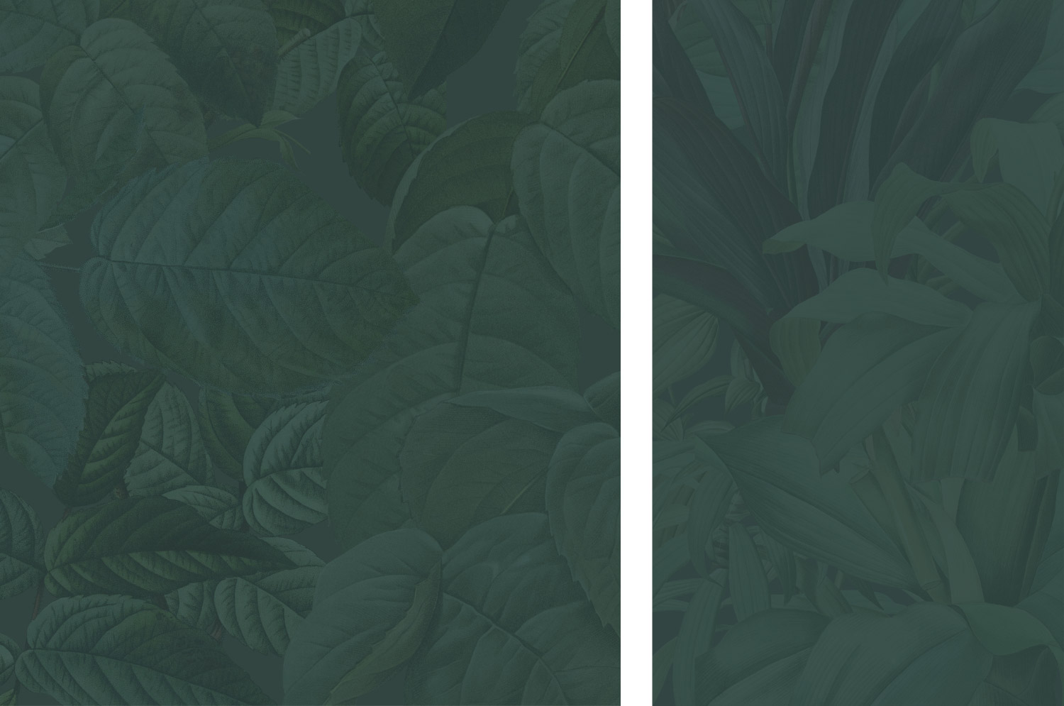
Like with past collages, the best tool I found for creating them was InDesign, because it efficiently handles large volumes of lined images very well. Neither Photoshop or Figma handles many high-resolution images very well without freezing, choking, or crashing.
The sizes of roses and lilies are consistent with the size at which they were drawn. Flowers were drawn a wide range of sizes and I wanted to preserve that to add variety to the collages rather than trying to scale them all to the same size. They’re shown at uniform sizes in the grid views.
I was very pleased with the final collages. Both showcase all the beautiful colors Redouté used and they’re fun to explore. The goal of the collages is to let visitors explore by color and navigate to the plate pages for more details so names of each flower were left off.
Home page
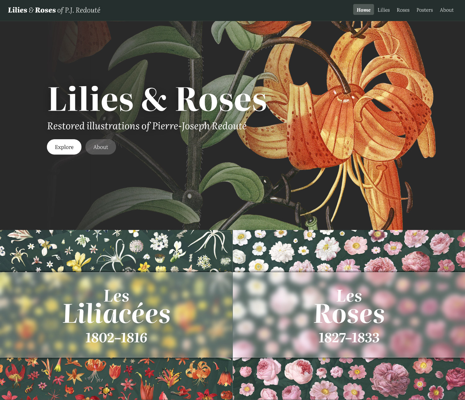
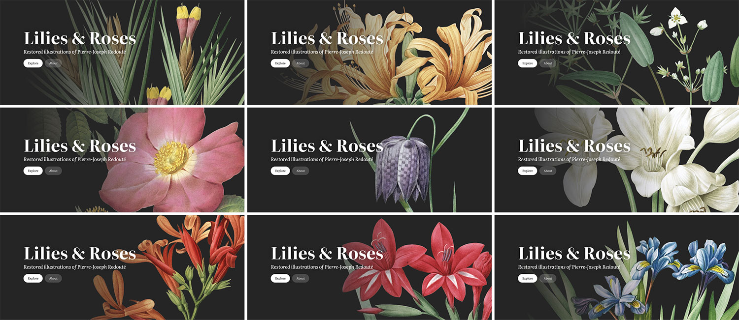
The home page has a limited purpose—to introduce the project and drive visitors to the main areas, so I kept the design fairly simple. Like other areas, the home page design went though several iterations. A design technique I’ve been using on previous digital editions is showcasing a random illustration as the hero image every time the page is loaded. I did this on the home pages of Illustrations of the Natural Orders of Plants, Iconographic Encyclopædia, and Picturesque Seats of Great Britain and Ireland. I like this approach because it showcases the variety of images available if someone visits the home page multiple times.

My initial ideas centered around showing a random lily paired with a random rose with simple large links to each collection. These designs ultimately didn’t work because they divided the attention too quickly and hindered the ability to focus on one thing to understand the purpose of the project. After I ironed out the design of the hero on plate pages, I decided to reuse that same concept on the home page hero with a few action buttons, followed by two large links to the lilies and roses collections. It’s a simple design but works well.
Breathing new life into illustrations
As I alluded to earlier, restoring images became a major part of this project—taking up around 80% of the overall work. Specifically, making the version of each illustration with a dark background required an enormous amount of manual work, but I enjoyed it. My early plans were to restore images with a clean white background and extract the flowers to be used for browsing. However, once I created a test hero image with a dark background, I was hooked and really wanted to see how all other images looked with a dark background—not just for the hero images but for the full plates.
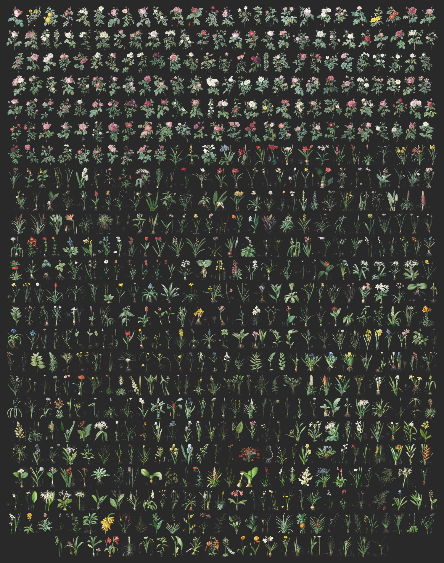
So in mid-November 2023, I committed to restoring all 655 plates with both light and dark backgrounds and 11 months later, I finally finished. Let me explain why it took so long.
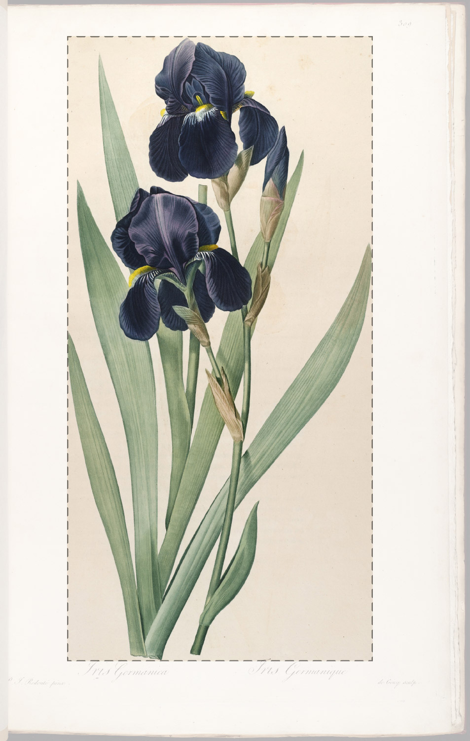
The first step in restoring the image was simply cropping. I cropped out the edges and text, focusing only on the illustration and any sketches. The calligraphy on each plate was beautiful but I wanted to focus on just the illustrations so text was not included in my digital edition.
Color restoration
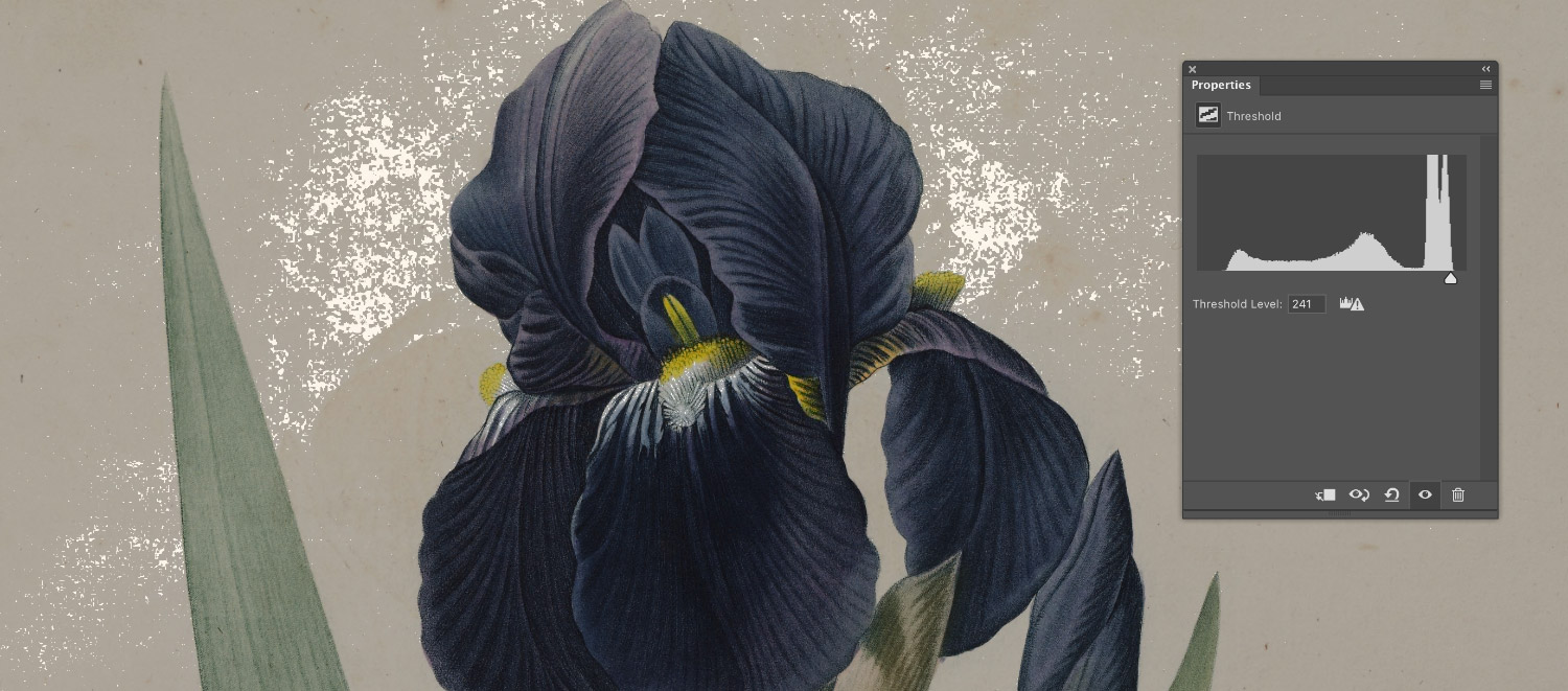
Adjustment layers were used to fix the yellowed and aged colors so they look more vibrant and as true as possible to the original intent when they were illustrated. To achieve this, I needed to adjust the white balance by using the white point of an image. The white point can be found by using a semi-transparent threshold layer to highlight the lightest pixels. By default, a threshold layer is set to 255 and appears as a solid black layer. As the slider is moved, pixels that are lighter than the threshold turn white. I used a threshold layer set to 30% opacity, which made the entire image a transparent grey and then lowered the threshold level until I saw pixels turn from grey to transparent white. One of those pixels was the white point in a levels layer.
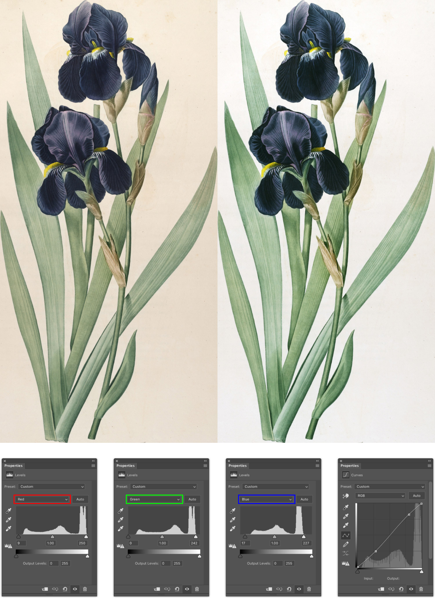
Next, the colors needed to be adjusted to fix the yellowing that happens with paper as it ages. I found that most images just needed some minor adjustments to the red and blue levels to fix this. Some images also needed an additional curves layer to increase the contrast a little.
Background replacement
Background replacement took the longest. Of the many options Photoshop offers to remove backgrounds, the manual approach worked best. I tried as many as I could find and devised a few of my own techniques but they fell short of the quality level I wanted. I wanted to preserve as many details as possible—and there were a lot of details.
Creating just a clean white background for every image would have been time consuming but not as bad because flowers were already drawn on lighter paper. The methodology for this would have been the same as what I did for the images in Illustrations of the Natural Orders of Plants—use a semi-transparent threshold layer as a guide to highlight the non-white areas and carefully brush them out.

The problem with this method is when a dark background is applied, a very visible white halo appears on all the edges because the edges were originally drawn on light paper. Since I wanted to add a dark background to all images, I had to find a way remove that halo or reduce is as much as possible.
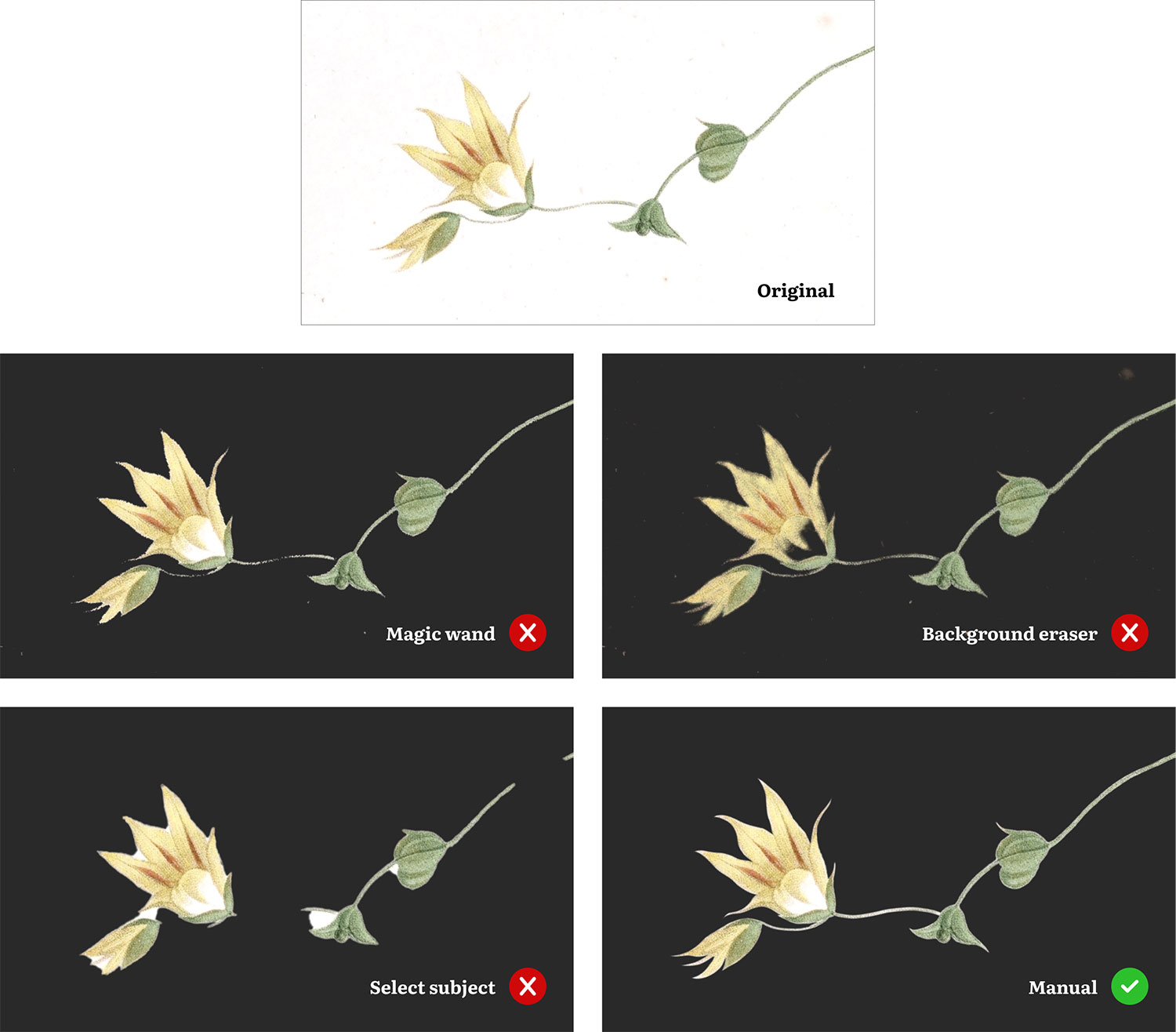
Photoshop has some built-in tools that seemed promising but fell far short of my expectations. Three are illustrated above on a small part of Daisia iridifolia for comparison with the manual method and the original as a point of reference.
- Original is the original scan after basic color restoration.
- Magic wand tool selected a lot of the background pixels but the edges were still rough and it selected too many pixels on the thin stems.
- Background eraser tool worked like a brush tool and its name implied that it removed backgrounds but it really only removes similar colors. Its tolerance can be adjusted to find more or fewer similar colors but it still left behind a lot of other splotches of colors and made edges too blurry. Plus, it removed too much from the flowers since it only looked for colors and doesn’t know what the shape is.
- Select subject detected the main object from an image and selected it and while it didn’t leave behind too many splotches on the background, it was too greedy in selecting pixels and selected too much of the flower.
- Manually painting the background was the slowest but gave me total control over the smooth edges, tight corners, and thin stems.
This is just one image as an example. All of these built-in features faired much worse when finer details like leaf serrations, thorns, hairs, or roots were present. One method I came up with on my own got closer than others:
- Select all contiguous background areas.
- Create a dark solid color layer with the selection applied as a mask.
- Invert mask so only the non-background areas show though.
- Blur mask by about one pixel.
- Adjust the curves of the mask sharpen the edges and reduce halos as much as possible.
- Temporarily, apply thick stroke to the mask to highlight any errant pixels not selected in the first step.
- Use the brush tool to on the mask to erase the highlighted errant pixels.
- Remove stroke and touch up any remaining details.
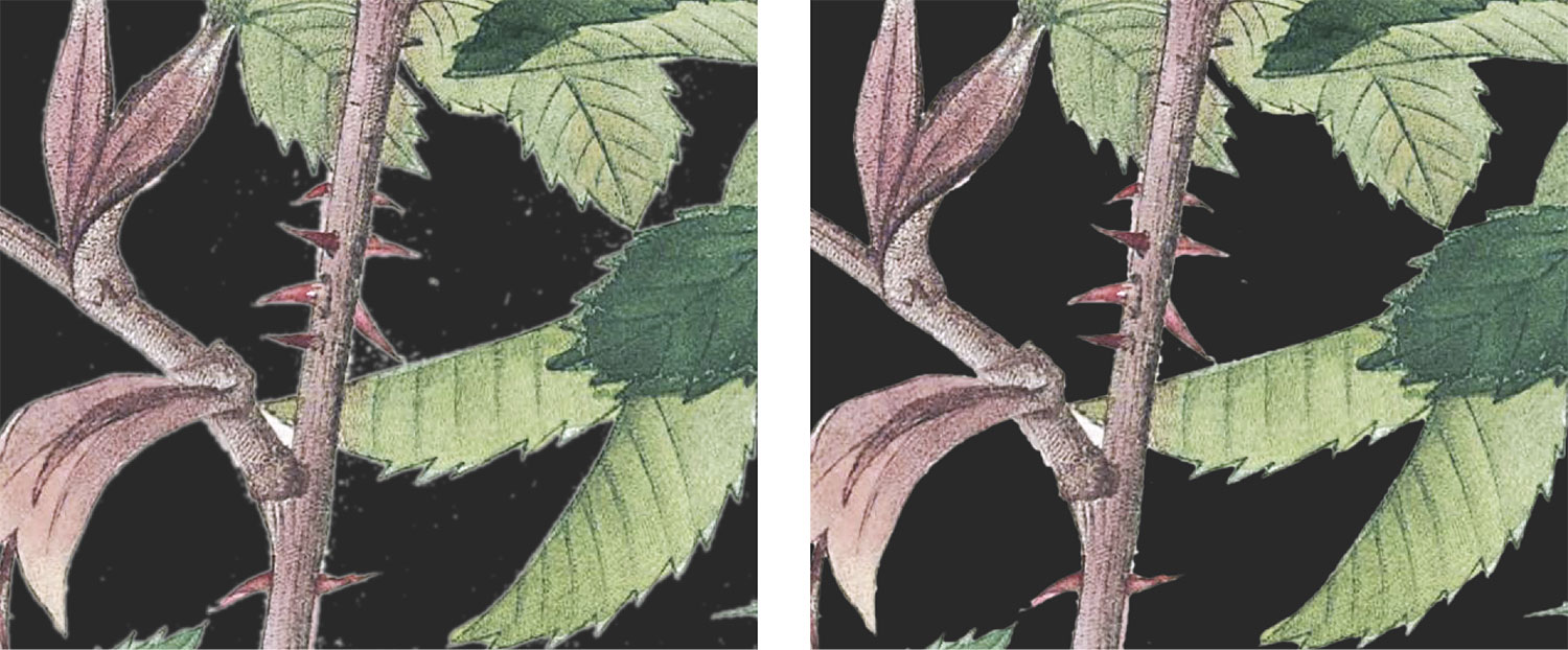
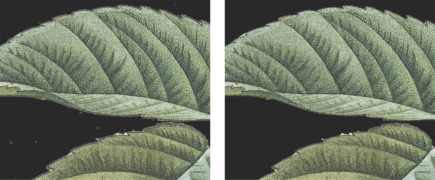
This method worked pretty well on images with well-defined edges like the stems of Rosa hudsoniana but not rough edges like the leaves of Rosa brevistyla, Rosa cinnamomea, and Rosa orbessanea.
Every “quick” method previously described resulted in a significant amount of time needed to clean up all the edges and fine details. I tried using combinations of all of them for a couple months but none seemed more efficient than simply making the layer mask manually by carefully and slowly tracing along every edge. So that’s what I did for all 655 plates. No matter the complexity, I traced every flower, every leaf, every stem, every root, and every hair to preserve all the details and ensure that Redouté’s hard work looked as good on a dark background as it did on a light one.

The timeline above illustrates the time spent restoring and replacing the background of all the images in each volume. Earlier volumes took longer because I was designing and building out the website, figuring out efficient methods, and tackling a few personal issues. Once I settled into a steady schedule of spending every free moment I had on the project, later volumes were completed more quickly. The last volume of lilies had several more plates than other volumes and some of the most complex images, which is why more than a month was needed to complete it.
I’m not exaggerating when I say the process taught me new levels of patience. Some images took only a couple hours because they had long smooth edges, and not a lot of details.
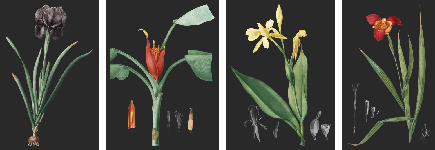
Most images took several hours or sometimes a couple days, even if they had smooth edges, because they included many overlapping leaves or petals.
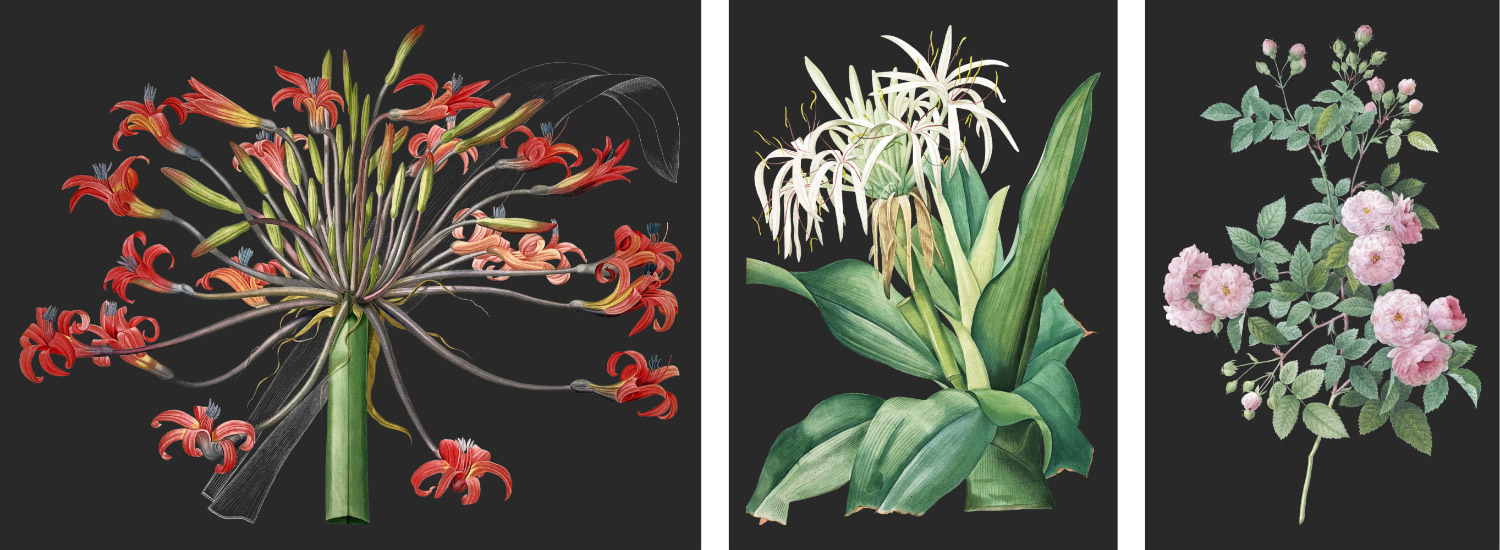
The most time consuming images had tedious details like complex root systems, tiny hairs, serrated leaves, hundreds of thorns, or thousands of leaves. Images like these took several days to complete…each. Below are some of the most complex and time-consuming images to trace and replace the background.
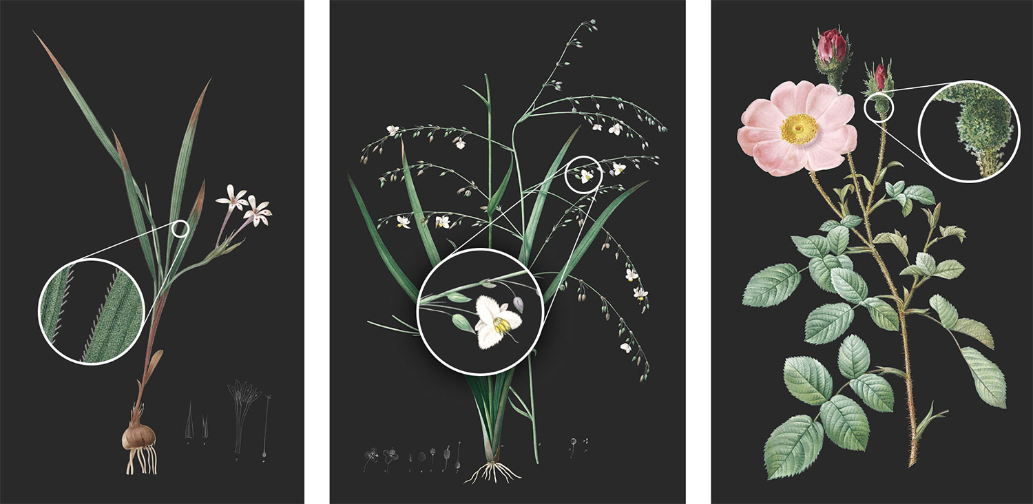
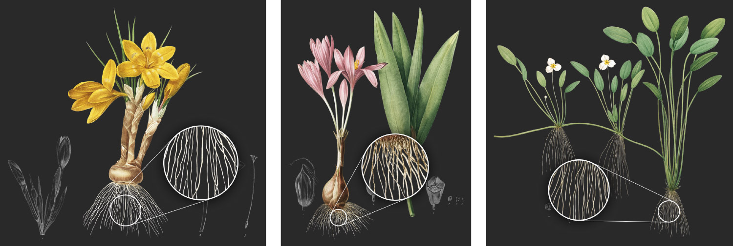
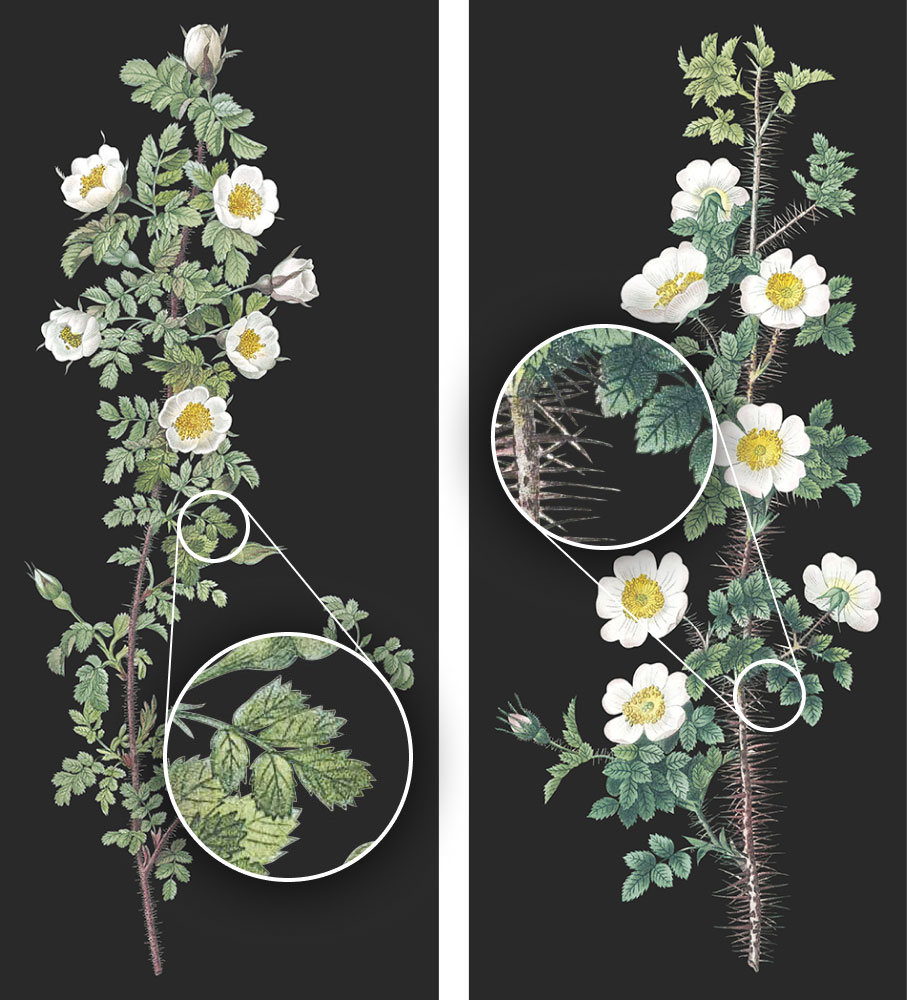
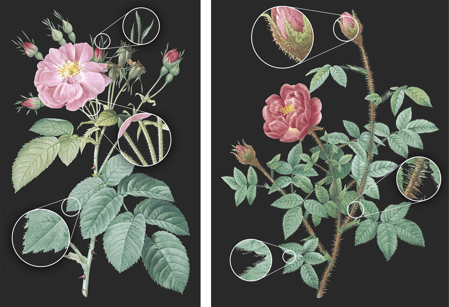
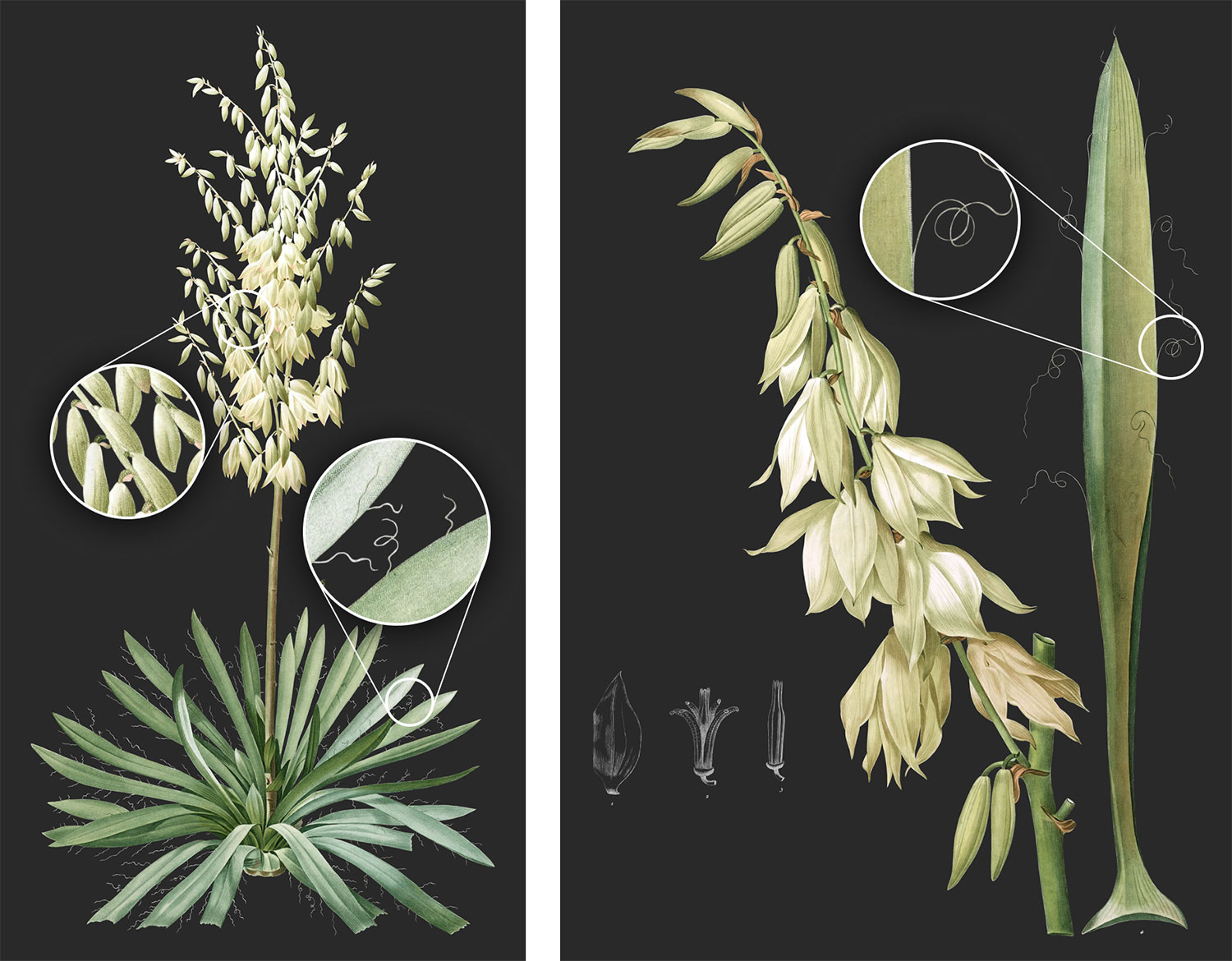
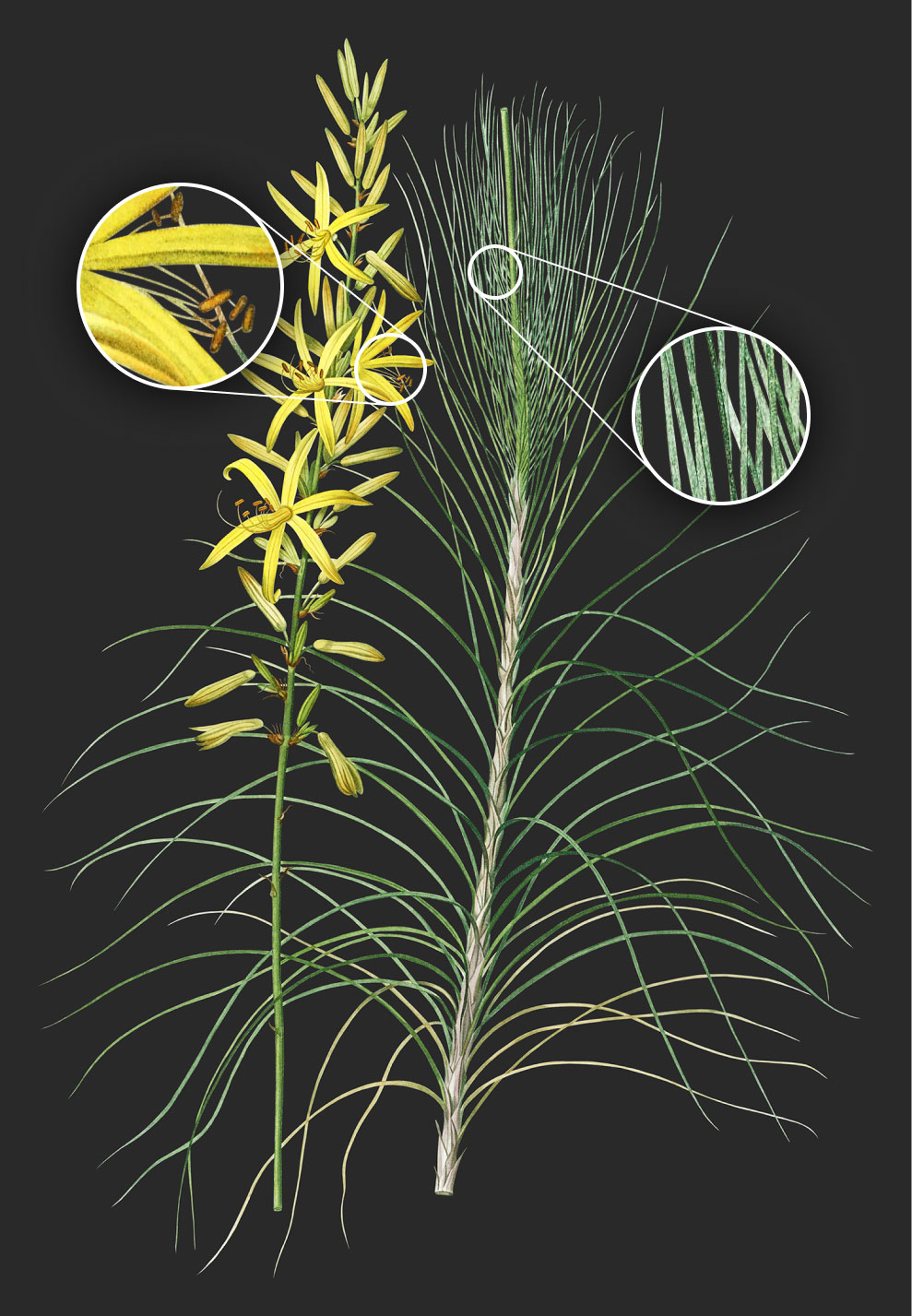
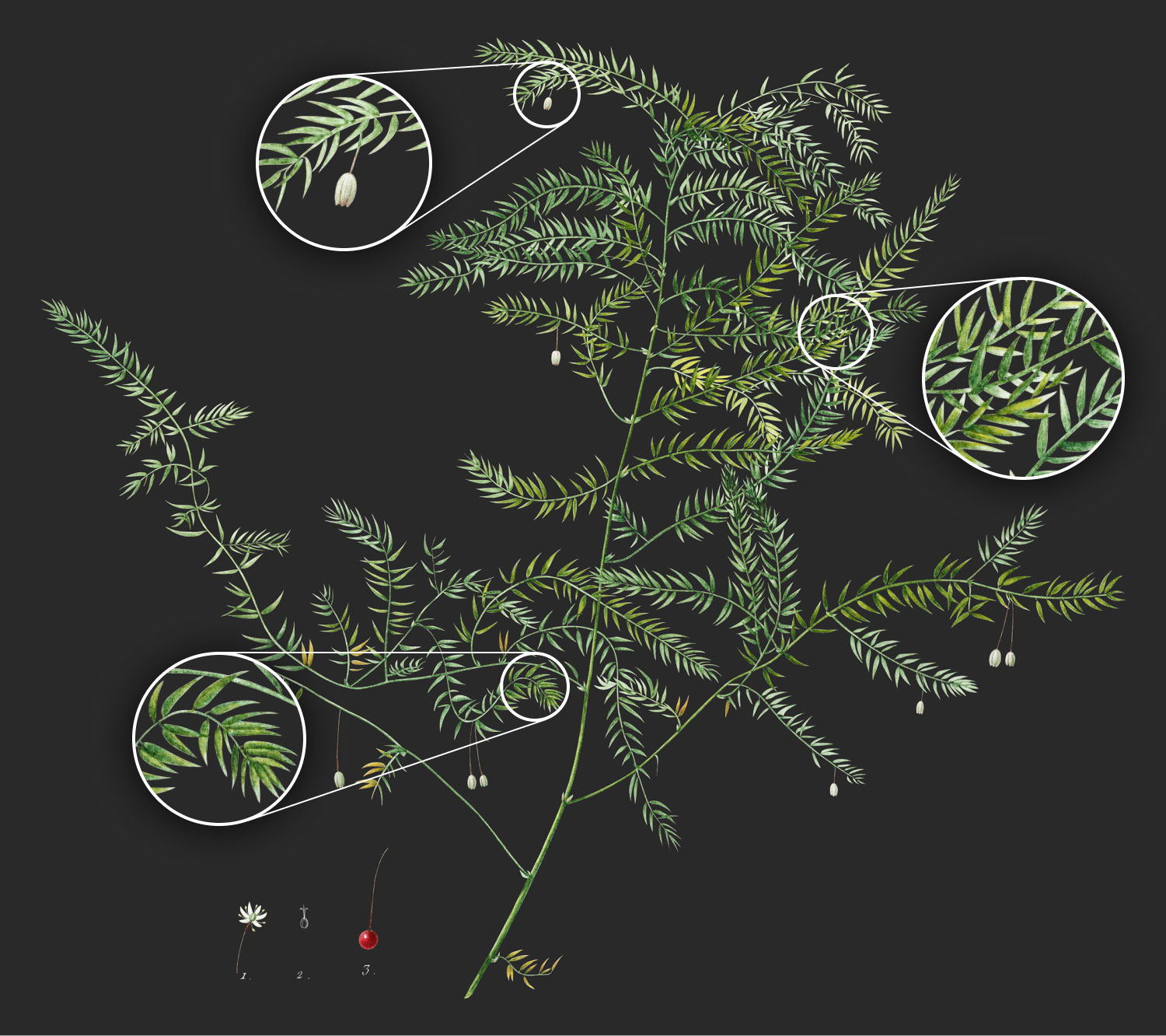
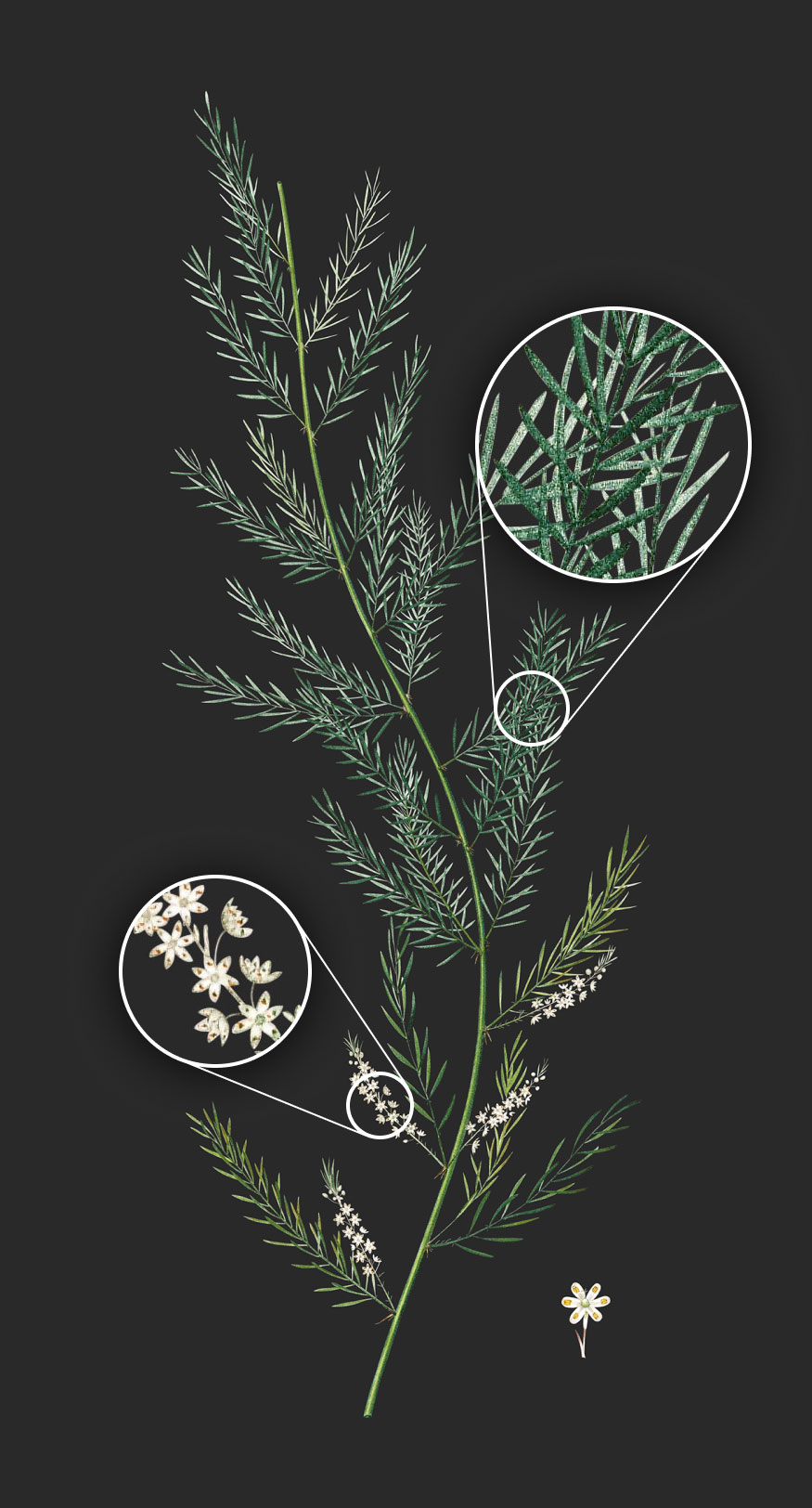
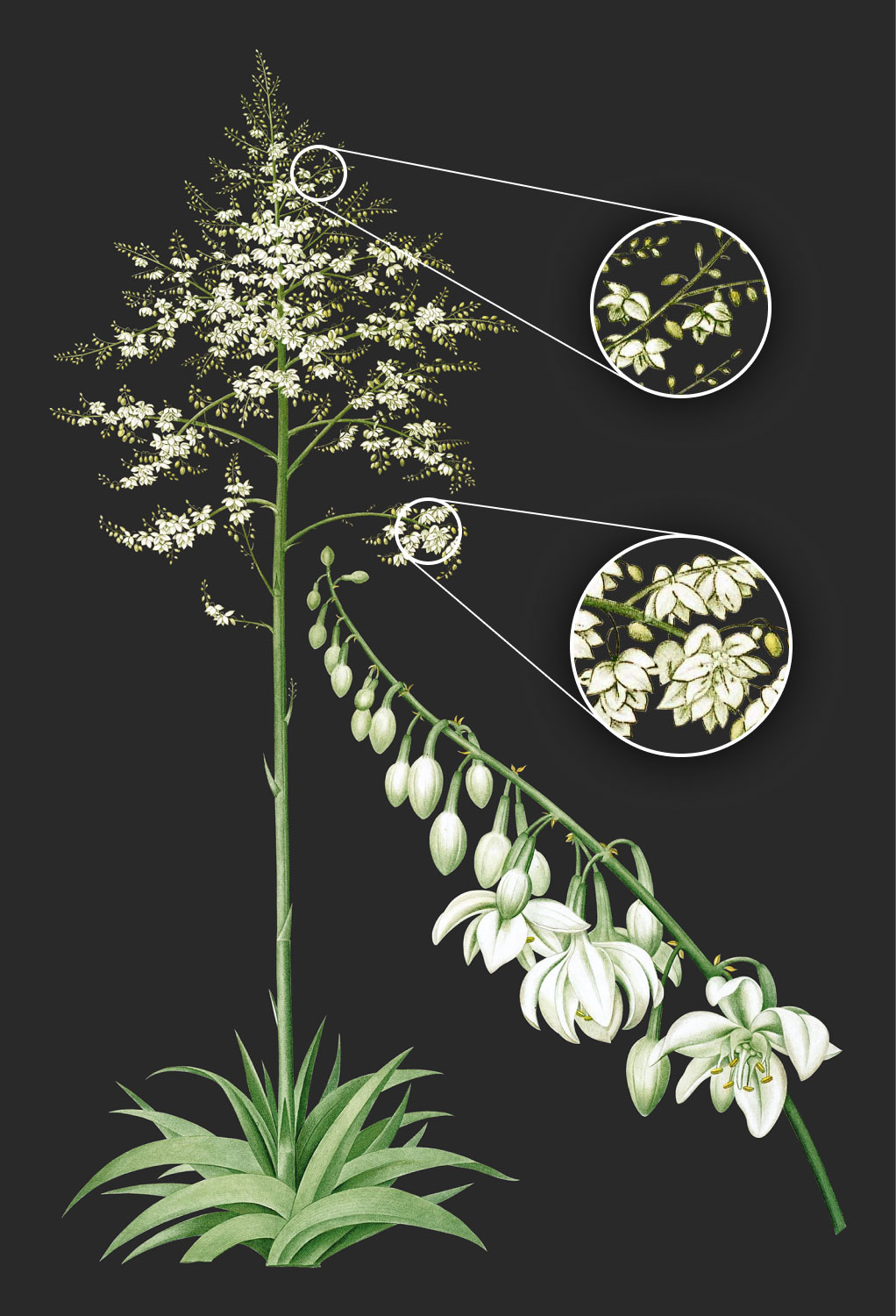
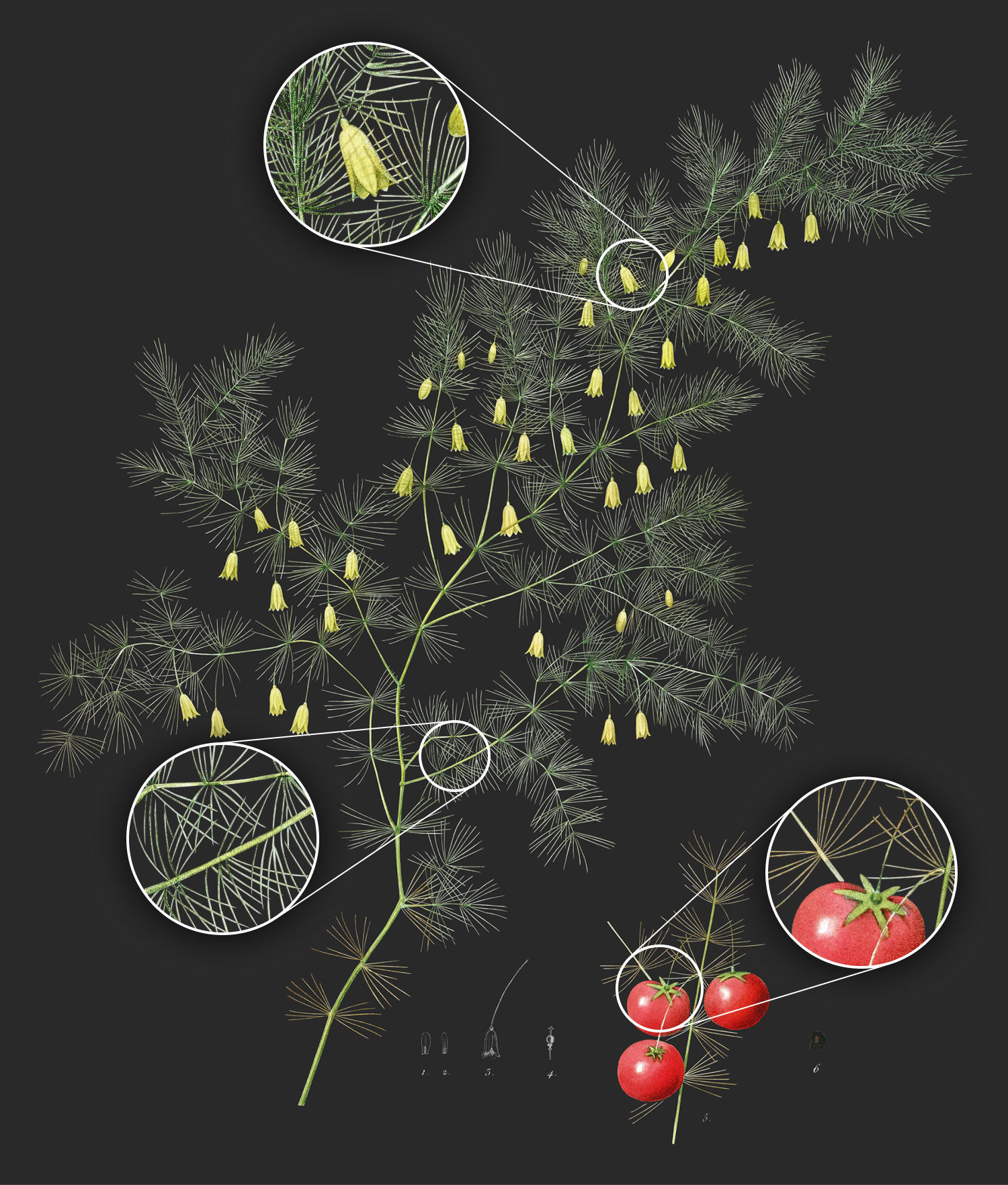
While the manual process took a while, I did find small ways to make it as efficient as possible. Below is a short video showing the pace at which I traced each image in real time. The display switches between a dark background and a light background with a blue overlay. The blue overlay is Photoshop’s brush preview mode which showed what would show through the mask. I was repeatedly flipping between the two using keyboard shortcuts to paint the edges.
The default shortcut for swapping foreground and background colors is the x key but since I’m left-handed, I remapped that to the / key so I could always keep one hand on the mouse and one hand on the keyboard with minimal movement.
For very complex areas like the leaves of the images mentioned above, I traced elements individually, selected them, then added them to the main mask.
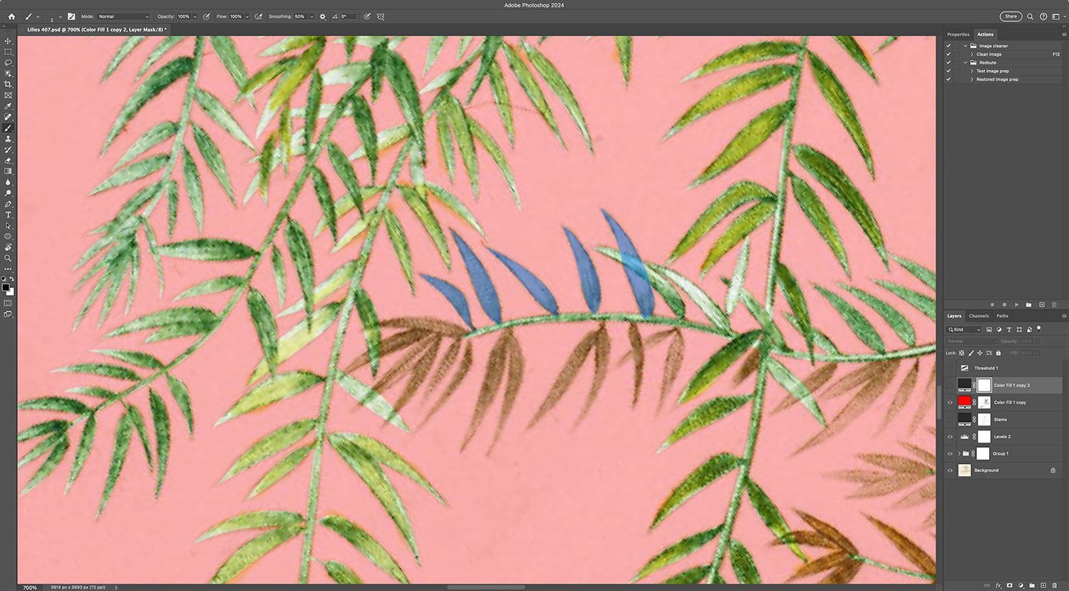
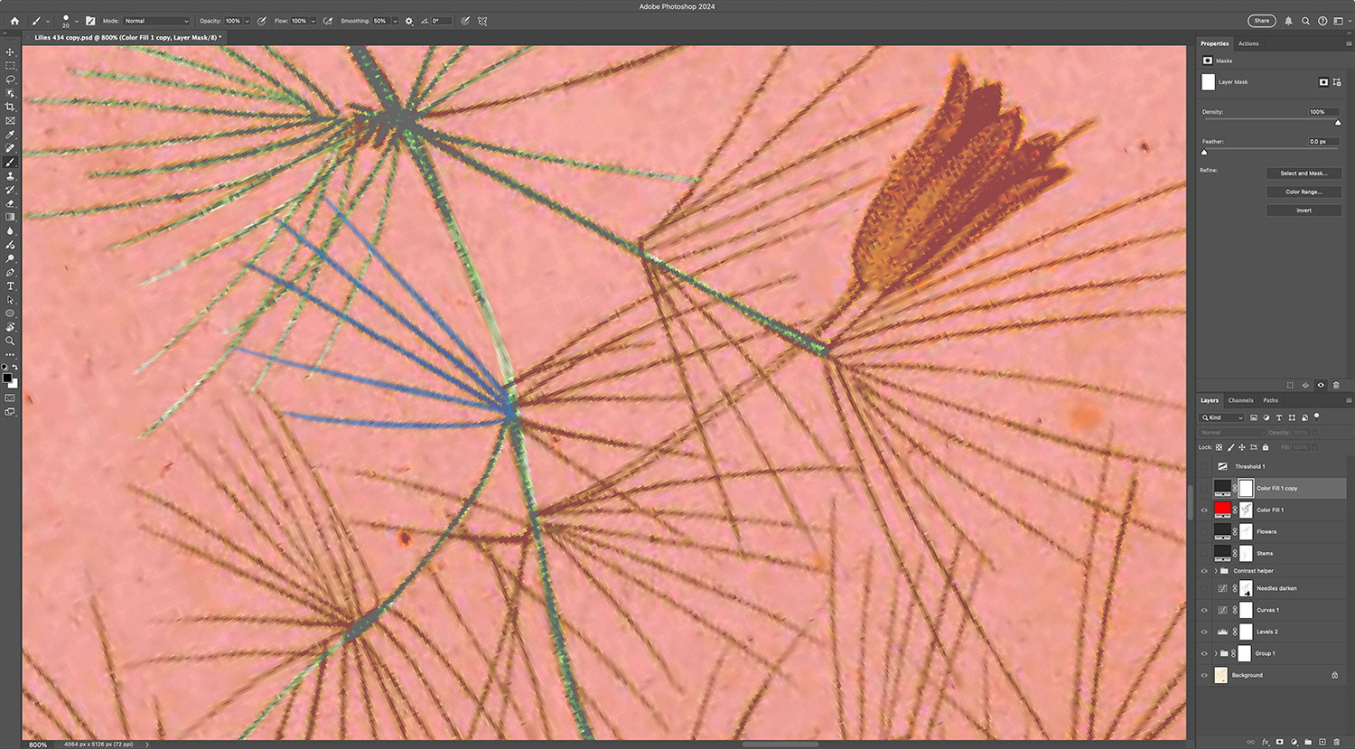
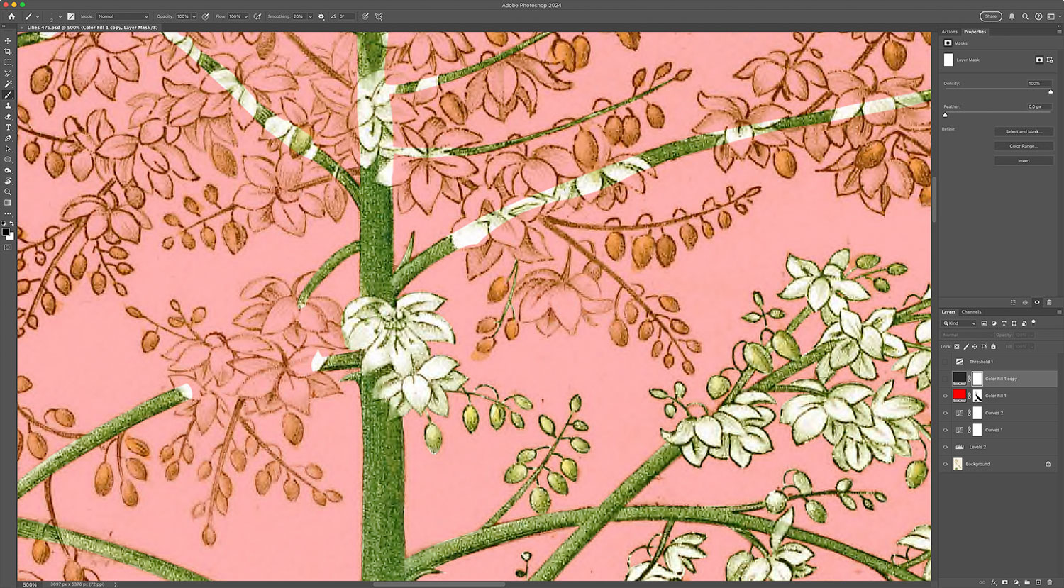
In the images above:
- Red is the main mask representing what will be the dark background.
- Green is the area already traced to show through the mask.
- Blue is the brush preview of a separate mask, which I would usually trace out for a few leaves at a time, select, and then add to the main mask.
The final step of replacing the background was updating the small sketches included on many of the lilies plates. These sketches were done in black only so I cleaned them up as much as possible so they looked good on a white background, created copies, and inverted them so they appeared as white on the dark background. A few of them were mixed with the full-color illustrations but that just required some precise masking to ensure they looked good on both light and dark backgrounds.

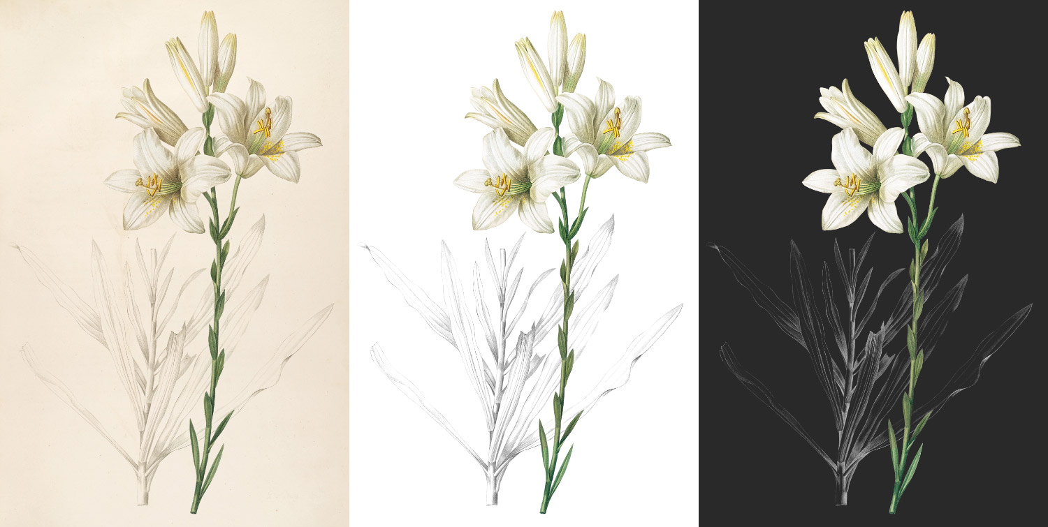
As the above images hopefully show, restoring images was a substantial effort. Below is a full collection of every rose and lily to give a sense of scale.
Extracting flowers
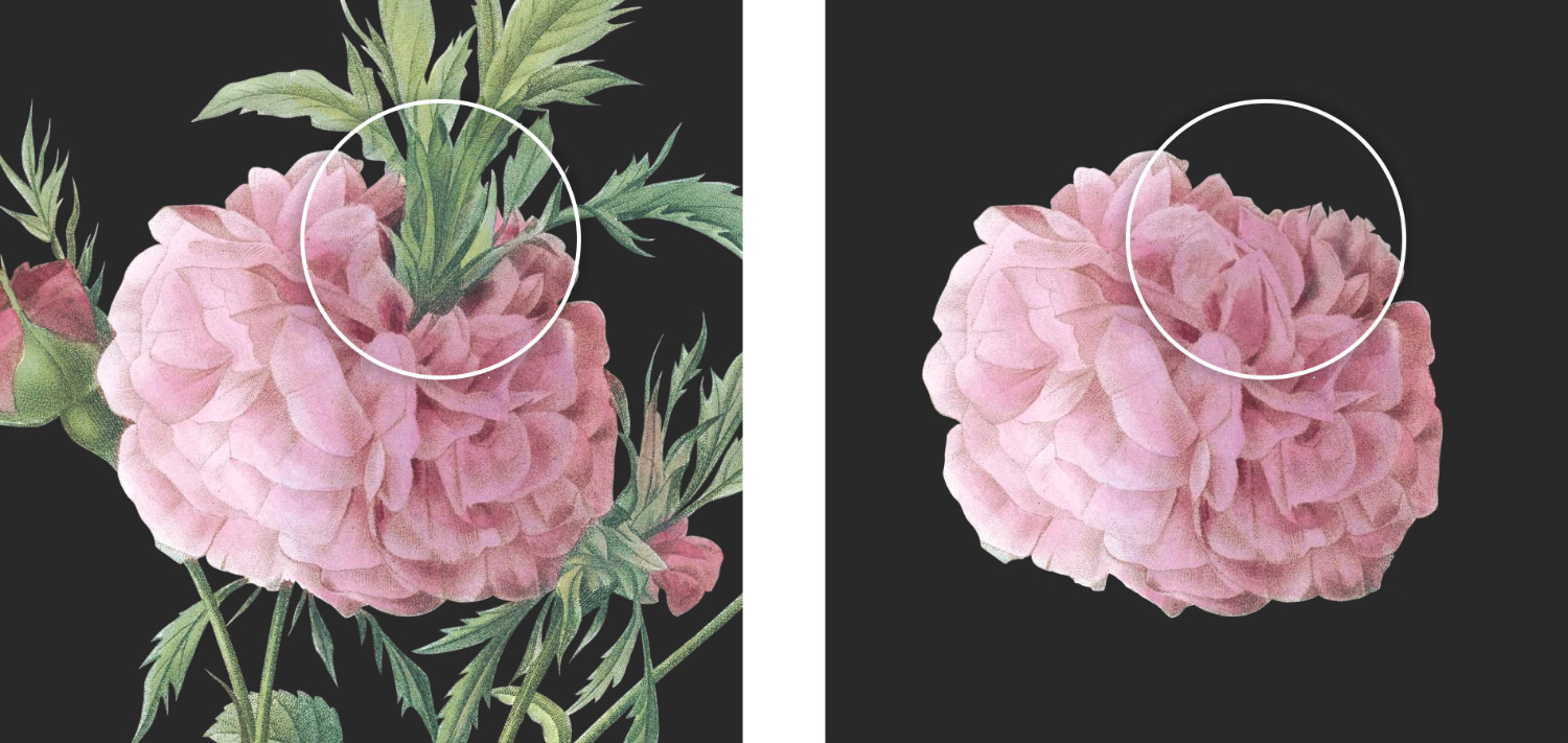
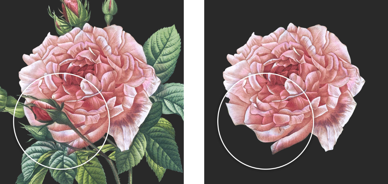
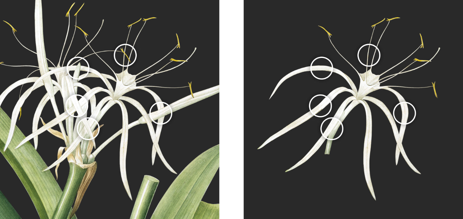
After the background was replaced for each image, I created a separate mask for the flower or set of flowers I wanted to extract to use on the browsing pages. Most of the time, this was very straightforward because the flowers’ edges are well defined. I tried to isolate one full flower from each plate but sometimes had to isolate a group of flowers because one would be too tiny. The goal was to find a good representative image for each flower.

A handful of images had objects obscuring flowers like stems, leaves, or other petals. For these, I exercised my artistic freedom to “erase” these objects using Photoshop’s clone stamp or generative fill features. I tried to keep usage to a bare minimum and only needed to adjust a handful of flowers. The images shown on the plate detail pages always show the original unaltered image but the flowers on the browsing pages and collages show the altered versions. The generative fill worked quite well for this most of the time but sometimes the stamp tool and a bit of elbow grease worked best.
Transcribing descriptions
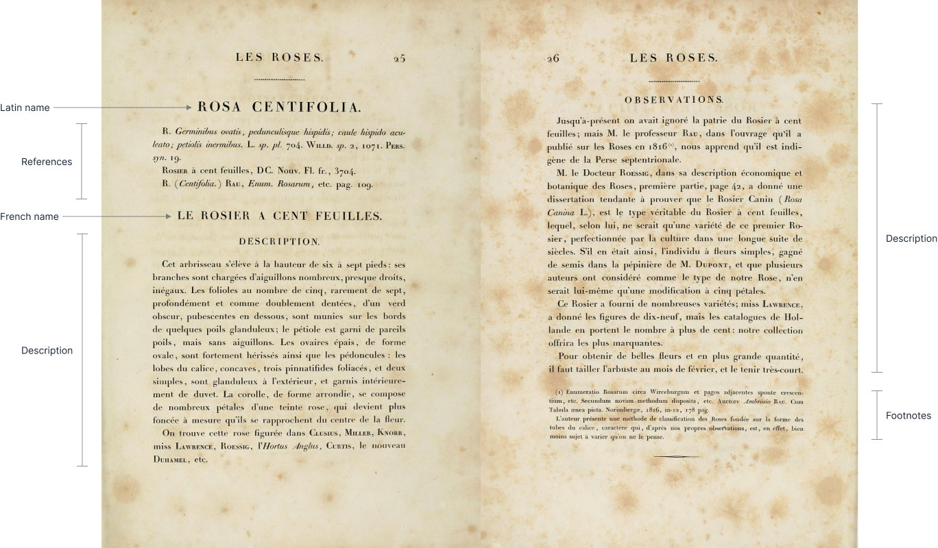
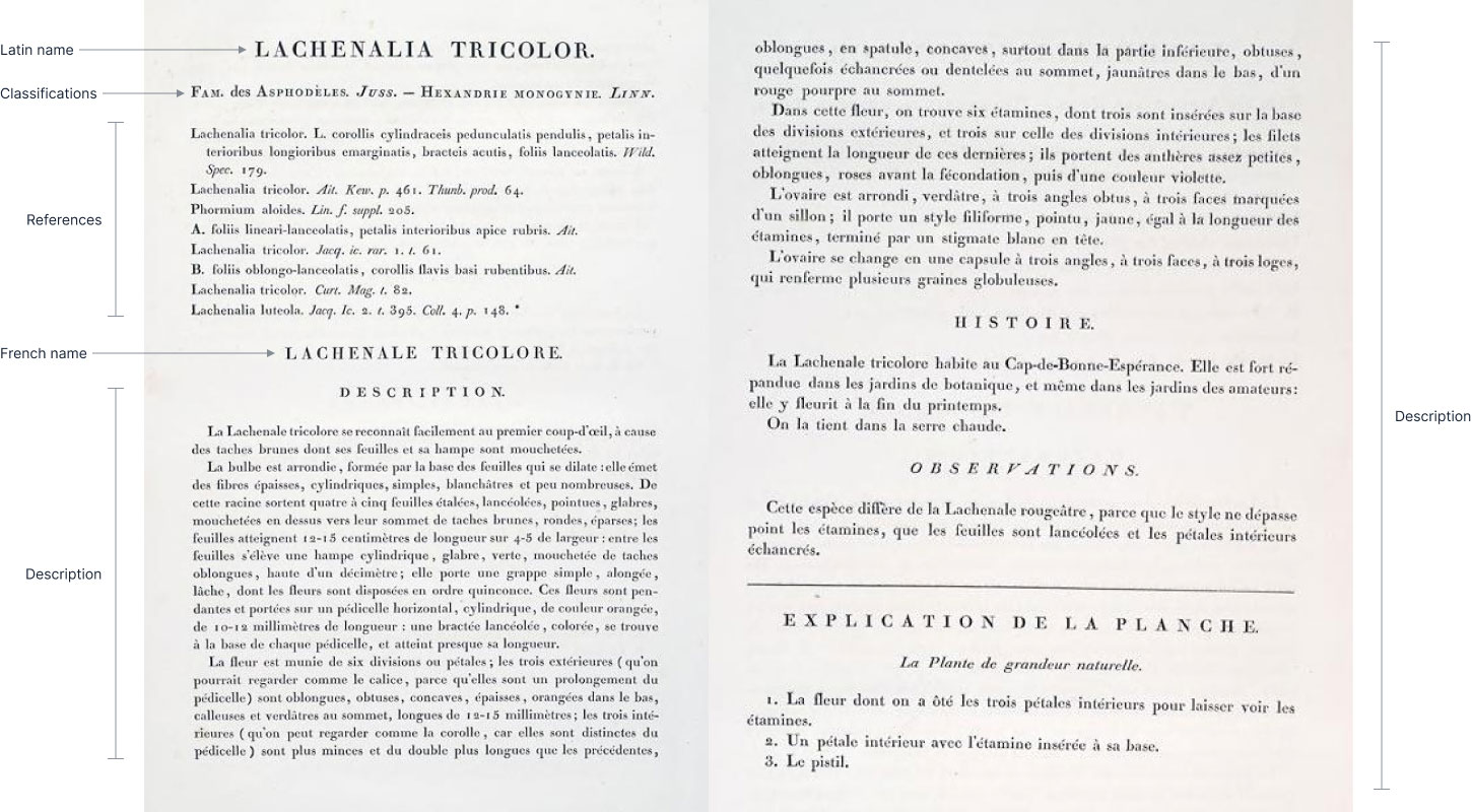
Redouté’s illustrations are clearly the focus of his collections but each one was also paired with a brief description about its characteristics. These descriptions are mostly consistent across all illustrations but have a few differences:
- Both roses and lilies:
- Names (Latin, French, and occasionally varieties)
- Various references to its nomenclature in other publications
- A description containing a mixture of a general description, historical information, and observations.
- Occasionally, a few footnotes are included to correct errors or provide more information
- Lilies only:
- A line about additional family classifications
- Enumerated explanations of the smaller sketches
- An occasional additional general description about the family as a whole
- Roses only:
- An occasional list of varieties of the rose with descriptions and/or nomenclature references
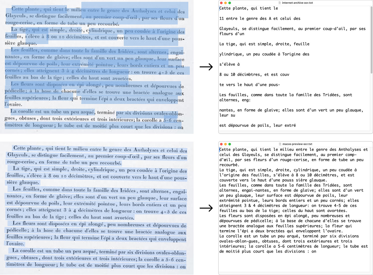
I couldn’t find these available as regular text anywhere online so I transcribed them from the original scans. Scans uploaded to the Internet Archive are usually run through OCR so a plain text version is available but the ones I could find were mostly nonsense. Unlike the scans of the images, the description scans were of a much lower quality, which probably contributed to the poor results.
Fortunately, and much to my pleasant surprise, macOS’s Preview did an excellent job recognizing even blurry text so I took screenshots of each page, pasted them into Preview, and copied the detected text. macOS’s Preview wasn’t perfect and I tried my best to catch all the errors but some may still have slipped by, which I will correct as I find them. Text was then pasted into simplified copy of Tiny that I run locally to edit it and format it into clean HTML.
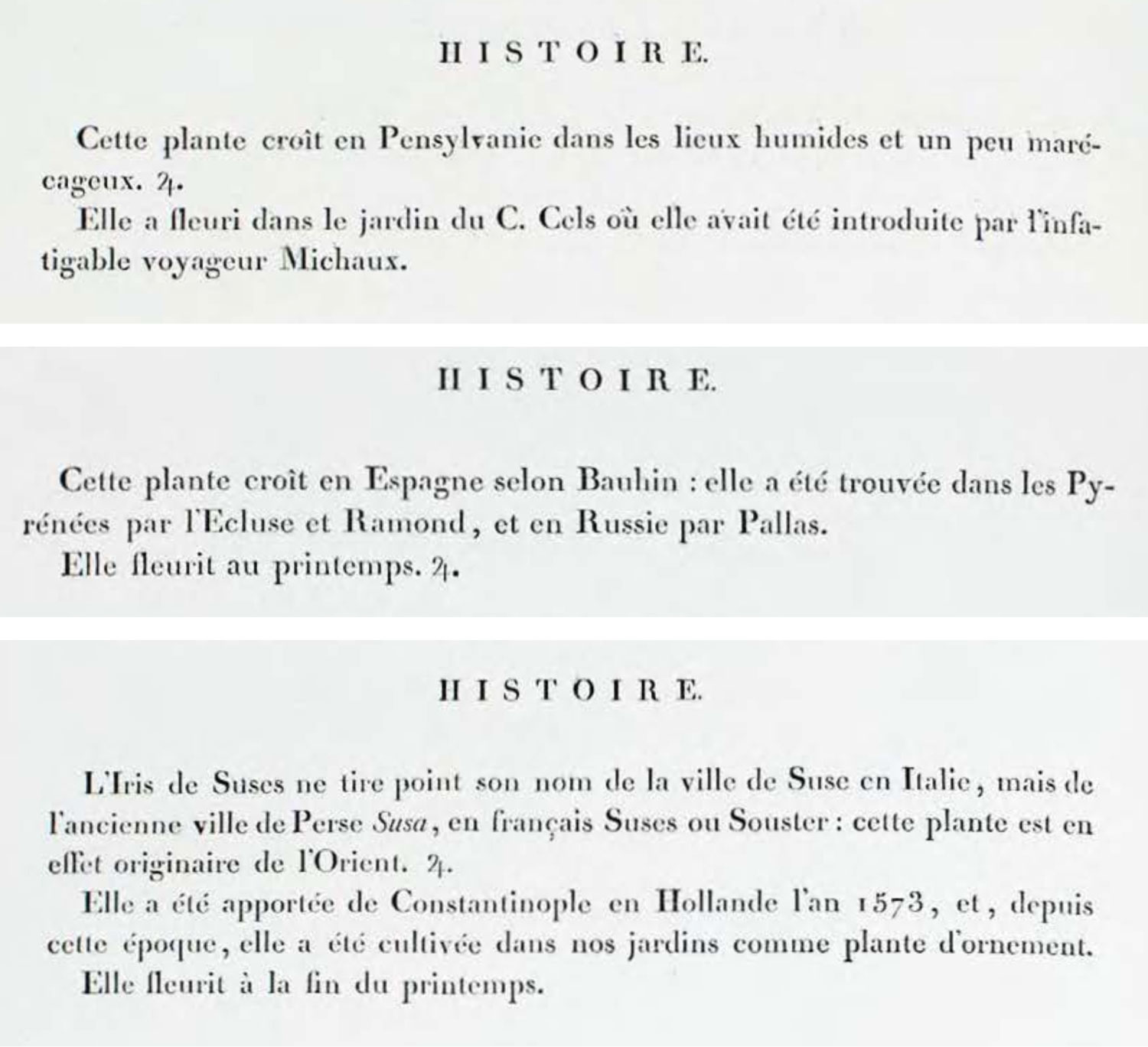
One curiosity I didn’t understand was the presence of what looked like the symbol for Jupiter (♃). It only appeared in the history section lily descriptions and mostly in the first four volumes. It only appeared a few times in later volumes. If any reader knows the purpose of this symbol, please contact me and let me know. I’m interested in learning about it.
Designing posters
When I started this project a year months ago, I had the goal of creating posters of all the flowers in Les Liliacées and Les Roses. I wouldn’t know if they would turn out well until I finished restoring all the plates. It was a gamble, but one I was willing to take. The two types of posters I thought could be interesting would be one showing all plates of both collections in their entirety, and another of just the flowers in colorful collages.
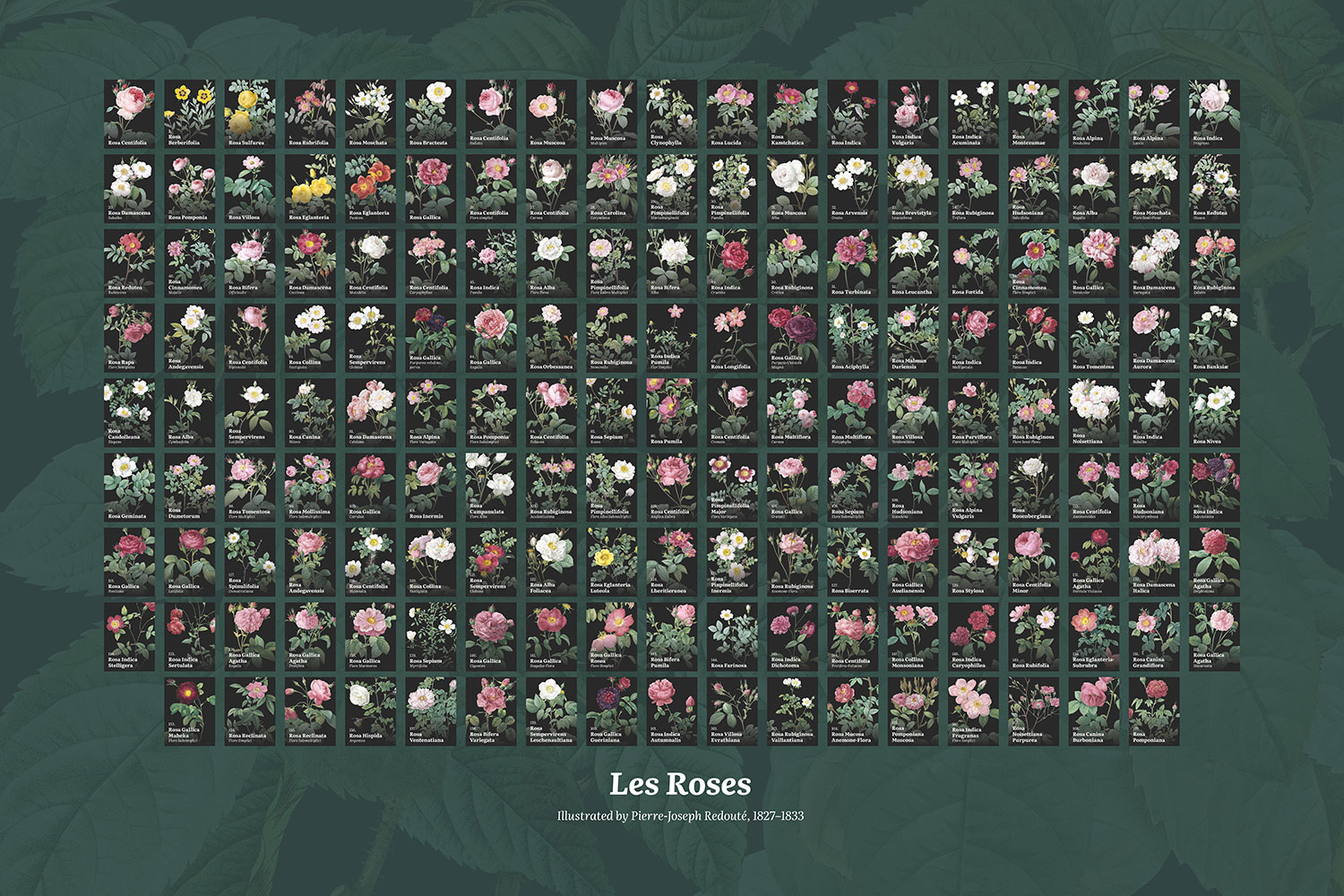
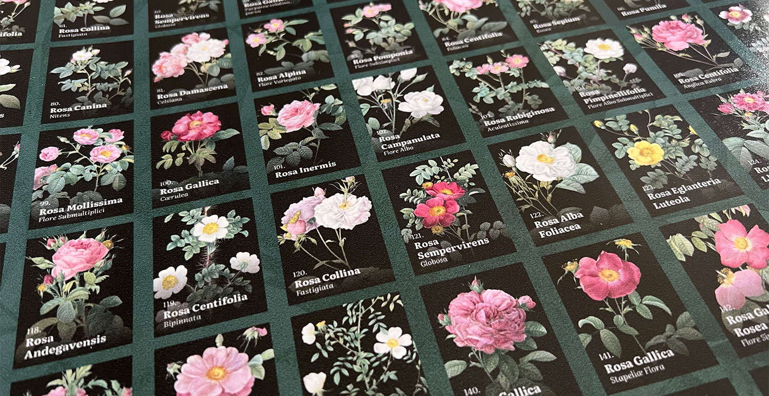
The first and only one I made showing plates in their entirety was for Les Roses. The idea was promising and looked striking on the digital view of the poster but the printed version wasn’t great. All the details were lost and the text was so small that the dark color bled into it, making it difficult to read. The overall poster was also just too chaotic to digest. Showing them in numerical order also didn’t add any value. It was worth a try.
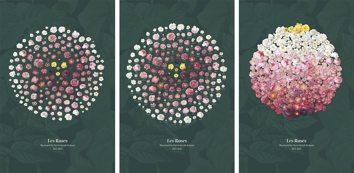
Two other early versions showcased the roses in a circular arrangement with a similar gradation to the interactive collage but without labels like a bouquet, and another trying to mimic the colors of some of the roses. I also applied the same collage of rose leaves to the background. Both were intriguing but still left me wanting more. The uneven distribution of flowers bothered me but I kept it them in the wings until I finished all the lilies images before trying different versions.
Since I built the interactive roses collage well before finishing the lilies, I had a lot of time to use it and I came to really like its arrangement so I wanted to create a similar design for a poster.
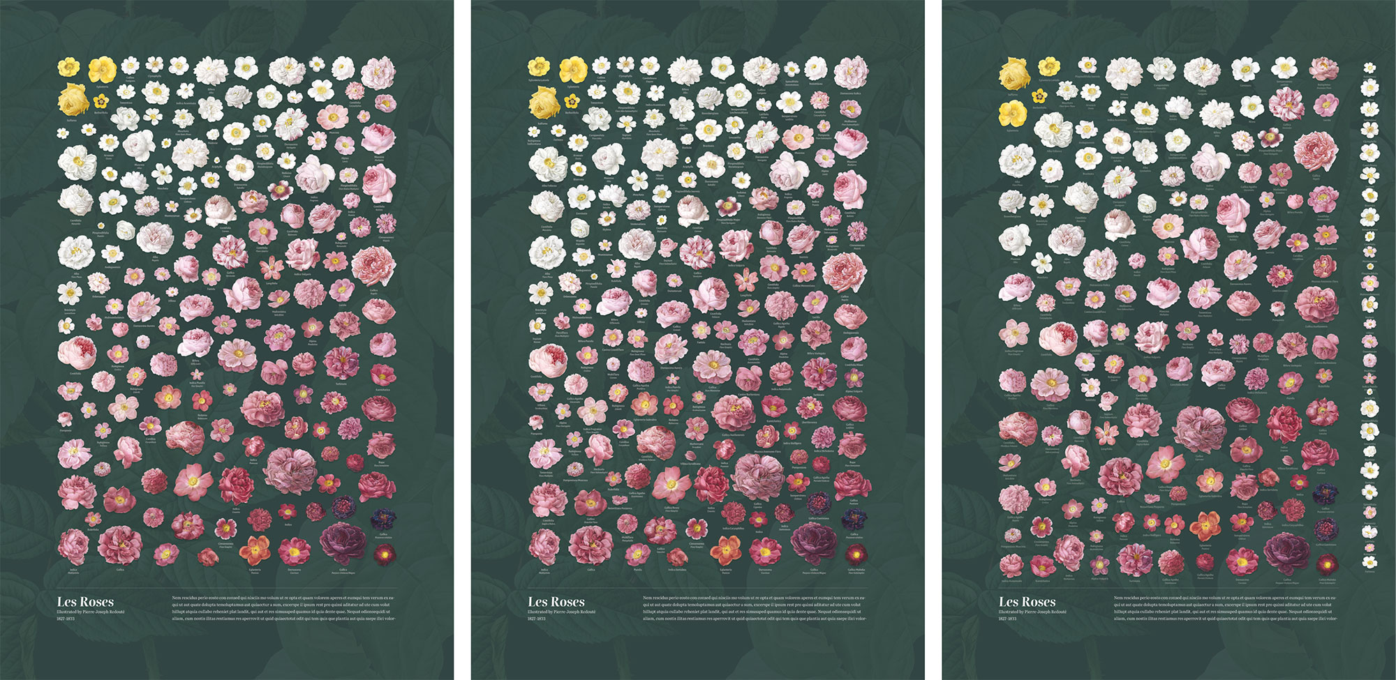
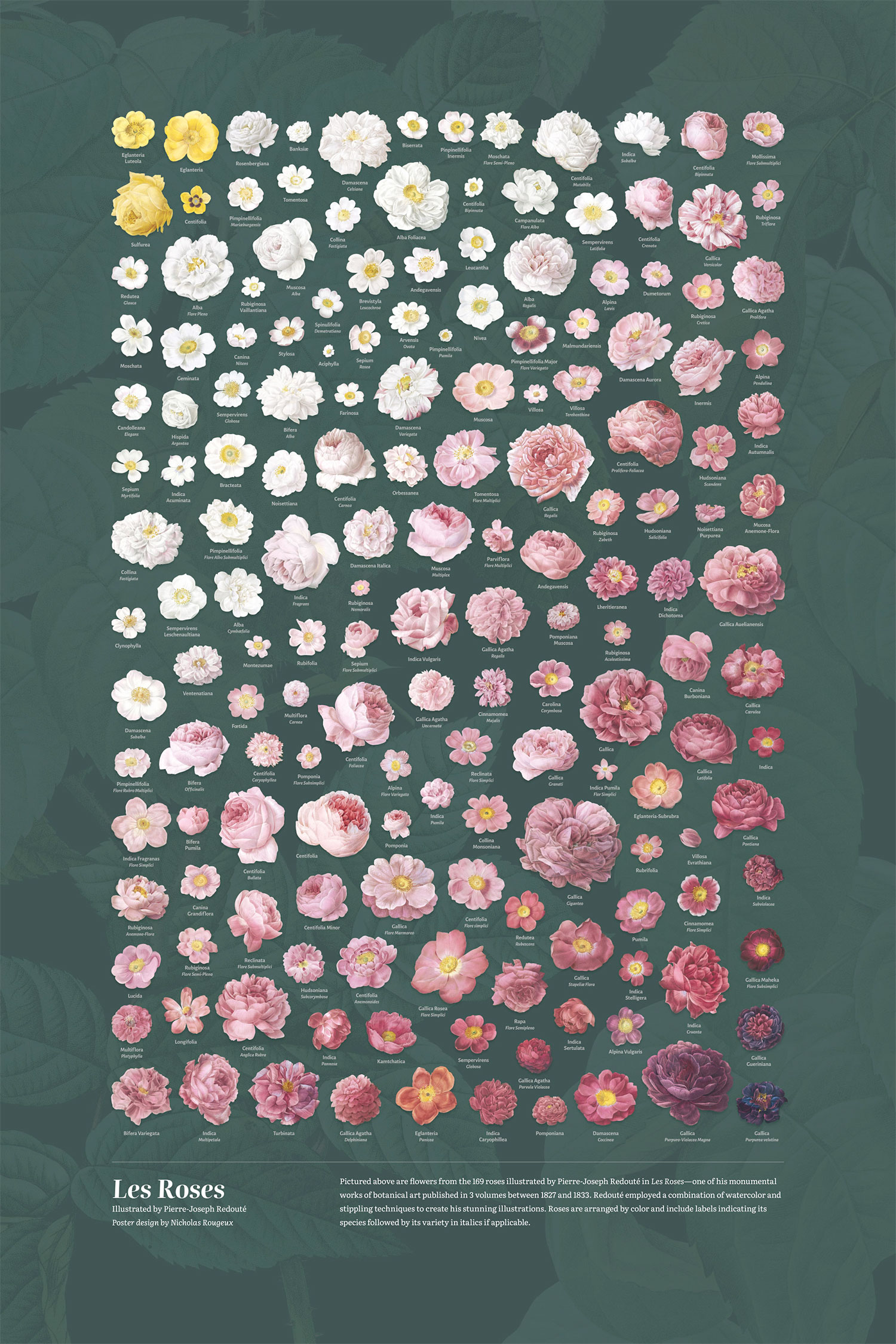
I naively tried to recreate it in poster form and add labels but seemed to forget the lessons I learned on my hummingbirds posters—the most important being: place the images first, then labels. I foolishly tried to position all the labels in the same position relative to each flower and tried a variation where I placed each flower with its label at the same time instead of all flowers first. The results were frustratingly subpar. Once I remembered my process for the hummingbirds posters, I started over again but with the interactive collage. After spacing those out to fit a poster layout, I placed the labels where they fit best and tried not to move the flowers much. The result was much better.
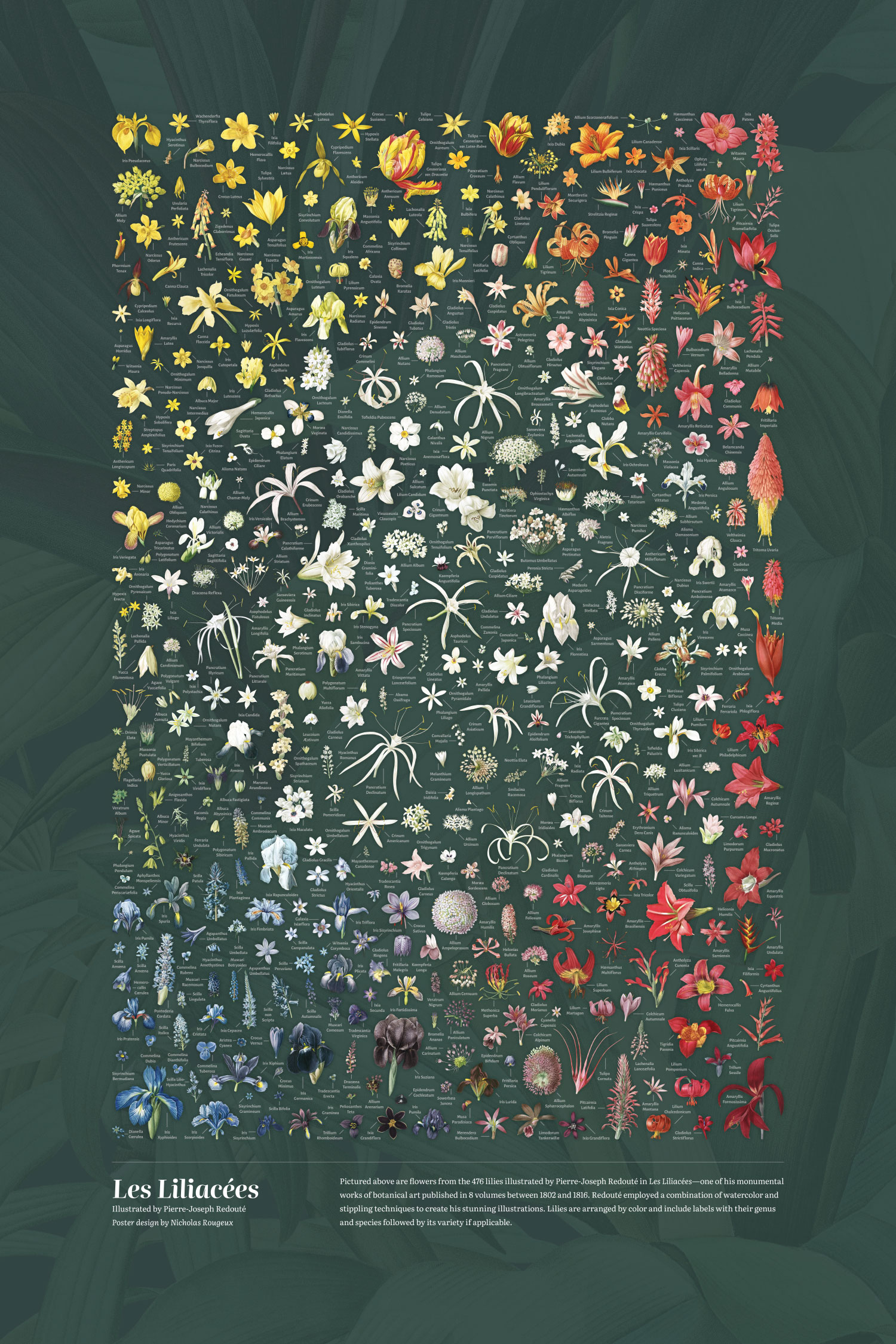
The lilies poster was substantially more complex because of the same challenges I encountered with the interactive collage but also because I needed to add 476 labels and wanted to try a different color arrangement. Rather than a blend from top to bottom like the interactive collage, which would have felt unbalanced in poster form with all the white lilies at the top, I opted to put all of them in the middle with the other color groups surrounding them. This proved to be a lucky choice because it allowed me to place the lighter shades of some colors closer to white the darker, more vibrant colors toward the outer edges.

With the lilies placed, it came time to add the labels. Given the lilies were packed so densely, I wasn’t sure that they would fit but I approached it methodically by placing each label in numerical order of the plates (label for the first plate first, second plate second, etc). This proved to be better than trying to label all the flowers from one edge to the other because it allowed me to place them evenly throughout the poster and make minute adjustments as needed. This way, I made adjustments evenly throughout instead of shifting everything toward one direction or another. Plus, placing them in numeric order allowed me to keep track of them and make sure I didn’t miss any. This process of adding labels can be seen in the images below which show the poster with no labels, first 100 lilies labeled, first 200, and so on until they’re all labeled.
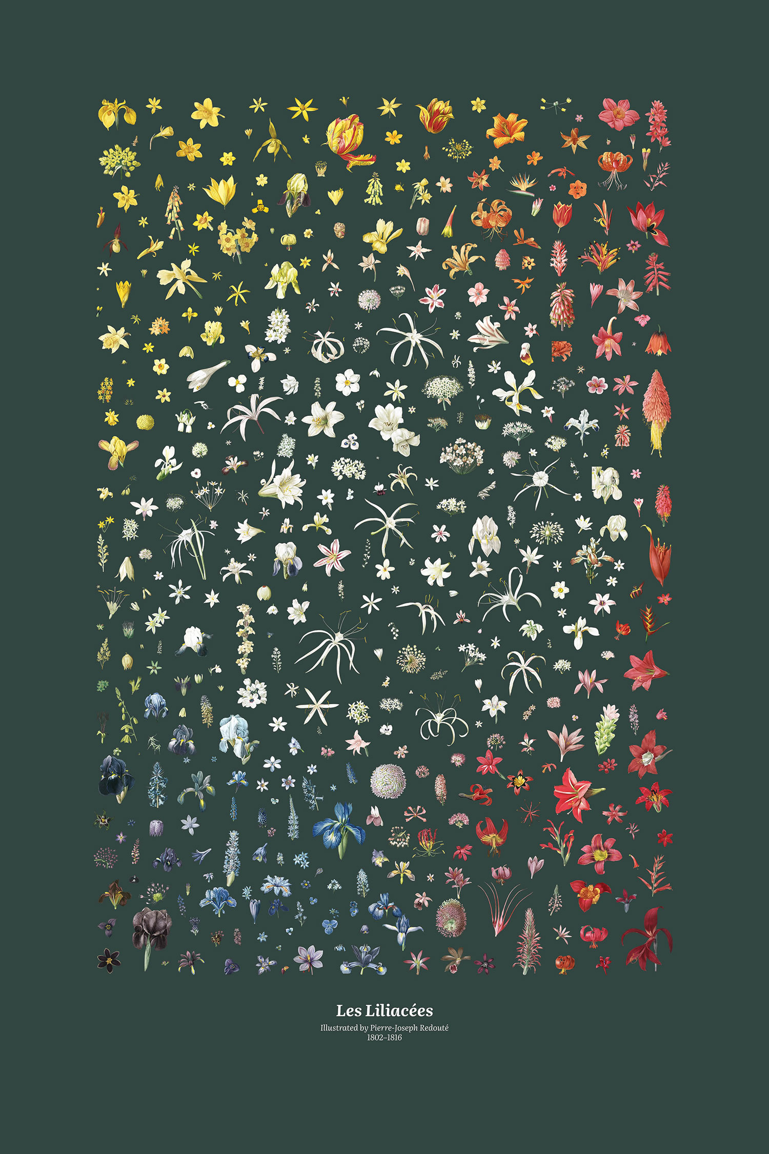 Drag slider to see the progress of arranging the lilies poster labels.
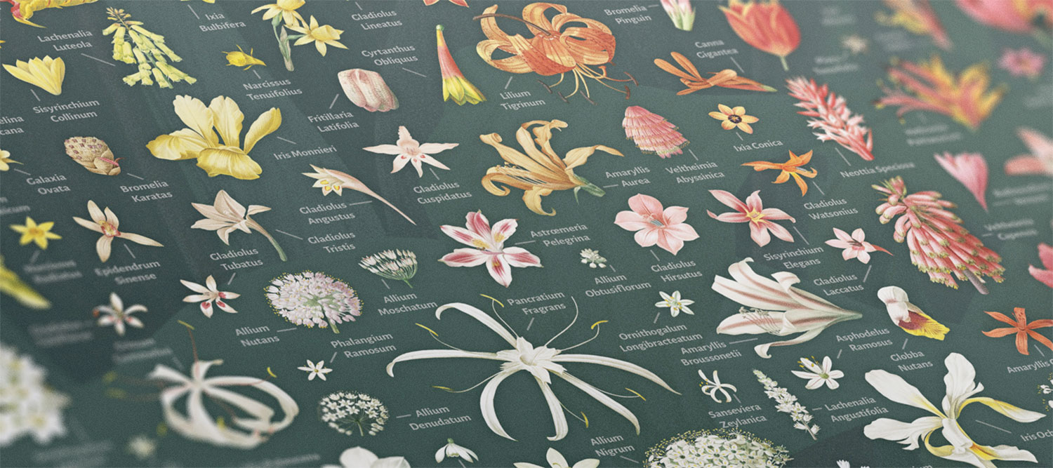
The final poster turned out better than I expected. It’s dense, but the wide range of colors is clearly visible and all the flowers are labeled.
Making this “Making of…”
I don’t usually write about my writing process because I’ve never considered it particularly special but found this post interesting for a few reasons that I wanted to share.
When I started this project back in November 2023, I worried that I wouldn’t have enough interesting behind-the-scenes information to fill a blog post. This is a common worry I have with most blog posts, but especially this one because I thought the creation process would be relatively straightforward. Still, I pressed on and “scribbled” notes in a Google doc as I worked on it. These notes contain everything from other sites found during research, technical articles for building the site, inspiration, and anything else that comes up during the lifetime of the project. This has proven to be one of the most valuable ways for me to take notes over the years because it’s fast, free, and always available to edit on all of my devices. As I reached the end of this project, Google added tabs to docs, that allows for easier organization—a welcomed enhancement.
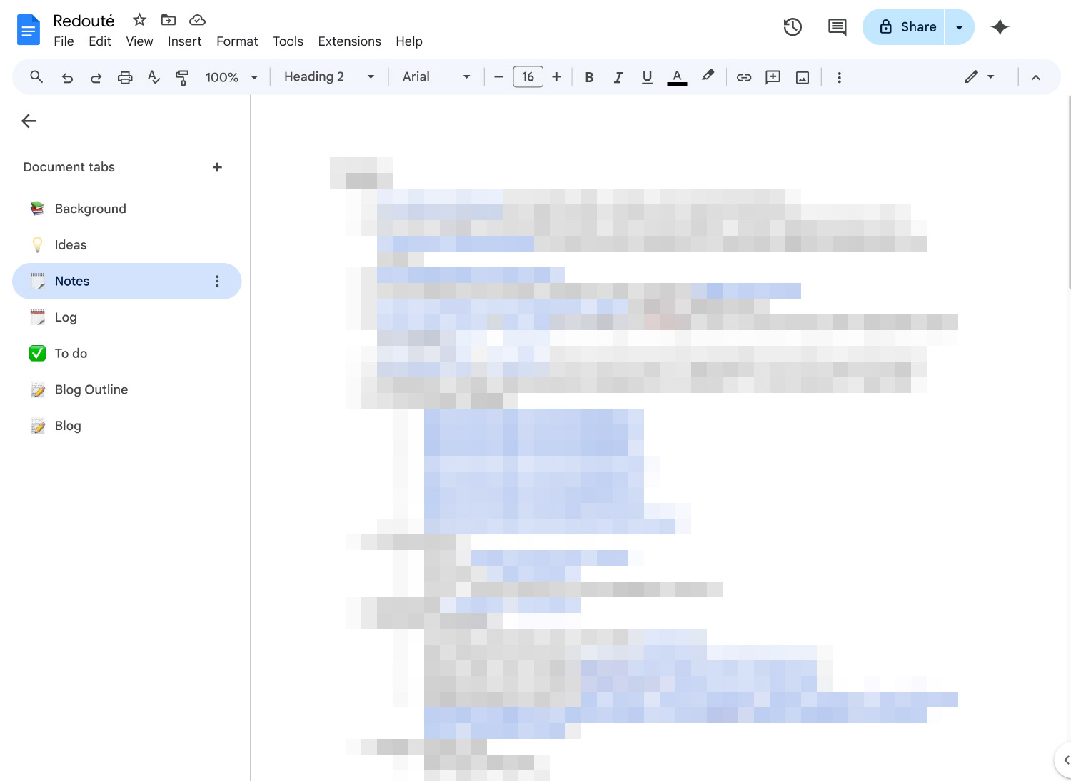
When I finished the project and it came time to write this post, I struggled to get started but after creating a rough outline and forcing myself to write anything, I became incredibly focused—spending days doing stream-of-consciousness writing during every free moment I had on any device that was available. Much to my pleasant surprise, I found more than enough to write about…and a long list of images to create as supporting material.
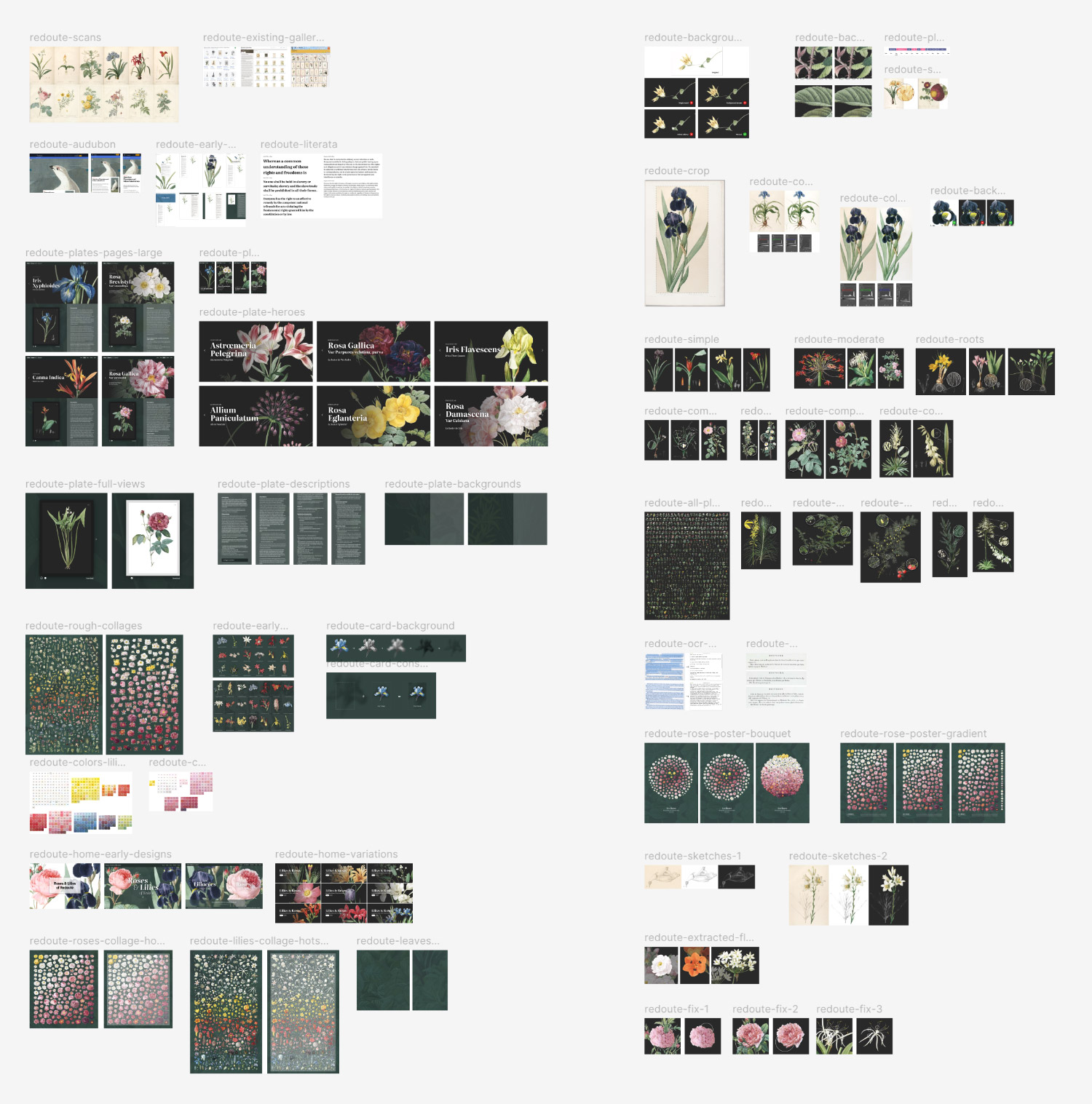
During writing, I added placeholders where I want to insert images. Then, after the first draft and basic edits were made in Google Docs, I converted it to clean HTML and added it to my site so I could preview it as I added images. In years past, I used to create a plethora of Photoshop files for these, which unnecessarily cumbersome to manage. In recent years, I’ve used Figma and it’s made a world of difference. Instead of dozens of disparate files to sort through, I create a single Figma file with pages for mockups, ideas, and images for things like this blog post. Plus, I can work on the images from anywhere instead of syncing files back and forth between devices. This isn’t a groundbreaking use of Figma but it has greatly improved my workflow over the years. However, I still found the need to use Photoshop to save images with better compression for the web. I usually export an image from Figma then use Photoshop to scale it down and save for the web. After all the images and their captions were been added, I re-read the post several times and making the final edits before publishing.
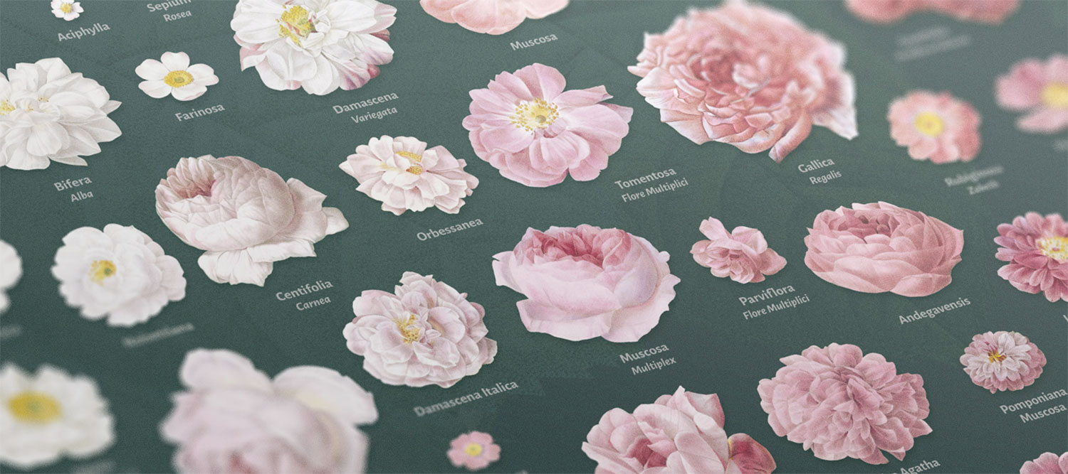
Soon after I completed both posters, I ordered test prints to see how they would look. To say I was pleased would be an understatement. The test prints turned out perfectly. The colors were incredibly vibrant, the text was very legible even though it was small, and all the details were showed up beautifully. Sometimes, smaller details get blurred but not this time. Setting my work in print never gets old. The digital world is so easily manipulated but printed materials have a finality to it and requires a commitment of time, money, and resources. Seeing these posters in person for the first time was a wonderful experience and a nice reward for completing the long 11-month project. The images I’ve posted above don’t do the posters justice. I wish I had a better camera to take closeup photos to showcase all the details.
Final thoughts
I have a bit of a love-hate relationship with long projects like this. I love that I have a goal that I’m slowly but surely working toward but hate that it takes so long to achieve it. I love knowing that I’ve got something to keep me busy but hate that I don’t make time for other projects. I love seeing the final result but hate when it’s over. A lot happened during this project and I’m excited for everyone to explore Redouté’s work in a new light.
