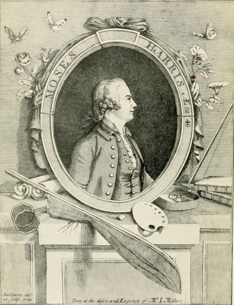
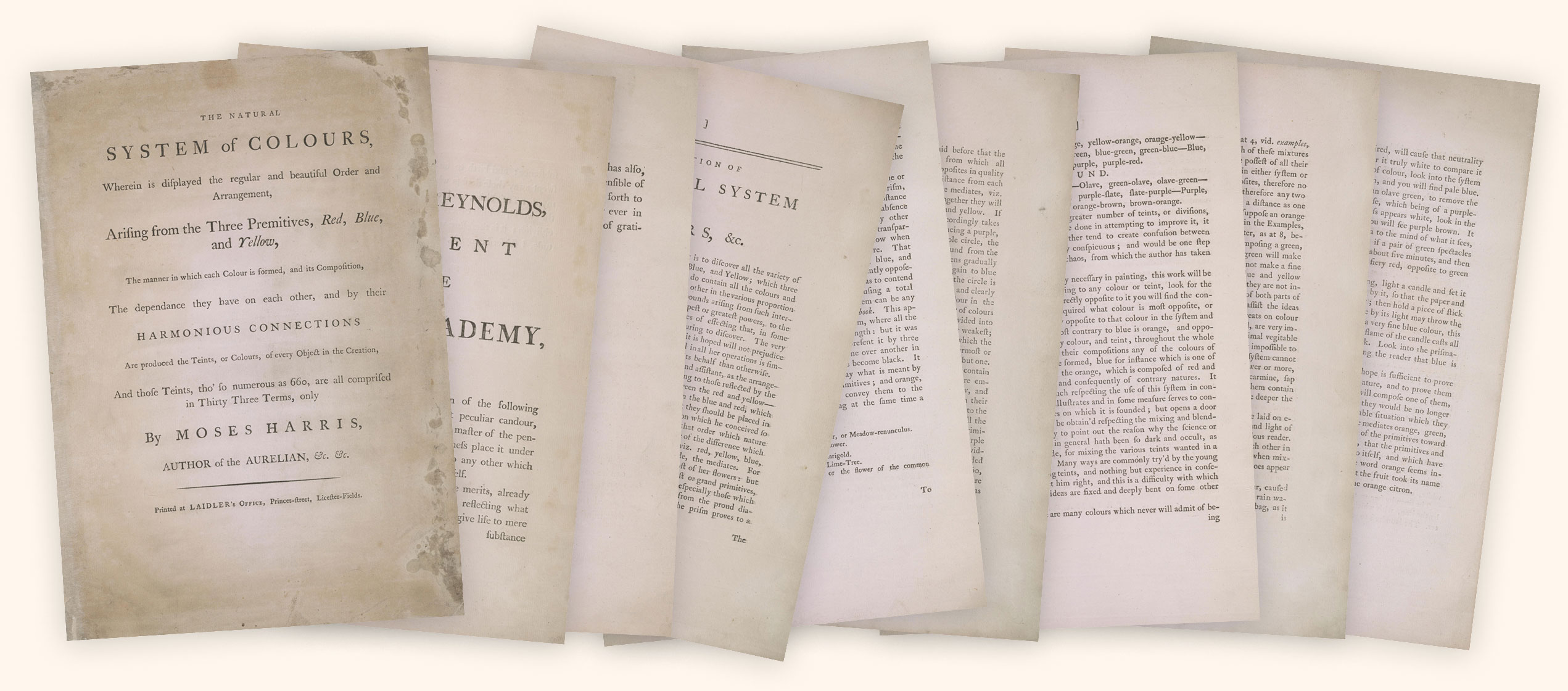
The Natural System of Colours
Recreating Moses Harris’ color wheels from the eighteenth century
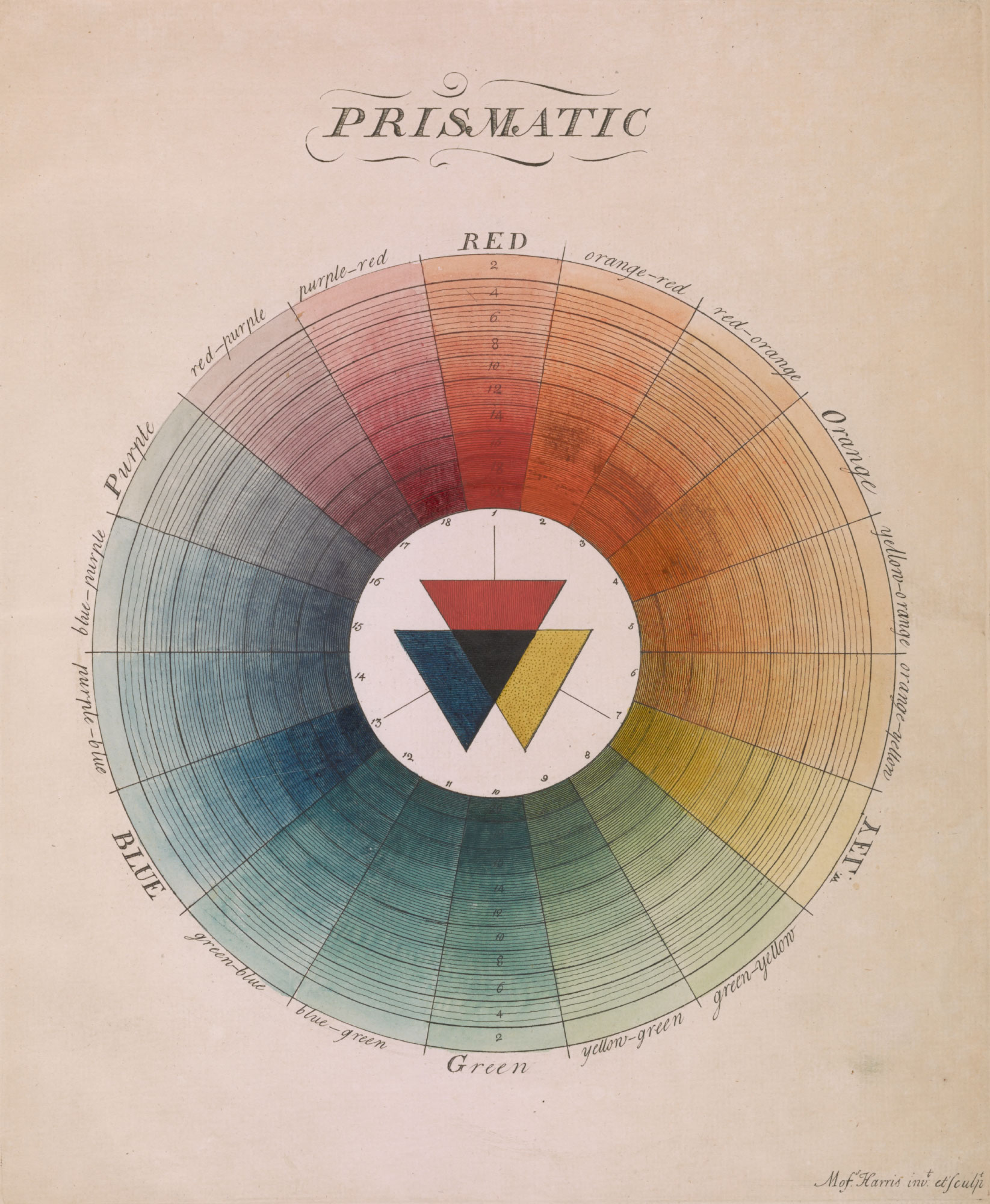
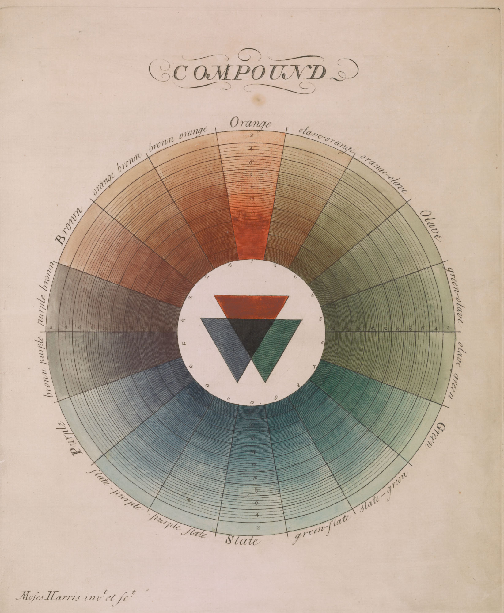
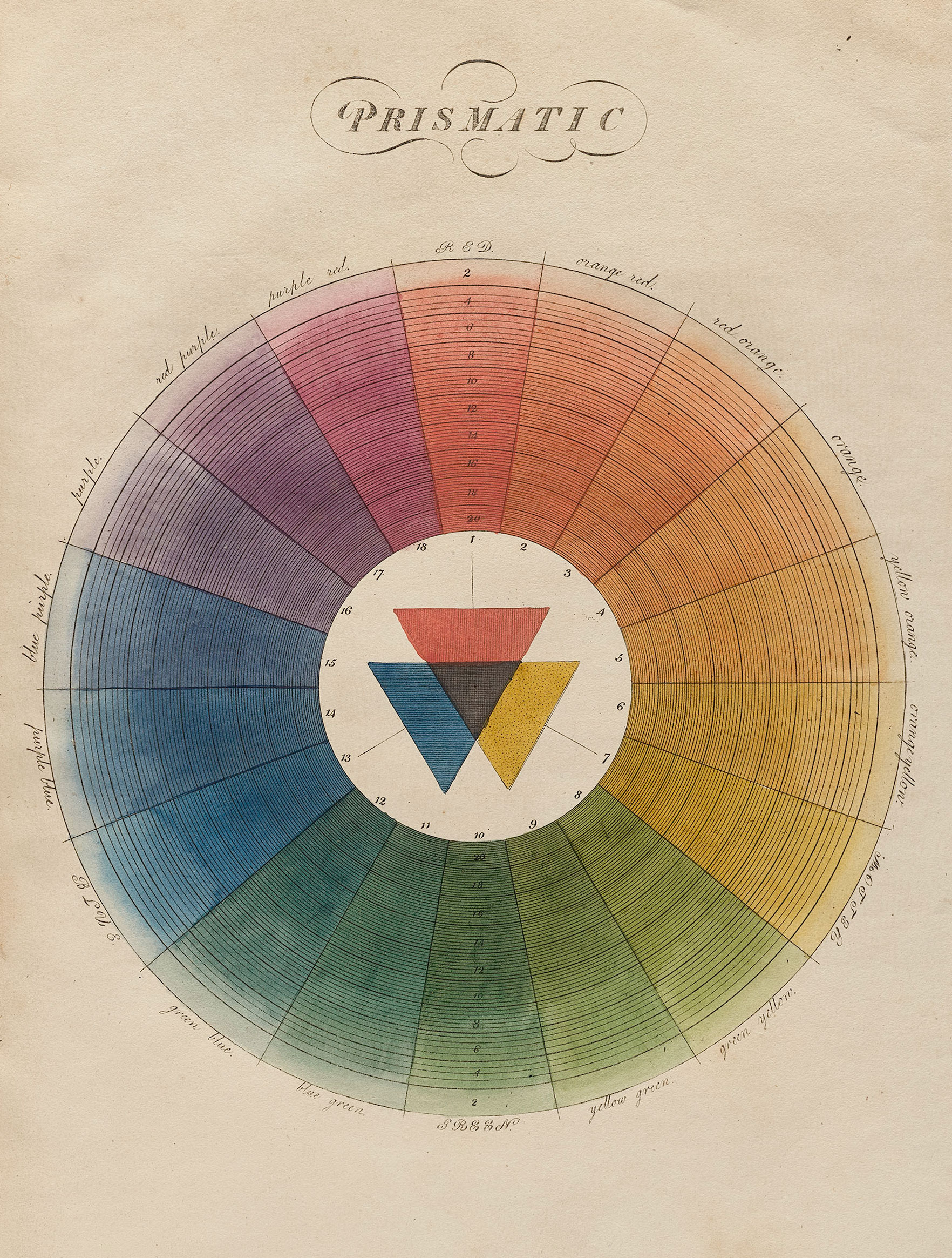
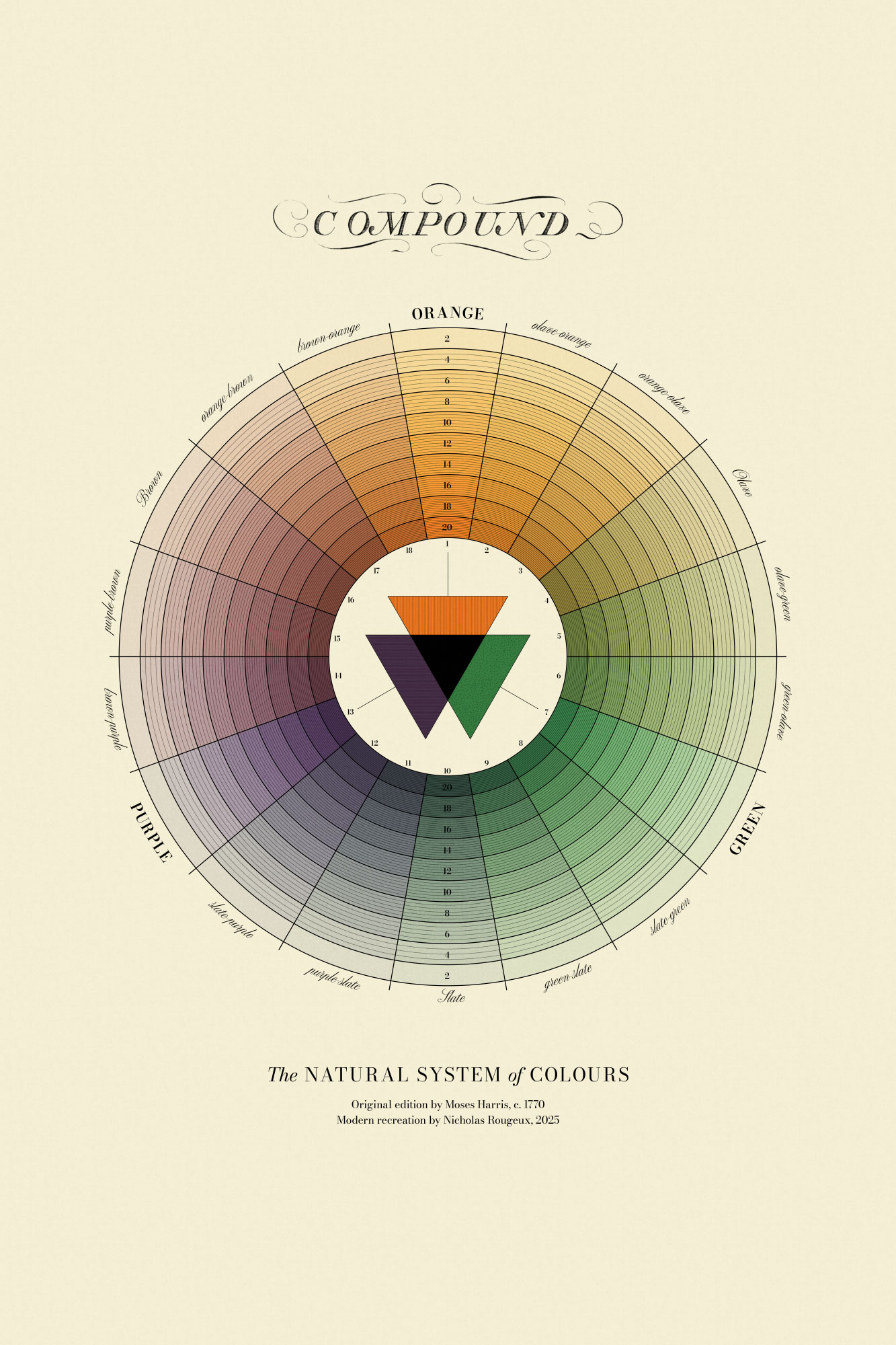
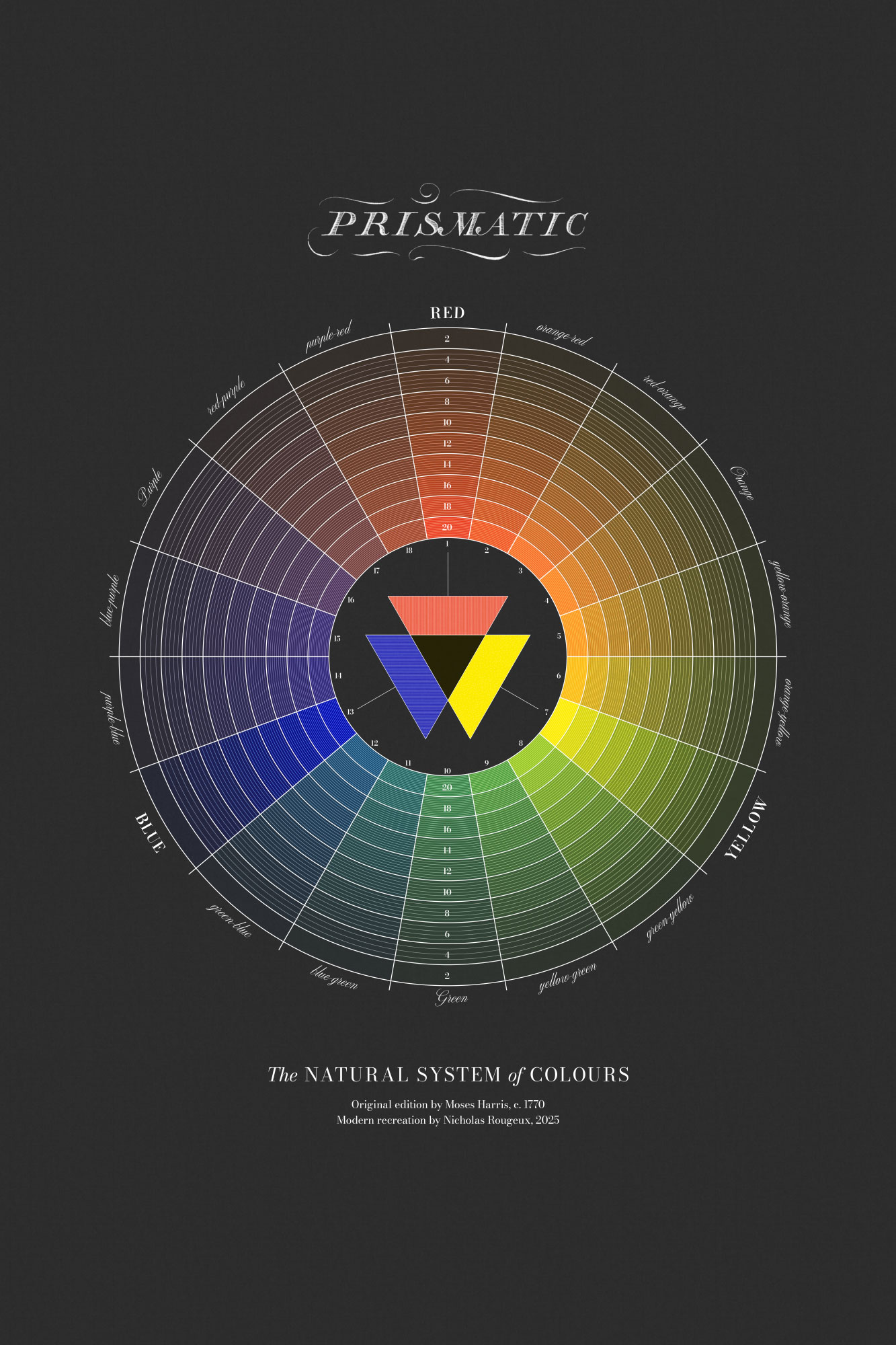
Published in 1766, The Natural System of Colours by Moses Harris, is a significant work in the history of color theory. Harris proposed that all colors are derived from three primary colors: red, blue, and yellow. He meticulously explored how these “primitives” could be combined to create a vast array of tints. His work featured two groundbreaking color wheels: the “Prismatic” wheel, based on the colors of the rainbow, and the “Compound” wheel, which demonstrated the relationships between secondary and tertiary colors.
Harris’ system was not only theoretical but also practical, aiming to provide artists and dyers with a systematic approach to color mixing. He emphasized the importance of understanding color relationships and the harmonious connections between different hues. While some of his ideas have been refined by later scientific discoveries, The Natural System of Colours remains a valuable contribution to our understanding of color and its organization.
At only nine written pages (including a title and dedication) it was a short treatise but its depiction of color wheels had a lasting impact.

This project is a recreation of Harris’ famous color wheels using modern digital methods and an expansion to behavior on dark paper for a new take on an old idea.
Harris originally listed two or three sources of where to find the “primitives” (primary) and “mediates” (secondary) colors in nature.

Primary colors for this project were sampled from equivalent swatches from the Daniel Smith artist materials website: organic vermillion, cadmium yellow, and ultramarine blue.
These three colors form the basis for all colors on the wheels.
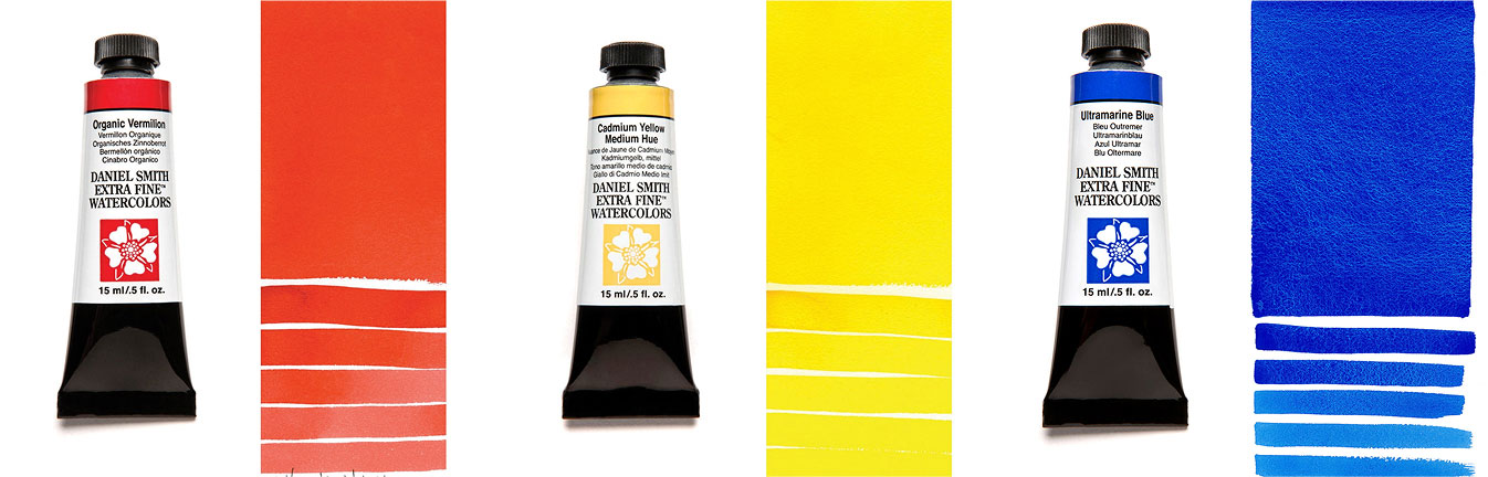
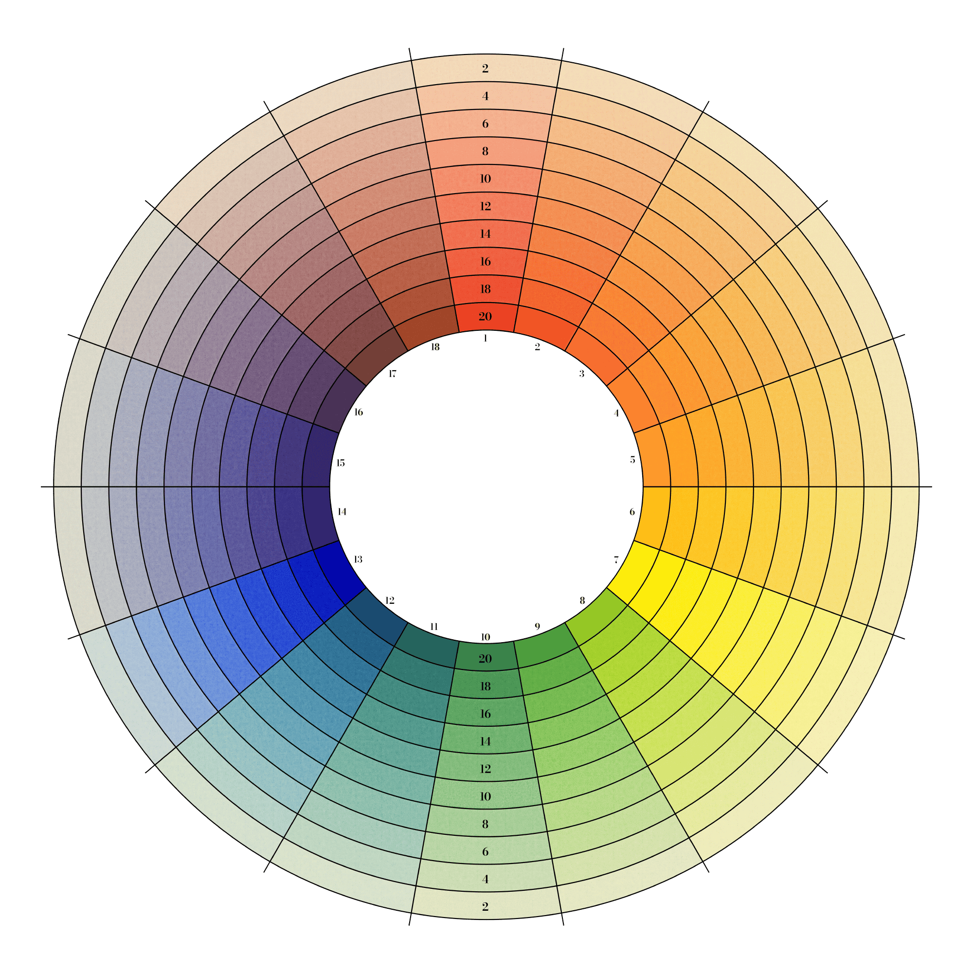
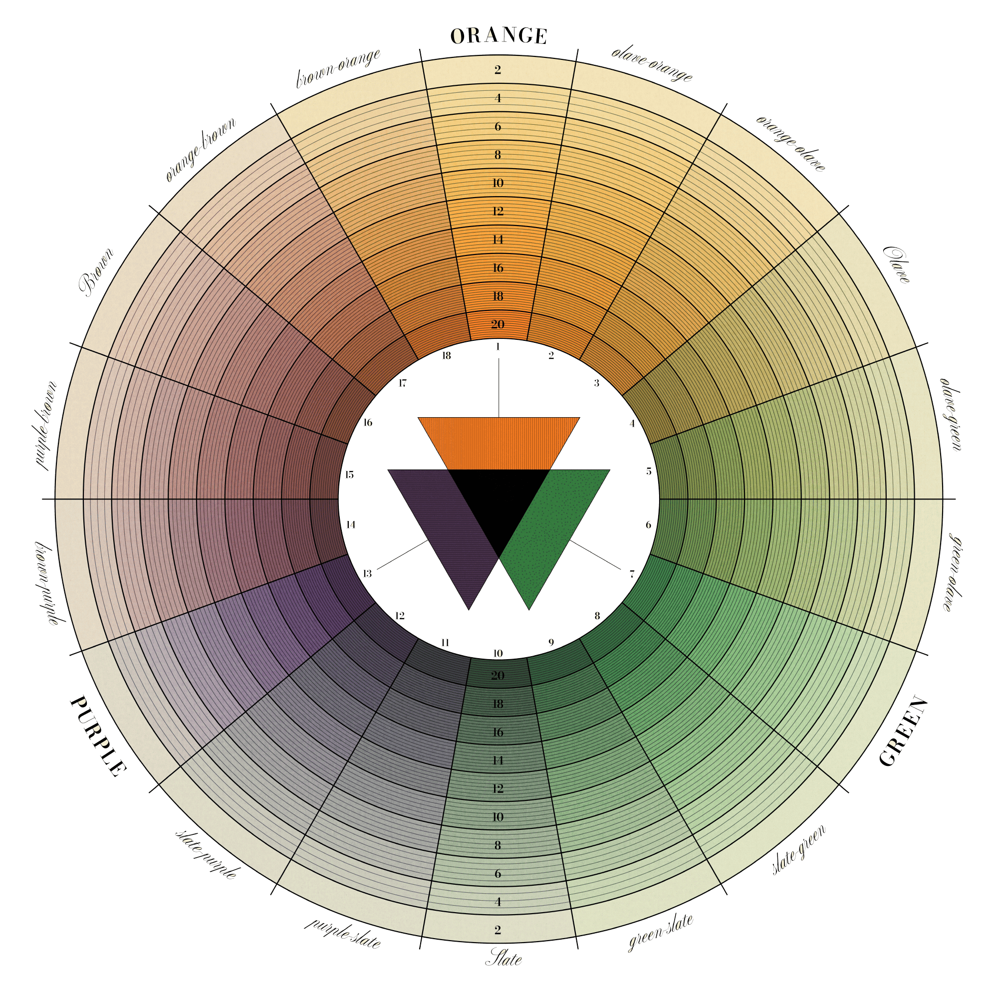
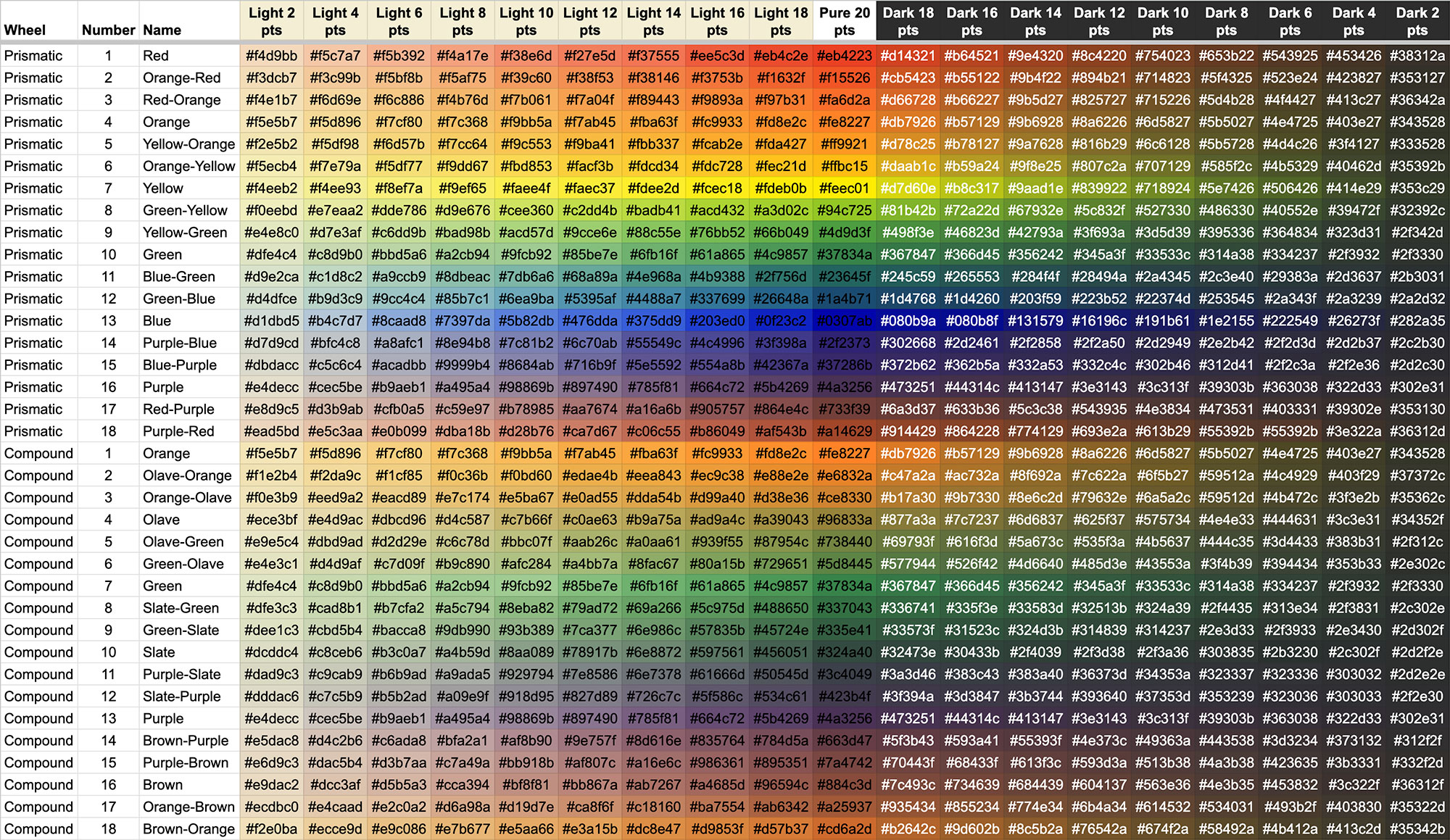
To mimic realistic watercolor behavior, Rebelle 7 Pro was used to paint the swatches and mix colors on realistic paper backgrounds. The red, yellow, and blue colors were used to create the secondary colors of orange, green, and purple. and combinations of those were used to create tertiary colors (orange-red, green-yellow, purple-blue, etc.) between them used on the prismatic wheel. Secondary colors were used as the basis for the compound wheel and mixed to create tertiary colors (olave [sic], slate, and brown. as well as quaternary colors between them).

Mixing colors is an imperfect exercise. Harris stated as much toward the end of his treatise. The colors mixed here were done with an eye toward creating an even distribution of colors around the wheel.
“Color which we may call material, or artificial, are very imperfect in themselves, and being made of various substances as animal vegetable and mineral, meketh the colouring part extremely difficult if not impossible to be done, with any degree of perfection, a colour according to the system cannot be perfect.”—Harris
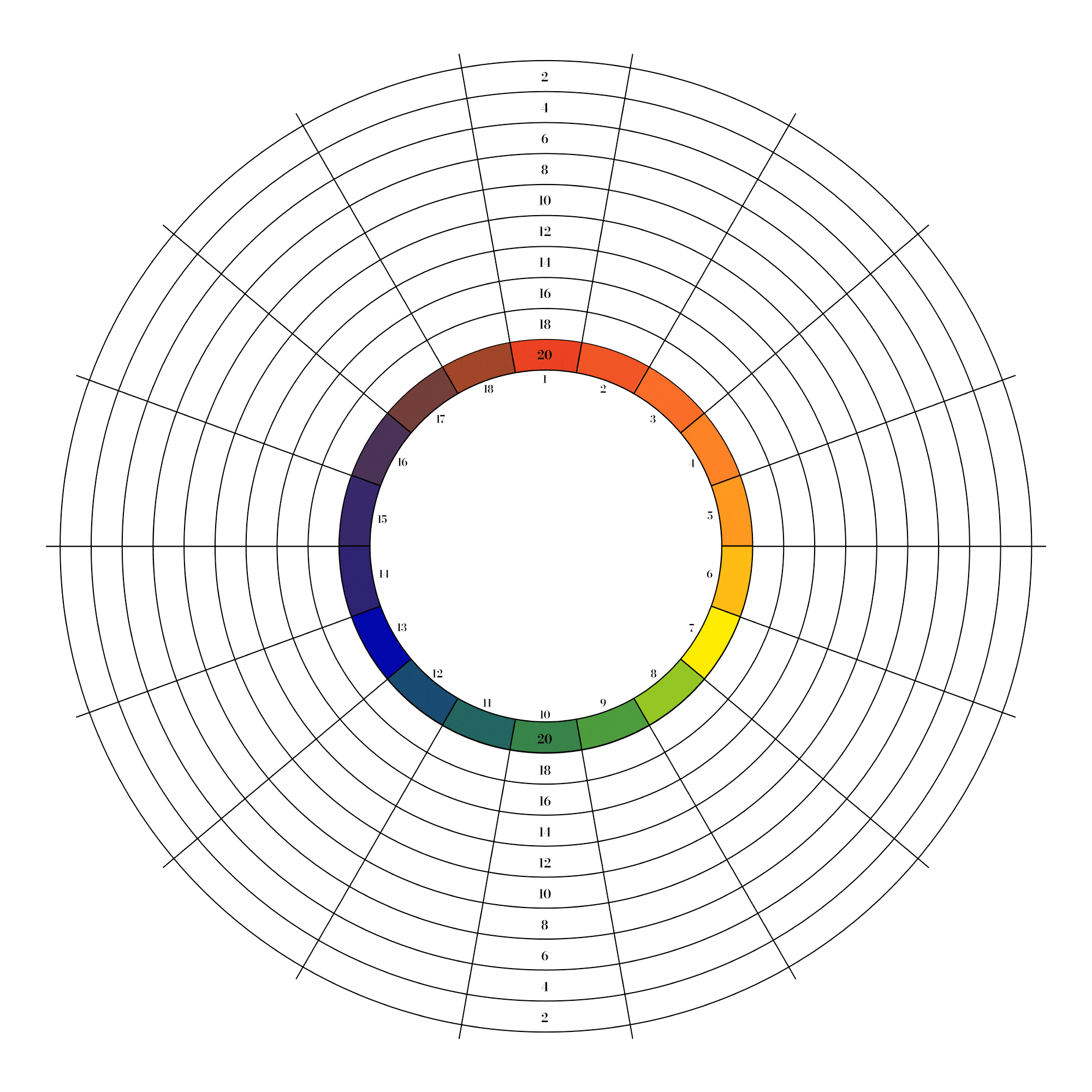
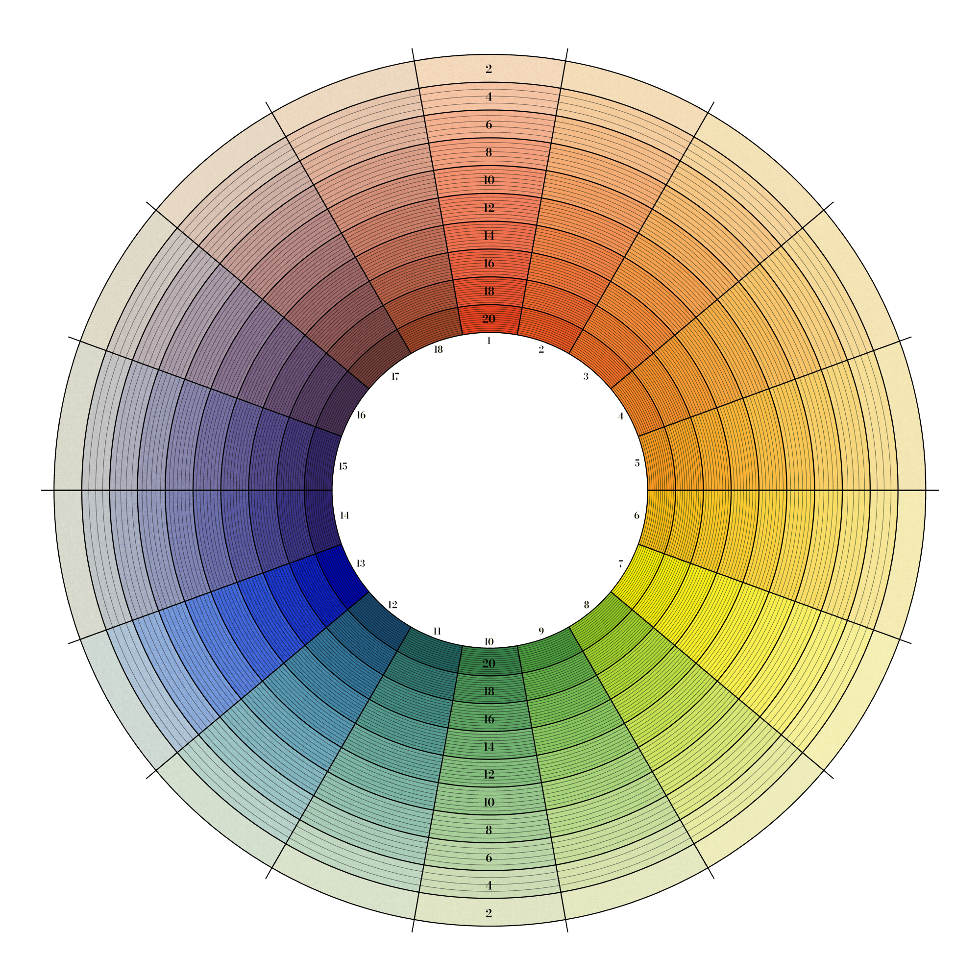
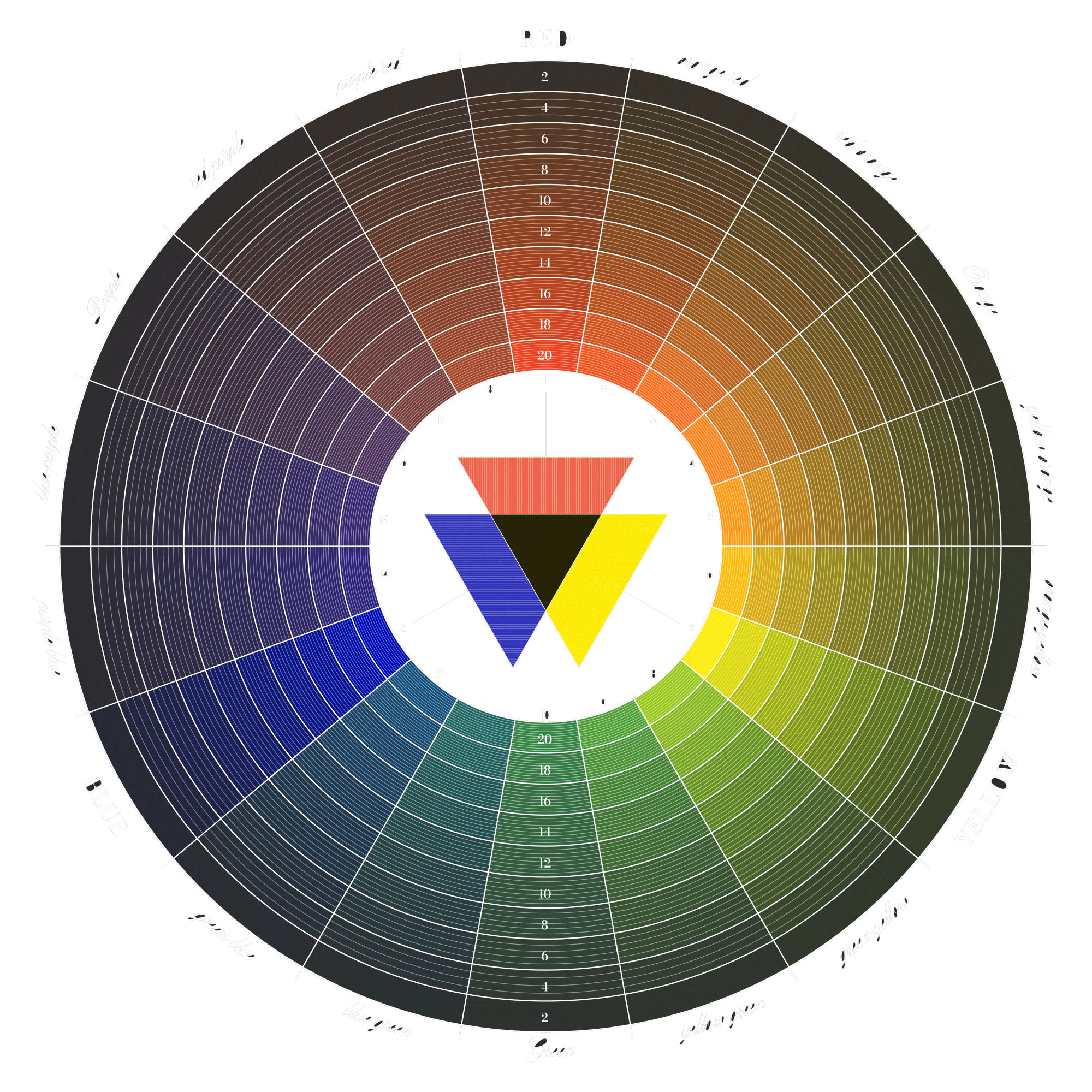
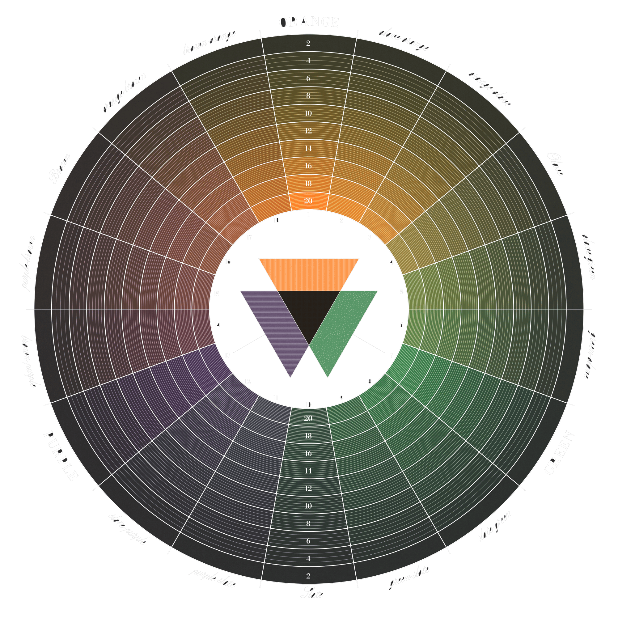
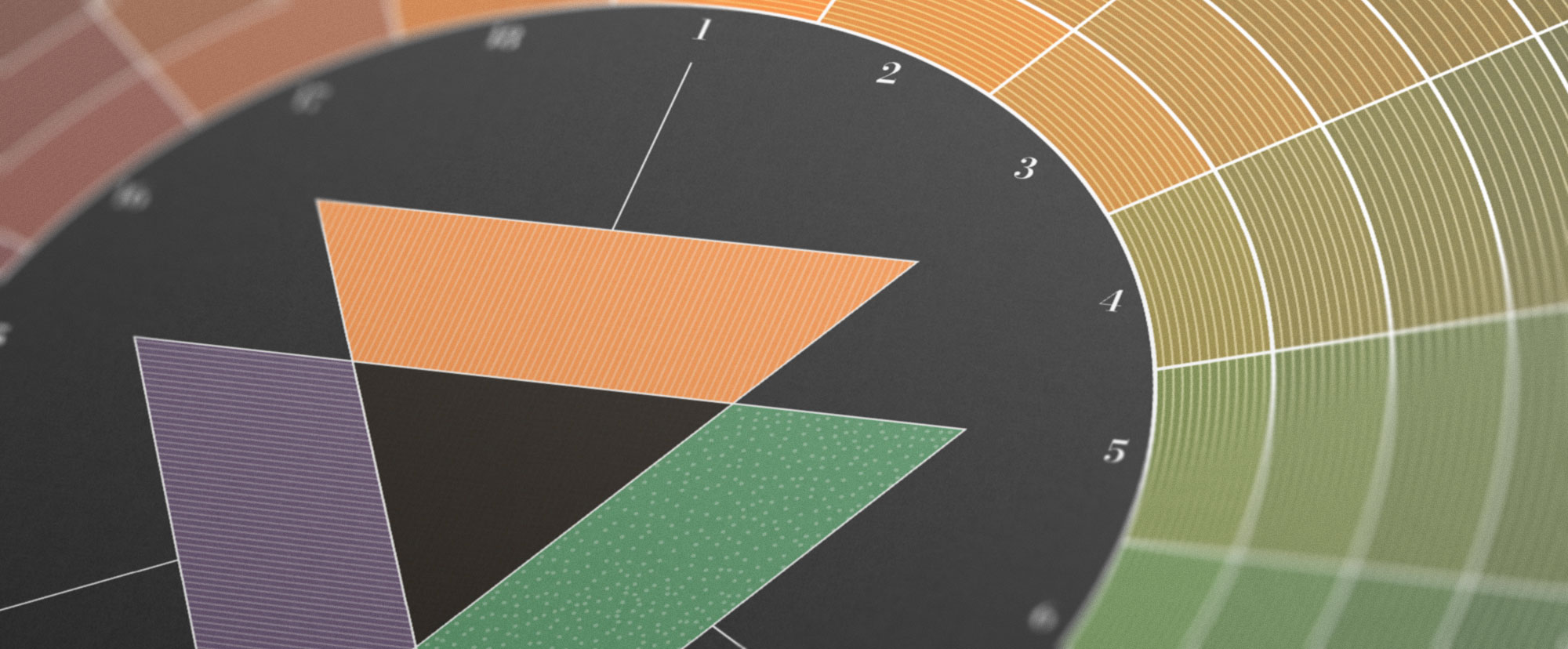
Harris arranged each wheel with 18 numbered sectors—basing his prismatic wheel on red, blue, and yellow arranged equidistant from one another and the remaining colors in between them. Each sector was masked off digitally and colors were painted inside them.

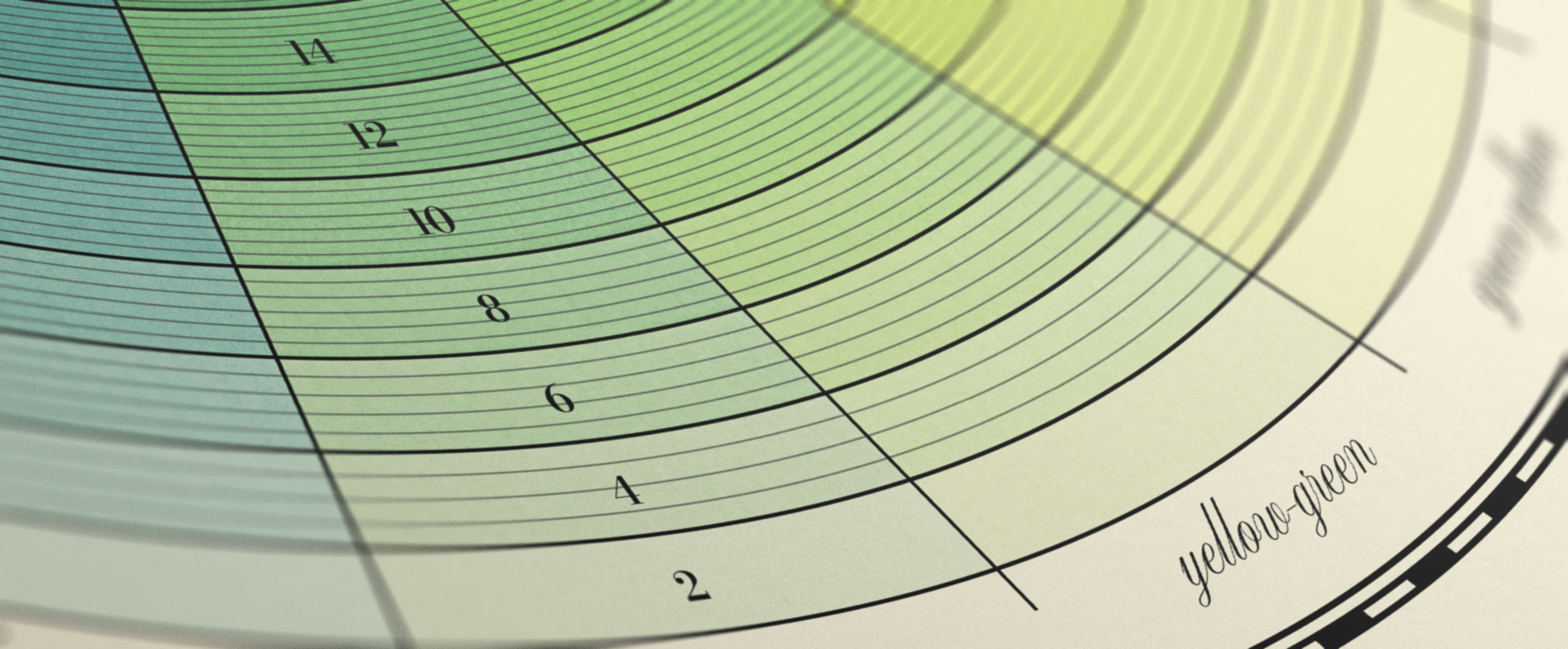
Harris used concentric circles to represent saturation levels decreasing from the center outward, measured in parts ranging from 20 parts (total saturation) to 2 at the edge.
Saturation was mimicked digitally by decreasing the opacity of each color painted (100% at the center and 10% at the edge)—allowing the texture of the paper to show through.
Harris overlaid additional black concentric circles that increased from 3 to 12 for each saturation level to vary the tone of each color, resulting in “a complex interplay in which the primaries never appear in their original form in the circle.”—Spillman, 2004
The center is filled with textured overlapping triangles representing the three base colors and a black triangle for all three colors combined.
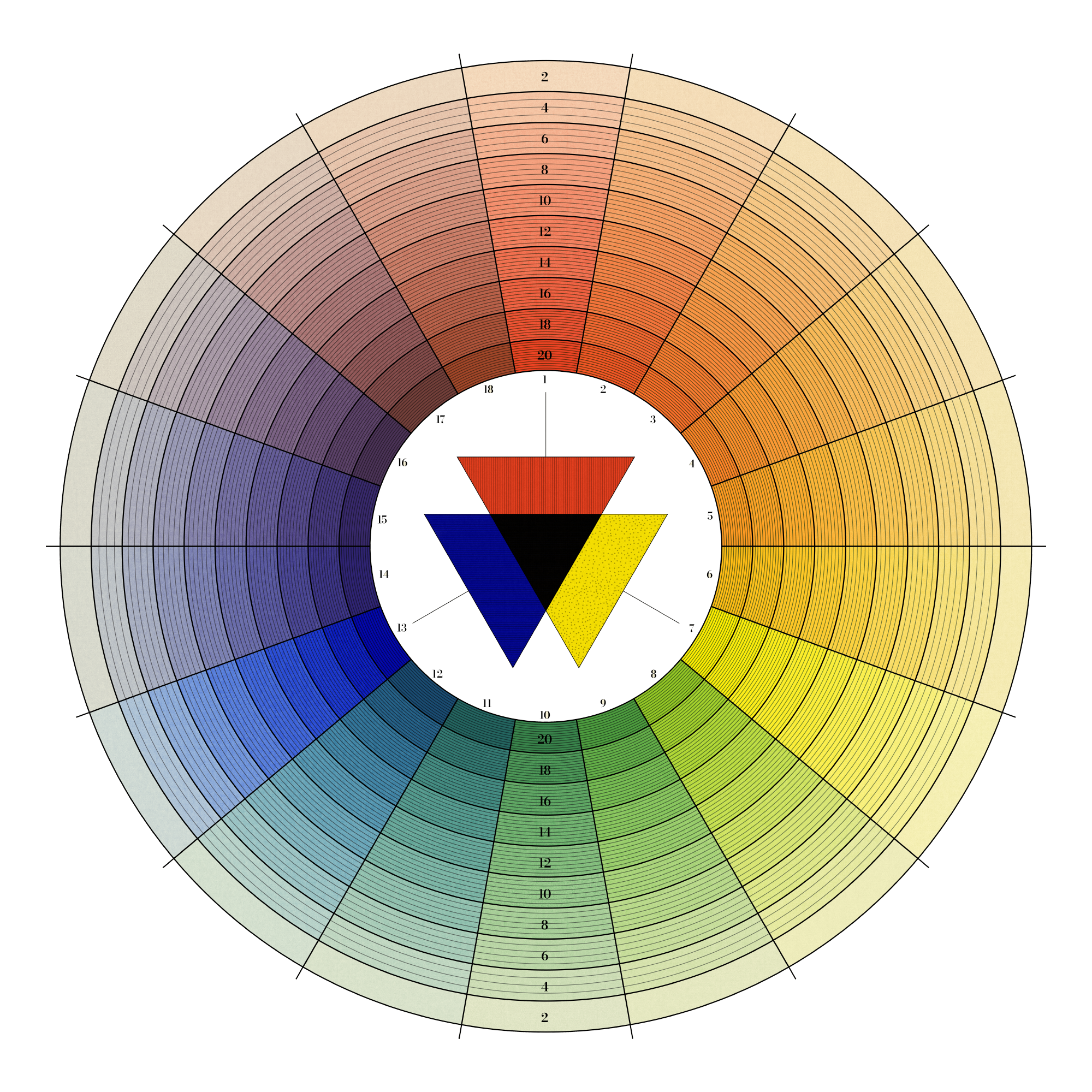
Finally, the names of each color were written along the outer edge with the primary colors in a bold capitalized serif typeface, secondary in a script with the first letters capitalized, and all others in lower case—similar to the first edition.

The compound wheel is structured the same as the prismatic but with secondary colors orange, green, and purple in place of red, yellow, and blue respectively. Tertiary and quaternary colors fill the remaining spaces.
Using the structure from Harris’ wheels, a dark version was created by changing the black lines and labels to white.

The dark paper resulted in a different interplay between it and the colors’ varying saturation (opacity)—making them appear brighter in the center.
Mixing physical colors has historically been a imprecise effort and doing so digitally is continuing to evolve. Most efforts to reproduce Harris’ colors wheels have produced similar results but none match exactly. This project was a design exercise in using solely digital methods to reproduce his wheels in a realistic manner.
The final four color wheels represent a new take on an old idea and are available as wall posters in both light and dark versions.


Additionally, a combined poster both color wheels is also available in a light and dark version. Included on each are color-restored scans of the first and second editions of Harris’ wheels and a small guide on where to find the colors in nature.


Data for both light and dark sets of colors (627 total) generated for this project are freely available in a public Google Spreadsheet with no restrictions under the CC0 1.0 Universal (CC0 1.0) license. Credit is appreciated but not required.
Learn more about how this project was made