Making of The Natural System of Colours
By Nicholas Rougeux, posted on February 18, 2025 in Art, Data
Recreating Mose Harris’ color wheels from the eighteenth century seemed straightforward until it wasn’t. I’ve long admired his “prismatic” and “compound” wheels and set a small design challenge for myself to recreate them digitally. As with most projects, it took an unexpected turn, but ultimately a good one.
Source material
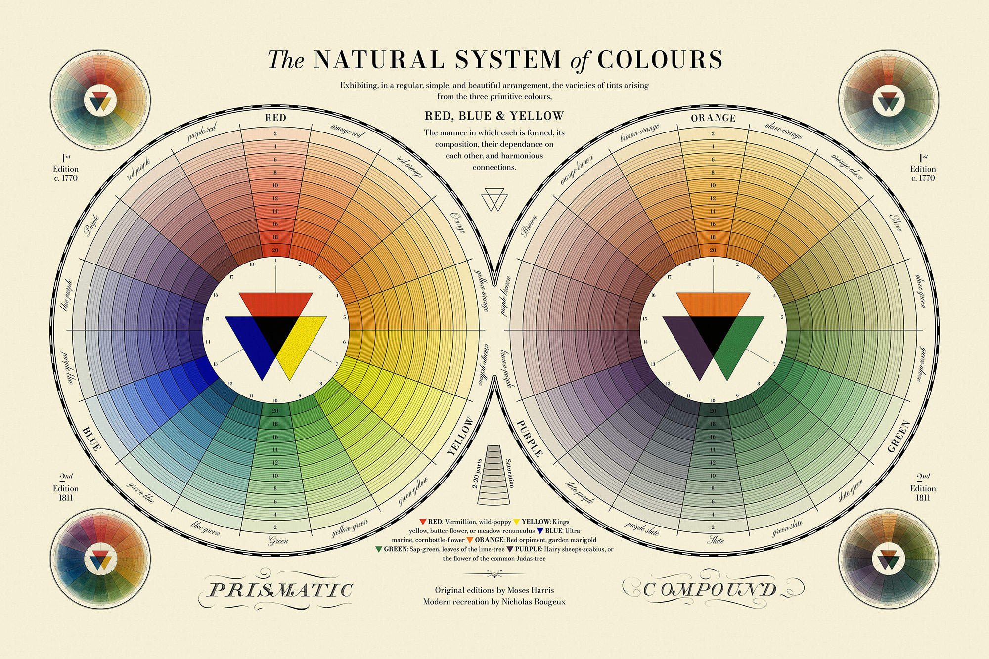
Harris first published his color wheels as part of The Natural System of Colours—a short treatise on color theory around 1766 as it relates to watercolors. His work was notable because it contained some of the earliest color wheels in history that showcased the relationships between primary, secondary, and tertiary colors. In 1811, a second edition with recreated wheels was published after his death. A third variation of the wheels was again created in 1963 for a newer facsimile edition. Due to the imprecise nature of mixing paints, each wheel was different from the last.
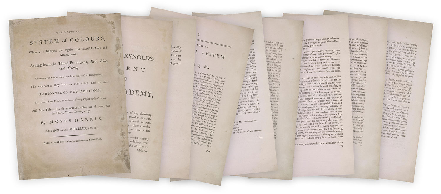

The complete first edition is available at the Library of Congress, select pictures of the second edition can be seen at Lowell Libson & Jonny Yarker Ltd. and Hansons Auctioneers, and some of the third at various resellers like Etsy and WorthPoint (listing one, listing two, listing three). In 2004, Werner Spillman published an excellent research paper comparing the various editions and providing additional details on Harris’ methodology.
Recreating Harris’ color wheels seemed like a fun small design challenge—small enough that wouldn’t even warrant a blog post like this but a few things I learned along the way warranted writing one.
Color wheel structure
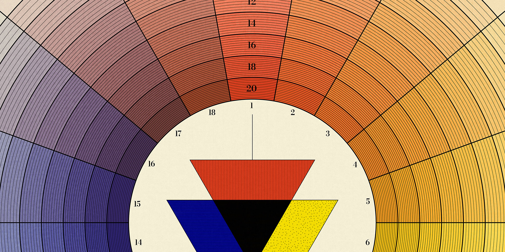
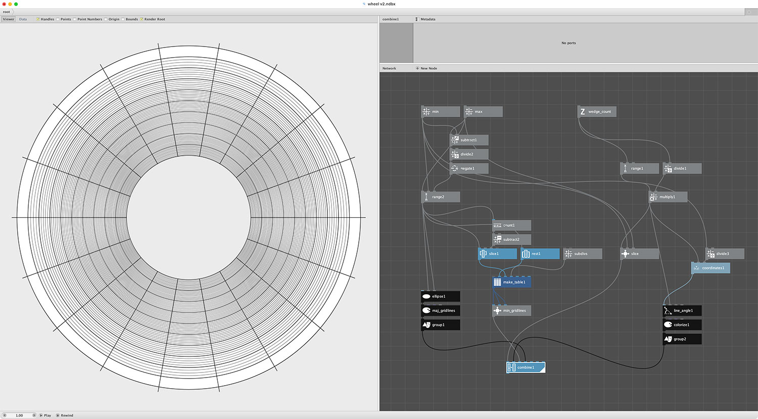
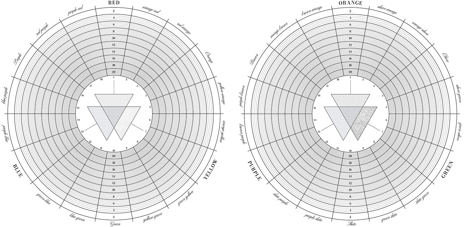
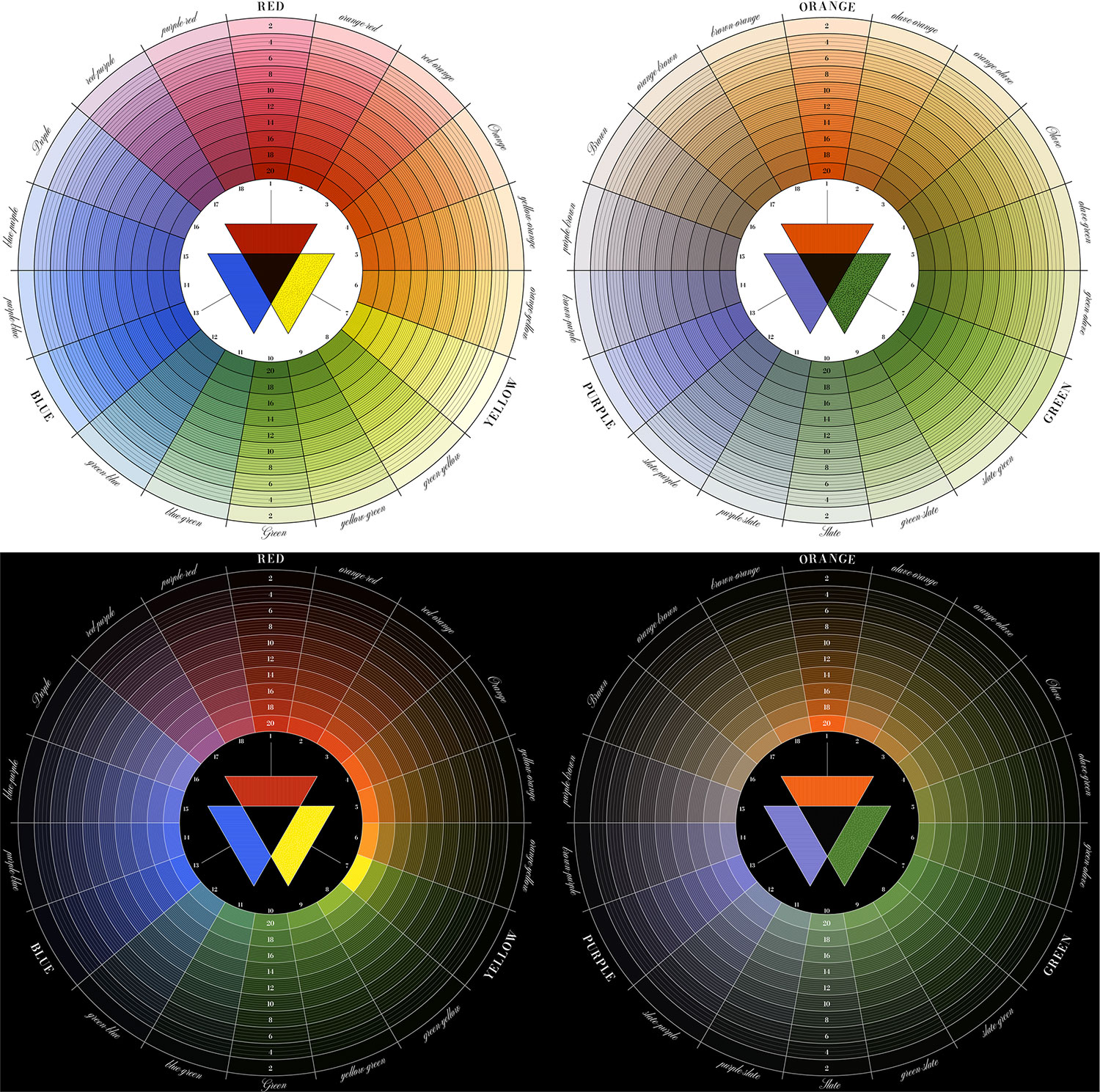
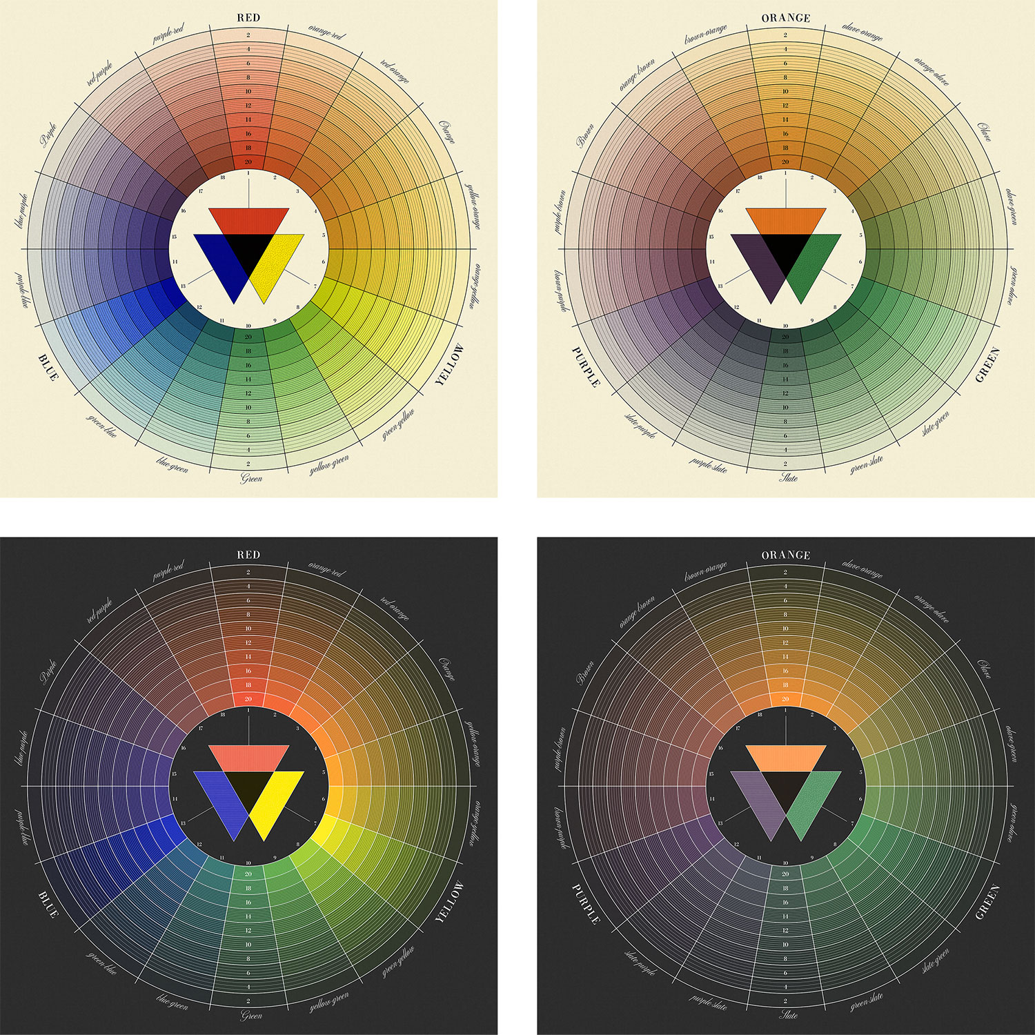
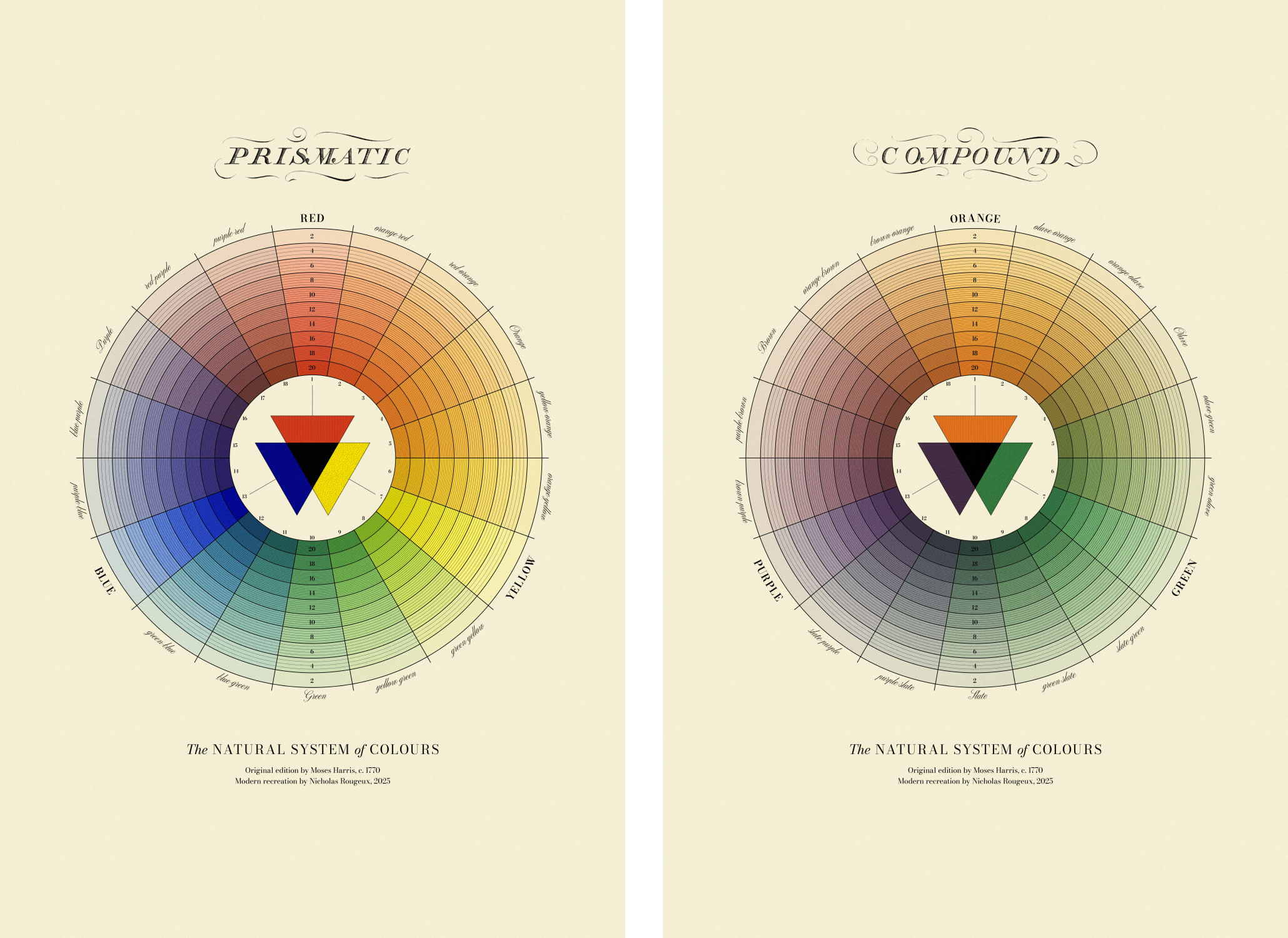
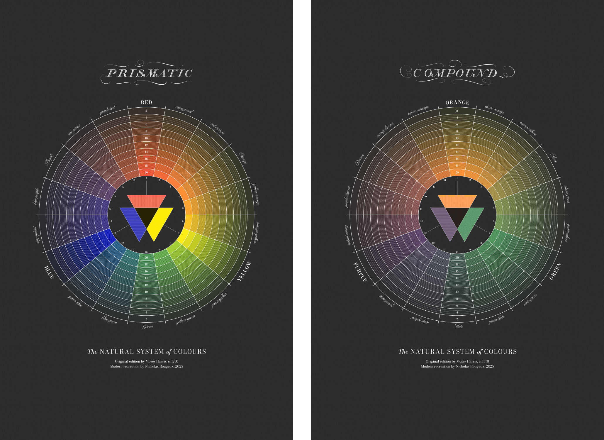
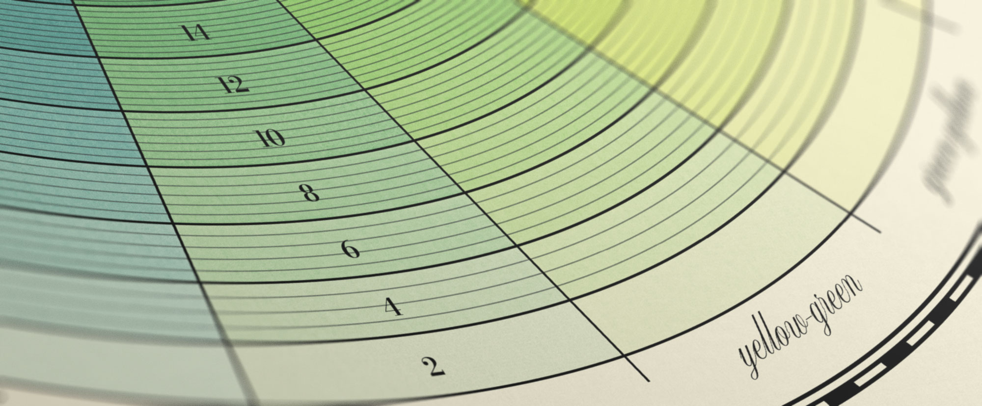
Harris used a relatively simple structure for each wheel: a set of concentric circles evenly divided into 18 arcs by spokes radiating from the center, which resulted in 180 places to paint with colors. The title page of the first edition claims that 660 colors were illustrated but with 180 spots for colors in 2 wheels and 3 set of colors duplicated (orange, green, and purple appear in both wheels), the final tally was only half that at 330.
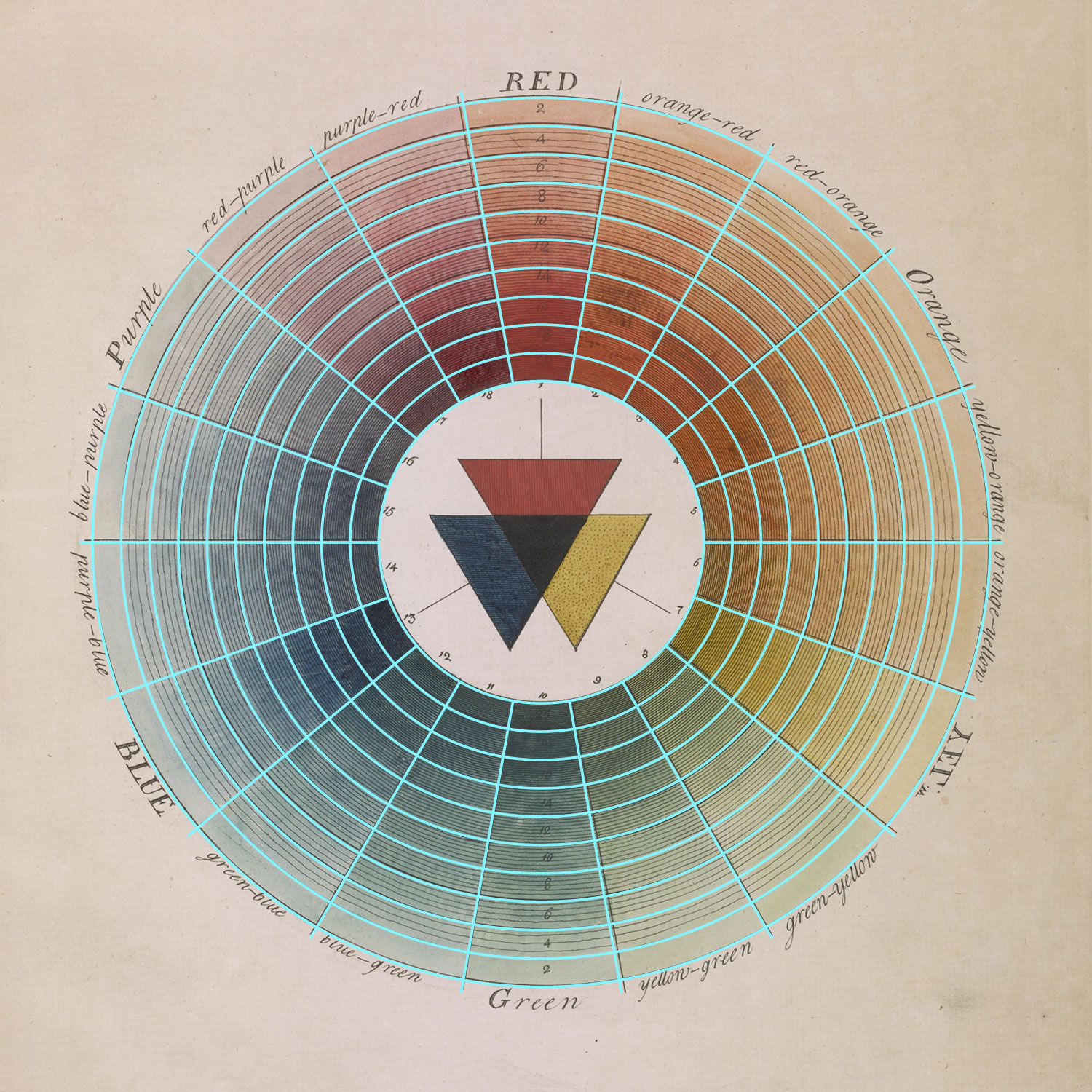
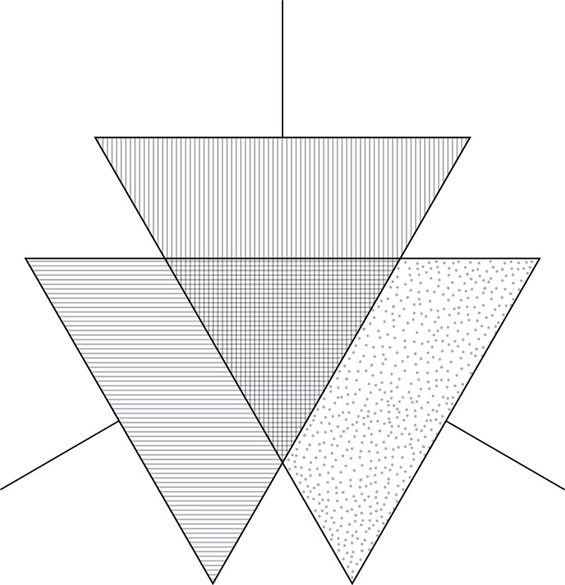
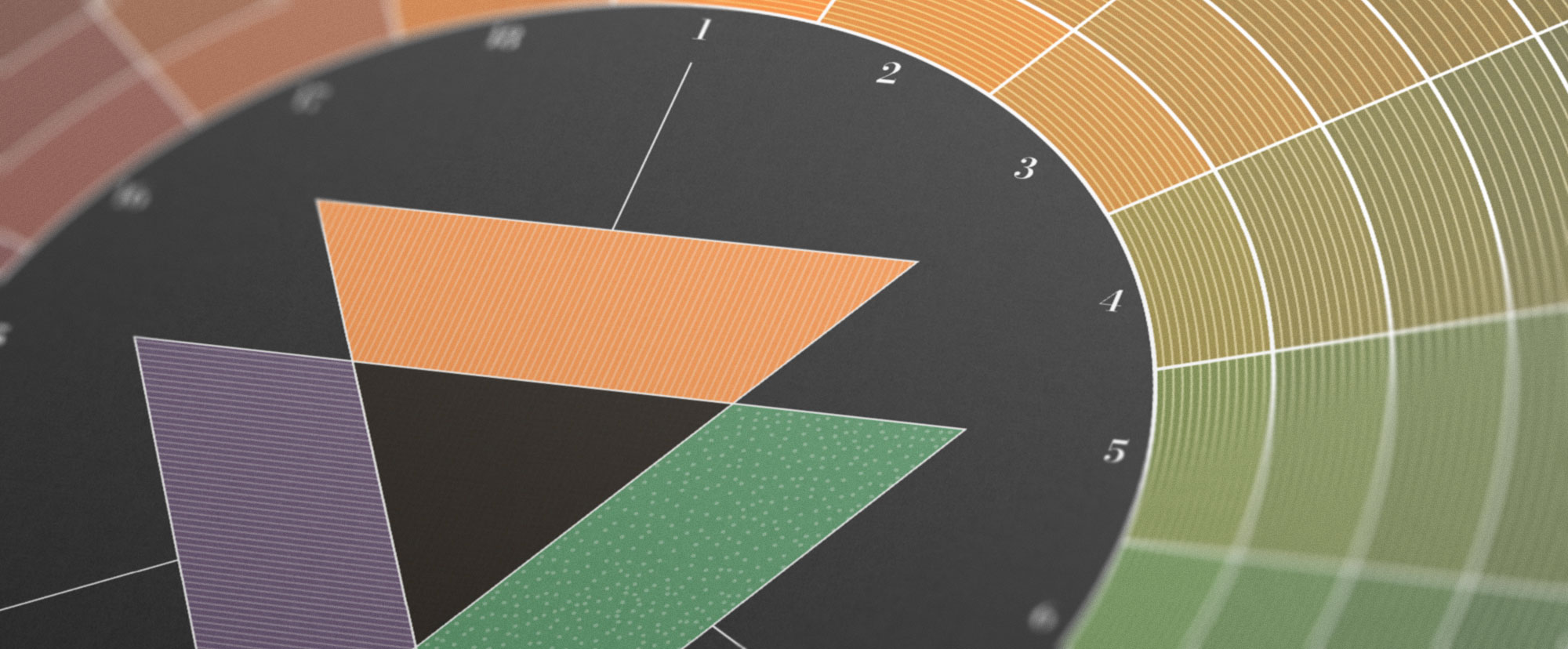
The concentric circles were numbered to indicate how colors changed if their saturation was reduced from 20 parts in the center ring down to 2 in the outermost. Harris also overlaid additional concentric circles that divided the others into 4–13 parts, creating a complex display of the original colors where they appeared darker in the center and lighter toward the outer edge. In the center, were three patterned triangles that represented the main colors used in each wheel.

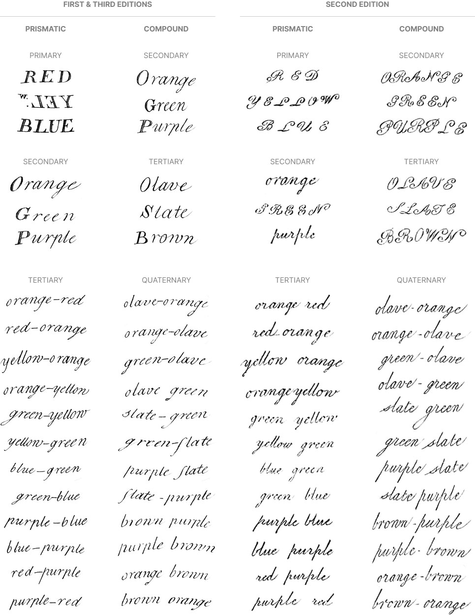
The use of text was minimal in both—comprising the color names, numbers, and part quantities. Color hierarchy was emphasized with different typefaces and capitalization. Harris originally wrote the names of the primary colors in uppercase with serifs, abbreviating Yellow stylistically as “YEL.W” and strangely written backwards. Secondary and tertiary names were written in script with the former capitalized using a serif letter. All other names were written in lowercase. In the second edition, the main colors were written in all uppercase script—hurting their legibility—and all others were written in lowercase script. The third edition used the same style as the first.
Recreating this structure seemed straightforward but took some additional elbow grease to create it in NodeBox. I could have eyeballed the measurements in Illustrator but NodeBox allowed me to create a precise replica that I later filled in using Illustrator. A tricky part was the extra divisions in the concentric circles. They increased from 3 to 12 starting from the second most outer ring. The number varied by one or two in the innermost rings in Harris’ original. The triangles were created in Illustrator, including the subtle patterns of lines and dots they contained.
Finally, I chose to mimic Harris’ original typography, using Bodoni Moda (Adobe, Google) for the primary names and numbers while Altesse was used for the secondary and tertiary names. Neither were an exact match but were close and much easier to create than tracing the originals. Using Illustrator's type on path tool, I placed the labels around the edges—an unexpectedly trying process because each one needed its own path.

The final results were very close to the original and I enjoyed seeing the polished structure created using modern methods.
Mixing colors
With the structure finalized, I turned my attention to the colors. In the first edition, Harris listed where to find the primary and secondary colors (“primitives” and “mediates”) in nature:
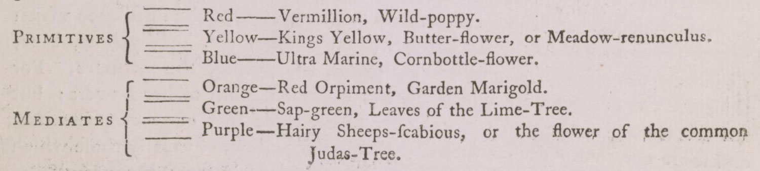
- Primitives
- Red: Vermillion, Wild-poppy
- Yellow: Kings Yellow, Butter-flower, or Meadow renunculus
- Blue: Ultra Marine, Cornbottle-flower
- Mediates
- Orange: Red Orpiment, Garden Marigold
- Green: Sap-green, Leaves of the Lime-Tree
- Purple: Hairy Sheeps-scabius, or the flower of the common Judas-Tree
Taking that to heart, I looked up and sampled colors from publicly available photos of each that I found online. The challenge was that lighting can change colors dramatically and not sources have the same colors. For example, hairy sheeps-scabius (Jasione montana or sheep’s bit) is much bluer than a Judas tree (Cercis siliquastrum). I used my best judgement to find images that I thought represented Harris’ original choices. Since the original colors aged significantly over the centuries, there was no way for me to evaluate how accurate my colors were but my goal was to create realistic colors.

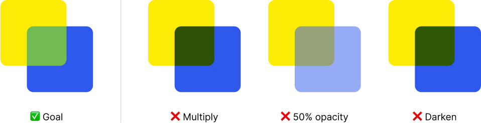
Mixing digital colors to mimic physical pigments is not an easy task and involves more than simply overlaying one color on top of another and adjusting opacity. Complex calculations are needed and are still being developed to create realistic results. For example, combining blue and yellow should yield shades of green but built-in blending methods in most graphics programs produce muddy results.
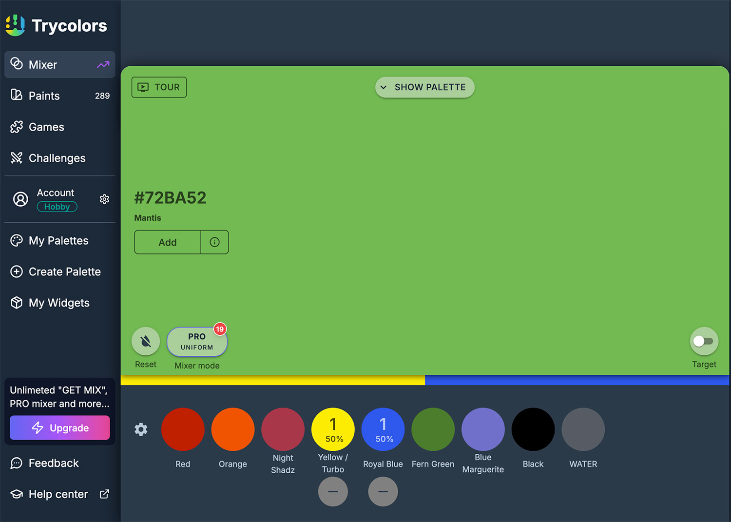
During my project to recreate The Color Printer, I learned of Mixbox, which does a great job at producing realistic color mixtures but required coding to get it to work and its license prevents it from being used in many tools so its usage is limited. Trycolors is another tool that uses similar algorithms and provides a helpful tool to precisely mix colors—taking into account the optical strength of darker colors via a “tinting strength” option to create adjusted, more realistic results.
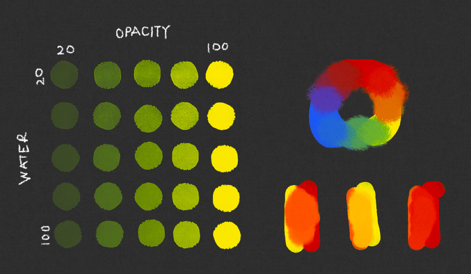
Using the six colors sampled from the photos I found online, I created all 21 base colors. I used equal parts of each to create secondary and tertiary colors and a two-thirds ratio to create those in between.
Harris indicated that saturation was based on a 20-part mixture. Since his wheels were painted with watercolor, I assumed the mixture was based on a ratio of pigment to water. I tried to mimic this by mixing my base colors with white as a substitute for water. For example, 10 parts red combined with 10 parts white created a light pink. Similarly, I used black to mimic painting colors on dark paper—something Harris didn’t do but I wanted to see how it looked. Carefully and methodically creating each color combination resulted in four complete color wheels: a light and dark version of both prismatic and compound wheels.
Remixing colors
I even went ahead and started designing posters but the more I looked my color wheels, the more they felt…lacking. The colors were mixed “correctly” based on the tools I chose but they felt hollow and flat. The fact that I mixed colors with white and black to replace water didn’t sit well with me so I started to consider other methods of creating them.
I briefly entertained the idea of buying watercolors and recreating the wheels in earnest but stopped short of doing so for several reasons. I couldn’t find a reliable precise way to measure out “parts” of colors and wading into the world of choosing the right paints, brushes, paper, etc. was too daunting for what was supposed to be a relatively small project. Plus, even if I painted my own, I didn’t have the equipment to create a big enough picture of it to place on a poster.
Instead, I looked toward digital painting apps that allow realistic color mixing. The graphic at the top of Mixbox’s homepage was enough to deter me from trying most of the apps shown to have inferior results: Photoshop, Procreate, Adobe Fresco, and Clip Studio Paint. I did try Adobe Fresco, which produced some encouraging results, though there still wasn’t a way to measure out specific parts of colors to get reproducible mixtures. Plus, I couldn’t find a way to export images more than about 4300 pixels square. I typically need to export images 18000×12000 pixels for my posters.
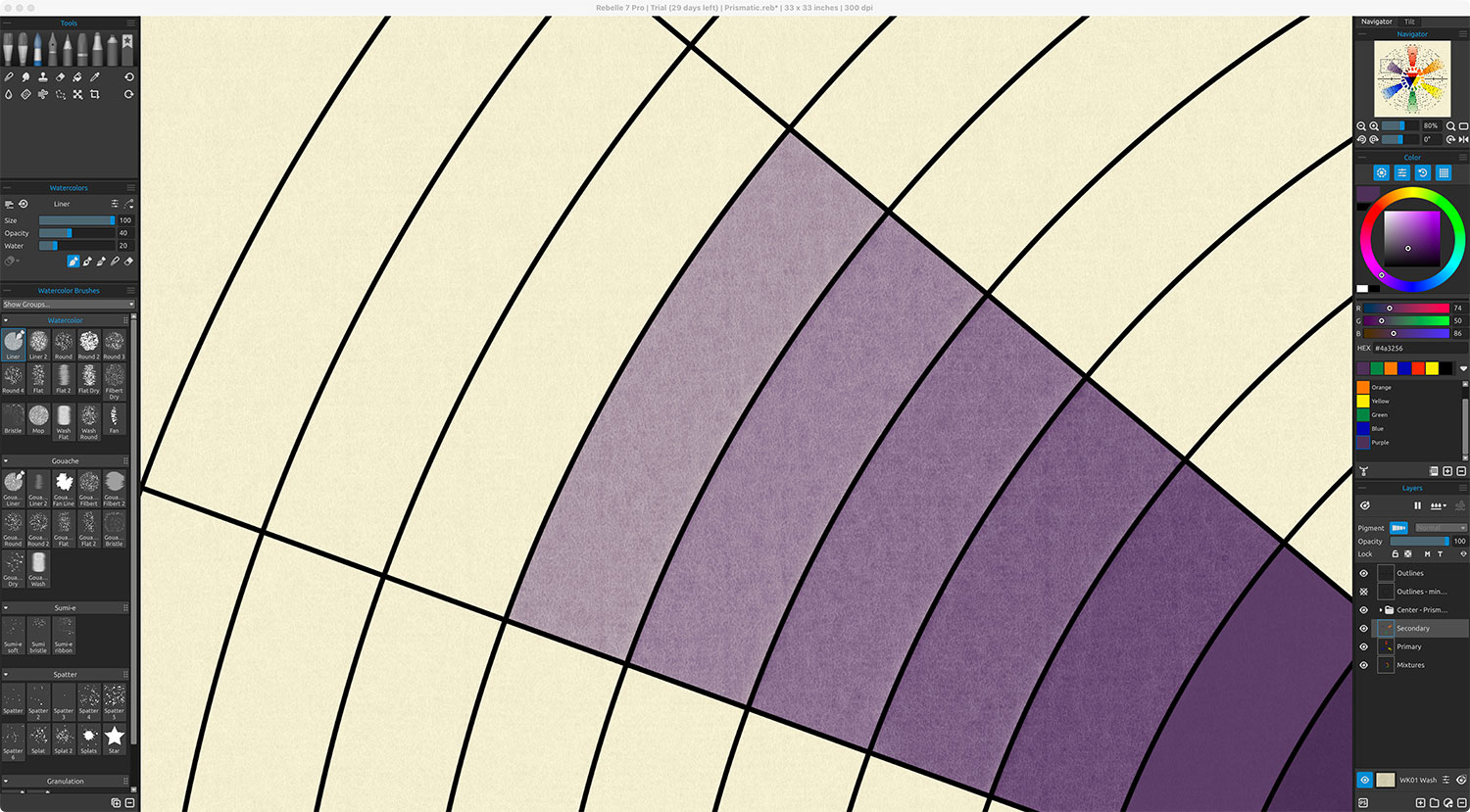
My research lead me to Rebelle, which touts “hyper-realistic” painting features and color mixing. After I took a crash course in learning how to navigate its interface, I found the results to be very promising. Mixed colors looked realistic and their paper options added a nice realistic texture to the colors instead of the flat versions I created on my own. Plus, it allowed for very large canvases and exporting in the resolution I needed.
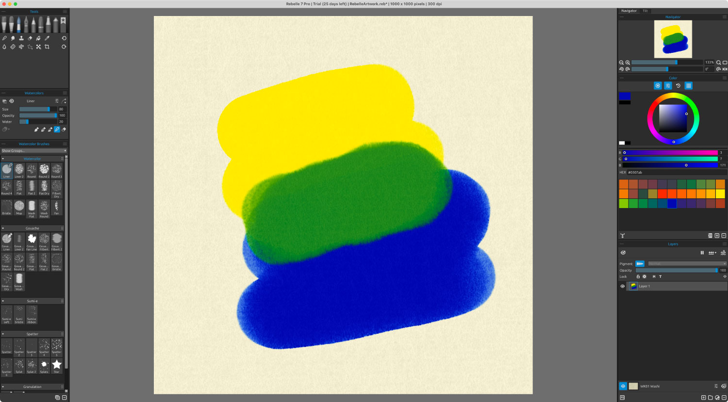
Rebelle had a wealth of brush settings, which was a mixed blessing because they required a lot of trial and error to find what worked best but having the options was better than not having them. Varying the amount of water in a brush only affected how colors were absorbed into the paper on which they were painted but opacity had the most realistic parallel to Harris’ saturation levels.
The most useful of the settings was the blending method, which allowed me to completely overpaint colors, overpaint and blend, or blend existing colors.

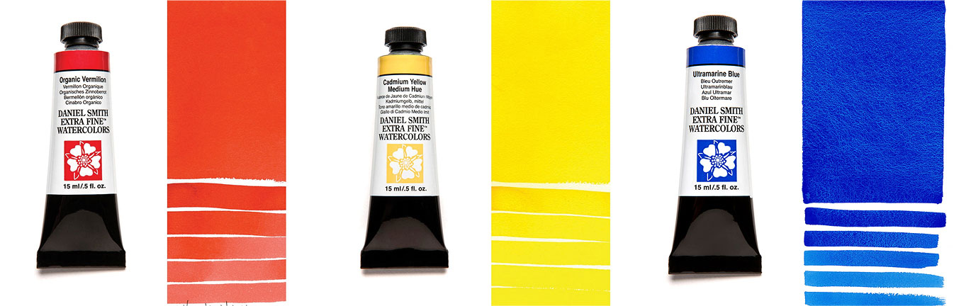
Before I started creating colors in earnest, I also changed my sources of colors from being sampled from photos. I chose to sample colors from Daniel Smith Artists’ Materials, a popular site selling watercolors and used their organic vermillion, cadmium yellow, and ultramarine blue as the basis for all mixtures instead of also sampling secondary colors.
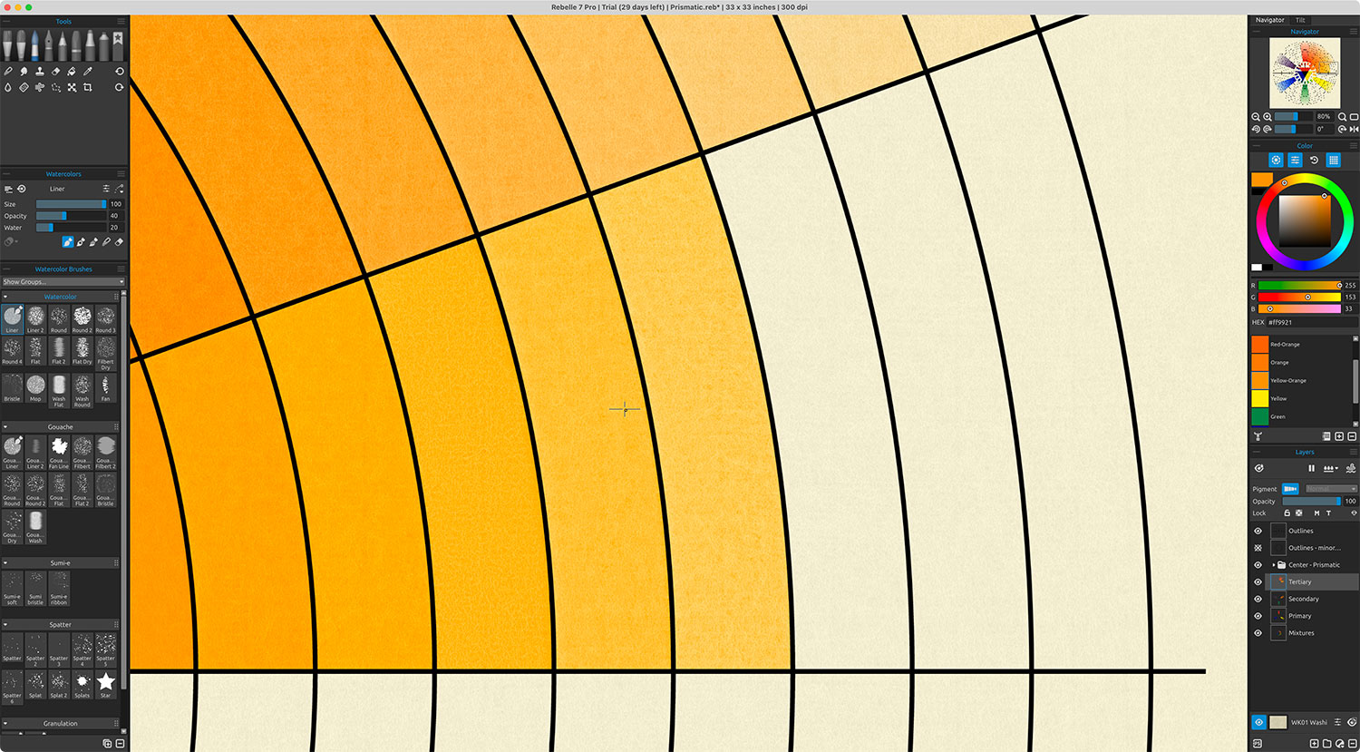
Using blending mods, I created the all the swatches for each wheel. Rebelle doesn’t have an option to specifically blend colors based on number of parts so I eyeballed the blended colors to be roughly equal parts of each. To do this, I drew a line of two colors and used the blend brush to blend them together.

With the base colors configured, I imported the outlines for the structure as different layers and filled in each arc using a process very reminiscent of what I would have done with real paints: select an area to paint, paint the color, and watch it dry. The drying part was an interesting process to observe. Rebelle shows the drying process and gives options for “blowing” on paint to dry it faster or push it in different directions. Occasionally, I would paint an area and immediately deselect it to start painting another one but before the paint had dried, resulting in the paint bleeding into neighboring areas. Not something I anticipated when painting digitally but it makes sense and I made sure each area was dry before continuing.
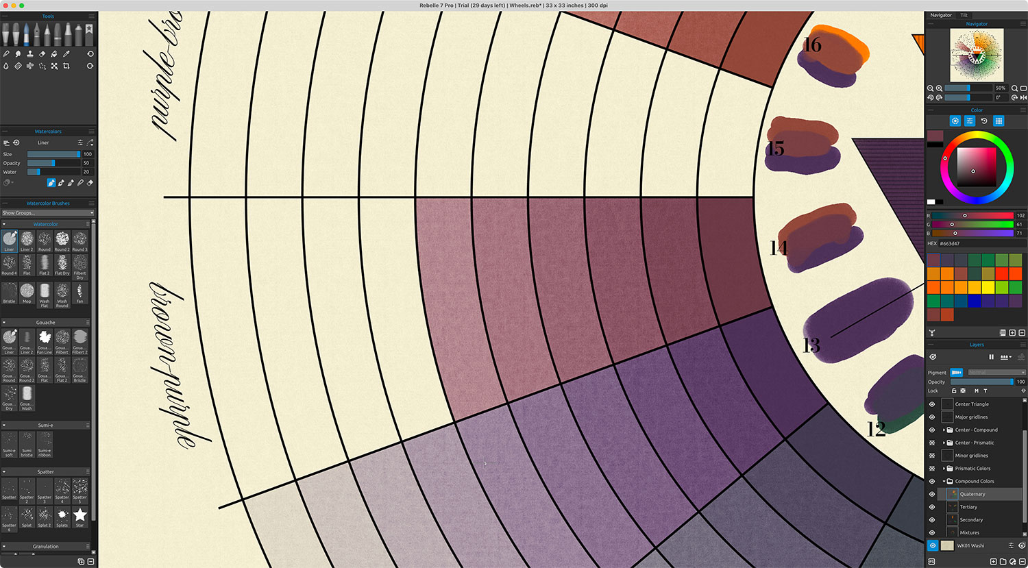
Rebelle also allowed the canvas to be changed, which impacted any colors painted on it—re-blending them with the new setting. This allowed me to create dark versions of each wheel without repainting them. The final results were color wheels that looked a lot more realistic and were more satisfying to me personally because I know the colors were mixed from just three primary colors: red, blue, and yellow.
Poster design
The main goal for this project was to create modern editions of Harris’ wheels and offer them as posters for those that enjoyed the originals as much as I did. Many places offer posters of Harris’ original wheels and have for many years. They’re very appealing and naturally work well as decorative posters. My take on them was that I recreated them from scratch.
Since Harris only wrote a handful of pages about the wheels, my initial designs included the full text on a poster showcasing both prismatic and compound color wheels. My idea was to mimic the visual complexity of antique double hemisphere maps where the focus was two large circular visuals surrounded by decorative imagery or other details. Unfortunately or serendipitously, the text was longer than I thought and trying to fit all of it on a poster would require it to be too small to be legible and it was distracting.

Once I came to terms with not including the full text, I explored variations that included scans of the original wheels from the first and second editions in the corners to show how the wheels have evolved, finally settling on one that included them plus Harris’ list of where to find the six primary and secondary colors in nature.

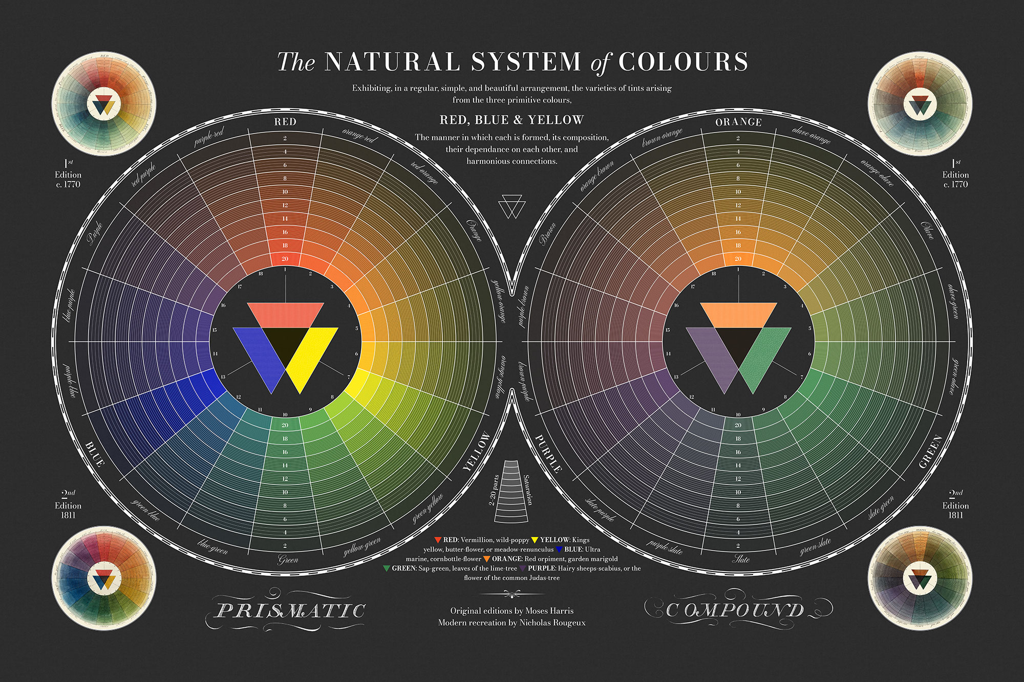
Additionally, I created a light and dark version of each wheel as standalone posters without the extra information, but showcasing my modern recreations. They’re similar to many others’ but unique because they’re remade from scratch using modern digital methods and unique dark versions are also available.
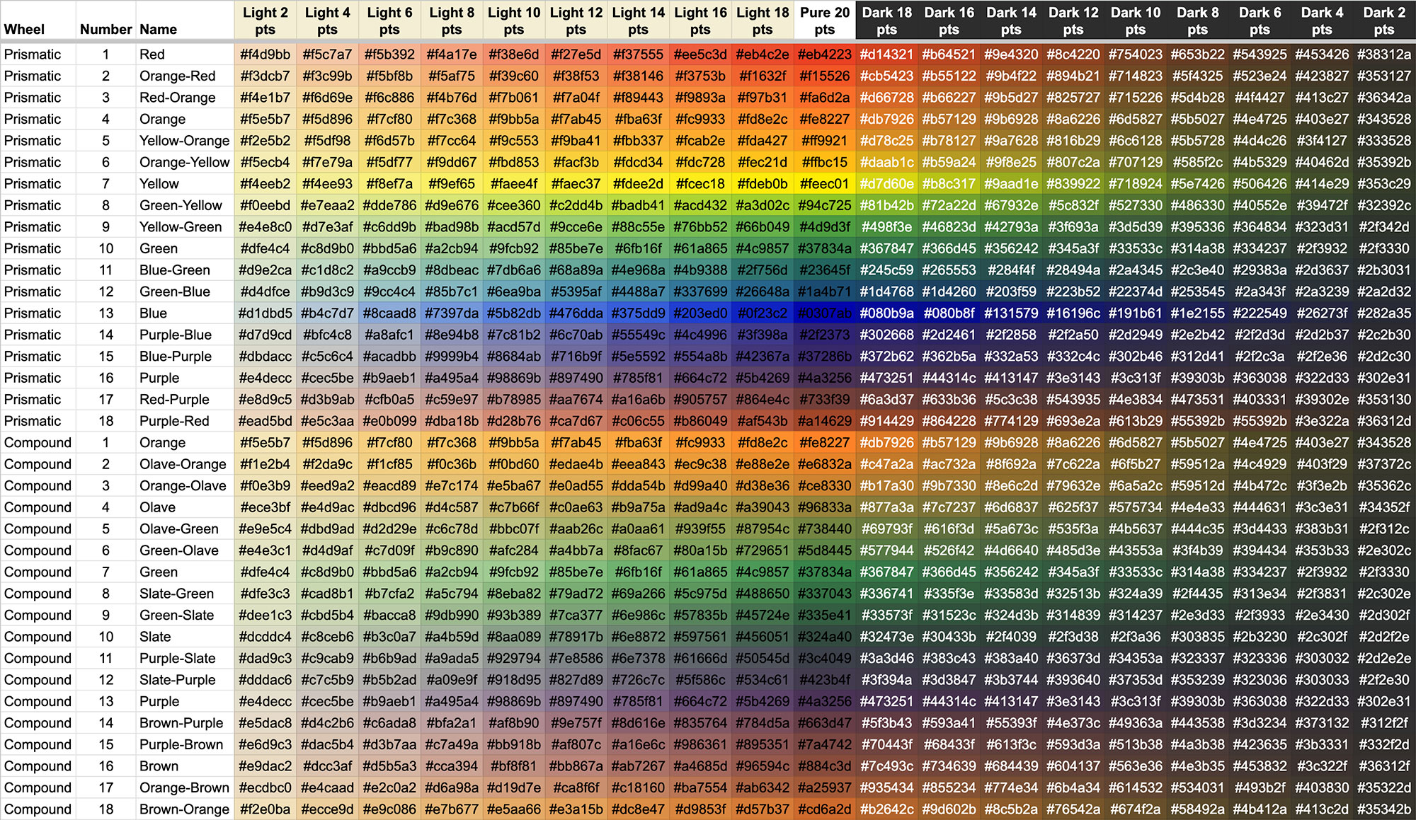
Color data
As I’ve done for previous projects, I catalogued all the colors mixed for this project and made them available for free as hex codes in a Google spreadsheet under the CC0 1.0 Universal (CC0 1.0) license. There are a total of 627 colors:
- 33 primary, secondary, tertiary, and quaternary colors
- 594 tints and shades of those colors painted on light or dark paper (codes for paper colors are in the dictionary tab)
If any readers use the colors in their project, I would love to hear about it.
One-page explainer
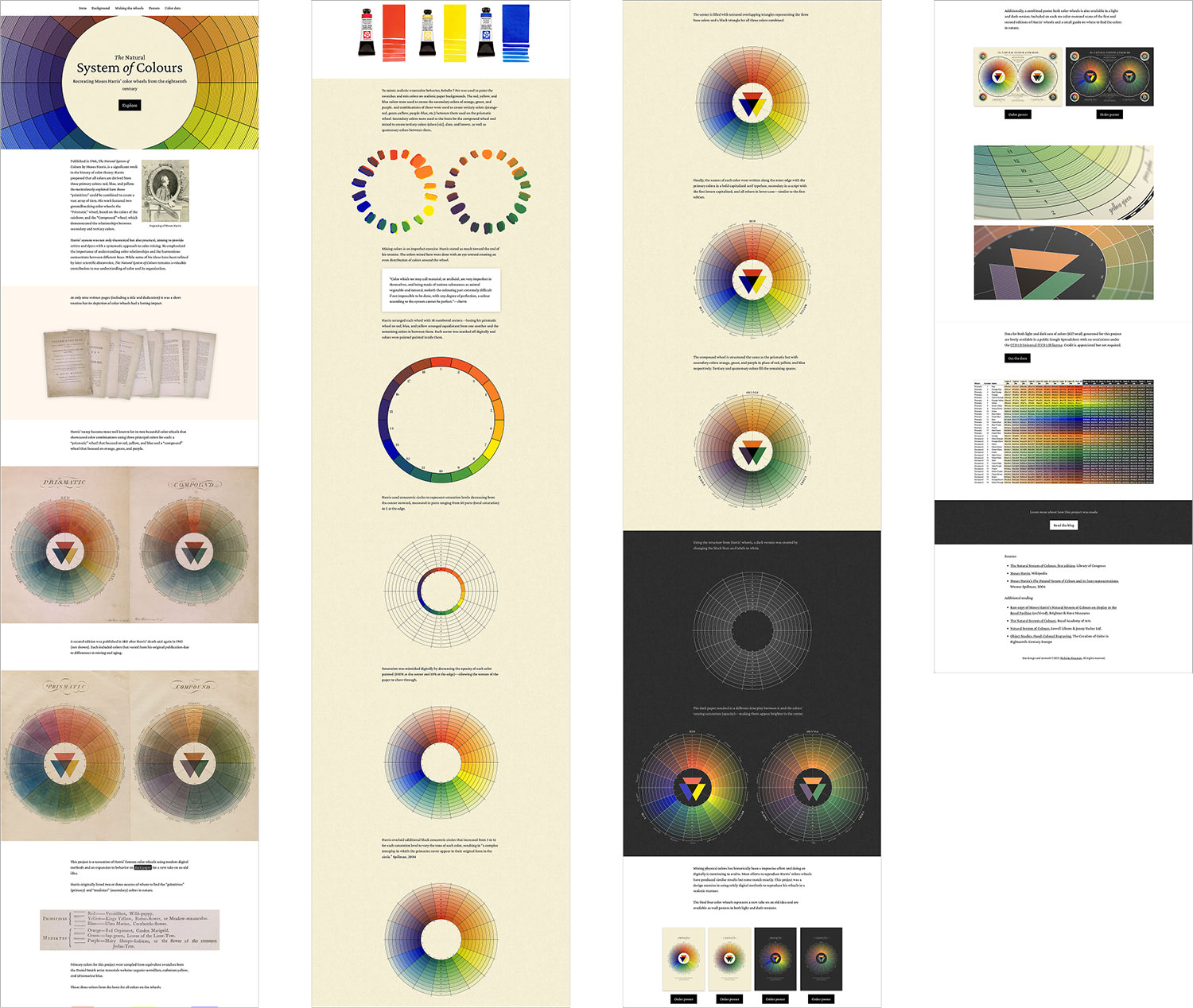
Recreating these color wheels proved to be interesting enough that I wanted to document it in a simpler manner than this blog post so I created a long one-page explainer that covered the process more holistically. The design is deliberately simple with no interactivity, large pictures, and minimal copy so anyone can enjoy the process I went through without diving into the details like in this blog post.
Final thoughts
This was a fun short project done over the course of just a few weeks–a departure from the usual months-long efforts I usually undertake. I love the long-term projects but hope to do more smaller, short-term projects like this in the near future.
I’m well aware of the absurdity of this project. The idea of digitally sampling colors from photos of physical objects to mix them digitally so that printed posters could be made sounds convoluted because it is. I could have gone out and bought some watercolors and done my own version but over the years, I’ve developed a strong fondness for reproducing antique books in part or in whole online—not because someone needed me to do it but because it’s fun and allows me to exercise my design skills. If others discover them and enjoy them, that’s wonderful and if they want to order a poster, that’s an added bonus. I’ve used skills from every project in later efforts so while recreating Harris’ color wheels doesn’t make much sense now, it may later on.