A Year of Scrabble

47 games … 1,533 turns … 30,378 points
I play a lot of Scrabble. My father introduced me to the game when I was 12 and we've played frequently ever since (25 years as of this writing). When my interest in data art and visualization was initially piqued a few years ago, I did what any newly-obsessed data junky would do. I catalogued every game we played for an entire year. The visuals that follow are visual experiments and focus on different ways of viewing personal data rather than exact details of who won or lost. Details for that are toward the bottom.
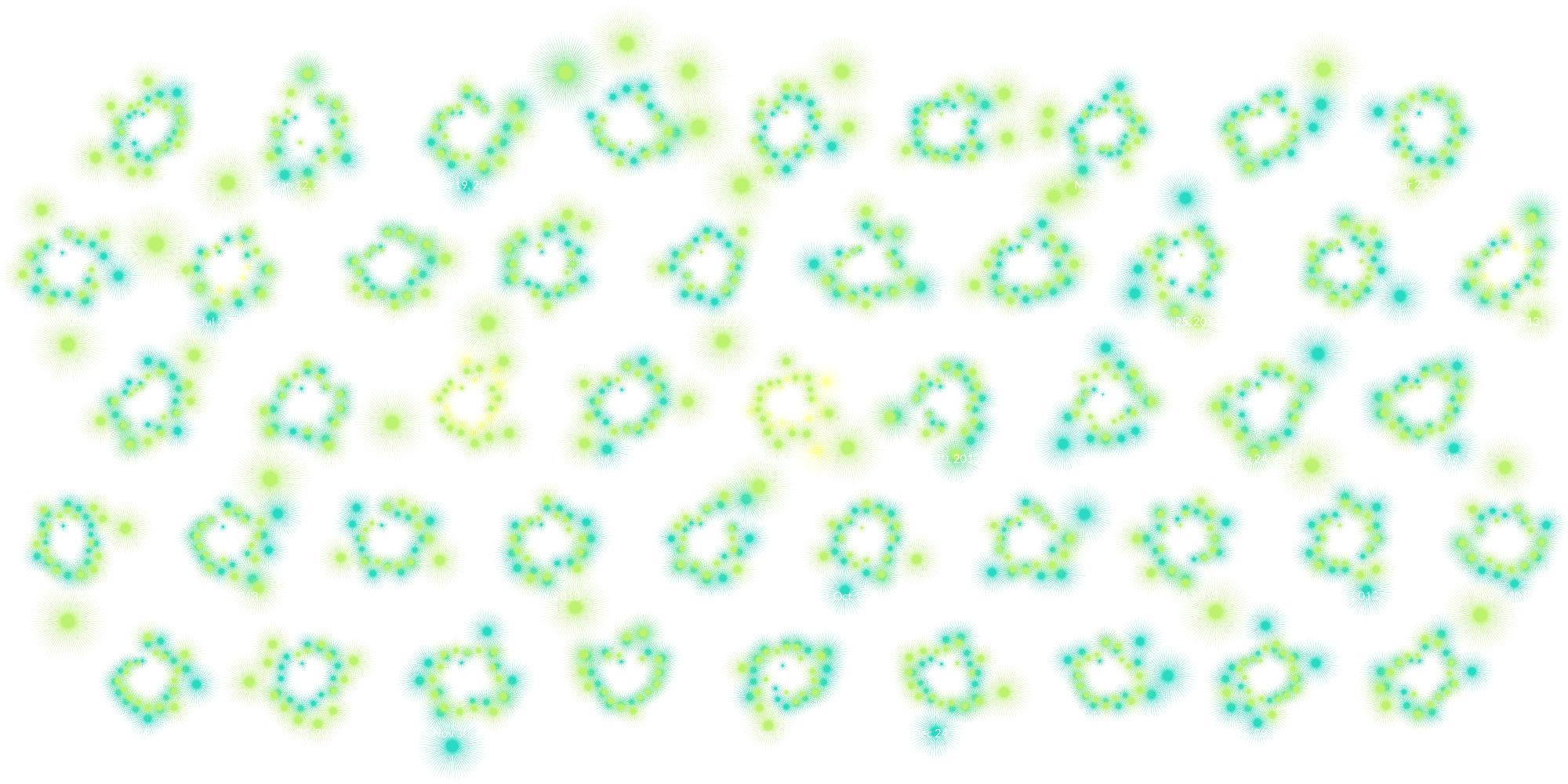
The graphic below tracks every point of every turn of every game between me, my father, and my mother played together in their dining room. Each game is represented by a cluster of stars. The satisfaction of playing a high-scoring word has always excited me so representing them by large starbursts seemed appropriate.
- Nicholas
- Mark (father)
- Deborah (mother)


Wandering paths
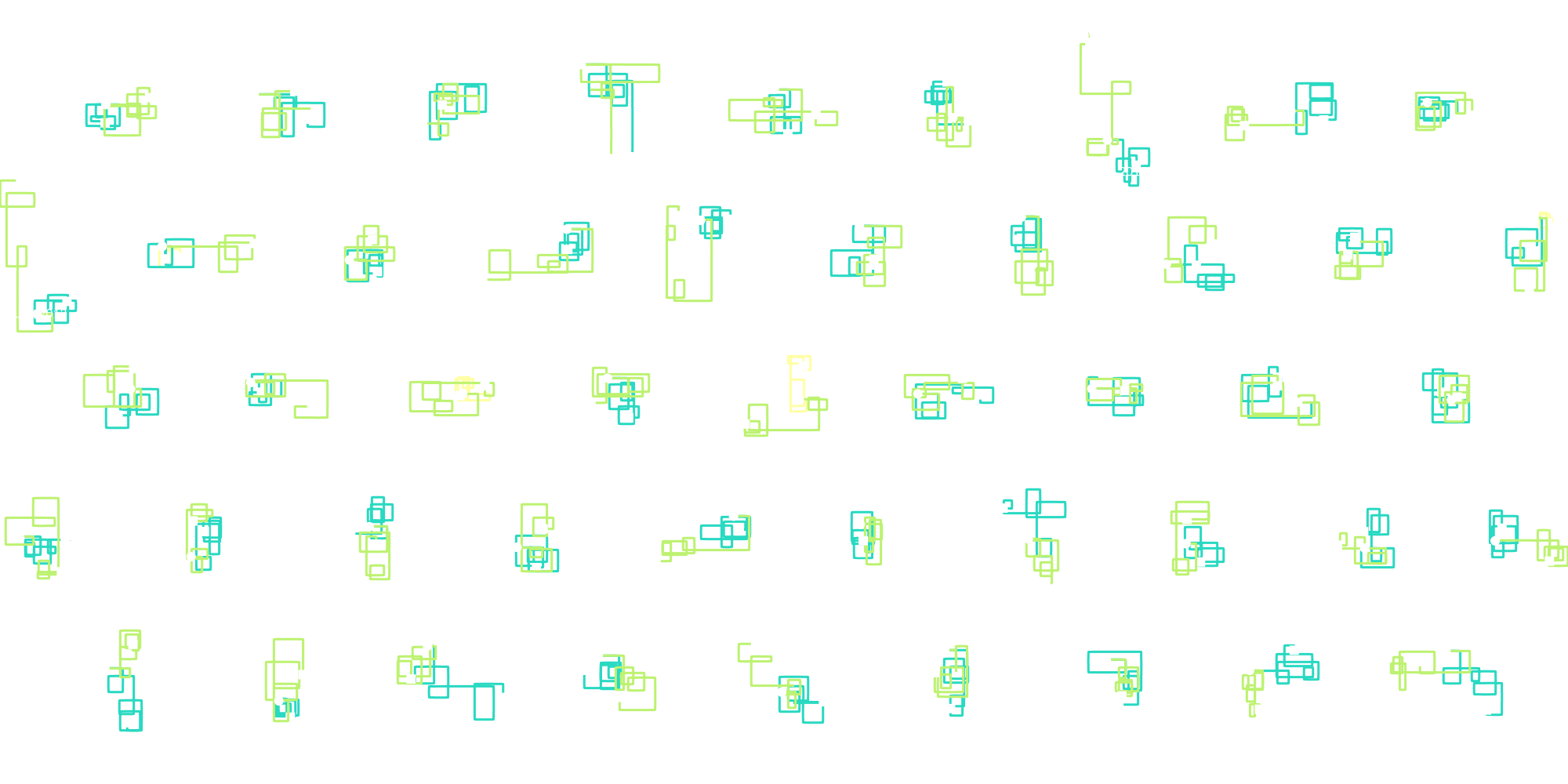
Anything can happen in a Scrabble game. Just becuase someone gets a bingo (playing all seven tiles at once) doesn't mean they'll win the game—but it helps. Some games can be neck-and-neck the whole time while others can be a landlide victory. Visualizing these as wandering paths starting at the same point shows just how varied games can be.
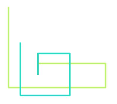
Starting at the for every game, a continuous line was drawn rotating 90 degrees with each turn and each segment's length is based on how many points were earned, ultimately ending at the .
Inspired by Stephanie Posavec's Writing Without Words project.

Games
These charts show turn-by-turn timelines of the scores in each game played in 2013.