Making of Humming-Birds
By Nicholas Rougeux, posted on October 1, 2023 in Art, Web
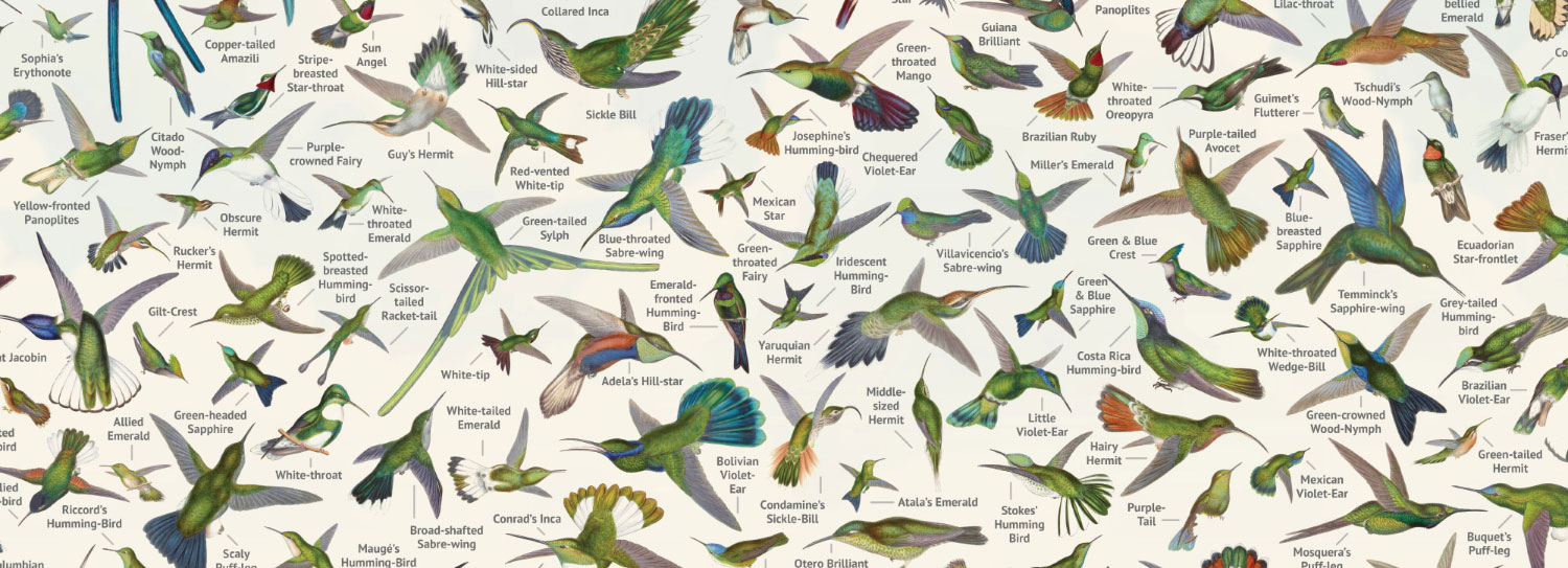
Hummingbirds are the closest living descendants of dinosaurs like the T. rex—one of many fascinating facts I learned while working on the digital edition of A Monograph of the Trochilidæ, or Family of Humming-Birds. Gaining unexpected knowledge has to be one of the best parts about working on a project.
As has become common with my digital editions, I stumbled upon the subject matter by accident browsing through rare book catalogs online. It’s become an oddly satisfying pastime of mine to peruse them in the hopes of finding something that catches my eye and triggers a new interest.
Source material
Hummingbirds are fascinating animals and comprise far more species than I imagined. From their ability to hover in the air to their beautiful plumage, they are a standout in the animal world—so much so that many ornithologists of the past had a hard time agreeing on how they should be classified. Hummingbirds caught the attention of English ornithologist John Gould early in his career and he spent much of the later years of his life up until his death compiling an impressive catalog of them.
Gould published several monographs on birds but his greatest interest was focused on hummingbirds. He accumulated a large collection of hundreds of species and traveled around the world to see them while corresponding with other ornithologists about their own collections.
Between 1849 and 1861, Gould published one of his most famous works titled A Monograph of the Trochilidæ, or Family of Humming-Birds, comprising 5 volumes issued in parts and 360 strikingly beautiful illustrations of hummingbirds. Accompanying each illustration was a brief description of the bird that included details on its habitat, anatomy, behavior, and more based on his personal experiences with them and others’.The monograph is considered one of the finest examples of ornithological illustration ever produced, as well as a scientific masterpiece. Included in the lengthy introduction was also a complete list of 416 species.
A supplementary volume by R. B. Sharpe was published in 5 parts between 1880 and 1887 after Gould’s death with an additional 58 plates and many descriptions written by Gould before his death. Though Gould is often named as the main author and illustrator, his wife Elizabeth Coxen and Edward Lear are known to have contributed heavily, with Gould taking credit for their work.
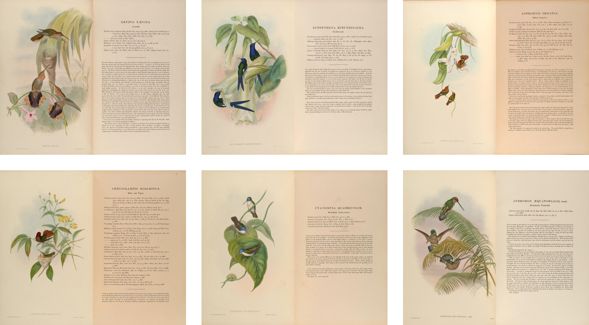
Much to my pleasant surprise, the scans of Gould’s monograph available were some of the best scans I’ve come across for any project. They were high resolution, great quality, had great color, and no pages were missing. That alone motivated me to consider making a digital edition. Scans can be found on the Internet Archive, contributed by the Biodiversity Heritage Library, which has more details about each:
- Volumes I–V: Biodiversity Heritage Library
- Volume I: Internet Archive / Biodiversity Heritage Library
- Volume II: Internet Archive / Biodiversity Heritage Library
- Volume III: Internet Archive / Biodiversity Heritage Library
- Volume IV: Internet Archive / Biodiversity Heritage Library
- Volume V: Internet Archive / Biodiversity Heritage Library
- Supplement: Internet Archive / Biodiversity Heritage Library
Introducing a monograph
A key goal I had for this project was to find an interesting way to introduce the subject of hummingbirds to new visitors. I wanted to highlight the large variety of hummingbirds in Gould’s monograph on the home page as a way to engage visitors so I planned to create a murmuration that included a hummingbird from each illustration. Ironically, hummingbirds travel alone and not in flocks, but displaying them in a murmuration still felt like a fun design exercise.
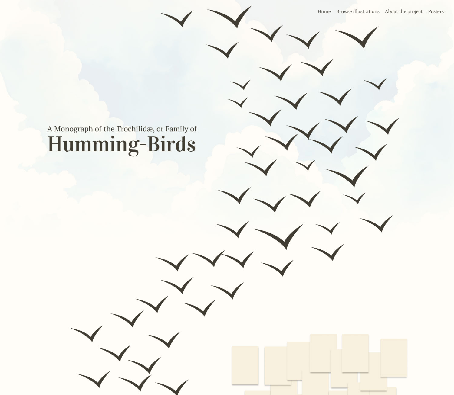
As part of an early rough mockup for the home page, I created a wave-like murmuration of placeholder bird symbols. The idea was that the flowing nature of the birds would encourage visitors to scroll down and be introduced to the areas of the monograph. Even after cobbling together a rough working version, I enjoyed the experience of scrolling down and watching the birds shift back and forth with each new topic.
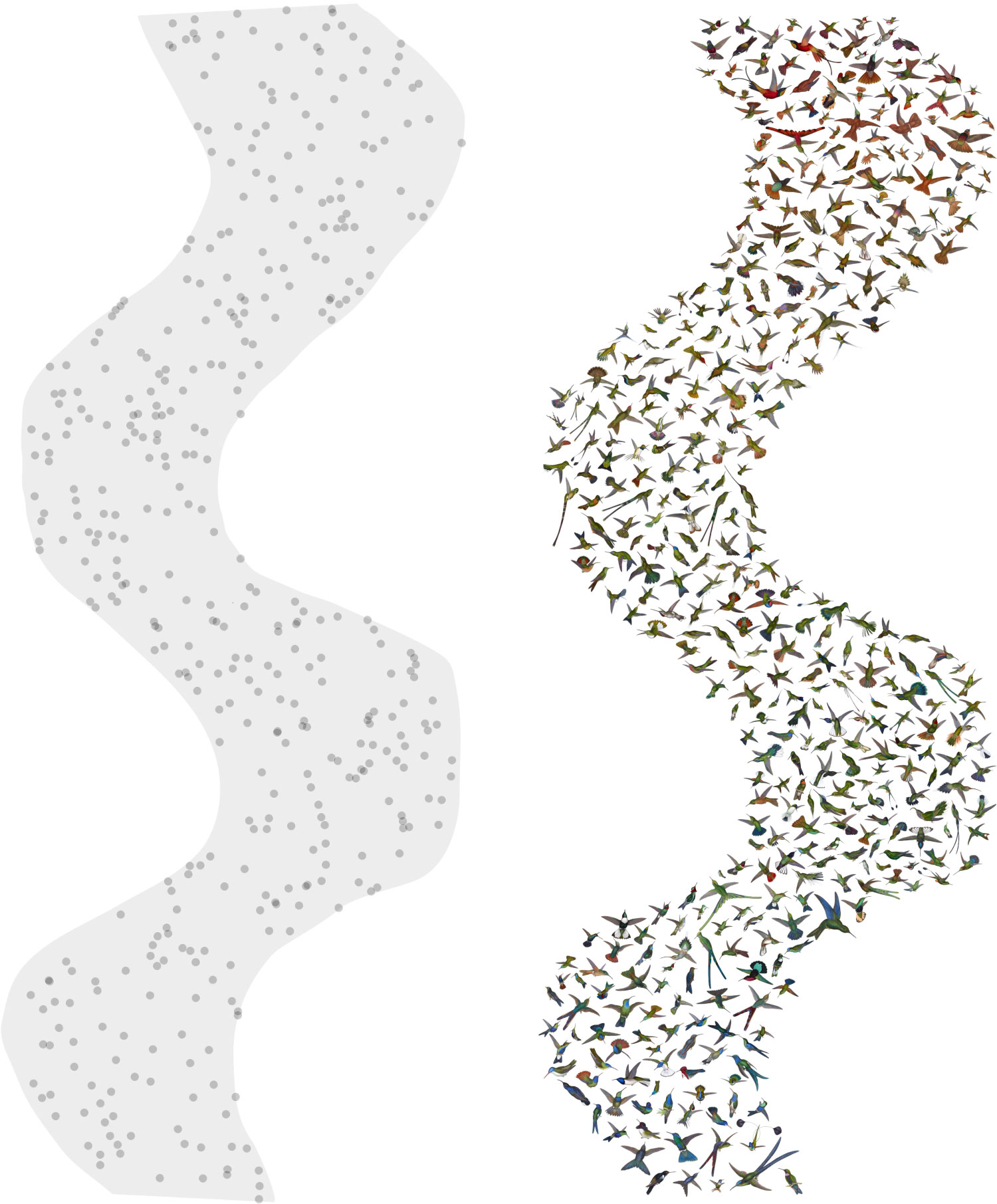
Happy with early results, I restored about 100 illustrations to see how it would look comprising the actual illustrations. One of the challenges I encountered in creating this graphic was positioning each illustration evenly. As far as I knew, there wasn’t an easy way to evenly distribute irregular shapes (hummingbirds) in another irregular shape (murmuration). However, there was a way to distribute a set number of points in an irregular shape randomly, which I could use as guides to start and then arrange the images manually.
To make the murmuration, I did the following:
- Roughly outline the shape for the murmuration in Figma.
- Export the shape as an SVG.
- Import the SVG into NodeBox and position points inside the shape using the scatter node.
- Take a screenshot of the points generated by NodeBox and import that into Figma.
- Manually place an illustration on each dot.
- Manually shift illustrations around so they’re evenly spaced.
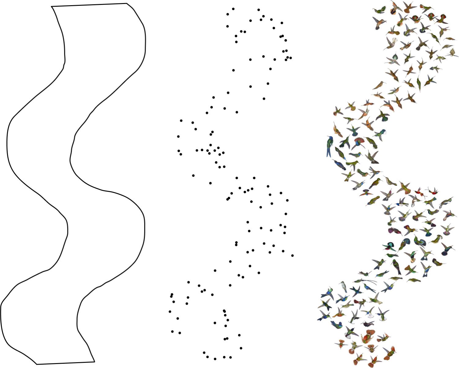
While this involved a lot amount of manual work, it was a lot more efficient than guessing what the spacing should be on the fly. The random distribution of points calculated by NodeBox was enough to ensure that illustrations were spaced out enough at the start so there was minimal guess work in how much they needed to be spaced out for the final image. I used a similar technique to make the collage for British & Exotic Mineralogy where I started with a grid of points and then shifted them around methodically to find their final position.
I had to wait until I restored all the illustrations to make the final murmuration that featured a bird from each one. However, I also wanted to sort them by color, which created an additional challenge: how could I distribute 400+ illustrations evenly and arrange them by color efficiently? As I restored each illustration, I sampled the key identifying color from it and kept it in a database while I was building out there rest of the digital edition. Once I had those colors, I sorted them by hue and then placed them in that order during step five above. That way, when I spaced them out in step six, it formed a subtle spectrum starting from reds, purples, and oranges at the top and transitioning to yellows, greens and blues at the bottom.
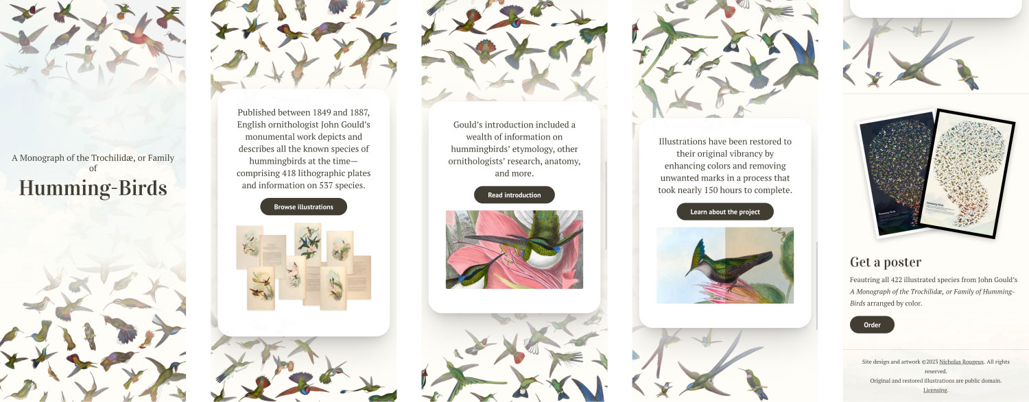
At each curve of the murmuration is a highlight of the digital edition to explore: all the illustrations, Gould’s original introduction, and more information about the project. To ensure these stayed in the correct positions at all screen sizes when the murmuration graphic was was resized, I employed what I thought was a clever idea: I measured the rough vertical size of each curve and made sure each highlight always fit in that gap. The murmuration is always as wide as the browser so that governs the size of the section containing each highlight, which is measured in percentages and absolutely positioned in a container holding them and the murmuration.
<div class="overview">
    <img class="murmuration" src="…" />
    <section class="overview-section overview-title">…</section>
    <section class="overview-section overview-illustrations">…</section>
    <section class="overview-section overview-intro">…</section>
    <section class="overview-section overview-about">…</section>
</div>

At smaller screens sizes, highlights no longer fit nicely in the gaps but are still positioned on top of them while the illustration is faded so they’re more visible using gradient masks.
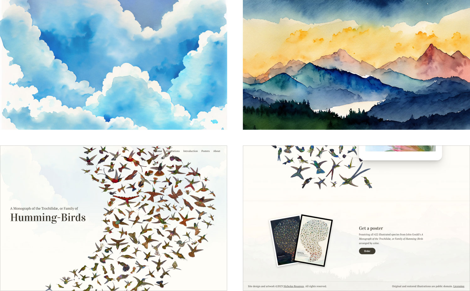
All illustrations included one or more hummingbirds paired with a unique plant and drawn against a lighter background of pastel colors. Quite a few included a scene from nature like clouds, water features, mountains, etc. I wanted to build on that and include something similar on the home page to give the large murmuration some depth and pay homage to Gould’s plates. I achieved this by including very faint images of clouds at the of the page and mountains at the bottom (which also appear at the bottom of all other pages). These images are unique because they were not taken from an illustration but generated in Photoshop with the new generative fill feature. Simple prompts such as “watercolor clouds” and “watercolor mountains” were used to generate them and they were blended into the background with some more CSS gradient masks. I have mixed feelings about AI-generated imagery but generating these images for this purpose felt like an interesting experiment that worked out well.
Browsing illustrations
Included in Gould’s monograph and supplement are 418 beautiful plates of illustrations of 422 species (some plates include multiple species) along with descriptions or other entries of a total of 537 species (not all species were illustrated). Some were described with a few sentences and others with simply a name and some references.
The monograph was organized so that the first volume included a lengthy introduction of more than 140 pages containing among other things, the preface, a list of subscribers, and general information on nomenclature, other publications, and anatomy of hummingbirds. After the general information, the bulk of the introduction comprised a complete list of all the species and illustrations with brief descriptions and references organized by genus and subfamily. The rest of the first volume contained 41 plates paired with longer descriptions and volumes 2 through 5 only contained plates with their descriptions. Plates were numbered in the introduction but those numbers were not included on the plates themselves, which made cross-referencing somewhat challenging for the average reader. The supplement included a brief introduction along with the remaining plates and descriptions.
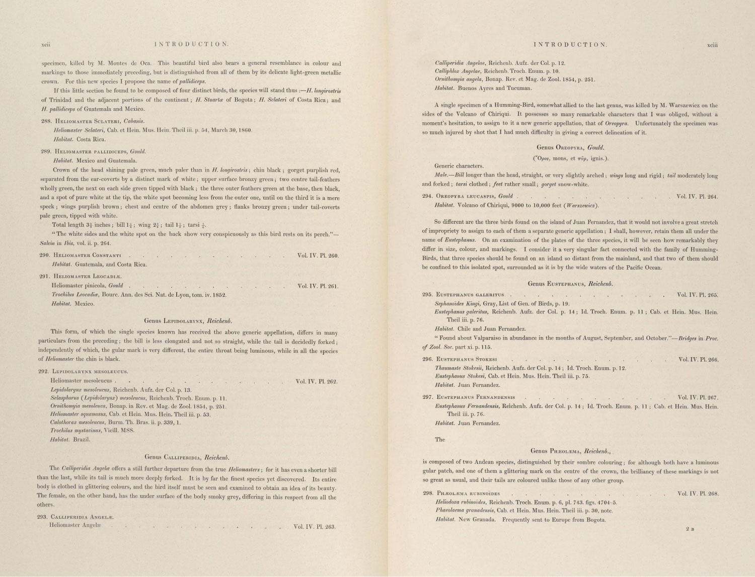
One challenge I set for myself was to design a pleasant way to browse this complete classified list of subfamilies, genera, species, and plates. With so many beautiful illustrations available, I wanted to use them as a way to punctuate the long list and differentiate the genera and species mentioned. To do this, I gained a deeper understanding of its structure:
- The first volume was dedicated entirely to the subfamily Phaëthornithinæ.
- Volumes two through five covered the other subfamily, Trochilinæ
- The supplement was a collection of birds discovered since the first five volumes were published.
These three groups weren’t enough so I had to break them up into more digestible sections. Breaking it up by volume was the next logical grouping but even that wasn’t enough. Upon closer examination, I found that Gould included periodic descriptions that introduce groups of genera within the Trochilinæ subfamily within each volume in addition to at the beginning of each. These descriptions served as the perfect way to break the content into more digestible chunks:
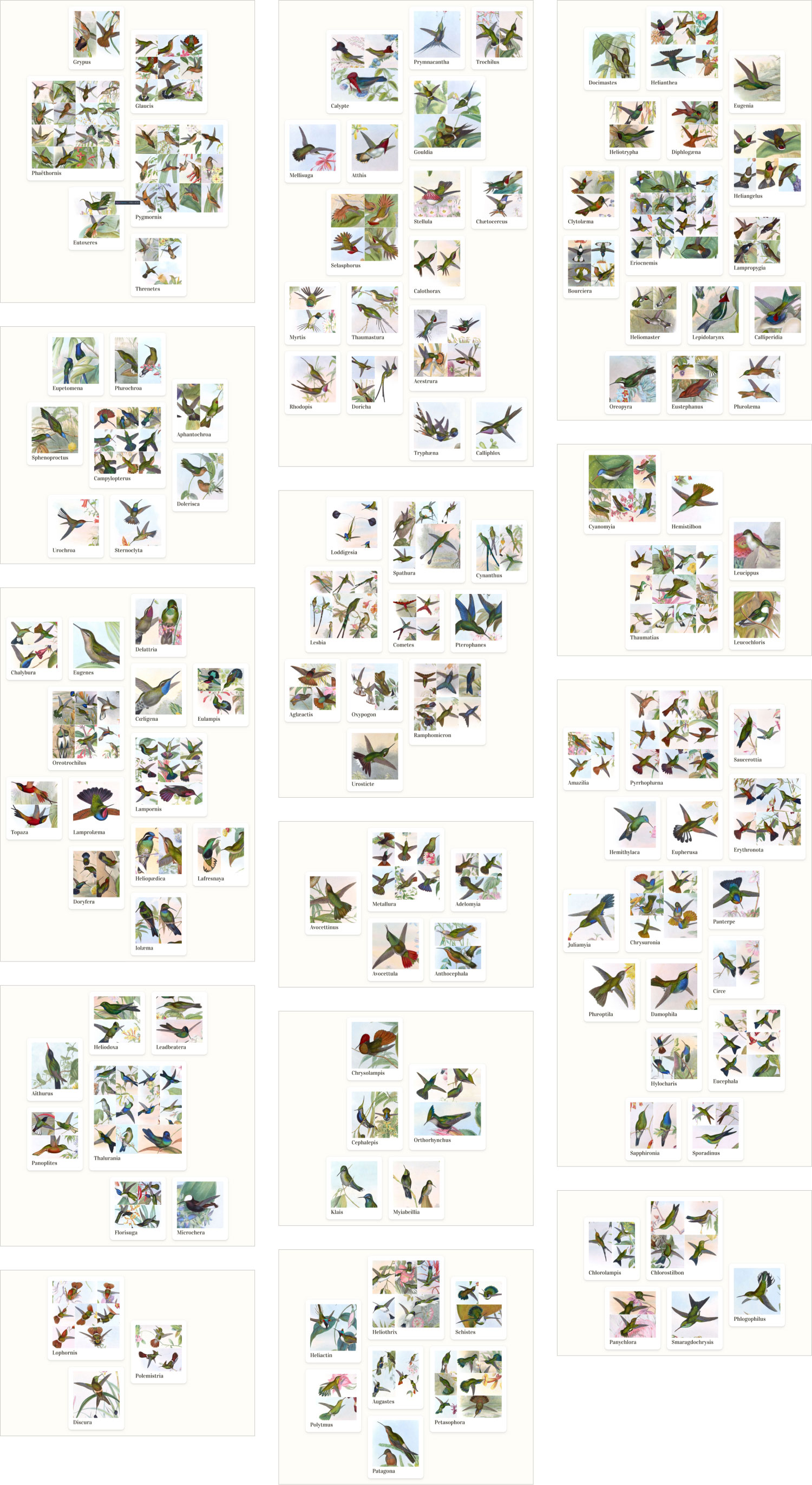
- Volume I: Phaëthornithinæ
- Volume II: Trochilinæ and genera Eupetomena, Sphenoproctus, Campylopterus, Phæochroa, Aphantochroa, Dolerisca, Urochroa, Sternoclyta
- Volume II genera: Eugenes, Cœligena, Lamproæma, Delattria, Heliopædica, Topaza, Oreotrochilus, Lampornis, Eulampis, Lafresnaya, Doryfera, Chalybura, Iolæma
- Volume II genera: Heliodoxa, Leadbeatera, Aïthurus, Thalurania, Panoplites, Florisuga, Microchera
- Volume III: genera Lophornis, Polemistria, Discura
- Volume III: genera: Prymnacantha, Gouldia, Trochilus, Mellisuga, Calypte, Selasphorus, Atthis, Stellula, Calothorax, Acestrura, Chætocercus, Myrtis, Thaumastura, Rhodopis, Doricha, Tryphæna, Calliphlox
- Volume III: genera: Loddigesia, Spathura, Lesbia, Cynanthus, Cometes, Pterophanes, Aglæactis, Oxypogon, Ramphomicron, Urosticte
- Volume III: genera: Metallura, Adelomyia, Avocettinus, Avocettula, Anthocephala
- Volume IV: genera Chrysolampis, Orthorhynchus, Cephalepis, Klais, Myiabeillia
- Volume IV: genera Heliactin, Heliothrix, Schistes, Augastes, Petasophora, Polytmus, Patagona
- Volume IV: genera Docimastes, Eugenia, Helianthea, Heliotrypha, Heliangelus, Diphlogæna, Clytolæma, Bourciera, Lamphropygia, Heliomaster, Lepidolarynx, Calliperidia, Oreopyra, Eustephanus, Phæolæma, Eriocnemis
- Volume V: genera Cyanomyia, Hemistilbon, Leucippus, Leucochloris, Thaumatias
- Volume V: genera Amazilia, Pyrrhophæna, Erythronota, Saucerottia, Hemithylaca, Eupherusa, Chrysuronia, Eucephala, Panterpe, Juliamyia, Circe, Phæoptila, Damophila, Hylocharis, Sapphironia, Sporadinus
- Volume V: genera Chlorolampis, Chlorostilbon, Panychlora, Smaragdochrysis, Phlogophilus
- Supplement: additional plates
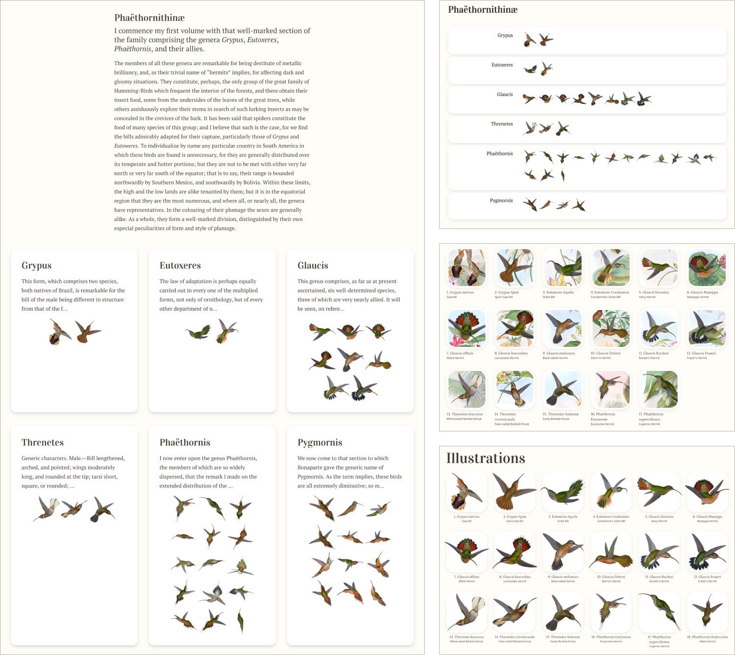
The design of each of these sections included three key parts: a banner showcasing a one of the plates featured within it, Gould’s original description, and a collage comprising each plate grouped by genus. Optionally, if there was enough room, an individual plate was also featured.
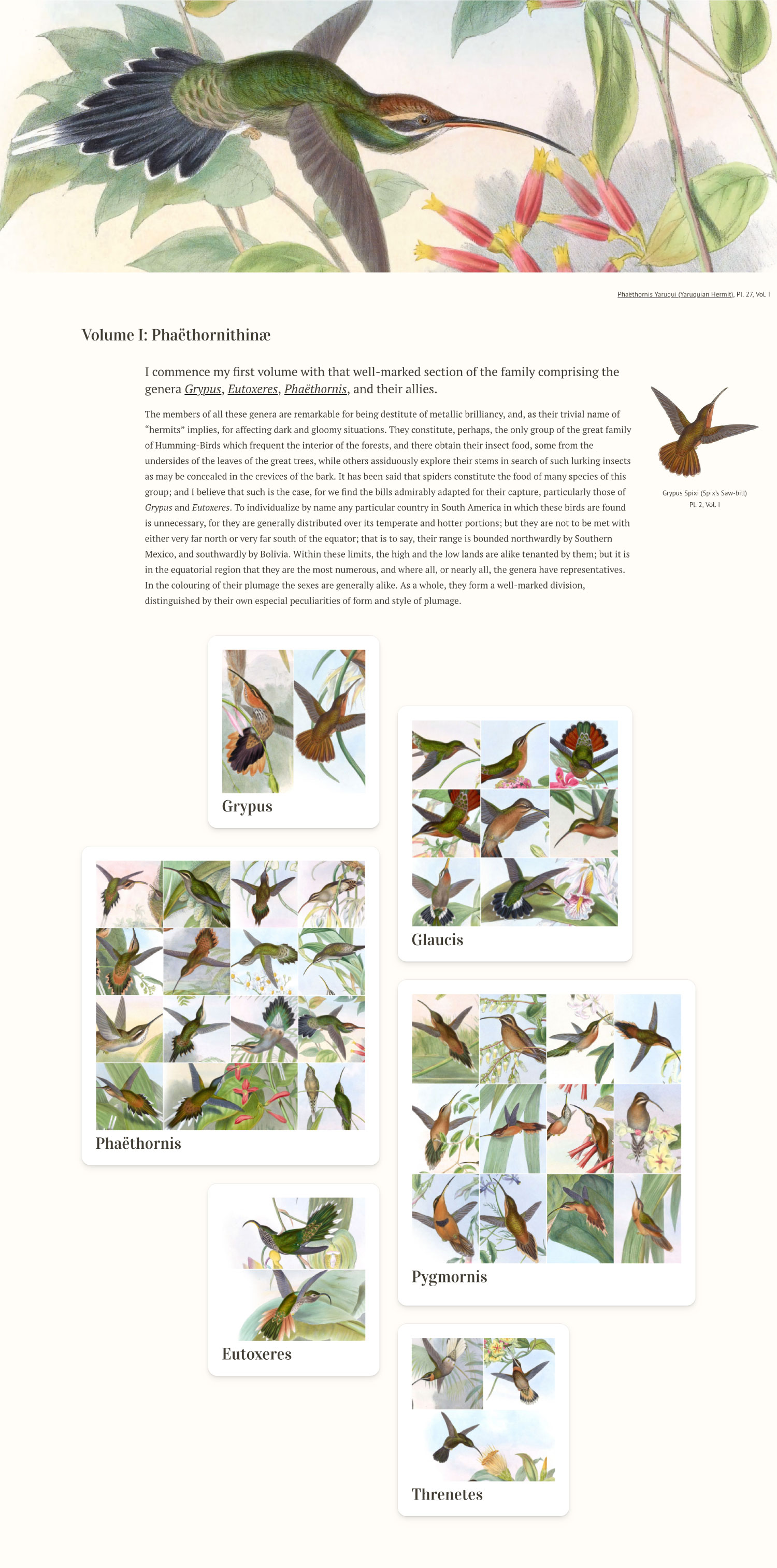
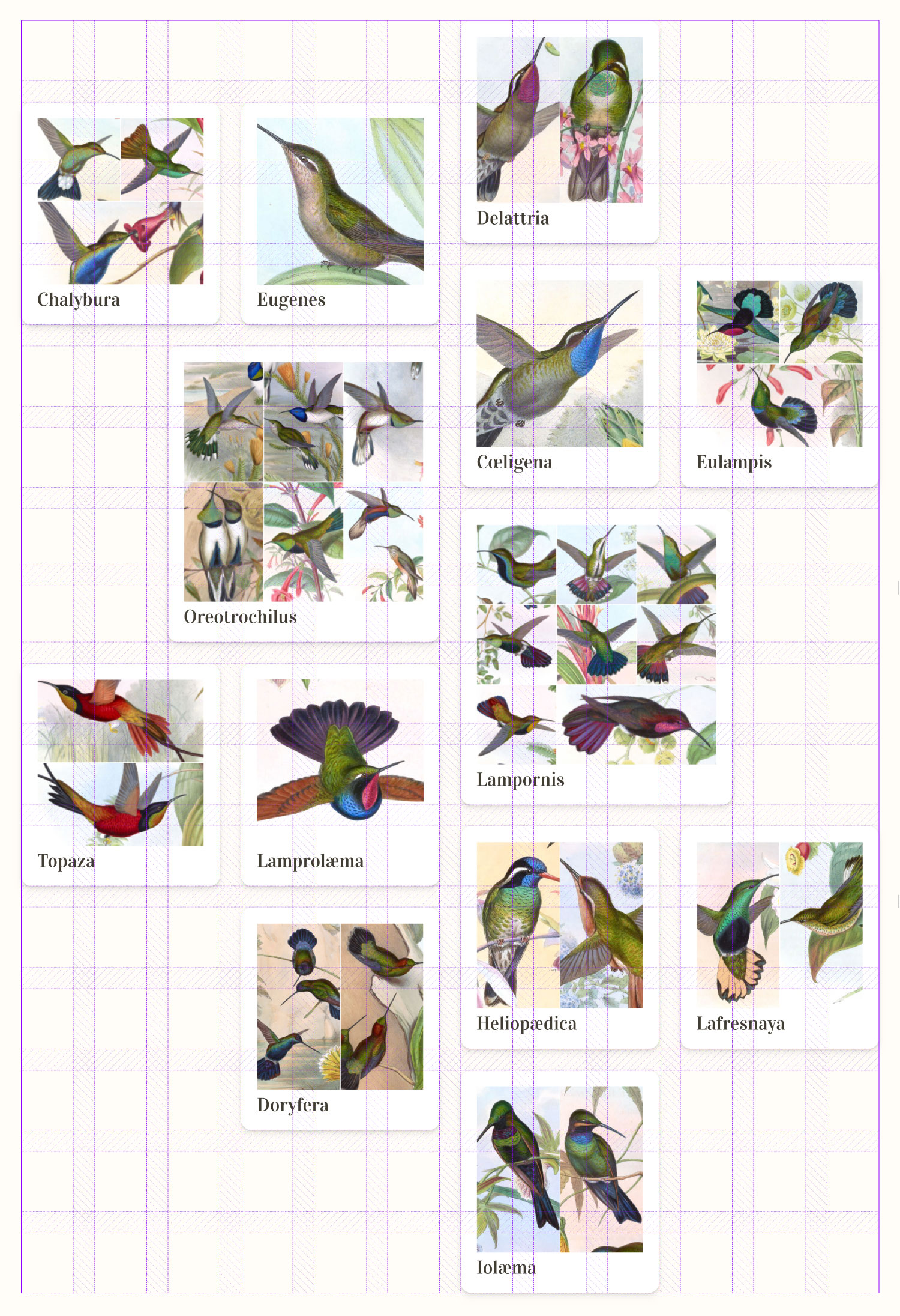
Each collage was custom designed to show all the plates in that genus in in a structured but organic layout adhering to an underlying grid. There were 14 collages in total and clicking a genus within each one takes visitors to a page with details of the species within that genus.
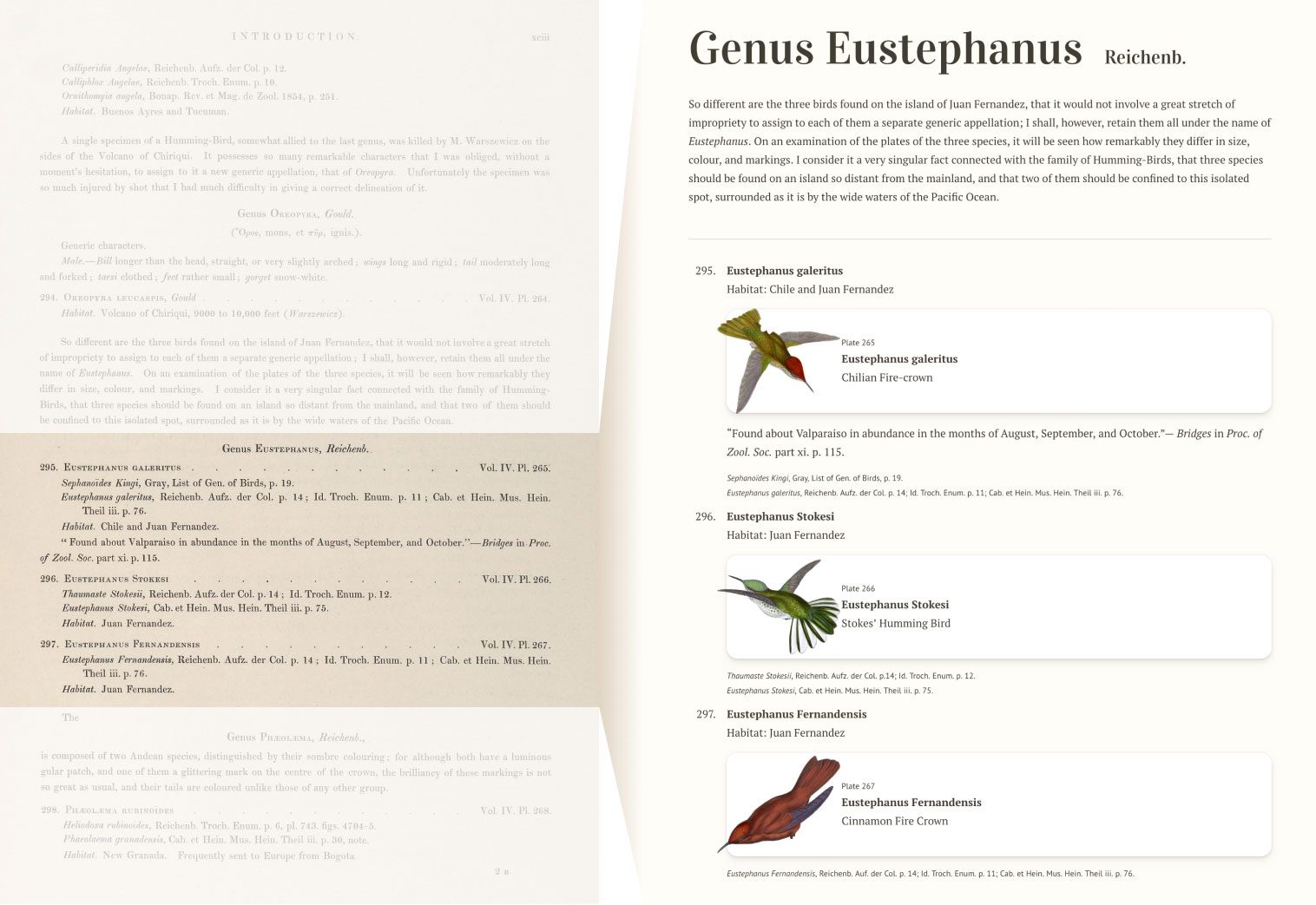
On the genus page is Gould’s original text with plates that were referenced in context. The original monograph only showed text and referenced plates by volume and number. Including an extracted image of a bird from each plate gives the reader a better idea of what to expect and makes reading the list more interesting.
Clicking each image shows a page for that plate including the original restored illustration, and its accompanying description. The splash of color behind the names is based on the key color sampled from the plate during its restoration. Each page also includes links to related species when they’re mentioned.
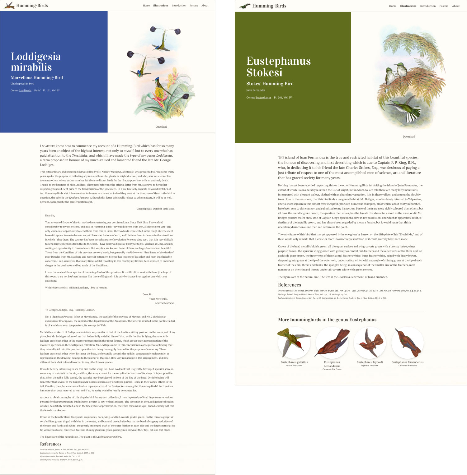
Splitting up the original lengthy classification list into these smaller chunks and using images to delineate them makes for a much more engaging experience and brings the beautiful illustrations to the forefront. Browsing a complete index can still be useful so an index of all plates was also provided. I designed this to be a simple alphabetical list.
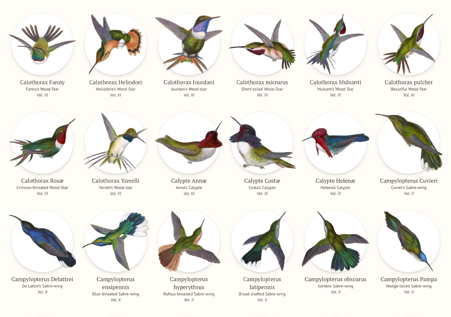
I iterated through several designs for these pages before settling on the final design. Early designs included thumbnails of the full color illustrations instead of just the extracted birds, larger thumbnails, smaller thumbnails arranged in boxes of varying types, but none were enjoyable to browse. They were still good to try because elements from all of them lead to the final design.
Building on a concept
One of hummingbirds’ most well known abilities is hovering almost perfectly still in the air. This idea of elegant flight and is what inspired the visual elements of the digital design.
Chief among them was the subtle elevation applied to most elements. The boxes on the home page, the collages, the circles in the index, and the boxes around the species links all have a subtle but noticeable drop shadow that elevates them from the background—in a way, giving them flight. All the hummingbird thumbnails also slightly extend beyond their boundaries to give the impression that they’re in flight. Additionally, any time a visitor hovers over the thumbnail of a hummingbird, it appears to float a little much like a real one would. This effect achieved with some simple CSS transforms and blend modes and I feel it adds a nice touch.
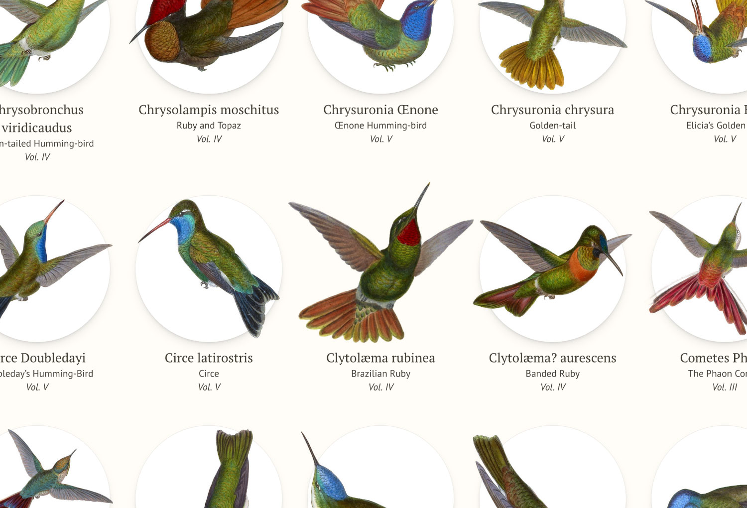
Every time any page other than the home page is loaded, a random hummingbird also appears in the upper left near the name of the site and it too appears to float when hovering over it.

The typography is a subtle nod to the elegance of hummingbirds. Vidaloka is used for the display typeface and has a beautiful elegance that shines in large sizes—especially with ligatures like æ and œ. PT Serif is the workhorse used for the main body and works well for large blocks of text. PT Sans rounds out the collection for captions and references.
Giving a poster life
I had hoped to find an interesting way to showcase all of Gould’s illustrations on a poster but didn’t have concrete direction beyond that when the project started. Creating the murmuration for the home page gave me the idea to create one that would work well as a poster. Little did I know how much work would be involved.
At first, I wanted to try to make a realistic shape of a murmuration but after researching photographs and illustrations of murmurations, I struggled to find a way to easily experiment with shapes that would comfortably fit on a poster. Most photos of murmurations I found were beautiful but my attempts at imitating them left a lot to be desired. Then it dawned on me to try generating some shapes with AI and things started to click. I used Adobe Firefly and the prompt “curved murmuration in the sky” to generate a handful of images.
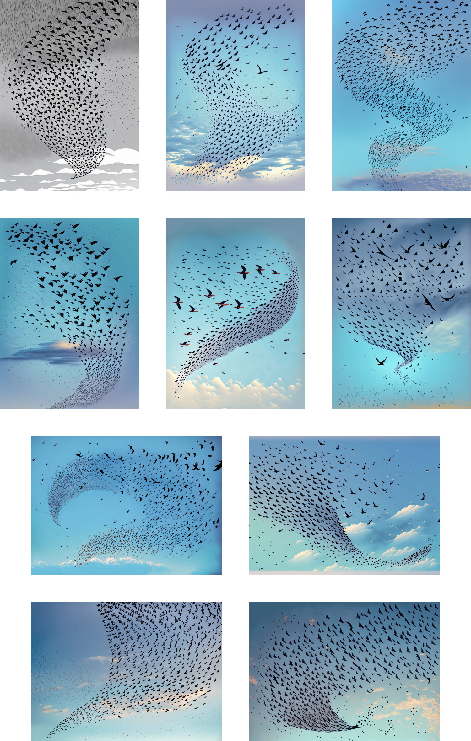
The results were fascinating and gave me the push I needed. After generating several images, I was most inspired by the one of the firsts that appeared—the greyscale one in the preceding set of images. Its general shape with elegant curves served as a good basis for the final shape.
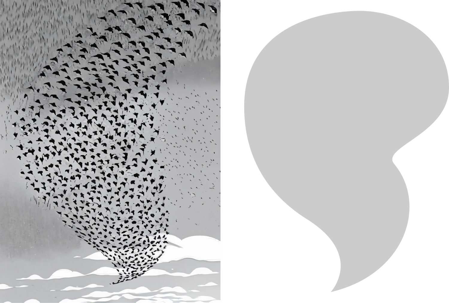
To create the murmuration for the poster, I followed the same steps for the one on the home page but what I did’t previously mention was the prep needed to organize the files so they could be used efficiently in Figma and InDesign. Since I wanted to arrange them by color, I had to rename the files based on their order after sorting by hue. Then, import those files into Figma and InDesign. Interestingly, I found NodeBox to be most useful in prepping the files. Those more skilled than me could probably take care of this with a simple script but I used what I knew.
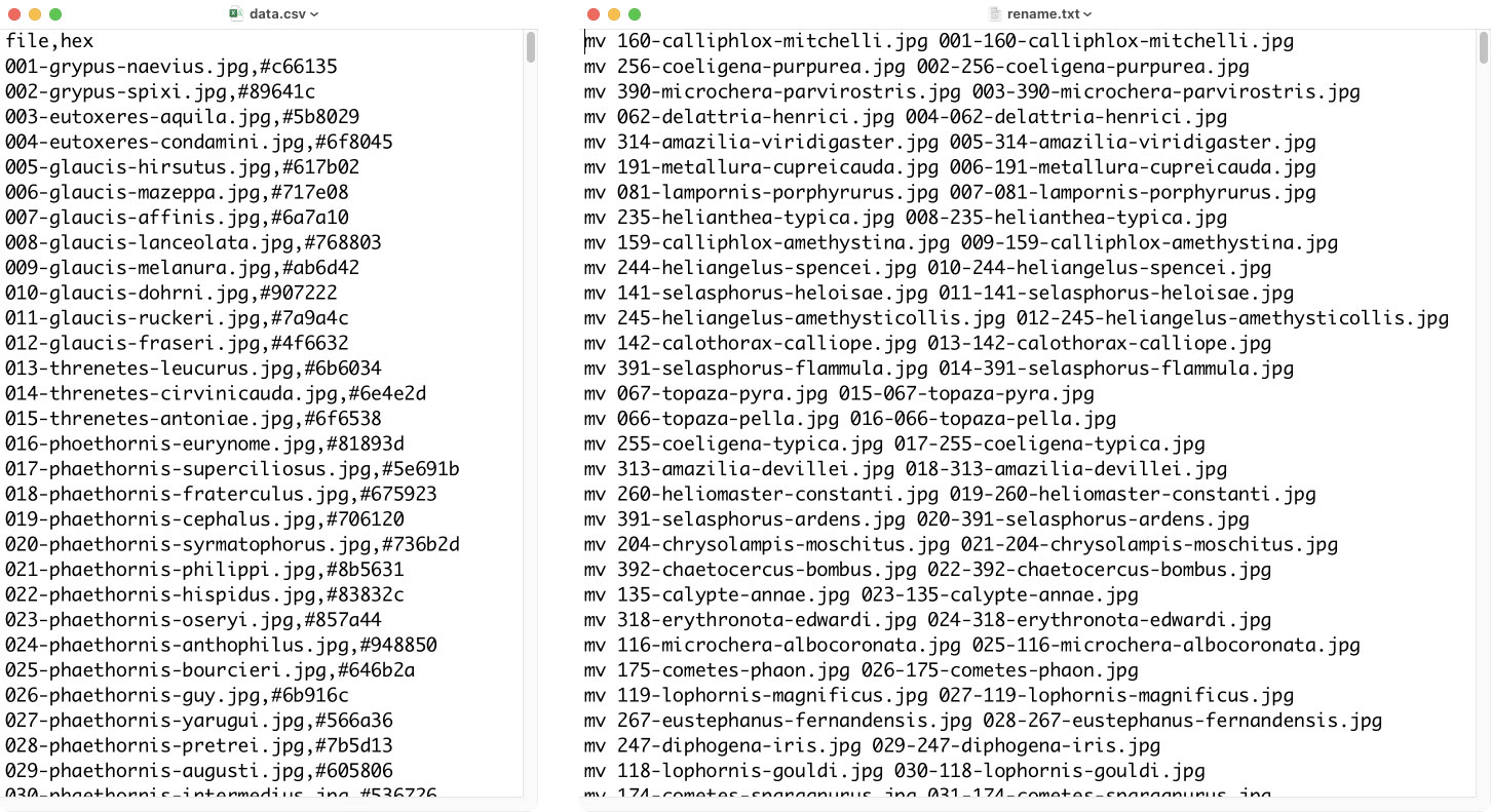
- Generate a CSV of filenames and colors (e.g.,
001-grypus-naevius.jpg,#c66135). - Import that CSV into NodeBox
- Extract the hue
- Sort files by the hue value
- Use concatenation to generate commands for a batch renaming file with numbers based on the new order (e.g.,
mv 001-grypus-naevius.jpg 043-001-grypus-naevius.jpg). - Export the commands from NodeBox to a CSV
- Clean up the renaming commands CSV and save as a text file.
- Put a copy of all the images and the renaming file into a folder and run the renaming file.
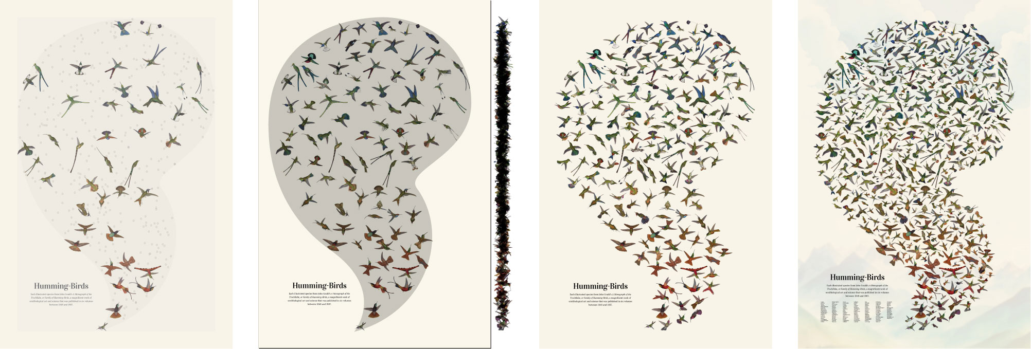
Next, came the poster assembly but with some modifications for managing them efficiently in InDesign:
- Import the murmuration shape into InDesign and size to fit the the poster.
- Manually place an illustration on each dot (first image from left above).
- Horizontally center all the illustrations and move to the side (second image from left above).
- Manually place the largest images back on the image first, then progressively smaller images—rotating and resizing as necessary to fit (third and fourth images from left above).
Horizontally aligning images after they were placed was important because it allowed me to see the distribution of color based on the overall shape. Over the course of making many collages for past projects, I’ve learned that ensuring all objects fit is most efficiently done by placing the larger objects first. This horizontal alignment also made the larger hummingbirds stand out so they were easier to move over. As long as I kept them roughly in the same vertical position, the color gradient from top to bottom was preserved. I even added some faint clouds and mountains to the top and bottom to give the birds the appearance of flight.
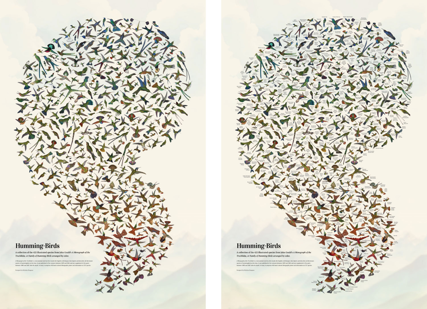
Unfortunately, the poster felt lacking. While working on it, I wanted to know the name of each hummingbird. I tried adding a legend of all the genera under the title with the idea of numbering each bird but that wasn’t enough. I firmly believed adding a legible label to each bird would be impossible and require too much work. After all, it took hours just to get all the birds to fit comfortably on the poster on their own. However, after a week of being uneasy about it, I started adding a few labels to see what was possible. Much to my pleasant surprise, I was able to add a label to every bird and they were legible when printed on a standard poster size. The labels increase the visual density of the poster but they also make it far more enjoyable to explore. The process of adding them took a solid day to complete.

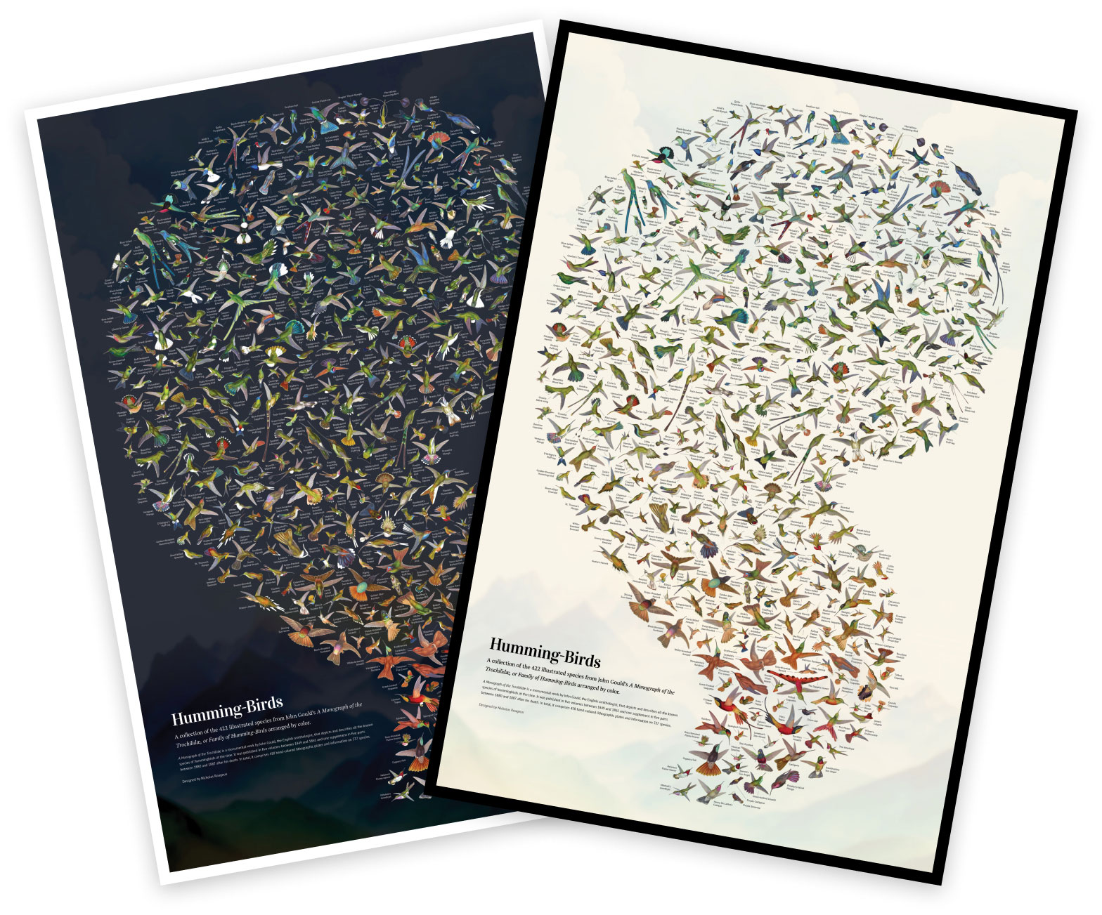
One final nagging thought stuck with me: “What about a dark version?” I couldn’t help but wonder if a dark version of a poster would look good. I thought it might but couldn’t be sure and there wasn’t an easy way to test it because all the images I had generated were JPGs. These worked fine for the first poster because I could set the blend mode to multiply in InDesign and the white background would disappear. I needed PNGs with transparent backgrounds for a dark version and those had to be created manually from the Photoshop files I created while restoring the images. The process took four extra days but I was able to prepare the PNGs and slowly got them in place. The result turned out better than I had hoped and the colors stood out even better than the light version. I liked both styles so they’re both available for purchase.
Final thoughts
This project turned out to be unexpectedly fascinating. Learning about the different types of hummingbirds over the two months spent on this project was great fun. The Loddigesia mirabilis and Topaza pella are some of my favorites with their long decorative tail feathers. I also enjoyed figuring out new ways of creating collages like the murmurations and I’m sure I’ll use those skills in future projects.
