Making of Iconographic Encylopædia
By Nicholas Rougeux, posted on February 6, 2022 in Art, Data
The digital edition of Iconographic Encyclopædia from 1851 was the largest and longest project I’ve undertaken by far. Comprising 500 plates, more than 13,000 illustrations, 1.6 million words, and spanning 13 months, it was a wonderful exercise in creativity and patience.
Inspiration
Inspiration came from completing several other digital editions of nineteenth century texts, but the main seeds were planted around the summer of 2020 as I was looking for a new project. While perusing the Internet Archive (a favorite resource for such things). I was struck by the treasure trove of illustrations in Iconographic Encyclopædia and their incredible detail. After some early attempts to think of an interesting project buried within, the sheer volume of information and the lack of decent ideas forced me to seek out material for other projects. This proved to be a good thing because the knowledge gained while working on them primed me to approach the encyclopedia with fresh eyes when I rediscovered it just before the end of the year.
When I rediscovered the encyclopedia at the tail end of 2020, I had just finished A Brief Exploration of the Dictionary of Typography and British & Exotic Mineralogy a few months prior. I was itching to do something similar in scope to the latter but with some creativity like the former. The encyclopedia was a perfect combination of the two.
Source material
As with most projects, I started with research. Unfortunately, there wasn’t much to be found about the encyclopedia beyond booksellers’ descriptions and brief mentions on Wikipedia. However, I did discover there were multiple editions published—each with their own unique characteristics.
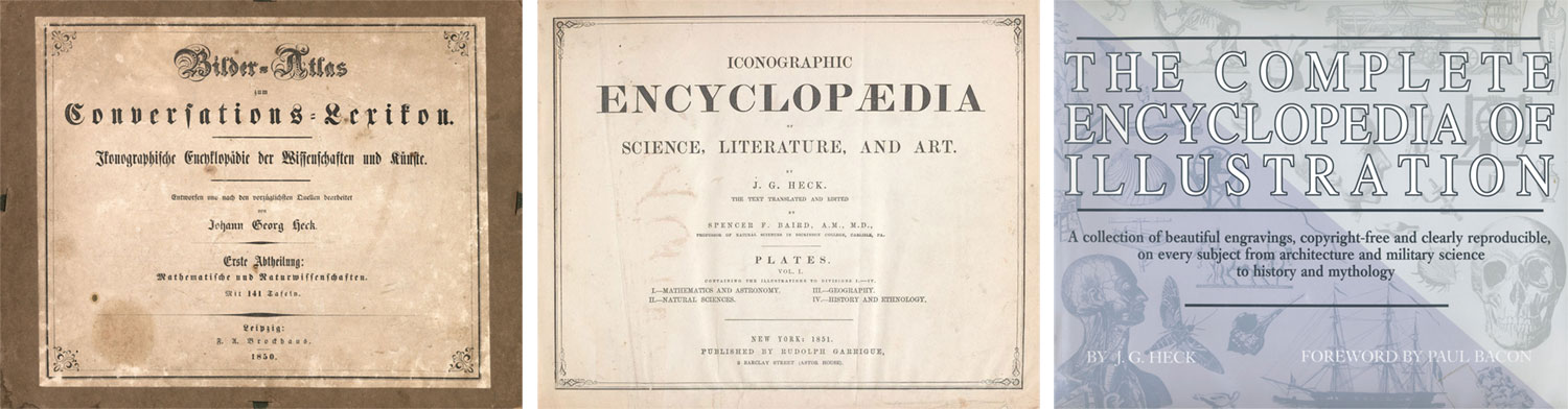
- German edition (original): In 1844, German publisher Johann Georg Heck started compiling his encyclopedia titled Bilder-Atlas zum Conversations-Lexicon. Ikonographische Encyklopädie der Wissenschaften und Künste as a supplement to a larger encyclopedia, Brockhaus Enzyklopädie. He worked with nearly 30 engravers to create 500 steel plates engraved with more than 13,000 illustrations covering a wide range of subjects from astronomy to zoology. Accompanying them were lengthy texts that described nearly every figure illustrated. The encyclopedia was released in 10 parts between 1849 and 1851 but always as separate collections: the plates and the descriptions. A brief history biography of Heck is available on Wikipedia (German, English translation) and an abbreviated English version on Historic Accents.
- English edition: Between 1851 and 1852, the encyclopedia was translated to English and published as Iconographic Encyclopædia of Science, Literature, and Art. This appears to have become the most well known edition and was what I found on the Internet Archive. It was edited by Spencer Fullerton Baird, who would later become the first curator of the Smithsonian Institution and released in six volumes: a two-volume set of plates and a four-volume set of the descriptions. Scans of the entire English edition are available on the Internet Archive—interestingly, uploaded by the Smithsonian Institution (plates, vols. 1, 2; descriptions vols. 1, 2, 3, 4). This struck me as a nice connection back to this edition’s beginnings. Portions of the text were rewritten and a few plates redesigned, the details of which are covered in my analysis.
- Remastered edition: A remastered version of the English edition was later released in 1979 under the title The Complete Encyclopedia of Illustration. This edition included plates from the English edition reproduced with fine-line offset lithography as described its introduction, which also includes summaries of the illustrations found in each subject. Paul Bacon wrote the foreword. Two key differences of this edition compared to its predecessor are the absence of the descriptions but the addition of new titles for all of the plates. This edition appears on many booksellers’ sites and on Amazon for fairly low prices.
I decided to base my project on the English edition because all its volumes were available and it was the most well known. A drawback was the quality of the plate scans. They were heavily compressed but I was willing to work with them, considering better options weren’t available. I bought a copy of the remastered edition with the half-baked notion that I could scan its plates myself and use them but ultimately decided against it. I couldn’t bring myself to destroy a book by ripping out its pages for scanning, doing so would likely violate copyright laws, and while their reproductions were beautiful, they had a enough differences from the original (e.g., darker contrast, lack of detail in areas) so I decided to stay with the scans from the English edition. I was glad to have chosen this route because the book I purchased proved to be valuable in other ways. It was the only edition that included titles for each plate and it serves as a great souvenir for a project that I enjoyed.
Having settled on the English edition, I started processing some plates but I was still unhappy with the quality. On a whim, I contacted anyone I could find at the Smithsonian to inquire about higher-resolution versions since they were the ones who uploaded the lower-resolution versions to the Internet Archive in the first place. To help my case, I shared links to my past digital editions. Much to my surprise, I received a prompt response from the kind people at the Smithsonian Libraries and Archives who agreed the scans were less than ideal. They were able to track down their master files and upload the higher-resolution versions after a couple weeks.
To say I was excited was an understatement. My motivation shot through the roof. I assumed if I was lucky enough to get a response, it would have been along the lines of, “Thank you but it’s not possible.” Hearing that they enjoyed my previous projects and they would upload the higher-resolution versions was a thrill. The project wouldn’t have turned out the way it did without their help. The collection page for of all six volumes of the encyclopedia is on the Smithsonian Libraries and Archives.
Three months into the project, I discovered higher-quality scans in the David Rumsey Historical Map Collection. These scans included the original plates and their tables of contents. I was a little disheartened for not having found it sooner but chose to stay with the English scans from the Internet Archive because they aligned better with the English text, there wouldn’t be a noticeable change in quality with how I wanted to display them, and the English plates were in the public domain. Rumsey’s scans are under a Creative Commons License but one that prohibited commercial uses and I wanted to create some posters from them. They’re still beautiful and worth exploring.
Goal
The goal was simple but daunting: create a digital edition that’s easier to explore than the printed editions.
An inherent problem with these editions was the separation between plates and their descriptions. Likely due to limitations of the periods in which they were published, this separation made readers jump through a lot of hoops to figure out what was illustrated on a plate or what was being described.
If a reader saw an interesting figure, they would need to:
- Find the figure number on the plate (sometimes wasn’t present).
- Find the subject of the plate (wasn’t shown on plates)
- Find the volume of descriptions that contains the subject of the plate.
- Search the table of contents for the plate number.
- Search the list of figures in the plate’s table of contents to find the pages on which they’re referenced (didn’t always contain a clear list and was sometimes a range of pages)
- Go to the page mentioned and search for the reference (e.g., Fig. XX).
Similarly, if a reader found an interesting description, the process would need to:
- Find the subject being discussed (at the top of every page).
- Find the plate of the figure being referenced (figures were referenced as “pl. 1, fig. 15” or often just “fig. 15” with its plate number appearing somewhere before it—often several pages away).
- Find the volume of plates containing the subject.
- Find the plate.
- Find the figure.
This process was arduous and one I went through many times when exploring the encyclopedia. I found myself wondering, “what’s that?” when I saw most figures and constantly groaning when I had to jump back and forth between several books to figure out what it was. Placing the figures and plates in context and thereby removing the back-and-forth would be vast improvement. Incorporating more than 13,000 figures into 1.6 million words of text during the nineteenth century would have have been prohibitively expensive and time consuming so it’s understandable why that wasn’t originally done. However, today’s technologies make this doable as long as someone is willing (and a little crazy) to put in the time.
Design
Crafting a design for such a large amount of material that keeps readers interested and wanting to explore more was a challenge. My design process was broken into several parts.
Figures
Figures were arguably one of two centerpieces of the entire encyclopedia—second only to the plates containing them. There were more than 17,000 references to figures throughout the text so their design was a natural starting point. I wanted to find a way to integrate figures and plates into the text without hindering the reading experience. There are too many figure references to show them at full size in context so I needed a way of making existing references interactive (e.g., pl. 1, fig. 15) indicating that they could be clicked to see that figure. Abstract indicators like ellipses or magnifying classes were my first attempts but proved to be too vague and added a lot of visual noise.
Tiny thumbnail previews proved to be the most interesting even though they were at such a small size. They also stood out and invited interaction while providing a hint of context for the surrounding text. I never expected anyone to read all 1.6 million words of text but a tiny picture of a bird, canon, ship, etc., can be enticing.
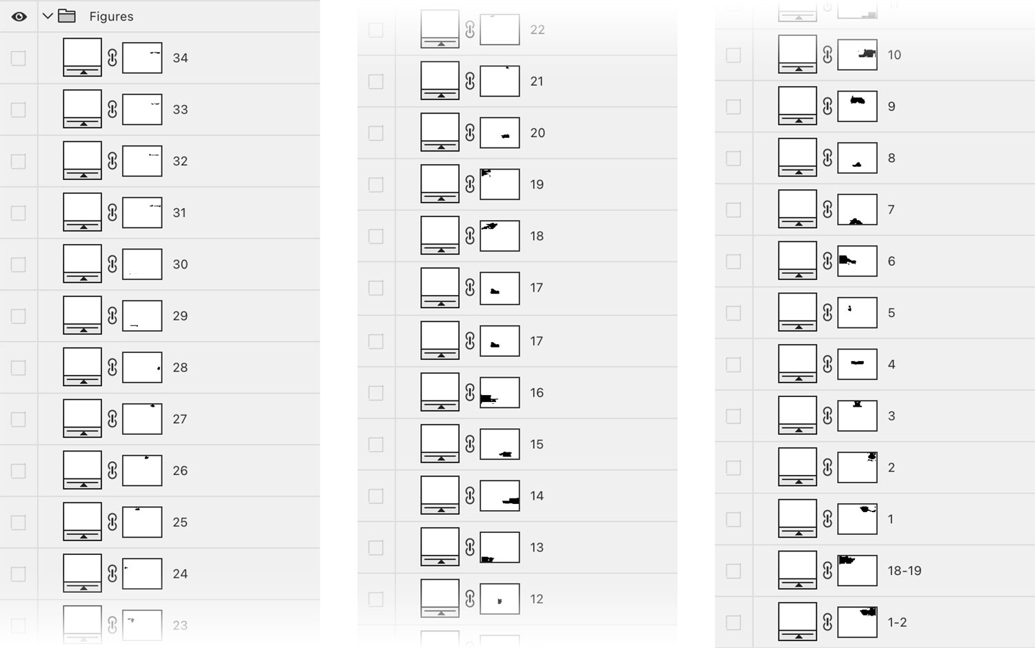
The challenge was adding these tiny previews efficiently. Creating small versions of each figure and loading them separately would negatively affect performance with hundreds or thousands on any given page page. I also didn’t want to have to create two files for every figure or add the image references in the code, which would have been a nightmare to maintain. To my surprise, the most effective solution was from the early days of the web: sprites. Sprites allowed for showing tiny previews by loading one composite image instead of thousands of smaller ones. Thankfully, CSS Sprites Generator from Toptal did a great job of creating the composite image and corresponding CSS. No other sprite generation tool I could find did this as quickly or provided the output I needed. The composite images for each subject are also fun to explore on their own.
After extracting all the images for a subject (the process of which is described later in this blog post), I prepped the sprites by creating a copy of each image that was scaled down to a size that would fit well within the text, which was no larger than 120 × 66 pixels. Keen-eyed readers may notice that this size is too large to fit nicely in the text. If images were scaled down to fit nicely in the text, they appeared a little blurry so I doubled the size of the sprites but halved all of the CSS values from the generator, which resulted in sharper images.
The sprites are injected into the text based on the attributes of each figure reference. As I formatted the descriptions (this process is also described later), I made sure to include two key attributes for each reference so a script could target it: data-plate and data-fig. These provided the necessary info so the script could inject the correct thumbnail.
For example, when a page loads, this figures are marked up like the following:
<a href="#" class="fig" data-fig="76" data-plate="1-2"><em>pl.</em> 2, <em>fig.</em> 76</a>
After a page is finished loading, the script runs, each figure is given one or more thumbnails:
<a href="#" class="fig" data-fig="76" data-plate="1-2" aria-expanded="false" id="figlink-81" role="button"><em>pl.</em> 2, <em>fig.</em> 76<span aria-hidden="true" class="fig-thumb plate-1-2-fig-76"></span></a>
Each tiny thumbnail’s class is specified in the CSS from the sprite generator:
.plate-1-2-fig-76 {
    background-position: -539.5px -176px;
    height: 33px;
    width: 34px;
}
The next challenge was to let readers view full size figures after clicking references. Originally, I thought of showing them in a popover but that would have obscured surrounding text. Multiple figures are also often included in a single reference (e.g., “Figs. 30–37”). Most of the time only one figure is mentioned but there can be as many as 65, which was too many to show in a popover. I also wanted to give readers as much context as possible in the expanded view, including captions, a link back to its plate, and a download link.
After iterating several times as I built out the rest of the site, I settled on a design that injects the figure next to its reference when clicked, accommodates all the info necessary, and allows readers to click to see a full screen version for the larger figures like scenes.
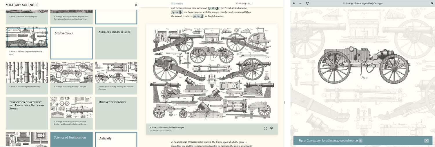
Plates
Individually, each of the encylopedia’s 500 plates is impressive. As a collection, they’re a wonder. I wanted them to be a prominent feature of the overall design and integration. Plates were placed in the text near where its figures were referenced the most and I was able to reuse some features from British & Exotic Mineralogy—namely the interactive overlay that made the figures clickable.
An early design showed plates alongside the text—the idea being that they would stay visible where they’re most relevant while scrolling down. The effect world have been similar to the diagrams on my Bryne’s Euclid project. This was problematic because determining relevance wasn’t always straightforward and several plates were often referenced simultaneously.
Instead, I opted for a linear layout where the plates still appeared closest to where its figures were referenced but didn’t stay visible while scrolling. Plates as a whole were rarely mentioned and every figure included a link to jump back to its plate so there was no reason to keep them visible.
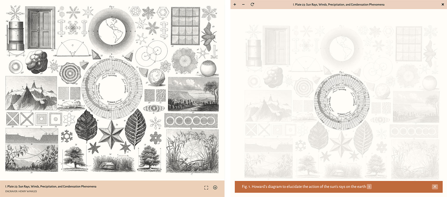
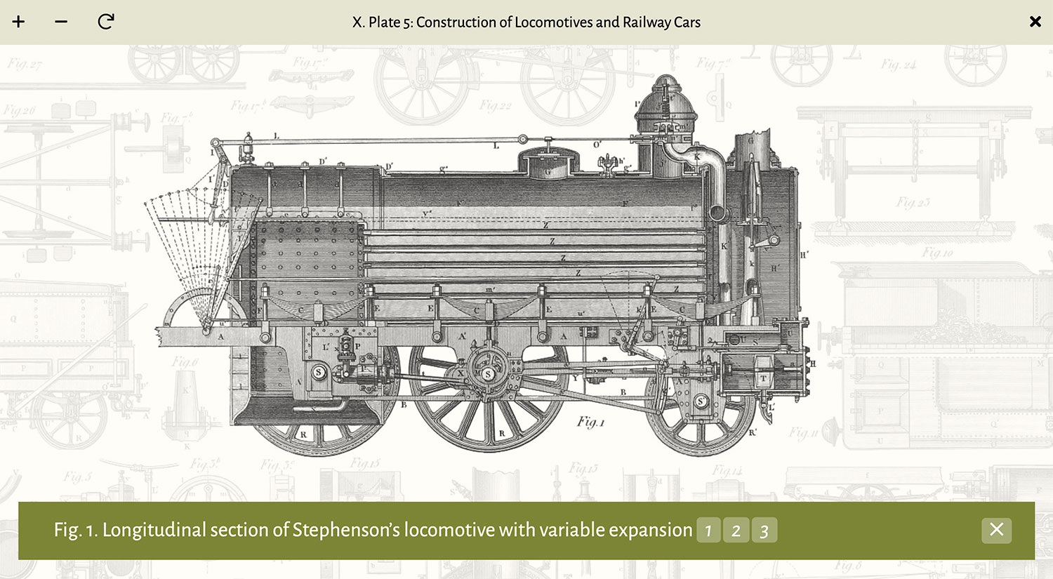
Making them interactive was based on the OpenSeadragon library. I planned on adding the interactive overlay to all plates when the page loaded but that proved problematic after the first proof of concept. The library uses scrolling for zooming which interferes when scrolling through a page. Plus, with up to 80 plates displayed for any given subject, performance would have taken a serious hit. Showing just a static image that took up the full width of the screen provided a reasonable view of the entire plate and clicking allowed for launching a full screen view to explore the details. As with the figures, a download link is available on all plates for the restored full resolution version. The full screen mode is also the only time when the coordinates for the clickable hotspots are loaded, which keeps performance smooth.
Since plate images were large, I set them up with lazy loading using jQuery Lazy so they only load when in view. This worked great but images that are loaded lazily don’t have dimensions by default so scrolling down or jumping between sections of a page caused the content to jump around while they loaded. As a workaround inspired by Preventing Content Reflow From Lazy-Loaded Images on CSS Tricks, I used a placeholder empty SVG with a hardcoded aspect ratio based on the image’s dimensions to take up the same space as an image would before it loads.
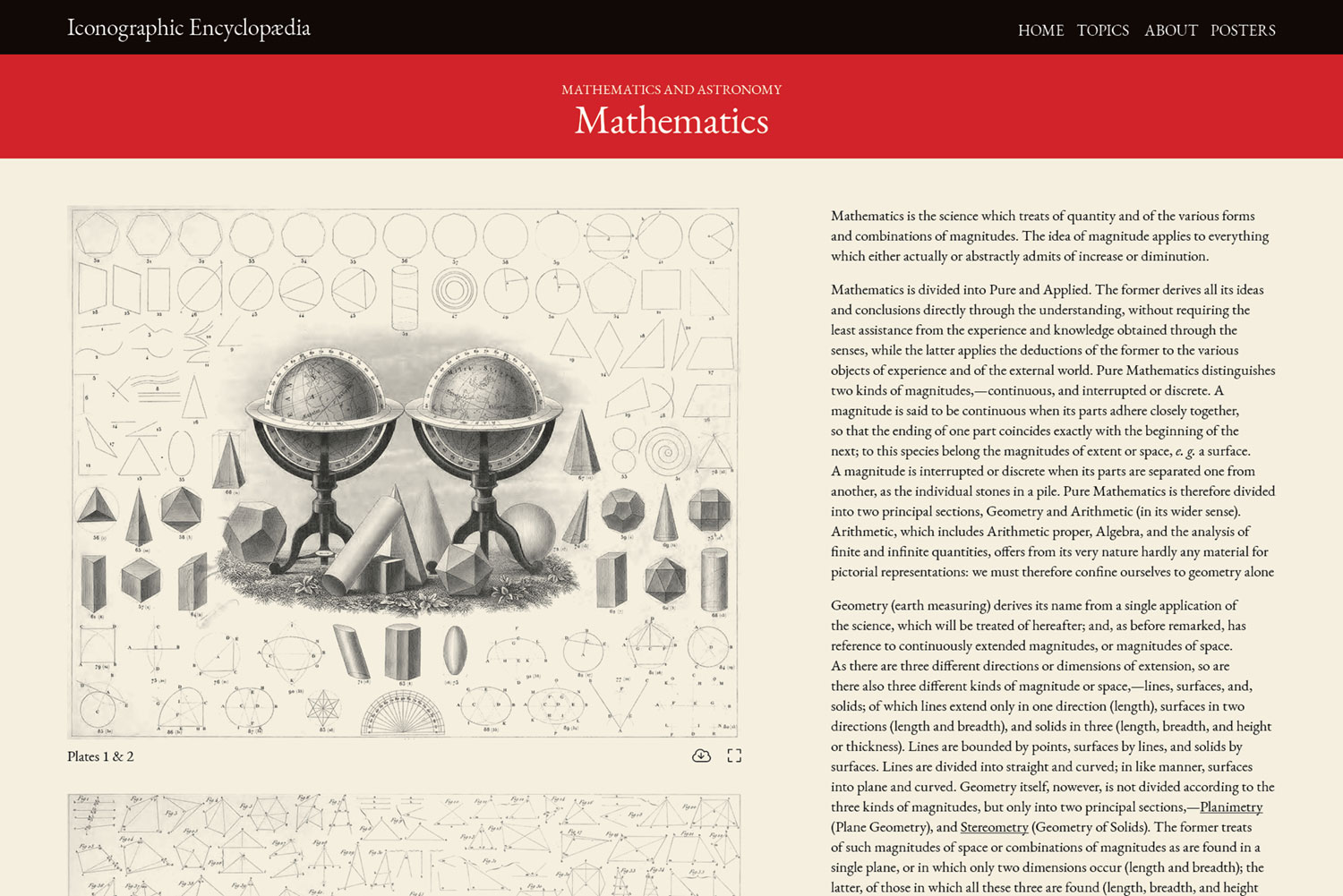
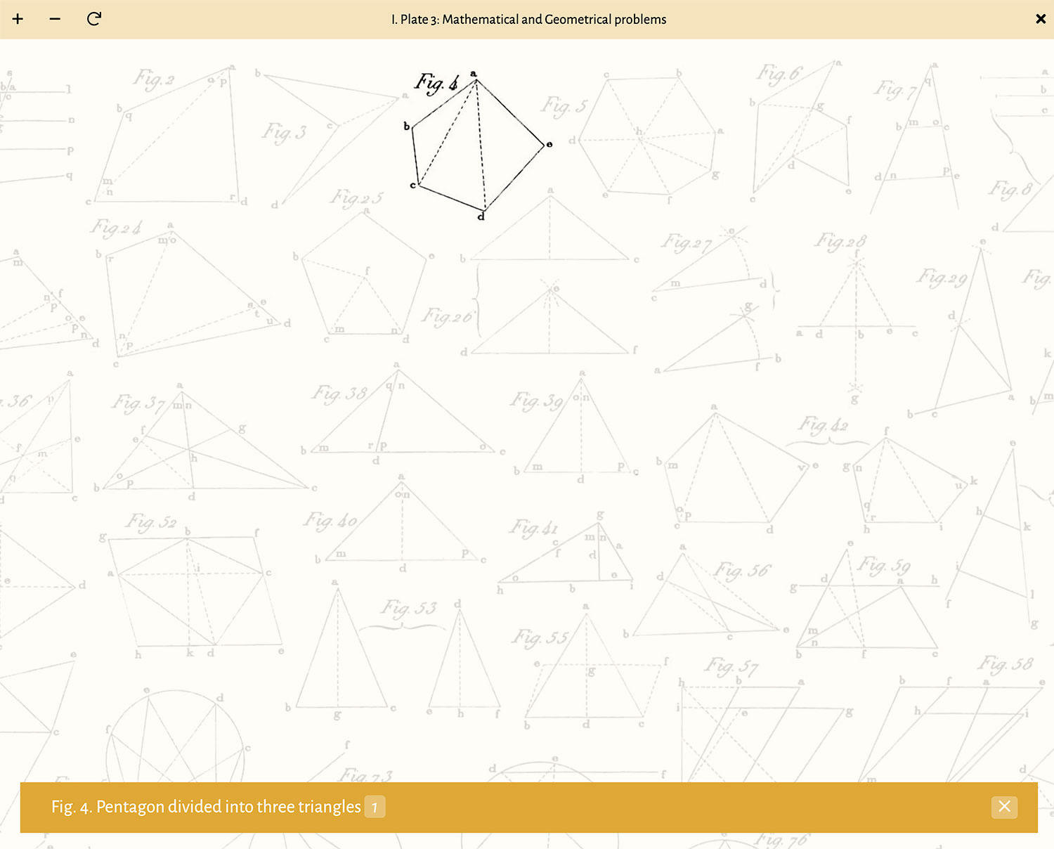
For example, the markup for the plate 3 in mathematics is:
<figure class="plate bleed" id="plate-3">
    <div class="plate-media"><img alt="" data-src="/images/iconography/mathematics/plate-3/plate-3-preview.jpg" height="1573" width="2000" /></div>
    <figcaption>
        <div class="plate-caption">
                <div class="plate-title">I. Plate 3: Mathematical and Geometrical problems</div>
                <div class="plate-engraver">Engraver: Henry Winkles</div>
        </div>
    </figcaption>
</figure>
The markup is minimal and semantic. The data-src attribute is used by jQuery Lazy to load the image when in view. After the page loads and a script runs, the markup looks like this:
<figure class="plate bleed" id="plate-3">
    <div class="plate-media">
        <svg class="plate-media-placeholder" xmlns="http://www.w3.org/2000/svg" viewBox="0 0 2000 1573"></svg>
        <button aria-label="Enlarge plate" class="plate-enable">
            <img alt="" data-src="/images/iconography/mathematics/plate-3/plate-3-preview.jpg" width="2000" height="1573">
        </button>
        <div class="osd">...</div>
    <figcaption>
        <div class="plate-caption">
            <div class="plate-title">I. Plate 3: Mathematical and Geometrical problems</div>
            <div class="plate-engraver">Engraver: Henry Winkles</div>
        </div>
        <ul class="plate-actions">
            <li><button aria-label="Enlarge plate" class="plate-enable"><i aria-hidden="true" class="fal fa-expand"></i></button></li>
            <li><a download="mathematics-plate-3.jpg" href="/images/iconography/mathematics/plate-3/plate-3.jpg" title="Download plate"><i aria-hidden="true" class="fal fa-arrow-circle-down"></i></a></li>
        </ul>
    </figcaption>
</figure>
Several things get added:
- An SVG at the beginning with the same dimensions as the image. CSS makes the SVG fill its parent container and places the lazy loading image on top of it so when it loads, no content is shifted.
- Buttons for launching the interactive view and downloading.
- Extra markup to facilitate the interactive view.
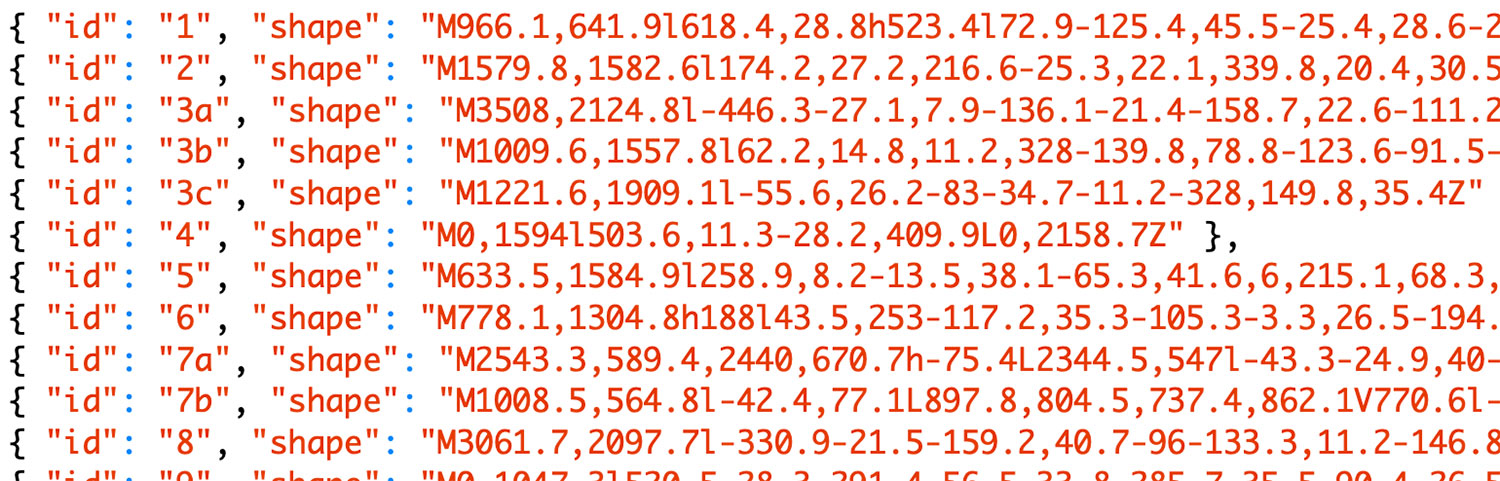
Once the interactive view is launched, it fills the screen. At first, I tried to keep it contained within the plate’s boundaries but this felt too restrictive and the plate was best enjoyed when it has the reader’s sole focus. I chose to use OpenSeadragon because it allows for zooming, panning, and clicking hotspots that can be loaded with some extra plugins. D3.js is used to load an external JSON file with hotspot coordinates and generate a transparent SVG overlay.
When a figure is clicked on the interactive plate, its hotspot is “highlighted” by increasing the opacity of all other hotspots, making it appear “active.” Its caption also appears at the bottom along with a list of numbered links for where that figure is referenced in the text, letting readers jump to each reference. These links, when combined with the ability to jump from an expanded figure to its plate allow readers to quickly navigate between plates and figures—mimicking but improving upon the back-and-forth of the original printed editions.
Covers
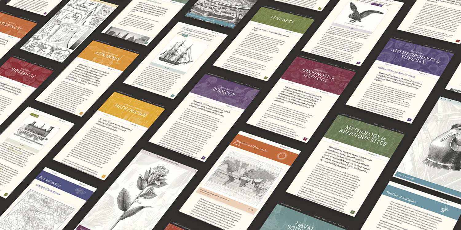
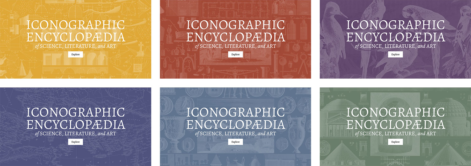
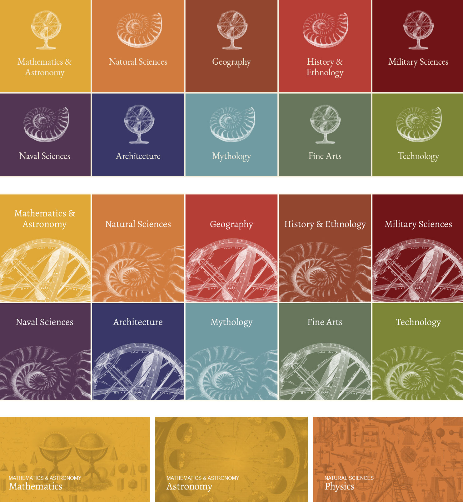
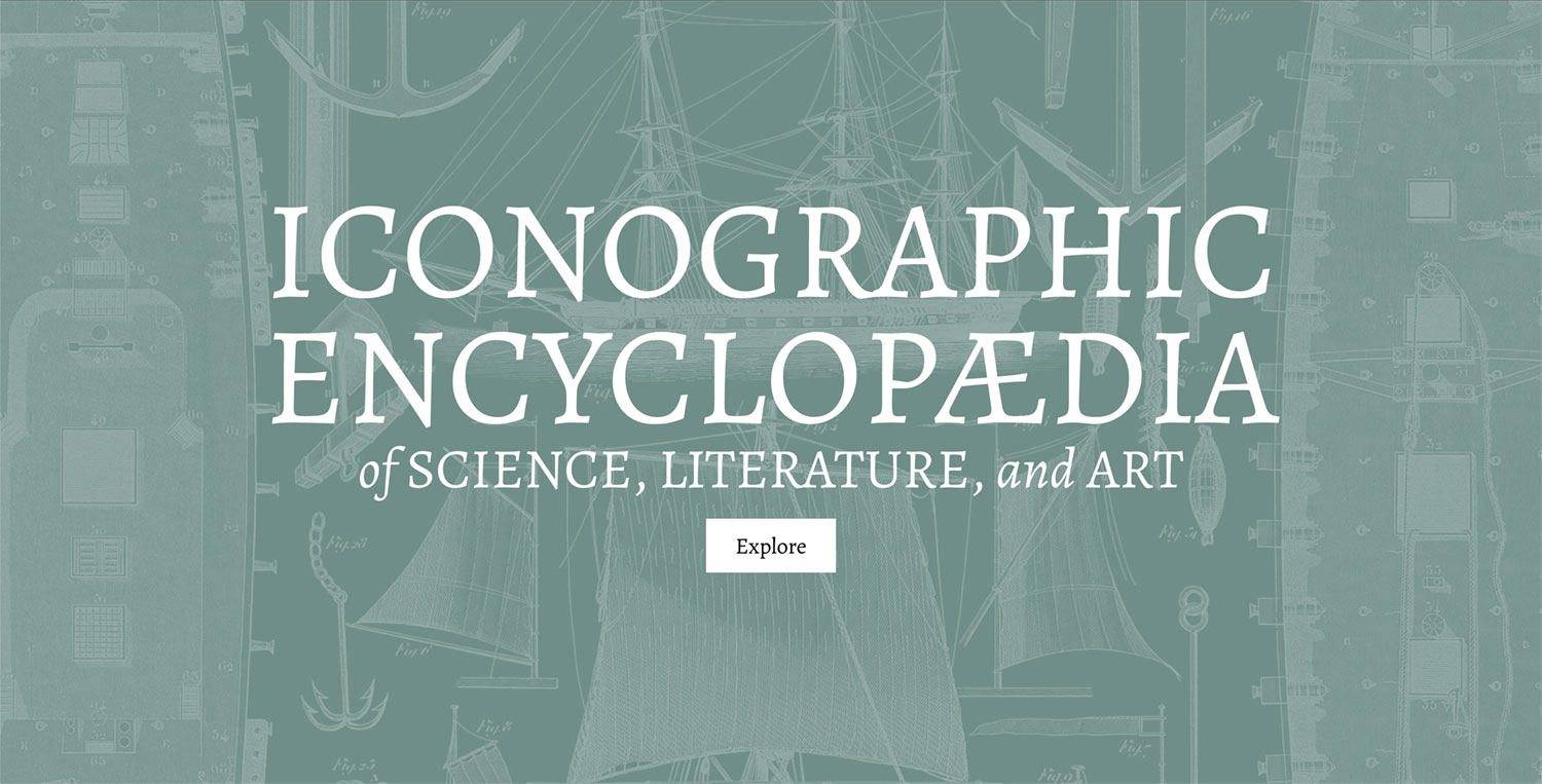
The large colorful banners (“covers”) at the top of the home page and each subject’s page are one of my favorite parts of the project because they add a visual pop. The name “Iconographic Encylopæedia” is a large, somewhat cumbersome name, so I decided to embrace it by making large and prominent. The background of each cover is an actual plate with inverted colors and made slightly transparent. On the home page, a subject is chosen at random and then a plate from that subject is chosen. On a subject’s page, a plate from only that subject is chosen. The result is the site’s identity driven by the illustrations. These covers establish a visual theme for the site: bold, unapologetically large splashes of color for major sections and decorated with real illustrations.
Tables of contents
Due to the length of each subject, a table of contents was a must and the one element that underwent the most revisions. Early iterations were focused on a modest design that only listed the second-level headings.
However, this left me as a reader wanting more because these simple designs didn’t reflect the breadth and depth of a subject. Plates added the visual spice to the text-heavy pages so I tried versions that included plates represented by either icons or small thumbnails in a sidebar.
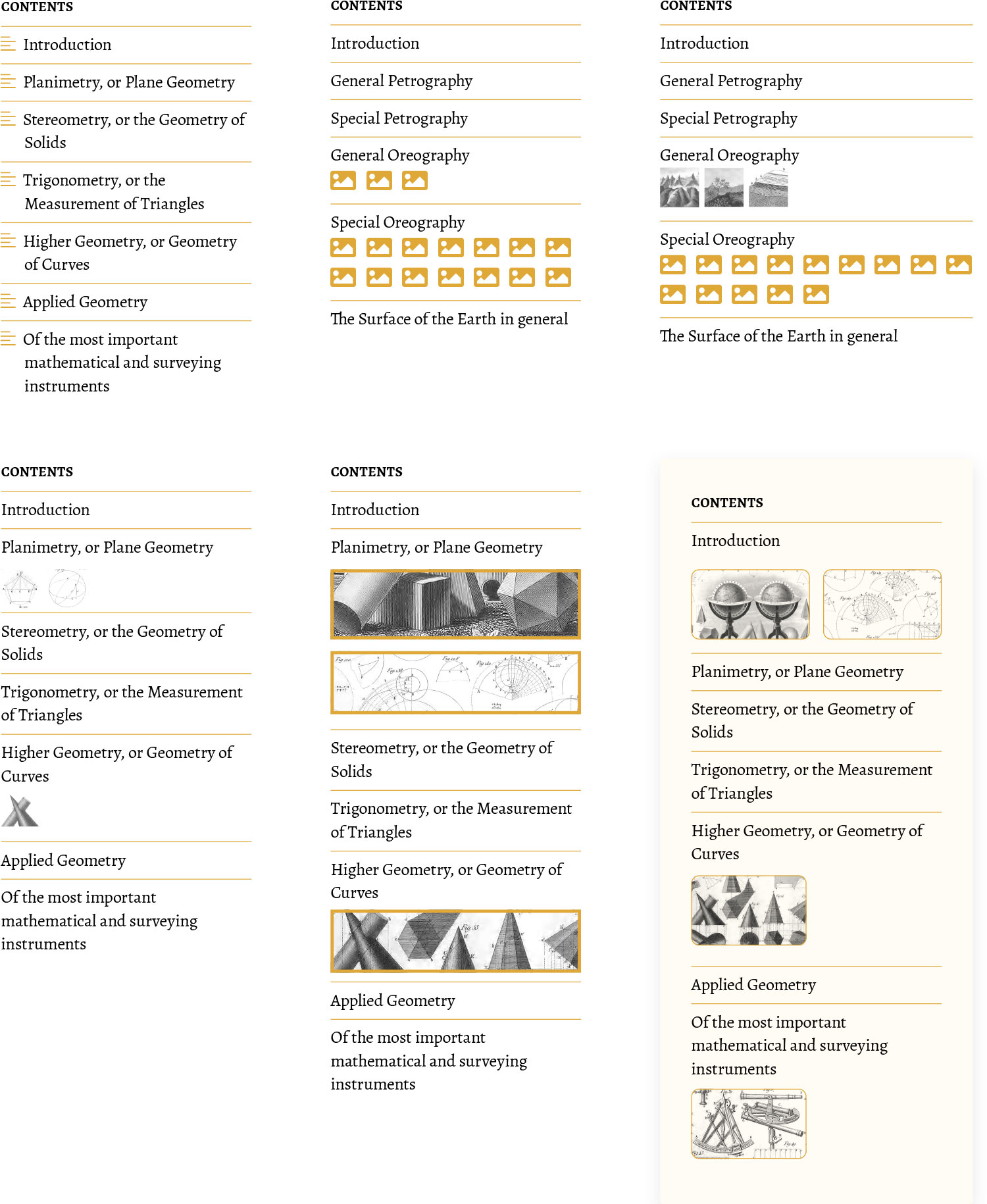
Still, this left me wanting because I felt the table of contents should serve as a summary of an entire subject but also pique a reader’s interest to jump around to interesting topics within it. My goal shifted from modest clarity to decorative elaboration. The next designs featured a larger menu that could drop down in the center of the screen and showed all levels of headings.
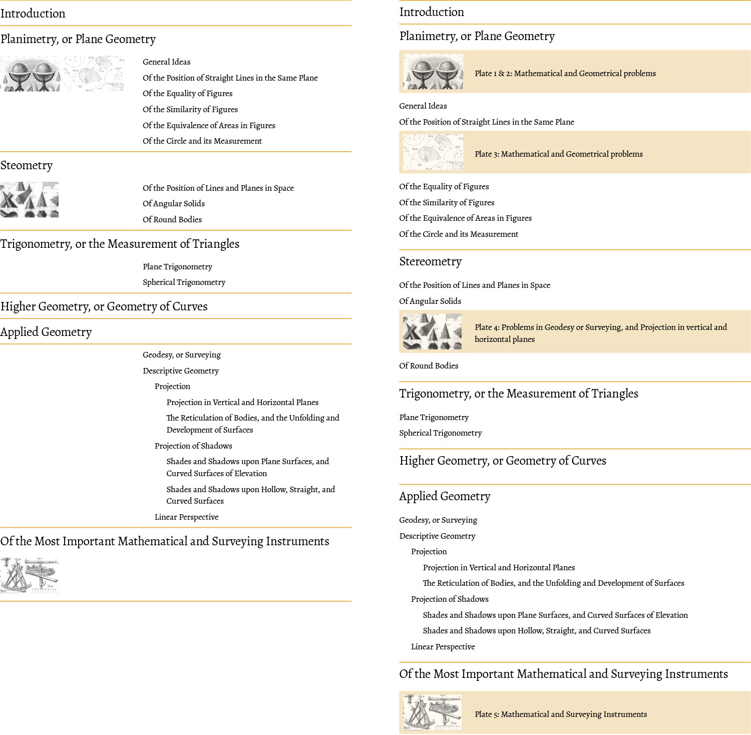
I built and used this this design for a while but it felt lacking because it was tame compared to project’s other design elements so I tried adding some splashes of color for the major headings, enlarging it to take over the full screen when opened, and changing the layout to be more magazine-like.
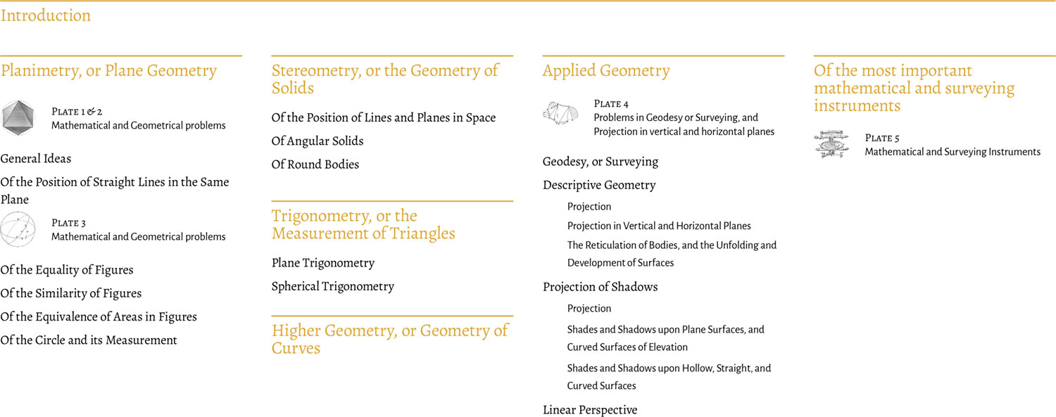
These were closer but devising a system to work with the varying structure of each subject proved problematic and just didn’t sit right with me. After giving myself time to let ideas simmer, I tried a much bolder design with squares that varied in design depending on their contents: splashes of color and figure previews for major headings, plate thumbnails, and less bold designs for lower level headings. Adding thumbnails for each major section was the icing on the cake. Each thumbnail was an actual figure that appeared in that section.
This finally felt more satisfying and much more intriguing as a reader. The hierarchy was a little less clear but that was a reasonable tradeoff for a more visually engaging display. After a little more polish, I settled on a final design that I really enjoyed exploring for every subject.
Colors
Colors were never used in past editions. Colorized versions of some plates are available for purchase but no color has ever been used in any official edition except for the cover of the remastered edition. I wanted to change that and make color a focal point.
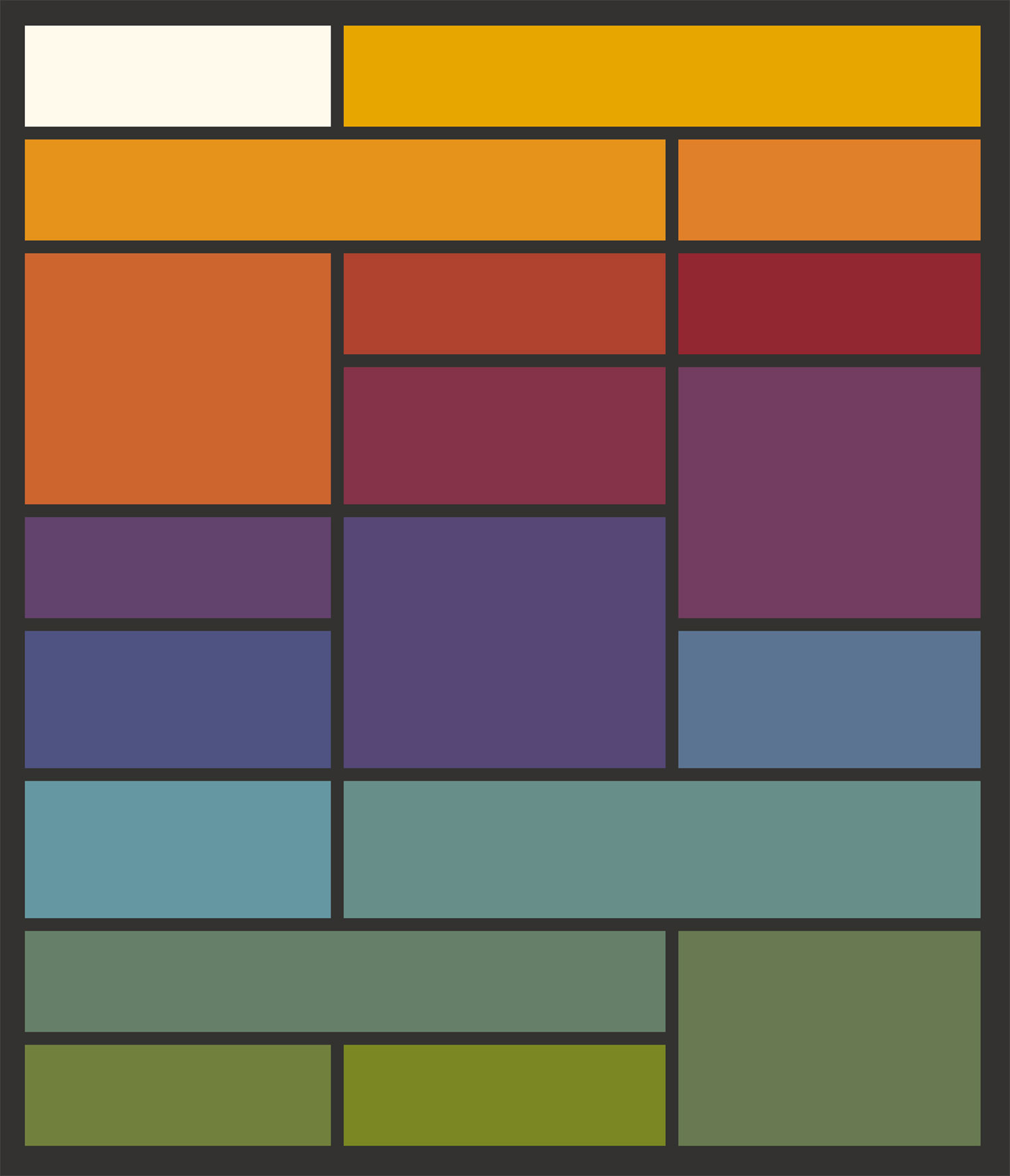
I’ve long enjoyed design systems that use accent colors for entire sections and wanted to try to do the same. I set a goal to develop a palette so subject had its own identity but they’re harmonious when viewed as a collection. The design also couldn’t rely on colors for conveying important information so they would be a purely aesthetic addition. I often find it difficult to come up with my own palettes so I turned to one of my own previous projects for inspiration: Werner’s Nomenclature of Colours. Little did I know when I created that project that it would serve as the perfect resource for this one. Werner’s guide is also from the nineteenth century and the 110 colors contained within were the perfect palette for the encyclopedia’s illustrations.
My original palette was based on 10 colors from Werner’s guide: dutch orange, orpiment orange, vermilion red, deep orange-coloured brown, arterial blood red, auricula purple, China blue, greenish blue, olive green, and sap green.
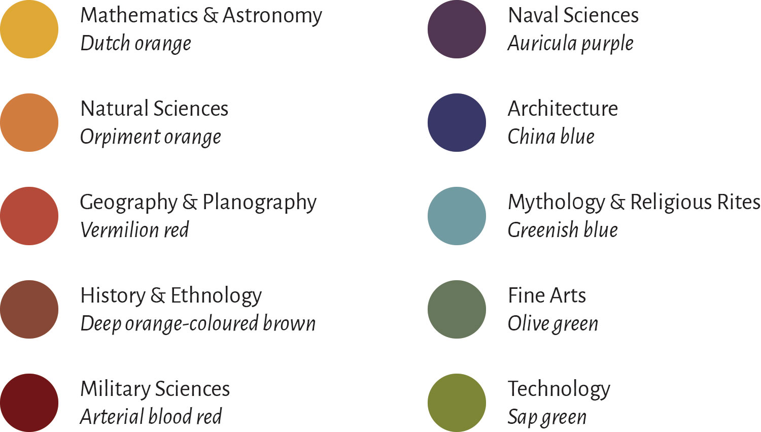
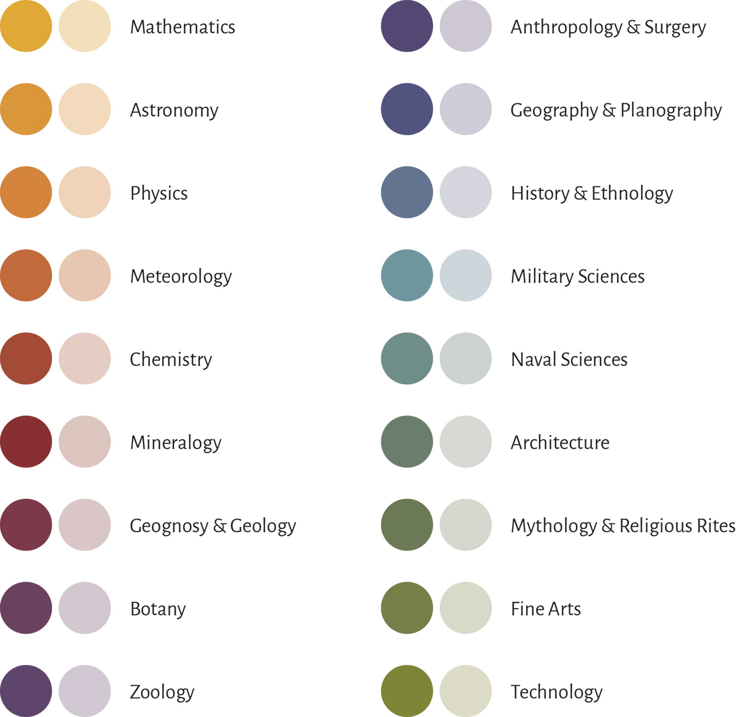
These colors were mapped to the encyclopedia’s original 10 divisions but since natural sciences contained 8 major subsections, that would have meant they all had the same color. I decided to break them out and give them their own. The final palette was based on a small modified set of Werner’s colors and interpolated to 18 colors using the online Chroma Color Scale Helper. I also created a transparent version of each color so vibrant versions could be used for primary accents (covers, headings, etc.) and transparent versions could be used for secondary accents (figure links, plate captions, etc.).
Implementing these colors was made a lot easier by taking advantage of CSS variable scoping. The colors are initially set at a global level:
--anthropology-surgery: #534873;
--anthropology-surgery-screen: rgba(83, 72, 115, 0.2);
--architecture: #6a7e6b;
--architecture-screen: rgba(106, 126, 107, 0.2);
…
Then they are used for generic variables within classes based on subject names:
.anthropology-surgery {
    --accent: var(--anthropology-surgery);
    --accent-screen: var(--anthropology-surgery-screen);
}

.architecture {
    --accent: var(--architecture);
    --accent-screen: var(--architecture-screen);
}

…
This allowed me to add a subject class like .architecture at any level where I wanted subject-specific accent colors and simply specify var(--accent) or var(--accent-screen) in the CSS. For example, on the zoology subject page, the body class is set:
<body class="zoology">…</body>
All elements that need to use the zoology accent color have styles like this:
.cover { background: var(--accent); }
.fig { background: var(--accent-screen); }
…
A not insignificant part of me loves the final palette and really enjoys that it was based on another nineteenth century book. It feels right.
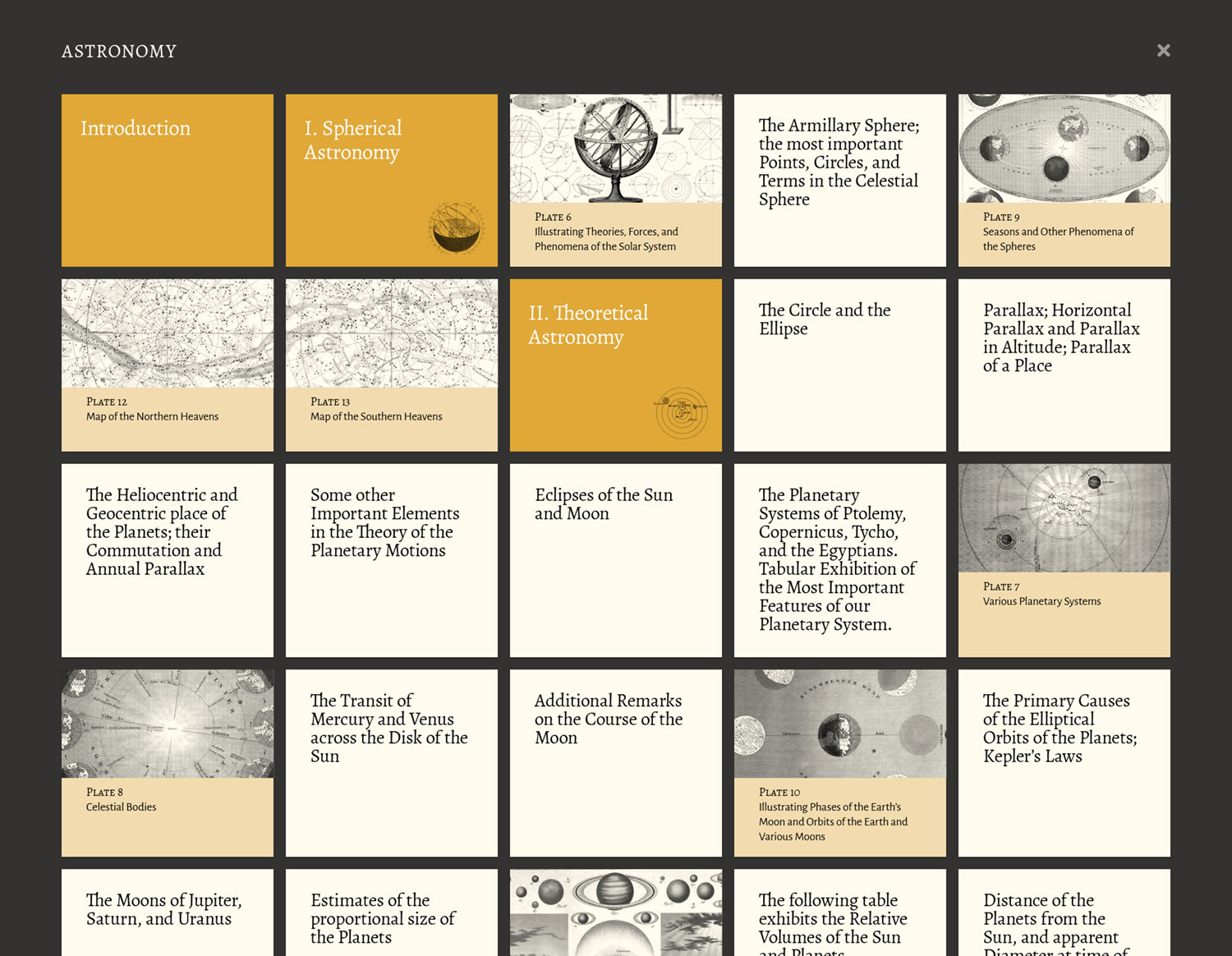
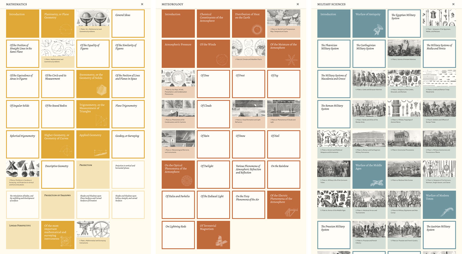
Subject navigation
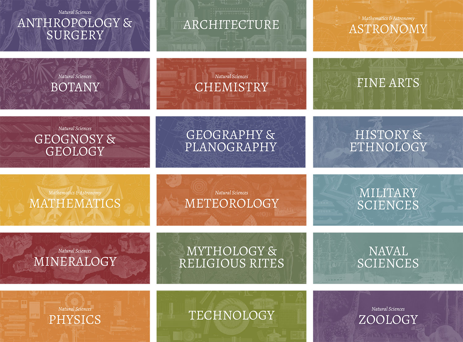
From the start, I knew the home page needed a prominent section for jumping to subjects and was excited to design something unique for this. The catch was that I didn’t know how the final result would look until a year later after I finished processing all the illustrations. Each subject had its own color and I thought it would be fun to also use a representative figure from its plates—mirroring the same theme used on the covers and tables of contents. Early designs were based on the original 10 subjects and were constrained to a uniform grid and the same placeholder was used for all of them. This worked for the most part but I felt that it could be more engaging, even after adding the final illustrations.
I tried varying the layout more while staying within a grid and including a link to the preface using the same cream color as the background from lighter areas of the site. The arrangements below were tests for 10 subjects and 18 subjects—both with the preface. Working with an odd number of links (11 or 19) was a helpful constraint so that forced me to avoid a standard grid.
Once the text and illustrations were added, the 18-subject layout really came alive and was consistent with other areas where illustrations were overlaid on splashes of color. The result is a longer list but this length also conveys the large amount of information in the encyclopedia and is much more interesting to scroll through. It also works well on smaller screens like tablets and switches to a linear list on phones.
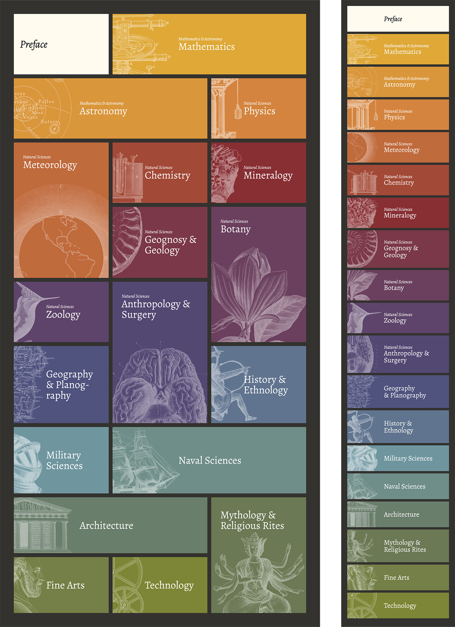
Thanks to some creative CSS, I didn’t have to create inverted versions of each image. I was able to use the original figure combined with an inversion filter and a screen blend mode.

This also became one of my favorite aspects of the site. Every time I completed restoring the illustrations for a subject, I updated the placeholder with a representative figure, which let me watch how it evolved as I worked through the encyclopedia. Even after more than a year of staring at it, I still enjoy it a great deal.
Typography
When typography is done well, it’s mostly invisible; but that doesn’t mean a little fun can’t be had. Content for this project comprised mostly long stretches of text so choosing the right typeface was crucial. It had to be legible and ideally have a little character but not so much that it was distracting. My first choices were some classics and others I used on previous projects: Adobe Caslon, Crimson Pro, and EB Garamond. They’re all excellent but I wanted to use something I never used before.
Inspiration came from Will Chase—a talented artist in the data visualization community I’d been following for a while. A short while ago, he redesigned his site and it stuck with me—particularly the colors and typography choices. Upon revisiting it, the sans-serif typefaces caught my eye, which were Alegreya Sans and Alegreya Sans SC from Google Fonts. When I looked them up, I was excited to find a serif version was also available.
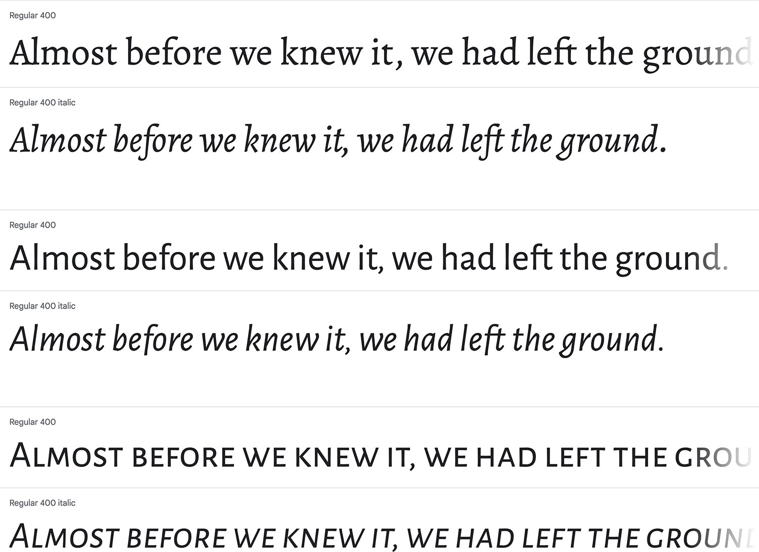
The Alegreya family had just the right amount of character. Long stretches of text were easy on the eyes and the italics stood out just enough from the regular font. Its description on Google Fonts even states it’s well-suited for long text:
Alegreya is a typeface originally intended for literature. Among its crowning characteristics, it conveys a dynamic and varied rhythm which facilitates the reading of long texts. Also, it provides freshness to the page while referring to the calligraphic letter, not as a literal interpretation, but rather in a contemporary typographic language.
The way the full title appeared with the “Æ” on the home page is ultimately what made me decide to use Alegreya. That character looked awkward in other typefaces. Most of the text on the site uses Alegreya while ancillary text like captions use Alegreya Sans or Alegreya Sans SC.
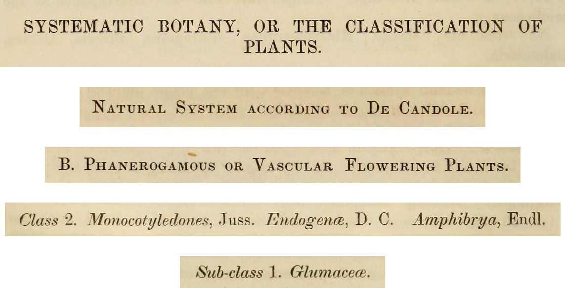
I also wanted to try to mimic some of the typographical styling from the original English edition of the encyclopedia. Its hierarchy of heading styling varied a little but most of the time used all upper case, regular text, italics, and small capitals. Different weights were never used. I didn’t copy these style exactly because other design elements aided in emphasizing headings like bold swaths of color but I used some of them in the main text and tables of contents. On larger screens, headings also hang to the left so they’re easy to see while scrolling.
Restoration
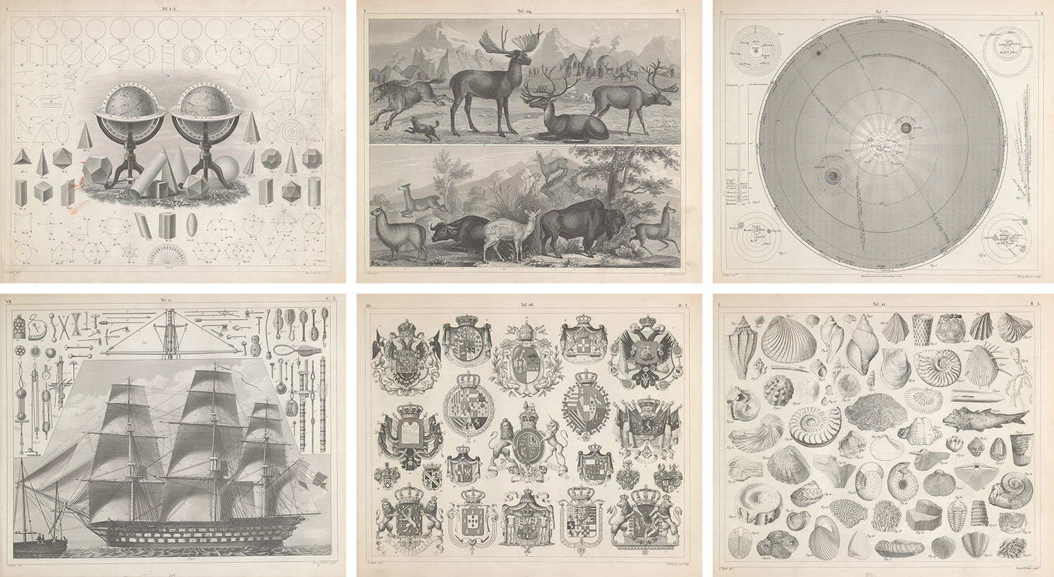
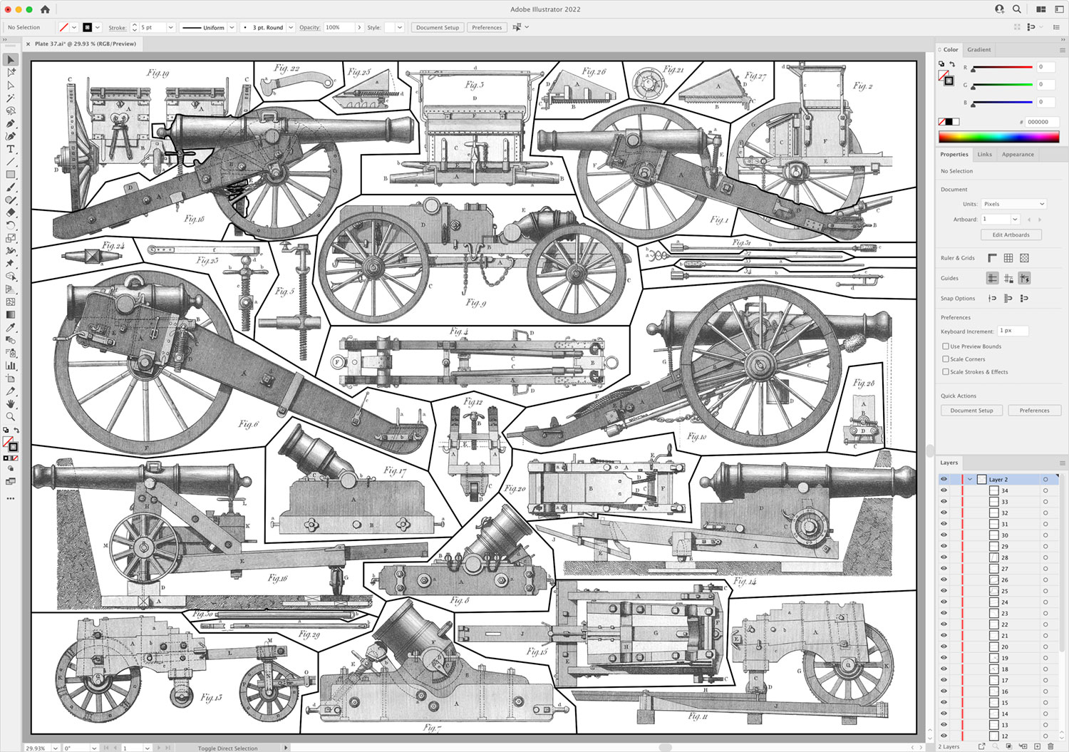
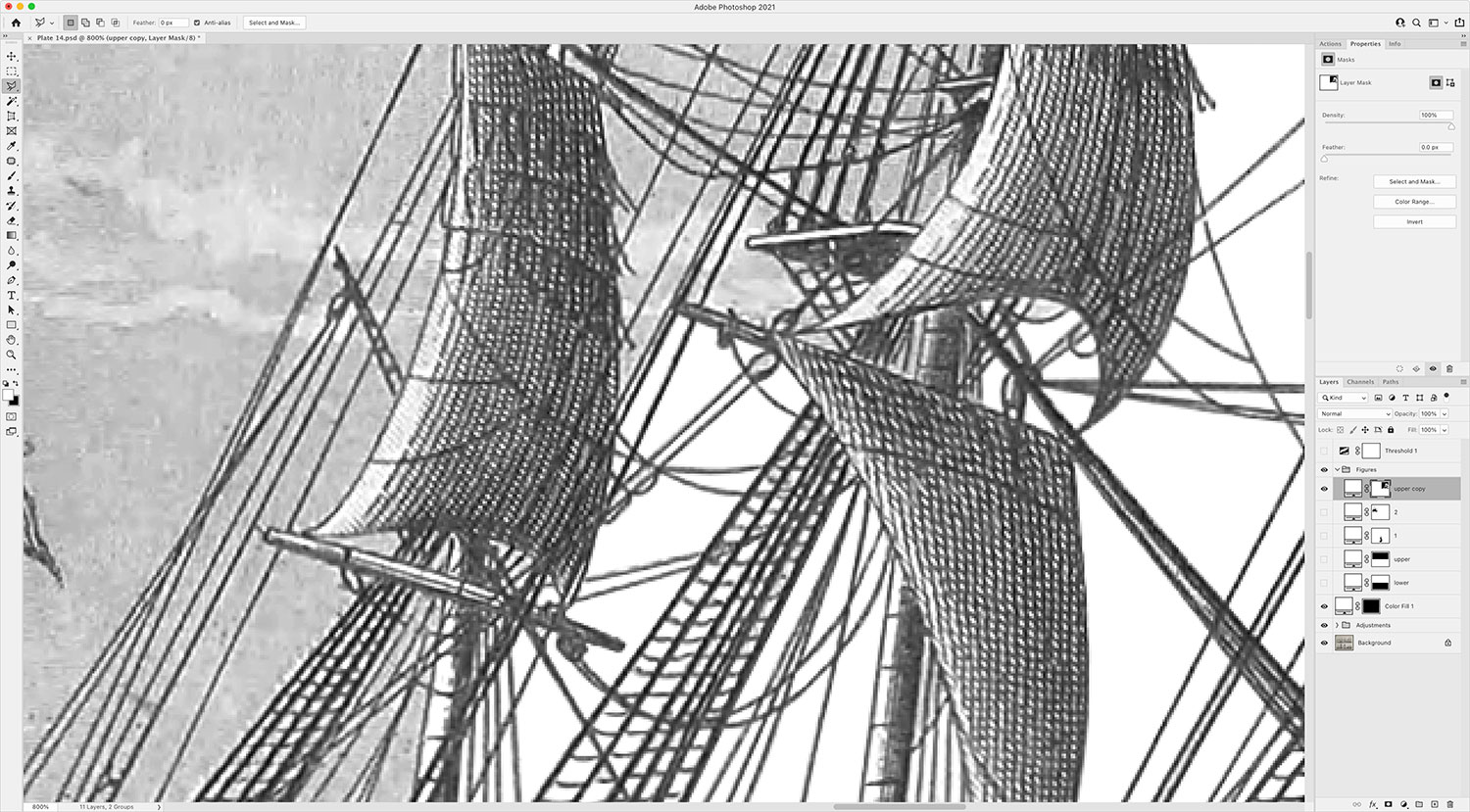
The most time-consuming part of this project was the restoration process. There’s nothing fast about restoring scans of nearly 500 plates, extracting 13,329 figures, or formatting 1.6 million words, which is why the project took longer a year to complete. I looked for ways to automate processes but much of it needed to be manual. The restoration part alone took nearly 1,500 hours and that didn’t include the time spent designing and building the site. The restoration process was a non-destructive one similar to the one for Illustrations of the Natural Orders of Plants, which in turn, was honed for British & Exotic Mineralogy. This allowed me to make adjustments as necessary while maintaining the original scans. The one used for Iconographic Encylopædia was a little more involved. The goal was to convert each scan into an image with a clean white background so individual images could be extracted. The first step was to convert the image to greyscale with a hue/saturation layer. Next, a levels layer let me set a white point to brighten up the image.
Lowering the white point removes more of the background but since scans had uneven lighting, additional masked levels layers with their own white points were needed to even it out without affecting the illustrations. A threshold layer set to its highest setting and with 30% opacity was a great way to tell which areas still weren’t completely white without guessing. They appeared as grey pixelated areas. Next, one or more curves adjustment layers were added to darken the illustrations while preserving the adjusted white background. Multiple curved layers were sometimes needed to darken individual figures with lighter lines.
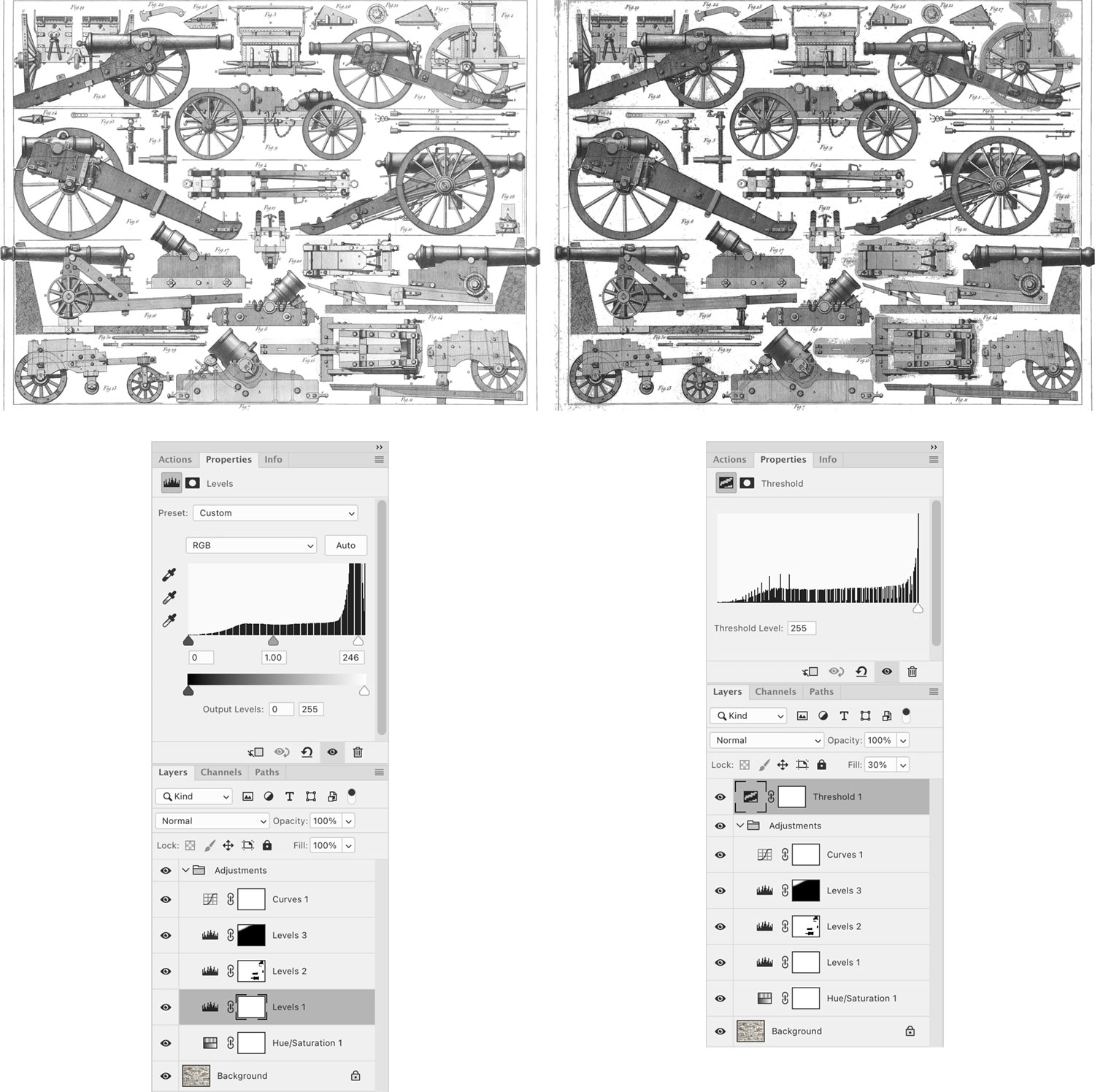
This process only took a few minutes and would clean up 90% of most images but the background still wasn’t completely white. I needed it to be white so the next step of extracting images was efficient and so interactivity could be seamlessly added later. Zooming in with the threshold layer exposed all the remaining pixels that couldn’t be easily whitened with the adjustment layers without negatively affecting the illustrations. Next came the time-consuming part: figure extraction. To extract figures, I used multiple white color fill layers—one for the plate as a whole, and one for each figure. The one for the plate as a whole was used to manually change the pixels that needed to be converted to white. The masking layer essentially let me choose where the white fill appears. This process involved manually cleaning the all the nooks and crannies of every figure.
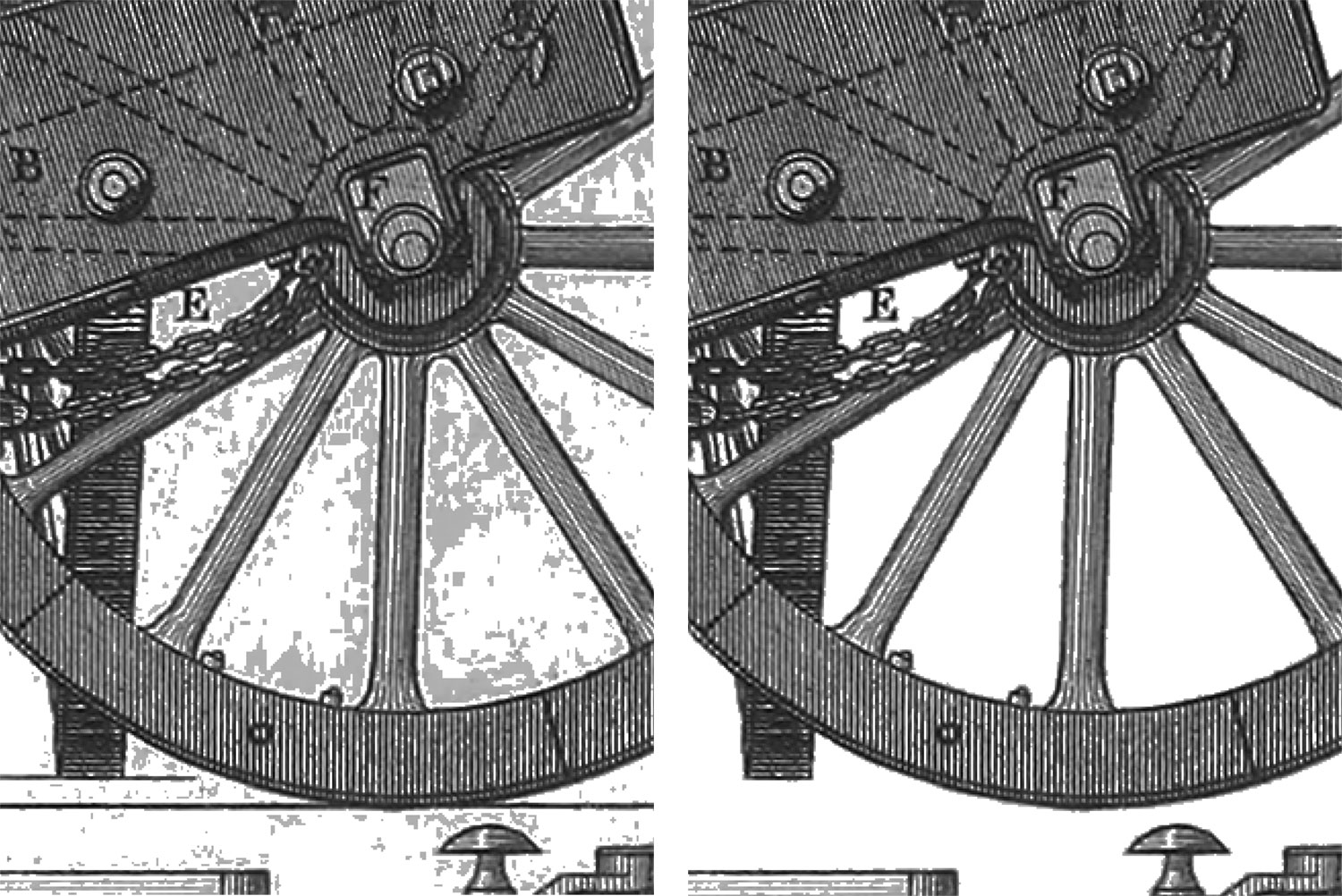
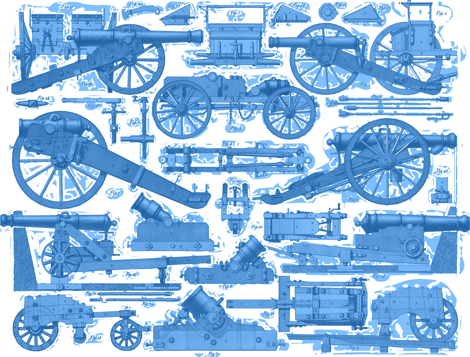
This mask also served as a visual checklist for which figures had have been exposed through it. Toggling the layer mask visibility with the \ key let me see that at a glance. By default, areas seen through the mask appear as red but I customized it to blue. (I like blue.)
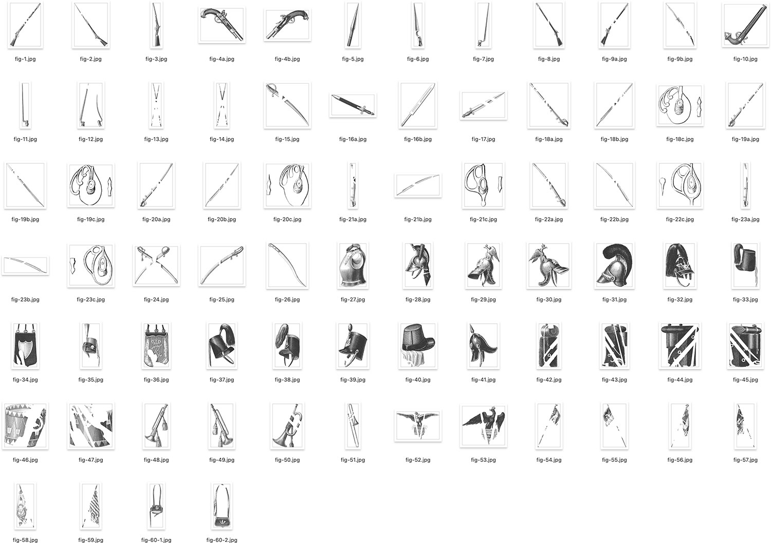
As I cleaned up each figure’s edges, I created a separate mask layer for just that figure and then used the trim function under Image > Trim to crop the image to the figure’s boundaries and export as a separate file.
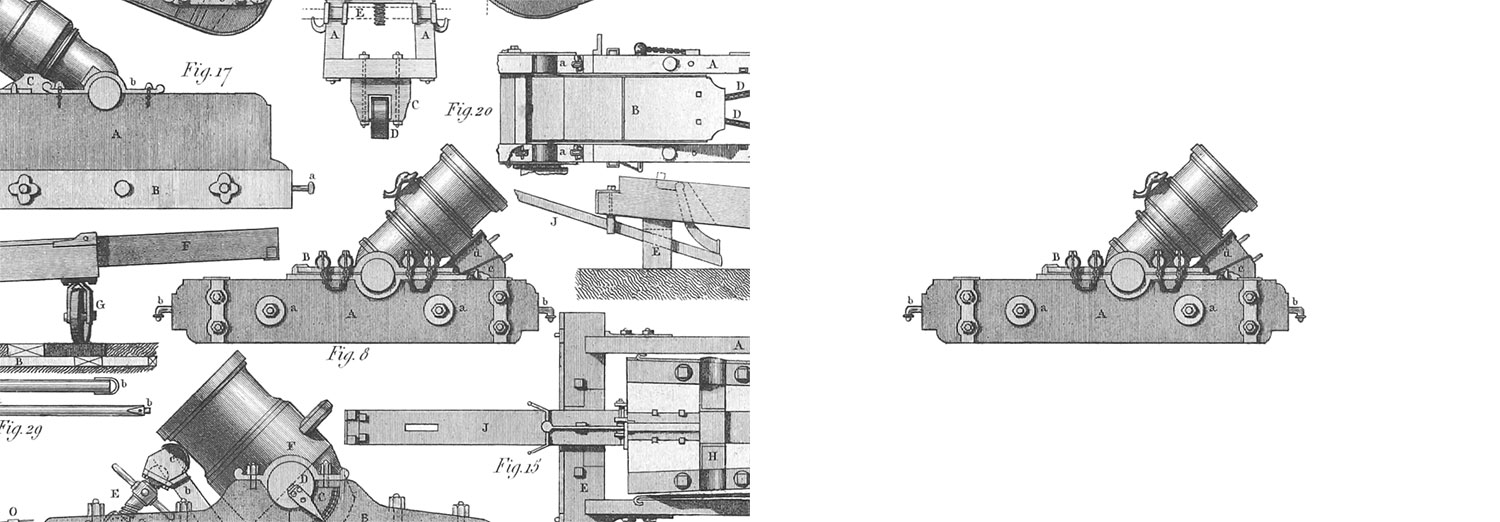
One thing that took me by surprise is how many figures appeared on each plate. On average, there were 27 figures on a plate—ranging from 1 to 210—and figures varied wildly in complexity. I could rarely guess how many figures were on a plate at a glance. Some were simpler to extract when separated from others but many overlapped or were part of full scenes so extra care was needed to mask them out.
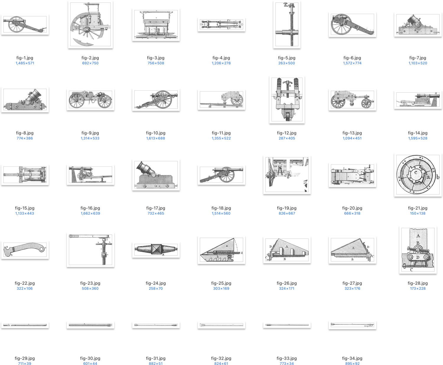
After extracting figures, I saved three versions of the plate: a thumbnail that appears in tables of contents, a preview that appears on a subject page before launching the interactive view, and one at full size that appears in the interactive view. I also made note of the engraver, the image size, and added the plate markup to its corresponding subject page.
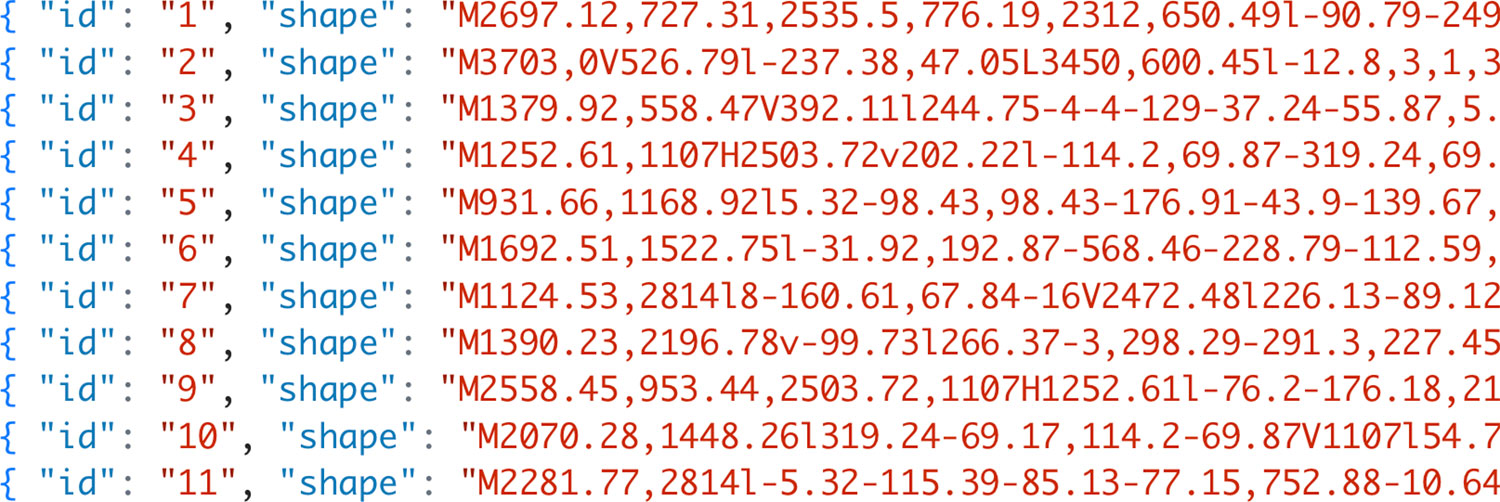
After restoring a plate and its figures, the clickable hotspots needed to be defined. This was usually a much faster process but still required care. The goal for these was to cover entire plates with interactive layers so clicking anywhere would highlight a figure. Photoshop files were imported into Illustrator as links and shapes were drawn around each figure. For plates with figures extracted from scenes, the masks were imported into and Image Trace was used to generate vectors of their outlines. Shapes were then exported as an SVG, the coordinates of which were saved in a JSON file to be loaded later by OpenSeadragon when a plate’s interactive view was launched.
The process just described was repeated for all plates. With 500 plates to process through and more than 13,000 figures to extract, the length of time needed becomes readily apparent. Despite the time involved, I found this process very relaxing. There was comfort in knowing that I was slowly chipping a way at a long process. Cleaning up each figure was also oddly satisfying. I also spent a large portion of this time doing other things while restoring the images like listening to podcasts, watching television, watching movies, commuting, etc. Nearly all of my free time was taken up by restoring images.
Spending so much time with these plates burned them into my memory fairly strongly—so much so that on the rare occasion that I encounter them in the wild, I do a double take and want to tell others all about them. This happened recently with one of the naval science illustrations. Several figures from plate nine appeared in a trailer for the movie Uncharted (at 14 seconds). They were visible for about a second as part of a prop book but I nearly fell out of my chair when I saw them.
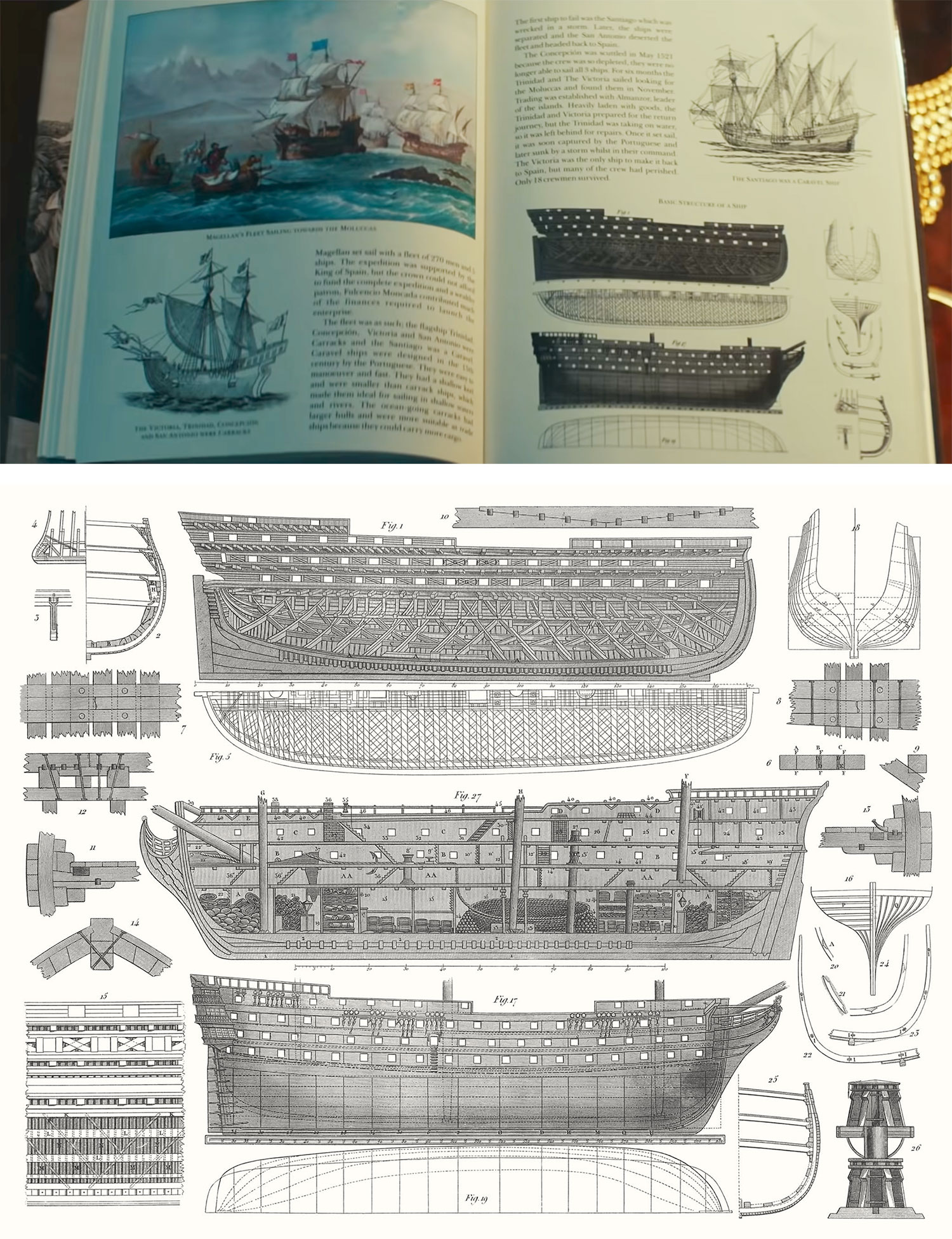
They were clearly modified from the original because the arrangement in the prop book is different from the plate. I suspect that these figures were chosen for their antique look and because the full plate appears in a Google Image search for “basic structure of a ship” and fit the theme of the movie. If anyone else has seen any of these figures appear in the wild, I’d love to hear about it.
Out of curiosity, I tracked all the time I spent working on the restoration. In hindsight, it would have been nice to track time spent on other aspects of the project. The details tracked included which plate was worked on, its subject, the duration spent at in any given section, down to five-minute intervals. In total, nearly 1,500 hours were spent across 13 months.
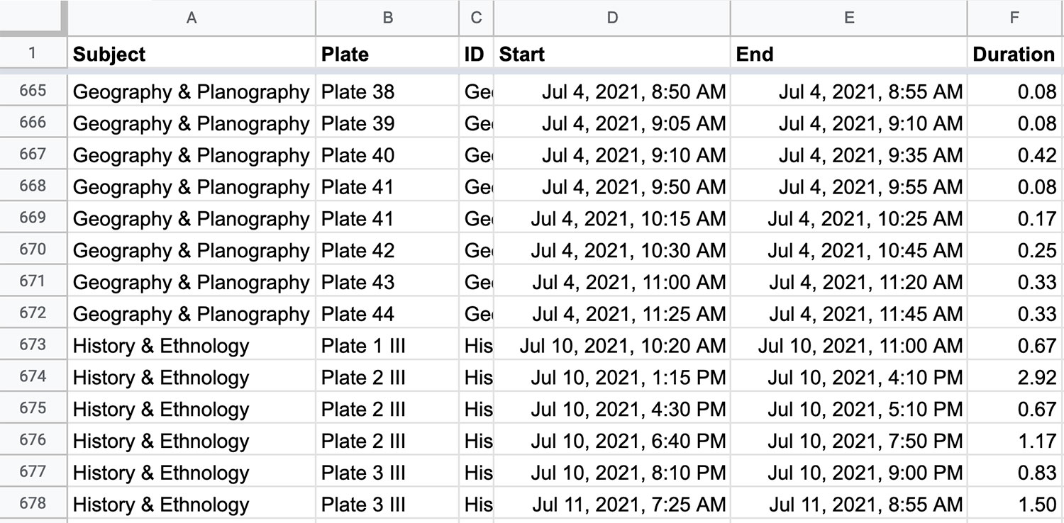
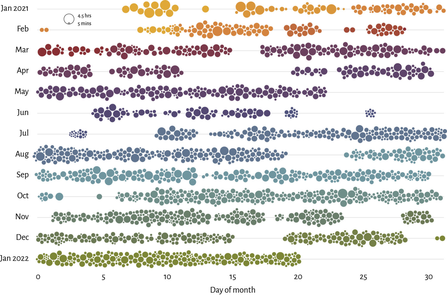
Plotting these on a chart and color-coding by subject highlights the periods I spent working on each one. Each dot on the chart above represents a period of uninterrupted time spent restoring images—ranging from five minutes to four and a half hours. The larger gaps between dots are when I was either working on the site’s design, coding, or formatting the descriptions for each subject. Since the its start, at least four hours of every day have been spent on some aspect of this project.
Some interesting facts can also be gleaned from the tracking data. On average, each plate took around three hours to process. Some plates like many in geography and planography or those with scenes that didn’t contain images took just a few minutes because they only contained one or three figures and just required a few adjustment layers to restore. Others took upwards of 14 hours to process.
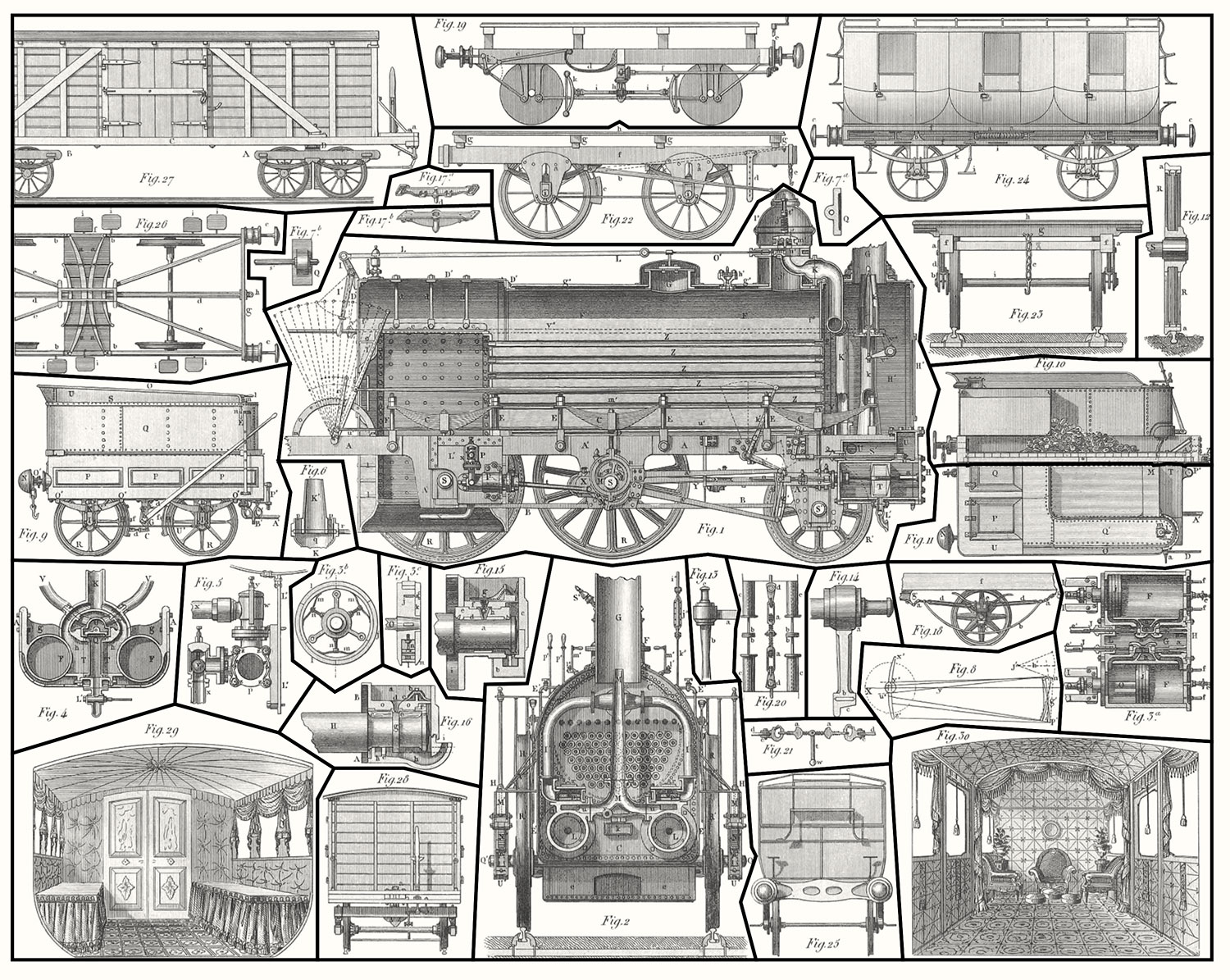
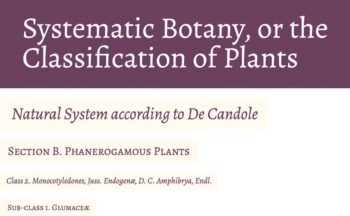
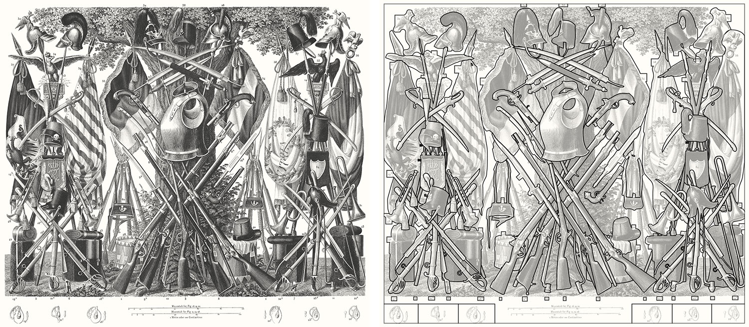
The plate that took the most time was military sciences plate 25 illustrating the various kinds of arms of the mid-nineteenth century. Extracting the images took 14 hours because it was the most detailed in the encyclopedia. It also has the most unique design. All the figures are part of one large scene and overlap each other so time was also spent figuring out which parts of the plate went with which figures.
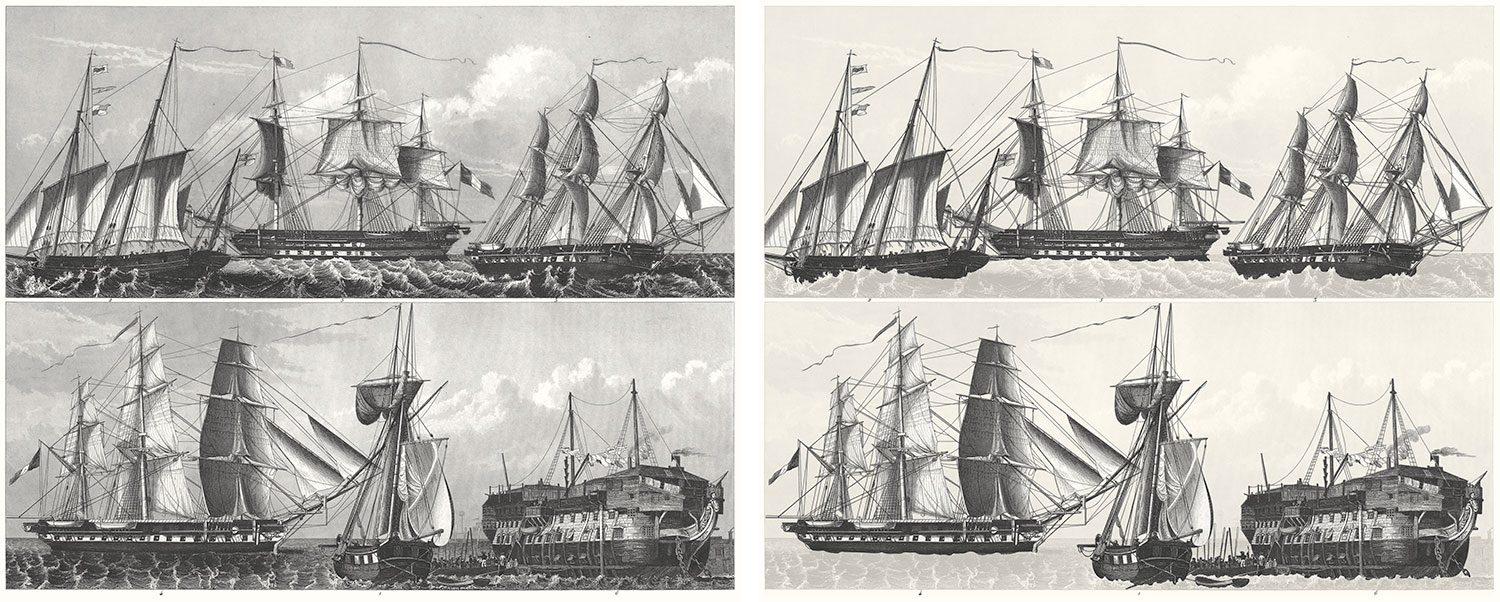
Several plates in naval sciences also took a long while to extract because most figures were part of a scene and those figures were ships with many ropes. Isolating those ropes took a tremendous amount of care and patience.
Descriptions
To give myself a reprieve from endlessly restoring plates, I worked on adding descriptions to each subject after finishing its plates and integrated them into the copy—a shorter process but also had its own challenges.
Scans uploaded to the Internet Archive are also converted into plain text via OCR. Most of the time, the end result is pretty good but not perfect. The descriptions for Iconographic Encyclopædia were on the better end of the quality spectrum so I didn’t need to retype them but I still had to format them all by hand to add the figure reference links, clean up mistakes, format headings, and more.
Having done this on a smaller scale before with British & Exotic Mineralogy, I was able to reuse the same approach with some modifications. I created a custom configuration of TinyMCE that I can launch locally to take care of the majority of HTML formatting. Only the necessary buttons were enabled plus one for a custom plugin I wrote that let me insert figure links with the necessary data attributes. I pasted sections of OCR’d text from the Internet Archive into it and compared it to the original scan—cleaning up formatting and adding links along the way.
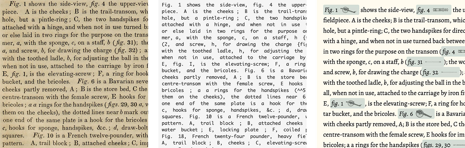
I quickly started to notice common mistakes in the text that could be fixed with a simple find-and-replace such as spaces before semicolons, extra slashes (/) or carets (^), and letter mistakes such as “tli” for “the” or “wdth” for “with.” I left these in to be fixed after all the text for a subject was in place.
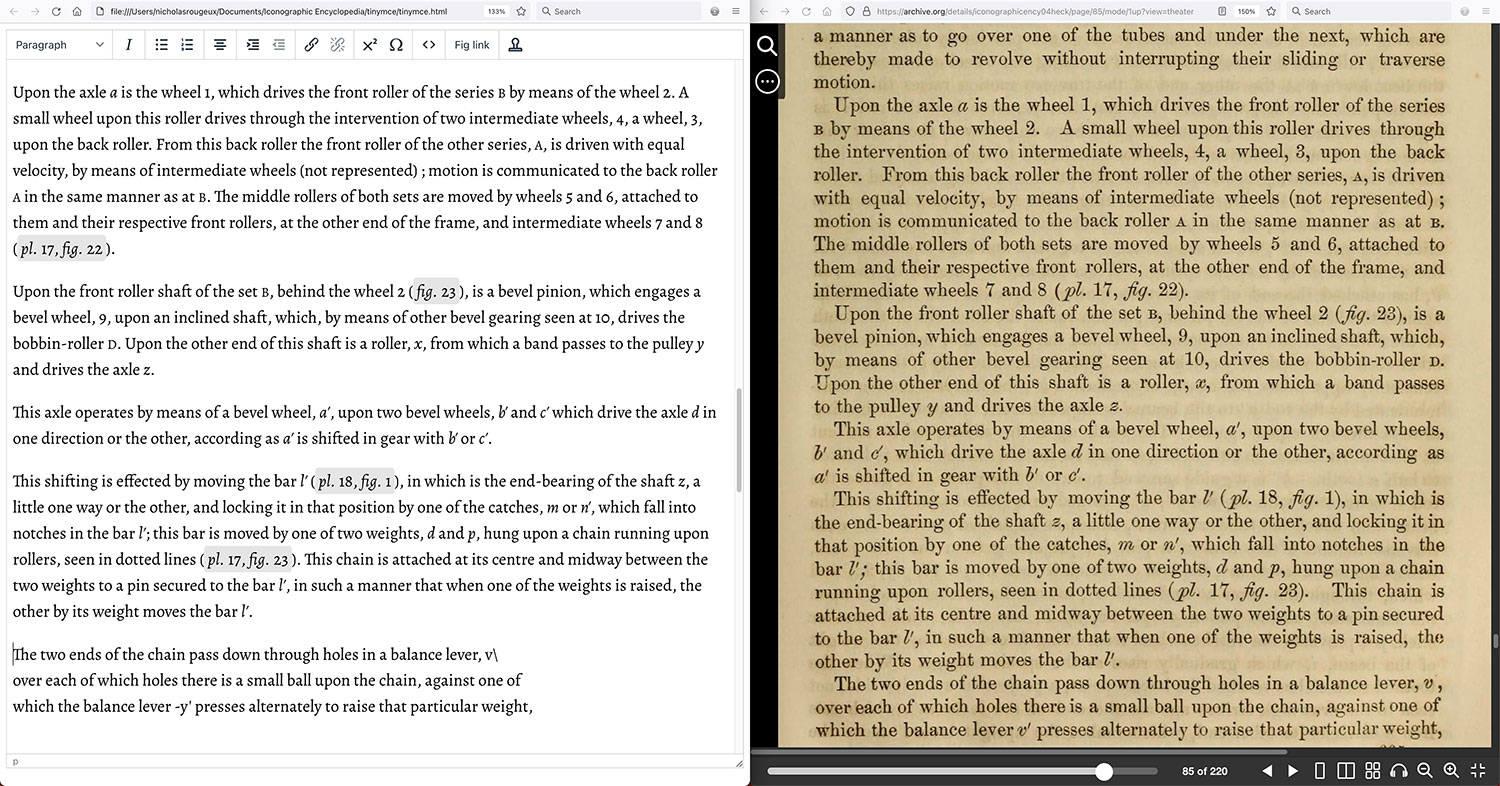
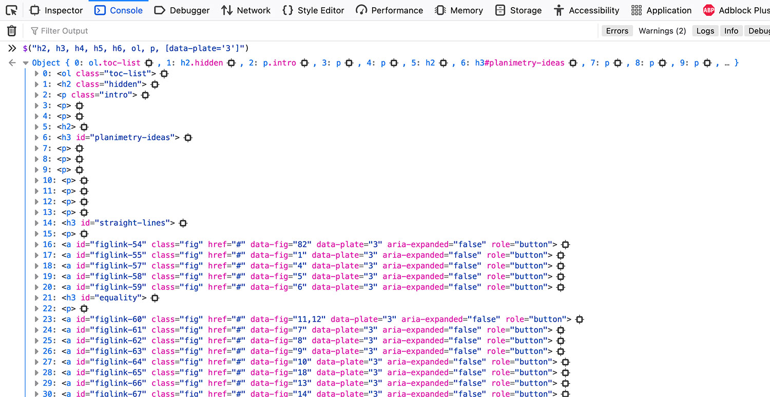
After a subject’s description was in place, I placed its plates throughout the text where their figures were referenced the most. The most efficient method I found for doing this was to use the console to get a list of all the main elements of the page as well as the figure references for any given plate. For example, to find all the references to plate 3 in mathematics, I ran this in the console:
$("h2, h3, h4, h5, h6, ol, p, [data-plate='3']")
This quick-and-dirty display was enough for me to tell that the plate should be placed at the beginning of the section about straight lines.
After this was done for each plate, I added the captions for each figure that appeared when a figure reference is clicked or a figure is clicked on an interactive plate. Captions for a subject are stored in an external JSON file that’s only loaded on its page.
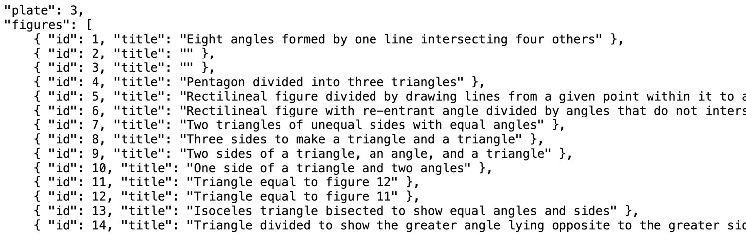
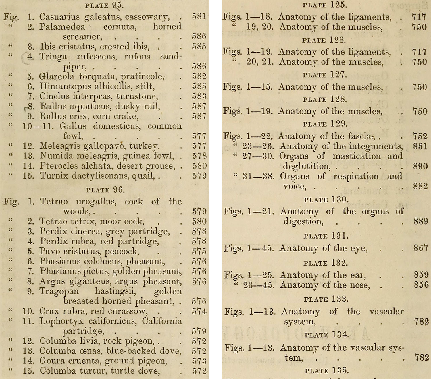
This process was time-consuming because there were many to prepare but also because many figures didn’t have clear captions. Most captions came from the tables of contents before each subject which listed its plates and the figures within. However, many entries were listed as a group, which forced me to derive captions from the text where the figures were referenced. For example the zoology had great captions—most of which gave the scientific and plain English names of the animals listed (e.g., “Fig. 12. Meleagris gallopavo, turkey”). On the other hand anthropology and surgery simply listed figures on its plates as a group (e.g., “Figs. 1–15. Anatomy of the muscles”). Plus, many figures were mentioned multiple times and 775 figures (nearly 6%) weren’t even mentioned in the text but only appeared on plates.
Deriving the captions that weren’t the tables of contents used a similar process to determining plate position. For example, to see all the references for anthropology and surgery plate 127, this was run in the console:
$(".fig[data-plate='127']")
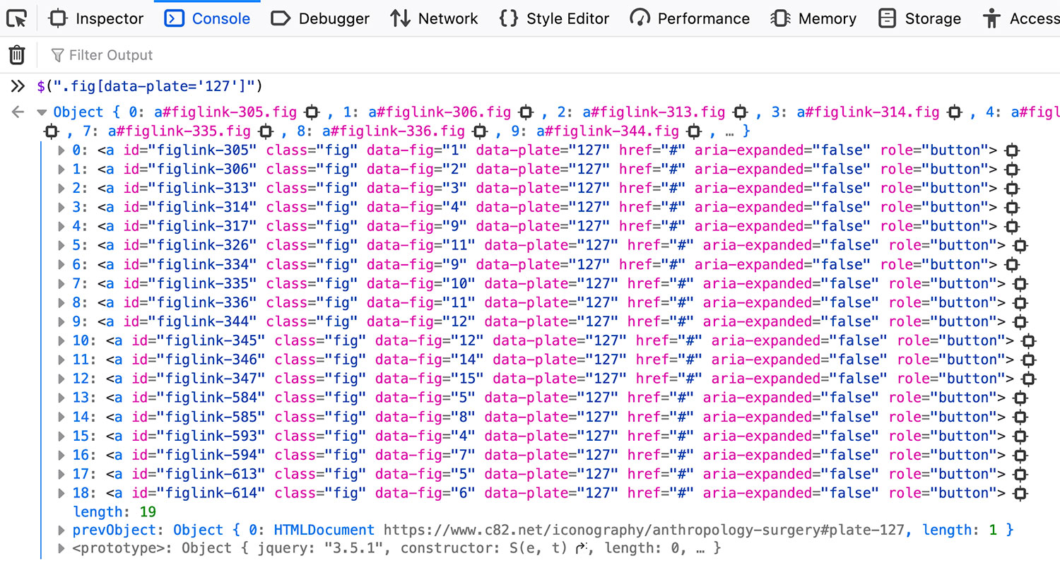
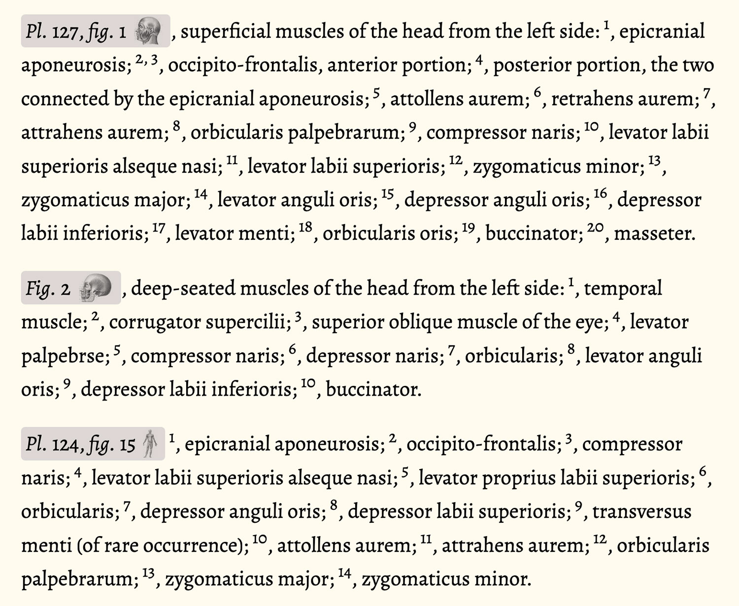
Then, for each result, I clicked the icon on the far right to jump to its spot in the inspector which gave me the ability to scroll to that element. From there, I could see how the figure was described and used that as the caption. Not all captions were clear cut so I had to take some best guesses.
After captions were finalized, the final step was running spell check on the entire description. I found that the most efficient method for this was to copy the entire page into TextEdit to strip the formatting and then paste the plain text into Word. Word recognized many correct words as misspelled either because they were proper names or nineteenth century variations (e.g., “practise” instead of “practice” and “skilful” instead of “skillful”). Rather than stepping through all of them, I changed the color of text to light grey so the misspelled words were readily apparent and simply scrolled through the text to fix the true errors. There may still be a handful of errors but this process caught the vast majority of them.
Zoology was the only subject that included a lot of references to other publications such as writings in American Ornithology, the Journal of the Academy of Natural Science, and Proceedings of the American Academy of Arts and Sciences. whenever possible, I included links to scans of these original publications and the pages mentioned. I didn’t need to but I thought if I could, I should to be complete.
The final pages for each subject are quite long but I feel this is preferable than splitting them into separate pages. Keeping them on one page makes jumping around between sections, figures, and plates much easier and they stand on their own as impressive volumes of information.
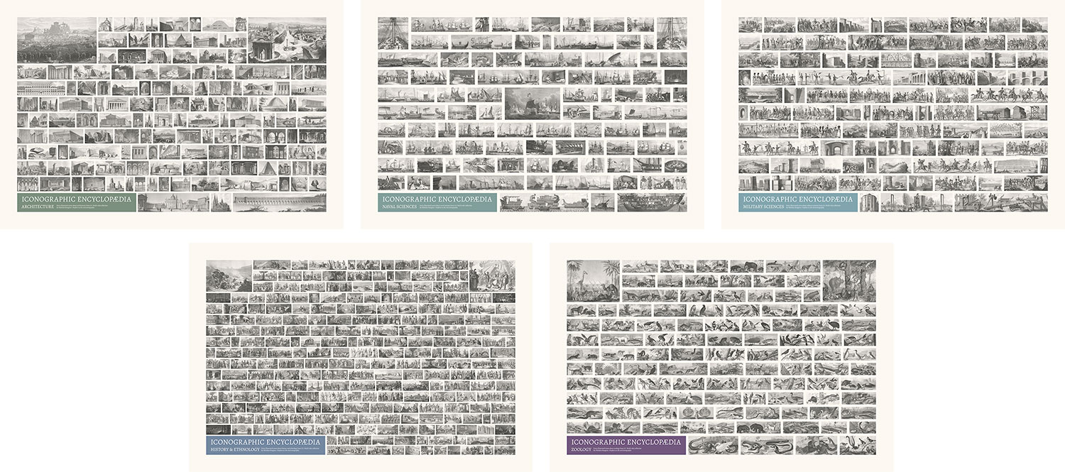
Posters
A driving force at the beginning of this project was the data-driven posters I hoped to make based on where figures occurred in the text. As the project went on, that expanded to and shifted focus to making a poster for each subject—something I never originally intended to do. Deciding which posters to make for a project like this is tricky. I like my posters to act as souvenirs for someone to remember the time they spent perusing my project. If they’re given as a gift, they can be a way to explore something new and always visit my project for more info. Either way, they should encapsulate a project or some aspect of it in its entirety.
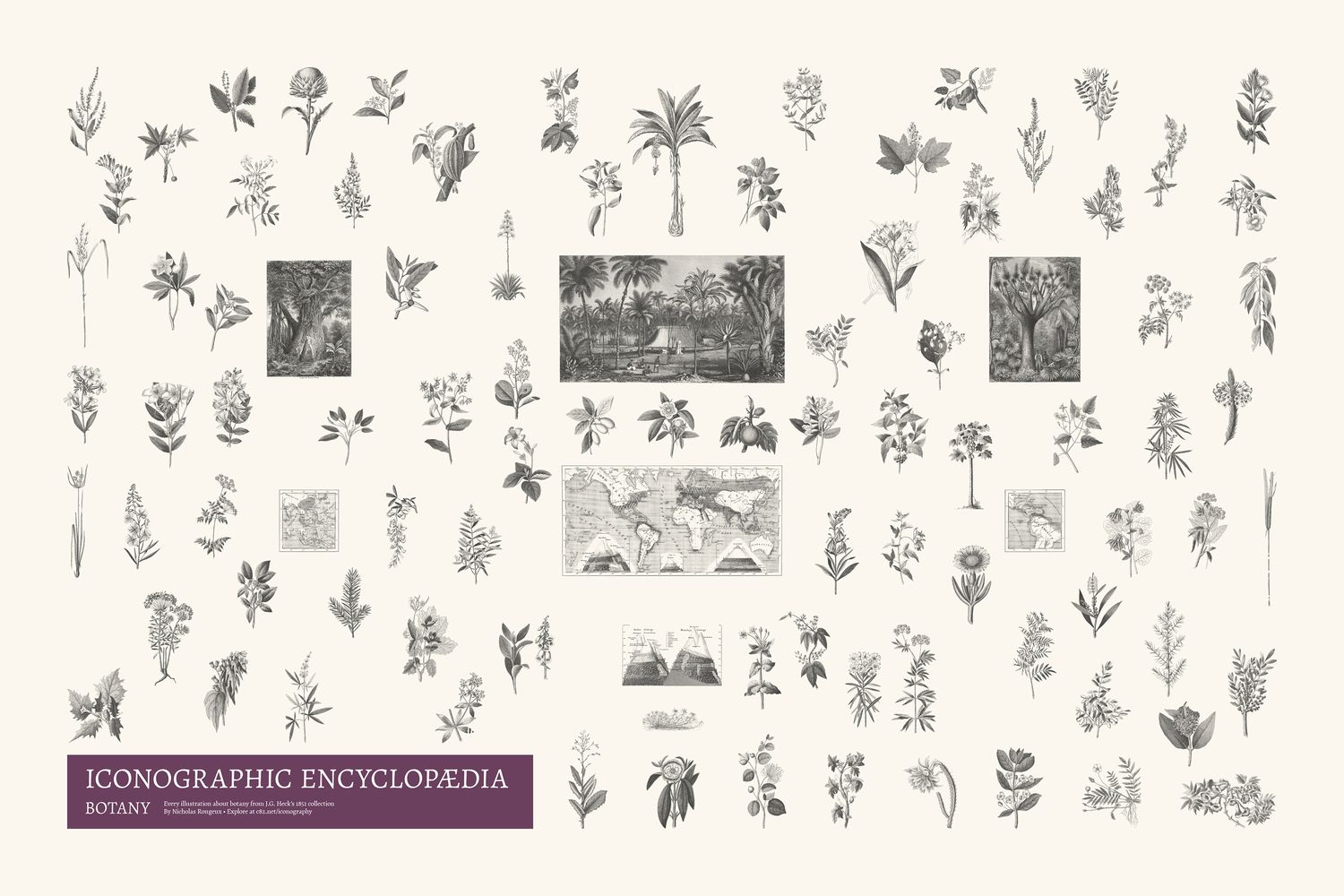
13,000 illustrations were far too many to fit on one poster but creating a poster for each subject seemed like the next best thing. A poster was made for each subject that contained every figure from that subject’s plates.
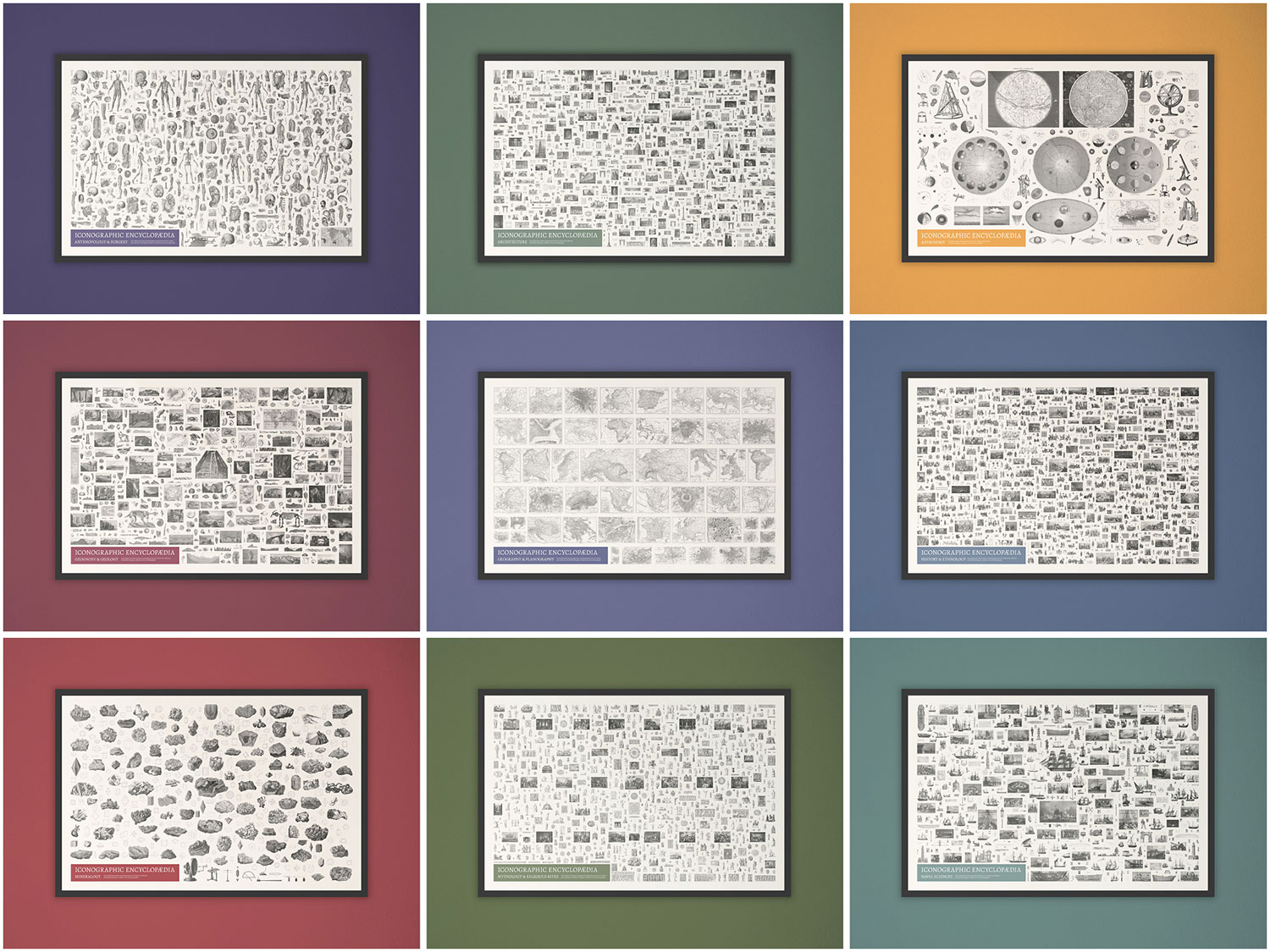
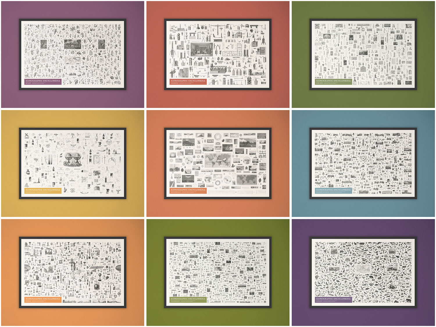
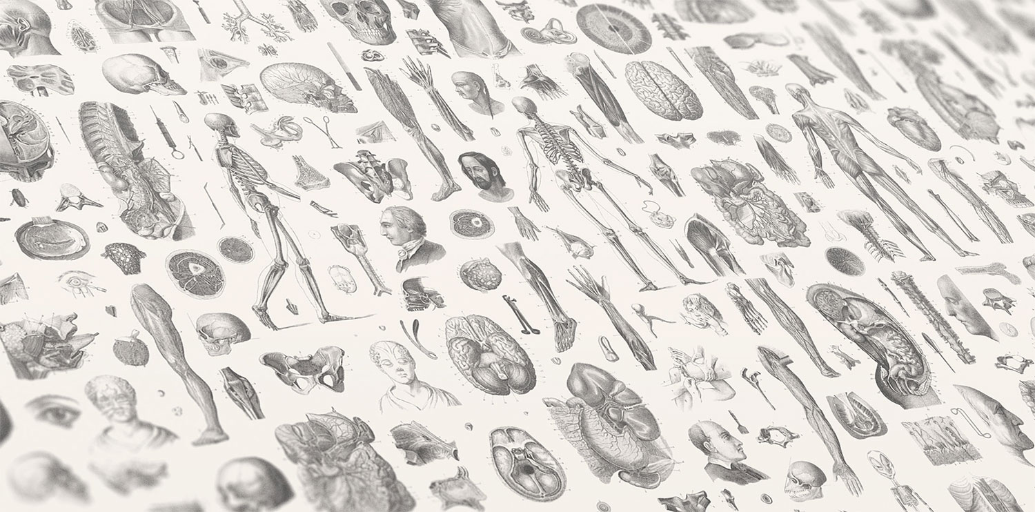
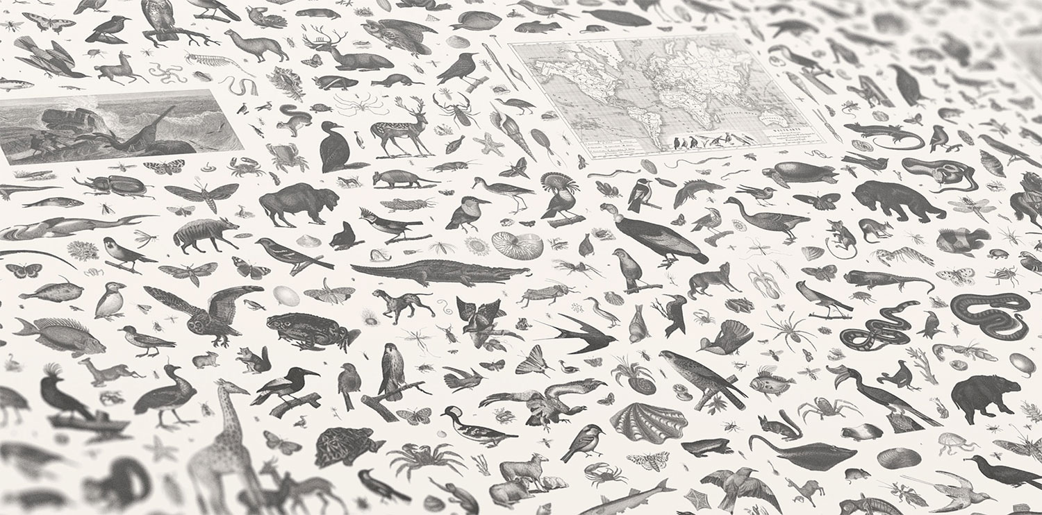
Figures were arranged by hand over the course of several hours for each poster. Below are steps in the process of making the botany and history and ethnology posters. The design of these posters mimics Heck’s original plates but on a grander scale. The figures on his plates weren’t arranged in a specific order on any given plate but collectively they painted a broad picture of a subject. The figures on these posters aren’t arranged in a specific way other than to showcase the breadth of topics discovered. Use the slider to see the progress of adding images in batches of 100. The final botany poster contains 1,519 images.
 Drag slider to see the progress from start to finish.
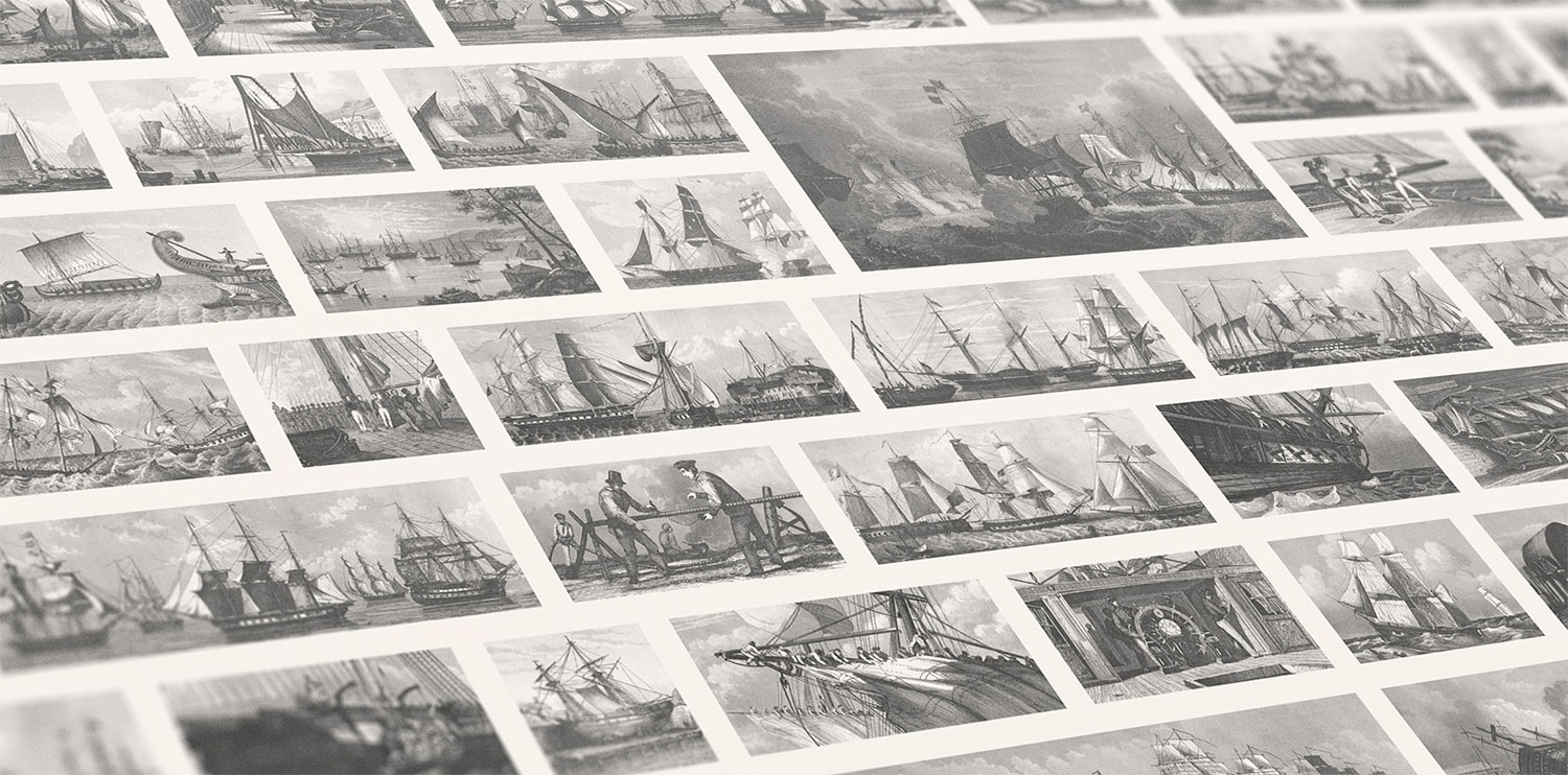
Five subjects (zoology, history and ethnology, military sciences, naval sciences, and architecture) also included many full scenes that contained figures or were figures themselves. Figures were extracted from these scenes for the aforementioned posters but the full scenes deserved to be showcased as well, so five additional posters were created for these subjects that contain only its scenes.
In addition to the subject posters, I created several minimalistic abstract data art posters that were visual explorations and experiments based on the data extracted from the ecyclopedia’s imagery and structure. I intentionally left titles, legends, and other text off these posters so they could be used as more decorative pieces rather than informative graphics. However, each one does have its own explanation in the art gallery.
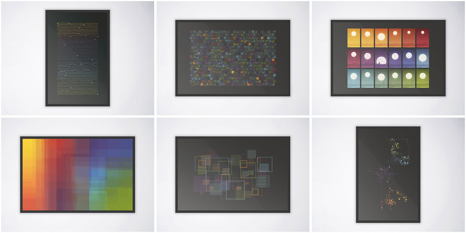
Each one is an experiment with representing an aspect of the encyclopedia in a way that makes the viewer think about it differently. I enjoyed exploring many ideas for these but only a handful made the cut. Below are some early iterations that were shelved. They include varying amounts of data because they were made at various points of the project’s overall completion.

Analysis
Accompanying the encyclopedia is a short analysis I compiled about the data I collected while working on it. I hadn’t planned on writing an analysis but was inspired by Andy Kirk’s The Seinfeld Chronicles, a beautiful book that he designed and wrote for “exploring the rhythm and texture of every episode of Seinfeld.” As the subtitle states, it’s “an unnecessary data exploration” and I felt creating something similar would be a great addition to my own project. Plus, this section would allow me to catalog some of the statistical and smaller interesting aspects that couldn’t be highlighted elsewhere.
Chief among them were the engravers. My early research attributed the plate engravings to Henry Winkles but nearly 30 other engravers were credited on many plates. Winkles engraved the vast majority (353 plates) but felt the others needed a mention. The name of plate’s engraver appears in the lower right of the original plates and I included their names in the digital edition below each plate. My analysis includes an alluvial diagram showing who engraved plates in each subject.
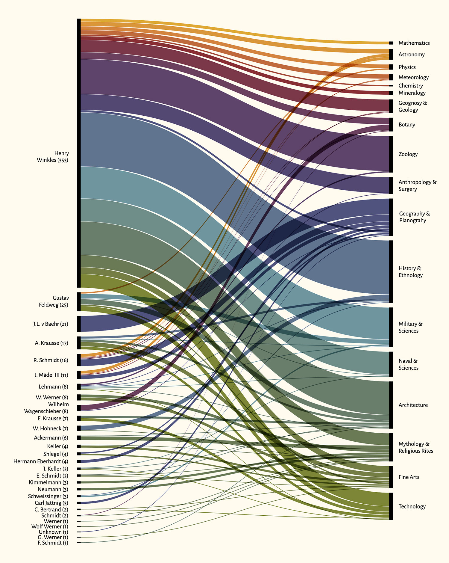
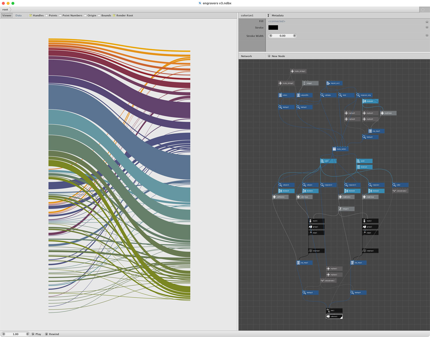
I wanted this displayed in a way that I couldn’t achieve using chart-building tools—specifically with the engravers sorted from most to least and the subjects sorted by the order they appeared in the original text and the links in the middle based on the colors of each subject. After some trial and error, I ended up creating the base chart in NodeBox, exporting as an SVG, adding labels in Illustrator, exporting as an SVG again, and refining in HTML and CSS. It may not have been the most elegant process but allowed me to make just what I wanted.
The figure timeline was something I wanted to find a way to visualize from the very beginning It shows where each figure reference occurs in each subject and in the entire encyclopedia. At first, I thought I might make a poster out of it but it felt more at home in the analysis section.
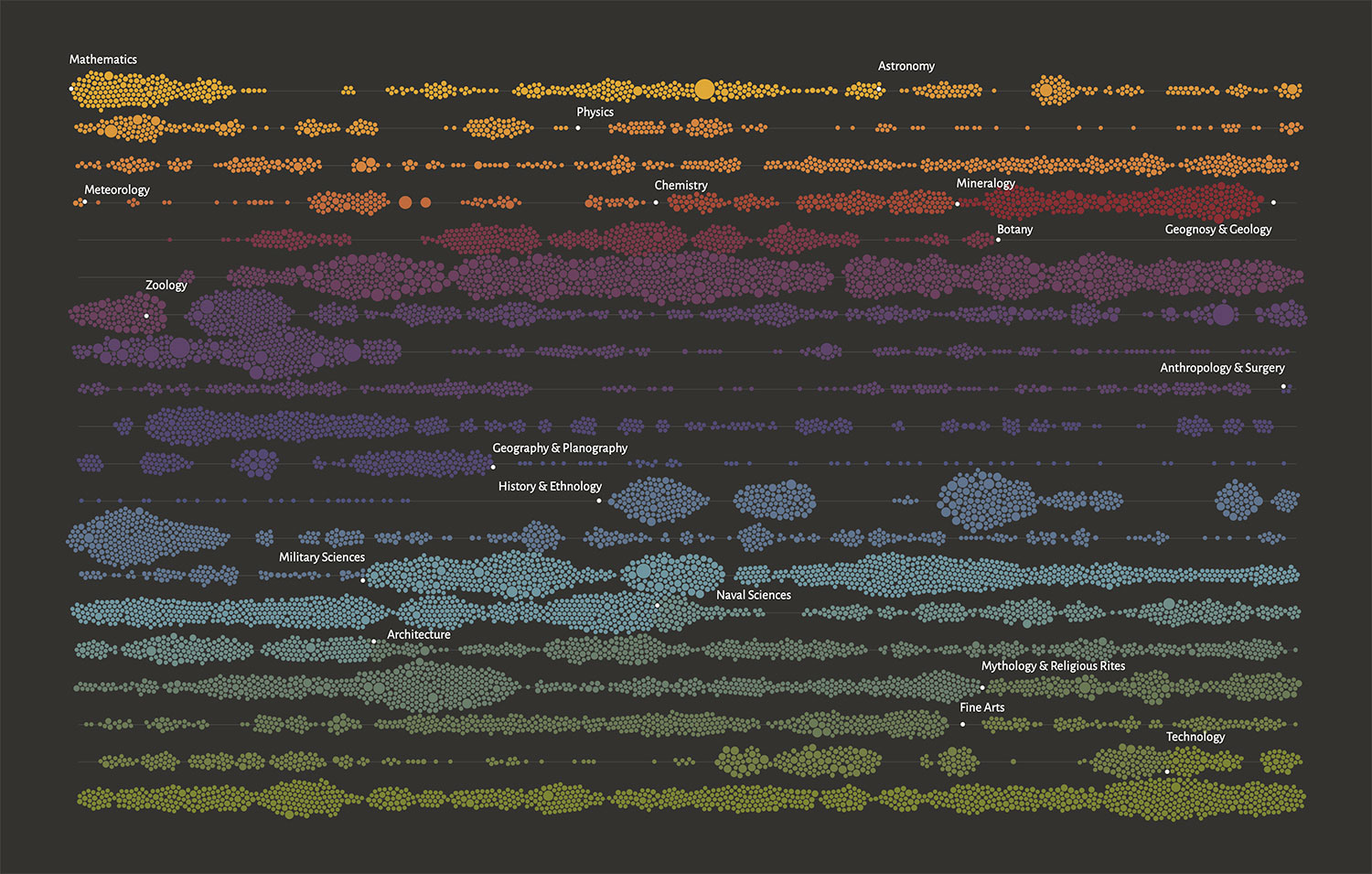
Data for the timeline were generated from each subject’s page by cataloging the position of each figure reference, the number of figures in it, and which subject is referenced. Data from all subjects were compiled into a spreadsheet which was used to calculate where each reference’s position when split across 20 rows. Those data were then fed into RAWGraphs to generate a beeswarm plot of the timeline. At 12,613 rows, this was a lot for RAWGraphs to handle but it performed admirably and generated just what I wanted. After some cleanup in Illustrator, to add the labels, remove the axes, and add a legend, it was added to the analysis page with the ability to click and see a popup of the number of references in a subject.
The differences between each edition were interesting to catalog over the course of the project and significant enough that I felt it was necessary to highlight them. Subjects were reorganized, entire sections rewritten, and several plates were redesigned. I couldn’t find any information about why this was done beyond what was mentioned in the encyclopedia’s preface. See the analysis for all the details.
Final thoughts
This project was a joy, a challenge, an experience, and something I’m proud to have completed. I’m grateful to have had the opportunity to take more than a year to bring it to life. There were plenty of head-scratching moments and others that made me wonder if it would ever end or was worth it. There were also many times of satisfaction and excitement upon completing key areas or creating new designs that pushed my boundaries. It’s sad to see it end but exciting to see it released to the world. Onto the next one.