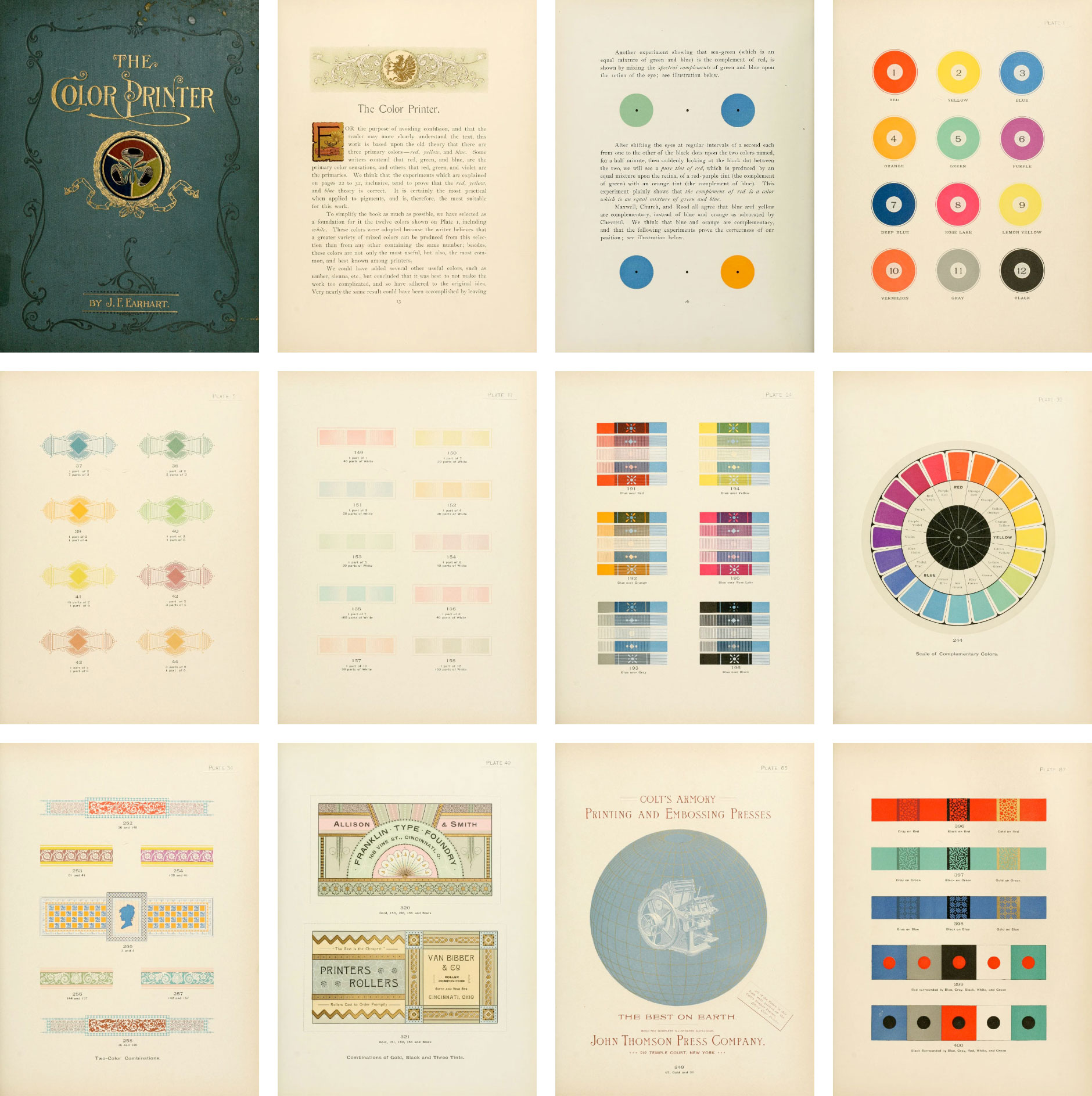
Making of The Color Printer
By Nicholas Rougeux, posted on March 13, 2023 in Web
Unlike previous projects, I designed the poster based on Earhart’s 1892 treatise, The Color Printer before giving much thought to the design of the website. In fact, I wasn’t going to make a full digital edition but completing the poster made it so much more approachable and enjoyable.
Working backwards
My workflow for digital editions generally involves designing the website, building it, and then making a poster based on the materials and knowledge I gained while doing so. This time, I did the opposite because I wasn’t sure if a website would be interesting enough. I try to add something extra to each digital edition to enhance it beyond the original source material and early on, I didn’t have a good idea of what I could add to The Color Printer. In the end, the poster and website ended up influencing each other.
Source material
I first learned of Earhart’s treatise in August of 2020 when I was looking for inspiration after completing British & Exotic Mineralogy. In the years since then, I revisited it several times but never had the inspiration to work with it until recently.
During my research, I found three sets of scans for The Color Printer—all at the Internet Archive and for reference, have numbered them based on the order in which they were found: scan #1, scan #2, scan #3. None of the scans was without its flaws but they complemented each other to serve as a reliable set of source material.
Designing the poster
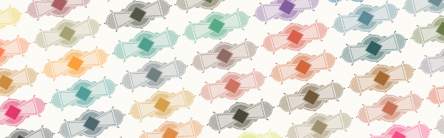
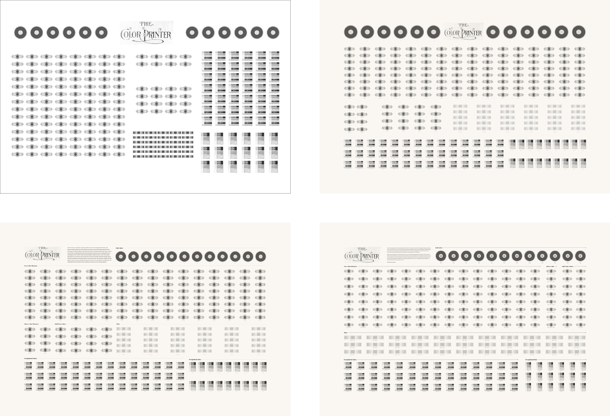
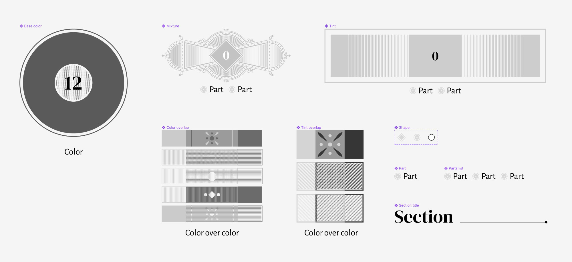
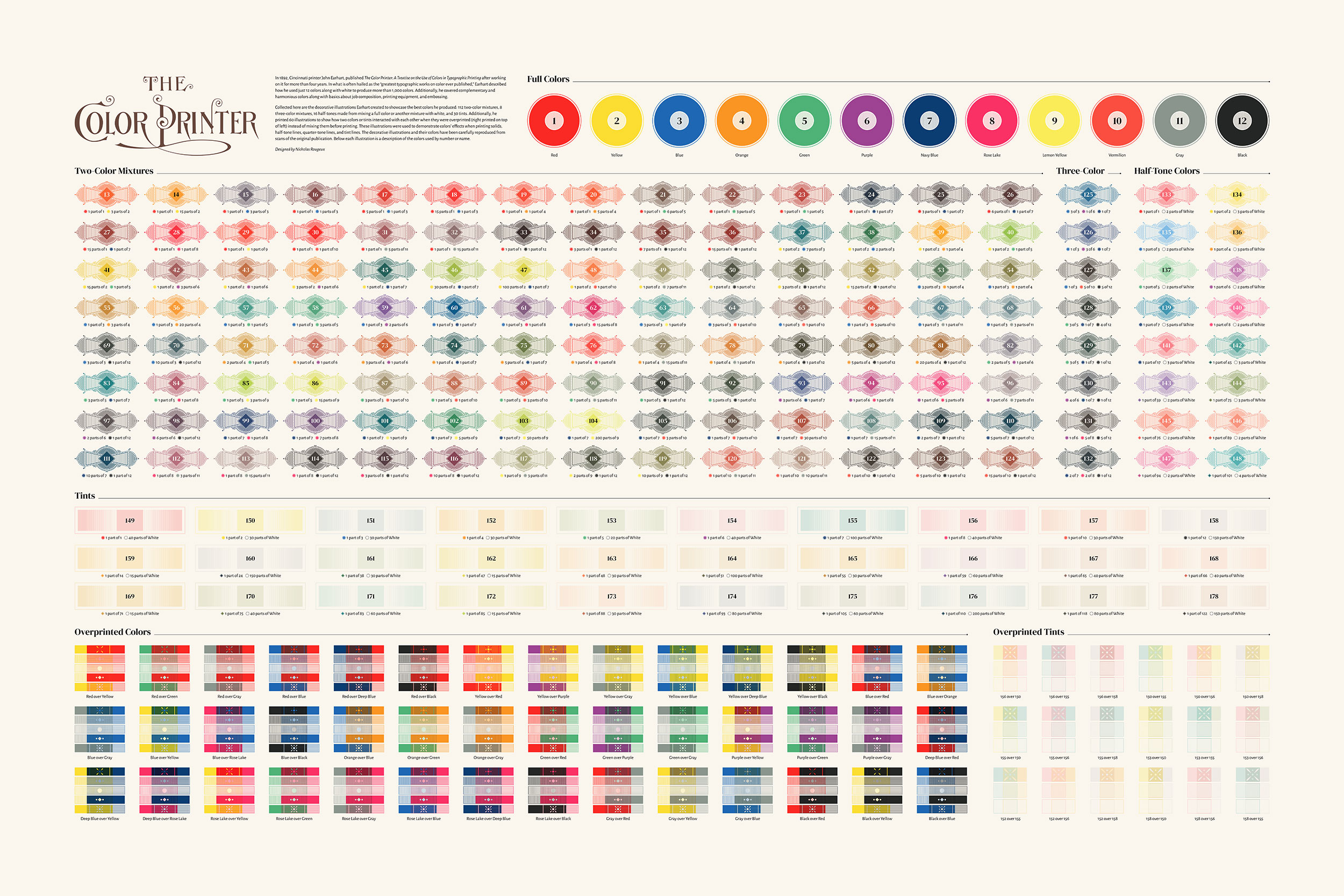
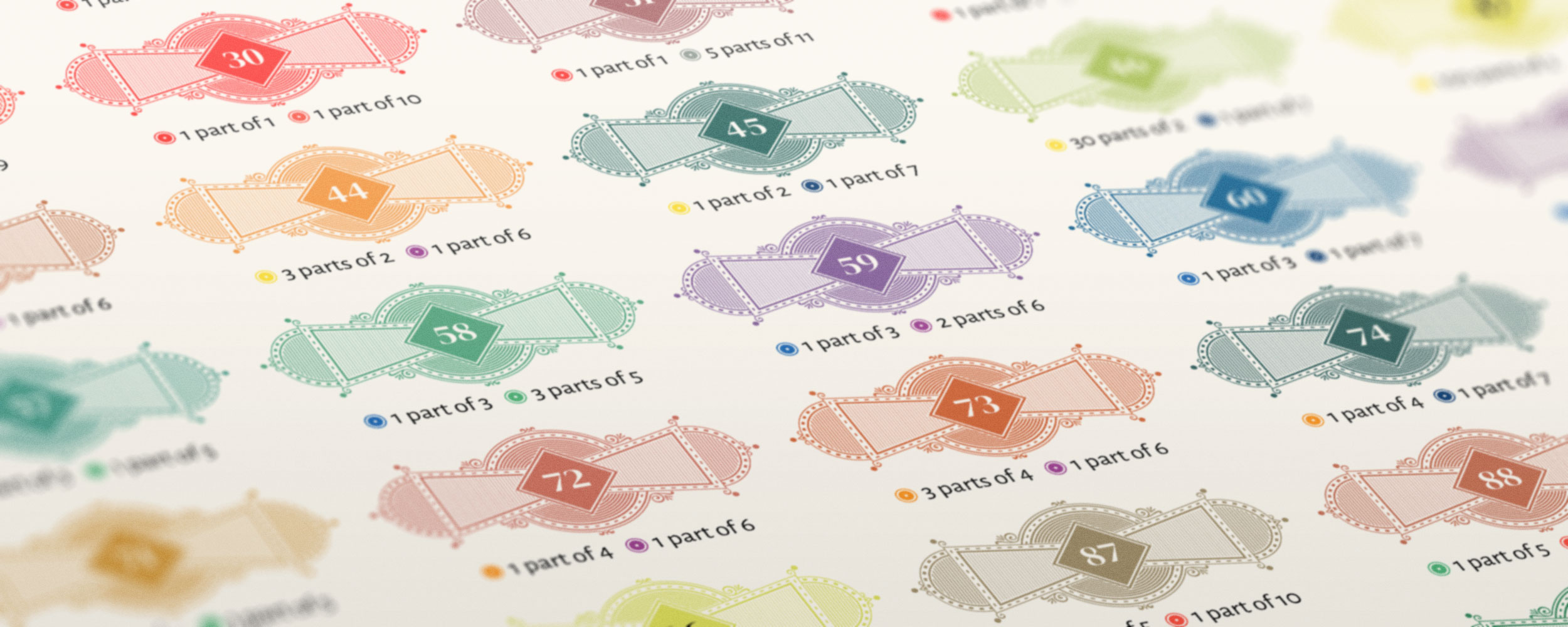
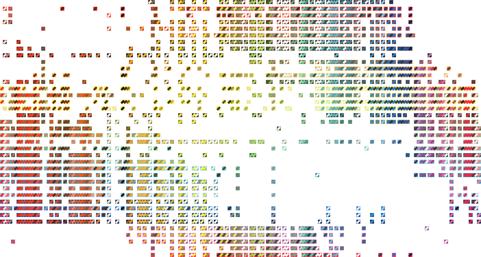
The goal was to include all the colors Earhart created in the poster. His engravings for each set of colors (full base colors, mixtures, tints, and overprinted colors) were beautiful and made his treatise stand out from other, which typically used simple squares or rectangles. He designed these to showcase how a single color can take on different appearances based on whether it was printed as a solid color or with lines of varying thickness—also called half-tone, quarter-tone, and tint lines.
Using these to represent the colors on the poster sounded like a fun idea but I didn’t want to spend the time photoshopping hundreds of the same image in different colors from the original scans. Instead, I decided to recreate each of the as vector graphic shapes. This way, I could more easily adjust the colors and have more control over the quality of how they appeared.
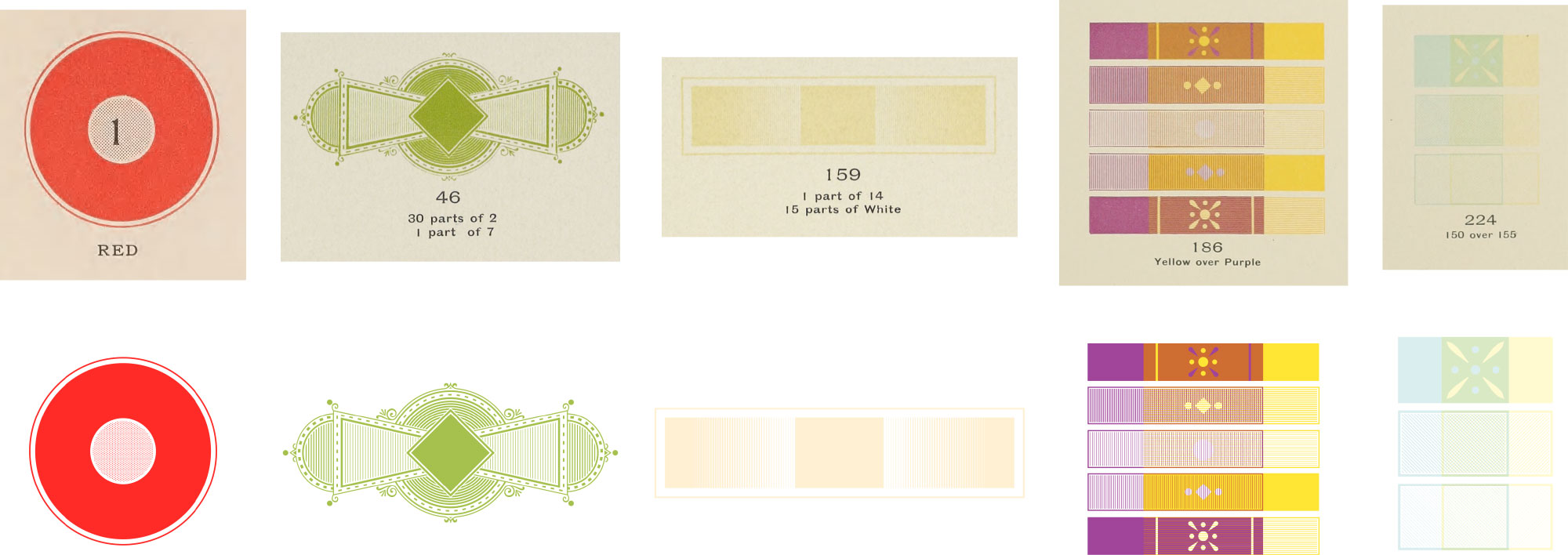
The results turned out great and the line thicknesses had a similar affect on the colors as the original at smaller sizes: thicker lines made colors appear darker while thinner lines made them lighter.
With these shapes created, I experimented with layouts. Early versions are rarely pretty but it’s important to start somewhere. Before I started sampling colors, I needed to determine if all the shapes could fit comfortably on a poster and a good layout quickly presented itself.
A tangent about tools
Again, breaking from previous workflows, I used Figma for the poster’s design instead of my usual tools of Illustrator and InDesign—probably the smartest decision I made for the project. I’ve been a slow adopter because of my long history with Adobe tools but have become more and more familiar with Figma in the last few years out of curiosity and professional necessity. For this poster, Figma was the only viable tool. I used Illustrator to create the color shapes because Figma’s vector editing still feels foreign and lacking but managing the layout in Figma was so much nicer than anything I could have hoped to achieve with Illustrator or InDesign.
The shapes were highly detailed and with so many in one document, management and performance often becomes a serious issue with Adobe products. Illustrator could have probably handled it but InDesign chokes with too many vector objects that aren’t imported as external files. InDesign has useful styling capabilities but Illustrator doesn’t. Neither have the features like auto layout, components, or instance overrides like Figma.
If I used Illustrator or InDesign, I would have had to create a hundreds of Illustrator files (one for each shape and color) and import them into InDesign. Then, spend a lot of unnecessary time arranging them into rows and columns with labels—something I’ve done many times for past projects. Even with InDesign’s spacing tools, this can be a painful process without something like auto layout because it’s very repetitive. Figma made this much easier because I made a component for each shape and used a lot of auto layout containers to keep shapes spaced evenly while I resized them.
I made numerous spacing and formatting adjustments and seeing them automatically take effect made the editing experience very enjoyable. Plus, Figma handled all the complex shapes perfectly and performance never suffered. As someone who group up with MS Paint, I’m continually amazed at what’s possible—especially in a browser. I can only hope that if Adobe’s acquisition of Figma goes through, these useful features make their way into Adobe’s other products.
That beautiful title
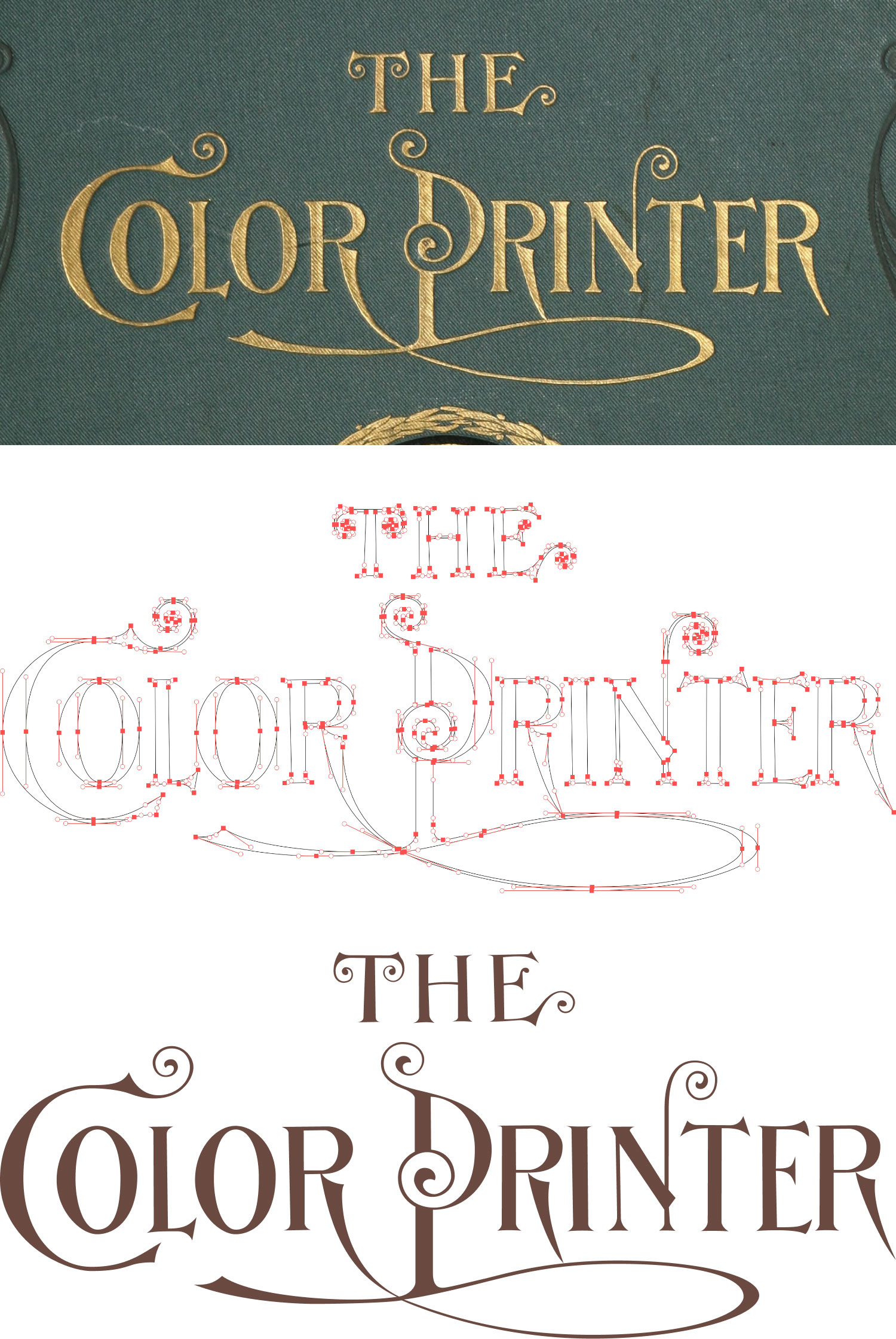
After settling on a basic layout, I focused on the title for a bit. The original cover of The Color Printer had a ornate gilded title that was too beautiful to replace with a stock typeface so I set out to recreate it as a vector. Initial attempts at using Photoshop to create a raster graphic and Illustrator to generate a vector automatically were substantially subpar and they not suitable for use on a poster. Instead, I created a vector shape from scratch. The spirals were a bit challenging but I was pleased with the result.
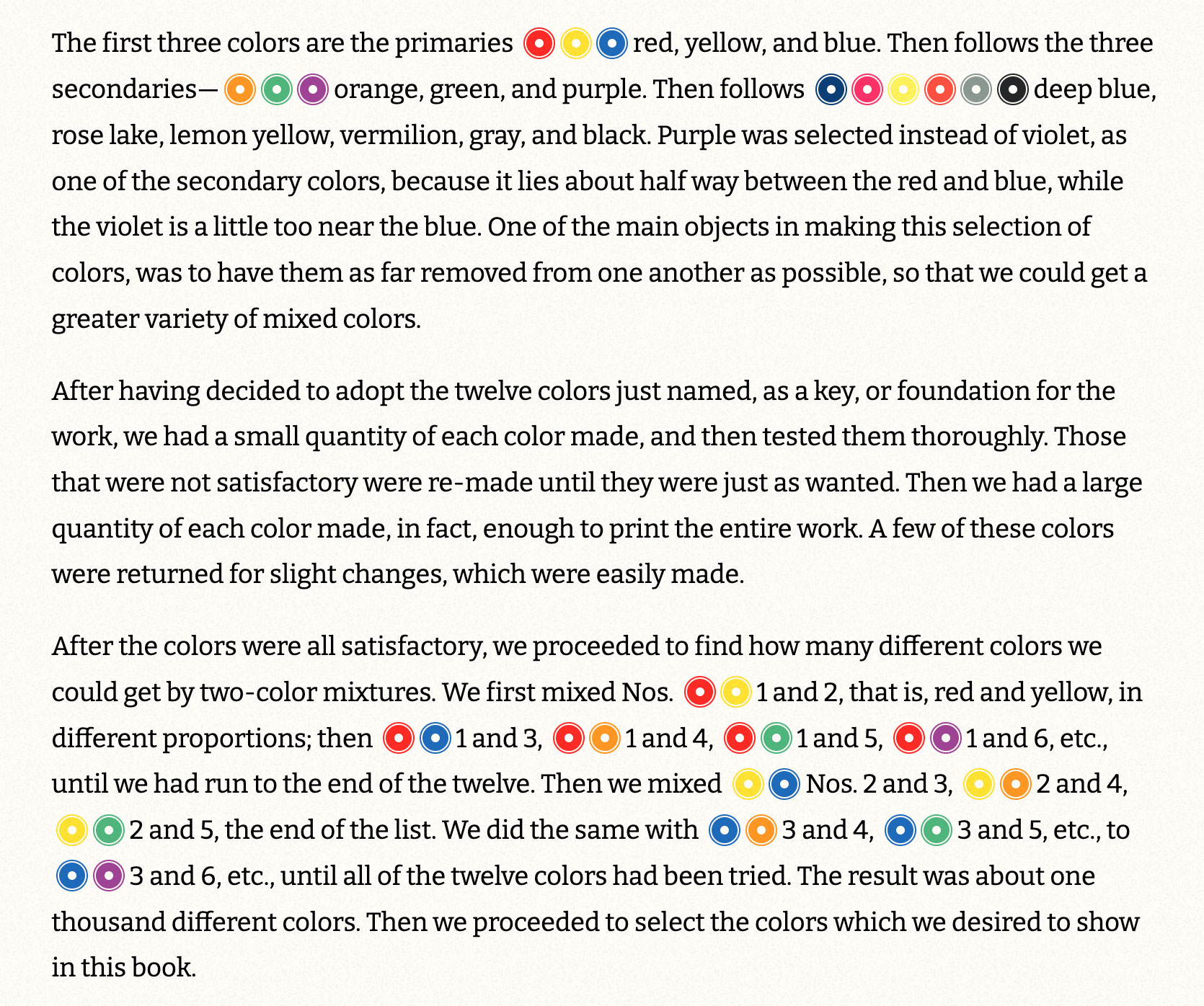
Colors
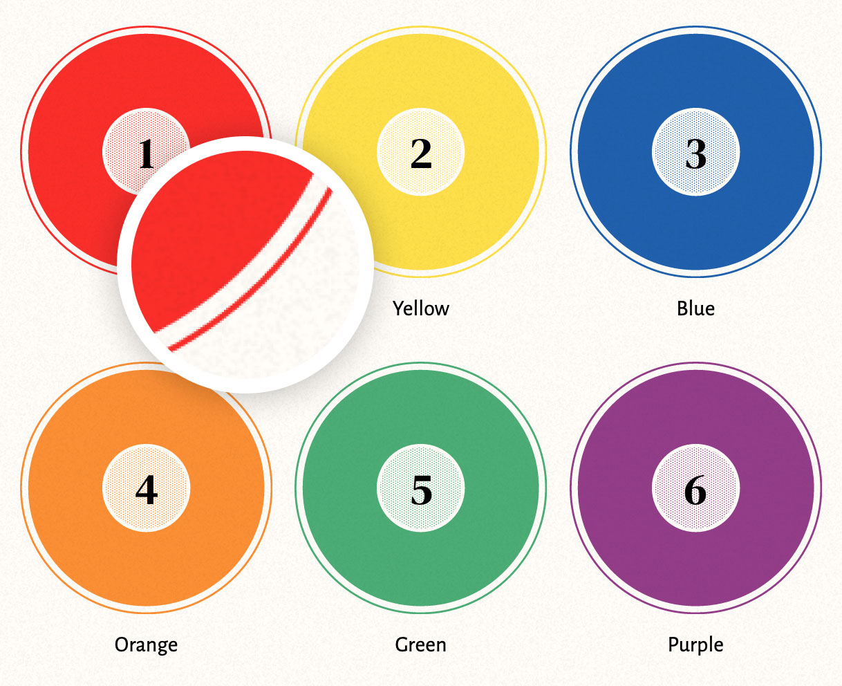
The next hurdle was getting the colors right. Restoring antique colors is not an easy task—especially when attempting to restore printed colors in a digital medium. Since there wasn’t a single point of reference for how they looked when originally printed, I took some liberties to achieve a modern interpretation that is as true as possible to what I thought Earhart intended. The first plate for each of the three scans has base colors 1–12 that were mixed for all the other colors. A comparison between these showed that there were noticeable differences between them.
Colors naturally age over time so the challenge was finding a way to restore these and all others consistently. I didn’t want to restore them to be too bright and vibrant but instead, retain a little of the antique feel to them while giving them more vibrancy. This meant that the same color adjustments I made to the first 12 should also be made to all the other plates because they were mixtures made from them. My goal was to use simple adjustment layers in Photoshop without manually adjusting individual colors.
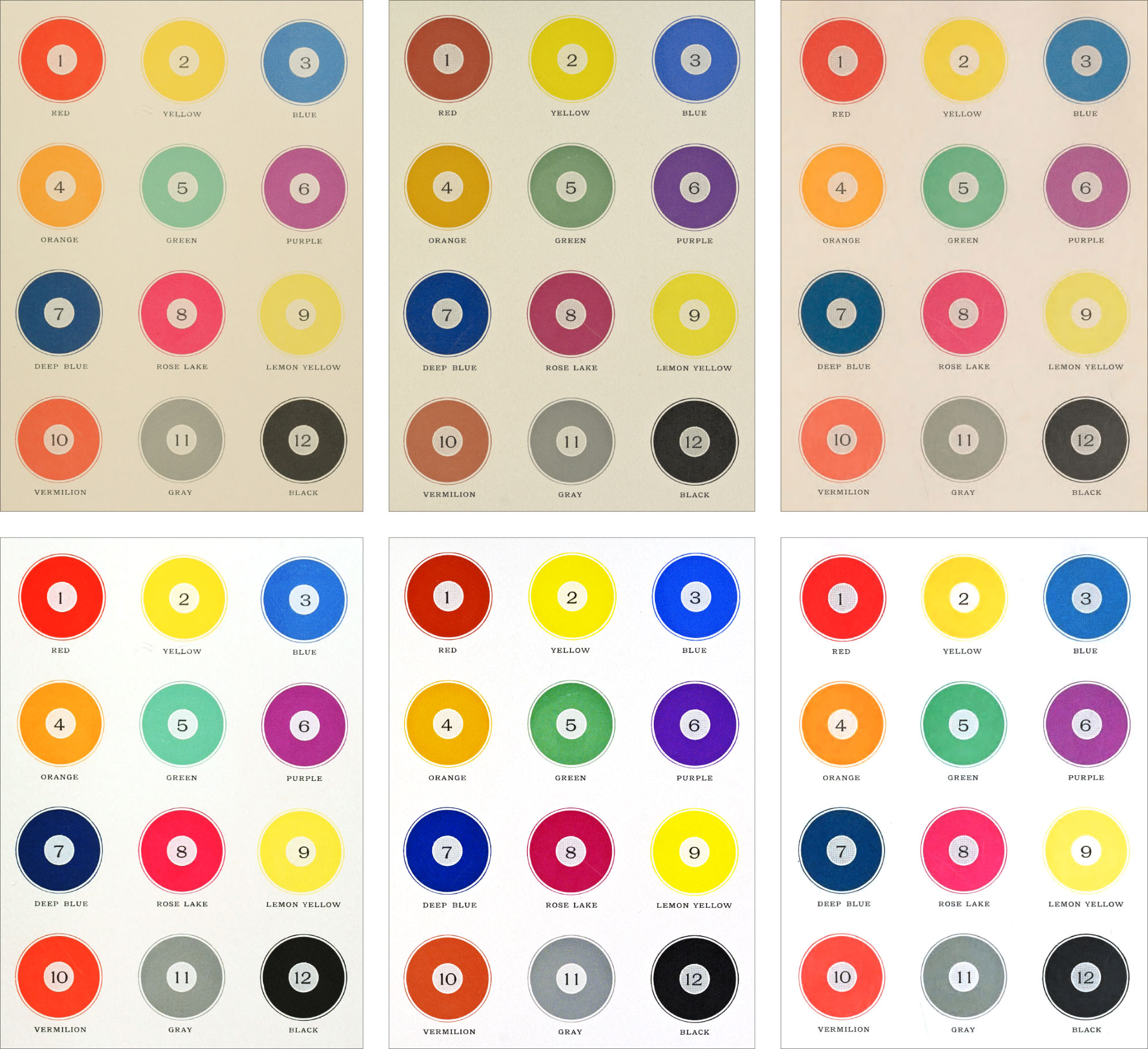
I initially liked the results from #1 the best but the green looked too teal and when the adjustment layers were applied to other plates, those colors looked too unnatural. I couldn’t get the green to look more green without negatively affecting other colors. The colors for #2 were so far off that I couldn’t find a comfortable set of adjustments to make all the colors look nice. The green looked better but the blues, yellows, and purple were far too bright and saturated. I finally settled on the colors from #3. They appeared closest to what I assumed Earhart would have produced but with a little aging still visible. The green is slightly less green than #2 but the rest of the colors aren’t oversaturated and appear distinct enough from each other.
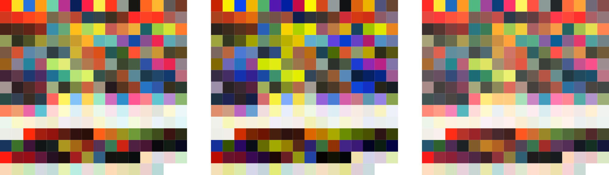
I thought a fun experiment would be to use Mixbox to mix the 12 base colors based on Earhart’s mixture ratios to produce new digital versions of the mixtures. Mixbox is an intriguing color mixing code library that mixes colors digitally but as if they were pigments for printing. The results were interesting as illustrated below but were different enough from my own color adjustments in Photoshop that I decided to stay with my own.
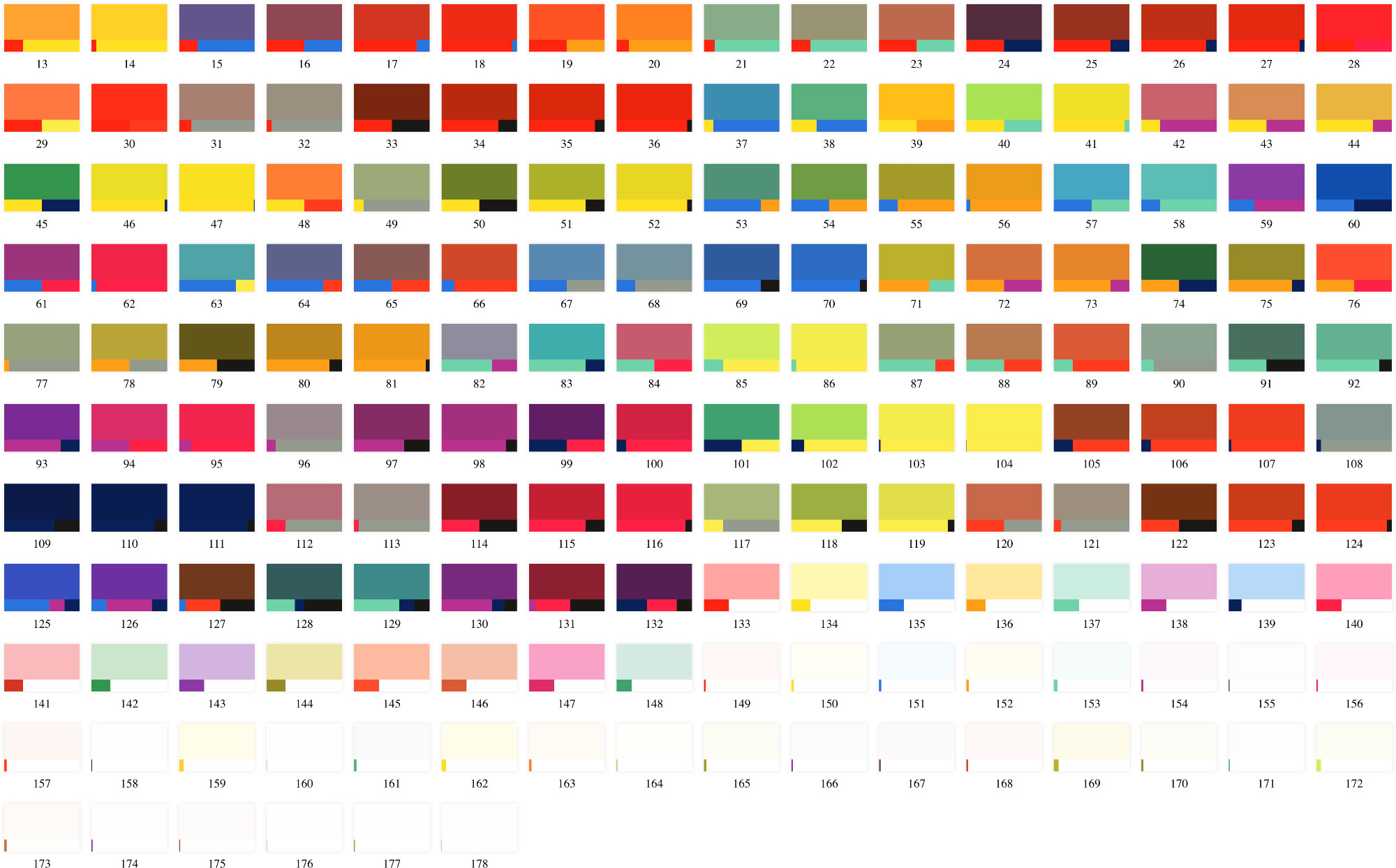
Looking at swatches of the colors I manually sampled from each scan, the differences between each one are noticeable.
As a true test, I applied the adjusted colors from each scan to the poster and #3 felt the most natural. As an extra adjustment, all colors are set on a light cream background and have their blend mode set to multiply so they blended well with it and didn’t appear too bright against it. This process of sampling and applying colors was tedious because they needed to be sampled and applied one at a time but the work was worth it to find a set that looked best.
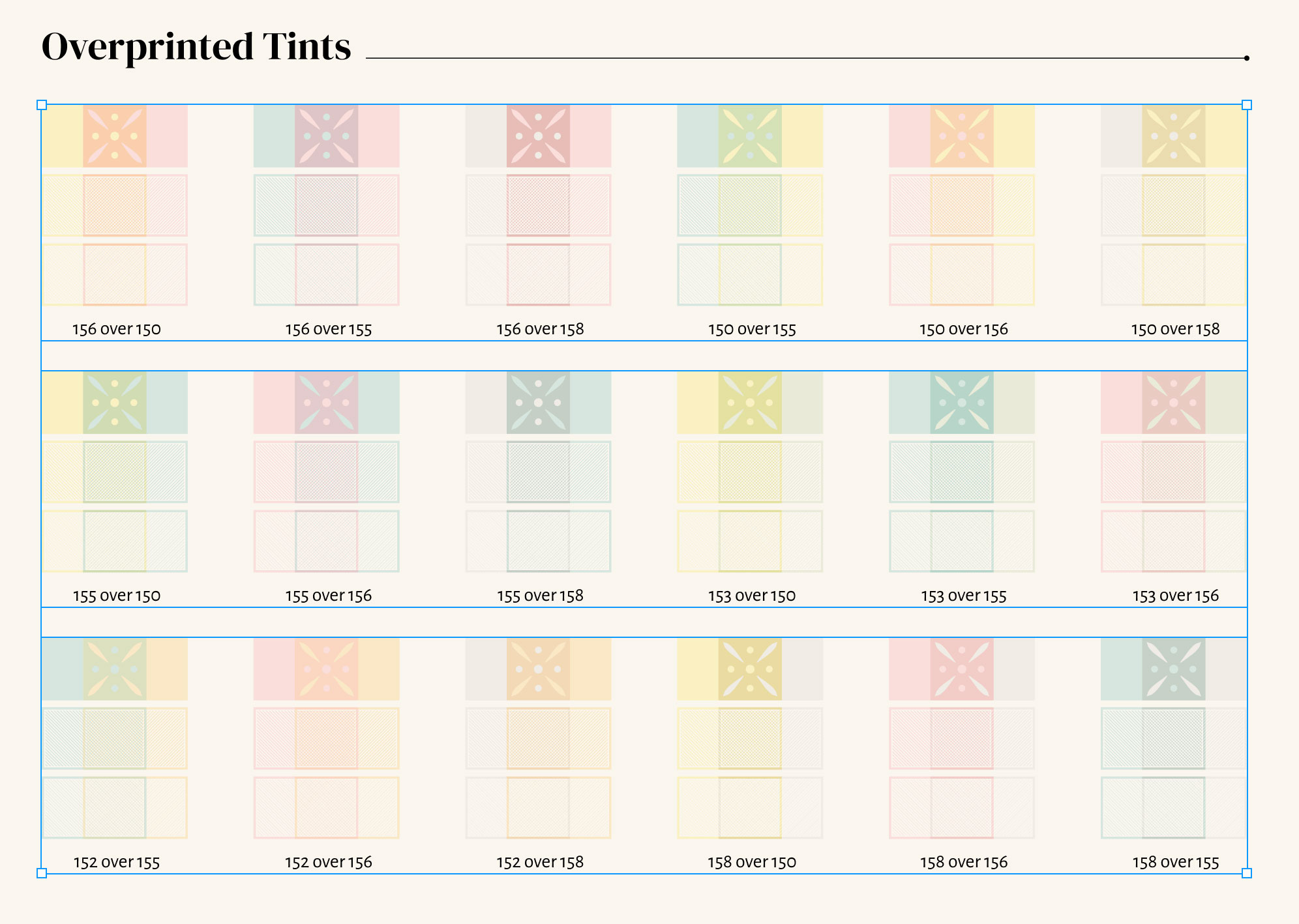
Faux overprinting
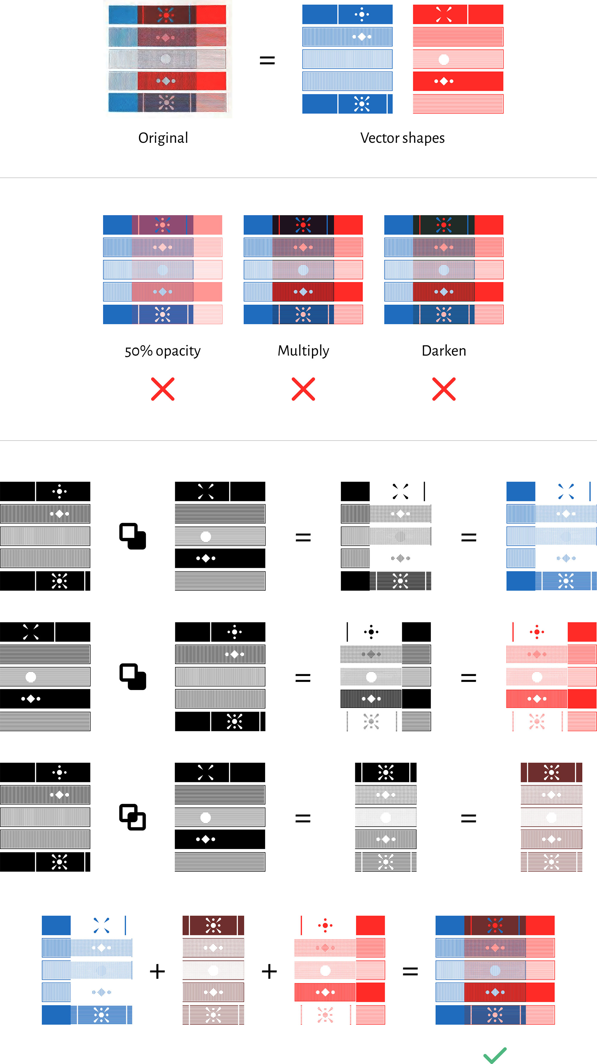
I couldn’t find a blending mode that accurately reproduced the effect of printing one color over another. Mixbox got close but not enough, so I also sampled each overprinted color from the scans. Each set of shapes representing overprinted colors was actually three separate shapes with no overlaps: two for the separate colors and one for the overlapping color, which was an intersection of the two shapes. The shapes for the separate colors are not the full shapes but the shape with the other subtracted from it.
Test prints
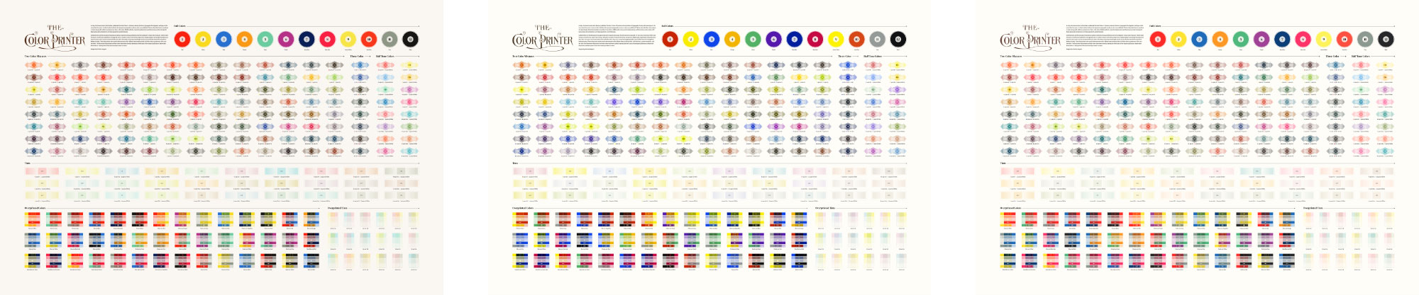
After what felt like endless adjustments an fine tuning, I ordered a test print of the poster to see if the details would appear okay and the text would be legible. I was pleased with the result but was also pleased to see that there was plenty of room to make most elements larger for legibility. So I bumped up the sizes of nearly everything, darkened the background color to make it more visible, and ordered a second test. Unfortunately, the second test came back blurrier than I would have liked, despite uploading what I thought was a high enough resolution (18000×16000 at 300ppi). It was clear there was some double printing so the problem wasn’t with the image I uploaded. I argued with Zazzle for a bit and eventually got a reprint. However, that still wasn’t great. I was about to give up hope and consider a redesign that didn’t rely on so many fine details but ordered one final test print—not of a raster image but of an Illustrator file. I exported an SVG from Figma, sized it Illustrator and uploaded that file to Zazzle. In hindsight, I should have done that to begin with but I didn’t because large raster images have worked for me in the past. Regardless, that did the trick and the final test print looked fantastic. All the details looked excellent as seen below.
Designing and building the digital edition
While waiting for the test prints to arrive, I mulled over the idea of creating a complete digital edition. Considering I had all the assets from the poster and the treatise was relatively short at around 230 pages, I figured it could be a nice side project to accompany the poster. Once again—breaking my pattern of thinking the reverse: that the poster would accompany the digital edition.
Organization
Earhart’s treatise only comprised a handful of chapters and 90 numbered plates of illustrations. Other illustrations were scattered throughout the text. The plates were spaced unevenly throughout, requiring the reader to do a lot of searching to find the plate being referenced. One goal for the digital edition was to place plates and illustrations where they were referenced in the text so they were easier to examine in context. Another was to consolidate some of the shorter chapters into single pages. I organized the book into five sections:
- Colors & Mixtures (home page): Introduction to the project that also contains the full lists of mixtures, tints, and overprinted colors from the first part quarter of the book.
- Complementary Colors: A shorter chapter with optical experiments for determining which colors are complementary.
- Harmony of Colors: The longest page with guidance for determining which colors work harmoniously when printed and a complete list of all the plates and their illustrations.
- Combinations: A complete list of the 3,600+ color combinations listed near the end of the treatise with added color swatches.
- Printing: A combination of the shorter sections at the end of the treatise covering job composition, printing presses, rollers, inks, papers, tail pieces, initial letters, and embossing.
Typography
For page titles and headings, I chose DM Serif Display to complement the original decorative title. They are never very close to each other in the design so the similarities don’t clash but instead, it carries the title’s elegance throughout. Bitter was used for body copy, both large and small, because it felt like a nice modern interpretation of the original typeface used. Its large x-height and thin weight kept it nicely legible for large blocks of text and I enjoyed the little bit of character in its italic style. Figure captions and asides were set in Alegreya Sans—a typeface that quickly became one of my favorites along with its related families when working on Iconographic Encyclopædia. It’s old style numerals and great legibility at small sizes made it complement the other typefaces nicely.
Reusable shapes
Having created most of the necessary shapes for the poster, I wanted to find a way to use them efficiently online. The best approach I found was to use SVG symbols where each shape defined in a single large file. To achieve this, I combined all the parts of a shape in Illustrator into a single compound path. Every stroke was outlined so it would scale to the size I needed and clipping masks were used to slice shapes.
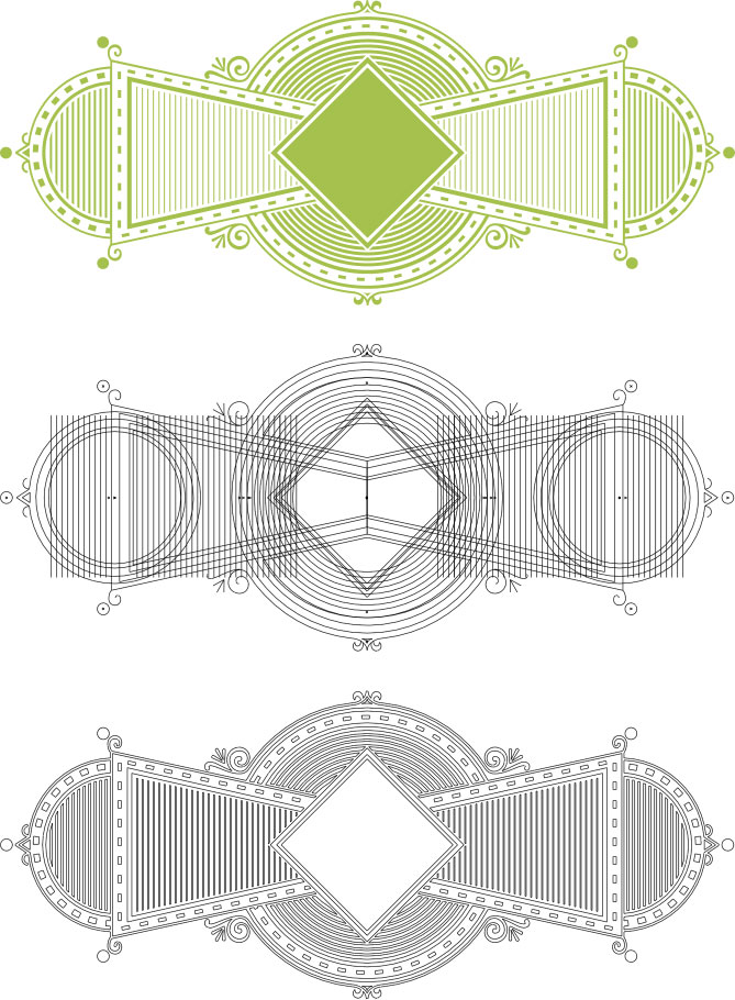
The final compound shape was then exported as an SVG and put into a symbols.svg file with the other shapes. Each path had a currentColor value added to the fill so it would work with the color I assigned it in the CSS later on. The values were extremely long due to the complex shapes but ended up being about the same file size as if I exported the shapes as an SVG without converting them to compound paths.
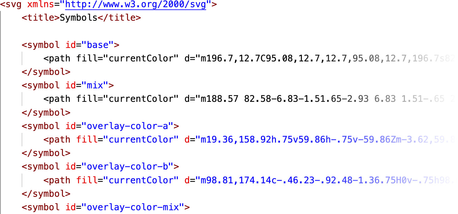
The great part about this approach is it gave me a single place of reference for all shapes instead of loading separate files or trying to inject a large amount of SVG code into my pages. Each symbol was then referenced using a simple HTML snippet:
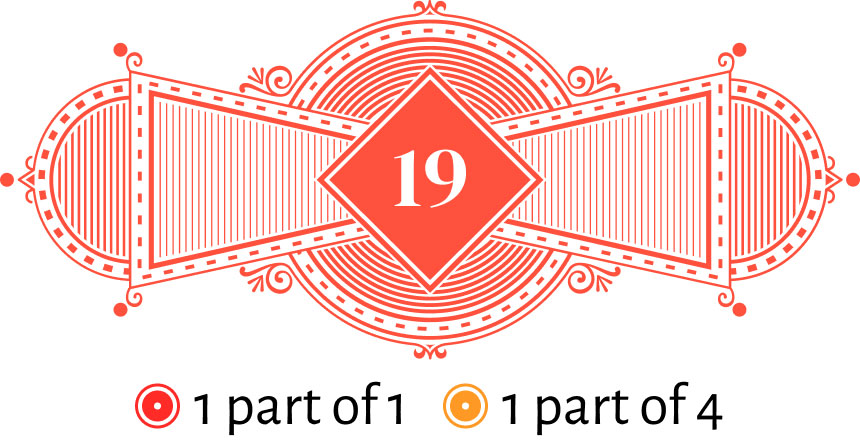
<div class="mix-img c19">
    <svg aria-hidden="true" width="665.77" viewBox="0 0 665.77 279.47">
        <use href="/images/color-printer/symbols.svg#mix"></use>
    </svg>
    <div class="mix-num">19</div>
</div>
<ul class="mix-parts">
    <li><mark class="hl hl-base c1">1 part of 1</mark></li>
    <li><mark class="hl hl-base c4">1 part of 4</mark></li>
</ul>
Things got a little hairy with some of the shapes as I’ll get into later but this worked well and made generating the lists of mixtures, tints, etc., much easier and didn’t negatively affect browser performance.
Color system
Hundreds of colors were generated for this project so a way to manage and apply them efficiently was key. I used a system similar to what I used on Iconographic Encylopædia—scoped CSS variables. All colors were defined in a separate CSS file that was broken into two sections: color values and scoping.
The section for color values had all the hex codes for each color. Most were named for the ID Earhart assigned to them (e.g., --c1: #ff2b27 for red, which had the ID of 1). Then, in the scoping section, I set the scope for that variable based on a class with the same name and the necessary foreground color when text was on it (e.g., .c1 { --accent: var(--c1); --foreground: #fff; }). This allowed me to use var(--accent) in my main CSS file to apply the color assigned to an element as long as it had the appropriate class.
For example, see the HTML snippet above for mixture #19. It uses the c19 class, which maps to the following:
.c19 { --accent: var(--c19); --foreground: #fff; }
Then, var(--c19) maps to the color #ff513d. The CSS for the mixture shape is as follows:
.mix-img {
    margin-bottom: 0.6em;
    position: relative;
}

.mix-img svg {
    color: var(--accent);
    display: block;
    mix-blend-mode: multiply;
    width: 100%;
}

.mix-num {
    color: var(--foreground);
    font-size: 2rem;
    left: 50%;
    line-height: 1;
    position: absolute;
    top: 50%;
    transform: translate(-50%, -50%);
}

.mix-parts {
    display: flex;
    font-size: 1rem;
    justify-content: center;
    list-style: none;
    margin: 0;
}

.mix-parts li { margin: 0 0.3em; }
The var(--accent) variable is applied to the SVG color which turns the shape reddish orange and var(--foreground) makes the text white. My colors CSS file is several hundred lines long because of all the different colors and two lines needed for each but it’s a manageable system and makes applying colors anywhere as easy as setting a single class on an element.
Highlights
Something fun I wanted to add was an icon next to colors where they were mentioned to reinforce what was being described. I was going to use simple circles but that felt too plain. Throughout the treatise, there were several categories of colors mentioned—each with their own shapes (rings for full base colors, diamonds for mixtures, etc.)—so I decided to use symbols corresponding to those plus a few others. The poster originally used simple circles below each illustration and I liked how they looked on the digital edition so the poster was updated to use the same symbols.
I marked these up using the <mark> element and used the same color classes from before to represent the colors mentioned:
    <mark class="hl hl-base c1">Red</mark>
    <mark class="hl hl-base c2">Orange</mark>
    <mark class="hl hl-base c3">Yellow</mark>
The color wheel on the Harmony of Colors page was the basis for most of the colors discussed there so I used rounded rectangles, which were somewhat similar to the rounded wedges. Metallic colors like gold didn’t have official shapes so I used circles with an added shine. The addition of these highlights made for busier text in some spots but I felt it helped more than it hindered.
Texture
As I did for the poster, all graphics and colors are set to mix-blend-mode: multiply so they blend with the cream-colored background—giving them a slightly warmer feel. Wanting to take this feeling a bit farther for the digital edition, I also applied a very faint noise texture to every page. Finding the right balance so it didn’t feel annoying took some trial and error but I thought it worked well. The faint texture on all the colors also makes them feel a little more tangible—as much as that’s possible in a digital edition.
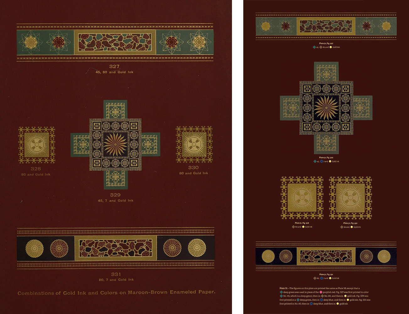
Metallic specimens
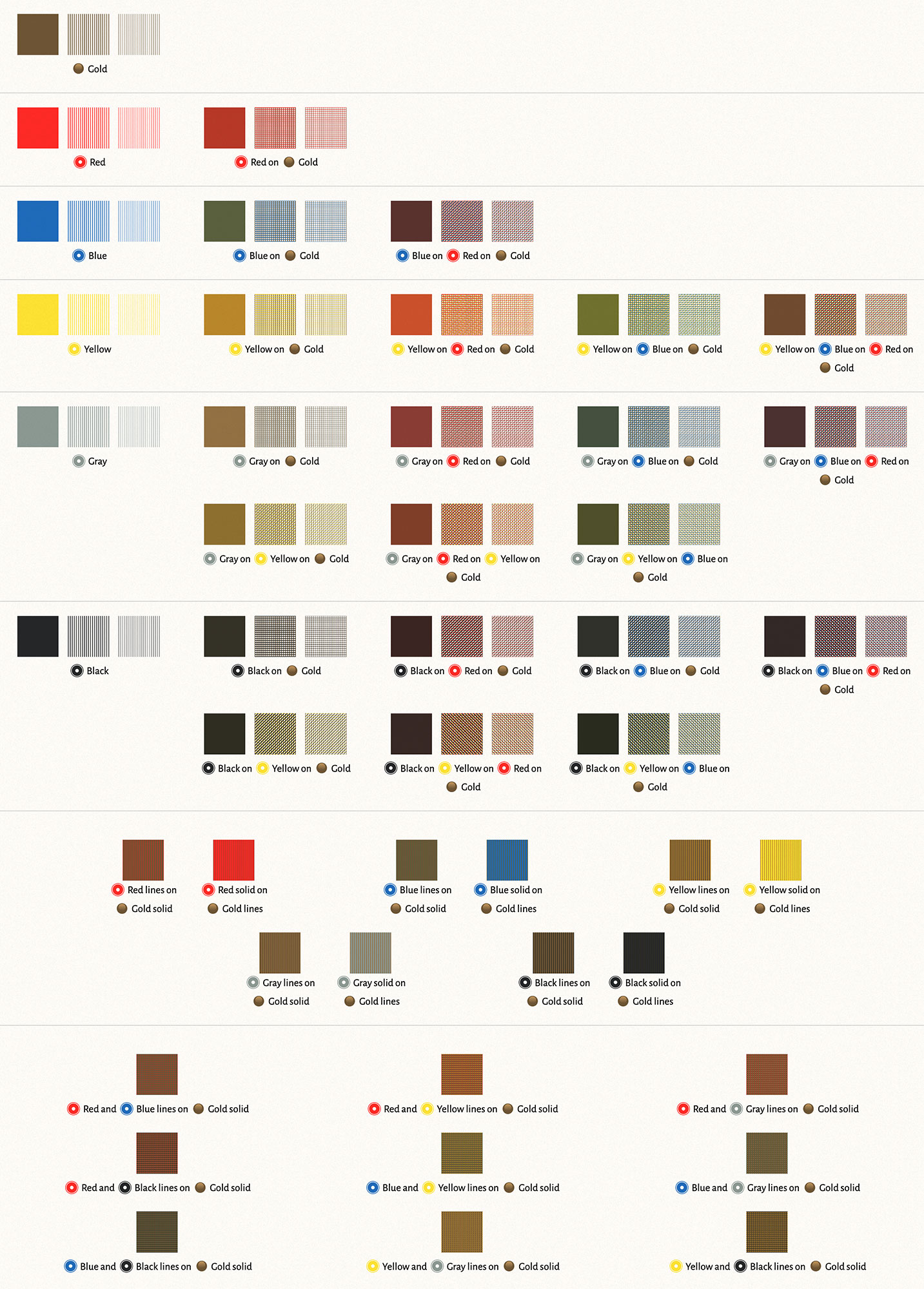
Two sections of the original Harmony of Colors chapter showcased how metallic colors can be printed with other colors. The first was three plates showing how they looked on red, green, and black enamel. These images required extra care to adjust because their original colors were largely a guessing game. I used the colors from scan #3 as a guide and adjusted the colors from scan #2 to match because the latter was of a higher resolution.
The other section showcasing metallic colors was plate 62, which demonstrated how red, blue, yellow, gray, and black interacted with gold bronze when printed in solid colors, halftone lines, and tint lines. Reproducing these shapes in SVG seemed overkill, so at first, I was going to simply adjust the colors in Photoshop and post the plate as a large image. This nagged at me because reproducing them felt achievable even though it would involve a lot of extra work, so I spent extra time creating the SVG shapes for them.
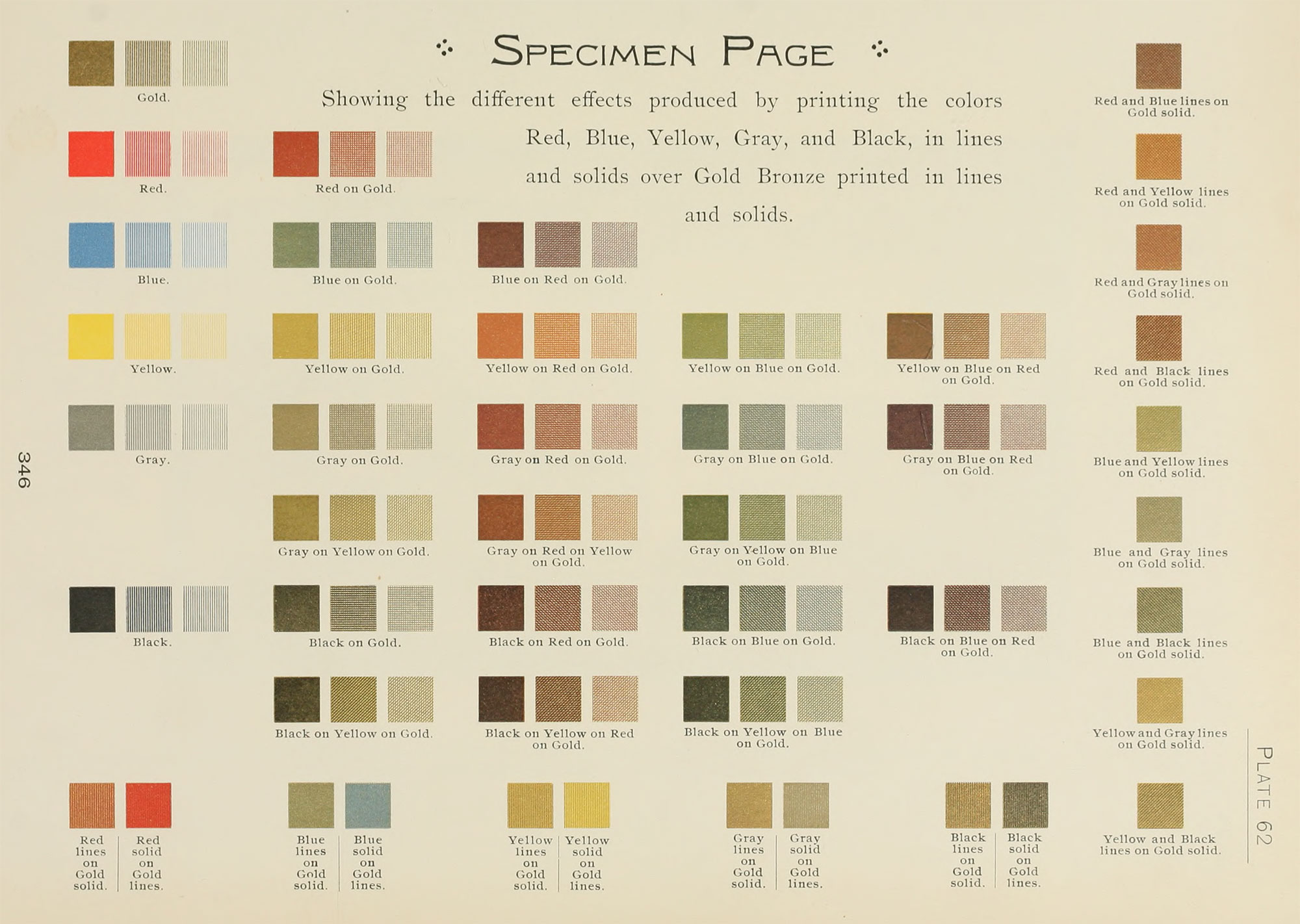
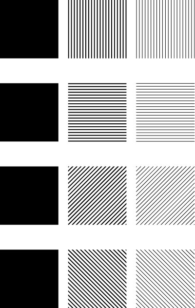
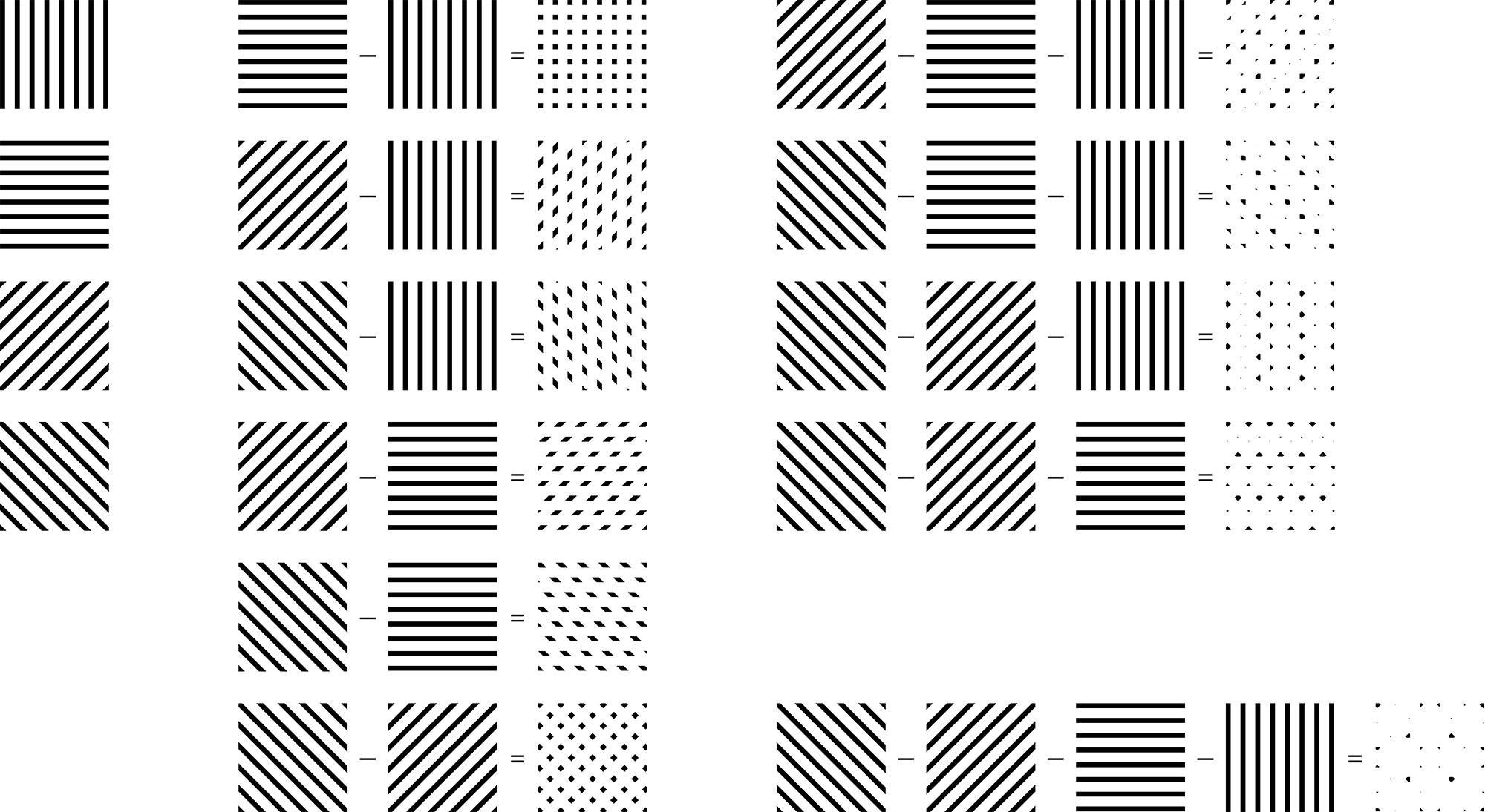
First, I reproduced the basic shapes in SVG. Then, I had to understand how they were printed. The text describes the overlapping colors as follows:
In the first cut they are perpendicular; in the second, horizontal; in the third they run diagonally from the right, down to the left; and in the fourth they run diagonally from the left, down to the right, so that when the four cuts are printed over one another, each color is plainly visible; especially so if the reader will examine any one of the figures on Plate 62 with a small magnifying glass.—Earhart, The Color Printer
This means that the four different cuts were used in the same order for any given color combination. For example, yellow on blue on red on gold produced the following pattern:
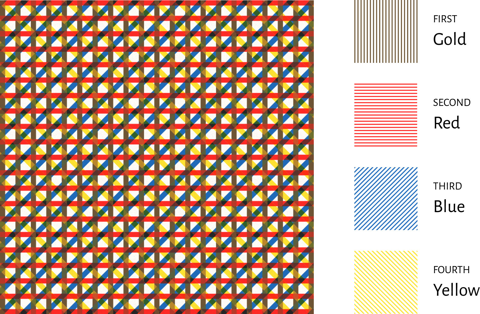
Like with the overprinted colors, I couldn’t simply overlap the SVG shapes and apply a blending mode like multiply because that produced colors that don’t match the original scans. I had to sample the overlapping colors from the scans and set the color to just the overlapped areas to them.
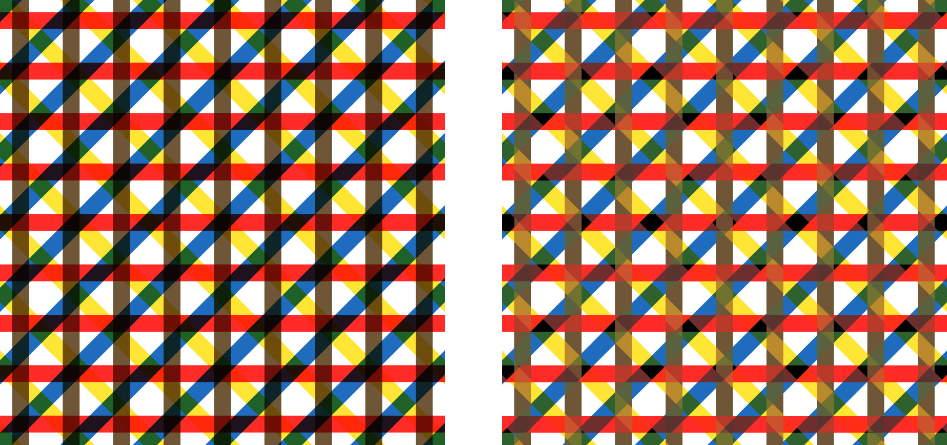
The catch was that accurately representing overlapping colors meant that I had to employ the same technique as the overprinted colors and create separate SVG shapes for each overlapping combination. With each specimen comprising 1–4 colors, that meant 1–15 shapes for each one and a total of 31 SVG shapes in the symbols file—each one with a very long path. This meant many shapes were needed to accommodate all possible combinations of shapes: 1 for a solid color and 15 each for halftone and tint lines. Each specimen is a combination of 1 to 15 of these shapes stacked on top of each other with a color applied.
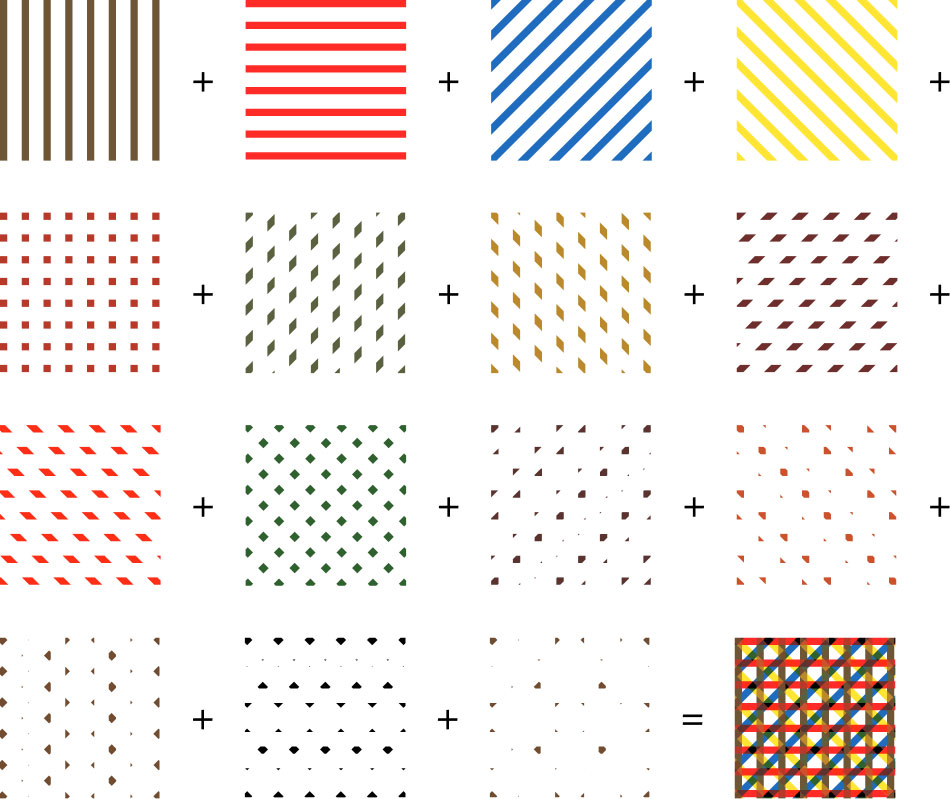
Finally, once I got the shapes set up, I organized them in a way that resembled the original scan with some basic modifications like the highlight icons and the position of the smaller groups. All this work generated hundreds of lines of HTML, a lot of SVG code, and nearly 1,000 lines of JSON for how shapes were combined. As I expected, this was overkill for squares that only measure 70×70 pixels but I’m pleased with the results—even if they are buried near the bottom of the lengthy Harmony of Colors page. The final specimens also looked very similar to the original scan, which was a nice bonus.
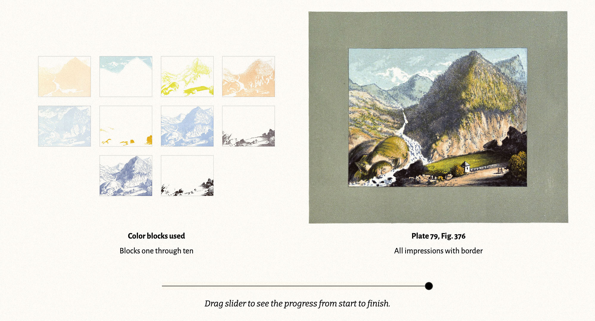
Pyrenees Mountains
A fun section to bring to life was the series of prints made for the Pyrenees Mountains. Earhart created 11 plates—each with a different color printed in sequence on top of each other (impressions), resulting in a final image surrounded by a gray frame. I cropped these images and added a slider below them so readers can watch the image come to live in a brief flipbook-like animation.
Combinations
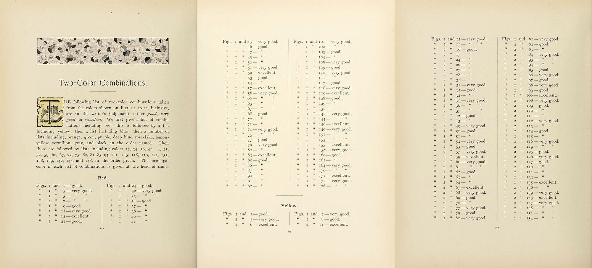
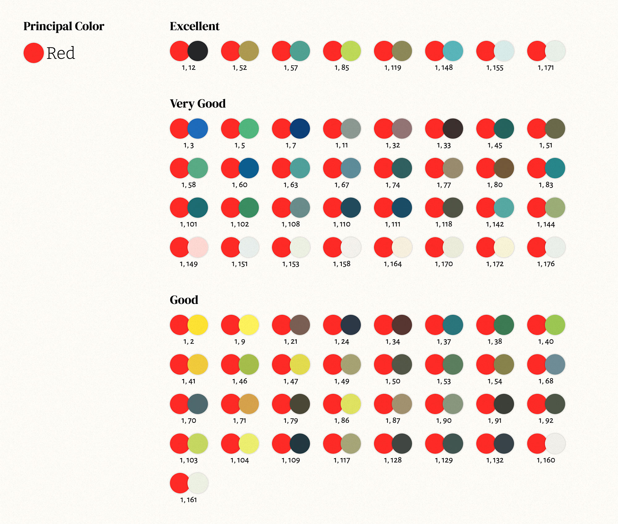
Toward the end of Earhart’s treatise is a list of thousands of two- or three-color combinations that he considered good, very good, or excellent. This list was systematically organized by principal color (e.g., combinations with red, yellow, blue, etc.) and included both base colors and mixtures as principal colors. The combinations were listed as regular text with numbers referring to the colors created earlier.
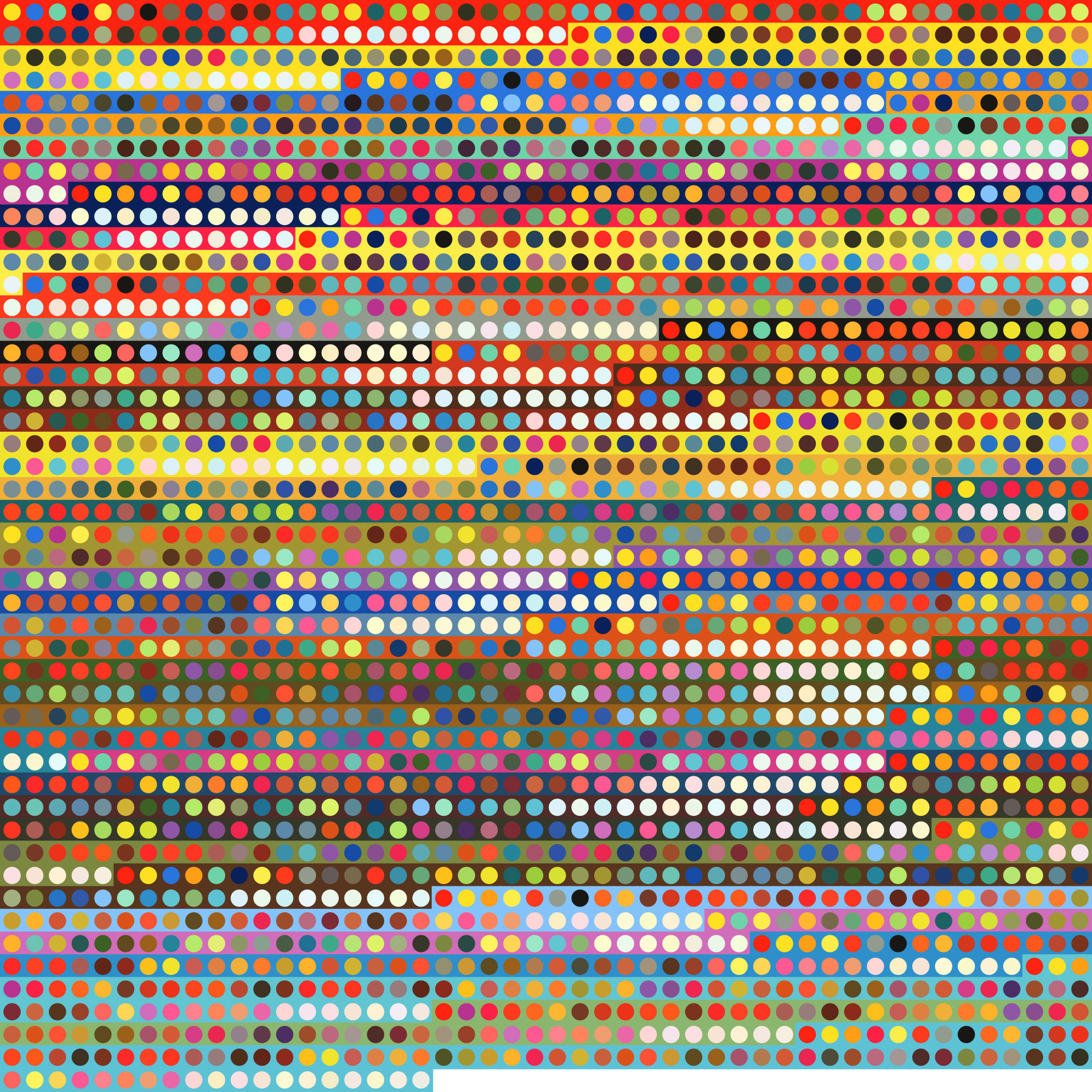
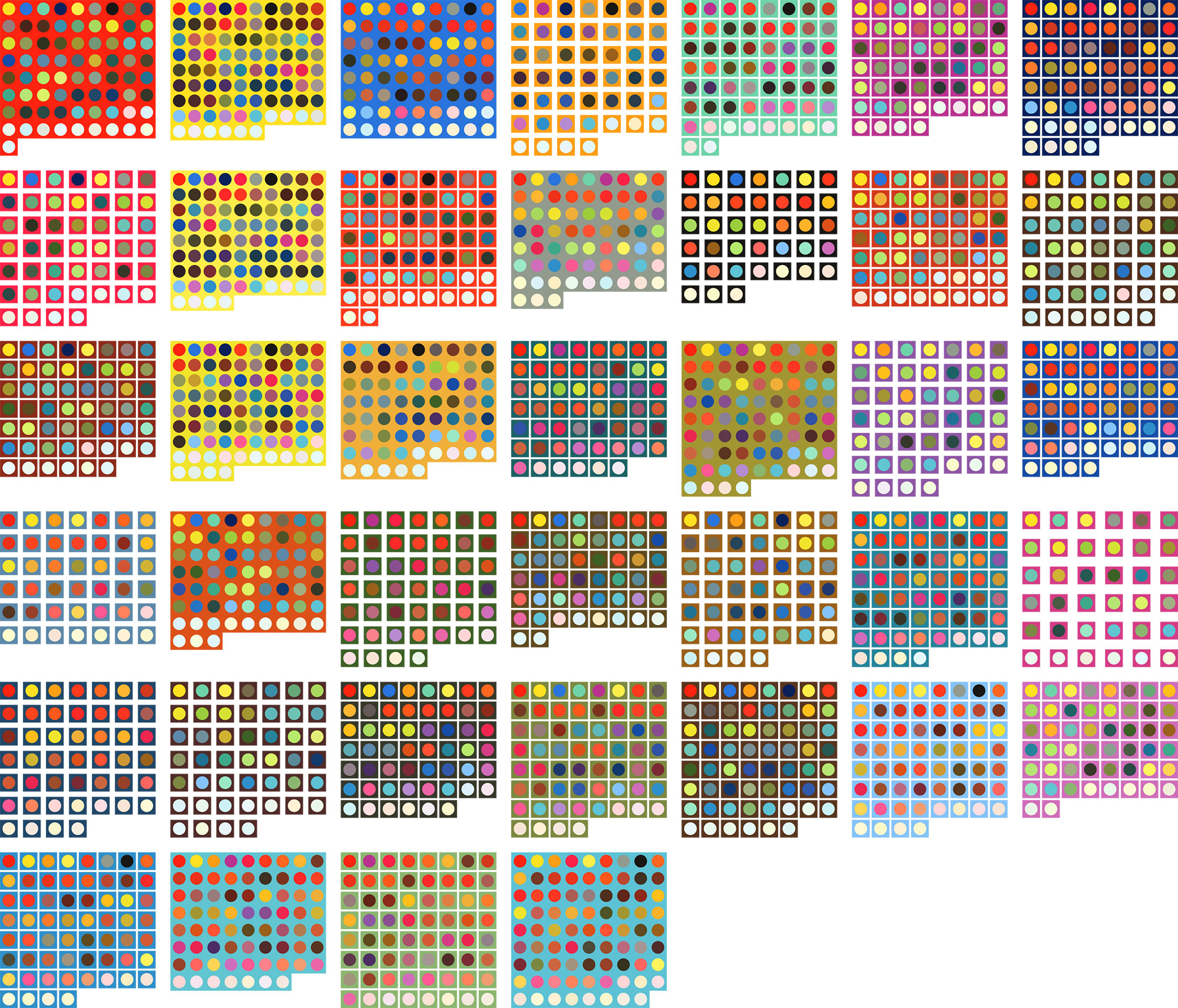
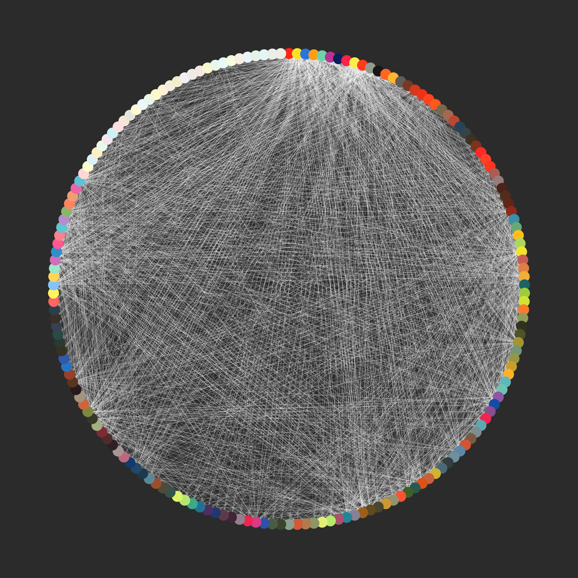
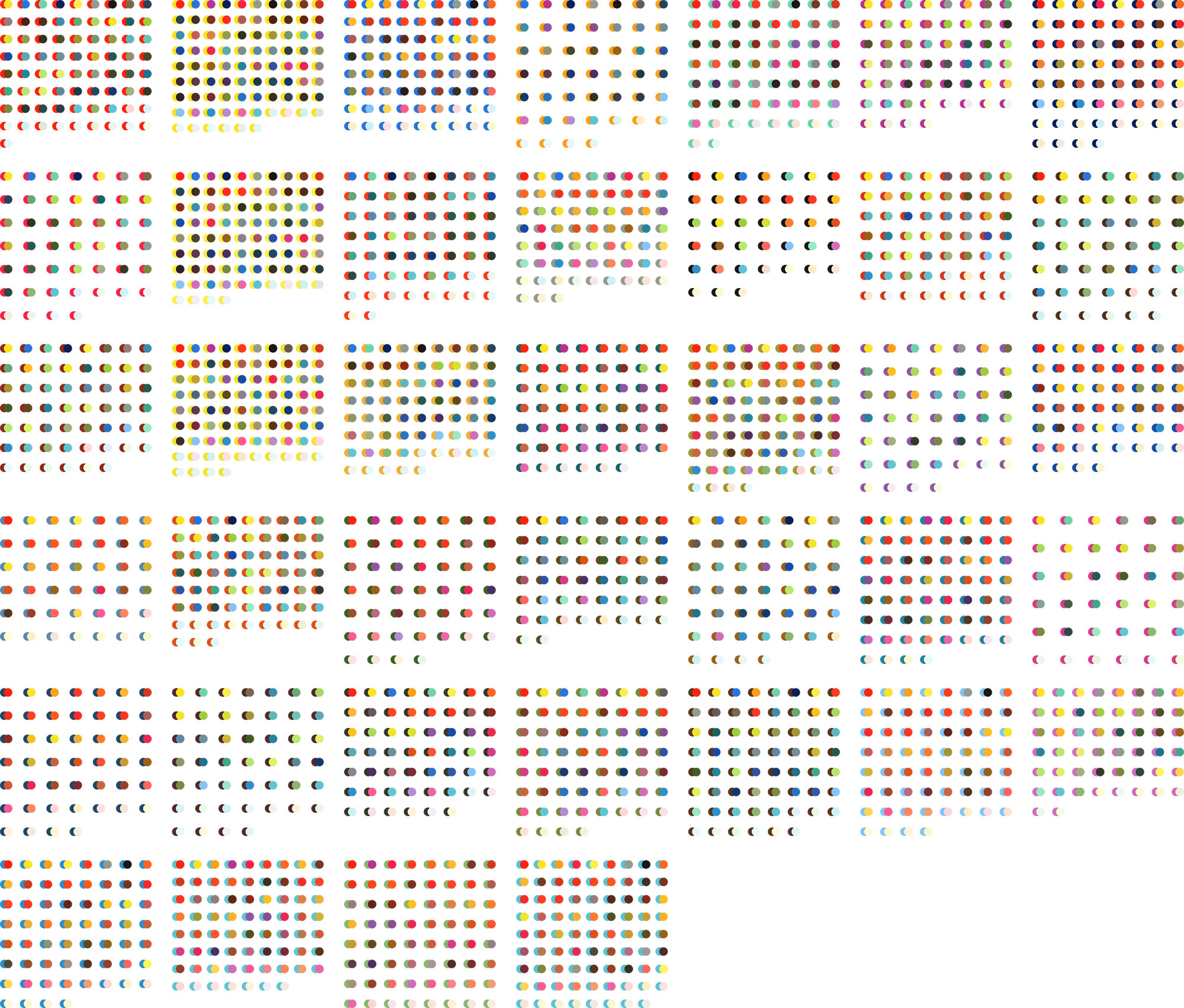
Of course, I couldn’t simply reproduce the list as ordinary text. This was a list of color combinations without the colors. I had to see what all these colors looked like to see why he classified them the way he did. After a bit of elbow grease, I transcribed the numbers into a spreadsheet and played around with ideas for a single comprehensive chart to visualize them. However, I quickly realized that there were just too many (3,683 combinations) to produce anything visually interesting without looking messy. Below are some early attempts at visualizing the 2,275 two-color combinations.
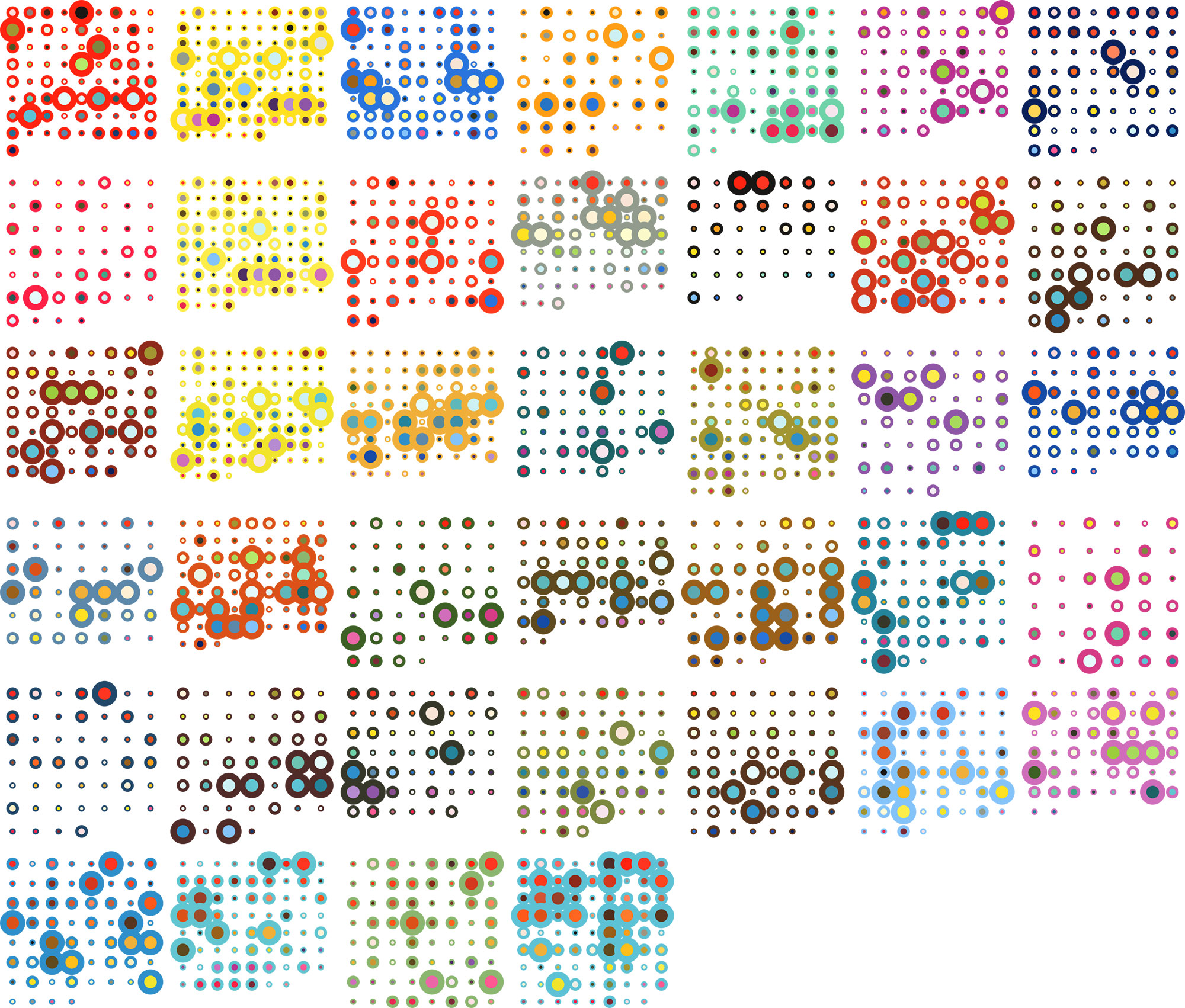
Ultimately, I opted for clarity over cleverness or artistic endeavors and reproduced the list in its entirety with swatches added so readers can see what each combination looks like.
Final thoughts
Switching things up and working on the poster first was a fun change of pace. Even though I didn’t plan on turning this project into a full digital edition, I’m glad I did because it gave me a chance to try new things and I’m really pleased with the results. This is now the fourth project I’ve created that focused on an antique color guide—the first three being Werner’s Nomenclature of Colours, Goeth’s Colors, and 17th Century Watercolors. There’s just something fascinating about digging through antique color guides that never ceases to pique my interest.