Harmony of Colors
We will now turn to Plate 32, which is equal in importance to the key plate. Plate 1 is the key to the mixture of colors, and Plate 32 is the key to the correct combination of colors.
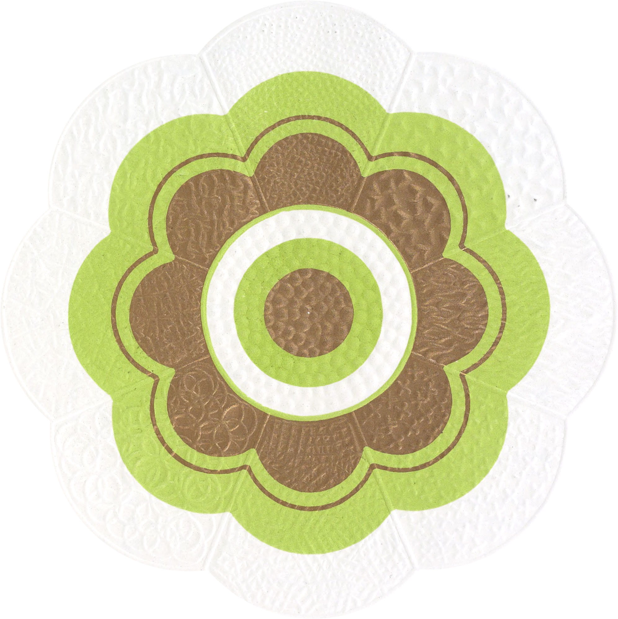
Plate 32.—This plate represents the colors of the solar spectrum, arranged in a circle so as to bring colors which are complementary directly opposite to each other. In combining colors there is a wide difference of opinion as to what is correct and what is not. Of course, when harmony is produced, that is certainly correct. But the question with printers the world over is: what rule can be safely followed to obtain harmonious results in the combination of colors? The writer confidently believes that the color chart on Plate 32, with the rules and explanations which follow, will in a great measure fill this very long-felt want.
Having made a close study of the works of the best writers upon the subject of color, during the past six years, and also, having made a great many original experiments in the combination and mixture of colors in the same time, we reached the conclusion that there are eight different harmonies of colors, and have arranged them into two series, as follows:
First Series—Harmonies of Related or Analogous Colors, which includes:
- The Harmony of Scale—by Contrast of Tone
- The Harmony of Scale—by Gradation of Tone
- The Harmony of Relative Colors—by Contrast of Tone
- The Harmony of Relative Colors—by Gradation
- The Harmony of a Dominant Color
Second Series—Harmonies of Unrelated or Contrary Colors, which includes:
- The Harmony of Distant Colors—Equal in Tone
- The Harmony of Distant Colors—by Contrast of Tone
- The Harmony of Colors with black
By Harmonies of Related or Analogous Colors is meant the harmony of two or more colors, in each of which, one color is plainly perceptible1 For example, orange and purple are near relatives of red, while orange-yellow and violet-blue are distant relatives of red; and the different tones and hues of red are its nearest relatives.
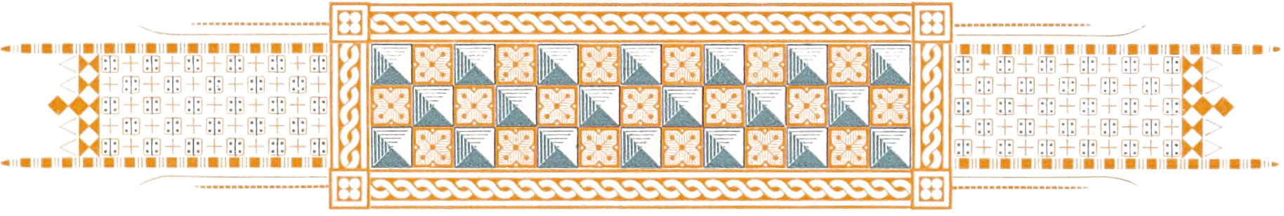
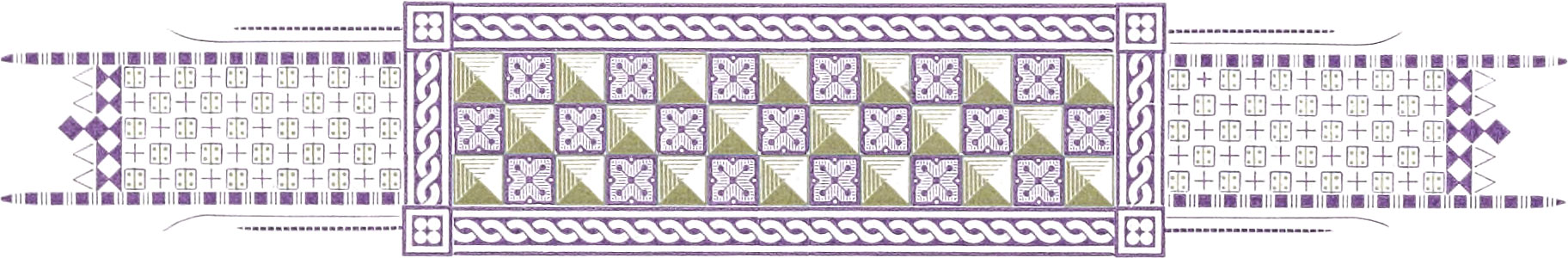
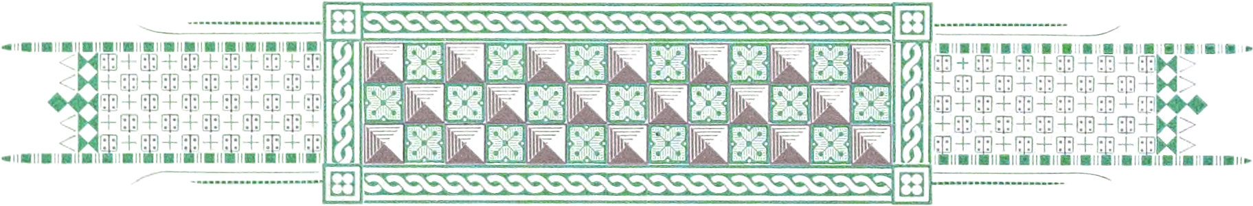
The Harmony of Scale—by Contrast of Tone is produced by the combination of two or more tones of one color, between which there is a decided difference. For example, see Figs. 284, 285, and 286, Plate 39, which shows three different three-color combinations of full-tones, half-tones, and tints; also Figs. 287, 288, and 289, on Plate 40. Fig. 287 is composed of one of the light, and two of the dark tones of red; Fig. 288 is composed of three of the dark tones of yellow; Fig. 289 is composed of a dark tone, full-tone, and half-tone of red. Also, Plate 42 which shows olive and its tint, and Plate 48 which shows sea-green and its tint.
The Harmony of Scale—by Gradation of Tone, is produced in two ways. First—by the combination of three or more tones of one color blended into one another, and showing a gradual increase or decrease in depth of tone; for example, the cut on Plate 61 was printed in three different tones of orange blended into one another. This harmony is best illustrated in the colors of the rose, and is frequently seen in the leaves of some plants and trees. Second—by the combination of three or more tones of one color, gradually increasing or decreasing in depth of tone, and showing a slight difference in depth between any two adjacent tones; for example, see the borders at top and bottom of Plate 80, which were printed in rose-lake and three of its light tones.
The Harmony of Relative Colors—by Contrast of Tone, is produced by the combination of two or more colors which are somewhat closely related, and between which there is a decided difference in tone; for example, see Fig. 389, Plate 85, which shows a combination of deep violet-blue and light yellow-green, the former being a hue of blue, and the latter a hue of green. Fig. 388 shows a violet-blue and yellow-green about equal in tone, making a poor combination, because the contrast of tone is very weak.
The Harmony of Relative Colors—by Gradation, is produced in two ways. First—by the combination of two or more related colors or hues blended into one another, and showing a gradual change from one color to another—the colors being arranged in their natural order as represented on Plate 32; for example, see the borders at top and bottom of Plate 89, which were printed with yellow, green, and blue, blended into one another. This harmony is best illustrated by the colors of the rainbow, and is frequently seen at sunset, the sky being a reddish-orange color at the horizon, and gradually blending, as you look higher, into delicate tints of yellow, green, blue, and violet. Second—by the combination of three or more related colors or hues, showing a gradual change from one color to another, with a dividing line or border separating the colors from one another; for example, take any third section of the chromatic circle on Plate 32.
The Harmony of a Dominant Color is produced by a combination of colors, in which one of them predominates to such an extent that it gives the whole design or figure the appearance of being delicately tinted with that color. This harmony is best illustrated by viewing a pleasing combination of colors through a delicately tinted glass. It is also frequently seen in spectacular plays, when a colored light is thrown upon a scene which is composed of a harmonious arrangement of colored objects. An imperfect illustration of this harmony can be had by viewing Plates 49 and 67 through the tinted sheets which precede them.
By Harmonies of Unrelated or Contrary Colors, is meant the harmony of two or more colors which are not related to each other—and which are, therefore, located some distance from each other in the chromatic circle. For example, red is not related to yellow or blue, or any color lying between them yellow is not related to red or blue, or any color lying between them; and blue is not related to red or yellow, or any color lying between them.
The Harmony of Distant Colors—Equal in Tone, is produced by the combination of two colors which are complementary, or nearly so—each being about equal in depth of tone; for example, see Figs. 245, 251, 264, 274, and many others in this work.
The Harmony of Distant Colors—by Contrast of Tone, is produced by the combination of two colors which are complementary, or nearly so, and between which there is a decided difference in tone; for example, see Figs. 256, 257, 258, 262, 263, 266, 269, and others in this work. Fig. 313, Plate 46, is a fine example of the harmony of distant colors—by contrast of tone; it shows a combination of six colors and gold.
The Harmony of Colors with Black, is produced by the combination of black with the full tones or light tones of the warm colors, and also, with the light tones of the cold colors; for example, black and the full tone of yellow; or black and the light tone of violet. In the former case the contrast is very strong, but in the latter it would be very weak if the violet was not made lighter in tone.
Rules for obtaining Harmonious Combinations of Two or More Colors
We will again turn to the scale of complementary colors on Plate 32. This scale, or chart, was arranged with the greatest care, so that colors which are complementary would be exactly opposite to each other. If the reader desires to get the strongest combination possible, with any one of the colors shown in this chart, he must take the color directly opposite to the one selected. If red be the one selected, then its opposite, sea-green, will make its strongest combination. It is hard for the printer nowadays to get out a job of color printing without using red in some form. It is certainly the most important color with which we have to deal. That being the case, we will first give the colors which will harmonize with red.
Two-Color Combinations
Red will harmonize with either of the two primaries, yellow or blue, and also with any one of the colors lying between them, in their normal state, or when reduced with white, or modified with gray, or darkened with black. The writer thinks that red forms the strongest combination with any one of the colors lying between green and blue reduced to a half-tone with white; for example see Fig. 262, Plate 35.
Yellow will harmonize with either of the two primaries, blue or red, and also with any one of the colors lying between them, in their normal state, or when reduced with white, or when slightly modified with gray. The reader will perceive that a very strong contrast exists between yellow, which is the lightest and most luminous color in the chart, and violet, its complement. In fact, when combining yellow with any of the colors which lie between red and blue on the opposite side of the circle, it is not best to make the contrast more violent by the addition of black to any of these colors instead, a more pleasing combination will be obtained by the addition of white to the color selected, thus reducing the violence of contrast. For example, the contrast between the violet and yellow is very strong. If the violet be reduced with white to a half-tone color, the combination will be much more pleasing, because we then get not only harmony of colors, but also a harmonious contrast of colors.
Blue will harmonize with either of the two primaries, red or yellow, and also with any one of the colors lying between them, in their normal state, or when reduced with white, or modified with gray, or darkened with black. Blue, makes the most effective combination with any one of the colors lying between red and yellow. Its best combination is orange; see Fig. 255, Plate 34.
Orange will harmonize with any one of the colors lying between green and violet, in their normal state, or when reduced with white, or when slightly modified with gray. Orange makes the best combination with anyone of the colors lying between sea-green and blue-violet. For example see Fig. 255, Plate 34.
Green will harmonize with any one of the colors lying between violet and orange, in their normal state, or when reduced with white, or modified with gray, or darkened with black. The best combination with green is its complement, red-purple. See Fig. 242, Plate 31.
Purple will harmonize with any one of the colors lying between orange-yellow and sea-green, in their normal state, or when modified with gray, or darkened with black, or when the greens are reduced with white. The best combination with purple is its complement, yellow-green. For example see Fig. 276, Plate 37.
In two-color combinations the reader can safely follow this rule—that any color shown in the Scale of Complementary Colors will form a good combination with any one of the seven colors on the opposite side of the circle, in their normal state, or when reduced with white, or modified with gray, or darkened with black.
To obtain the best result in the combination of two tones of one color, or two tones of different colors, always combine a full color with a dark tone, or a full color with a half-tone, or a half-tone with a very light tone. By following this rule a violent contrast of tone will be avoided.
In combining two hues, a primary color should show plainly in each hue. For example, when a hue of blue and a hue of green are combined, the blue should be moved toward violet and the green toward yellow—that is, in opposite directions on the chart. This would make a combination of violet-blue and yellow-green. See Fig. 389, Plate 85. The best result will be obtained if a primary color predominates in each hue. For example see Fig. 390, Plate 85, which shows a combination of violet-blue and green-yellow; blue predominates in one color and yellow in the other.
In nearly all of the best two-color combinations it will be found that they are really complementary colors, somewhat modified by the addition of other colors or black.
All specimens of monochrome printing (that is, printing in different tones of one color), belong to the harmony of scale.
The combination of colors which are complementary, while not always the most pleasing, is sure to produce the strongest contrast; for example see Figs. 239 and 242, Plate 31; also Figs. 255, Plate 34; 262, Plate 35; 276, Plate 37, and many others. For bold and effective work the combination of complementary colors can not be excelled.
By the combination of two colors which are complementary, each color gains in fullness, while the combination of two colors which are not complementary, will cause each color to move a little toward the complement of the other.
The combination of cold and warm colors always results in the warm colors appearing warmer and the cold ones colder.
All of the primary colors are increased in strength and fullness, when combined with white on a gray ground.
When there is a lack of harmony or contrast between any two colors, they should be separated by a band of black, white, gold, or some neutral color which will harmonize with both.
A very effective two-color combination is obtained by combining a primary or secondary color with its complementary gray—that is, a gray to which its complement has been added. For example, see the figures on Plate 38. Fig 280 is a combination of blue and orange-gray; Fig. 281 shows orange and blue-gray; Fig 282 shows violet and yellow-gray; and Fig. 283 shows green and purple-gray.
Black will form a good combination with any color lying between red and blue on the right side of the circle. The light tones of blue should be used in combination with black, otherwise the contrast will be weak.
Black forms its best combination with orange-red or vermilion. A common mistake with printers generally, is the combining of a purple-red or rose-lake with black. Purple-red or rose-lake will combine well with black, only after the black has been moved toward green by the addition of green or yellow.
Gray will form good combinations with any of the colors shown in the circle, especially the ones lying between red and green; its best combinations being yellow, and the light tones of red, orange, and green.
Combinations of Three or More Colors
In many of the best three-color combinations it will be found that they are really combinations of the primary colors in a modified form; that is, red predominates in one color, yellow in another, and blue in the other. For example, the red may be modified with gray, or shaded with black, or moved toward orange or purple; the yellow may be modified with gray, or shaded with black, or moved toward orange or green; the blue may be modified with gray, or shaded with black, or moved toward green or purple. In the combination of the three primary colors modified, they should always be moved in the same direction around the circle; that is, if the red be moved toward purple, then the yellow must be moved the same distance toward orange, and the blue the same distance toward green. If the red be moved toward orange, then the yellow must be moved the same distance toward green, and the blue the same distance toward purple. This rule will also apply to any combination of three colors shown on Plate 32.
Red will harmonize with the other two primaries, yellow and blue; also with yellow and green-blue, yellow and violet-blue, green-yellow and blue, green-yellow and violet-blue, and yellow-green and violet-blue. If the red be moved a little toward purple, or a little toward orange, then the other colors in the combination must be moved an equal distance in the same direction around the circle, so that they will be at the same relative distance from each other as before the change in the red. Any of the pairs of colors named will form a good combination with red, in their normal state, or when reduced with white, or modified with gray, or darkened with black.
Yellow will harmonize with the primaries, red and blue; also with, purple-red and blue, orange-red and blue, orange-red and violet-blue, purple-red and green-blue, and red-purple and sea-green. Any of the pairs of colors named will form a good combination with yellow, in their normal state, or when reduced with white, or modified with gray, or darkened with black.
Blue will harmonize with the primaries, yellow and red; also with yellow and purple-red, yellow and orange-red, green-yellow and red, green-yellow and purple-red, and green-yellow and orange-red. Any of the pairs of colors named will form a good combination with blue, in their normal state, or when reduced with white, or modified with gray, or darkened with black.
Orange will harmonize with green and violet, green and purple-violet, blue-green and violet, blue-green and purple-violet, sea-green and purple-violet, and sea-green and purple, in their normal state, or when reduced with white, or modified with gray, or darkened with black.
Green will harmonize with violet and orange, violet and orange-red, blue-violet and orange-red, and purple-violet and orange, in their normal state, or when reduced with white, or modified with gray, or darkened with black.
Purple will harmonize with orange and blue-green, orange and sea-green, yellow-orange and blue-green, yellow-orange and sea-green, and orange-yellow and sea-green, in their normal state, or when reduced with white, or modified with gray, or darkened with black.
In three-color combinations the reader can safely follow this rule—that any three colors shown in the Scale of Complementary Colors, will form a good combination when they are selected as far from one another as possible. There should be at least four colors between any two colors on the warm side of the scale, and at least five colors between any two colors on the cold side of the scale. For example, in the combination red, yellow, and blue, there are four colors between red and yellow, six colors between yellow and blue, and seven colors between blue and red; in the combination purple-red, green-yellow, and violet-blue, there are six colors between purple-red and green-yellow, six colors between green-yellow and violet-blue, and five colors between violet-blue and purple-red.
Combinations with Black
In the use of black, there is one point the reader must not lose sight of; and that is, that black should be combined with a cold color, only after the cold color has been reduced with white.
The following is a list of good three-color combinations, including black:
- Black, red, and yellow
- Black, red, and green-yellow
- Black, red, and yellow-green
- Black, red, and the light tones of green, blue-green, sea-green, green-blue, and blue
- Black, orange-red, and green-yellow
- Black, orange-red, and yellow-green
- Black, orange-red, and the light tones of green, blue-green, sea-green, green-blue, and blue
- Black, orange, and yellow-green
- Black, orange, and the light tones of green, blue-green, sea-green, green-blue, blue, and violet-blue
- Black, yellow-orange, and the light tones of blue-green, sea-green, green-blue, blue, violet-blue, and blue-violet
- Black, orange-yellow, and the light tones of sea-green, green-blue, blue, violet-blue, blue-violet, and violet
- Black, yellow, and the light tones of green-blue, blue, violet-blue, blue-violet, violet, and purple-violet
- Black, green-yellow, and the light tones of blue, violet-blue, blue-violet, violet, purple-violet, and purple
- Black, yellow-green, and the light tones of violet-blue, blue-violet, violet, purple-violet, purple, red-purple, and purple-red
- Black, red and green-gray
- Black, red and blue-gray
- Black, orange-red and green-gray
- Black, orange-red and blue-gray
- Black, light green and purple-gray
- Black, light green and red-gray
- Black, light blue and yellow-gray
Combinations with Gray
Gray will form a good combination with any two colors which are complementary or nearly so. It is the happy medium between black and white. Any color seen upon a black ground will appear paler; when seen upon a white ground it will appear deeper; but when seen upon a gray ground it will appear at its true value. For example see Figs. 399 and 400, on Plate 87.
In forming combinations of three different colors, it is generally most effective to combine a full-color, a half-tone, and a tint; or a deep-shade, a full-color, and a half-tone. The reason is, that in such combinations we have harmony of contrast as well as harmony of colors.
Descriptions of Plates Showing Combinations of Two Colors
Plates 33 to 38, inclusive, show a variety of fine two-color combinations which belong to the harmony of distant colors.
Plate 33.—Fig. 245 on this plate is a combination of one of the dark tones of orange and a light green-blue. Fig. 246 is composed of red-gray and a sea-green tint. Fig. 247 is composed of a light brown and a sea-green tint. Fig. 248 is composed of a purplish hue of red and a light green—a strong combination. Fig. 249 is composed of a sage-green and a rose-lake tint. Fig. 250 is composed of a green-gray and a rose-lake tint. Fig. 251 is composed of a light red-brown and a light green-blue.
Plate 34.—Fig. 252 on this plate is composed of a fine bright red and a light green-blue. Fig. 253 is composed of a red-gray and a green-yellow. Fig. 254 is composed of a half-tone purple and a green-yellow. Fig. 255 is composed of the complementaries, blue and orange. Fig. 256 is composed of a half-tone olive and a flesh tint. Fig. 257 is composed of a light blue-green and a flesh tint. Fig. 258 is composed of one of the dark tones of red and a light green-blue.
Plate 35.—Fig. 259 is composed of red-brown and a light blue-green. Fig. 260 is composed of a green-yellow and a purple tint. Fig. 261 is composed of a sage-green and a purple tint. Fig. 262 is composed of red and a light green-blue— a very strong combination. Fig.263 is composed of a light brown and a pearl tint. Fig. 264 is composed of a red tint and a pearl tint. Fig. 265 is composed of a purple-red and a light blue-green.
Plate 36.—Fig. 266 is composed of one of the dark tones of an excellent combination. Fig. 267 is composed of a light brown and a blue tint. Fig. 268 is composed of a gray-orange and a blue tint. Fig. 269 is composed of sea-green and a half-tone rose-lake—a strong combination. Fig. 270 is composed of a light violet and a half-tone yellow. Fig. 271 is composed of a half-tone blue and a half-tone yellow. Fig. 272 is composed of a light red and a half-tone olive—an excellent combination.
Plate 37.—Fig. 273 is composed of olive and a half-tone rose-lake. Fig. 274 is composed of a dark tone of red and a dark tone of yellow—a good combination. Fig. 275 is composed of a light brown and a half-tone blue. Fig. 276 is composed of purple and light green—a very good combination. Fig. 277 is composed of a blue-gray and yellow. Fig. 278 is composed of blue-green and orange. Fig. 279 is composed of one of the dark tones of rose-lake and light blue-green—a good combination.
Plate 38.—Fig. 280 is composed of blue and orange-gray. Fig. 281 is composed of orange and blue-gray. Fig. 282 is com posed of violet and yellow-gray—a good combination. Fig. 283 is composed of green and purple-gray—a splendid combination.
The assortment of splendid two-color combinations just described, were selected with great care. Some of the figures are composed of full colors, and others of half-tones or tints. In selecting any of these combinations for use in fancy printing, consisting of type, borders, etc., it is best to print the type matter in the deepest or darkest of the two colors used. Sometimes an ornamental initial letter, or a bold display line, will look better if printed in the lighter of the two colors.
Description of Plates Showing Combinations of Three or More Colors
Plate 39.—This plate shows three three-color combinations, which are good examples of the harmony of scale—by contrast of tone. A combination of different tones of one color is always pleasing, it matters not what color may be used. This is very properly called monochrome printing. Fig. 284 is composed of olive in the full-color, half-tone, and tint. Fig. 285 is composed of rose-lake in the full-color, half-tone, and tint. Fig. 286 is composed of deep blue in the full-color, half-tone, and tint; this is a very effective combination.
Plate 40.—This plate also shows three three-color combinations, good examples of the harmony of scale. Fig. 287 is composed of two of the dark tones and one of the light tones of red. Fig. 288 is composed of three of the dark tones of yellow. Fig. 289 is composed of red in the full-color, half-tone, and a dark tone.
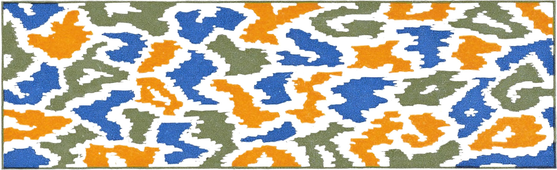
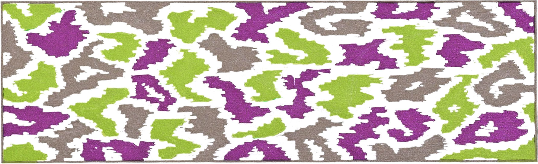
Plate 41.—This plate shows three three-color combinations; in each figure two of the colors are complementary, and the third color is a mixture of the two. Fig. 290 is composed of red, sea-green, and black; the latter was produced by a mixture of the red and sea-green shown in this figure. Fig. 291 is composed of orange, blue, and an olive produced by a mixture of the two. Fig. 292 is composed of purple, light green, and a color produced by a mixture of the two.
Plate 42.—This plate contains only one specimen—Fig. 293; it is composed of one of the dark tones of yellow, its tin, and pale gold. This combination belongs to the harmony of scale.
Feather—Gold, 5 94, 17, 7 and 83
Card and Border—164, 51 and 171
Plate 43.—This plate shows a very elaborate specimen— Fig. 294—printed in gold and eight colors. In the feather, the gold was printed first; then the green; then the reddish purple; then the maroon-red; then the deep blue, and finally the sea-green. The card and border was printed in color No. 51 and its tint, and a sea-green tint.
Plate 44.—This plate contains some elegant combinations of gold and two colors. Fig. 295 was first printed in a blue tint, then in gold, and then in one of the dark tones of orange. Fig. 296 was first printed in a flesh tint, then in gold, and then in a half-tone of deep blue. Fig. 297 is a combination of the three primaries—red, yellow, and blue, modified by mixture with other colors. Fig.298 is a splendid combination of sea-green, gold, and one of the dark tones of orange, printed in the order named. Fig. 299 is a combination of the three primaries with other colors. Fig.300 was first printed in a delicate green tint, then in gold, and then in a light red-brown. Fig. 301 was first printed in a purple tint, then in gold, and then in a light green.
Plate 45.—This plate also contains some splendid combinations of gold and colors. Fig. 302 was first printed in a yellow tint, then in gold, and then in a sage green; this is a good example of the harmony of relative colors—the colors, including gold, being nearly related to yellow. Fig. 303 was first printed in a pearl tint, then in gold, and then in one of the dark tones of orange. Fig. 304 is a fine combination of two colors which are nearly complementary, and gold; the half-tone olive was printed first, then the gold, and then the half-tone purple. Fig. 305 is composed of a sage-green, a light blue-green, gold, and a deep photo-brown, printed in the order named—making a splendid combination. Fig. 306 was first printed in a half-tone of deep blue, then in gold, and then in a light red. Fig. 307 was first printed in an olive tint, then in gold, and then in a half-tone olive; this specimen belongs to the harmony of scale. Fig. 308 was first printed in a flesh tint, then in gold, and then in a half-tone green.
Plate 46.—This plate contains nine different combinations of gold and colors. Fig. 309 was first printed in an olive tint, then in a rose-lake tint, then in gold, and then in black. Fig. 310 was first printed in blue, then in sage-green, then in a flesh tint, then in gold, and then in black. Fig. 311 was first printed in a greenish yellow, then in a half-tone purple, then in sea-green, then in gold, and then in black. Fig. 312 was first printed in a half-tone purple, then in an olive tint, and then in gold. Fig. 313 was first printed in red, then in one of the dark tones of orange, then in a light green-blue, then in gray, then in a primrose tint, then in gold, and then inblack—making a splendid combination. In this design the light green-blue was treated in two different ways—by printing an open border over it in black, causing it to appear more blue, and by printing an open border over it in gold, causing it to appear more green. Fig. 314 was first printed in a green tint, then in a flesh tint, and then in gold. Fig. 315 was first printed in green, then in a green tint, then in a rose-lake tint, then in gold, and then in black. Fig. 316 was first printed in purple, then in a sage-green, then in an olive tint, then in gold, and then in black. Fig. 317 was first printed in a greenish yellow, then in a flesh tint, then in gold, and then in black.
Butterfly: 78, 143, 2, 36, 83, Gold and 114
Card: 155 and 7
Plate 47.—The only design shown on this plate is Fig. 318, which represents a butterfly and business card. This is a splendid example of the harmony of distant colors. It was not the intention of the writer to stick very close to nature in coloring this butterfly, but instead we aimed to show an odd, and at the same time a correct combination of colors. We believe that printers everywhere will be well pleased with not only the combination, but also with the excellent presswork shown in this specimen. The first color printed in the butterfly was No. 78, one of the dark tones of orange; then a half-tone violet, then yellow, then one of the dark tones of red, then sea-green, then gold, and then a deep photo-black. The card was first printed in a blue tint with an electrotype taken from emery paper, and then in a deep blue.
Plate 48.—Fig. 319 on this plate was first printed in a sea-green tint, then in copper bronze, and then in sea-green; it was then embossed with a box-wood plate made with steel punches.
Plate 49.—This plate contains two specimens of cards printed in gold, three tints, and black. Fig. 320 was first printed in gold, then in a green tint, then in a rose-lake tint, then in a gray tint, and then in black. Fig. 321 was first printed in gold, then in a blue tint, then in an orange tint, then in a gray tint, and then in black. In both of these cards some very fine tints are produced by printing the gray tint over the rose, green, blue, and orange tints.
Plate 50.—This plate, as well as the two following, is intended specially to show printers some good results in printing gold ink and colors on colored enameled cover papers. Fig. 322 was first printed in a purplish red, then in color No. 8o, which is one of the dark tones of orange, and then in gold ink. By referring to Plate 10, the reader will see that Fig. 8o is a rather dark color, in which black predominates; but when printed on the deep green paper, the orange predominates. Fig. 324 was first printed in a purplish red, then in a deep blue, and then in gold ink. Fig. 326 was first printed in No. 8o, then in a deep blue, and then in gold ink. These splendid effects can be used to great advantage on fancy covers for catalogues, and other work of a similar character.
Plate 51.—The figures on this plate are printed the same as Plate 50, except that a deep green was used in place of the purplish red. Fig. 327 was first printed in color No. 45, which is a deep green; then in No. 80, and then in gold ink. Fig. 329 was first printed in a deep green, then in deep blue, and then in gold ink. Fig. 331 was first printed in No. 80, then in deep blue, and then in gold ink.
Plate 52.—This plate shows some excellent results, obtained by printing gold ink and colors on black enameled paper. We have used some odd figures on this plate, merely suggestive of some of the uses which can be made of this paper. Fig. 332 was first printed in a deep green, and then in gold ink. Fig. 333 was first printed in deep blue, and then in gold ink. Fig. 334 was first printed in a deep green, then in vermilion, then in white, and then in gold ink. Fig. 335 was first printed in deep blue, then in a deep green, then in vermilion, then in white, and then in gold ink. To obtain the best result in printing red and white on black paper, the inks must be opaque, so that they will cover the black as completely as possible. The same rule will apply to yellow or any other luminous color.
Plate 53.—Fig. 336 on this plate was first printed in a green tint, then in a yellow-green tint, and then in one of the dark tones of orange. This specimen is an example of the harmony of relative colors.
Plates 54 and 55.—These plates show nine different patterns of embossing borders, made in two, three, and four-em pica widths, and four, eight, and twelve-em pica lengths. The corner pieces are made in two, three, and four-em pica squares. The manner of embossing with these borders is fully explained in another part of this work.
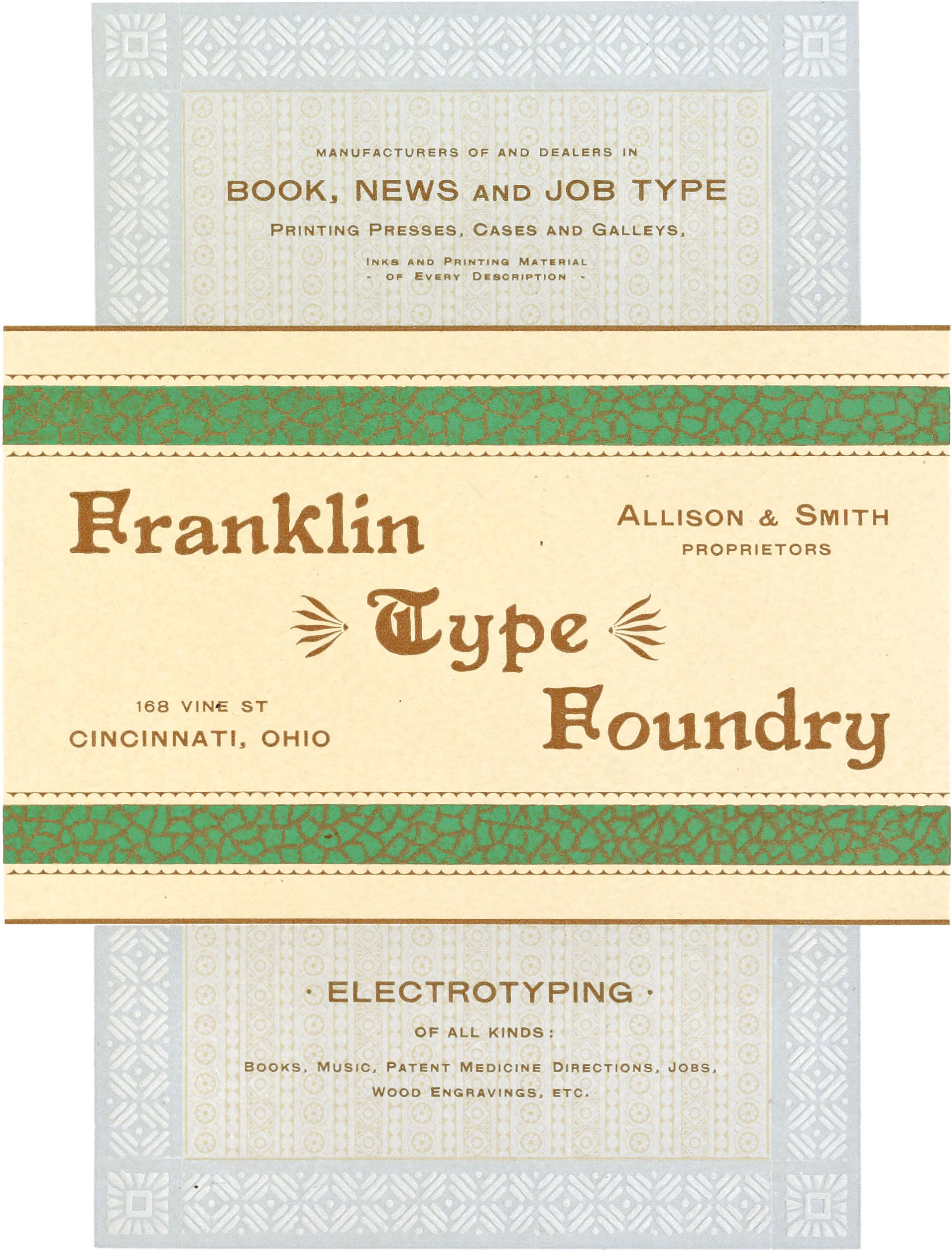
158, 152, Gold, 5, 81 and 160
The border around the page was printed with Color No. 160 and embossed at the same time.
Plate 56.—This plate represents a business card printed in gold and three colors, lying across a page framed with an embossed border. The first color printed was a gray tint as a solid ground for the page above and below the card; then the orange tint was printed solid in the card, and as a figured pattern on the inside of the page over the gray tint; then the gold was printed in solid bands on the card; then figured borders were printed in green over the gold bands; then all of the type matter and the outlines of the card were printed in color No. 81, which is one of the dark tones of orange. Finally, the embossing border was printed in a pearl tint, and embossed at the same time. The card is an excellent example of the harmony of relative colors—all of the colors, including gold, being closely related to yellow.
Plate 57.—This plate represents a handsome cover page, printed first in gray, then in gold, then in a figured sea-green tint over the gray, then in deep blue, and then in one of the dark tones of red; the gold bands were then embossed.
85 and Copper Bronze
Samples of nine different patterns of Embossing, from one plate made with punches.
Plate 58.—Fig. 341 on this plate was first printed in a light green, and then in copper bronze. It was then embossed with a box-wood plate, containing nine different patterns made with soft steel punches. The outlines of the plate were cut with a round graver.
80 and 163
Specimen page, showing the use of Embossing Punches.
The plate was made with four different punches.
Plate 59.—This plate was first printed in a flesh tint and then in one of the dark tones of orange. The sheet was then embossed with a plate made with four of the punches used on Plate 58.
Color 115
Specimen of Embossing in imitation of the right side of Leather Paper
Color 165
Specimen of Embossing in imitation of the wrong side of Leather Paper
Plate 60.—This plate shows an imitation of both sides of leather paper, embossed. Fig. 343, representing the right side, was printed in a deep photo-brown, and was then embossed with an electrotype, taken from a sheet of embossed tin used by trunk makers; the type matter was then printed over it in green bronze. Fig. 344, representing the wrong side, was printed in a manilla color and embossed from an electrotype taken from the other side of the tin mentioned above.
Plate 61.—The figure upon this plate was first printed in orange and two of its dark tones blended together; then the type matter and borders at the sides were printed in its darkest tone. This combination belongs to the harmony of scale.
Plate 62
Showing the different effects produced by printing the colors Red, Blue, Yellow, Gray, and Black, in lines and solids over Gold Bronze printed in lines and solids
Plate 62.—This is a most interesting plate, showing a great variety of handsome colors produced by printing the colors red, blue, yellow, gray, and black, in lines and solids over gold bronze printed in lines and solids. The reader will probably find on this plate many effects in printing which he has not seen before. We will not explain each one separately, as the matter printed below each figure makes this unnecessary; we will, however, show the cuts which were used to produce the figures printed in four colors. For example, the fourth figure to the right of black, showing black on blue on red on gold, was printed with the cuts below, in the order named:
The cuts were specially engraved to show the colors in solids, half-tone lines, and tint lines. The different colors were produced by printing solids over solids, half-tone lines over half-tone lines, and tint lines over tint lines. Each of the nine colors on [bottom] were produced by printing half-tone lines in two colors over one another on solid gold. The five pairs of colors [second to last] were produced by printing colors in half-tone lines over gold solids, and in solids over half-tone gold lines. A score or more of fine metallic colors are produced by printing one or more colors over solid gold. Some of the colors on this plate look very much like fine cloth goods with golden threads interwoven. The reason for this is because the lines in no two of the cuts run in the same direction. In the first cut they are perpendicular; in the second, horizontal; in the third they run diagonally from the right, down to the left; and in the fourth they run diagonally from the left, down to the right, so that when the four cuts are printed over one another, each color is plainly visible; especially so if the reader will examine any one of the figures on Plate 62 with a small magnifying glass. We believe that a greater number of fine effects in color printing has never been produced by six impressions.
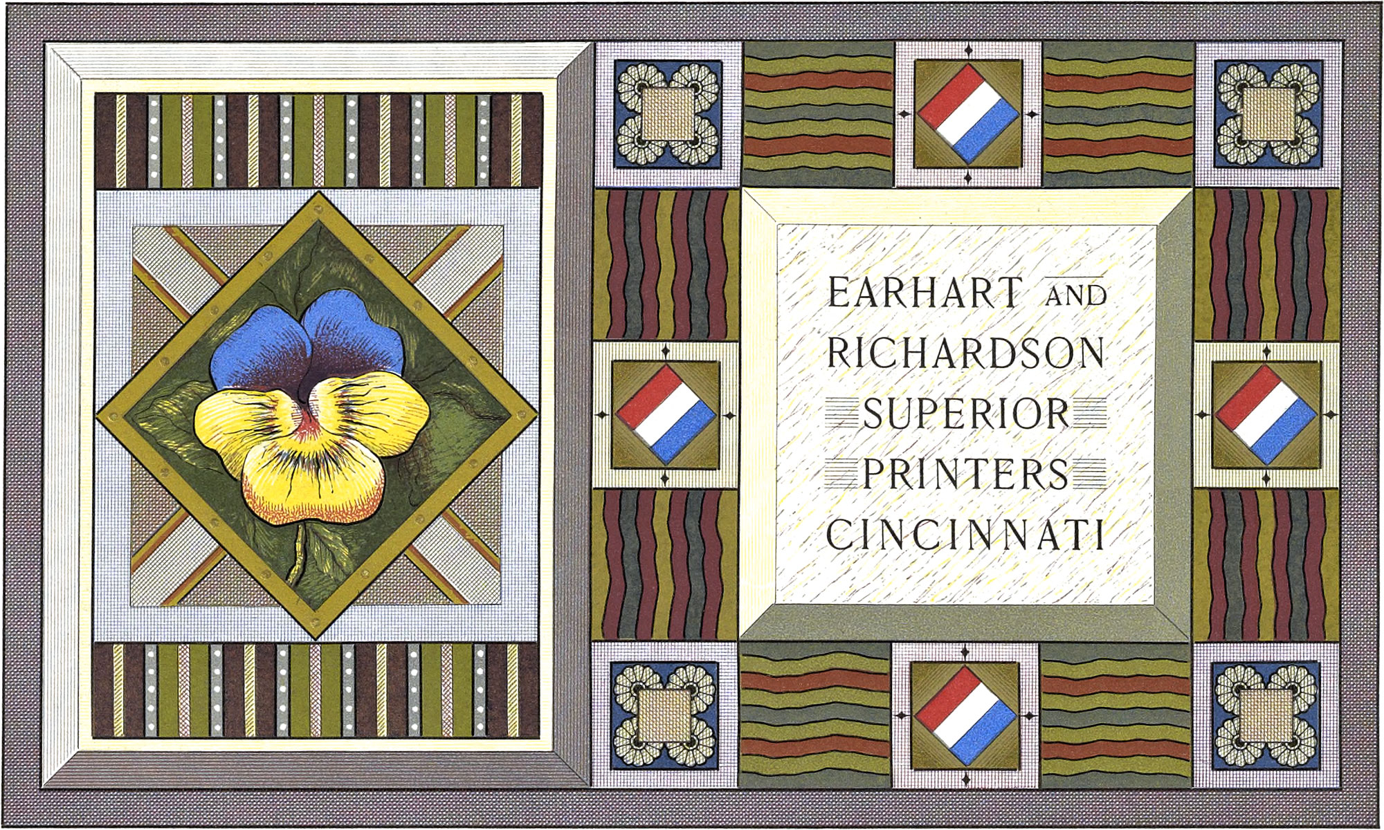
Plate 63.—The card on this plate is a good illustration of the use of the effects shown on Plate 62. The same colors were used, printed in the order named. In this card we aimed to produce, with a few impressions, a great variety of colors arranged in harmonious groups; some of the most effective are the dull metal colors, produced by printing colors over gold bronze. For example the reader will refer to the numbers 3, 6, 12, 9, 17, 29, and 35 in the key-form on Plate 64. 3 represents a reddish copper produced by printing red over gold. 6 represents a steel blue produced by printing blue over gold. This card is a fine example of the harmony of distant colors.
Key Form of Plate 63
- Gold
- Red
- Red on Gold
- Red lines on Gold lines
- Blue
- Blue on Gold
- Blue on Red
- Blue lines on Red lines
- Blue on Red on Gold
- Yellow
- Yellow lines
- Yellow on Gold
- Yellow lines on Gold lines
- Yellow on Red
- Yellow on Red on Gold
- Yellow on Blue
- Yellow on Blue on Gold
- Yellow lines on Blue lines on Gold lines
- Yellow lines on Blue lines on Red lines on Gold lines
- Gray
- Gray lines
- Gray on Gold
- Gray lines on Gold lines
- Gray on Red
- Gray soldi on Red lines
- Gray lines on Red lines
- Gray on Blue
- Gray lines on Blue lines
- Gray on Blue on Gold
- Gray on Blue on Red
- Gray lines on Blue lines on Red lines on Gold lines
- Gray on Yellow
- Gray solid on Yellow lines
- Gray lines on Yellow lines
- Gray on Yellow on Gold
- Gray on Yellow on Blue
- Gray lines on Yellow lines on Red lines on Gold lines
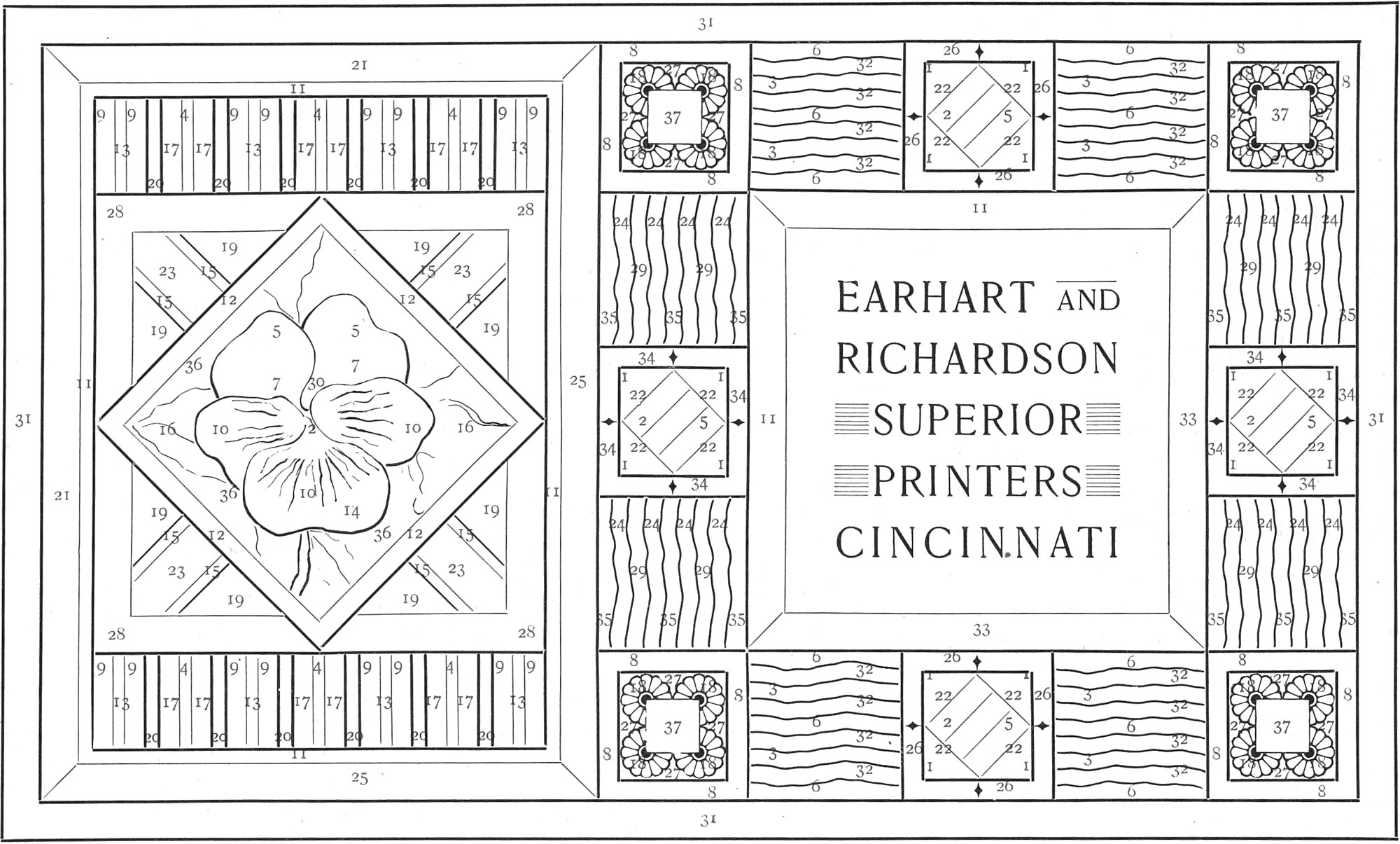
Plate 64.—This plate represents the key-form of the card on the preceding plate. It was set up altogether in type and brass rule. We used the pansy in this card, because it is a flower that frequently contains both the primary and secondary colors, if the leaves are included. The location of the different colors produced by printing the colors named in lines and solids over one another, is indicated by numbers ranging from 1 to 37, inclusive.
Plate 65.—This plate was first printed in a blue-gray, then in a yellow gold, and then in one of the dark tones of red—making an effective combination.
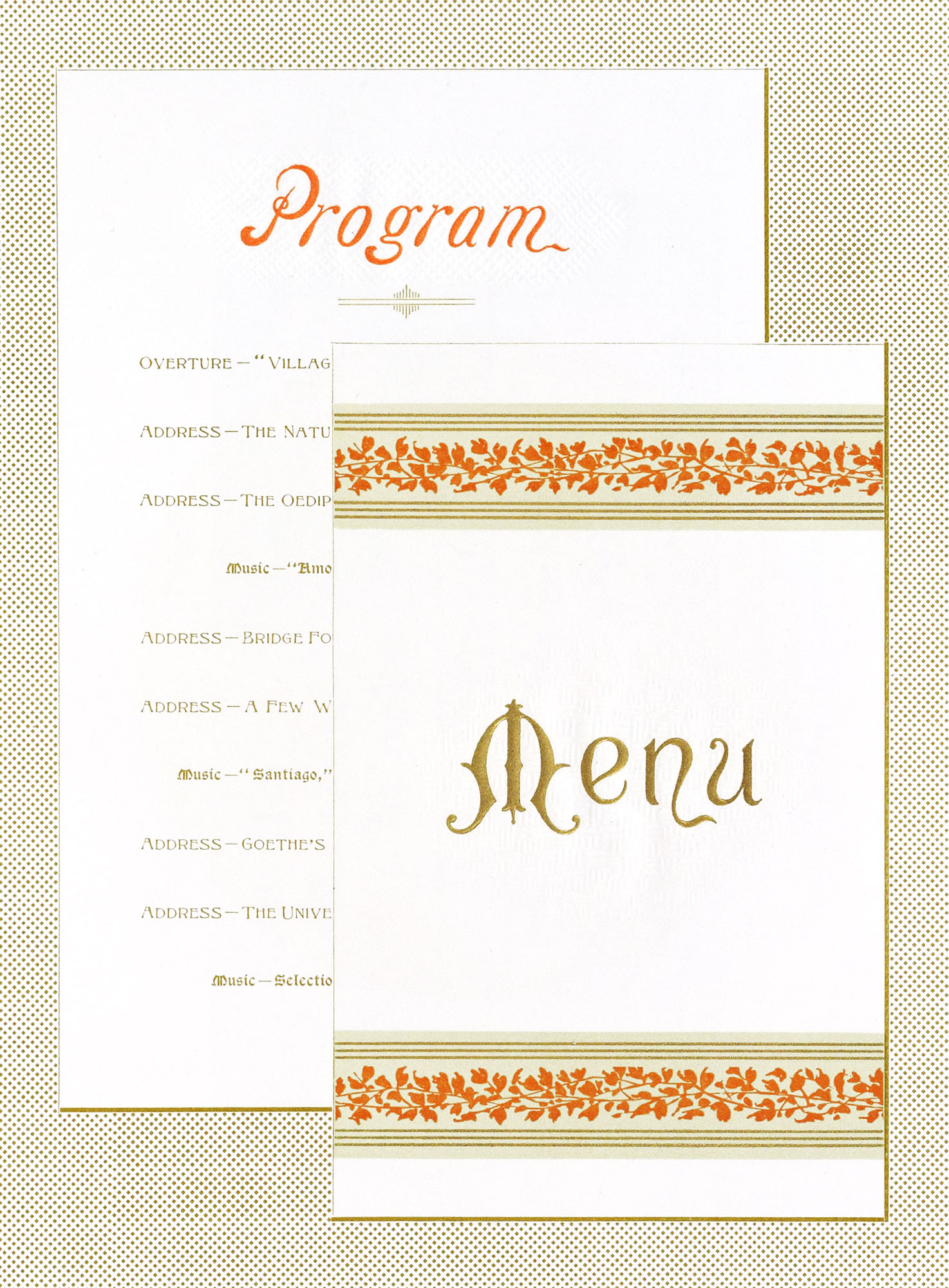
Plate 66.—This plate represents a program card, and the first page of a menu card, lying on a sheet of stippled paper. It was first printed in an olive tint, then in gold, then a light red, and finally in one of the dark tones of orange; then the words “menu” and “program” were embossed. The ornamental bands at the top and bottom of the menu page are excellent specimens of color combination.
Plate 67.—Fig. 351 on this plate is a fine specimen of card work, printed in gold and four colors. The first impression was pale gold; then a sea-green tint was printed; then a flesh tint; then a gray tint, and finally one of the dark tones of red.
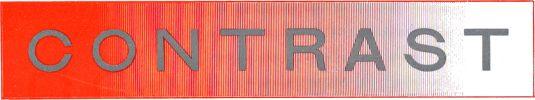
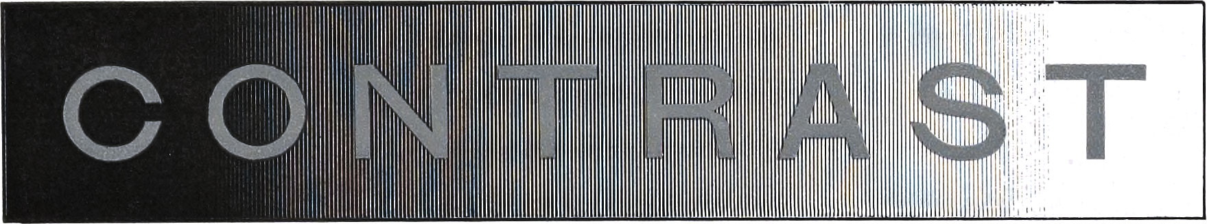
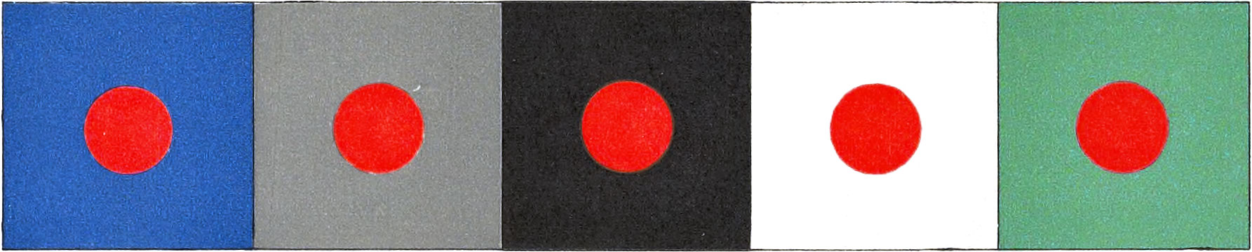
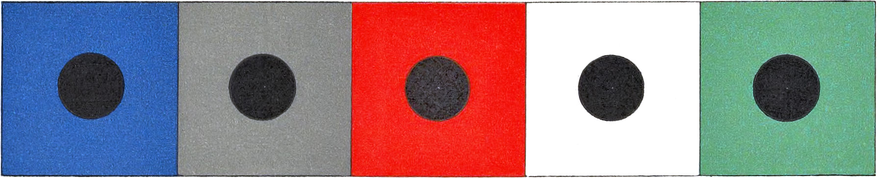
Plate 68.—The figures on this plate are intended to show the effects produced upon different colors, by placing them in contrast with the different tones of other colors. Fig. 352 shows red surrounded by the different tones of black; the result is that the letter C which is surrounded by solid black appears much lighter than the letter R which is surrounded by a half-tone black; and the letter C appears very much lighter than the letter T which is surrounded by white. The same will apply to Fig. 353 which shows yellow in contrast with black, Fig. 354 which shows gray in contrast with blue, and Fig. 356 which shows gray in contrast with black. In Figs. 354, 355, and 356 the gray was printed in one impression. We call the special attention of the reader to the letter C in each of these figures; note the apparent difference between these letters. Surrounded by blue, the C appears to be a yellow-gray; surrounded by red it appears to be a green-gray; surrounded by black it is a pure gray, but appears much lighter than it is in fact. The apparent change which takes place in a color, when it is surrounded by another color, is due to the fact that any color occupying a small area of surface will be strongly tinted with the complement of the color which surrounds it.
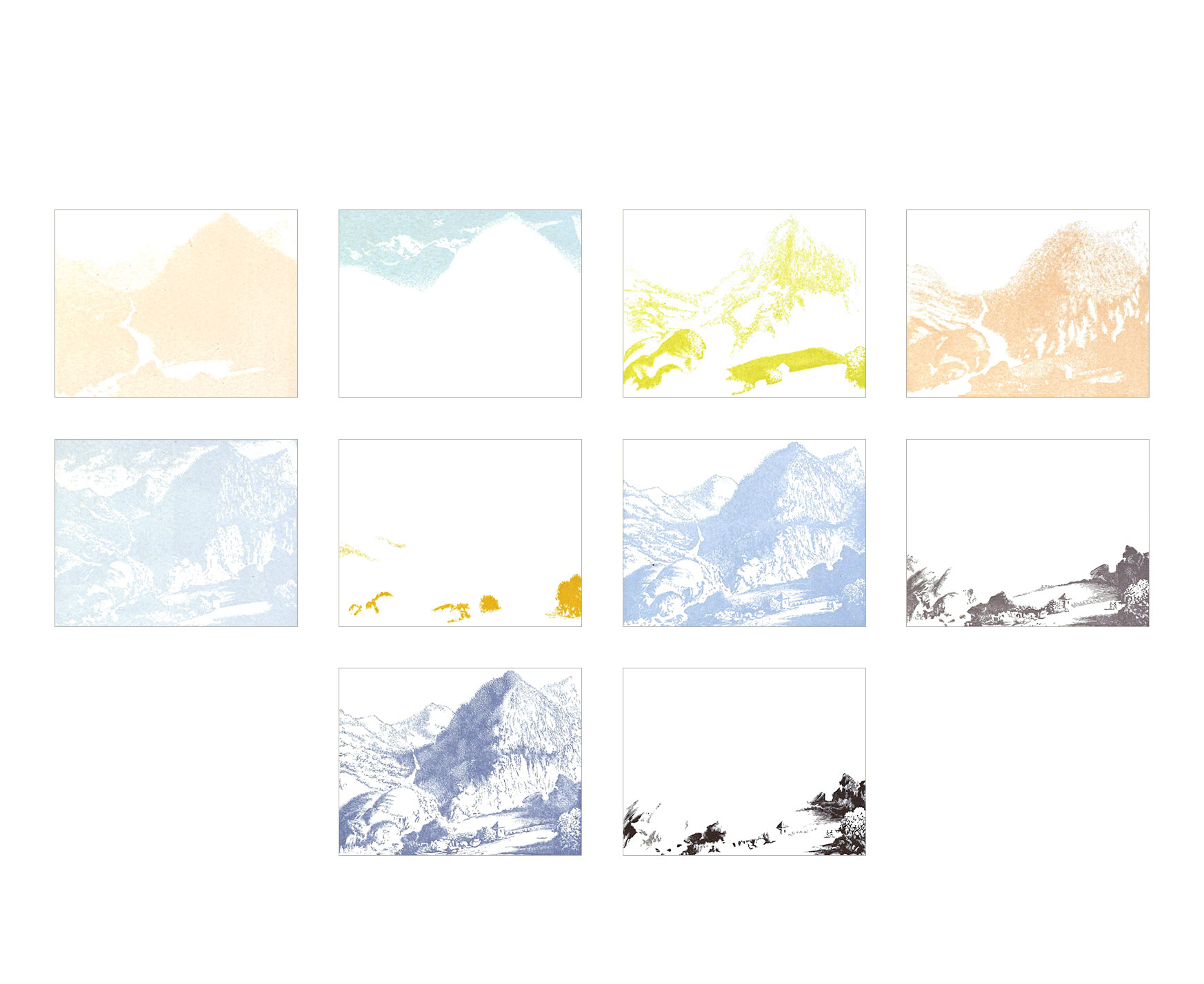
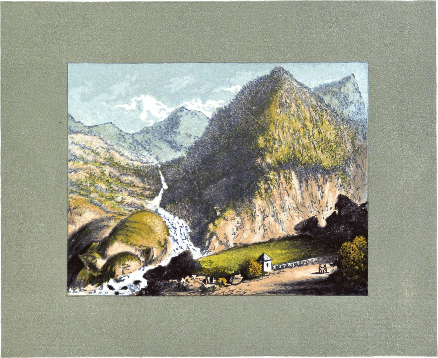
Plates 69 to 79, inclusive.—These plates represent a series of impressions showing a landscape printed in ten colors. Bach block is shown separate and also as registered into its proper place as the work progresses toward completion. The picture represents a scene in the Pyrenees Mountains, in Southern France, and was reproduced from an old picture printed in the early part of this century. Fig. 376, on Plate 79, is the completed picture; the last impression was the border, or mat, which was printed in a green gray, and then the whole picture was embossed, or roughed, with an electrotype taken from a sheet of emery paper.
Plate 80.—The borders at top and bottom of this plate were printed in rose-lake and three of its light tones—making a fine example of the harmony of scale—by gradation of tone; then the back-ground of the page was printed in an olive tint from an engraved plate; then the type form was printed in olive—the whole producing a most pleasing and harmonious page.
Plate 81.—Fig. 378 on this plate shows an impression from an electrotype taken from emery paper. Fig. 379 shows an impression in a deep blue-black from a plate engraved with bunches of needles fastened together.
Plate 82.—Fig. 380 shows an impression in a deep photo brown from a piece of walnut wood, side grain. Fig. 381 shows an impression in the same color, from a piece of ash wood, side grain.
Plate 83.—Fig. 382 shows an impression from a piece of quartered oak wood. Fig. 383 shows an impression from a piece of shell-bark hickory wood, end grain. Various woods can be used to good advantage for tint plates. For instance, the writer has many times printed cards, letter-heads, checks, etc., in a deep buff tint and one or more colors, for different lumber merchants the buff was printed as a back-ground from a piece of natural ash or oak wood. In one case the type form was printed in a deep yellow-brown, producing a fine effect—a good specimen of the harmony of relative colors.
Plate 84.—The figures on this plate show four different tint patterns printed from stereotype plates taken from different patterns of book cloth. Figs. 384 and 385 were taken from the right and wrong sides of one pattern, and Figs. 386 and 387 from the right and wrong sides of another pattern.
Plate 85.—This plate shows three different combinations of hues. Fig. 388 is composed of a light violet-blue and a yellow-green; as both colors are nearly related, and are also about equal in tone, the combination is weak. Fig. 389 is also composed of violet-blue and yellow-green, but the violet-blue is much deeper and the yellow-green lighter than in Fig. 388; as a result, it is a better combination because of its contrast of tone. Fig. 390 is composed of violet-blue and green-yellow—an excellent example of the harmony of hues.
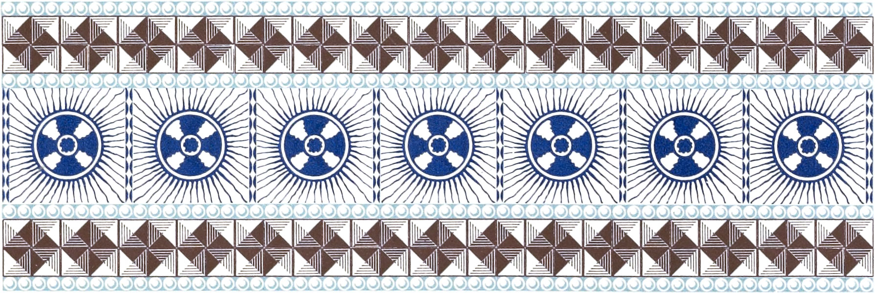
Plate 86.—The figures on this plate were printed with inks not shown in any other part of this book. Fig. 391 is composed of ultramarine blue and persian orange. Fig. 392 is composed of bronze-brown and green lake. Fig. 393 is composed of bronze-blue, bronze-brown, and green lake—an odd combination. Fig. 394 is composed of carmine and green lake. Fig. 395 is composed of bronze-blue and persian orange.
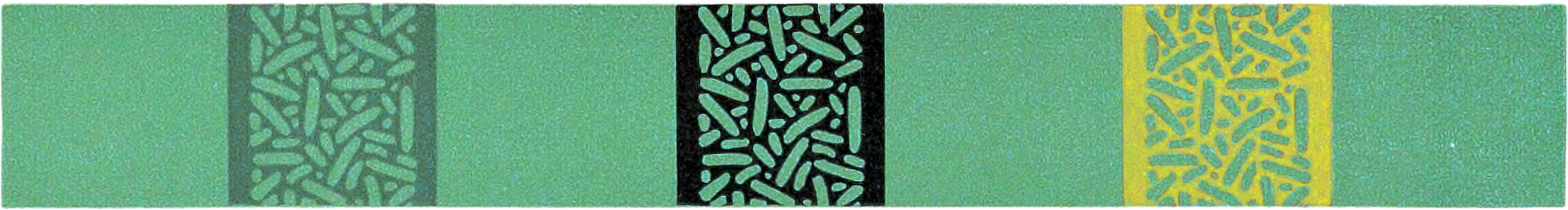
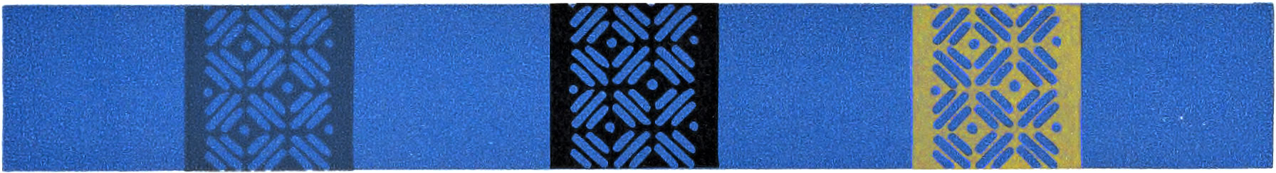
Plate 87.—Fig. 396 on this plate shows the different effects produced by printing an open border in gray, black, and gold, on red. Fig. 397 shows the different effects produced by printing the same colors on green; and Fig. 398 shows the different effects produced by printing the same colors on blue. Fig. 399 shows the changes which apparently take place in red, when it is surrounded by different colors; when surrounded by blue it appears tinged with orange; when surrounded by gray it appears at its true value; when surrounded by black it appears a little lighter than it is, and when surrounded by white it appears a little deeper than it is in fact; when surrounded by green it appears more brilliant than in either of the cases just mentioned. It appears most brilliant when surrounded by sea-green, its complement. Fig. 400 shows the changes which apparently take place in black, when it is surrounded by different colors; when surrounded by blue it appears slightly tinged with orange; when surrounded by gray it is seen at its real strength; when surrounded by red it appears slightly tinged with sea-green; when surrounded by white it appears darker than it is in fact; when surrounded by green it appears to be tinged with red-purple, the complement of green. The eyes must be held about twenty inches above the page while testing the explanations just given, to obtain the best result.
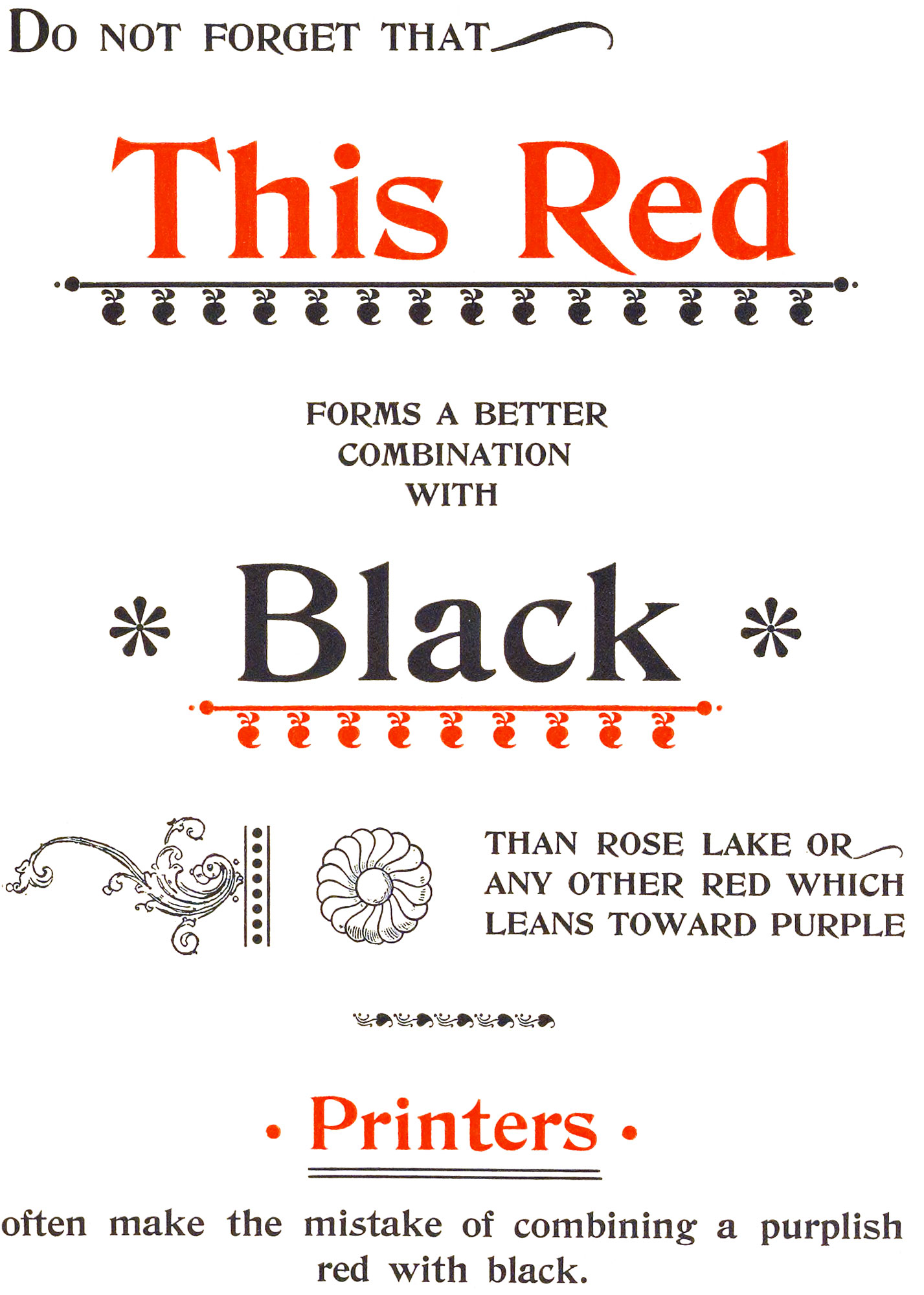
Plate 88.—This plate shows a combination of black and deep vermilion. By reading the matter on this plate it will be seen that no further explanation is necessary.
Plate 89.—The borders at top and bottom of this plate were printed in yellow, green and blue blended into one another—a good example of the harmony of relative colors—by gradation. The type form was printed in color No. 34, which is one of the darkest tones of red.
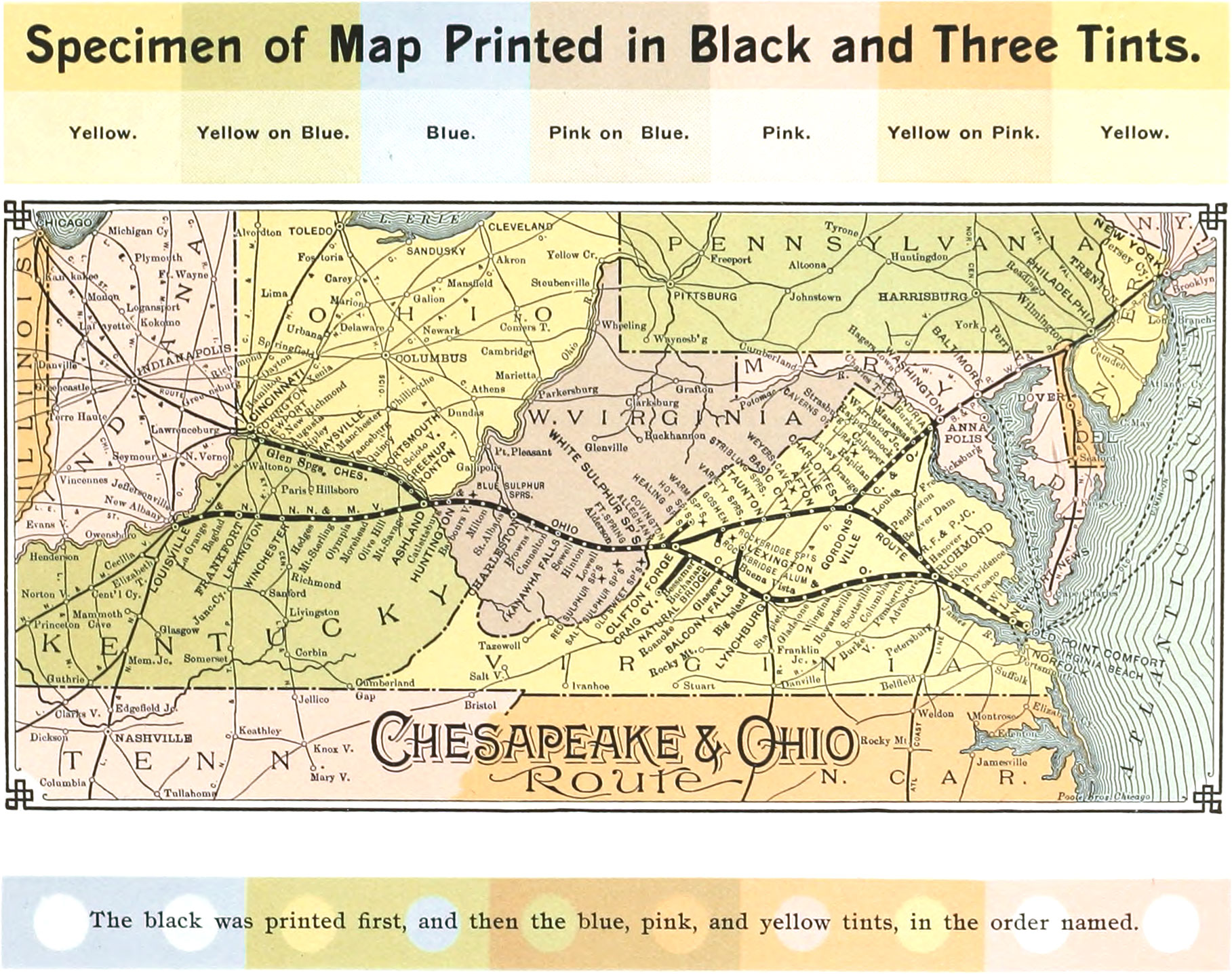
Plate 90.—This plate shows a specimen of map work printed in black and three tints. The tints were made by mixing the colors with magnesia, and were printed over the black. Magnesia makes a transparent tint which is specially suitable for work of this character. The black was printed first; then the blue tint; then the pink tint, producing a purple tint where it laps the blue; then the yellow tint, producing a green tint where it laps the blue, and a salmon tint where it laps the pink. These tints were made a little stronger than is necessary for map work, for the purpose of showing how plainly the black can be seen through them.