Printing
A Few Hints on Job Composition
In the composition of display work of any kind, there are two things which the printer should always keep in mind—Harmony of Type Faces, and Harmony of Proportion.
By Harmony of Type Faces, we mean that when more than one character of letter is used in a job, they should be selected with a view to producing a harmonious contrast of face—that is, there should be a decided difference in character but not a violent difference. For example, in the card below, we have used one style of letter for the main lines and for the sake of contrast of face, have used a roman letter for the balance of the card.
Harmony of Proportion is produced when a job is so constructed that all the borders, panels, lines of type, etc., of which it is composed, bear a proper proportion to one another in heft, height, and length, and are located so as to produce a nice balance—the whole being properly proportioned to the size of the sheet or card upon which it is to be printed.
So then it may be said that when a job shows a harmony of type faces, and at the same time a harmony of proportion in all its parts, it is a very perfect specimen of the compositor—s art.
When it is possible to set the whole of a job in the different sizes of one style of letter without producing a disharmony of proportion—one of the best results in job composition is attained. For example, see Plates 43, 49, 61, 80, and 88. This harmony in type faces bears the same relation to type, that the harmony of scale does to colors; for example, see Plate 80, which was set in different sizes of one letter, and the borders at top and bottom were printed in different tones of one color; the balance of the page was printed in two tones of another color.
When a fancy letter or one that is peculiar in character is used for the main display lines of a job, it is always in good taste to use a plain roman or gothic letter1 (or sometimes both) for the balance of the matter. The gothic and roman letters bear the same relation to type faces that gray does to colors gray is a neutral color, and can be used with any other color without producing a disharmony. So it is with the gothic and roman letters; they can be used with any other letter without producing a bad effect. This rule also applies to any plain letter in which the gothic or roman character predominates. For example, see Plates 47, 48, 49, 53, 56, 57, 65, and 67.
It is not in good taste to place near together in one job, two lines of letters between which there is a violent difference in form or character; it is always best to avoid extremes in the selection of different kinds of type for display lines. The card following is a good illustration of what printers ought to avoid. It will be observed that there is a violent contrast in form between the two main lines, while the character of the letters is the same and a violent contrast in both form and character between the letters in the business line and the letters in the street line and also between the letters in the street line and the letters in the city line.
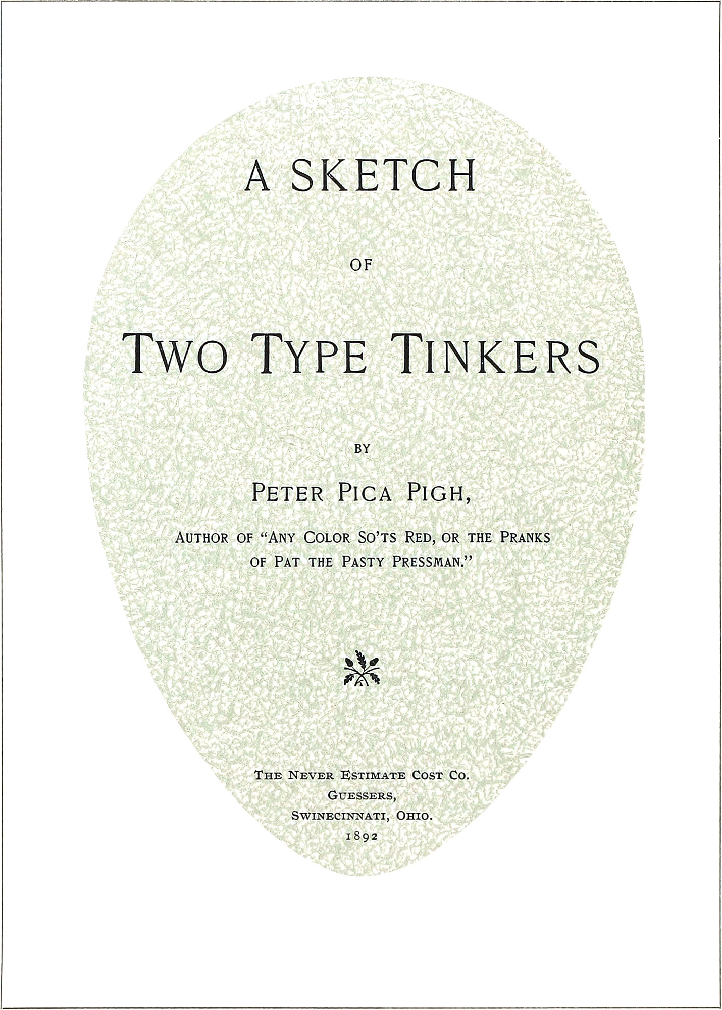
It is not in good taste to use a very extended letter for a narrow title page; or a very condensed letter for an oblong page. To get the best result, the letters and the page should be very nearly the same in proportion. If possible, the most important line or panel should be located between three and five-tenths of the full length of the page from the top. It will sometimes be found that, on account of the nature or quantity of the matter, this suggestion can not be followed. A perfectly-shaped egg, viewed as represented [below], is a splendid illustration of the form of a perfect title page.
When a single line of type is to occupy the center of a page, it should be placed a little above the actual center; otherwise, if placed exactly in the center, it will appear to be below the center. For example, see illustrations below.
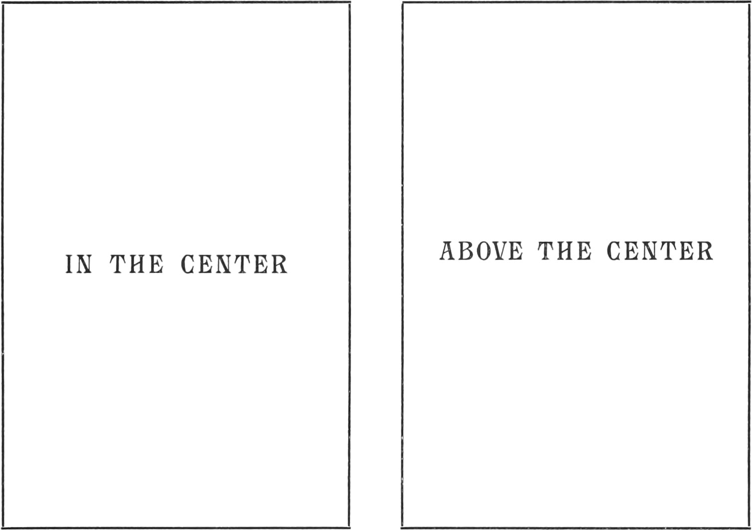
This rule will also apply to any amount of type matter, ornaments, panels, etc., which are intended to occupy the center of a page or panel.
In the composition of high-class display work, when it is possible, the letters in a line of type should be spaced so that each word will show an even distribution of color—that is, the body of each word should approach as nearly as possible to the even sweep of the painter’s brush. See example below.
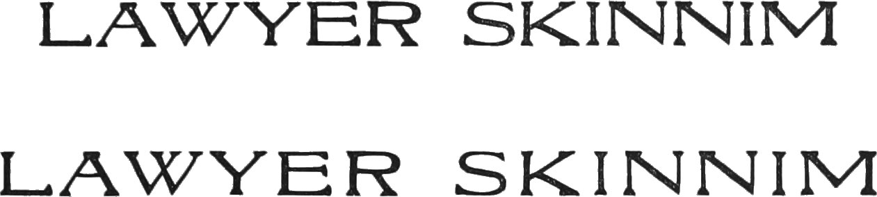
Sometimes the combination of certain letters makes it impossible for us to get a very even distribution of color by spacing but we can always improve the appearance of the line by so doing; see following example:
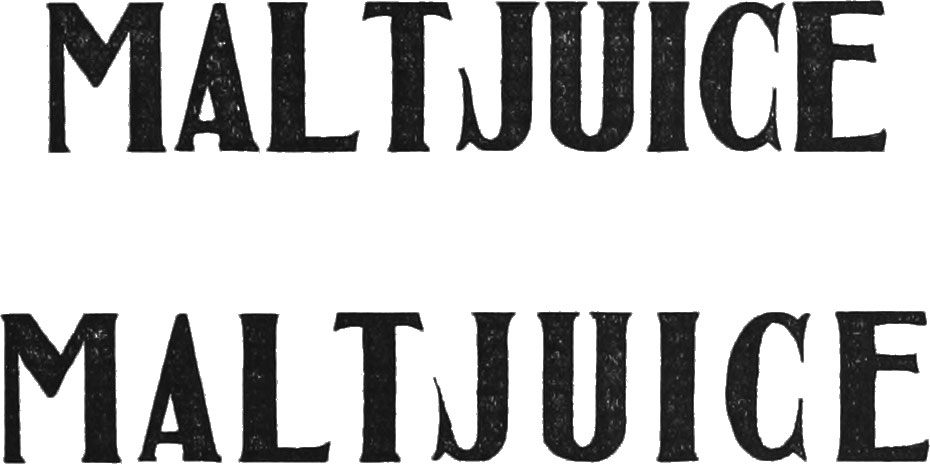
The letters which cause the uneven appearance of lines are A, F, J, L, P, T, V, Wand Y. In some job types this unevenness is overcome to a great extent by some of these letters being mortised or by all the other letters not named being cast on bodies somewhat wider than the face.
A Few Hints on Printing Presses, Rollers, Inks, and Papers
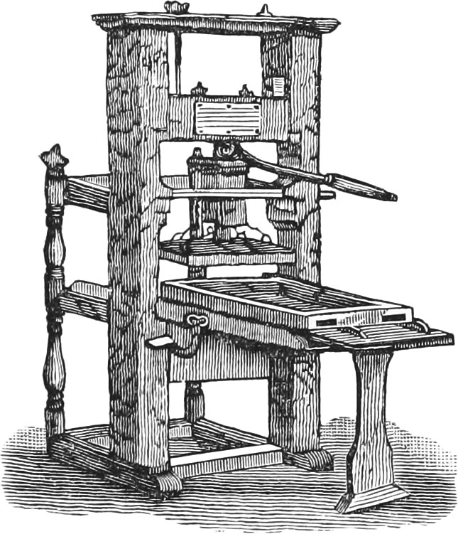
To do good presswork one must have good presses, ink, and rollers. If a cylinder press, the tympan should be made of thin, hard press-boards held firmly to the cylinder by a sheet of fine muslin, and on top of the muslin there should be drawn a sheet of fine, heavy manilla paper; on top of this there should be not to exceed two or three sheets of thin book paper of the best quality. When the tympan is so constructed its surface should be a little below the surface of the cylinder bearers, so that when the over-lays are pasted in their proper places on the tympan, and a sheet of fine manilla paper drawn over the whole, the surface of the tympan will then be exactly on a line with the surface of the bearers on the cylinder. A tympan made up in this manner is specially suitable for a high class of job and illustrated catalogue work.
The platen of a job press should be so adjusted, that when the tympan is made up of two sheets of fine three-ply bristol, covered with three or four sheets of thin manilla or book paper, it is then in proper condition for printing delicate scripts and other light-face letters. For heavier forms it will, of course, be necessary to add more sheets of paper and sometimes an extra card. The tympan must always be drawn as tight as possible to insure good work.
A roller when in the best condition for taking up the ink and freely giving it off again, should be firmly elastic, and should feel tacky when the hand is gently pressed upon its surface; at the same time, if the hand is moved rapidly along its surface, it should feel smooth and polished as if it was not very tacky. A form roller should be nicely adjusted so that it will be evenly pressed by the vibrator, along its full length, without flattening its surface; at the same time it should firmly but evenly press the face of the form without depositing any ink below the actual face of the type, cuts, etc., contained in the form.
Printing ink should always be adapted to the surface upon which it is to be stamped. If the paper is hard and smooth, then the ink should be somewhat stiff; but if it is soft and rough, then the ink should be comparatively thin. Black inks require less impression to make them adhere properly to the surface of paper than any of the colors; the reason being that the coloring matter of which the blacks are made, is generally composed of much finer particles than the colored inks; for this reason very fine half-tone and wood engravings can be printed much cleaner and sharper with black than with any colored ink.
Sometimes it will be found that certain heavy-bodied colors, such as vermilion, orange, etc., will cake on the form and rollers; the reason for this is generally because the varnish in the ink is not quite strong enough to hold the coloring matter, which is very heavy. This trouble can often be overcome by adding a little medium varnish to the ink. Boiled linseed oil is one of the best mediums there is for reducing inks, when a little too stiff for printing upon some papers. It will sometimes be found, however, that linseed oil will not answer the purpose; for instance, we have tried to reduce certain inks which had become somewhat hard, and found that the oil merely separated the hard inks into little buttery masses which could not be united nor reduced to an even consistency for working. By adding a little varnish we soon had the inks in excellent condition for printing.
Very often it will be found that a job is to be handled soon after coming from the press. In such cases setting-off and smearing can sometimes be avoided. For example, say the job is to be printed in medium blue ink; mix one part ultramarine blue, one part bronze blue, and about two parts zinc white; the result will be a good blue which will work well and dry quickly. Any mixture of inks in which zinc white predominates will work well and dry quickly, without the printer being annoyed by the sheets setting-off.
It is sometimes hard to make an ultramarine blue, a violet, or a purple ink print smoothly upon some papers; the best result is obtained with these inks when they are printed on an unsized paper; the colors will invariably lay smoother and look much better than when printed on sized paper.
In bronze work, the best result is generally obtained when a fine writing paper is used. In the use of enameled or coated papers, the printer will frequently be troubled by the fact that after the work is completed the bronze powder will rub off at the slightest touch; the reason for this is, the greater part of the sizing does not remain on the surface, but, instead, it goes through the enamel or coating, to the body of the paper, leaving the powder to come off when it is touched. This trouble can be overcome by printing the form first in the sizing and then, when dry, running the work through the press a second time and applying the bronze powder at the last printing. The first printing is for the purpose of filling the paper so that the size will remain on the surface in the second printing. When paper is sized or properly filled, so that the size when printed will remain on the surface, there will then be no danger of the powder coming off.
In printing half-tone and fine wood engravings, the best result will be reached when a fine enameled book paper is used. A more perfect surface impression can be obtained on this paper than upon any other. By examining impressions of a cut upon different kinds of paper with a magnifying glass, it will be plainly seen that the lines are thinner and sharper on the enameled paper than upon any other. The reason for this is that the instant the cut comes into contact with the paper, all the surplus varnish or oil in the ink goes through the enamel, instead of remaining on the surface and being spread by the pressure of the cut, as it will on a hard, sized paper.
Description of Head and Tail Pieces and Initial Letters
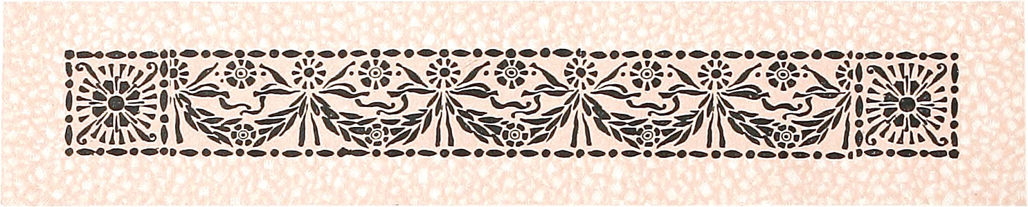
The head-piece on page 3 was printed in three of the light tones of color No. 80, and the tail-piece on same page was printed in color No. 64 and two of its light tones; both are excellent examples of the harmony of Scale.
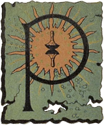
The initial B on page 5 was printed in tint No. 163 and black. The initial P on page 11 was printed in a gray tint and black.
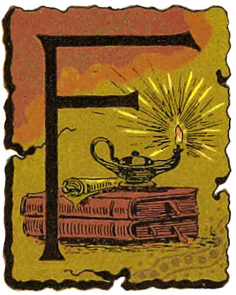
The head piece on page 13 was first printed in tint No. 170, then in tint No. 159 and then in color No. 81—a good example of the harmony of relative colors. The initial F on same page was first printed in a pale gold bronze, then in a half-tone red, then in color No. 41, and then in black.
The head-piece on page 22 was printed in color No. 51 and its tint No. 164, the tint being printed first. The initial P on same page was first printed in gold bronze, then in a blue, then in an orange red, and then in black.
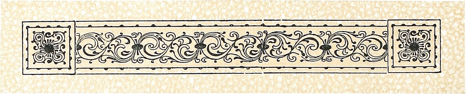
The tail-piece on page 32 was printed in color No. 71.
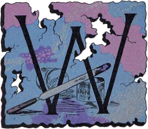
The head-piece on page 33 was first printed in tint No. 152, and then in color No. 35—a rich combination. The initial W on same page was first printed in silver bronze, then in a half-tone blue, then in a half-tone rose-lake, and then in black.
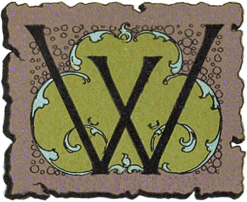
The head-piece on page 38 was first printed in tint No. 176, then in tint No. 169, and then in color No. 73. The initial W on same page was first printed in gold bronze, then in green, then in purple, and then in black.
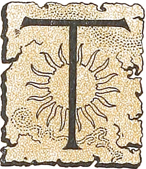
The head-piece on page 60 was first printed in tint No. 166 and then in black. The initial T on same page was first printed in tint No. 162 and then in black.
The head-piece and initial W on page 97 were first printed in an orange tint and then in black.
The head-piece and initial I on page 124 were first printed in a flesh pink and then in black.
The head-piece and initial T on page 130 were first printed in tint No. 165 and then in black.
The head-piece and initial T on page 134 were first printed in a green tint and then in black.
The head-piece on page 136 was printed in color No. 71. The initial on same page was printed in same color and then in black.
A Simple Method of Embossing
The different specimens of embossed work shown in this book were done in the following manner: In the first place, the embossing plate or border was locked in a chase ready for press. Then the form was “made ready” so that the impression showed firmly and evenly on the tympan, without the use of ink. Then a paste was made of Barytes powder and a good flour paste thoroughly mixed in equal proportions, the flour paste being free from lumps. Then the face of the form was well oiled, so that when the impression was taken the pasted sheet would not stick to it. Then the paste was spread evenly and thinly over the impression on the tympan with a stiff brush, and a sheet of manilla tissue was laid over this, and an impression taken upon it. Then this impression was again coated thinly with the paste, care being taken to put the paste where it was most needed, and another sheet of the tissue was added. This operation was repeated until every part of the work was embossed as evenly as the plate or border would allow. Then the matrix so made was dried with a hot iron or a piece of burning paper; in the mean time, at intervals of a minute or two, a half dozen impressions were taken on the tympan so that the matrix would not warp or shrink out of position while being dried After the matrix was thoroughly hard and dry, the guides were set and the sheets run through at a moderate rate of speed. In embossing the border on Plate 56 it was also printed in a blue-gray tint over a gray tint at the same time. Many fine effects can be produced with the different embossing borders shown on Plates 54 and 55, by embossing and printing them at one impression in a tint on delicately tinted paper or cardboard. The Barytes powder can be obtained of any dealer in painters’ dry colors.
It will be noticed that the embossed work does not stand in very high relief. This is due to the fact that the sheets were subjected to great pressure during the process of binding the work, which, of course, somewhat flattened them out. This method of embossing is not suitable for heavy or hard bristol board. Any smooth stock that is somewhat soft and at the same time tough, is best for the purpose.
- The type known as gothic, in the United States, is composed of plain lines, and is the simplest in form of any type made. ↩