Making of the New York and Erie Railroad organizational diagram
By Nicholas Rougeux, posted on March 29, 2025 in Art
Org charts tend to be a rather boring affair—with their lists of names and who reports to whom—but they didn’t start out that way. One of the first in American business, is a stunning portrait of a classic institution—the New York and Erie Railroad. Drawn in 1855 and only rediscovered in recent decades, this diagram captured my attention and I finally took the time to recreate it from scratch as a fun technical exercise. What was unexpected was the depths I ended up going to in order to learn about its fascinating history.
Source material
Unlike my previous projects, the source one was not a lengthy book with hundreds of illustrations or scientific explanations, but a single image available at the Library of Congress.
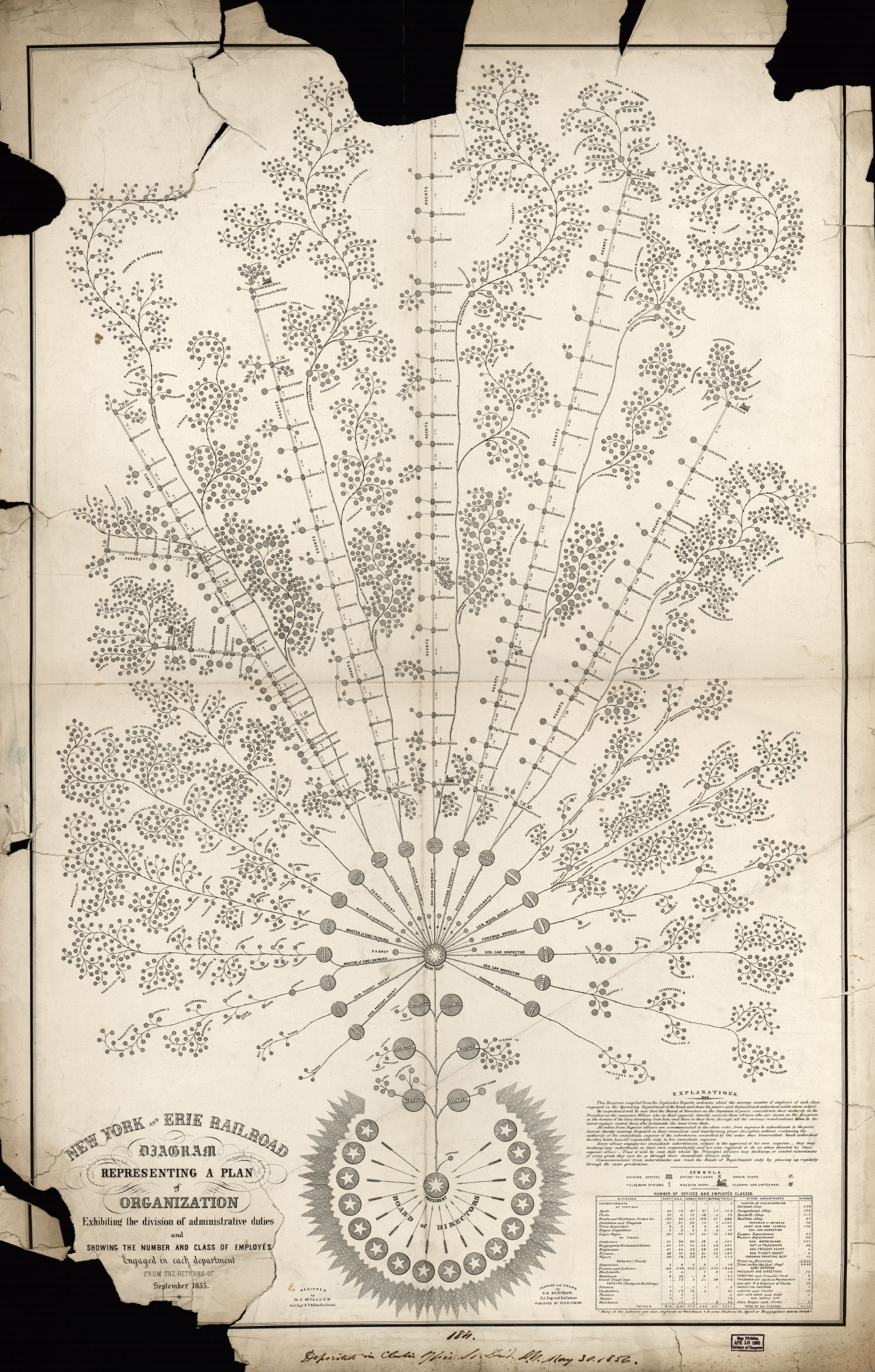
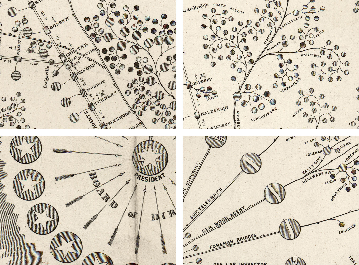
This sprawling diagram was designed by Daniel McCallum in 1855 shortly after he became general superintendent of the New York and Erie Railroad and drawn by Civil Engineer George Holt Henshaw. He created it as part of his efforts to improve accountability, operational efficiency, and lines of communications throughout the complex railroad system. Unfortunately, his insistence on enforcing rules he devised to govern all employees ultimately resulted in their resentment toward him, financial difficulties for the railroad as a whole, the first strike of railroad engineers in America, and his resignation. He was later appointed by President Lincoln to take charge of the United States Military Railroads due to his bridge and railroad expertise (Wrege et al., 2005). Despite its origins and the outcomes it precipitated, the diagram remains an impressive feat of design that up until just a few decades ago was relatively unknown.
In 1977, railroad and economic historian Alfred Chandler Jr. described the diagram’s existence in his book, The Visible Hand: The Managerial Revolution in American Business by referencing other publications that covered it shortly after it was originally published. Among them was one of his own published in 1956 about his great grandfather, Henry Varnum Poor, editor of the American Railroad Journal during McCallum’s tenure. In this book, Chandler described the diagram:
The design of the chart was a tree whose roots represented the president and the board of directors; the branches were the five operating divisions and the service departments, engine repairs, car bridge, telegraph, printing, and the treasurer’s and secretary’s offices; while the leaves indicated the various local ticket, freight, and forwarding agents, subordinate superintendents, train crews, foreman, and so forth (Chandler, 1977, as cited in Wrege et al., 2005).
Chandler didn’t include an image of the diagram in his book and it remained relatively unknown until 2005 when two researchers, Charles Wrege and Guideon Sorbo Jr. consulted with him for their article, A Bridge Builder Changes a Railroad: The Story of Daniel Craig McCallum in the 24th volume of Canal History and Technology Proceedings. In their article, they detailed Chandler’s descriptions of the diagram and included Poor’s original description from the American Railroad Journal, in which he describes the diagram as “got up in handsome style”—a turn of phrase that I thoroughly enjoyed.
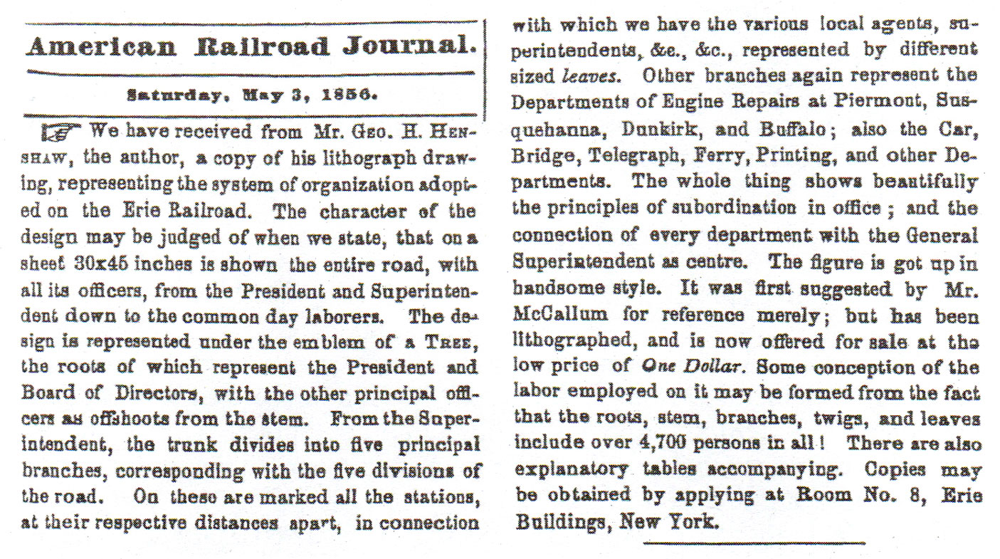
Wrege and Sorbo also described its resemblance to a tree, hypothesizing that the tree was chosen because of McCallum’s history as a Freemason. However, they were disabused of this when a masonic representative stated, that
…trees or horticultural metaphors-with the exception of the Acacia as a symbol of hope, rebirth or renewal-play no role in the teachings or rituals of Freemasonry. (Wrege et al., 2005).
After much research, they proposed the idea that its organic design was based on the Salix caprea or goat willow—a plant commonly found in the counties around the railroad. They support this notion by comparing drawings of the Salix caprea’s stems and leaves to elements of the diagram and even overlaying a drawing of a Salix caprea directly on top of a mirrored version of the diagram, creating a rather messy, albeit apt comparison, noting:
The Salix caprea’s fan-shaped appearance, rounded oval leaves, and specific shape of the branches compare favorably to similar elements of the Erie Plan.
…one can readily see the close comparison of the distribution of the willow branches and leaves in the picture to the branches and leaves in the Erie Plan. The curvature of the branches and leaves in McCallum’s design follows the typical weeping branches of the Salix caprea. The fact that railroad operations, while mechanized, require great flexibility on the part of the employee, also reinforces his use of the willow in symbolic form. Finally, in comparison to the narrow lanceolate leaves normally associated with willows, the oval leaves of the Salix caprea closely resemble McCallum’s round leaves. (Wrege et al., 2005)
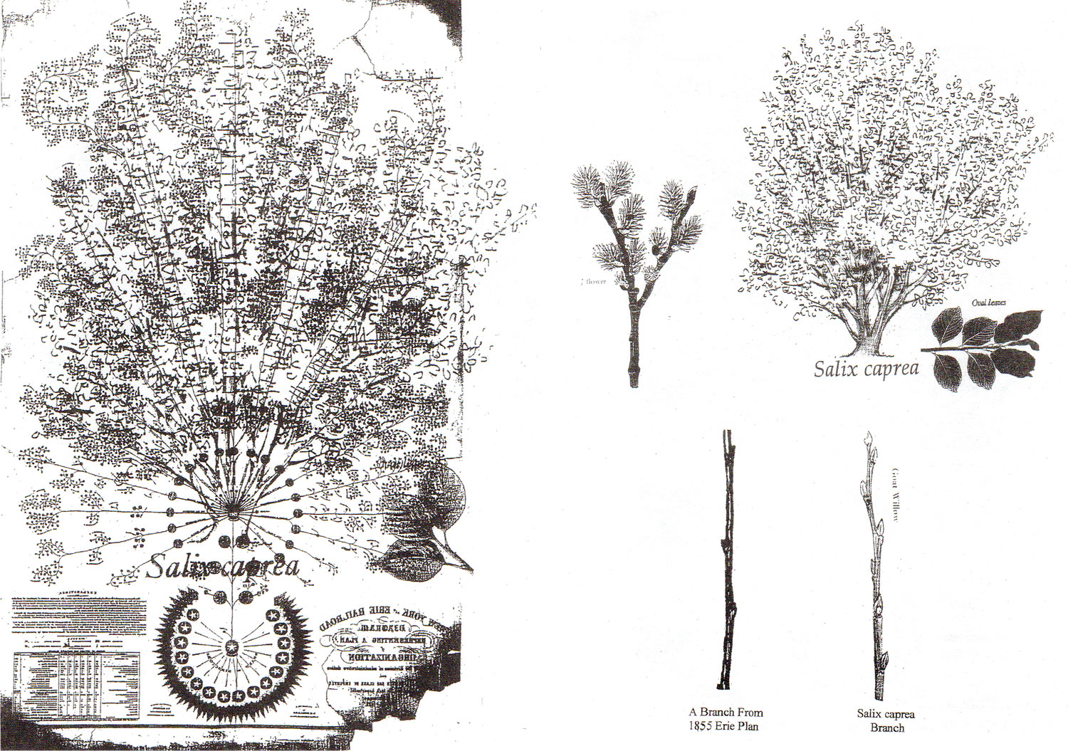
While this sounded plausible, it’s my amateur opinion that it was somewhat over-elegant because of its convenience. There are indeed similarities between the diagram and the Salix caprea but not enough evidence to draw a direct connection. I believe the diagram has an organic nature not because of a masonic history or connection to the local flora but because a tree-like branching diagram simply lends itself well to the hierarchical representation of the employees. Regardless, the diagram is a beautiful and functional artwork worthy of many kinds of analyses.
A great piece of ephemera was included in Wrege and Sorbo’s article in the form of an advertisement for the diagram from July 14, 1856 that appeared in the American Railroad Journal stating that it could be purchased for $1 for thick map paper or $1.75 for it mounted on rollers (about $37–65 after inflation). The authors noted,
The number of copies of the Erie Plan sold is unknown. Considering the resignation of McCallum in 1857, and the failure of the Erie in 1857, the sales of a diagram of one of the greatest railroads in the world may have been disappointing, which may also be the reason for only one known copy existing today.
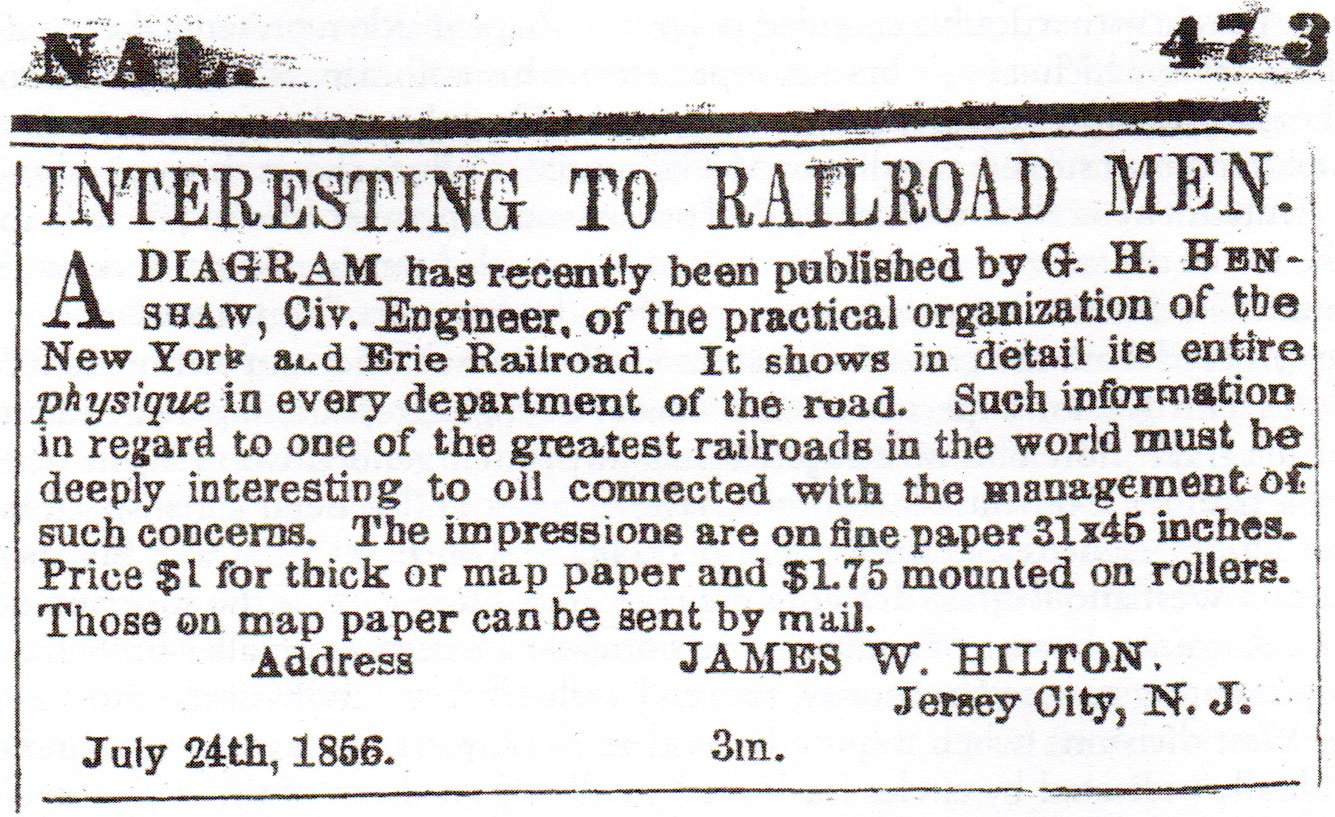
Viewing such a piece mounted on rollers would have been wonderful to see.
In 2013, their article was referenced in a sidebar of an article from McKinsey titled Big data in the age of the telegraph written by then Harvard-Newcomen postdoctoral fellow at the Harvard Business School, now Berkeley Associate Professor Caitlin Rosenthal. In it she discusses McCallum’s diagram and its valuable lessons for leaders navigating large data landscapes. Some time between then and the writing of this post, it came across my radar and languished in the back of my mind ever since.
When looking for a new project, I thought it would be something fun to explore, not knowing how much time I would spend researching its origins. The brief history above is only a portion of what’s available in the various publications I mentioned and all are worth a read. What follows is an account of my efforts to restore, recreate, and expand on the diagram using modern tools.
Typography
The most appealing part of recreating the diagram was drawing the beautiful curved branches and watching the tree they represent come to life. However, before I could do that, I had to figure out if the building blocks that made it so interesting were even possible—chief among them, typography, which could be broken down into four parts: title, legend, labels, and credits.
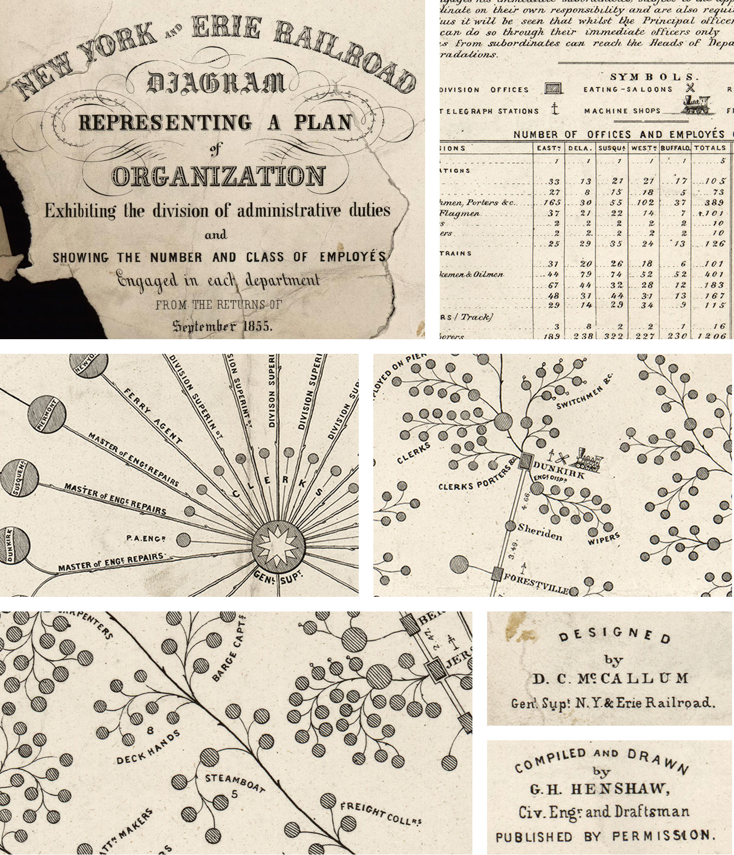
A wide variety of typographical styles were used—ranging from simple and geometric for labels, to ornate in the title. I knew finding the right modern equivalents was going to be a challenge but one I would enjoy. My research started by messaging the talented team at Fonts In Use, a wonderful site created to “document and examine graphic design with the goal of improving typographic literacy and appreciation.” I learned about in 2023 when they posted about the typography used on the newest Metra tickets I acquired. I asked if they could identify any of the typography in the diagram and they confirmed my suspicions that all lettering was engraved by hand and not based on specific fonts.
I briefly entertained the idea of making my own fonts but I knew what went into designing one and wasn’t ready to embark on such a lengthy journey for a few characters. Instead, I spent days sifting through the hundreds of fonts I collected over the years, libraries like Google Fonts and Adobe Fonts, and other font foundries to find ones that resembled those in the diagram as much as possible.
Title
The full text of the diagram is “New York and Erie Railroad diagram representing a plan of organization: exhibiting the division of academic duties and showing the number and class of employés engaged in each department: from the returns of September 1855” and it comprised the most varied typographical collection with 11 fonts—a different one each line and 2 used on the last. Some elegant filigree also decorated the main parts of the title.
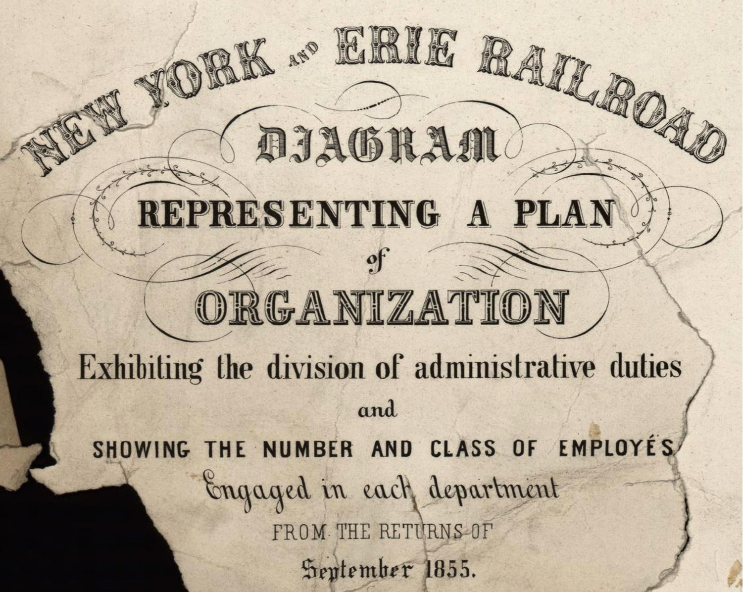
Finding a modern equivalent for the first line, New York and Erie Railroad was a challenge because of its unique ornamental style. The three closest I could find were Hickory, Bruce Ornamented No. 881, and Dusty Circus Main. I chose the latter with some minor vertical stretching because it had roughly the same visual weight of the original. Normally, I loathe stretching a font but made some exceptions with this and a few other areas on the poster to meet space limitations.

The second line, Diagram, was written in old English style and while many fonts in that style are available, the three closest I could find were English Towne, Olde English, and Same Old English JNL. The title had the added feature of thin horizontal lines in the middle for shading and a kind of shadow on the upper right of each character. English Towne was the closest but didn’t have the shading lines. To achieve these effects, I created four separate layers:
- Outlined version of the original font with transparent middle parts
- Duplicate of the second layer with a custom pattern of horizontal lines applied as a fill
- Custom-drawn shapes as shadows
Representing a Plan was another combination of several layers offset to give the appearance of text elevated off the background. The two closest fonts I found were Noto Serif and Libre Bodoni—both freely available from Google Fonts. The thicker serifs on Noto Serif looked best.
The two smallest words—of and and—appeared to be the same style and the closest match I found was Bodoni Moda. I chose the bold italic style even though the original wasn’t italicized to achieve the more decorative “f” like the original.
Organization was another word written in an ornamental style and the two closest matches I could find were Rosewood and Alta Mesa Regular. Rosewood was too top heavy with shading and had shadows that were too deep while the latter was the closest match.
Like with of and and, Bodoni Moda was also used for the text, Exhibiting the division of administrative duties, but with a little vertical stretching. Oranienbaum and Times NR Condensed were considered because of their condensed nature, but Bodoni Moda had more appropriate contrast between its horizontal and vertical strokes.
Two fonts immediately came to mind for the text, Showing the number and class of employés: DIN Condensed and Barlow Semi Condensed. I’ve had the DIN family installed for many years and often consider it for text in all caps due and used Barlow in a separate professional project in recent years. DIN Condensed had the closest fit.
The typography for Engaged in each department presented an interesting challenge because its text was italicized but leaning to the left, instead of the right, which is the norm. In my research, I learned this type of “reversed italic” text is also called retalic text. It also looked like a form of script, which made finding a match extra challenging. Initially, I couldn’t find any fonts that supported left-leaning text and I didn’t want to manually skew the text because the results would look subpar at best, so I tried to find fonts with italic styles that matched the original diagram. The few I found were Imperial Script, MonteCarlo, Inglesa Variable, and Great Vibes, but none sat well with me. Fortunately, after digging through many fonts on Adobe’s site, I found one a lone retalic style, Beverly Drive. By a stroke of luck, it was also a script that somewhat resembled the original diagram.
The penultimate line of text, from the returns of, was a thin slab serif and of the three closest I found—Halant, Glegoo, and Novecento Slab—Glegoo was the closest at the small scale and had consistent width along all strokes.
Finally, the date at the bottom, September 1855, was written in two styles—old English the month and another serifed one for the year. The three I considered for the month were English Towne (again), LTC Goudy Text Pro, and Amador, with the latter being used because it was a bit more legible, despite the tall x-height of the lowercase letters. Bodoni Moda was used once again for the year.
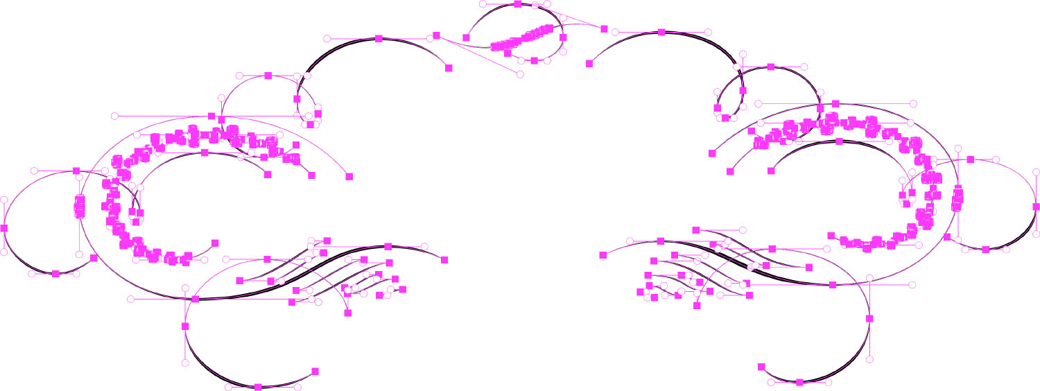
As a finishing touch, I reproduced the filigree decorating the first five lines of the title using simple curves with varying stroke widths. Most anchors were placed along horizontal and vertical tangent lines to ensure they were as smooth and clean as possible—a common technique and one I employed two years prior when recreating the title for The Color Printer. At the bottom below the title is a very tiny bit of filigree that was very rough in the original but I did my best to clean up what I thought was the original intent.
The final title was a fairly close replica and with the spirit of the original.

Legend
The legend, or “explanations” as it was labeled, filled in the large area in the lower right of the diagram and contained a brief explanation of McCallum’s rules, an overview of the symbols sprinkled throughout, and a table of “employés” in different classes throughout the railroad.

A wealth of information was packed into that area, dominated by wide italicized handwriting that looked like a combination of print and script. The handwriting was used primarily in the explanation and interspersed with geometric print in the table of employees. The handwriting was a great style that didn’t have a good modern parallel, or so I thought. I searched for typefaces that resembled nineteenth century text and found Madisonian but it felt too formal. I broadened my search to those with more stylistic italics like Magister, Libre Bodoni, and Bodoni Moda, but none felt quite right.
Then I found Geographica and its italic style was nearly perfect. According to its description, it was “inspired by the neat, hand-lettered text on the 1700s maps of Thomas Jefferys, Geographer to King George III” and had a style nearly identical to the text in the legend. Its x-height was taller than the original and was a little more spacious but these were fine compromises for my needs. As a bonus, it had a style of superscript with dots underneath for the few spots in the lower right portion of the table that needed them.
The headings for Explanations and Symbols were set in Scotch Modern, which was also used for station labels along the the five branches of the main diagram. Explanations was stretched and spaced out a bit.
For the geometric sans serif text used for the symbol labels and in the table, I considered using DIN or Barlow again and used the former for the table title, but their condensed styles were too narrow and their regular styles were too wide for text in the table. At smaller sizes, I couldn’t find a weight that worked well. The legend—as well as many of the labels in the main diagram—also included many superscript letters with a dot underneath—a style I fell in love with over the course of the project. The following section has more detail about reproducing them and how they’re used in the personnel labels. I found that Interstate set in bold worked great for text at tiny sizes, wasn’t too wide or narrow, and the superscript size matched the original nicely.
Once again, Geographic was a great fit for the old style numbers for the number of personnel in each class and at each station.

Labels
The main diagram contained three types of labels: personnel, stations, and the distances between those stations. These labels are the heart of what gives the diagram its vintage identity when exploring up close.

Personnel labels were by far the most prevalent and written in uppercase with varying methods of abbreviating using superscript. Many also wound around groups of personnel, which added to the organic tree-like feel of the diagram. Like with the labels in the legend table, I used Interstate for each one—drawing the curves for the text to follow as close as possible to the original. Recreating the dots below the superscript letters proved to be more troublesome than I thought. I hoped I could use the dot diacritic but Interstate did not support it. I also tried using extreme negative tracking but could never get the dots to line up perfectly under their corresponding letters. Ultimately, I settled on using two layers for each label that required dots—one with the text and another just for dots—both aligned to the same curve.
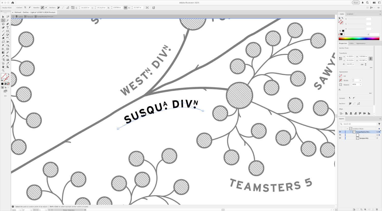
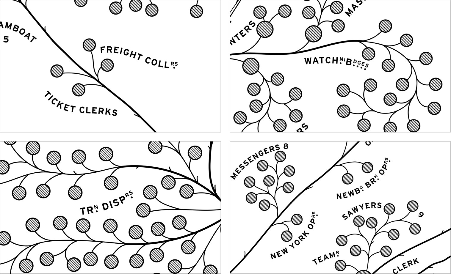
This technique resulted in more tedious work but allowed me the flexibility to position them just the way I wanted by using spaces and tracking setting, especially when just one dot was occasionally used for two letters. Superscript letters were used more liberally in some areas than others, resulting in some very interesting-looking labels.
The labels for leadership positions (treasurer, land agent, auditor, etc.) and the different divisions emanating from the general superintendent role in the center were also set in Interstate. Some groups of personnel included numbers after the text that appeared to be in a different style and I started by setting my numbers in Bodoni Moda to match but they felt disjointed so I kept them in Interstate to feel more cohesive.
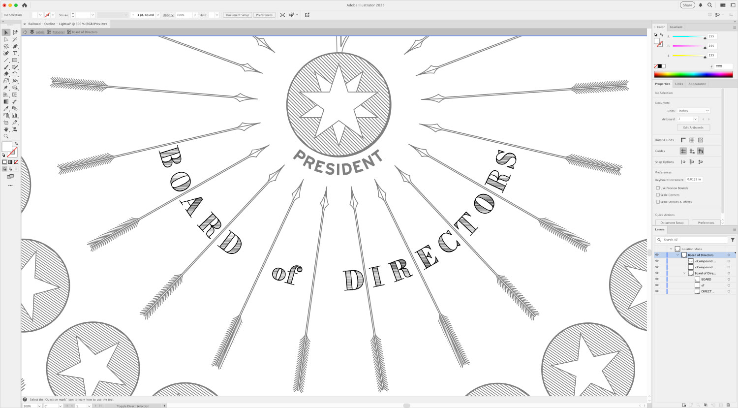
The label for the board of directors unlike all the others, which was appropriate because all the visual elements for them were unique. It sat in the curved space between the arrows connecting the 16 circles with inset stars to the president, alternating between or two letters between most arrows. It was also set in Bodoni Moda but with the same shading treatment as the word Diagram from the title.
As previously mentioned, Scotch Modern was used for station names with varying degrees of stretching depending on space restrictions. Whenever space allowed, I tried to keep them the same style for consistency. Names of smaller stations are written in title case rather than uppercase. Between each pair of stations was a small number representing the miles between them. They varied in style and size more than I expected and except for a few tight areas, I made sure they were styled consistently with Glegoo.

Credits
At the bottom of the diagram nestled between the board of directors, title, and legend were two sets of stylized credits for the diagram’s creators: Daniel McCallum, the railroad’s general superintendent and George Holt Henshaw, a civil engineer and draftsman.

They each follow the same typographical usage:
- Activity (Designed or Compiled and Drawn) set in Interstate bold
- by set in Geographica regular
- Job title set in Glegoo
I also took the liberty of adding my own credit in the available space at the lower left of the title as a stamp of my authorship in restoring and recreating the diagram. This area was missing in the scan on the Library of Congress’ site and without any indication that something was there originally, I felt that including my credit was acceptable.

Iconography
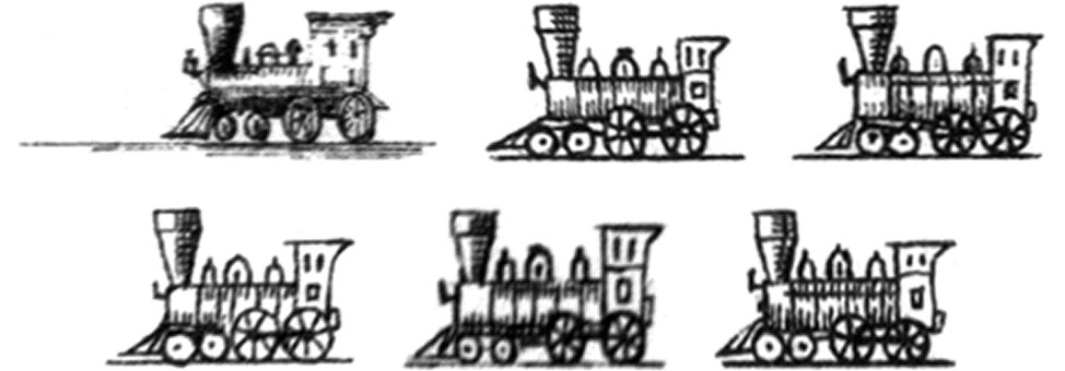
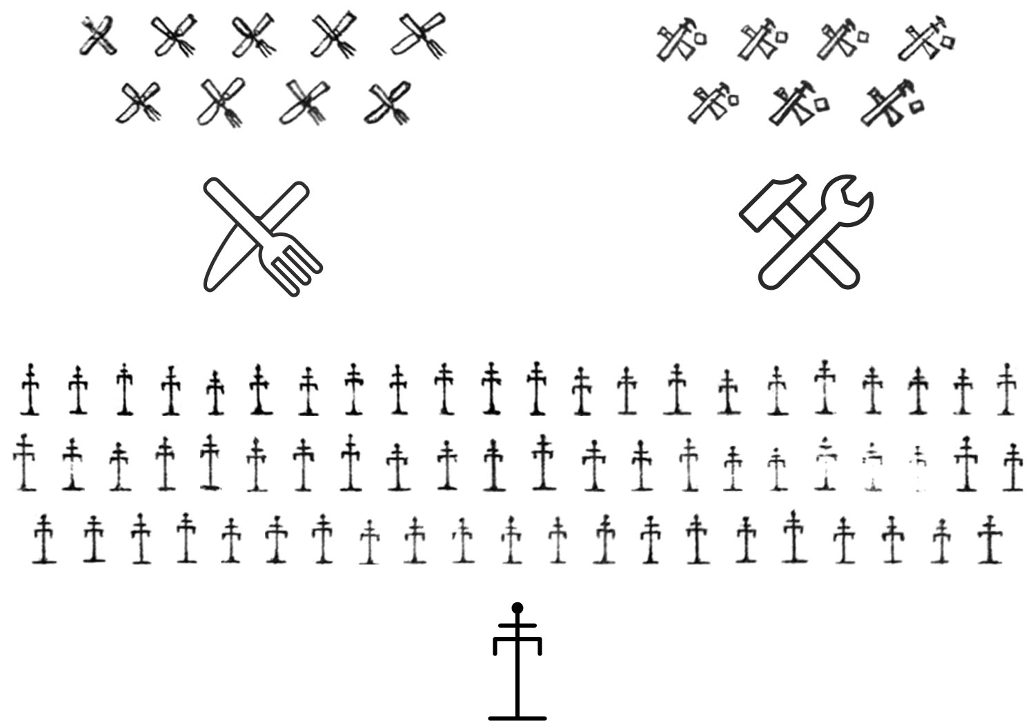
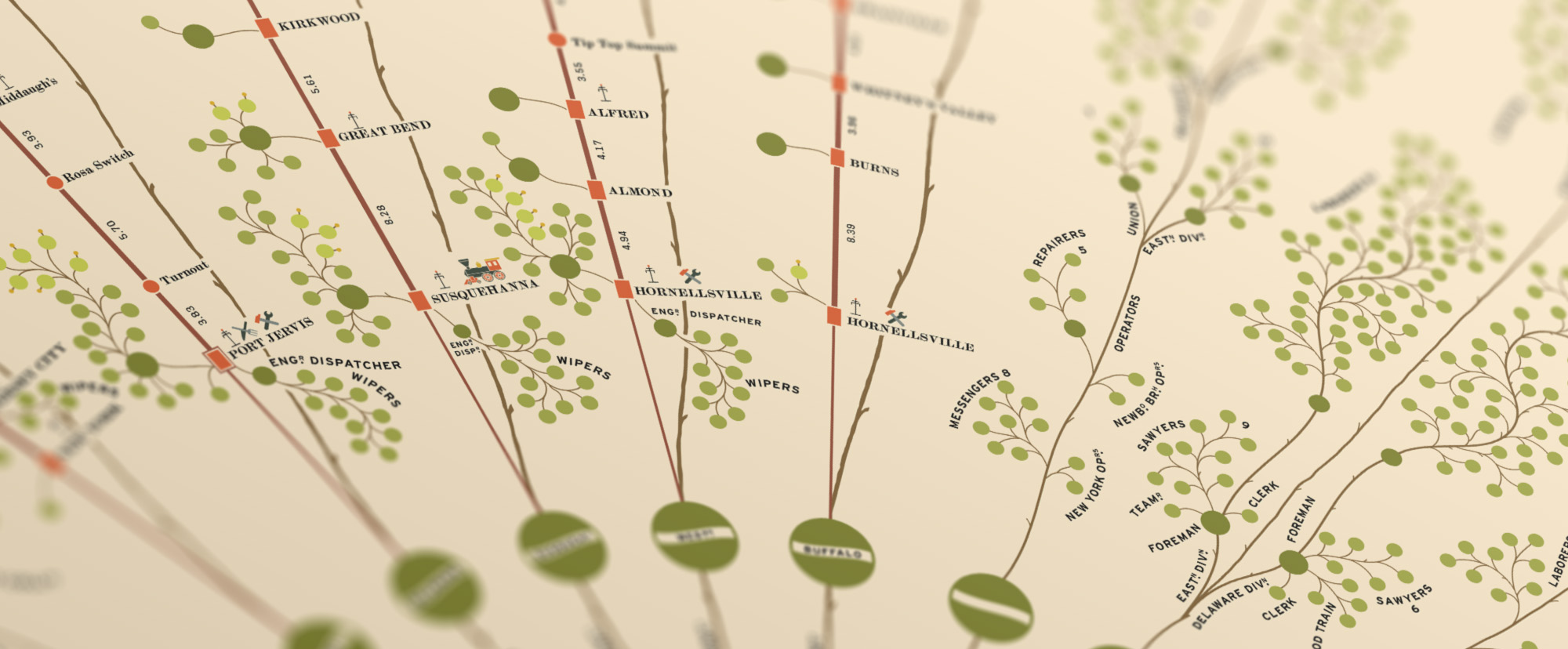
Sprinkled along the straight lines representing the five major lines are four symbols representing the services or amenities at each station: a locomotive for machine shops, tools for repair shops, eating utensils for eateries or saloons, and a telegraph pole for telegraph capabilities.

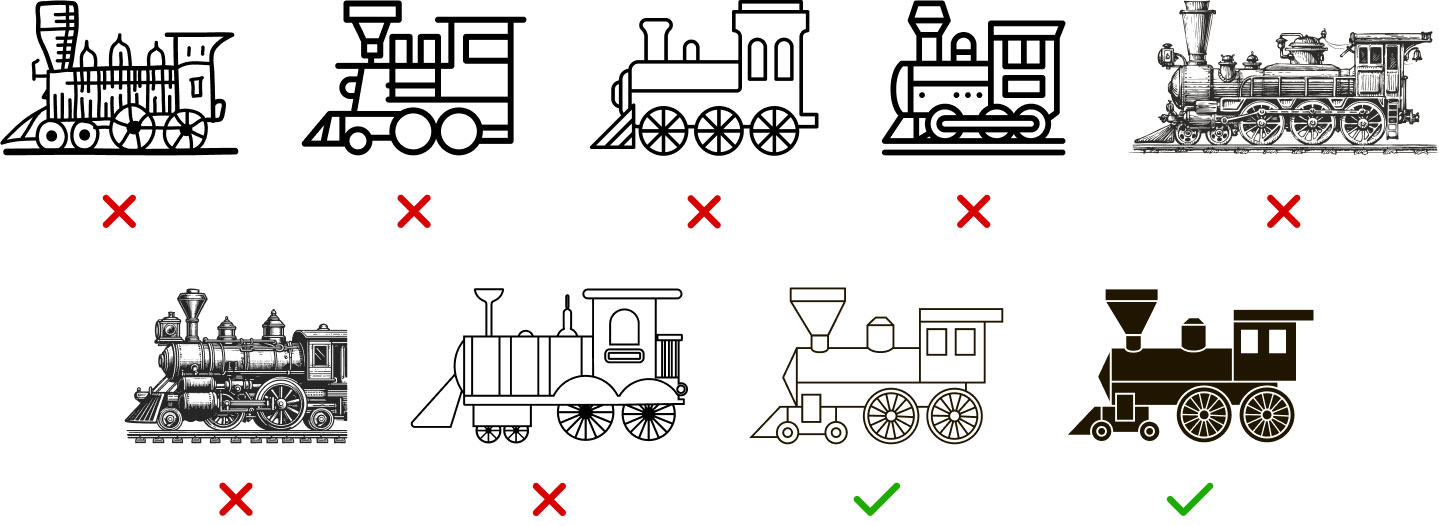
As I worked my way through the diagram, I noticed that the locomotives were similar to each other but no two were the same. Six were drawn in total: one in the legend, which was the most detailed and five rougher versions at major stations or termina in the diagram. My naïve idea of tracing one of them as an exact copy was significantly underwhelming. Attempts to automatically convert them to vector drawings in Illustrator were even more so. I searched through The Noun Project and Adobe Stock for better versions—trying to find a balance between hand-drawn and high-fidelity that would work at small sizes. After much trial and error, I settled on one from a set of old train icons that resembled the detailed one from the legend. As a bonus, a dark version was also available for the dark style of posters I planned to make.
The symbols for saloons and repair shops were very rough due to their small size and I wanted to match the more polished nature of the locomotive symbol so I exercised some creative freedom and used icons from Adobe Stock with some modifications. The symbol for repair shops was a little cryptic, with what looks like a wrench and some other straight tool. I later learned as part of my extended research that it was intended to be a hammer (Wrege, et al., 2005). I chose a more standard-looking hammer and wrench. The most straightforward of these to recreate was the telegraph pole as it was a simple arrangement of lines with a dot on the top.
Diagram
The main diagram was created in several stages, starting at the bottom with the board of directors, working my way up through leadership in the center, then drawing each main branch, starting on the left side and moving clockwise to the right. I worked this way so I had an easier time keeping track of what I had done but this had the unexpected benefit of easing me into the more complicated areas in the middle instead of starting with them right away.
Leadership
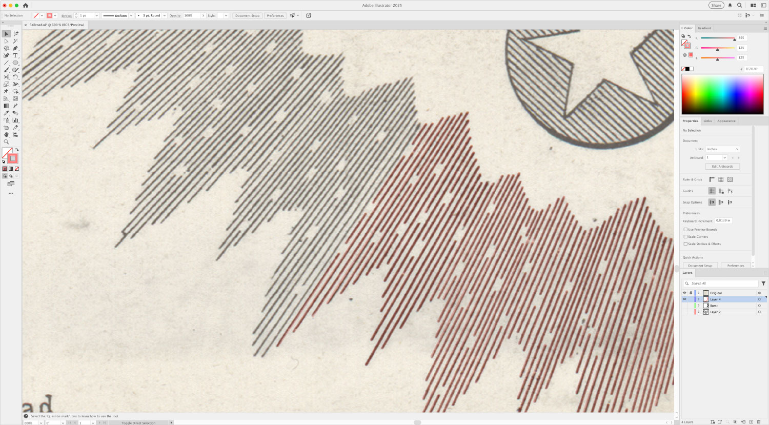

The first part I drew was what I referred to as the “burst,” or the lines that resembled rays of light surrounding the board of directors. In a futile attempt to create them efficiently, I tried to create evenly-spaced lines emanating from a central point and clipping paths for the jagged edges and cutouts but the results started to look too polished and the charm was lost. Instead, I bit the bullet and drew each of the 1,582 lines by hand to ensure an exact replica.

The stars representing the board of directors and arrows connecting them to the president looked like they were evenly spaced distributed around him but they weren’t, so after starting with them as such, I manually shifted them to align them with the original. I also created a custom lined pattern for the shading in the circles that world be used for all others. This pattern is a simple set of tightly-spaced lines but always at a 45 degree angle.

The larger circles for the president and general superintendent were the only two with layered stars. The 6 circles connected to the president representing others in charge of business affairs and 18 representing smaller divisions had decorative ribbons and labels on them. Again, these looked evenly-spaced but needed a manual touch to align them properly.
Personnel
I developed a sequence of steps for drawing each branch so I could keep track of what I had done as I stopped and started over the weeks needed to complete them. Using the Western line as an example, these were the steps:

First, trace the “trunks,” which were the winding and straight double lines connected to the division head. The winding trunks comprised thin and thick lines drawn with the paintbrush as closely as possible to the original with minimal smoothing, giving them a bit of dimension. The straight ones were double lines representing the five main train lines and the distances between stations.
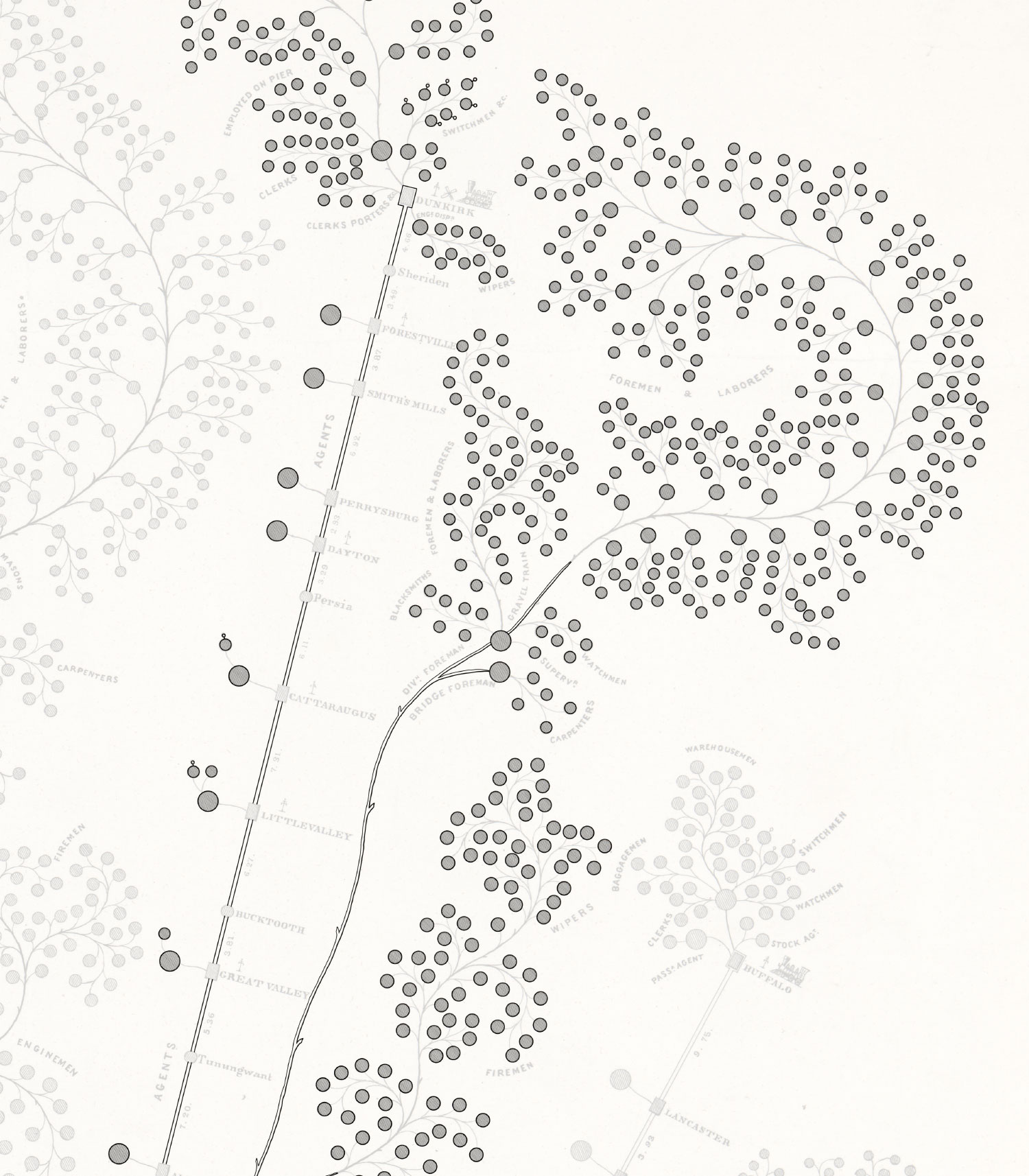
With the trunks in place, I added the small rectangles for stations (when necessary) and the many circles for personnel, which I referred to simply as “dots.” There were two main sizes is these dots—the larger, indicating supervisors, and smaller for the lowest level of personnel. To ensure I didn’t miss any, I always placed the dots in a clockwise order. A subset of the dots had small protrusions pointing in various directions indicating flagmen or switchmen.
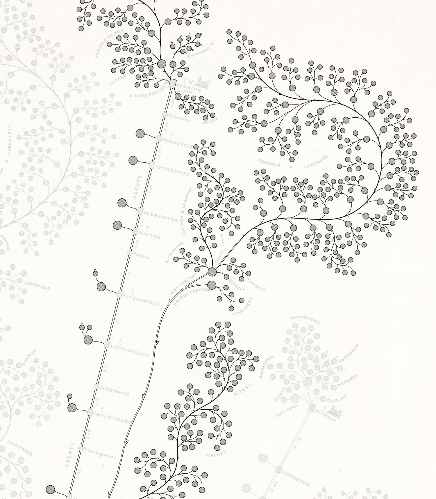
Next were the thin curved branches connecting all the dots and the trunk. I enjoyed this the most even though it was the most tedious. With Illustrator’s fidelity option turned up for the paintbrush tool, I was able to draw the best curves without worrying about precision. This was a lot faster than drawing with the pen tool and messing with bezier curves manually. Thicker versions of these branches were used for areas with many dots.

However, the positions of the endpoints needed polishing to line up perfectly, so after I drew them, I made a second pass to move each endpoint so it intersected precisely with a dot or connecting branch to ensure a smooth look. Again, I methodically drew each branch in a clockwise order and adjusted their endpoints on a second pass in the same order. These branches took the longest to create compared to all other parts of the restoration but the result was worth the effort.
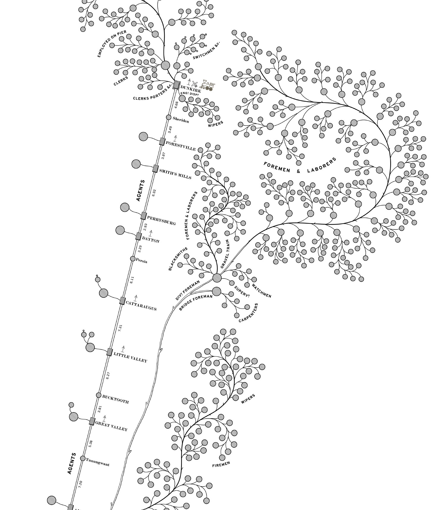
Finally, I placed the labels and iconography, starting with station names along the straight trunks, followed by the distances between them, and ending with their services/amenities. Nearly every label for personnel groups was set along a curved line and no two were the same so each curve was manually adjusted to be as close to the original as possible. The text size varied a little in the original but I maintained a consistent size in my version consistently except for a few of the larger groups which warranted larger labels. I also took the liberty of correcting a few typos and personnel counts but the original had very few errors.
This process was completed for each major division. Below is a set of images showing the order in which each part was completed. Drag the slider to step through the various stages.
 Drag slider to see the progress from start to finish.
In hindsight, creating the title and legend first, followed by the leadership areas was a wise choice because I was able to iron out many of the nuances and workflows before embarking on the long repetitive task of drawing all the branches. Keeping my file well organized and approaching it methodically meant I rarely had to redo anything and making mass adjustments was relatively simple.
At this point, the diagram was complete but I wasn’t.
Colors
As with most my projects, I wanted to add my own spin on it and for this one, I chose to create new colorized versions. While recreating the diagram, I periodically experimented with different palettes on a small subset of representative shapes, starting with generic palettes I found on Pinterest inspired by the victorian era and a vintage map.
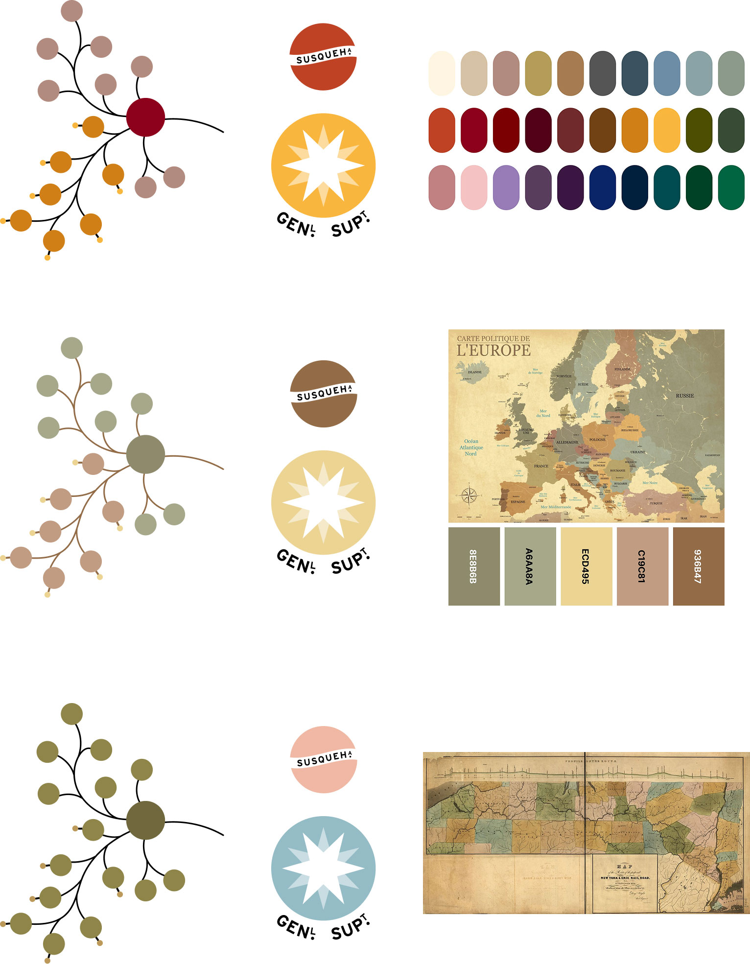
These were fine but nothing special. They illustrated a key change I wanted to make, which was replacing the thin lines shading each circle with flat colors. I loved the shading lines from the original but wanted to make variations that were a more modern while still paying homage to the original. In an effort to give the colors more meaning, I discovered a map of the proposed route of the New York and Erie Railroad from 1834. This beautiful map of southern New York counties had a great set of colors but when applied to the small sample, they didn’t have enough contrast for the wide variety of elements I wanted to color.
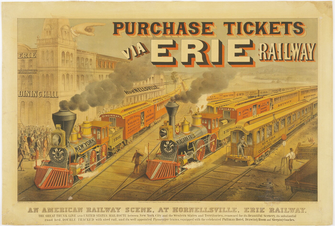
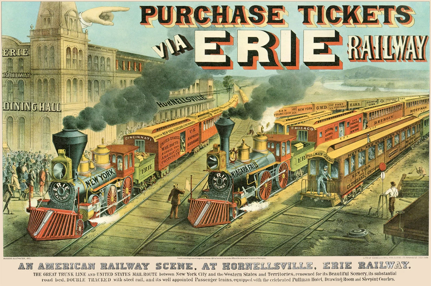
After some more digging through railway ephemera, I found a wonderful advertisement for the Erie Railway from 1874, promoting the stops along its route by way of named locomotives and train cars. The Amon Carter Museum of American Art has an original and I found a restored version on Etsy. The second I saw the latter, I knew it would be the perfect source of a palette. The bold red in the title and on the equipment worked so well with the bright yellow and subdued green for the landscape. My initial pass at a color palette used a few too many colors but I liked the general direction.
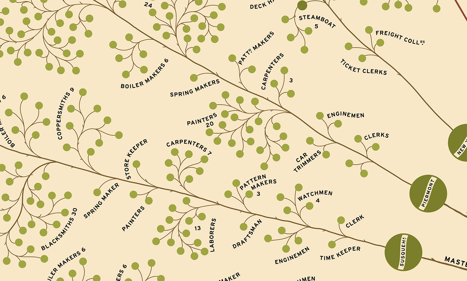
While experimenting with colors, I settled on the idea of using them to differentiate between structure and people. Most importantly, since the diagram had such a strong resemblance of a tree, I wanted to use shades of green for the people as leaves. A different shade of green was used for supervisors so their presence is more noticeable. The winding branches connecting them were colored brown. The tiny protrusions for flagmen and switchmen are a bright yellow as a nod to their job of keeping everyone safe and running smoothly along the tracks. Straight lines representing the physical lines and stations along them use shades of bright red. The colors of top leadership circle vary from shades of green to highlight their different roles: light blue for the primary leadership roles of president and general superintendent to which many others report and bright red for the board of directors that govern the activities.
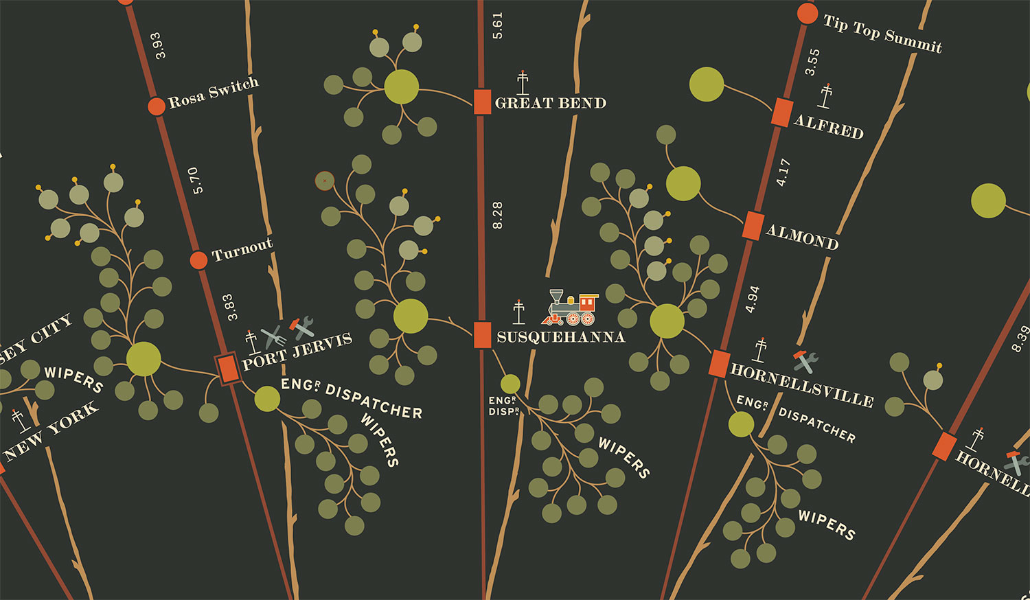
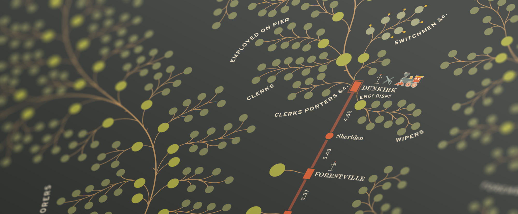
Colors from the Erie Railroad advertisement were also used for the other symbols representing station services and amenities. As an added bonus, I also created dark versions of the diagram—one in black and white and another in full color. The addition of these rounded out the set of posters nicely and I’m thrilled with the final results. Seeing them in person and exploring all the details is quite fun.

Missing piece

Keen-eyed readers may have noticed that my recreation differs from the original in a small but important way: the missing piece at the top center. The missing piece cut off the farthest part of the Susquehanna line and a few of the foremen and laborer dots from the Delaware line. In all my research this small part is only referenced once as a note on the Library of Congress’ site as “missing sections along the margins.”
The lack of information nagged at me throughout the project and I spent weeks combing through maps, old books, and library records hoping to find a shred of information about what was once depicted there. I sent dozens of emails to anyone who might have had any information about it. I was only able to piece together part part of it. For the rest, I made educated guesses, calculated estimates, and exercised a little creative license.
First, I listed the few things that had to be true given what was visible around it:
- After Crosbyville, another station was 4.92 miles away.
- A station past Crosbyville had a relatively long name ending in “LLE.”
- There wasn’t enough room to have more than one or two stations beyond Crosbyville.
My first stop was Google maps to see what was 4.92 miles away from Crosbyville in New York by using its measure feature and drawing along existing rail lines. Canisteo was the only town and according to their Wikipedia page, they were indeed part of the Erie Railroad. Since Henshaw drew the stations at mostly accurate distances from each other, placing a station at 4.92 miles away from Crosbyville (now Adrian) left room for one more station to be named next to the “LLE” that was above it.


Following the train line on Google Maps, the next town was Hornell, which was an appropriate distance away to line up with the visible “LLE” text but “Hornell” was a much shorter name and didn’t fit. Digging into the history of Hornell, I found a page on the Allegany County Historical Society’s site titled “Erie Railroad” and a line of text confirming that the station used to be named Hornellsville (emphasis mine):
The Susquehanna Division’s portion of that mileage began at SR Tower, just west of Susquehanna station and ended just west of the Hornell station, no longer Hornellsville…
The City of Hornell’s Wikipedia page also confirmed that it was surrounded by the Town of Hornellsville so that answered the question of the station ending in “LLE.” The next challenge was to determine the exact distance of the station from Canisteo. The first line of the diagram’s explanation mentions that it was “compiled from the September Reports” and as luck would have it, I found a publication on Google Books titled, Reports of the President and Superintendent of the New York and Erie Railroad to the Stockholders for the Year Ending September 30, 1855, which later research confirmed was the one mentioned. It contained, among other operational and financial details, the distances between stations in table Z on page 180, which listed Hornellsville as 4.21 miles from Canisteo.

Hornellsville is also listed two more times on the diagram near the division heads for the Western and Buffalo lines. Both of those indicated that it had a telegraph station, saloon, and a repair shop. However, they both showed different amounts of employees—the one on the Western division with significantly more.
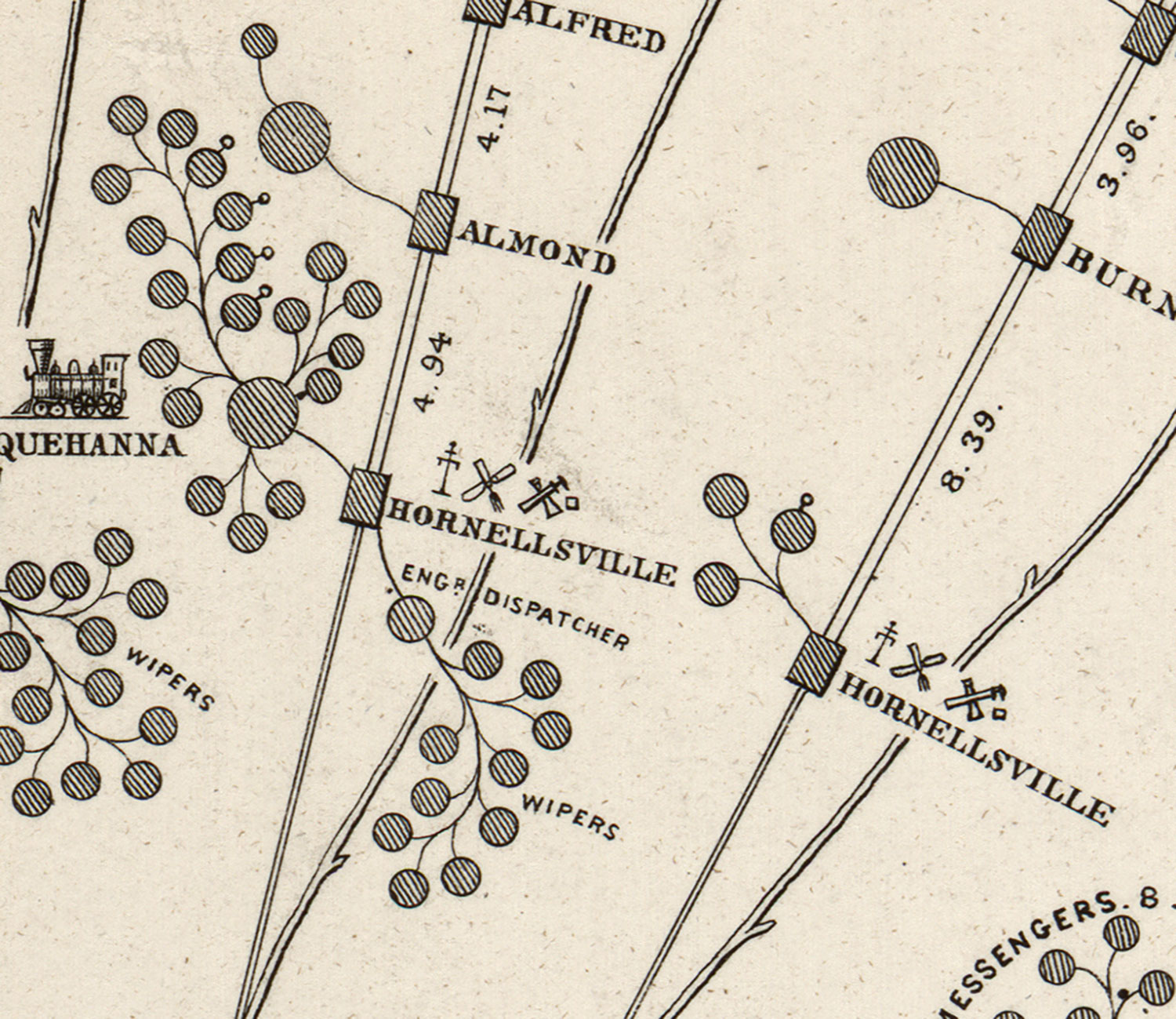
Given the number of services available at Hornellsville and the fact that they were represented as rectangles in the other area of the diagram, using a rectangle was a safe assumption. Half a small circle is visible at the bottom of the missing area, which is just about the same distance away from where a station and its agent would be for Canisteo when compared to others. Therefore, I added a rectangle for Canisteo, a larger circle, and the other half of the smaller one. I was pleased with my detective work.

However, this was the end of what I could definitively determine based on existing information. I could not find any information on the number of employees at each station beyond a casual mention of a foreman, division inspectors, subordinates and a station agent in the 1855 report (see pages 38–43). This was useful information but not as reliable as a roster or a larger report about personnel.
Below are my other attempts to track down this information:
I found a restored version of the diagram for sale on Etsy and reached out to the seller who told me that he consulted period maps and conducted his own research, later adding that he used the help of AI to reconstruct it.
I contacted the Hornell Public Library asking for any information about Erie Railroad employees around 1855 and they quickly responded saying that while they had some information on the history of railroads, I should contact the Hornell Erie Depot Museum. At first, I considered myself extremely fortunate that there just happened to be a museum dedicated to the Erie Railroad in the very town for which I needed information. Unfortunately, despite repeated emails, phone calls, voicemails, and outreach on their Facebook page, I could not get in touch with a single person either at the museum or city hall, whose phone number was the one associated with the museum. I was surprised that ended up as a dead end because I thought if anyone would know anything about my question, they would.
I broadened my search to the state level and chatted with a librarian from the New York Public Library (NYPL) who recommended I contact their Irma and Paul Milstein Division, which specializes in United States history, local history and genealogy. After doing so, they found four reports spanning 1833 to 1869 covering details about the railroad’s operations. They weren’t available remotely through their site but most were online at HathiTrust. After sifting through hundreds of pages, I couldn’t find any new information. They also provided links to Archive Grid for archival collections in other institutions, New York State Archives (NYSA), and the Library of Congress for the bulk of the New York and Erie Railroad materials. Additionally, they found the same McKinsey article by Rosenthal that I referenced at the beginning of this post and specifically called out the footnote in the aside referencing the article by Wrege and Sorbo. Finally, they recommended contacting the National Canal Museum (NCM) and the Railway and Locomotive Historical Society (RLHS). They were truly a font of knowledge and gave me a lot of avenues to explore. I’m very grateful for their assistance.
Between sending my request to the NYPL and receiving their helpful response, I contacted the Steuben Historical Society (Hornell is in Steuben County) and piqued the interest of their director but he said they didn’t have “such a thing in any comprehensive form.” He did say he would check with sources he knew about local history and would get back to me. I haven’t heard back at the time of this writing.
Heeding the advice of the NYPL, I contacted the NYSA, RLHS, and NCM. The NYSA referred me to a search on the New York State Library’s catalog for reports and maps relating to the railroad. The membership secretary at RLHS commented that I was having a hard time because “no large railroads kept central records of all their workers.” I received no response from NCM. The New York State Library stated that they didn’t have much information around railroad history and suggested I contact the Williamsburg Depot, the Railroad Museum of the Niagara Frontier, or their Manuscripts and Special Collections Unit but didn’t sound hopeful that they would produce helpful results.
The mention of Wrege and Sorbo’s 2005 article in Rosenthal’s footnote piqued my interest because it sounded like a fruitful avenue for finding information about the missing piece but also about the general history of the diagram and I was right. It reshaped my entire view of it but more on that later. With my interest elevated, I sought about finding their original article, which presented its own challenges. The NYPL mentioned that it was published in the 24th volume of the Canal History and Technology Proceedings. In trying to find that specific volume, I found records for nearly all other volumes on various sites but never the 24th. None of the the records I found for the other volumes were available for viewing online but at least there were records.
The lack of a response from the NCM is especially unfortunate because in a page on their site describing the annual symposium for which the proceedings were published, they stated,
All of the Symposium papers are available in PDF form from the Archives of the National Canal Museum/Delaware & Lehigh National Heritage Corridor. Limited numbers of some complete volumes of the Proceedings are also available at $5 per copy by ordering through www.delawareandlehigh.org.
However, there was no record of the papers for purchase on the site mentioned—another dead end.
Feeling rather defeated, I started writing this blog post and after a few pages, decided to try once again to find the now-fabled 24th volume and had another stroke of luck when I found a single record buried on the Penn State Universities Libraries site labeled as, Canal history and technology proceedings: volume XXIV March 19, 2005 / editor, Lance E. Metz. To say I was elated would be an understatement. This is the only record of that volume I found. After I chatted with one of their librarians about getting a copy of the article and they said I could request it as an interlibrary loan through my local library. I quickly did so and received a 38-page PDF of it a few days later after paying a minor $15 fee. I also was able to get the original book from which the article was scanned to see if there was any improvement in the image quality and after another few days and an additional $15 fee, I confirmed that they weren’t any different in the book.

After becoming somewhat obsessed with this diagram, this article was a gold mine. The depth of research Wrege and Sorbo did to learn about its history was a joy to read. Ironically, there’s no mention of the missing part of the scan on the Library of Congress’ site, which was a minor disappointment, but the knowledge I gained more than made up for that. Much of the introduction of this blog post was informed by its contents. The article was published in 2005 and therefore still under copyright so it cannot be freely posted here but I will send it to anyone interested—just contact me.
Since I could find no other mention of the missing piece, I decided to start making educated guesses, estimates, and exercised some creative license to fill in the last piece of the puzzle: the employees. Circling back to square one, I started with the numbers in the legend, which stated that for the Susquehanna line, there were the following employees at the stations:
- 21 agents
- 15 clerks
- 55 warehousemen, watchmen, porters, etc.
- 22 switchmen and flagmen
- 2 train dispatchers
- 2 engine dispatchers
- 35 engine wipers
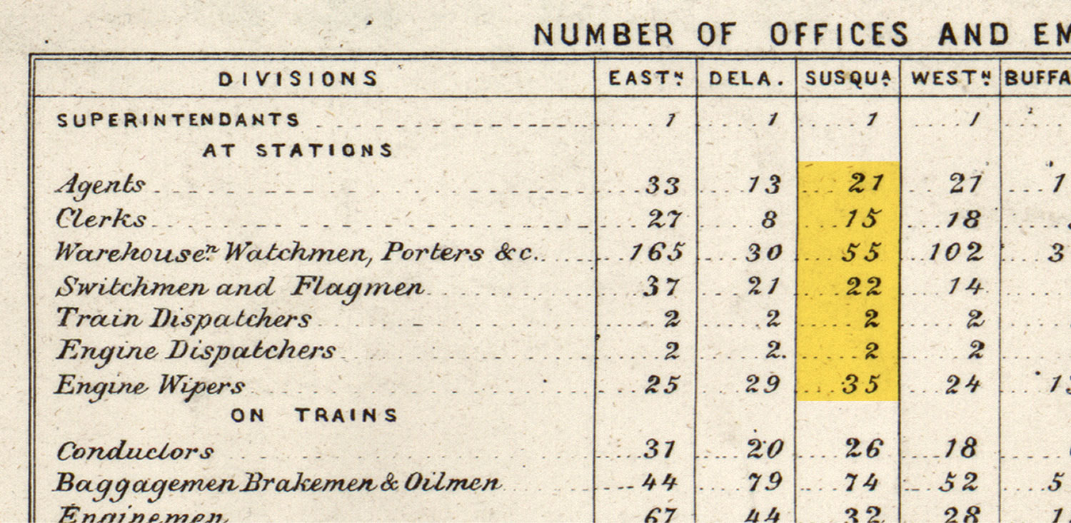
In counting the circles along the Susquehanna line, I found:
- 20 larger circles, probably indicating agents
- 1 labeled clerks connected to the general superintendent
- No warehousemen, watchmen, or porters labeled
- 22 labeled switchmen and flagmen
- No labeled train dispatchers
- 1 labeled engine dispatcher
- 26 labeled engine wipers
- 67 unlabeled small dots
The only number that lined up with the legend was for the switchmen and flagmen. However, this made some sense considering the first sentence of the explanation above the table states (emphasis mine):
This Diagram compiled from the September Reports, indicates about the average number of employeés of each class engaged in the Operating Department of the Road…
Even the September report which I found earlier doesn’t have any definite numbers for the employees along each line. So if the numbers shown were averages and no other source had information, I made some estimates:
Canisteo appeared to be a smaller town than Hornell but larger than Crosbyville so I decided to make its station a rectangle. Most stations represented as rectangles had a larger dot representing a station agent and a smaller one so created the same for Canisteo.
Hornellsville was represented two other times on the diagram—once for the Western line and again for the Buffalo line. This made sense, considering Hornellsville was a fork to two destinations: Dunkirk and Buffalo according to an 1855 map on the Library of Congress. The Western line showed an engineer dispatcher with 10 wipers reporting to them and a large circle representing a supervisor with 19 employees reporting to them—4 of which were flagmen or switchmen. The Buffalo line had fewer employees with two unlabeled small circles and one switchman of flagman because it was only a projection (Wrege, et al., 2005). Looking at all the other representations of engineer dispatchers throughout the diagram, they had an average of nine wipers reporting to them so I put one engineer dispatcher and nine wipers at Hornellsville on the Susquehanna line. A simple average of the four switchmen or flagmen on the Western line and the one on the Buffalo line produced three so I added three switchmen or flagmen to it as well. Finally, I added three unlabeled dots for an extra few personnel. Labels and connecting branches were drawn in the style of the rest of the diagram.
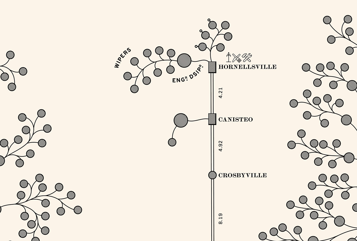
This method of determining employees was rough but I didn’t want to leave the spot empty or partially filled so this process felt appropriate given the limited information available. Port Jervis and Susquehanna are the other two examples of the same place shown in the diagram more than once with different personnel at each so this display was not without precedent.
The story almost ended here…
In fact, I wrote most of this blog post assuming I had chased down all the leads and wasn’t going to get any more information. That is, until I thought to email Caitlin Rosenthal—the author of the McKinsey which sparked this entire endeavour. In her article, she mentioned that she located a second copy at St. Lawrence University in upstate New York. In all my research, I only came across variations of the scan at the Library of Congress. Even the file page on Wikipedia for the diagram and all pages referencing it don’t include a mention of another copy. I asked her if she remembered anything about it and while she didn’t, but she did point me to a listing of maps in the special collections department at the university’s Owen D. Young Library where the diagram was listed (fourth line from the bottom of the second page). That prompted me to leave voicemails and send emails to the team there asking if they knew about it and if they could send me a picture.
To my surprise, they sent me back two pictures of their copy—beautifully intact and one of them contained the very piece I spent weeks trying to track down.
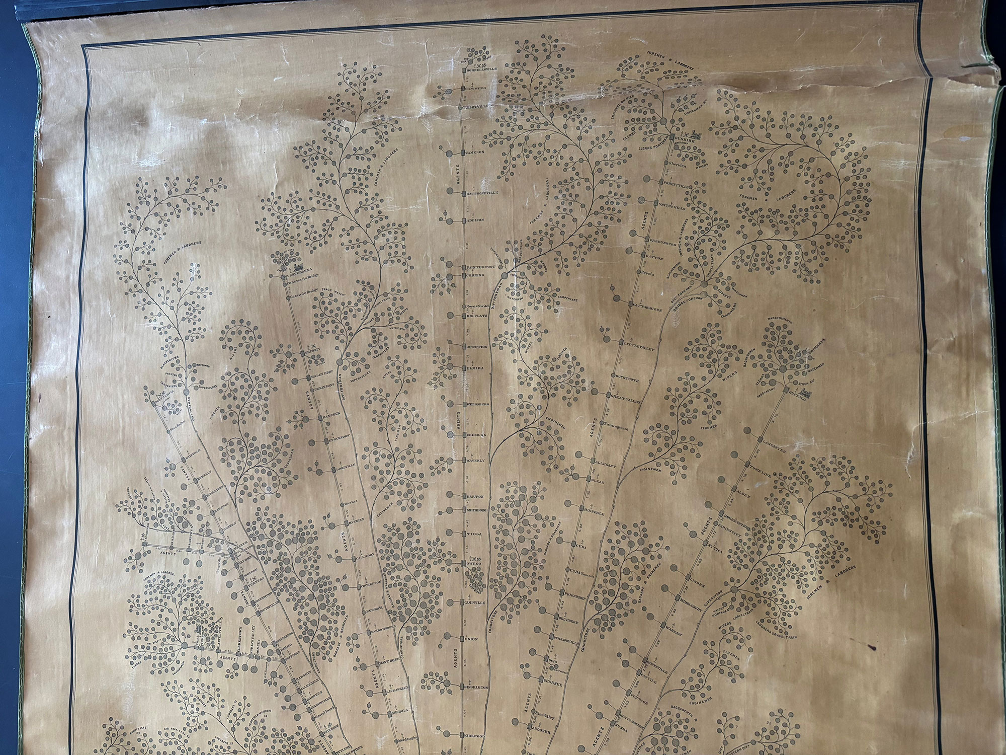
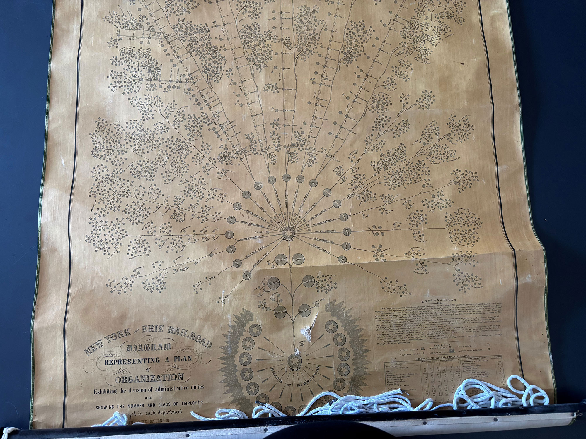
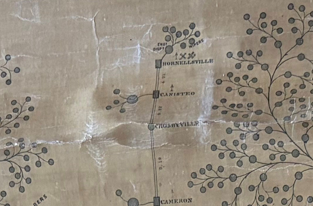
To say I was excited would have been a great understatement. I was over-the-moon thrilled that I tracked down not only a second original copy, but that it also had the missing piece and I was able to get pictures of it so I could complete my restored diagram. To my knowledge, these pictures are the first to be shared online of this second copy. I acknowledge that could have saved myself a lot of work by emailing Caitlin in the first place but I wouldn’t have learned as much as I did or developed an appreciation for the diagram and its history if I hadn’t tracked down the original article and done all the extra research. The journey was the best part of this project.
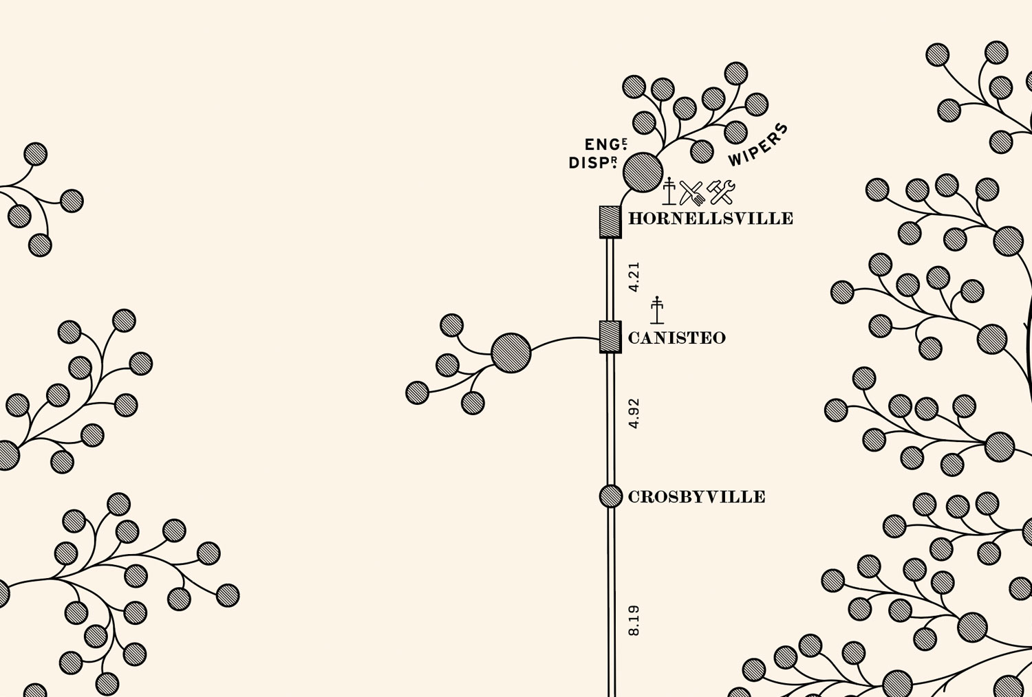
I was also pleasantly surprised to see that my reconstruction wasn’t that far off base from the original. I correctly figured out the station names, distance between them, types of stations, and the fact that Hornellsville had an engine dispatcher with the nine wipers.
Final thoughts
I adored working on this project. It was small, relaxing, surprisingly interesting, and had an incredibly satisfying ending. The posters only took a few weeks to create and I explored a lot of great typography in the process. The deep dive into its history was unexpectedly exhilarating. I spent more than twice the amount of time researching it than creating the posters and I learned more than I ever imagined. Finally filling in the missing piece felt like something out of a movie. Writing this blog post was a joy because I loved to piecing together all my research to share with others.
I appreciate my friends and family enduring my rambling about my latest discoveries. My sincerest thanks goes out to the librarians who helped me with research and pointed me in new directions I would have otherwise never discovered. Librarians are truly the unsung heroes of many research projects.
My hope is that by publishing this blog post and offering my posters for sale is that I introduce this fascinating little slice of American history to others and fill in a very minor but long-standing gap for others doing research in the future.
References
- Chandler Jr., A. (1977). The Visible Hand: The Managerial Revolution in American Business.
- Wrege, C., & Sorbo Jr., G. (2005). A Bridge Builder Changes a Railroad: The Story of Daniel Craig McCallum. Canal History and Technology Proceedings, XXIV, 183–218.
