Chapter XII
German Types: 1500–18001
I. Examples of German Printing
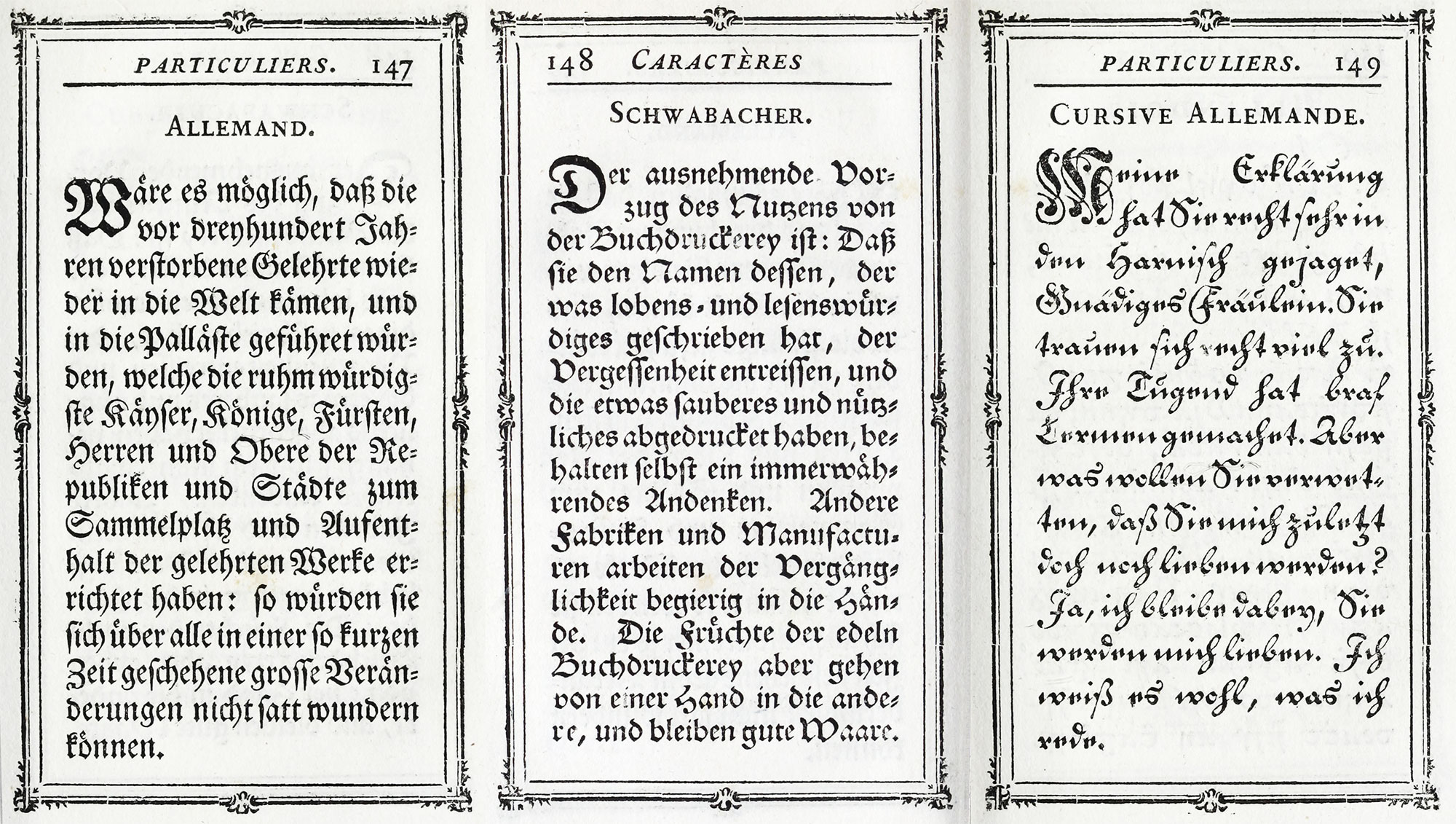
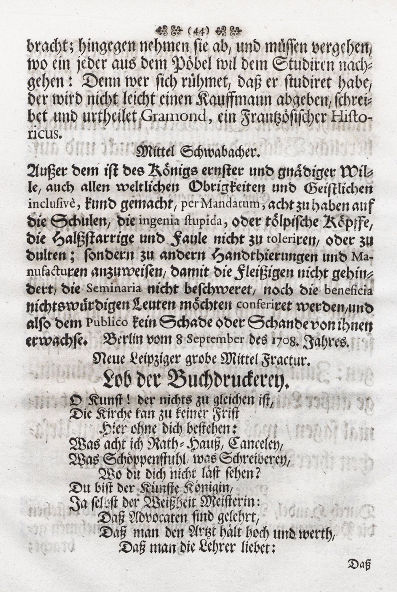
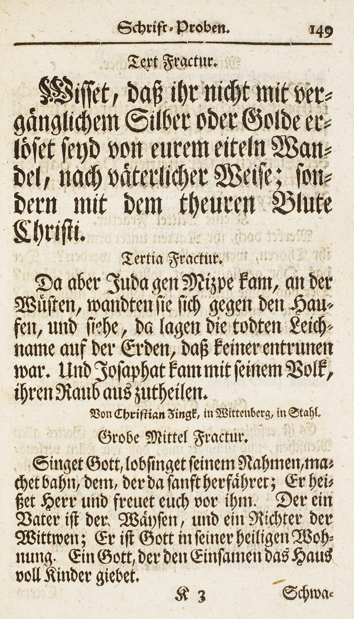
In fifteenth century German gothic or black-letter fonts, a differentiation of type-faces began to show itself, as we have seen, in the last twenty years of the century, between types that were somewhat pointed—like lettre de forme—and a rounder, more cursive gothic letter, with certain peculiarities—the closed a, looped b, d, h, and l, and a tailed f and s.
The first type was called “fraktur.” The second—in its original intention a kind of vernacular type, which became very popular from 1490 to 1500—was ultimately known as “schwabacher.” Although there were many variants of these two type-forms, they are the ancestors of the two varieties of gothic character shown to-day in German specimen-books under the same names. Of these two type-families, the first developed with extreme rapidity, while the second retained more or less its primitive features. We are so accustomed to identify styles with periods, that we forget that there is no sharp distinction between the end of one style and the beginning of another; and that the tendency which brings about a change of style exists for a long time before it comes to its hey-day, and survives a long time after it has gone out of fashion.
§1. XVI Century
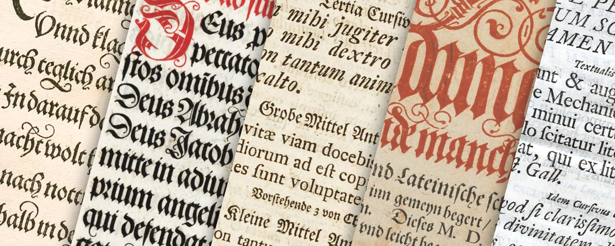
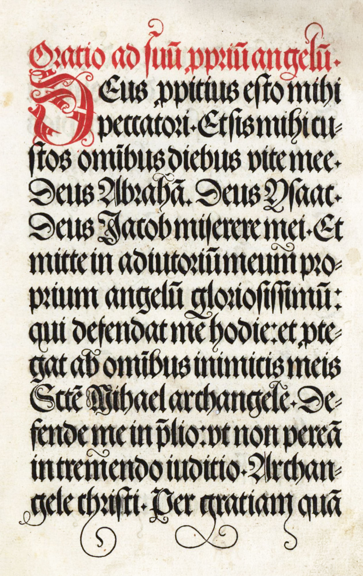
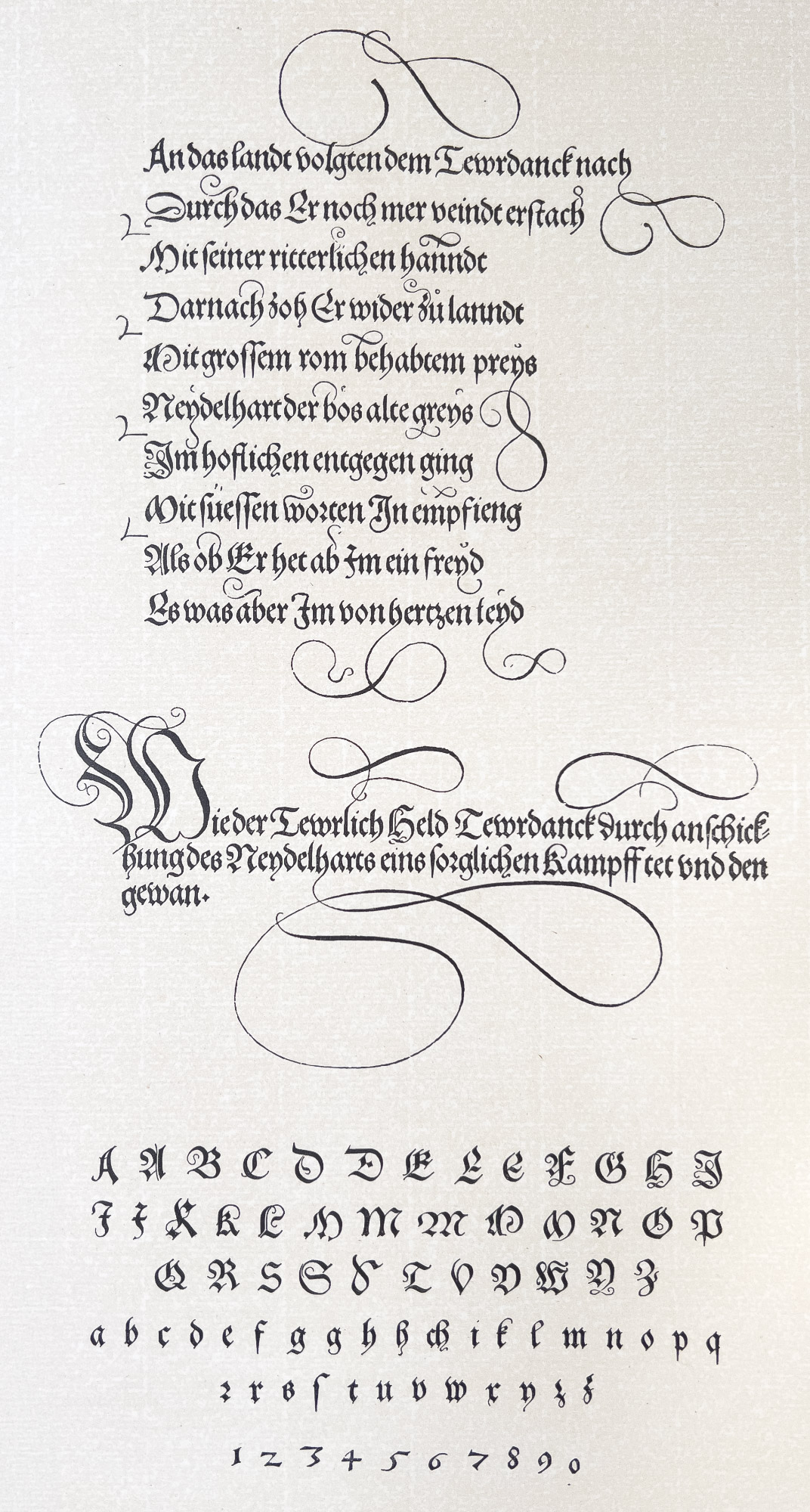
Fraktur—the pointed form of these two types—is the first to be considered. A Diurnale, printed at Nuremberg by Hans Schönsperger in 1514 (fig. 73), is a splendid example of early fraktur, though the type has too much variety of form. The descending f’s swindle to the form of pegs; flourishes on capital letters and the tails to the g’s and h’s are all too restless, and the eccentric curves in rounded portions of capital letters are in form particularly disagreeable and vulgar. Special characters were cut for this font, intended for use in the last line of a page, so that their “curly-cues” could project into its lower margin, just as there was a set of letters with friskings, intended to gambol over the margin at the top. The classical example of this kind of type is that shown in the same printer’s Story of the Knight of Teuerdanck (a poem of chivalry of very indifferent merit), composed in honour of the marriage of Maximilian and printed at the Emperor’s expense at Nuremberg in 1517 (fig. 74). It took five years to prepare, and in some cases punches were cut for seven or eight varieties of a single letter, and when proofs were first shown, printers could not believe that it was composed from movable characters. Ingenious and splendid as is the effort of the type-cutter to imitate the work of the pen, the result scarcely seems worth the trouble. It was a tour de force and cannot be considered an example of normal type-work.2
73. Type used in Diurnale: Schönsperger, Nuremberg, 1514
From Druckschriften des XV bis XVIII Jahrhunderts (facsimile), Oratio ad suu[m] proprium angelu[m] (scan)
74. Type used in Teuerdanck: Schönsperger, Nuremberg, 1517
From a copy in the Library of Congress, Washington
In the pages of the Teuerdanck the style of gothic type changed entirely, and the simpler forms of the older fraktur were twisted into less agreeable shapes. These types are characteristically German—which is, artistically, seldom a compliment! An idea of sixteenth century fraktur can be had from the Thurnier Buch, printed at Frankfort in 1566 by Sigmund Feyerabend,3 a page of Löneissen’s Von Zeumen of 15884 (without place or printer), and the title-page from the Strassburg Fundamentbuch of 1579, printed by Bernhard Jobin (fig. 75). On this page the third to sixth and eighth to tenth lines are printed from type, the form of which is nearer to the German types used three hundred years later, than to those of a hundred years before. It is a distinct decline from the purer gothic letter. In this title-page the decorated letters are cut on wood, but their tormented forms are really what the typographer would have been glad to find in type. Later this ambition was fulfilled. These types commended themselves to the rank and file of German printers, and became the ancestors of the modern German fraktur. The difference between fifteenth and sixteenth century German fraktur may be seen in our illustration (figs. 76a and 76b).
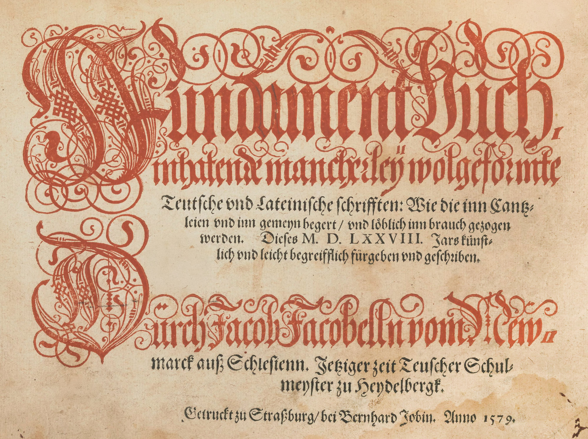
75. Title-page of Fundamentbuch: Jobin, Strassburg, 1579
From Druckschriften des XV bis XVIII Jahrhunderts (facsimile), Fundament Buch inhatende mancherleÿ wolgeformte Teutsche vnd Lateinische schrifften (scan)
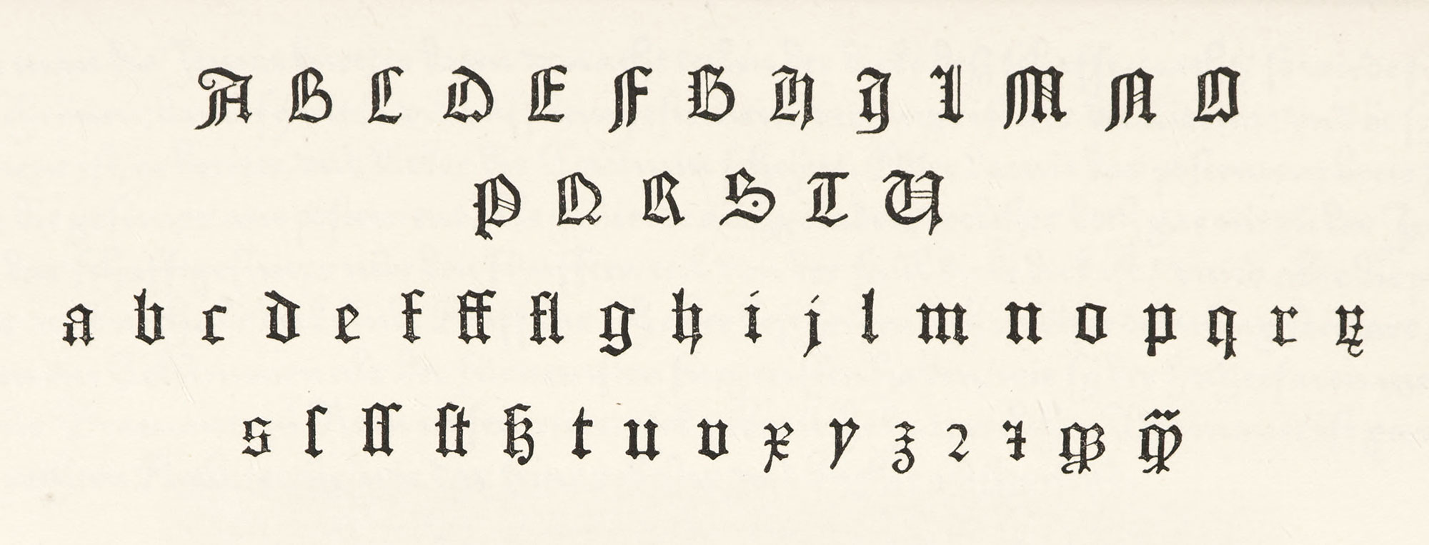
76a. Alphabet of Fifteenth Century Fraktur used by Neumeister, Mainz, 1479
From Druckschriften des XV bis XVIII Jahrhunderts (facsimile), Meditationes, seu Contemplationes devotissimae (usage)
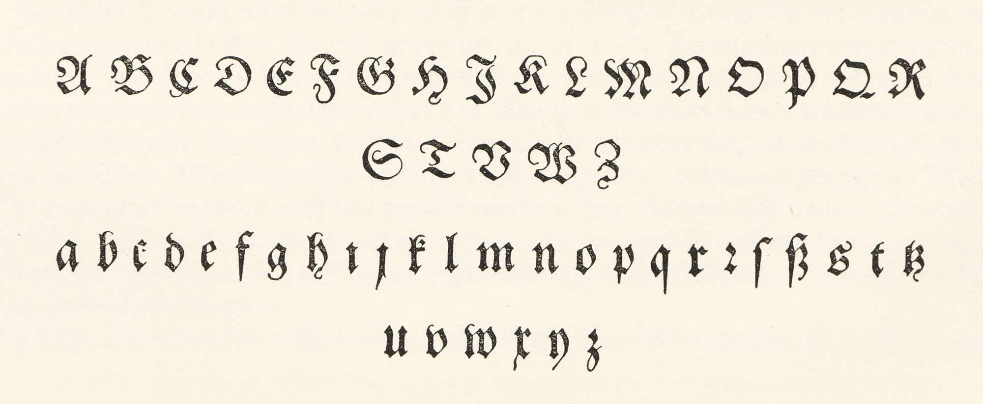
76b. Alphabet of Sixteenth Century Fraktur used by Feyerabend, Frankfort, 1566
From Druckschriften des XV bis XVIII Jahrhunderts (facsimile), Thurnier Buch (usage)
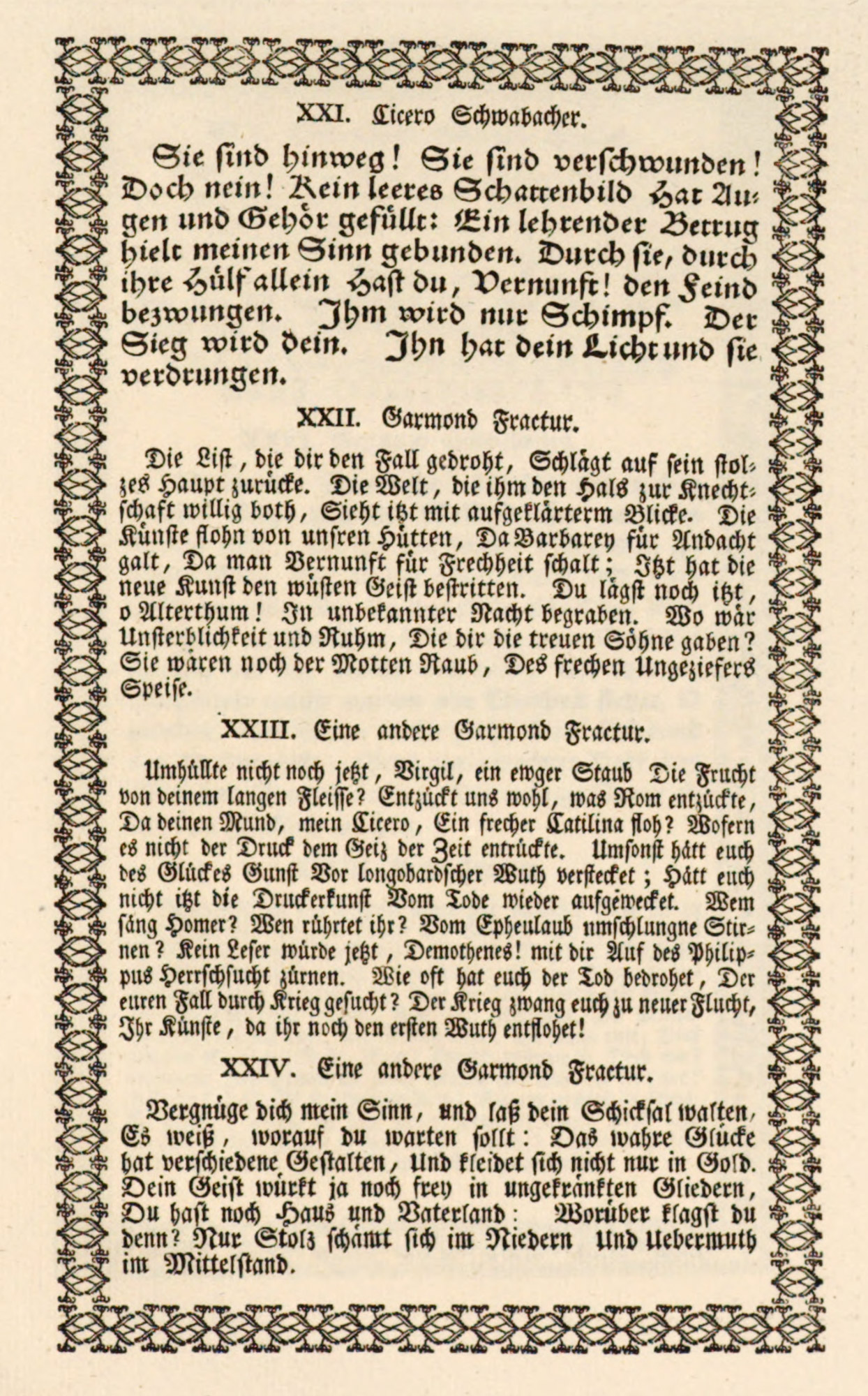
For the fraktur of the first half of the sixteenth century a good example is shown in Lied auf die Schlacht von Pavia, printed in 1525.5 By the seventeenth century the fraktur type-form had practically crystallized, and the changes that occur in it are not sufficiently marked to make it worth while to pursue its history very carefully. Almost any German seventeenth century book shows its usual style. Here we shall leave it, for the moment, to consider the character called schwabacher.
There were many kinds of schwabacher type. We find a form of schwabacher used in 1509 by Johann Schoeffer at Mainz in his Reformacion der Stat Franckenfort.6 Much the same sort of type—perhaps a little more pronounced in its schwabacher form—was employed by Chrystoph Froschauer at Zurich in 1567 in his Kunstrich Buch (fig. 77). The paragraph in a cursive type imitated the German handwriting of that period—a fussy, restless kind of character, which is distracting to the eye and has somewhat the appearance of ravelled carpet-threads.7 In Leonhardt Thurneysser zum Thurn’s Historia…aller…Erdgeweschssen, printed at Berlin by Michael Hentzsken (fig. 78), a schwabacher type is used. This last book shows the rate at which both type and composition went downhill after the middle of the sixteenth century—very far from the simplicity of a hundred years before. Pages composed in schwabacher have head-lines set in tortured forms of fraktur, and words in italic capitals are introduced into lines of black-letter. Then again, italic is employed for Latin terms and names in the midst of black-letter text, and the notes are a muddle of roman and black-letter characters. Paragraphs are indented, and yet paragraph marks are used. Even the hands and asterisks which mark the paragraphs are ugly in form. Everything about the composition is bad!
77. Cursive and Schwabacher used by Froschauer, Zurich, 1567
From Druckschriften des XV bis XVIII Jahrhunderts (facsimile), Ein kunstrych Buoch von allerley Antiquiteten (scan)
78. Types used by Hentzsken, Berlin, 1578
From Druckschriften des XV bis XVIII Jahrhunderts (facsimile), Historia vnnd Beschreibung influentischer, elementischer vnd natürlicher Wirckungen, aller fremden vnnd heimischen Erdgewechssen (scan)
As to the sixteenth century roman types used in Germany, Johann Schoeffer of Mainz printed in 1520 Ulrich Hutten’s De Unitate Ecclesiæ Conservanda in a heavy roman type of a kind very common at that period, a page of which is reproduced (fig. 79). The same printer in 1525 issued the Canones Apostolorum in a larger and better roman character, accompanied by a charming italic. While the composition of the page was too fanciful for so solid a letter, it is an elegant piece of work, and the types are finer than most contemporary roman fonts.8
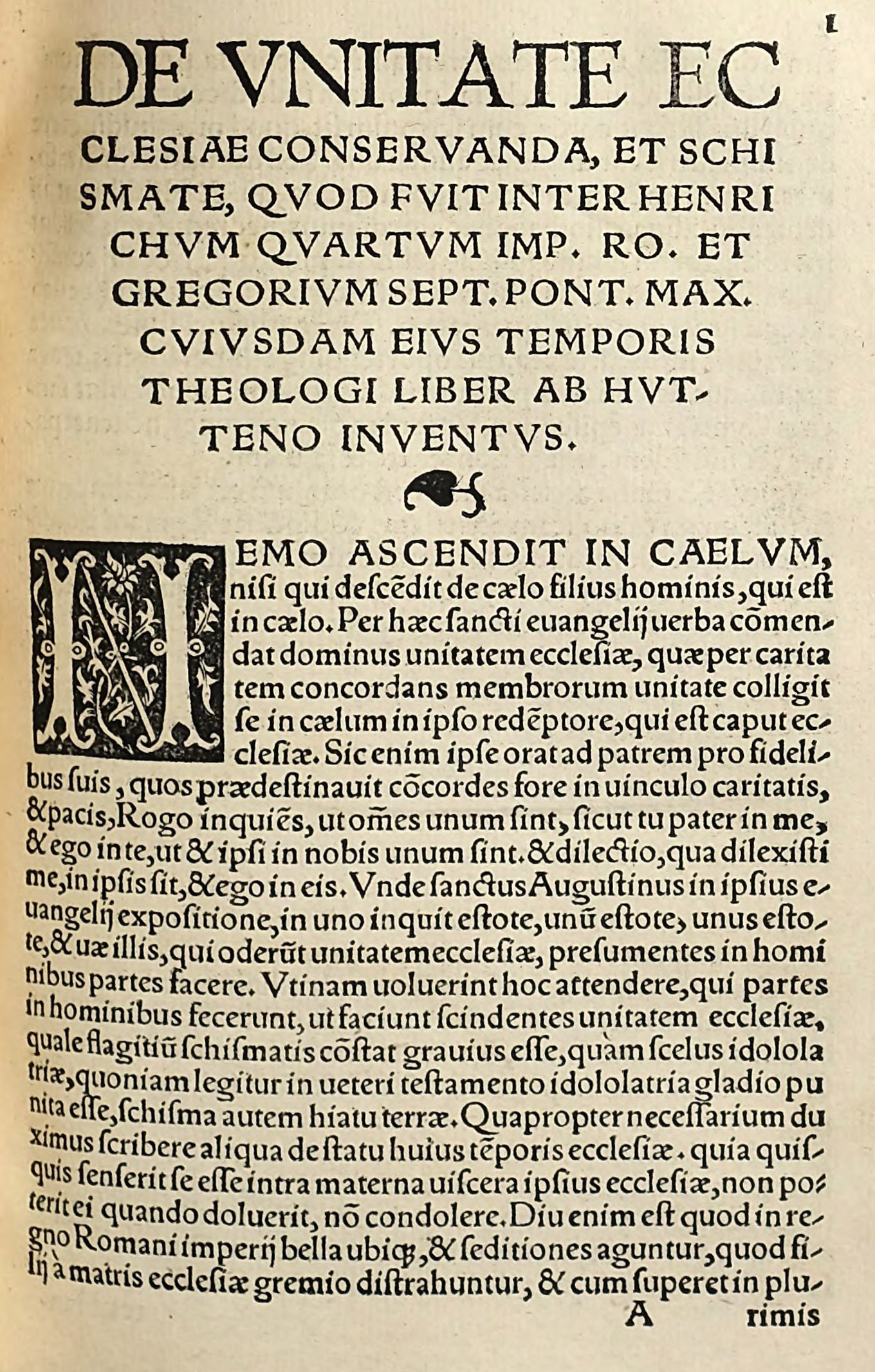
79. Roman Type used by Schoeffer, Mainz, 1520
From a copy in Harvard College Library (facsimile), De Unitate Ecclesiae Conservanda (scan)
One city that stands out splendidly in the work of the sixteenth century German press is Basle. The great figure in printing there was Froben (1460–1527), who set up his printing-house as early as 1491; but who is now chiefly remembered by his association with Erasmus after 1514. Erasmus lived with Froben while some of his books were in the press, and this was the great period of the office. Among Froben’s foremost achievements were the first published edition of the New Testament in Greek, with a new Latin translation by Erasmus, issued in 1516, and the editions of Jerome, Ambrose, Tertullian, and Cyprian which Erasmus supervised. Erasmus’s own books were also printed by Froben; and a portion of a page from Adagiorum Opus D. Erasmi Roterodami is reproduced (fig. 80). The massive and monumental sort of roman type which Froben used, often combined with splendid, rich borders and initials in close harmony with it, made books of great dignity and style, which scarcely miss—but none the less to lack—real beauty.
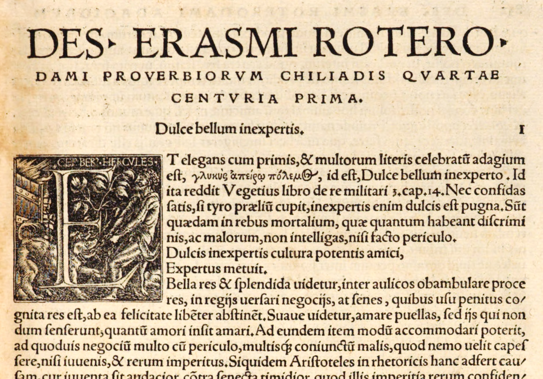
80. Roman Type used by Froben, Basle, 1526
From a copy in Harvard College Library (facsimile), Adagiorum Opus D. Erasmi Roterodami (scan)
In the group of distinguished printers there, were Oporinus, printer for Luther; Petri, Episcopius, Cratander, Curio, and Bebel. Their editions, especially the folios embellished by brilliant decorations and initials by the Holbeins, Urse Graf, and other designers, will repay study. It is easy to recognize most Basle books of this period by their heavy roman type, very solidly set, and by certain typographical peculiarities of arrangement.
There are of course exceptions, such as the magnificent folio De Humani Corporis Fabrica of Andreas Vesalius, printed by Oporinus in 1553—a volume not at all of the Froben order, but reminiscent rather of Plantin or some Italian printer. Its noble old style and delicate italic, delightful initial letters and careful anatomical engravings, and a famous title-page “The Anatomical Chamber” (attributed to Titian but by Giovanni Jan Stephan de Calcar), make up a fine and unusual remarkable volume.
The closeness of the type-setting is noteworthy and recalls much earlier books, and its presswork is uniformly good.
Erasmus’s Latin translation of the New Testament, printed in italic by Froben in 1521, in a square 12mo, is an interesting example of one of Froben’s small formats, and its brilliant decorations make its little pages almost “sing.” The divisions are usually marked by captions in spaced capitals used in Froben’s characteristic way. This edition was dedicated by Erasmus to Leo X (fig. 81). Erasmus’s tractate, Antibarbarorum—a small quarto issued by Froben in 1520, printed from roman fonts, with decorations by Holbein—is another example of Froben’s smaller books.9
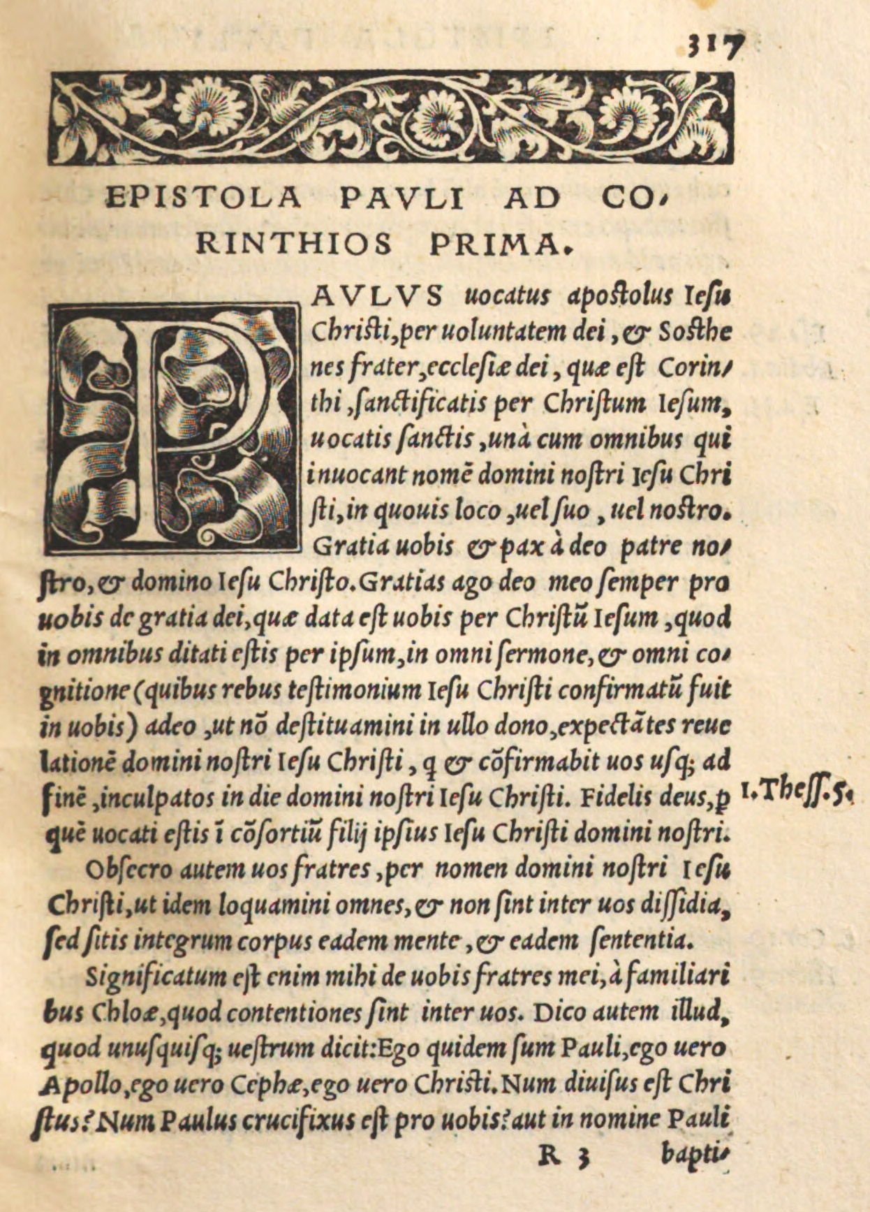
81. Italic in Erasmus’s New Testament: Froben, Basle, 1521
From a copy in Harvard College Library, Munich Digitization Center (scan)
The Officina Isingriniana at Basle was responsible, in 1542, for a wonderful botanical book—Leonhard Fuchs’s De Historia Stirpium—which has various features worth notice. For the preface it employs a brilliant Venetian italic (for example, see fig. 104), which on these folio pages is most effectively displayed. The indexes of plants in Greek, Latin, and German are set respectively in Greek, roman, and fraktur types, four columns to a page. The text-pages follow, composed in the characteristic heavy, squarish roman type affected by Basle printers; the divisions of name, genera, form, place, time, etc., under each plant being set in lines of small spaced capitals. The glory of the book is its delightful outline plates of plants, cut on wood by Veit Rudolph Specklin, which in freedom and truthfulness are beyond praise. In some copies these are carefully coloured. A full-length portrait of the author backs the title-page, and a pleasant touch is given at the end by representations of the two designers, Füllmaurer and Meyer, at work, with flowers before them, while a conceited-looking gentleman—the “sculptor” Specklin—appears to be impatiently waiting for them to get through!
A beautiful edition from Henric Petri’s press is a work by Henricus Loritus (called Glareanus from his birthplace, Canton Glarus), entitled Dodecachordon. This was written to prove that there were twelve ecclesiastical modes identical with the ancient Greek modes in music. To illustrate this the printer employs some very interesting music types. At the top of the massive pages the title is arranged in a condensed lower-case Italian letter which gives great elegance to the work. This book (of its kind one of the most distinguished that I know) was printed in 1547.
The rough specimen of Joh. Petri (fig. 82) shows the kind of roman and italic used in Basle printing-houses, but the successful manner of its use can be realized only by seeing such books as I have mentioned. Besides three sizes of roman and two of italic (the largest size of each much like Schoeffer’s), the sheet displays a Greek font and some Hebrew type. The fraktur at the bottom is very characteristic in its ugliness. Published in 1525, it is, except for Ratdolt’s the earliest specimen-sheet known.
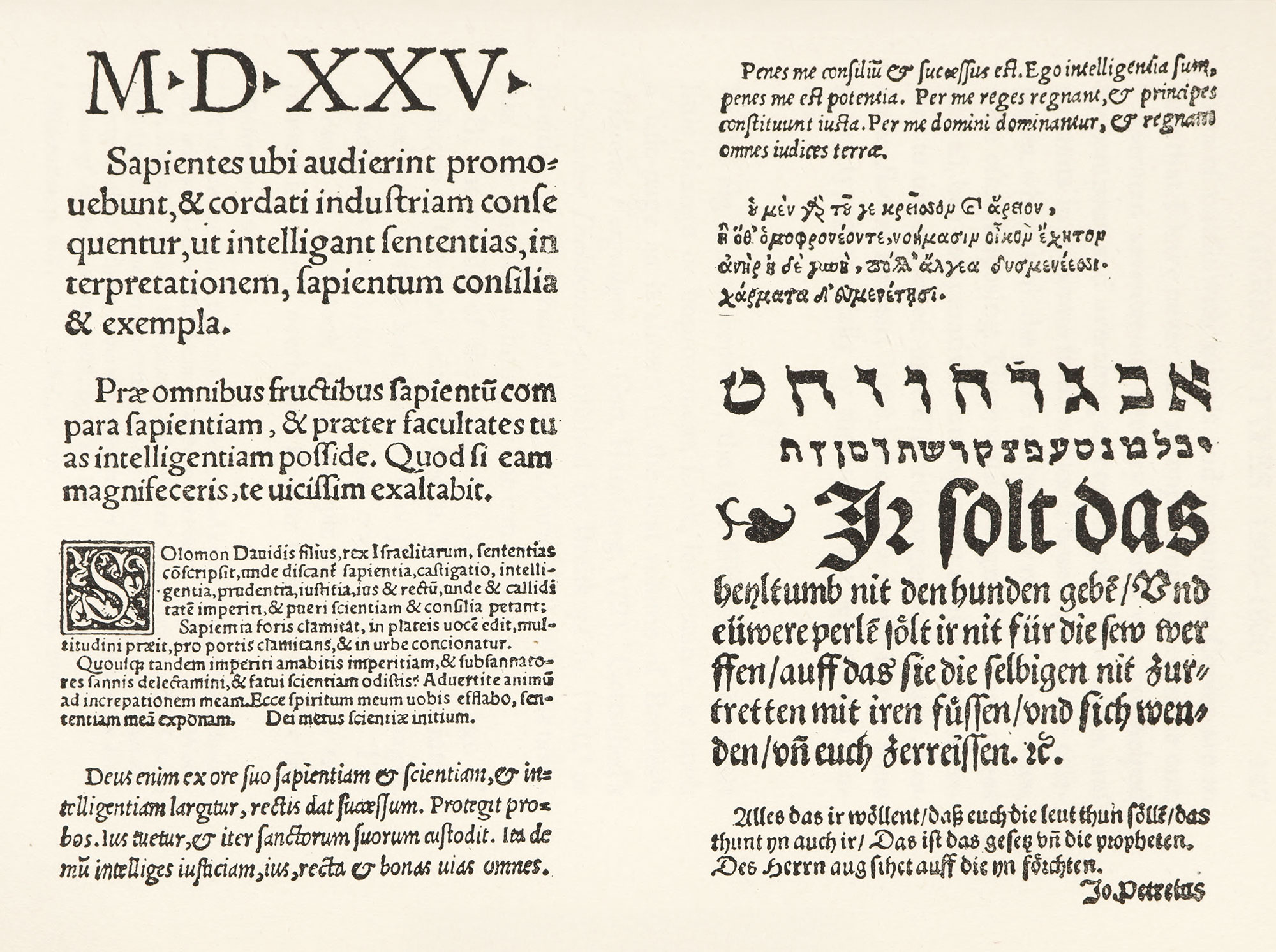
82. Specimen of J. Petri, Basle, 1525
From facsimile issued by K. Burger
At the end of the sixteenth century, the use of roman letter, or “antiqua” as it was, and is, called in Germany, became less frequent, and in the seventeenth century it was comparatively little used. By the beginning of the eighteenth century it succumbed to the popular taste for fraktur—though to be revived a little later.
By about 1550, both fraktur and schwabacher types had taken on very much the general appearance of their modern German equivalents, except that they were heavier and more masculine in appearance. Luther’s German Bible of 1534 shows a title-page set in a heavy, vulgar sort of fraktur,10 and its opening page of the Psalter is set in schwabacher types of characteristic form. The Fabeln of Burkhard Waldis, printed in 1550, shows again a typical form of fraktur,11 as does the text of the same writer’s Ursprung und Herkumen der zwölf ersten alten König und Fürsten Deutscher Nation.12
The German books of this period are discouraging typographical productions. Their general character may be seen by glancing at the rank and file of German folios in any library which owns a collection of sixteenth century German books. The curious may investigate perhaps with some profit (but with little pleasure) the Hohenzollern Collection illustrative of German history given to the library of Harvard University by Mr. Archibald Cary Coolidge in 1902. But for most people, a glance at the pages devoted to this period of Könnecke’s Bilderatlas will be enough. The title-pages in which red is so unsparingly introduced are typographically as tasteless and bad as they can be, and exhibit a “frightfullness” which leaves nothing to be said.13 As the century went on, the work seems even worse. The Historia von D. Johann Fausten printed at Frankfort in 158714 and other editions of the same work are very ugly and very obviously Teutonic.
§2. XVII Century
The elaborate specimen of George Leopold Fuhrmann of Nuremberg shows the types in use in the early years of the seventeenth century in a well-known German printing-house. This book was published in 1616. Its introduction gives an account of the origin of printing and its chief promoters. The fonts which are shown comprise six sizes of black-letter, ten of roman and italic, two of Greek, and four fonts of music with initials and ornaments. Copies are so rare that I have never had an opportunity to examine one.
German seventeenth century printing was not helped by pompous and overcharge copper-plate title-pages, and portraits in elaborate frameworks. These copper-plate title-pages, which took the place of the older red and black titles, were often imposing. There were typographical title-pages as well, but comparatively unimportant affairs, supplementary to the engraved title. The title-pages in Zeigler’s Asiatische Banise, Leipsic, 1689,15 show how badly things were going typographically by the end of the seventeenth century.16
§3. XVIII Century
In the eighteenth century, the first fifty years show but little change or improvement. Look, for instance, at such a title-page as is shown in the first volume of Broctes’s Irdisches Vergnügen in Gott, Hamburg, 1721,17 Gottsched’s Critischer Dichtkunst, published by Breitkopf in 1730,18 or Breitinger’s Dichtkunst,19 issued at Zurich in 1740—as tasteless and muddled printing as one can conceive.
By the middle of the eighteenth century, a change of fashions in German printing began. Vignettes were introduced and a little less matter was put upon title-pages. Anaemic roman types were also occasionally used. The Messias of Klopstock is an example of a book with text printed in vulgar, overblown fraktur types, with very few words on the title-page (fig. 83). Such an aesthetic writer as Winckelmann allowed his Geschichte der Kunst des Alterthums to appear (at Dresden in 1764) in a very hideous and typical German characters (fig. 84). If a well-known printer wrote and printed a book about printing, one would certainly expect him to execute it as well as he knew how; and perhaps Breitkopf did, but his quarter volume Ueber die Geschichte der Erfindung der Buchdruckerkunst, published at Leipsick in 1779, is printed on miserable paper, in ugly fraktur type, poorly composed—a volume such
As to be hated but needs to be seen.
At the end of the century, still lighter and weaker types and styles were in vogue. Lessing’s Nathan der Weise in 177920 shows the general feebleness of taste. Herder’s Briefe, published in 1793, shows the fraktur types which had come to be the fashion.21 As early as 1775 a general desire for light types had influenced the forms of fraktur itself, as in J. G. Jacobi’s Iris, evidently imitating—very unsuccessfully—contemporary French printing (fig. 85). Some of the pale, condensed fraktur used at this period was probably influenced by those French condensed poétique types made fashionable by Fournier and Luce. The attempt to imitate French work was also owing, in some degree, to that fashion for things French encouraged by Frederick the Great, who—after those earlier tentative plans mentioned by Fournier had come to nothing—established about 1767, through his court printer, Decker, a foundry and printing-house, fashioned after the Imprimerie Royale de France. The Parisian founders Gillé, Fourner, and Didot, and Bodoni of Parma were among those who supplied, either then or later, much of its material.
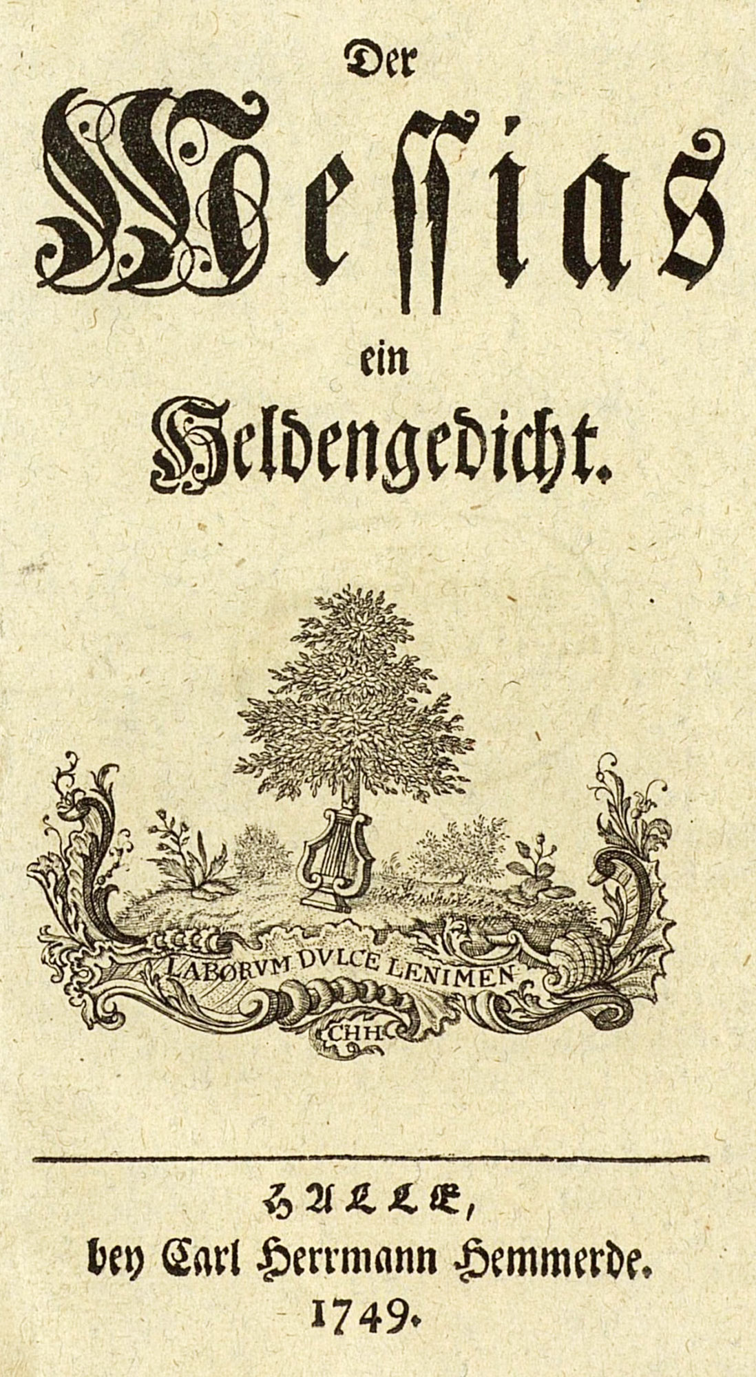
83. Title page of Klopstock’s Messias: Halle, 1749
From Könnecke’s Bilderatlas zur Geschichte der deutschen Nationalliteratur (facsimile), Deutsches Textarchiv (scan)
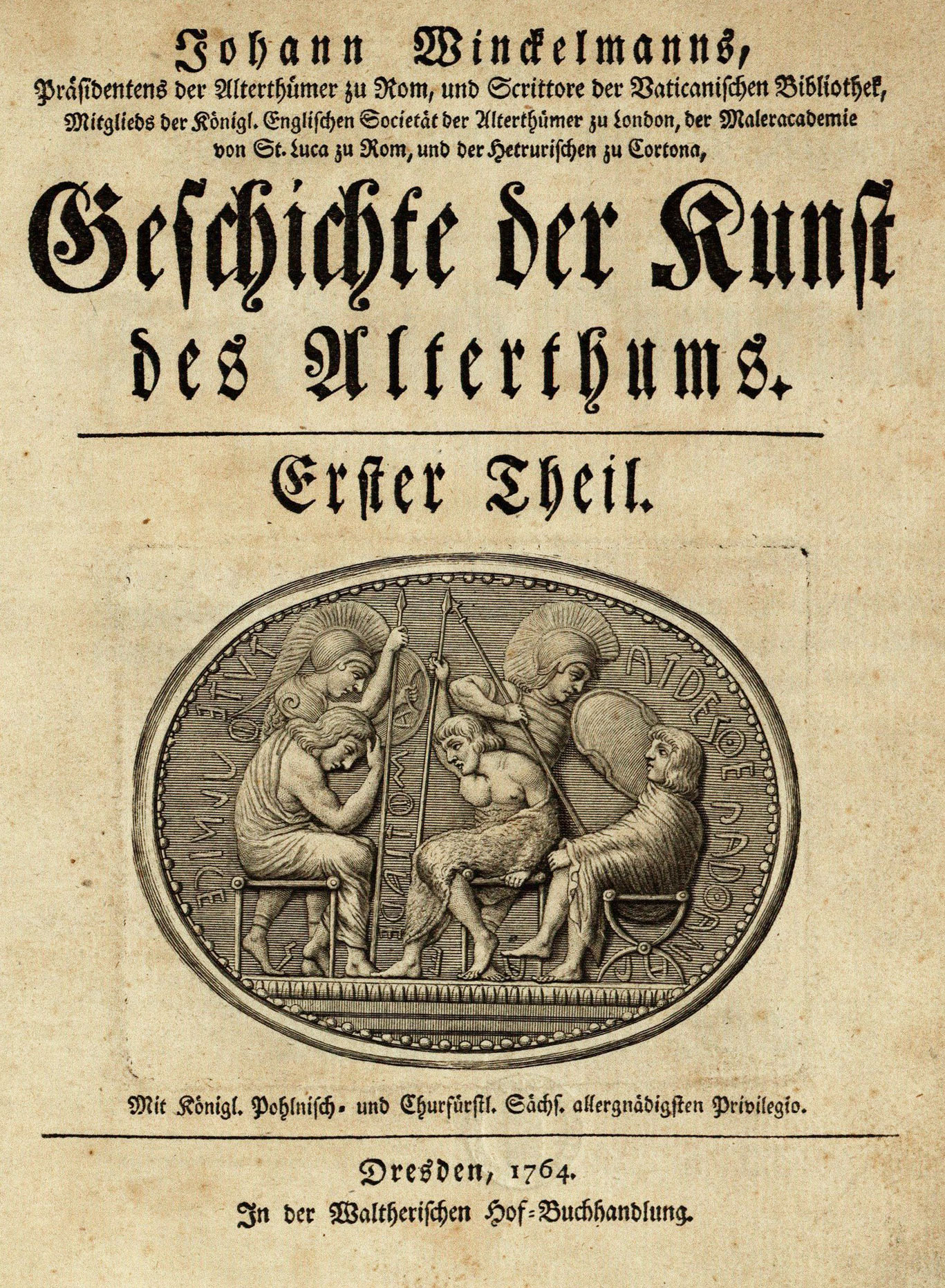
84. Title-page of Winckelmann’s Kunst des Alterhums: Dresden, 1764
From Könnecke’s Bilderatlas zur Geschichte der deutschen Nationalliteratur (facsimile), Deutsches Textarchiv (scan)
85. Pages of Jacobi’s Iris, Düsseldorf, 1775
From Könnecke’s Bilderatlas zur Geschichte der deutschen Nationalliteratur (facsimile), Munich Digitization Center (scan)
The printers and publishers who took a principal rôle in fostering the incoming taste for lighter types and more open composition which marked the beginning of the nineteenth century were Goschen and Unger, and perhaps the publisher Cotta of Tübingen, whose imprints figure on many publications of the period. Georg Joachim Goschen (1752–1828) was the publisher of the first edition of Goethe’s Faust, the title-page of which is reproduced (fig. 86), and which speaks—or “whispers”—for itself. Goschen was a painstaking printer and a learned man; but he is not much remembered nowadays, though he took an important part in the revival of fine printing as then understood—notably in his editions of Wieland. On such title-pages as his Faust or Unger’s Wilhelm Meister (fig. 87) we see how little was put on the title-page, how poorly that little was placed there, and in what dejected looking characters it was printed—all that remained of fifteenth century German fonts after the repeated whittlings of these enlightened gentlemen!
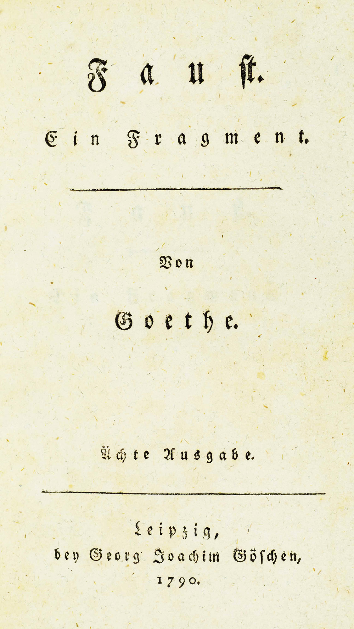
86. Title-page of first edition of Faust: Goschen, Leipsic, 1790
From Goschen’s Life of George Joachim Goschen (facsimile), University of Dayton (scan)
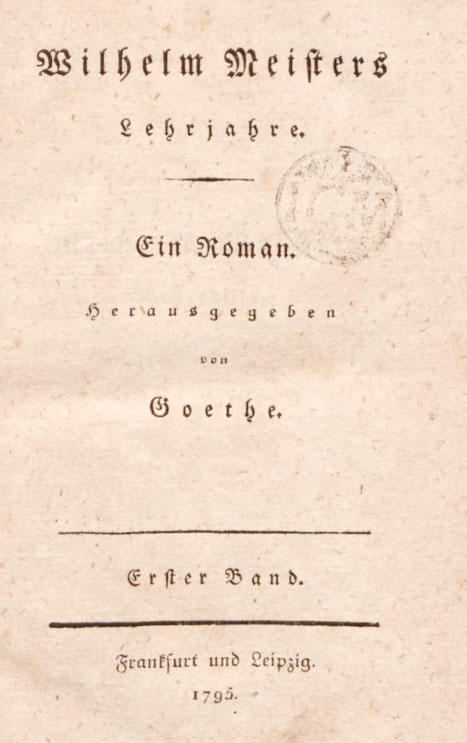
87. Title-page of Wilhelm Meister: Unger, Berlin, 1795
From Könnecke’s Bilderatlas zur Geschichte der deutschen Nationalliteratur (facsimile), Internet Archive (scan)
As will be noted, almost all the letter-forms employed in these later title-pages and books were fraktur, the schwabacher seeming to be replaced by its less than attractive rival, which in turn was giving way before the fashion for Didot roman types, which were carrying everything before them.
II. German Foundries and Specimens
We have a contemporary account of type-founding in Germany and Prussia by Fournier, who in the year 1766 wrote:
Germany, the cradle of Printing, has successfully cultivated the art, by establishing several celebrated foundries, which are usually richer in material than those of other countries, because, in addition to the ordinary types common to other foundries, those have been added which are peculiar to that peculiar country, like the German characters called Fracture [sic] and Schwabacher, which it is necessary to have in all sizes (fig. 88).
At Vienna there are two foundries, of which one brought from Venice belongs to M. Trattener [sic], founder and printer to the Emperor.
At Frankfort-on-the-Main, there are also two; the most important, which is very employ provided with ancient and modern characters, is known under the name of the Lutheran Foundry. It belongs to M. Luther, descendant of the famous Luther, so well known to the Christian world. It is furnished with sets of matrices by French artists.22 The other, according to the specimens issued in 1714, belonged to Jean Henry Stubenvoll.
At Leipsic there are three foundries; the first and the most considerable is that of M. Jean Gottlob Emmanuel Breitkopf, type-founder and printer. It is the most interesting foundry that I know of in Germany, on account of the number and variety of its ancient and modern types, its music types and its ornaments. The better of the two others belongs to M. Hr. Erhardt; it is fairly well equipped with both Latin and German characters.
At Basle there are two foundries; the first, which is very noted for the number and variety of its types, of which some came from French masters, and of which new specimens were issued in 1721, belonged at that date to M. Jean Pistorius, founder and printer. The other, the stock of which is made up of types more modern in cut, belongs to M. Haas, a very celebrated type-cutter. The other German foundries are as follows: to wit, two at Halle, two at Nuremberg, one at Wittenberg, one at dona, one at Erfurt, one at Brunswick, one at Lüneburg, one at Cologne, one at Augsburg, one at Prague, one at Stuttgart in Wurtemburg.
Prussia had no type-foundry until 1743, when one was brought from Brunswick. It was of little value and was established in Berlin. This foundry not succeeding, a man named Kanter started another in the same city, equipped with fonts from the Breitkopf foundry at Leipsic and the Zinche foundry at Wittenberg; its stock has since been increased by other types made by a certain Gallner, a rather tasteless and unintelligent type-cutter.
The King of Prussia, wishing to establish a Royal Printing-House at Berlin modelled on that of the King of France, gave orders to procure at Paris the punches, moulds, and matrices necessary for a foundry, which was to form the nucleus of such an establishment. M. Simon, printer to the Archbishop [of Paris], being consulted about this undertaking, wrote and printed in 1741 a Projet d’établissement d’une Imprimerie Royale à Berlin, which was sent to the King, with a recueil of my types, intended to equip this foundry. This scheme having fallen through, the Kind brought to Berlin a celebrated type-cutter of the Hague, named Jean-Michel Schmidt, giving him orders to set up a Royal Foundry; but the wars which have since broken out, and the death of this type-cutter in 1750, have suspended its establishment.23
88. Fraktur, Schwabacher, and Cursive, as shown by Fournier le jeune
From Manuel Typographique (scans)
For the types produced we have the “Specimens” shown in the works on typography by Pater (1710), Ernesti (1733), and Gessner (1740–45); and the specimen-books of Trattner (1759–60) and Unger (c. 1791).
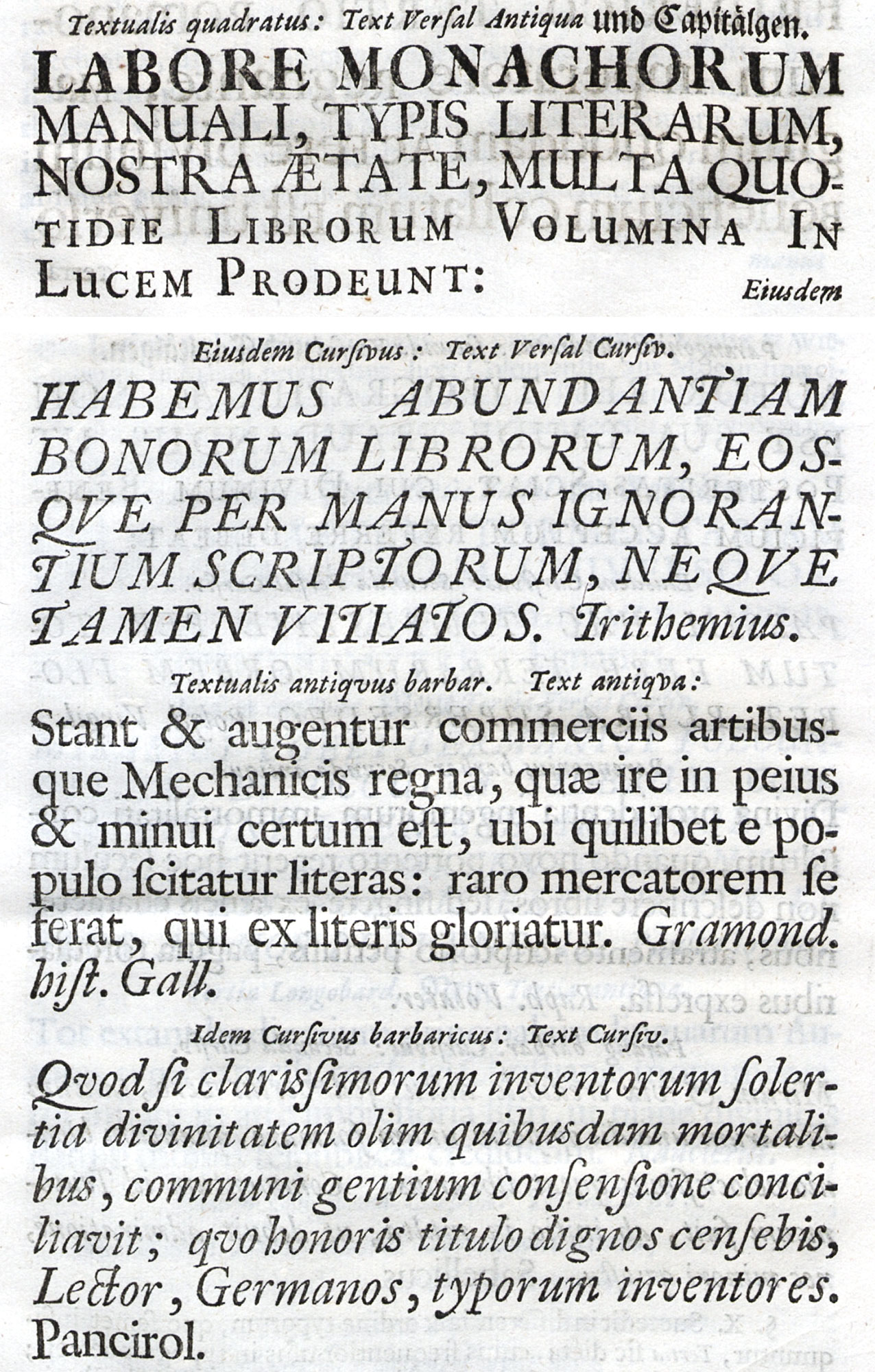
The first, a small quarter book in Latin by Paul Pater about printing and printing types, was published at Leipsic in 1710 by J. F. Gleditsch and Son under the title of De Germaniæ Miraculo Optimo Maximo, Typis Literarum, earumque differentiis, Dissertatio. The third chapter treats of the different types then in use in Germany and their names, and shows specimens of capitals and lower-case in roman and italic, in various weights, and in sizes from Grosse Missal-Versal to Nonpareil. These are followed by a variety of fraktur and schwabacher types, Greek, Hebrew, Samaritan, Chaldaic, etc. The book is probably one of the earliest tractates on the typographical material of a nation, and gives a characteristic collection of fonts in use in German printing-houses at the end of the seventeenth and beginning of the eighteenth century. Its title-page (fig. 89) indicates what could be done when a German printer took the bit in his teeth. A page of roman and italic types, still retaining some good qualities, and another showing fraktur, schwabacher, and roman, are produced (figs. 90 and 91).
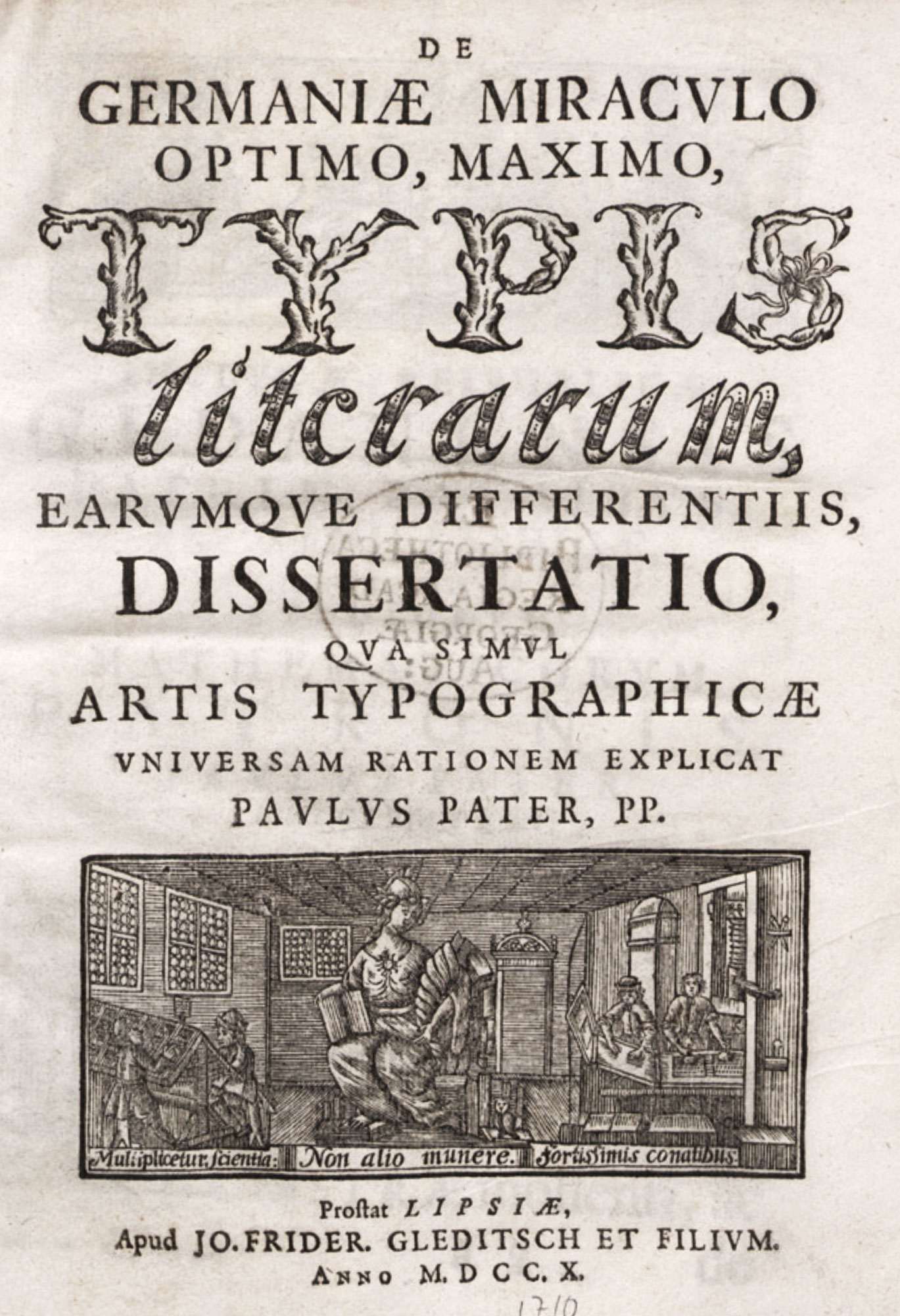
89. Title-page of Pater’s Dissertatio, Leipsic, 1710
From a copy in the Providence Public Library (facsimile), Göttingen Digitization Centre (scan)
90. Types from Pater’s Dissertatio, Leipsic, 1710
From a copy in the Providence Public Library (facsimile), Göttingen Digitization Centre (scan)
91. Fraktur and Schwabacher Types: Pater’s Dissertatio, Leipsic, 1710
From a copy in the Providence Public Library (facsimile), Göttingen Digitization Centre (scan)
The second book, in which types and printing of the same period are covered even more fully, is J. H. G. Ernesti’s book Die Wol-eingerichtete Buchdruckerey,24 a treatise on printing, published at Nuremberg by the heirs of Johann Andrea Endters—a well-known “printing family”—in 1733. After about fifty introductory pages the specimen-sheet begins, probably from the Endters printing-office, and showing its types in 1721. Here we have ten pages of fraktur, starting with the shaded “Imperial” letters and ending with pearl—forty-seven varieties of every degree of tastelessness and, in the smaller sizes, every variety of illegibility, though a few of the latter have some distinction. In certain cases larger types are introduced in lines of another font, quite in the manner of the lining system to-day. The schwabacher letters are fairly good characters and retain their sturdy traditional forms.
Twenty-two sizes and varieties of roman and fourteen varieties of italic are shown. In the larger sizes of roman, the letters are narrow and condensed and there are excessive contrasts between the thick and thin lines, but as sizes become smaller, the Roman letter becomes rounder and more monotonous in colour. Awkward in shape and arranged in lamentable fashion, books printed in it were easier to read, but scarcely less ugly than when printed in fraktur.
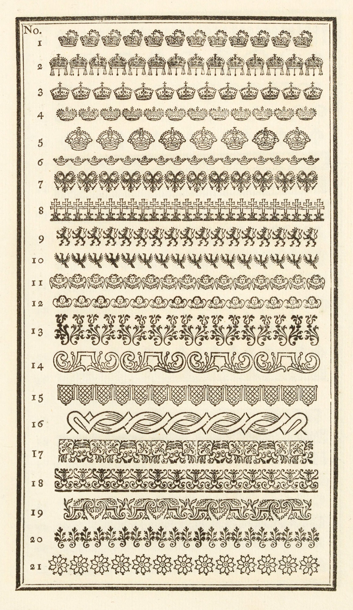
The italic type displayed has the same faults as the roman—round, open, but awkward in shape and quite without charm. It is supplied in a light and heavy face, with latter to be used, probably with fraktur. One reason why the effect of these italic types is so faulty is their miserable fitting and the wretched composition, and it is only fair to say that on such yellowing, spongy paper no character could be given a lively, sharp impression. This specimen also shows Greek, Hebrew, and exotic types, characters for music, the calendar, medicine, etc. At the end of the book is a garden of the type-flowers or “Röslein,” which displays many of the good old traditional patterns which have never been bettered (fig. 92).
92. Typographical Ornaments, probably from the Endters Printing-house, Nuremberg, 1721
From Ernesti’s Die Wol-eingerichtete Buchdruckerey
A third “source-book” is Christian Friedrich Gessner’s Buchdruckerkunst und Schriftgiesserey,25 published in four volumes at Leipsic, between 1740 and 1745. Apparently this work was to an eighteenth century German printer and amateur, what Fournier’s Manuel Typographique was at that date to Frenchmen of similar tastes. The first volume contains an account of the invention of printing, lives of printers (especially those of Leipsic), portraits of all degrees of interest and excellence, printers’ marks, plans for imposition, and alphabets—Greek, Hebrew, Syriac, Turkish, Arabic, Coptic, Armenian, etc. There are chapters on orthography; and plates showing the ancient cases for Latin, Greek, Hebrew, Arabic, and other languages. Type-founding is accurately illustrated, and there are pictures of presses, the case, and compositor’s material, tools, and appliances down to the diminutive candle which gave him light. But it is the Shrift-Probe or specimen of types in Bernhard Christoph Brietkopf’s (1695–1777) foundry which is interesting to us.26
Of the German eighteenth century type-founders, Brietkopf is easily the most important. He began life as a journeyman printer, started as a type-founder in 1719, and published this specimen-sheet of his foundry at Leipsic in 1739. He apparently cut most of his own punches. He was also a musician, and the name is familiar in connection with music printing. When Goethe went to Leipsic in 1765 he met Breitkopf, and some of the poet’s earliest poems were set to music by the son, Johann Gottlob Immanuel, who succeeded his father in the conduct of the foundry, and was also a bookseller and printer. The latter was a contemporary of Fournier, and they corresponded on the subject of music-printing. His own improvements in music types were introduced about 1754. Another idea of Breitkopf’s was map-printing from types, and he also did something toward reforming the shape of German characters, a field in which there was illimitable opportunity. When he died, his printing-house was one of the largest and most important in the country. He was, it is said, the purchaser of some of Baskerville’s matrices. The house he founded is still extant.
Fournier said Breitkopf’s foundry was “the first and most considerable of those at Leipsic, and the most interesting foundry that I am familiar with in Germany, on account of the number and variety of its ancient and modern types, its music types, and its type ornaments.” The first four pages of Breitkopf’s specimen show eighteenth century fraktur (fig. 93), and the next four pages fraktur and schwabacher together—the latter the better of the two, especially in larger sizes.27 Nothing good can be said about the fraktur letters. The roman and italic types in this specimen are unattractive, too. The capital letters are very condensed and show excessive contrasts of thick and thin lines, and compare unfavourably with those in Pater’s volume. The lower-case roman in the medium sizes is square and blocky in effect (fig. 94). As the sizes grow smaller, the effect becomes more and more monotonous and “airless.” The italic is somewhat condensed and ungainly in design. Some of these types were cut by Christian Zingk of Wittenberg, no doubt the foundry “de Zinche à Wittemberg” of which Fournier speaks, and others by Johann Casper Muller and Joh. Peter Artofao, of Leipsic, Andr. Koler of Nuremberg, and Pancr. Lobinger of Vienna. The four folding plates following this specimen of Breitkopf’s show Dutch types of the period xvii century types which came from the foundry of Erhardt (figs. 217 and 218) at Leipsic, which Fournier says was, after Breitkopf’s, the best establishment there.
For tastelessness of composition no example could be more to the point than this book, which was, nevertheless, published in the interests of typography.
93. Fraktur Types of Breitkopf’s Schrift-Probe, Leipsic, 1739
From Gessner’s Buchdruckerkunst und Schriftgiesserery
94. Roman and Italic Types: Breitkopf’s Schrift-Probe, Leipsic, 1739
From Gessner’s Buchdruckerkunst und Schriftgiesserery
The specimen of Johann Thomas Trattner of Vienna may properly come under German specimen-books of this period. Its various parts devoted to roman, German, and exotic types and ornaments were published in 1759 and 1760.28 The roman types are mostly beneath contempt; and the models for them seem to have been gathered from the four quarters of the earth. Some show Dutch influence, others French, and a few of a very round, colourless roman and italic are so bad that they could have originated nowhere except in Trattner’s own foundry! A condensed and irregular Dutch italic is one of the features of the Latin types. To German text types some ornamented letters add a touch of horror hitherto unachieved by any Teutonic type-cutter; but the entire vulgarity of the fraktur displayed is relieved by some very good schwabacher fonts. In Trattner’s fraktur, as in his roman fonts, there seems to be a taste for a thin condensed letter, modelled on the condensed types then popular in France. A great many ornaments, mostly copied or derived from French work of the period, are displayed in combinations which have much of the ingenuity of current French work and few of its agreeable qualities. We reproduce a page of schwabacher and fraktur, the latter in the condensed form alluded to (fig. 95), and a page of these vignettes de fonte (fig. 96).
95. Schwabacher and Fraktur: Trattner’s Abdruck dererjenigen Deutschen Schriften, etc., Vienna, 1760
From a copy in the Library of the American Type Founders Company, Jersey City, New Jersey (facsimile), Österreichische Nationalbibliothek (scan)
96. Ornaments: Trattner’s Abdruck von denjenigen Röslein, etc., Vienna, 1760
From a copy in the Library of the American Type Founders Company, Jersey City, New Jersey (facsimile), Harvard Library (scan)
Johann Frederic Unger (1750–1804) of Berlin was the individual who figured as the chief representative in Germany of the Didot and Bodoni influence. He was a really learned and distinguished man, a friend of Goethe and a correspondent of Schiller. His foundry and printing-house contained the chief part of the ancient material of the old Lutheran foundry at Frankfort-on-the-Main, which, toward the end of the eighteenth century, Unger acquired for his Berlin establishment.
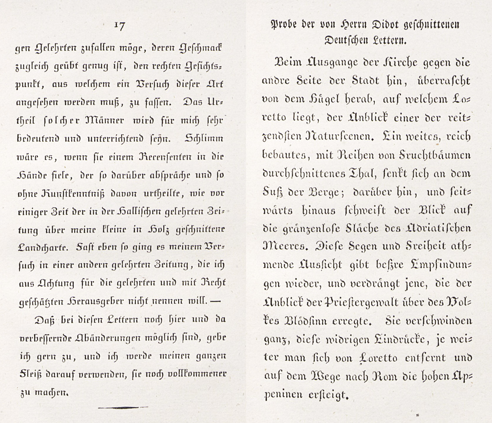
Unger’s Schriftproben der Didotschen and gewöhnlichen Lettern, issued about 1791 at Berlin, clearly exhibits the sort of thing he was introducing into German typography, and some of the pared-down fraktur types and a page of the new decorations (so called) which Unger introduced are shown (figs. 97a and 97b). The hair-like serifs and light strokes in the roman letters, and, under the heading Neue Deutsche Lettern, the anaemic italic, the condensed and fantastic fraktur fonts, show what he desired to popularize in German typography. Relegated to the back of this prim little book are the Ordinaire Deutsche Lettern, both in schwabacher (some of them excellent) and fraktur, which at least have the merit of a certain robustness. Cursive letters, a repertoire of colourless, starved-looking borders, and a folding-sheet of forlorn-looking music types, complete the collection. The Neue Deutsche Lettern in this specimen were cut by Unger and his engraver Gubitz, except the Corpus Fractur, which Firmin Didot engraved. Didot’s types may be contrasted with Unger’s modifications of German fraktur (fig. 98), where I think Unger went Didot did one better—or worse!
At this period German typography sunk to its lowest ebb. Up to that time German fonts had some strength and the composition some character; but by the year 1800 the boldest and noblest typography in Europe had degenerated to the weakest and poorest. What happened to it later—in the early part of the nineteenth century—is “not worth forgetting.” Of its connection with the modern English revival of printing, I have later to speak.
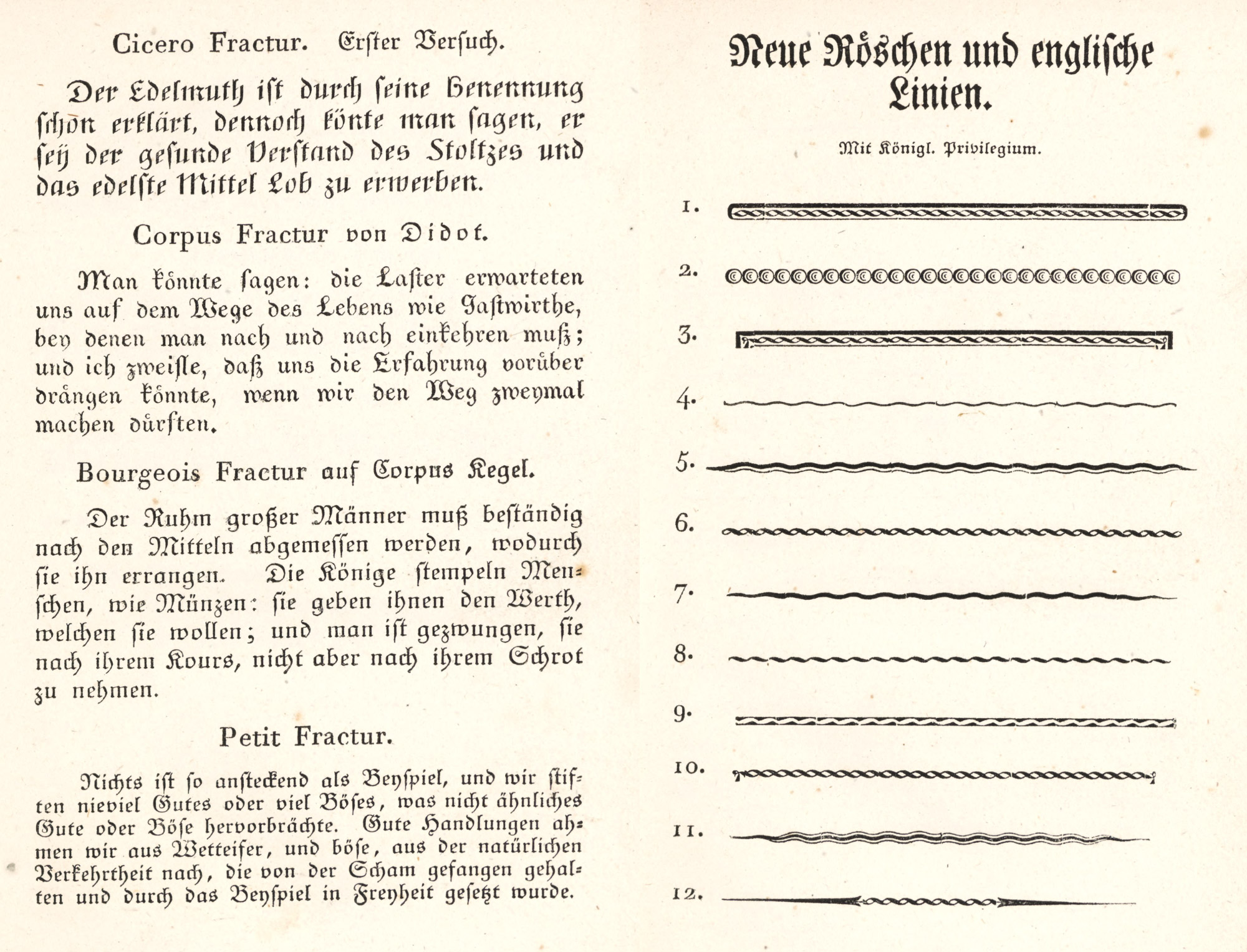
97. (a) Neue Deutsche Lettern and (b) Ornaments: Unger’s Schriftproben, Berlin, c. 1791
98. Unger’s and Didot’s Modifications of German Fraktur, 1793
From Enchedé’s Fonderies de Caractères et leur Matériel dans les Pays-Bas du XVe au XIXe Siècle (facsimile), Probe einer neuen Art Deutscher Lettern (scan 1, scan 2)
- This chapter, with others which treat of types from 1500 to 1800, is a guide to a course of exercises in training the eye. The text, however much it abounds in dates, names, or historical facts, is of little importance compared with the study of the facsimiles or examples to which it directs attention.
- Vicenz Rockner, court calligrapher, designed the type for the Teuerdanck, and is supposed to have copied it from a manuscript attributed to Johann Neudörfer. At first thought to be printed from wood-blocks, an inverted i in the edition of 1517 disposed of this theory. The type (also used in the seventeenth century) was probably cut by Hieronymus Andrae, who had other sizes in his own printing-house, where he executed books for Dürer. (For whole upper and lower case alphabet, and figures, see Druckschriften, pl. 3). The Teuerdanck was reprinted by Schönsperger at Augsburg in 1519.
- Druckschriften, pl. 45.
- Druckschriften, pl. 73.
- Gustav Könnecke’s Bilderatlas zur Geschichte der deutschen Nationallitteratur. Eine Ergänzung zu jeder deutschen Litteraturgeschichte. Marburg, 1895 (second edition, illustrated), p. 125.
- Druckschriften, pl. 27, smaller text.
- Paléographie Latine, pls. 118, 121.
- Druckschriften, pl. 94.
- For some fine titles, etc., from his books, see Butsch’s Bücher Ornamentik der Renaissance, I, pls. 40, 41 (Holbein’s design), 46 (A. Holbein), 48, 52, 53, and 59 (Holbein’s initials).
- Bilderatlas, p. 141.
- Bilderatlas, p. 144.
- Bilderatlas, p. 143.
- Bilderatlas, pp. 151, 153, 154, 156.
- Bilderatlas, p. 160.
- Bilderatlas, p. 196.
-
The introduction of the copper-plate marked a new epoch in book illustration, and wood-engraving declined with its increased adoption.… Wood-cuts, headings, initials, tail-pieces, and printers’ ornaments continued to be used [in books of the seventeenth century], but greatly inferior in design and beauty of effect to those of the sixteenth century.
Crain’s Decorative Illustration of Books, London, 1896, pp. 129, 130.
- Bilderatlas, p. 207.
- Bilderatlas, p. 209.
- Bilderatlas, p. 211.
- Bilderatlas, p. 238.
- Bilderatlas, p. 251.
-
The so-called Lutheran Foundry at Frankfort was the representative of the first printing-office established at Frankfort-on-the-Main in 1531, to which a foundry was added. This foundry and printing-office descended through various hands to Erasmus Luther, a relative of Martin, under whom it acquired a very great reputation. It supplied many German and Dutch printing-offices with their types. Enschedé thinks that the Elzevirs of Leyden procured several of their Greek fonts from this foundry; and that Daniel Elzevir and other celebrated printers bought its types and punches. Toward the end of the eighteenth century, much of its material went to the Berlin foundry directed by Unger.
- Fournier’s Manuel Typographique, Tome II. pp. xxix–xxxiv.
- Die Wol-eingerichtete Buchdruckerery, mit hundert und ein und zwanzig Teutsch, Lateinisch, Greichisch, und Hebräischen Schrifften, vieler fremden Sprachen Alphabeten, musicalischen Noten, Kalendar-Zeichen, und Medicinischen Characteren, Ingleichen allen üblichen Kunst, nebst einer summarischen Nachricht von den Buchdruckern in Nürnberg…Nürnberg, gedruckt und zu finden bey Johann Andreä Endters seel. Erben. 1733. An earlier edition appeared in 1721.
- Die so nöthig als nützliche Buchdruckerkunst und Schriftgiesserey, mit ihren Schriften, Formaten und allen dazu gehörigen Instrumenten abgebildet auch klärlich beschrieben, und nebst einer kurzgefassen Erzählungvom Ursprung und Fortgang der Buchdruckerkunst, überhaupt, insonderheit von den vornehmsten Buchdruckern in Leipzig und andern Orten Teutschlandes im 300 Jahre nach Erfindung derselben ans Licht gestellet…Leipzig, ben Christian Friedrich Gessner, 1749. 4 vols.
- Vol. I, p. 145, second series of folios.
-
Fournier says that schwabacher,
has been very much used in Germany—where it took the place of italic when employed with the German character, or to indicate some other text than those which were represented by the German, roman, and italic characters employed in the same work.
- The title-page of the first part reads: Specimen Characterum Latinorum existentium in Cæsarea ac Regio-Aulica Typorum Fusura apud Joannem Thomam Trattner, etc. Vienna, 1759. A second edition, enlarged, appeared in 1769, sometimes to be found with a supplement dated 1782.