Chapter XVI
Spanish Types: 1500–1800
I. Examples of Spanish Printing
The great traditions of printing held their own in Spain during the first part of the sixteenth century somewhat persistently—perhaps more so than in other countries.1 This was no doubt due to Spanish conservatism, and to the geographical position of the country, which isolated it from foreign fashions. Indeed, the Mozarabic Breviary of 1502, printed by Peter Hagenbach, a German, at Toledo, the Mozarabic Missal of the same date, and some later volumes are—like very many Spanish fifteenth century books—simply copies of manuscripts, rendered in type. The Hurus printing-house at Saragossa produced fine work of this kind. The most renowned of its illustrated books, says Haebler,
is the edition of the Officia quotidiana of
15001499, which contains some fifty woodcuts and more than one thousand magnificent initial letters. The copy printed on vellum and illuminated, which was in the hands of Don José Sancho Rayon when Hidalgo wrote his enthusiastic description of it, is one of the finest specimens executed at any time and at any place in the world, and reminds us of the beautiful illuminations of the mediaeval manuscripts.
The splendid Missale Romanum on vellum, printed in 1510 at Saragossa by “George Coci Theutonic,”2 a successor of Hurus (and owner of this office after 1506), is executed in a very Italian letter, in red and black, with music, and with a representation of the Crucifixion opposite the Canon, which is surrounded by elaborate borders. It is a book typical in style of the fifteenth century.
In the early years of the sixteenth century—between 1514 and 1518—one of the masterpieces of Spanish typography appeared; namely, the Polyglot Bible printed by Arnald Guillen de Brocar at Alcalá; usually known as the Complutensian Polyglot, from the Latin name of Alcalá—Complutum. This was published at the expense of Cardinal Ximenez (or, as he is commonly called in Spain, Cisneros), Primate of Spain, Archbishop of Toledo, and founder of the University of Alcalá, whose patronage of learning and printing is now better remembered than his hand in the destruction of thousands of Arabic manuscripts—an orthodox feat in which he was the principal actor! This Bible—a very splendid performance for any period, and the first of the great Polyglots—was printed in Hebrew, Chaldee, Greek, and Latin, between 1514 and 1518, as has been said; but it was not published until after the Cardinal’s death in 1522. The Greek types used in the New Testament are particularly famous, for they preserve the character of older Greek manuscripts, being based on an early book-hand and not (like the Aldine Greek fonts) on the fifteenth century cursive handwriting of Greek scholars. This font was possibly modelled on the Greek characters of a manuscript from the Vatican Library which the Pope lent Ximenez to aid in constituting his text. But the Complutensian Polyglot was printed under special and advantageous conditions, and cannot be considered typical of Spanish work of its period. Its printer, Brocar, was appointed typographer to Charles V, for whom he executed in 1517, at Logroño, the Crónica de Don Juan II, by Perez de Guzman, which Haebler calls a masterpiece of typography. This and the Polyglot Bible, I shall describe later. Of the ninety-two books printed by Brocar but sixteen appeared before 1500. For some time after his death (which occurred probably before 1523), his office continued to be one of the most famous in Spain.
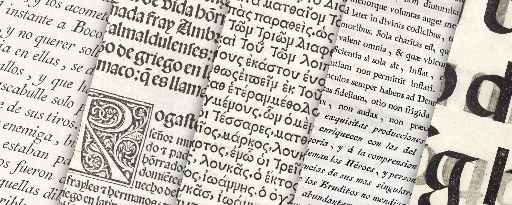
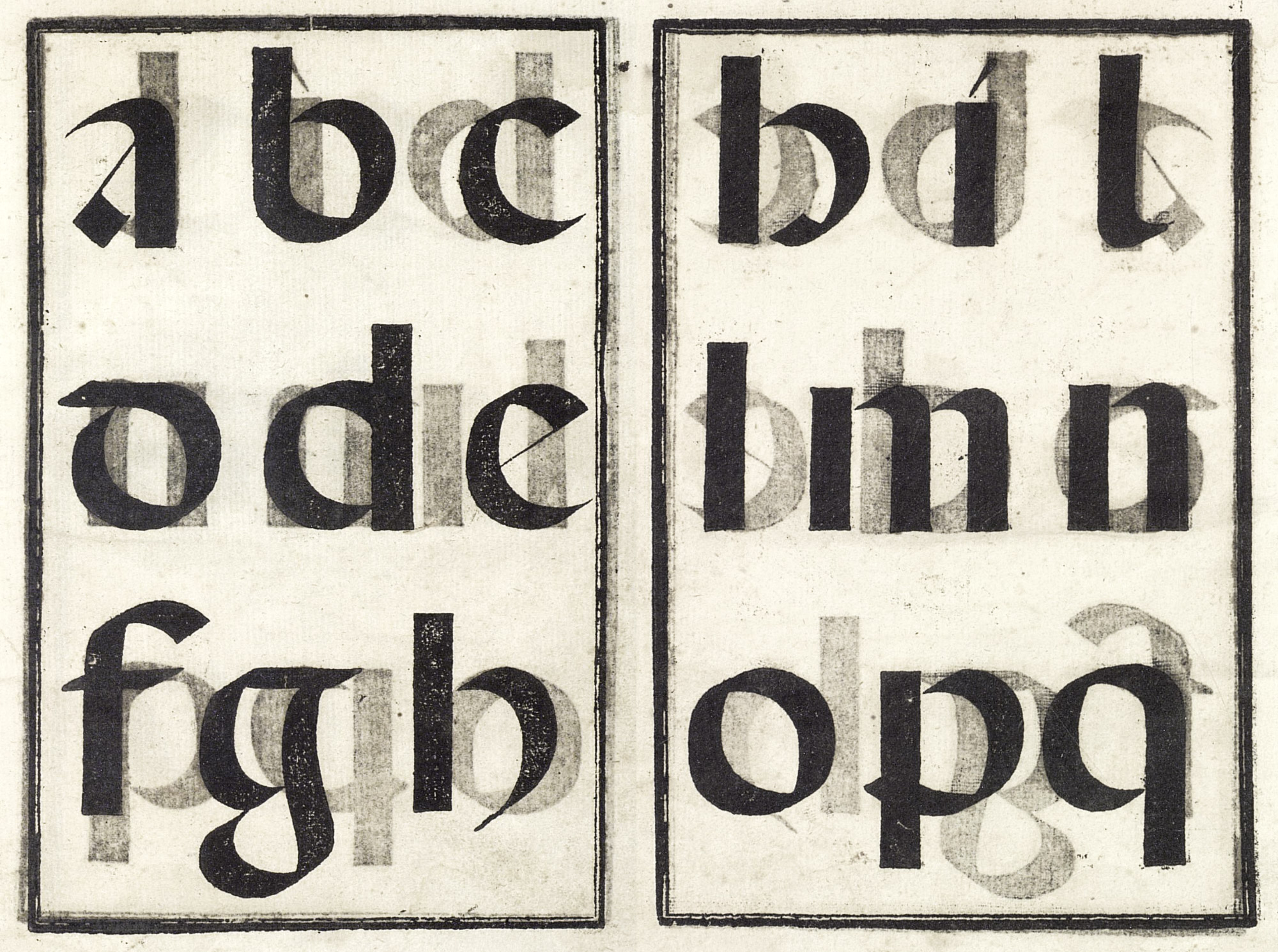
How strongly the old traditions of Spanish typography persisted, is proved by books printed even after 1550, which are almost indistinguishable from incunabula. There was the same love of a massive black-letter for the text; the same enormous heraldic emblems were popular; the same xylographic inscriptions in large, round Spanish black-letter appeared on title-pages. This round Gothic letter in all its splendour was used in Spain for lettering titles on vellum-bound books—printed in roman type—all through the seventeenth and well into the eighteenth century; and the illustration of part of a Gothic alphabet in this hand (fig. 219) may be compared with Plantin’s canon d’Espagne (fig. 197), and some examples of old gothic fonts (fig. 220), which were its type equivalents. By 1560, as in other parts of Europe, there was a more general introduction of roman type, and a realization of the flexibility of printing when applied to preliminary matter; and this led to a change of style. The roman fonts used in these later books were of rather a coarse, rough kind, not particularly interesting, nor very distinguishable from the poorer roman types used in France and Italy at that date.3 In some folios, a tall, thin lower-case roman letter, something like the types of Garamon or certain Italian roman characters, was used with great effect for head-lines and running-titles; and it was sometimes employed in liturgical books in connection with plain-song notation.
219. Round Spanish Black-letter, from Lucas’ Arte de Escrivir, Madrid, 1577
From Strange’s Alphabets (facsimile), Arte de Escrevir de Francisco Lucas (scan, pp. 105–106)
220. Antique Black-letter: Specimen of La Fabrica del Convento de S. Joseph, Barcelona, 1777
From Muestra de los caracteres que se hallan en la Fabrica del convento de S. Joseph (scan 1, scan 2)
The influence of the Netherlands on printing in Spain was considerable. Plantin of Antwerp produced the Polyglot Bible commonly called after him, under the patronage of Philip II—whose patronage was about all he gave to it! Plantin printed, besides liturgical books for Spain (for which he later obtained a special “privilege” enjoyed for a long time in the Plantin-Moretus family), a large number of books in Spanish. These were mostly composed in his delicate early manner, which was more interesting and distinguished than his later somewhat overblown style. Spain, in the sixteenth century, had more book printed abroad than any other country, on account of its preponderating political importance—the Netherlands ranking first in this output, followed by Italy. These foreign productions influenced the native Spanish press in both format and typography, and there are many volumes of this period printed in Spain which, in their small roman type, restraint in arrangement, and delicacy of decoration, are plainly inspired by foreign influence.
Plantin was invited to establish a printing-house in the Peninsula. Being asked by Philip II in 1572 to suggest which of his sons-in-law could take charge of it, Plantin, probably not wishing to deprive himself of the help of either Moretus or Raphelengius, replied with diplomacy that they might direct it together, but that neither was capable of doing it alone. That particular plan, therefore, came to nothing. He did recommend to the King, however, in 1576, a printed of Flemish origin, Matthew Gast, who had been fore some years previously in Spain. This Matthew Gast, who had an establishment in Salamanca, had himself found difficulties in procuring types, for in 1574 we find him writing to Plantin, asking him to send him a type-cutter. Plantin replied that since the death of the type-cutters Guyot and Tavernier, he himself had found only one man who was good for anything, and he had continually to be told what to do in any work demanding initiative or judgement.
For Spanish printing, the seventeenth century was a discouraging period. The types in use were chiefly roman; the first edition of Don Quixote being printed from uncouth, old style roman fonts. The copper-plate title-pages in general European use had also some vogue there. As was the case wherever they appeared, printing fell off. Sometimes it only seemed to do so, because the contrast between the rough types of the time and the precision of a copper-plate was to the disadvantage of the typography; sometimes because if the fashionable copper-plates were supplied, printers seemed to feel that they could print as badly as they chose—a point of view then current in England and elsewhere. Then, too, the close political relations with Italy played a part in Spanish printing, and Italian fashions in seventeenth and early eighteenth century printing were usually bad. Spanish books of this period are much like the wretched productions of the Italian press—with congested title-pages, composed in letters too large for the page, ill-printed, and decorated (or at least supposed to be) with badly executed typographical ornaments. The type was generally a crude old style roman letter.
The first quarter of the eighteenth century, however, saw some efforts toward more interest in national typography. The first Spanish king of the Bourbon family, Philip V, granted in 1716 certain privileges and exemptions for music-printing (not before attempted in Madrid), which had been begun on the initiative and at the expense of Don Joseph Torres, chief organist of the Chapel Royal. And in 1717 it was ordered that a press for liturgical books should be set up, so that book for Spain and in particular for the Indies, no foreign books of that class need be imported; but it was not done. In 1729, Antonio Bordazar, a native of Valencia (where he was born in 1671), proposed the establishment of a printing-house in Spain to produce liturgical works for the use of the Spanish Church. In old days, a monopoly of such volumes seems to have been maintained by the monastery of the Escorial, which procured missals, breviaries, etc., from the Plantin-Moretus Office at Antwerp; and they were still, apparently, imported under this privilege. In 1731, a royal decree again approved the native printing of Spanish liturgical books, and called for a discussion of ways and means to this end. Bordazar had already submitted to Philip V a carefully drawn-up memorial in which he represented that types, paper, and ink could be as easily procured, and books as successfully produced, in Spain as in the Netherlands, and he now received the royal authority to print this document.
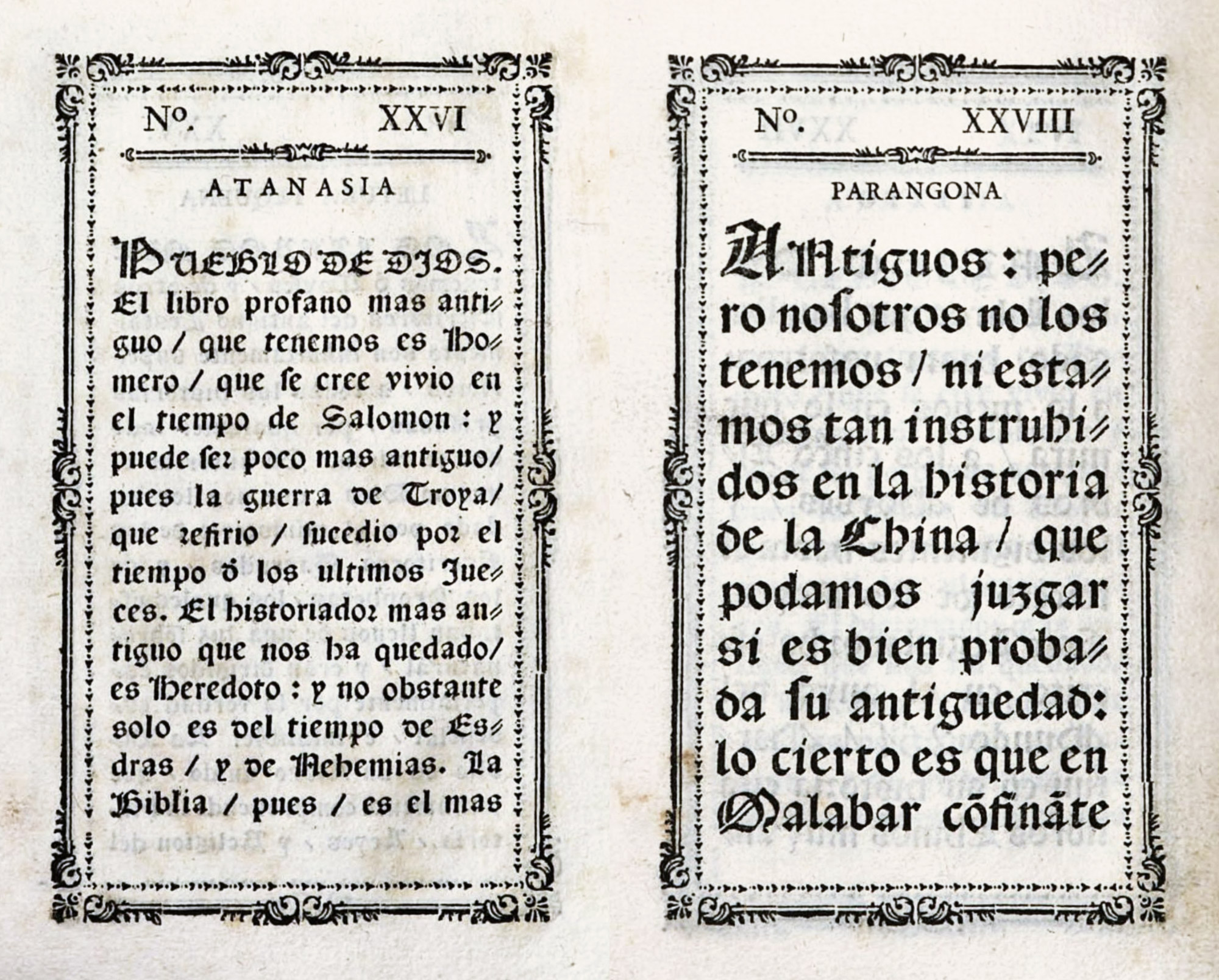
This he did in the year 1732, at Valencia, under the title of Plantificacion de la Imprenta de el Rezo Sagrado, que su Magestad (Dios le guarde) se ha servido mandar que se establezca en España, in a handsomely printed tractate of some twenty folio pages (fig. 221). It is divided under the heads of paper, type, engravings, materials for calendars and music, inks, estimates of costs, choice of liturgical books to be printed, presses, administration, and time necessary for installation. The most interesting thing about it for our purpose is the specimen of types—Caracteres de España—which it was proposed to use. These are shown in twelve sizes—grancanon to glosilla; portions of Latin service-books, printed in red and black, being employed to display the types. These pages constitute the earliest Spanish specimen of types that I have seen, though these types were not Spanish but were cast from matrices imported from Flanders. In the paragraph concerning them Bordazar says:
Given the paper, about which there is no doubt, correspondingly one can have no doubt about type, for Carlos II, of glorious memory, had matrices brought from Flanders, and these are the ones now in the keeping of Juan Gomez Morales, a skilful and intelligent4 type-founder of Madrid,5 whose variety of types, although they seem but few, are increased in different ways as may be required,6 by means of spaces either separating letter from letter7 or line from line, making in each book such combinations as elegant arrangement demands; without any need of using for 76 books a like number of kinds of type, or even two or three kinds for each book, as is said by those ignorant of the subject. For this would call for more than 200 varieties, a number that does not exist and has never existed in all the presses of Europe. Thus all the books which are now, or which ever have been, in the Royal Monastery of the Escorial are combinations and arrangements that can be obtained from the types of Juan Gomez Morales, which are the following
(here appears the specimen). Bordazar adds:
Regarding the durability and lasting sharpness which the contours of certain foreign types possess, because of which some persons have through the moulds to have been made of silver, types of the same quality may be cast in future, since the alloy has already been made in Valencia, and has been approved by the founder, Juan Gomez Morales himself, who rated it as of the quality of Dutch type-metal and thought it was of foreign make.
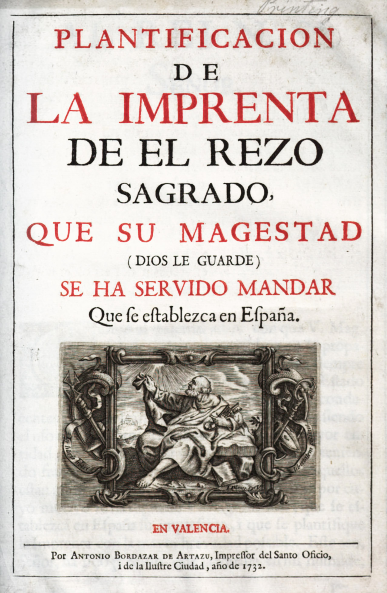
221. Title-page of Bordazar’s Plantificacion, Valencia, 1732
From Google Books (scan)
The texto (fig. 222) was used in Yriarte’s Obras Sueltas, printed at Madrid by Franciso Manuel de Mena in 1774, and apparently, with the change of a few letters, in Bayer’s De Numis Hebræo-Samaritanis, printed at Valencia by Benito Monfort in 1781. Perez de Soto appears to have used it in the Bibliotheca Arabico-Hispana Escurialensis of 1760. Mendez says that these types came from the “incomparable printing-house of Plantin,” and that they were ultimately utilized in Carlos III’s time,8 which carries out the attribution I have given the texto. This is still further confirmed by finding the same type, with a variant italic, in the Opera of Hubert Goltzius, published at Antwerp in 1708; whether an edition of Goltzius issued some sixty years earlier employed the type, I have not been able to learn. It is one of the most beautiful roman fonts I have ever seen; and the best of three forms of italic used with it—that in Obras Sueltas—is almost equally charming.
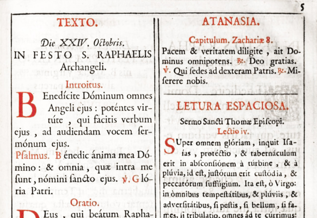
222. Texto, Atanasia, and Lettura Espaciosa from Boradzar’s Plantificacion, Valencia, 1732
From Google Books (scan)
Bordazar’s farseeing and enlightened proposals created some stir, but he did not live to witness their realization. After his death in 1744, José de Orga,9 also of Valencia who had been brought up in Borodazar’s printing-house, were he seems to have been manager or foreman, took up the plan and petitioned (in 1748) Ferdinand VI to be allowed to establish a “liturgical” printing-press in Madrid for the use and honour of the Spanish nation—setting forth numerous difficulties and inconveniences caused by the necessity of having such books printed abroad; and again alleging that the work done earlier by Plantin and Moretus, and by other printers in Venice and Holland, could be performed just as well in Spain, both as to material and execution, at less cost, and without taking money out of the country.10 Orga removed to Madrid, where he died February 19, 1756, and, as far as the native production of type was concerned, his efforts seem to have come to nothing at all. Fournier wrote, in 1766,
Spain is lacking in type-cutters: it has but two foundries, which are in Madrid; one belonging to the Jesuits, who let it for five or six hundred livres; the other was bought in Paris, from M. Cottin, who sold it for thirty thousand livres.
But the project to print liturgical books in Spain was finally taken up, in Carlos III’s reign, by a Compañia de Impresores y Libreros, in conjunction with the authorities of the Escorial.
This body obtained royal sanction, and the establishment of a completely equipped printing-house for it was approved in 1787. A building was bought and the scheme was in operation when Mendez wrote of it in 1796,11 and in 1811 its director was Juan Josef Sigüenza y Vera—a pupil of the famous Ibarra.
This fruition of a long-considered and interminably deferred plan came to pass at the end of the eighteenth century, a moment when some excellent Spanish printing was done12—the result of a general movement in industry and art at the prosperous national era. Carlos III, whose reign lasted for almost thirty years, and who died in 1788, was a Bourbon, half-brother, to Ferdinand VI, and much influenced in his tastes by France. A most enlightened man, his efforts toward the rehabilitation or establishment of all kinds of Spanish industries, and his patronage of the fine arts, were very ably seconded by his ministers. It was under Carlos that the Buen Retiro porcelain was made, and the palace of San Ildefonso at La Granja was filled with charming products from a glass factory there which he encouraged. Trade in watches and optical instruments was fostered at Madrid; fine leathers were made at Cordova and Seville, and velvets at Avila. A royal decree of 1733 had already pronounced that hidalgos could engage in handicrafts without loss of caste! Then, too, the Crown granted various exemptions and privileges to the printing-trade. In 1763, a decree had exempted printers from military service, and this applied to type-cutters and type-founders. Metals used in the work of the latter were reduced in price by one-third, and divers privileges and rights were conceded to printers—partly to help the industry and partly to improve book-making.
About the middle of the century, Gabriel Ramirez was doing good work, and Perez de Soto, royal printer produced creditable books; but Joachin Ibarra, who was born in Saragossa in 1725, was the Spanish printer who had the greatest reputation—not merely in Spain, but throughout Europe. Ibarra was evidently much influenced by Bodoni, and somewhat, perhaps, by Didot and Baskerville. To look to Bodoni was natural. Parma, like the Kingdom of the Two Sicilies, was then in Bourbon hands, and the relation between the Spanish Court and that of Parma was close. Carlos III (whose mother, Elizabeth Farnese, was a Princess of Parma) was himself made Duke of Parma in 1731. On his accession to the Kingdom of Naples, where he encouraged fine printing,—notably Baiardi’s great work, Delle Antichità di Ercolano, alluded to by Mendez,—his brother Philip became Duke of Parma. Philip, in turn, was succeeded by a son, Ferdinand, who was Bodoni’s Patron.13 Ibarra, therefore, as Spanish Court printer, must have been perfectly familiar with the books printed for Carlos III’s nephew by Bodoni, who held the same post in Parma that Ibarra held at Madrid. In fact, Bodoni had the honorary title of Printer to the Spanish King; and this accounts for the beautifully printed memorial discourses issued at Parma by Bodoni in 1789, on the death of Carlos III—Botteri’s Orazione Funebre in lodi de Don Carlo III; and in the Oratio in Funere Caroli III of Ridolfi delivered in the Papal chapel at Rome on the same occasion.
Ibarra’s magnificent Spanish and Latin edition of Sallust, printed in 1772, is generally considered his masterpiece (fig. 223). Other great books printed by Ibarra were the Royal Academy edition of Don Quixote of 1780, an edition of the Bible, the Breviarium Gothicum…ad usum Sacelli Mozarabicum or Mozarabic Breviary (1775), Mariana’s Historia de España, and Antonio’s Bibliotheca Hispana, Vetus et Nova (1783–88)—all of which are worth study. The Sallust, Don Quixote, and Antonio’s work are later discussed.
Ibarra’s printing was greatly admired by book-lovers of that day all over Europe. The Chevalier de Bourgoing, writing in 1782 of the Academy edition of Don Quixote, calls it
equally admirable for the quality of the ink, the beauty of the paper, the clearness of the character, and to be compared with the finest productions of the kind in any other nation. This is not the first proof the Spaniards have given of their ability in the art of printing. Every connoisseur is acquainted with, and prefers to the editions of Baskerville and Barbou, the Sallust, which the Infant Don Gabriel has translated into his own language, and some other works from the presses of Ibarra at Madrid, and from those of Benedict Montfort at Valencia, which are masterpieces of the typographical art, and will one day be sought after by posterity, as we now search for those of the Elzevirs.14
Franklin, whose busy mind was always interested in the development of typography, was conversant with Ibarra’s editions. Writing from Passy, December 4, 1781, to William Strahan, he says:
A strong Emulation exists at Present between Paris and Madrid, with regard to beautiful Printing. Here a M. Didot le jeune has a Passion for the Art.… He has executed several charming Editions. But the “Sallust” [sic] and the “Don Quixote” of Madrid are thought to excel them.
This rivalry between Didot and Ibarra perhaps explains a rather sour allusion to the latter in the Épître sur les Progrès de l’Imprimerie written by Didot fils aîné, in 1784, who uses the names of both Ibarra and Baskerville as pegs on which to hang laurels in honour of his excellent papa! Bodoni—more generous—writes in 1774 of the “stupendous Sallust not long since printed with so much finitezza at Madrid.” and Bayne in his Journal reports a conversation with Franklin in which the latter said that, excepting the Sallust, he thought the Don Quixote equalled anything he ever saw. Née de la Rochelle says,15
Ibarra carried the perfection of his art to a point until that time unknown in Spain and the emulation he inspired in his confrères caused great advances in Typographic Art in twenty years than it had made in the two preceding centuries. He is distinguished for his magnificent editions, in which sumptuous engravings are combined with sumptuous types, great accuracy, and superior presswork.
Ibarra, it may be said here, introduced in Spain on his own initiative improvements akin to those made by Baskerville in England—first, an ink of particularly brilliant quality which he made for his own use; and second, hot-pressed paper. Indeed, he invented a machine to produce the latter. Carlos III appointed Ibarra court printer, and he was also printer to the Primate and the Academia de la Lengua, for whom he executed their Dictionary. He died at Madrid, November 23, 1785; and the Imprenta Real published before the new year a Soneto á la muerte de Joaquin Ibarra, Impresor de Camara de S. M.16
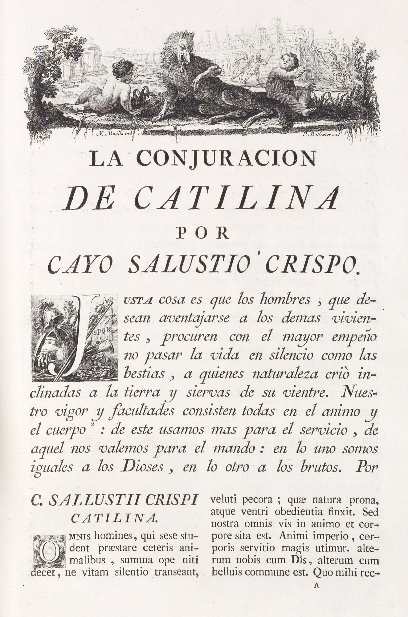
223. Page of Sallust: Ibarra, Madrid, 1772
From La conjuracion de Catilina y la Guerra de Jugurta (scan, p. 16)
In this revival of printing, Valencia stands out through the work of Monfort, whose particular claim to remembrance is Fr. Prez Bayer’s work on Hebrew-Samartian coins, printed in 1781. Bayer was a great figure in all the scholarly undertakings of the period—the reformer of the studies in the University of Salamanca, where he held the chair of Hebrew; a learned classical scholar, and perceptor to the Infantes of Spain. He it was who contributed to the opening dissertation to the Infante Don Gabriel’s translation of Sallust. A native of Valencia,17 and archdeacon of its cathedral, he was familiar with Monfort’s work, and naturally employed him.
Benito Monfort, in contemporary opinion ranking next to Ibarra, was born at Valencia about 1716, and died (a few months before Ibarra) in 1785. He learned his trade in the office of Antonio Bordazar, where (as I have said) José de Orga, another eminent printer, was manager. Monfort set up his own office in 1757, and later became printer by appointment to the city of Valencia, to its University, etc. His editions were praised by his contemporaries, who compared him, for no very intelligible reason, to Baskerville. In the first volume of his edition of Mariana’s Historia de España, a letter from the king, Carlos III, is quoted, “who has seen with special satisfaction the beauty of this edition.” Among other books praised in a contemporary notice18 are Perez de Guzman’s Crónica del Ray Don Juan II (1779), Pulger’s Crónica de los Reyes Católicos (1780), and Perez Bayer’s De Numis Habræo-Samaritanis (1781), “which for its beauty and accuracy has merited the highest eulogies from other nations.” The Mariana and these three books seem to have been his best achievements.
Antonio de Sancha, a Madrid printer, did some admirable work at this period, and his best books are worth looking at. His Don Quixote, edited by Pellicer, in five volumes illustrated with copper-plates, was fairly well printed. His nine-volume edition in duodecimo is desirable on account of its charming and well-engraved designs. Some of Sancha’s other printing I shall describe in detail—notably his edition of Solis’ Conquista del Mexico.
There were also well-made books printed at Madrid by Ramirez, Marin, the Imprenta Real, and other houses, as well as by the widow and sons of Ibarra, who carried on his establishment in the Calle de la Gorgeuera, after his death. Among the works executed under their direction was a very uninspired one-volume edition of the Diccionario de la lengua Castellana, with the widow’s imprint as Impresora de la Real Academia Española. A more credible example of their work is the anonymous Relacion del Ultimo Viage al Estrecho de Magallanes (in 1785–86), a handsome quarto printed in 1788. The classic work by Mendez, Typographia Española, of which the first volume only was printed, also appeared with the imprint Viuda de Ibarra—a barely respectable piece of typography. There was great activity among Spanish printers about this time. Robert Southey, writing from Madrid in 1796, says rather tartly, “Literature is reviving in Spain. The translation of Sallust by the King’s brother made it fashionable.” Coincident with this revival of printing, a number of Spanish “specimens” were issued, some of which are of considerable interest.
Printing had been introduced into the New world in 1539. Jacob Comburger, who settled in Seville early in the sixteenth century, was the foremost printer of his period. He had a son (or brother) Johann, who succeeded in obtaining an exclusive privilege for printing in Mexico, but to take effective advantage of it gave him considerable trouble. He finally sent out from Spain a certain Juan Pablos, who, in the city of Mexico, in 1539, printed the first American book, the Doctrina Christiana en la Lengua Mexicana e Castellana. Antonio Ricardo of Turin, who had settled in Mexico, emigrated to Peru, where at Lima he printed in 1584 a leaflet on the correction of the calendar and a catechism, the latter being the first book printed in South America proper. Early Mexican and South American typography was, in the main, a colonial copy of printing of that period in the Mother Country. The books bore to the best Spanish printing about the same relation that American colonial work did to the English printing of its time. Title-pages in facsimile from many of these books may be seen by those who are sufficiently curious by looking through Vindel’s Bibliografia Grafica.19 The serious student—and he must be very serious—should look at the books themselves. They had, however, so little influence on typographical usage in general, that they are beyond the boundaries of the subject of this book.
§1. XVI Century
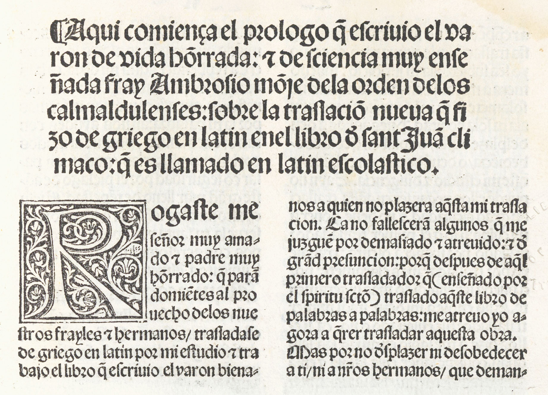
For our first example of a sixteenth century Spanish book we may take De las Tablas y Escalera Spiritual, a Spanish translation of the Latin work of St. Juan Climaco, printed in quarto at Toledo by Peter Hagenbach by order of Cardinal Ximenez in 150420—Hagenbach being printer by appointment to the Cardinal. It was therefore published under distinguished auspices. Its title-pages bears a coat of arms, surmounted by a cardinal’s hat, and below, in a rich, round, Spanish gothic letter, is the title in four lines. The rest of the book is printed in a spirited Spanish black-letter set in double column—the principal divisions beginning with handsome block initials with black grounds, and the contents of each division being set in effective lines of large black-letter (fig. 224). Running-titles are also composed in this large type, with folios on right-hand pages only. At the beginning and end of the book, these large characters run across the page, giving a very noble effect. The beautiful “texture” of the pages of type makes a very handsome book—but one which is practically a “fifteener” in general style.
224. Gothic Types: Hagenbach, Toledo, 1504
From a copy in the Boston Public Library
A similar black-letter volume—an edition of De La Natura Angelica by Franc. Ximenez (Burgos, 1516)—is interesting because it is an example of the work of Fadrique de Basilea, a famous printer, and one of the few in Spain who, in the fifteenth century, used roman type for entire books. Not so fine as the preceding, it is much the same in type and arrangement, except that the folios, similarly placed, are set in enormous capitals which much disfigure the page.
“George Coci, Alemen,” who acquired the Hurus office about 1506, and whom Haebler calls one of the most celebrated printers of the century, issued some good editions of the classics at Saragossa in the early sixteenth century. His Livy of 1520—Las quatorze decadas de Tito Livio—is magnificent. It contains the first example of “colour printing,” as we now understand it, that I have found in a Spanish book. The title-page—a huge armorial device surrounded with the collar of the Golden Fleece—has beneath it a scroll on which is the title and “privilege” in five lines of gothic letter, printed in red. The arms above are in four colours, black, red, yellow, and green, printed from wood-blocks.
The text appears in a beautiful, rather condensed gothic type, closely set (fig. 225). The titles of the chapters are composed in a larger size of much the same font. Fine woodcuts extending the full width of the page are very freely introduced, and accord splendidly with the type of the book. Haebler calls it one of Coci’s most splendid productions, and certainly it is a sumptuous performance—of its kind. All the books printed by Coci that I have seen are interesting and distinguished.
225. Gothic Type: Coci, Saragossa, 1520
From a copy in the Boston Public Library (facsimile), Las quatorze decadas de Tito Liuio hystoriador de los Romanos (scan)
In another fine book—Pulgar’s El Gran Capitan—printed by Jacob Cromburger at Seville in 1527, much the same gothic type is used—a little rounder, perhaps—not so well printed or so finely imposed. The title is very characteristic—a large coat of arms, above three lines of title and two lines of “privilege,” all set in black-letter—the whole surrounded with rough woodcut borders. On the text pages (fig. 226), the notes or glosses are set in a smaller size of gothic type. Many of the Spanish romances of the class of Amadis de Gaul (for instance, an illustrated small folio edition of 1535) were printed by Crom burger, and had, typographically, a finish and richness of appearance in contrast to like editions by other printers. They deserve careful attention.
226. Gothic Type used by Cromburger, Seville, 1527
From a copy in the Boston Public Library (facsimile), Breve parte de las hazanas del excelente nombrado gran capitan (scan)
These books are good examples of the earlier form of Spanish volume, and their style survived in certain classes of literature almost through the sixteenth century. All of them were set in gothic types; but the earliest type used in Spain was roman, and the most famous book of the sixteenth century—the Complutensian Polyglot—largely employed it.
This, the first Polyglot Bible, the world owes to Cardinal Ximenez, who, to use his own phrase, produced it “to revive the hitherto dormant study of Holy Scripture.” It is in six folio volumes. In the first volume, the title appears in medium sizes of Spanish gothic type arranged in an inverted pyramid placed at the bottom of the page; and above it, printed in red, are the arms of Cisneros surmounted by a cardinal’s hat. At the top of the title-page, which is surrounded with a border of decorative strips of ornament, a four-line verse appears, in a smaller size of the gothic type used below. The prologue and introductory matter are set in a very handsome and Italian roman type, with head-lines of the fine gothic letter used in the title (fig. 227). Then follows the polyglot Pentateuch in five divisions—first Hebrew, the outside column, second, the Latin Vulgate, in a narrow column placed in the middle, set in roman; and on the inside, in irregularly spaced black-letter, a new Latin translation of the Greek Septuagint, which is printed beneath it in a crabbed Greek type. The three versions are printed parallel to one another, line for line. Short lines in the Vulgate version are filled out with ornaments made up of circles, and a similar trick is resorted to in the Hebrew text. In a block on the inside of right-hand pages is a Chaldee version in Hebrew characters, and beside it a block of black-letter Latin translation, left-hand pages reversing this arrangement. Hebrew and Chaldee roots are given in the margin. Granted the great difficulty of the problem from the type-setting point of view, and the necessary variations of colour of Hebrew, roman, black-letter, and black-letter with Greek types interlined—not to mention side-notes—the general solidity of effect is still remarkable. Still more remarkable is the evenness of colour in the presswork. This first volume completes the Pentateuch.
227. Roman and Gothic Types used in Complutensian Polyglot Bible: Guillen de Brocar, Alcalá, 1514–17
From a copy in the Boston Public Library (facsimile), Library of Congress (scan)
In the second volume of the Old Testament the page is made up of three columns of equal length, though of unequal width—Hebrew, Latin, and Greek and Latin interlined. The third volume runs on in much the same manner, except that there is no Hebrew text for certain books; and the fourth, similarly arranged, completes the Old Testament and the Apocrypha—the latter given in two versions only. Minute letters refer from every word in the Vulgate to every Hebrew word throughout the Old Testament.21
In the New Testament, which occupies the fifth volume (though in point of date the first volume printed), no rubrication appears on the title-page, and the text-pages are divided into columns of Greek and Latin—the Latin being set in roman. In this—the first printed Greek Testament (though not published until after Froben’s 1516 edition, edited by Erasmus)—the wonderful Greek type is what all Greek type should be in style—a reversion to the fine early Greek manuscript-hands. It is very open and clear in design and of a beautifully even strength of line throughout. Reference is made by small gothic letters above the text repeated in alphabetical order, from every word in the Greek text to each word in the Vulgate. While this somewhat disfigures the page, it is so cleverly managed that it does not obtrude itself. To see how the famous Greek types look, normally printed, one must study such pages as that from which our illustration is taken (fig. 228). The sixth volume ends the work with a Hebrew and Chaldee vocabulary, indexes, etc.
228. Greek Type used in Complutensian Polyglot Bible (New Testament): Guillen de Brocar, Alcalá, 1514–17
From a copy in the Boston Public Library (facsimile), Library of Congress (scan)
The whole undertaking, which occupied about fifteen years, was started in 1502, and the printing, begun at Alcalá in 1514, was finished in July, 1517, “by that honourable man Arnald Guillen de Brocar, master of the art of printing”—as indeed he was. Ximenez died in 1517. Leo X sanctioned the issue of 600 copies of the work in 1520, but apparently it was not published until 1522. It cost Ximenez 50,000 gold ducats, to-day equivalent to considerably over a million dollars. The magnitude of the task, the efficiency of the plan, the even quality of its execution, make the beholder pause. It was a splendid conception, and it was splendidly carried out.
A book of four hundred or more double-column pages rubricated so highly, printed by Brocar at Logroño (where he also had a press) in 1517. It is a folio edition in black-letter of Perez de Guzman’s Crónica del Ray Don Juan II, and is very fine of its kind, though not so fine, in spite of its lavish use of red ink, as Coci’s Livy of 1520 or the books of the Granada printer Sancho de Nebrija (or Nebrissensis). It was executed by order of Carlos V, to whom Brocar was appointed printer on his first visit to Spain in that year.
Haebler tells us that a series of books was printed at Granada by Sancho de Nebrija, “executed with the utmost accuracy and splendour,” between 1533 and 1552. This printer’s books are interesting because of their early and good use of roman fonts—type clear enough to be perfectly readable, but without much distinction or beauty. Several books by then celebrated grammarian, Antonio de Nebrija (otherwise known as Antonio Martinez de Jaravia), sometime professor in the University of Alcalá, and one of the editors of the Complutensian Polyglot, were printed and published at Granada by his son Sancho, and employ types of this style. His Latin translation of Pulgar’s Spanish chronicle of the reign of Ferdinand and Isabella (a fine example of this press) opens with a title-page ornamented with a border in four pieces—meant to be Renaissance—engraved on wood by some one very awkward with this graver and surrounding a brilliant armorial device. In what little space is left beneath is crowded:
Habes in hoc volumine, amice lector, Ælii Antonii Nebrissensis Rerum a Fernando & Elisabe Hispaniarū fœlicissimis Regibus gesta Decades duas. Necnō belli Navariensis libros duos. Annexa insuper Archiepi Roderici Chronica alijs historiis antehac non excussis. Cum imperiali privilegio. Ne quis alius excudat aut vendat. Anno mdxlv.
The last two sentences are in the nature of an early copyright. The next page of the book (fig. 229) might have been taken bodily from one of Froben’s editions. This is true of all pages with displayed headings, where lines of large capitals, ornamented at each end with florets, descent abruptly in the second line to a much smaller size of capital letter. The use of italic with roman capitals in the Aldine manner in tables of contents, also reminds us of Basle books. Each chapter begins with a wood-block initial. At first sight imposing, on examination the typography seems coarse and loosely put together, partly because it is so, but mostly because it recalls better books, with more brilliant decorations and more massive roman types, printed in a like manner. The Chronicle of Roderigo of Toledo shows a title-page with a border surrounding blocks of title which, though a long way after those of Froben is very striking.
229. Roman Type used by Sancho de Nebrija, Granada, 1545
From a copy in the Boston Public Library (facsimile), Rervm A Fernando & Elisabe Hispaniarũ[m] fœlicissimis Regibus gesta[rum] Decades duas
An earlier book, Introductiones in Latinam Grammaticen, by Antonio de Nebrija—a small folio printed at Alcalá by Miguel de Eguia, successor to Brocar, in 1525, with text in roman, surrounded with notes set in a nervous and beautifully cut Spanish gothic type—is also of interest, both for its arrangement—very romantic for a grammar—and its fine fonts. The same author’s edition of Persius, printed at Seville in 1504 by Cromburger, is another instance of text set in roman, surrounded by notes in an intricate weave of delicate gothic characters. Its title-page (an inscription in roman capitals in a panel of ornament) is wonderfully handsome. In the smaller books later printed by Sancho de Nebrija at Granada, he seems to have relied on roman for both text and notes; as in his father’s Hymnorum Recognitio, printed in 1549. Its title-page—though but a feeble copy of similar Basle books—and index will repay examination.
One of the few beautiful Spanish books of the late sixteenth century, printed in a pure and elegant roman type, was Alvar Gomez de Castro’s De Rebus Gestis a Francisco Ximenio, Cisnerio—a contemporary life of Cardinal Ximenez, still held as a very high authority. This book might have come from an Italian press, so spirited and delicate is the roman font used for it, compared with the most contemporary Spanish roman fonts, and so simple and elegant is it in composition and imposition. To be sure, the title-page bears a pretentious wood-block, out of keeping with the severity of the text-pages, and the prefatory matter is obtrusive. But its simple text-pages are almost Jensonian in their reliance upon pure typography for beauty. The book was printed by Andres de Angulo at Alcalá in 1569 (fig. 230).
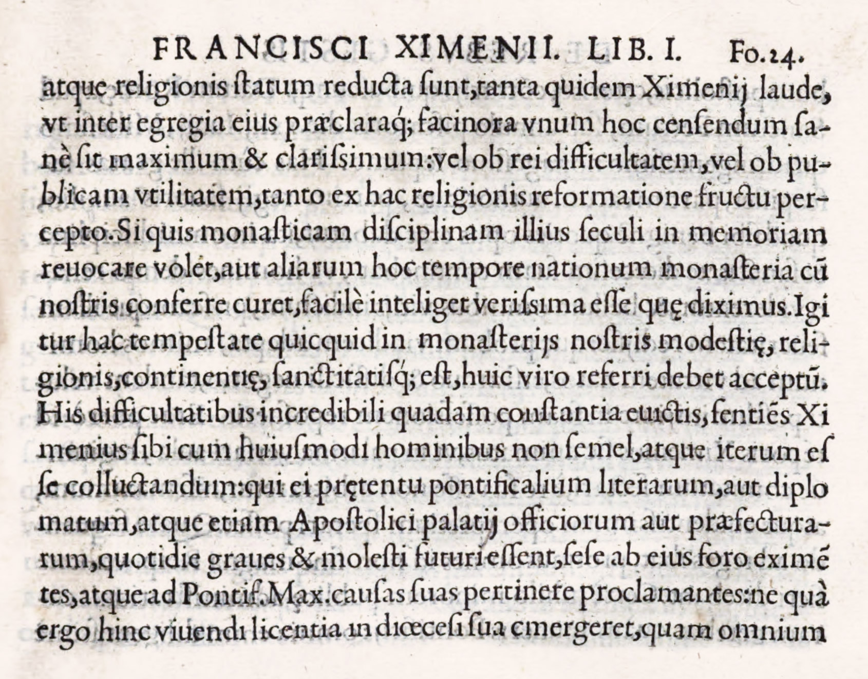
230. Roman Type used by Andres de Angulo, Alcalá, 1569
From a copy in Harvard College Library (facsimile), De Rebus Gestis a Francisco Ximenio, Cisnerio (scan)
§2. XVII Century
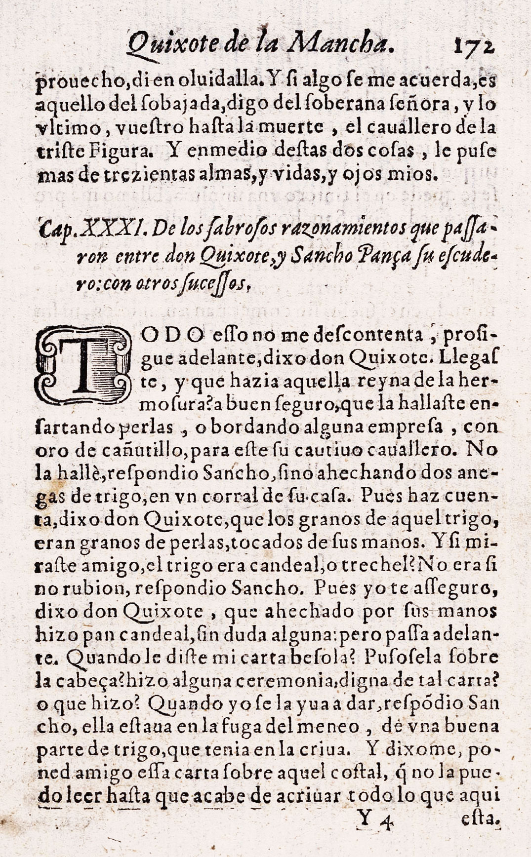
The great Spanish book of the seventeenth century, and of every century since, is Don Quixote. The first edition of the First Part was published by Juan de la Cuesta at Madrid in 1605. It is a square octavo. As to its type-setting, after some preliminary matter in a dull, heavy roman type, and in an irregular italic, and the familiar introductory poetry addressed to Don Quixote and Sancho Panza, arranged alternately in roman and italic, comes the text. This is very solidly set in the same heavy roman, but is managed most simply, and I think for that day it was probably considered a very modern sort of book. The argument of each chapter is set in italic; the text, as I have said, in a rough old style roman (fig. 231). When poetry occurs in the text, it is sometimes composed in a pretty and gay sort of swinging italic letter, sometimes in italic of a more commonplace cut. Each book starts with a head-line of type ornament, and its text begins with a large block initial. At the end of the book the “epitaphs,” etc., are set in italic with roman head-lines, and a table of chapters, chiefly in italic, closes this First Part.
231. Types used in first edition of Don Quixote: Juan de la Cuesta, Madrid, 1605
From a facsimile edition in the Boston Public Library, Biblioteca Digital Hispánica (scan)
The Second Part, issued at Madrid by the same publisher in 1615, resembles the First, except that chapter headings are smaller, and poetry is sometimes in single column in a roman letter like the text, or in double column in a size of italic slightly smaller. It is a respectable production,—nothing more,—but more readable than most seventeenth century editions of novels, which were usually very poorly printed.22
A roughly executed but fine seventeenth century book is the folio edition of Pedro Salazar de Mendoza’s Cronica de el gran Cardinal de España, Don Pedro Gonçalez de Mendoça, printed by Donna Maria Ortiz de Saravia at Toledo in 1625. Arranged in double columns, surrounded and separated by rules, it is greatly superior to most books of the time in its finished effect and unity of conception.
Another more characteristic seventeenth century book—G. Gonzalez de Avila’s Teatro de las Grandezas de la Villa de Madrid of 1623—has an engraved and much overloaded title-page, followed by an equally elaborate engraved dedication, in which heraldic arms and a figure of the Blessed Virgin and Child play a large part; and after the preliminary “approbation” set in roman type, and some italic which looks very Italian in cut, a dedication follows, Al Rey Nuestro Señor, in handsome old style letter. The preface is set in old style roman type, and then grandezas of the city are described in five hundred or more folio pages, generally in double columns of roman type with italic capitals. Awkward and over-large ornaments appear here and there. Decorations made up of florets appear occasionally. The only thing consistent throughout is lack of unity and taste!—like poor seventeenth century printing everywhere. The book was issued at Madrid by toas Junta, royal typographer.
Franciso de los Santos’ interminable Descripcion breve del Monasterio de S. Lorenzo el Real del Escorial, called by him “unica maravilla del mundo” (and by others the eighth), written after the completion of the Pantheon in 1654, was printed at the Imprenta Real (which I take to be merely a term) in 1657. This is a like book to the Grandezas, though a better one. It is set in a handsome old style roman type with patches of italic here and there. The presswork, however, is miserable—most uneven in colour. The translation of royal bones to their gilt and marble charnel-house—corona de esta maravilla—and the discourses delivered on the occasion, close with a touch of horror a respectable and not very inspiriting piece of printing. A copy of the 1667 edition formed part of the library at Samuel Pepys.
The first edition of Antonio de Solis’ Historia de la Conquista de Mexico, printed at Madrid by Bernardo de Villa-Diego, printer to his Majesty, in 1684, is a good example of a late seventeenth century folio. The title-page, set almost wholly in various sizes of roman capitals, is surrounded with a badly printed type-border. Then follow approbations, civil and religious, among which appear dedications to the King and the Count of Oropesa, by whose hands (the title-page tells us) this volume was laid at the Royal Feet. The work itself is set in double column in a rather fine roman letter, interspersed with masses of vivacious condensed italic, not without charm (fig. 232). The book, which is a late example of many similar volumes, is interesting to compare, both as to type and arrangement, with Sancha’s edition of Solis, printed at the height of “revival of printing” in the reign of Carlos III.
232. Opening of Solis’ Conquista de Mexico (first edition): Villa-Diego, Madrid, 1684
From a copy in the Boston Public Library (facsimile), Google Books (scan)
§3. XVIII Century
For eighteenth century Spanish printing, our first example is a book printed at Madrid in 1726 by Francesco del Hurio, printer to the Spanish Academy—a folio Diccionario de la lengua Castellana in six volumes.23 Its title-page is set in twenty-two lines of type, of which no less than ten are rubricated, and the name of Philip V (to whom it is dedicated) is as large as Diccionario—the first word of the title.24 This page is bordered with type ornaments, in red and black—a fashion much copied in colonial Spanish printing. All its prefatory matter is composed in various sizes of good, but rough, old style roman and italic, and the Dictionary itself is set in a smaller font which is pleasant in feeling. In the main, it is a sober, solid piece of work; but the woodcut head-pieces and common, ornamented initials employed are ugly, and the presswork is of varying degrees of badness.
Perez de Soto of Madrid produced between 1760 and 1770 a work that was then, and still is, thought a great achievement in scholarly printing—Casiri’s Bibliotheca Arabico-Hispana Escurialensis. Miguel Casiri was librarian of the Escorial, and this is a catalogue of the Arabic works in that library. It was printed in Latin and Arabic, in two volumes folio, at the expense of the Crown by Soto, who was printer by royal appointment. The roman and italic types used for the preface and text of this book—though much tried by too rough a paper—are remarkably beautiful, and appear to be the texto shown by Bordazar in his Plantificacion of 1732. The Arabic characters accord delightfully in colour with the roman types. In spite of sprawling head-pieces and ill-managed preliminary matter, the work is a wonderfully able piece of printing.
Of Joachin Ibarra’s work, I describe first his Sallust—Cayo Salustio Crispo en Español—translated from Latin by the Infante Don Gabriel Antonio de Borbon, second son of Carlos III. It was printed in 1772 and vividly recalls Bodoni’s early manner. The title-page is entirely engraved; and besides a few full-page plates there are some handsome engraved head and tail-pieces and initials designed by the court painter Maella and others, which are agreeably combined with type. The Prologue is set in a very calligraphic italic, the Life in a beautiful font of roman—both fonts produced by Antonio Espinosa. The Spanish text of the book is set in the same beautiful clear italic, in a larger size, which has still more the look of writing. Beneath each page of translation the Latin text appears, set in a small roman letter in double column. It is very even in composition, if we allow for the spaces necessary for the figures for notes; though an odd feature is the equal space before and after commas, semicolons, and colons—a trick common, however, in contemporary work (fig. 233). At the end of two hundred and eighty-eight pages of text come notes, a treatise on the language of the Phœnicians by Perez Bayer,25 and an index—these being set in double column, in a small, clear, old style roman type. Now this all sounds very simple—and it is; but as we turn page after page of this distinguished, lively, easily read italic and massive roman, we see how magnificent pure typography was made at an unexpected moment and place. It is really the beauty of these two fonts of type that, above all, makes such a wonderfully beautiful book. Like all great printing, it looks as if it could not have been planned in any other way; and like all great art, it appears so simple that only after seeing it repeatedly do we realize how fine it is. One hundred and twenty large-paper copies were printed on a rich, creamy hand-made paper. Almost all of these were given away by the translator, Don Gabriele, to the Royal Family, friends at court, persons of distinction, or learned institutions. He sent one to Franklin, then envoy to France, who (very characteristically) sent him in return the Proceedings of the American Congress! The Sallust is one of the finest volumes produced in any country during the eighteenth century—though it could have been printed in this particular style only in Spain.
233. Italic used for Spanish text of Sallust: Ibarra, Madrid, 1772
From La conjuracion de Catilina y la Guerra de Jugurta (scan, p. 153 [269])
Of Ibarra’s excellent editions of Don Quixote, there were three, all illustrated with copper-plates—that of 1771, in four volumes octavo; of 1780, in four volumes quarto; and of 1782, in four volumes octavo. Of these the 1780 “Academy Edition” was the most important—indeed, according to an authority26 on editions of Don Quixote, “the finest edition which Spain has produced and perhaps altogether the most estimable one we have.” Ford, in his delightful disquisition on the book—too little known—speaks of this edition, saying, “the finest, that ‘de lujo,’ was published for the Academy of Madrid by Ibarra, and no grand library should be without it.”27 Ponz mentions as in process, in his account of the Academia Española, “a magnificent edition which is to be a definitive one, executed by the Academy under Royal patronage.”28 Henry Swinburne, who visited Spain in 1776 wrote
There is now in hand, an edition of Don Quixote, with prints taken from the original drawings of the dresses and landscapes of the country, which has employed all the best engravers for some time past.… This work…does great honour to the editors and printers.… The works of Calderon have lately reprinted; and a new edition of Lopez de Vega, on excellent paper, and with very fine types, is in great forwardness: Printing seems of late to be the branch they most excel in.29
Of the “Academy Edition” in quarto, the first volume opens with a simple title-page set entirely in roman capitals, without engraved decoration (fig. 234). The complicated preliminary matter—that introductory to the actual book, and the preface, poetry, etc., which form part of Don Quixote—is managed with delicacy and restraint, and with an entire absence of fussiness. As to type, the opening parts and text are set in a kind of modernized old style roman and italic (fig. 235). Where poetry occurs in the text, it is set in italic, as are the “arguments” to chapters. All the type used in the book hands together wonderfully, and the fonts are so full of colour, and so original and lively in cut, that they seem like the work of a man unhampered by professional and mechanical traditions. They were of Spanish design, being made by Geronimo Gil for the printing-house of the Biblioteca Real, and loaned to the Academy for this edition. The roman appears to be the atanasia gorda en texto of the Real Biblioteca specimen of 1787.
234. Title-page of Academy Edition of Don Quixote
From a copy in the Boston Public Library (facsimile), Biblioteca Nacional de España (scan, p. 11 [CERV/5 V.1])
235. Types used in Academy Edition of Don Quixote: Ibarra, Madrid, 1780
From a copy in the Boston Public Library (facsimile), Biblioteca Nacional de España (scan, p. 634 [CERV/6 V.2, 138])
Engraved head-bands, head-pieces, and tail-pieces ornament the Prologo de la Academia and the text, but otherwise the book is severely plain, except for a portrait and many full-page plates designed and engraved—like the more agreeable decorations—by Spanish artists. Though well executed, these large plates are somewhat stiff and academic in design. The paper used for this edition is a creamy linen (made for it at the paper mills of Joesph Florens in Cataluña); the ink a vivid black; the presswork clear and remarkably even, and the imposition of the pages easy and distinguished. As a whole, excepting, perhaps, the full-page plates, everything prophesied of this edition, or said about it on its completion, is true. And this, the finest edition of Don Quixote that has ever been printed, was wholly the product of Spanish skill.
Two years later (1782), Ibarra published his pretty “reading edition” in four octavo volumes, printed from a somewhat modelled old style type, very straightforwardly arranged, and ornamented by many pleasant copper-plates. It is an example of what might be called Ibarra’s quieter work.
The four noble volumes of Nicolas Antonio’s Bibliotheca Hispana, Vetus et Nova, dealing with the works of Spanish authors from the time of Augustus to 1684, were begun by Ibarra at Madrid about 1783 and finished by his widow in 1788. They are in folio and printed throughout in a series of workmanlike old style fonts. These dignified pages, so practical in arrangement, are well imposed and printed on a fine rough linen paper. They are undecorated save for the heraldic trophies on the title-pages, and the second series (Nova) an occasional engraved head-piece and initial, which do not add to the effect. The first two volumes are among the soberest and most satisfactory of Ibarra’s editions—though the preliminary matter (as usual with this printer) is not as well handled as the text itself. The second part of the work was edited by Perez Bayer, who had a hand in so many of the great typographical and literary undertakings of that day.
Sancha’s imprints show a general tendency to copy contemporary French work, and such books as Malo de Lugue’s Establicimientos Ultramarinos de las Naciones Europeas of 1784, in five volumes, might easily be mistaken for a French edition of a little earlier date. Its text is very simply arranged in leaded old style types, with plain old style letters for initials, printed on good paper, with ample margins—a very satisfactory “library edition.” Las Eroticas, y Traduccion de Boecio [volume 1, volume 2], by Villegas, brought out in 1774, are pretty volumes—for Spain—and the engraved title-pages, with doves, clouds, garlands, torch, and lyre, remind us of attractive Parisian volumes of poetry by fashionable versifiers. The simple pages of poetry, without decorations, strike a comparatively modern node (fig. 236). Sancha published many such agreeable books.
236. Type used by A. de Sancha, Madrid, 1774
From a copy in the Boston Public Library (facsimile), Las Eroticas, y Traducción de Boecio (scan)
To see the progress that printing made in this Spanish revival, compare Villa-Diego’s edition of Solis’ Historia de la Conquista de Mexico, issued at Madrid in 1684 (fig. 232), with Sancha’s beautiful quarto edition of the same book, printed under distinguished patronage, also at Madrid, in 1783 (fig. 237). This is still considered a great edition of Solis’ work. The types used are frankly old style, and of these the larger sizes are the best. Introductory matter fills fifty pages, and this prefatory material is divided into eleven sections. To arrange it successfully, as Sancha has done, would tax the ingenuity of any printer. On arriving at last at the History, how fine it is! The first page is faced by a portrait of Cortez after Titian; the opening page is really ornamented by its engraved head-piece and initial; the type of the text is a large, beautiful old style, printed on laid paper in a sharp, brilliant impression. A series of twenty-four delightful and rather ingenuous full-page engravings designed by Joseph Ximeno are scattered through the work, each Book of which begins with an engraved head-piece and ends with a tail-piece. The engraved lettering beneath the full-page plates shows how magnificent was the style of calligraphy which still survived in Spain. This volume, which Sir William Stirling Maxwell called “the triumph of the press of Sancha,” much increases one’s respect for him.
237. Opening of Solis’s Conquista de Mexico: Sancha, Madrid, 1783
From a copy in the Boston Public Library (facsimile), Historia de la Conquista de Mexico (scan)
Benito Monfort’s edition of Juan de Mariana’s Historia General de España, printed at Valencia in two quarto volumes in 1783 [volume 1, volume 2], is a really fine book, though far less elegant and studied in Sancha’s Mexico. The title-page, with its brilliant copper-plate heraldic vignette, is effective, though its mixture of sizes and kinds of types is not worthy of the text-pages. A prospectus of the work (which was published by subscription) alludes to the encouragement that Carlos III gave to printing, as one of the means of its publications. For its appears that the King—“to encourage an art and business which so greatly contributes to culture, to the promotion of science, and to useful knowledge”—permitted Monfort to reprint it in spite of some legal obstacles; His Majesty having also in mind the reëstablishment of printing-houses that had formerly existed in almost all Spanish cities, in many of which the industry had died out. Twelve pages of subscribers’ names, which attest the results of his prospectus, are followed by a prologue, an account of Mariana and his works, notes thereto, etc. His preliminary matter is not successfully managed, but the text itself, in a good, modelled, late eighteenth century old style font, is well arranged and very handsome. The paper and ink are excellent, the imposition most elegant, and as a whole it is a successful piece of printing.
Monfort’s 1779 edition of Perez de Guzman’s Crónica de Don Juan II is a readable folio. The title-page, to be sure, is a wretched mixture of shaded, decorated, and plain roman capitals, with italic added thereto; but the simple pages of text, set in double column, with chapter heads in roman capitals, and the argument of each chapter in italic, are dignified in effect, the presswork is fair, the paper delightful. The same printer’s edition of Pulgar’s Crónica de los Reyes Católicos of 1780 shows progress, and has a much better and simpler title-page. It is ornamented here and there with copper-plates, evidently of Spanish origin. The text is arranged much as the Juan II. The type in both books is a very Spanish-looking early “old style,” though the hand-made paper on which it is printed makes it look rougher than it is. Where they go to pieces is in the introductory and “displayed” typography.
The book most quoted as an example of Monfort’s printing is Perez Bayer’s learned Latin work on Hebrew-Samaritan coins—De Numis Hebræo-Samaritanis—a quarto printed in 1781. The type is about fourteen-point in size, well leaded, with some Hebrew introduced. The notes are set in smaller type, in double column, at the bottom of the page. Here and there, small engraved plates of coins are inserted in the text with great taste. There are also a few full-page plates. The book ends with notes, set in a handsome roman type, and an index (fig. 238).
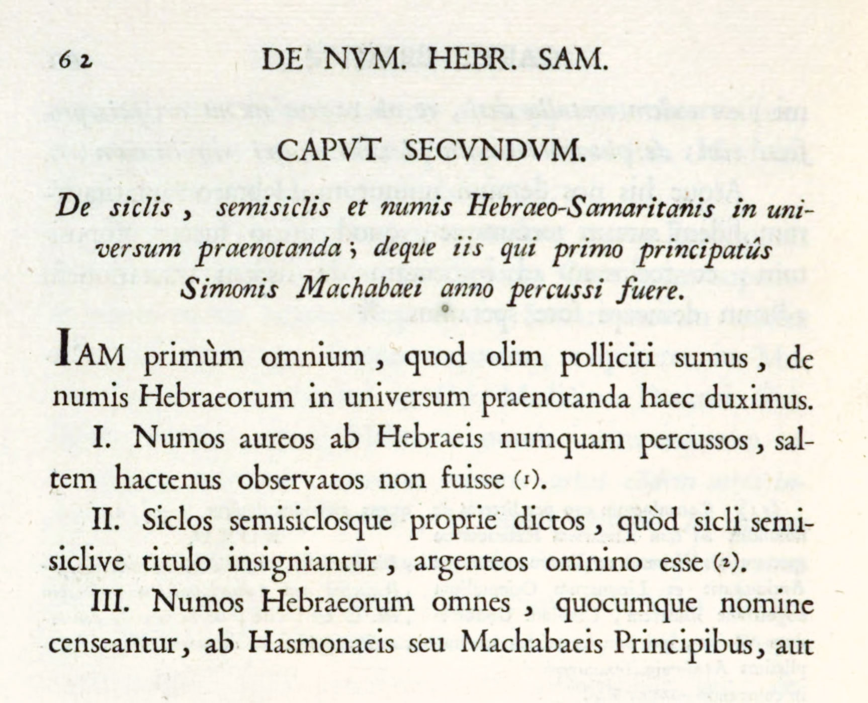
238. Type used in Bayer’s De Numis Hebræo-Samaritanis: Monfort, Valencia, 1781
From a copy in the Boston Public Library (facsimile), Google Books (scan)
It is easy to understand why this piece of printing had great reputation at that day. In the first place, the types (the texto of the specimen shown in Bordazar’s Plantificacion), beautifully displayed by Latin, are of severe classical form and lighter in effect than most types used in Spain at that time. They have, especially lines set in capitals, a noble “inscriptional” quality, and all that Monfort had to do to make a masterpiece was stick to them! But he lacked the courage and taste to do this in the preliminary matter. Then, too, the engraved initial, head-piece, etc.—attractive enough in themselves—have nothing to do with these dignified types. On the other hand, it is in conception immensely ahead of its time in its typographical harmony with the serious scholarship of Bayer’s work. With the exception of the first twelve or fourteen pages, it is as classical in feeling as any Spanish volume I have come upon—except Alvar Gomez’s life of Cardinal Ximenez, printed more than two hundred years earlier (fig. 230).
This roman was employed seven years before Yriarte’s Obras Sueltas, published at the expense of his friends, and honoured by subscriptions from the Infantes Gabriel, Antonio, and Luis. It is a most beautiful piece of printing, and one of the very best examples of the Spanish revival. The delicate but virile roman, with an italic superior in style to that used in the De Numis, its exquisite paper, ample, well-disposed margins, and the great reserve of arrangement make a distinguished book, and one of classical effect. This came from the press of Franciso Manuel de Mena, of Madrid, in 1774, and suggests how much good work was being done in Spain, at that moment, by printers whose names are forgotten (fig. 239).
239. Page from Yriarte’s Obras Sueltas: Mena, Madrid, 1774
From a copy in the Boston Public Library (facsimile), HathiTrust (scan)
Good examples of eighteenth century luxurious printing of a more ephemeral kind are the pamphlets for the Spanish Academy on gala occasions—orations on marriages of the royal family printed by the “Imprenta” of that body; Antonio Marin’s distinguished brochure recording the opening of the Academy of San Fernando (1752); “relations” of the distribution of prizes for the same Academy, printed by Gabriel Ramirez in 1754, 1755, and 1756, including some admirably arranged verse; the Address of the Academy on the accession of Carlos III, by Perez de Soto; and similar examples of work by Ibarra. Almost all of these are carefully executed from old style types, some fine of their kind, and embellished (to use the word of that day) with some handsome copper-plate decorations, intended to resemble the similar engravings in the French books.
It is because this eighteenth century revival is so little known, and its work is so individual and so good, that I described at some length a number of its best books. I am tempted to say that, as a class, Spanish books show the most characteristically national typography of Europe. Yet, although this seems so, I think it is chiefly because we are so unfamiliar with them that their peculiarities strike us freshly; whereas our eyes are accustomed to the equally strong national traits latent in French or Italian books of corresponding periods. However this may be, Spanish typography has its stately charm; though its primitive and uncompromising character may not be fully realized until—amid a collection of old Spanish books—one comes across some elegant French version of a Spanish classic.30 This bring us back to European printing with a start, and makes the old styling that “Europe ends at the Pyrenees” seem for a moment true. But—cosas de España!—there are those who love things Spanish, and I am among the number. For those who do not, in the phrase of Cervantes, “Patience, and shuffle the cards!”
II. Spanish Foundries and Specimens
The eighteenth century Spanish “specimens” to be considered in closing this chapter are those of Espinosa, 1771; a Barcelona specimen of the Convento de S. Joseph of 1777; the first Real Biblioteca specimen of 1787; the Pradell specimen of 1793; Ifern’s book of 1795; and that of the Imprenta Real of 1799—all (except the second) issued at Madrid.
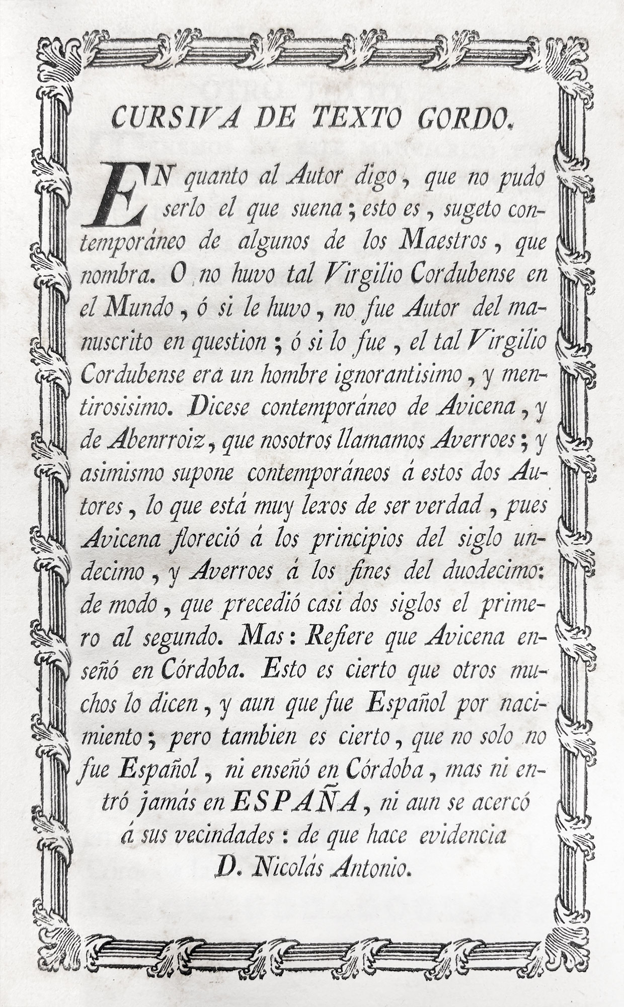
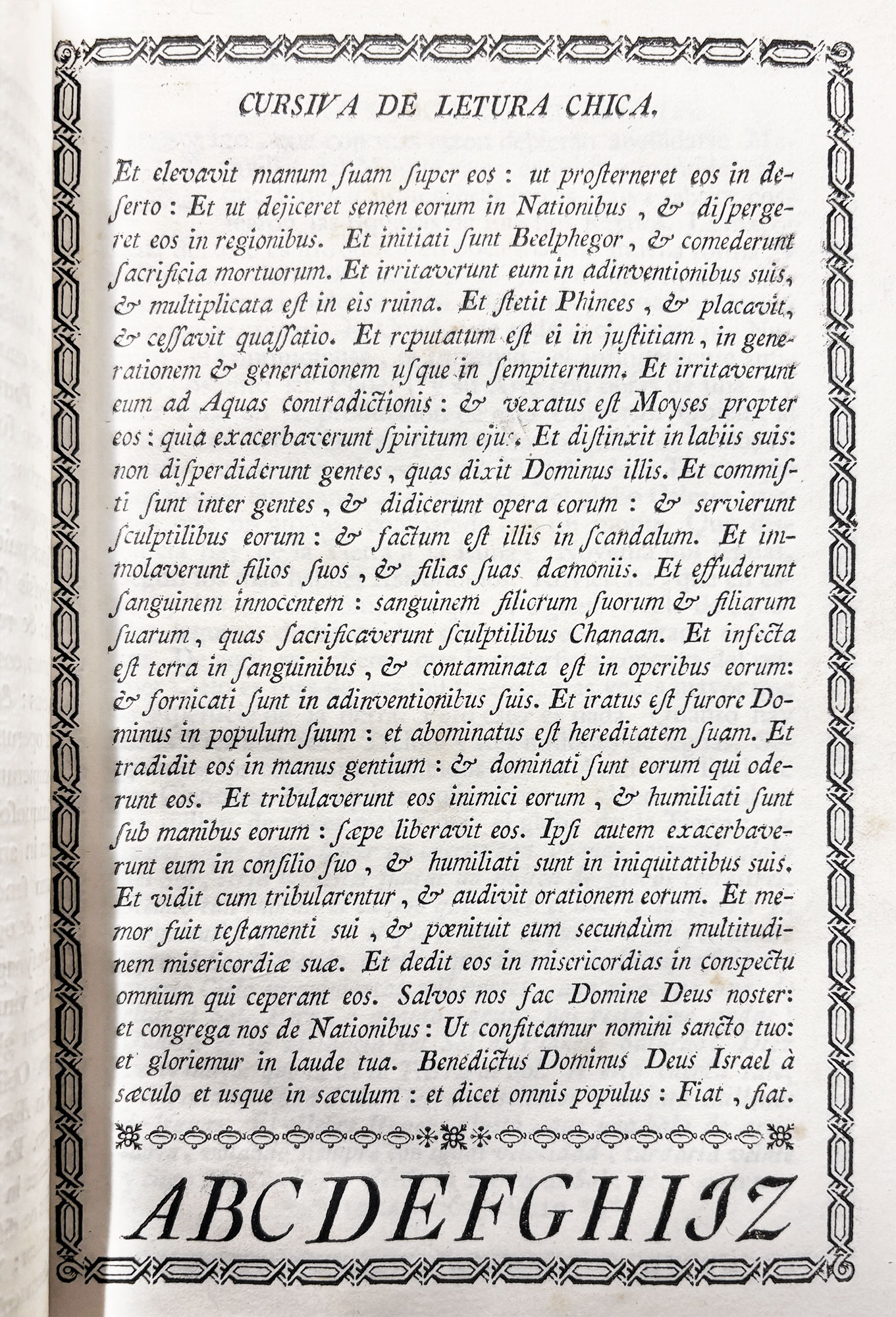
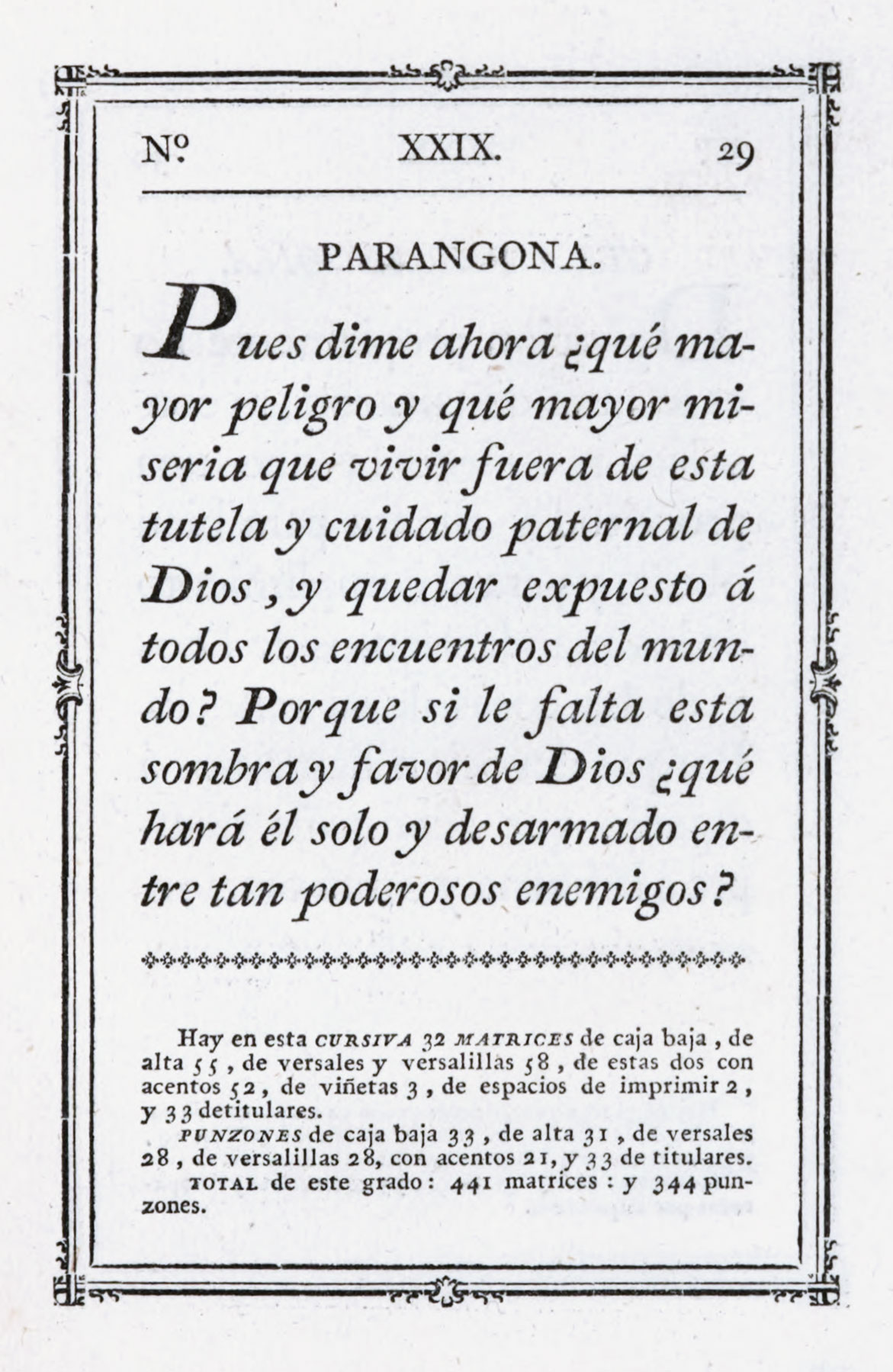
The first book is entitled Muestras de los Caracteres que se funden por direccion de D. Antonio Espinosa de los Monteros y Abadia, Academico de la Real de San Fernando, uno de sus primeros Pensionados, en Matrices hechas enteramente por el mismo, con Punzones, que igualmenta prosigue trabajando hasta concluir unsurtido completo. It shows a series of slightly condensed old style types which are remarkable in one respect—that roman characters in some cases, and italic in all, have an extraordinary quality of pen-work. The italic—i.e., that used in the prefatory address preceding the title-page (fig. 240)—the texto gordo and its cursiva (figs. 241 and 242), texto en Atanasia cursiva, cursiva de letura chica (fig. 243), and the curious entredos (fig. 244), are not altogether pleasant in effect, but they are among the most thoroughly calligraphic characters to be found in any existing specimen-book; and, too, they are very Spanish letters. The italic of the parangona Salustiana is that used in Ibarra’s Sallust, though so badly printed as to be almost unrecognizable. Spain is writ large on every page of this volume, in types, ornaments, and their arrangement—though the borders on some of the pages are copies of Baskerville’s and Fournier’s type “flowers.”
240. Italic in Prefatory Address: Espinosa’s Murestras de los Caracters, etc., Madrid, 1771
From Providence Public Library Special Collections (scan)
241. Texto Gordo (roman): Espinosa’s Murestras de los Caracters, etc., Madrid, 1771
From Providence Public Library Special Collections (scan)
242. Texto Gordo (italic): Espinosa’s Murestras de los Caracters, etc., Madrid, 1771
From Providence Public Library Special Collections (scan)
243. Italic of Letura Chica: Espinosa’s Murestras de los Caracters, etc., Madrid, 1771
From Providence Public Library Special Collections (scan)
244. Entredos (roman and italic): Espinosa’s Murestras de los Caracters, etc., Madrid, 1771
From Providence Public Library Special Collections (scan)
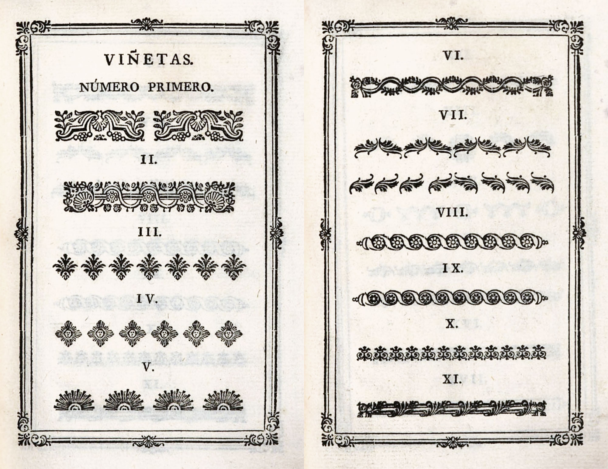
The second specimen is entitled Muestra de los Caracteres que se hallen en la Fabrica del Convento de S. Joseph, Barcelona. Por el Ho. F. Pablo de la Madre de Dios, Religioso Carm. Des., 1777—a title-page the arrangement of which is a copy of the title-page in Bodoni’s Parma specimen of 1771—in turn modelled on a title in Fournier’s earlier Manuel. This rare little 32mo specimen is interesting for its showing of ancient black-letter types which were employed in early Spanish printing—Muestra de los Caracters que se usaron en las Impresiones Antiguas de España—of which two sizes are reproduced on an earlier page (fig. 220). The larger is somewhat pointed, though not as much so as many other Spanish gothic types: the smaller is a rounder letter and perhaps resembles the Spanish equivalent of the lettre de somme—in Spain called the letra de Tortis.31 The roman and italic types in the book are old style of the usual kind, though here and there fonts appear which are somewhat calligraphic in appearance. The eleven pages of borders or viñetas are, most of them, Spanish renderings of French designs. The book (dedicated to Carlos III) was evidently printed by some one familiar with Fournier’s style of type-setting.
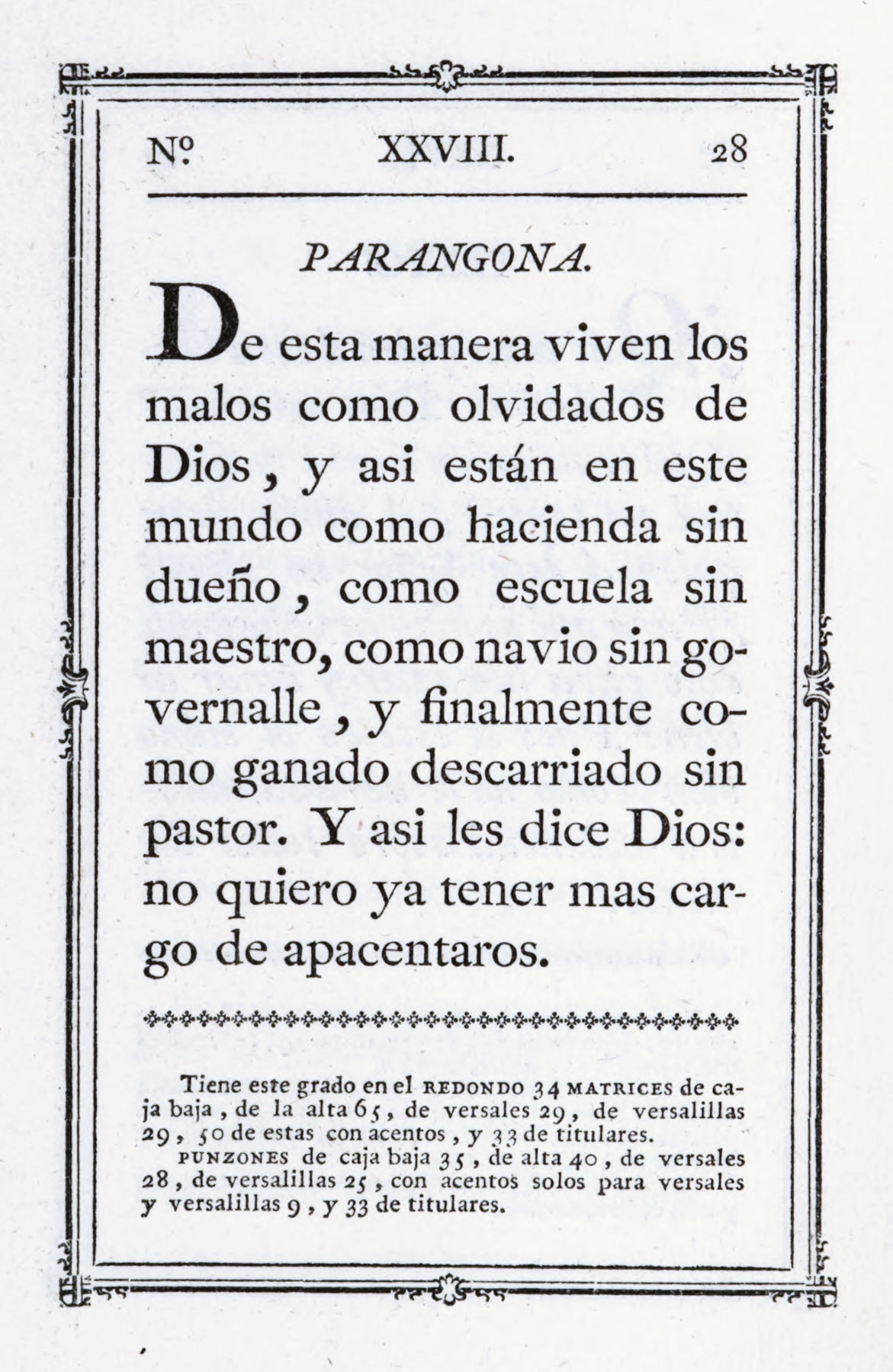
In the volume of Ponz’s Viage de España devoted to Madrid, the author, in his account of the Real Biblioteca, says that it is much to be hoped that the works of national writers will be published under the direction of the Royal Library when the Imprenta Real is actually established, as it shortly will be by the King’s instruction; the principal difficulty—that of obtaining suitable matrices—having been overcome. Ponz adds that these have been engraved with the utmost perfection by Don Geronimo Gil, and that specimens of them have been submitted to the King by Don Juan de Santander, chief librarian. The volume in which this passage occurs, Ibarra published in 1776.32 Allowing for the leisurely deliberation with which the development of type-cutting ambled along in Spain, perhaps eleven years was not a long period to wait for a specimen of the types themselves. Ibarra had already used some of them (loaned by the Real Biblioteca) in his quarto Academy edition of Don Quixote issued in 1780. It was not until 1787 that a specimen-book appeared, entitled Muestras de los Nuevos Punzones y Matrices para la Letra de Imprenta executados por Orden de S. M. y de su Caudal destinado a la Dotacion de su Real Biblioteca. These were probably all cut by Geromino Gil, though no supporting statement is made except on the first page, where we are told that a minute type, proudly called Plus Ultra and described as the smallest letter in Europe, was cut by Gil, although he left it unfinished. These types are very Spanish in effect—notice particularly the parangona in roman and italic (figs. 245 and 246), the roman otra parangona on page 30, and the cursiva nueva—a version of the condensed French italic then popular (fig. 247). Specimens of Greek, Hebrew, and Arabic characters are included in the collection. The titling-letters resemble some Holland fonts, and many of the ornaments are derived from Fournier, from Caslon, and from Baskerville—with a difference. It is a fine assemblage, and is one of the first that I know of, where the number of matrices and punches is appended to the display of each font. Many of these types and ornaments ultimately found a place in the Imprenta Real of Madrid and appear in its specimen of 1799.
245. Roman cut by Gil: Specimen Real Biblioteca, Madrid, 1787
246. Italic cut by Gil: Specimen Real Biblioteca, Madrid, 1787
247. New Italic of Texto (showing French influence): Specimen Real Biblioteca, Madrid, 1787
The next book in the group is Muestras de los Grados de Letras y Viñetas que se hallen en el Obrador de Fundicion de la Viuda é Hijo de Pradell, Madrid. En la Oficina de Don Benito Cano, Año de 1793. Eudaldo Pradell, the founder of this establishment (sometimes called the Catalan foundry), was a country boy of good family. He was first apprenticed to an armourer—as was Caslon to a gunmaker. He went to Barcelona when twenty years old, and there met the head of the Imprenta Real, Pablo Barra. This man urged Pradell to become a type-cutter, as Spain needed such a workman. After a good many difficulties, Pradell produced four fonts which were brough to the attention of Carlos III, who gave him a pension in 1764. Pradell, in a biographical note to this specimen, is called el primer inventor en España de esta Arte. He set up a foundry in Madrid, where her pursued his trade successfully, and he departed this life in 1788. In the next year his son Eudaldo, who continued his father’s business, was also pensioned by the King.
The peticano (fig. 248), lectura, texto, and entredos were the first types that the elder Pradell finished. The body of the letter is, in some cases, large compared with its ascenders. The descenders are generally short, which partly accounts for the rolling look of the fonts in large sizes. Pradell’s italic fonts have the pen-work appearance which was such a feature of Spanish eighteenth century types. The ornaments in his book show the Bodoni and Fournier influence, modified by Spanish rendering. There is an assortment of mathematical signs and some large arabic numerals—the latter reminiscent of Bodoni. Music-types, a supply of awkward, heavy titling-letters, flowered letters, and nine pages of “flowers” complete a very interesting volume.
248. Peticano, cut by Eudaldo Pradell, Muestras de la Viuda é Hijo de Pradell, Madrid, 1793
The next specimen is Muestras de los Caractéres que tiene en su Obrador Pedro Ifern, Fundidor en esta Corte. En la Imprenta de Fermen Thadeo Villalpando (1795). The prefatory note to this 16mo volume reads:
These printing characters are cast from the punches and matrices which were entirely the work of Don Eudaldo Pradell, first inventor of them in Spain, for which he was pensioned by His Majesty in the year 1764, which matrices are now the property of Pedro Ifern, being part of the dowry of his wife, Doña Margarita Pradell, and which are dealt in by virtue of the royal order following
—which is appended, dated August 16, 1790. Ifern’s specimen is a pretty little book, got up with considerable state and showing naturally much the same collection as his mother-in-law’s more ambitious volume; but the paper is lighter and more attractive than the Pradell specimen, and shows off both types and ornaments better. The ornaments are not quite the same. Many of them are derived from French sources and some from English, but they are all treated in a very Spanish way (fig. 249).
249. Ornaments from Muestras, etc., Pedro, Ifern, Madrid, 1795
A final volume to be described is the 1799 specimen-book of the Imprenta Real of Madrid, which was at last started and which seems to have absorbed the material cut by Gil for the Biblioteca Real. Richard Ford in his classic Hand-Book for Travellers in Spain—“the best guide ever written for any country”33—speaks of the Imprenta Real as being, in this day, in the Calle de Carreteras—the same street in which, about a hundred years earlier, Barettei,34 then travelling in Spain, visited a printing-office. Housed in a cumbrous building, the work of an architect named Turillo, it contained, Ford tells us, “the royal printing and engraving establishment. From this press have issued many splendid specimens of typography,” though he, unhappily, neglects to say what they were. This establishment was later situated in the Calle del Cid, but to-day no longer exists.
The title of this specimen is Muestras de los Punzones y Matrices de la Letra que se funde en el Obrador de la Imprenta Real, Madrid, Año de 1799. The book is in two parts. The first comprises an ambitious collection of excellent roman and italic types, followed by some Greek types (fine in the largest and smallest sizes), a few pages of Arabic, and a little Hebrew. Apart from Gil’s fonts, and others of that style, there are a number of lighter fonts, both in roman and italic, that, while distinctly “old style,” show the taste for lighter letter-forms which was then making headway in Spain. [See] a second collection of type decidedly more modern cut. The tendency toward less “nourished,” lighter letters is clearly seen in these over-finished, monotonous characters (figs. 250 and 251)—types by no means so interesting as those in Part I. Following these is a large display of capital letters in roman and italic, shaded initials, Greek capital letters, and a repertoire of “flowers,” some of which we reproduce (figs. 252 and 253). A few are original, but a great many of these “flowers” were derived from Holland,35 France,36 and England,37 and others from various perfectly recognizable sources; but they are rendered in such a way as to be transmuted into very Spanish design.38
250. Roman tending to “Modern Face,” from Muestras, etc., Imprenta Real, Madrid, 1799
From Internet Archive (scan)
251. Italic tending to “Modern Face,” from Muestras, etc., Imprenta Real, Madrid, 1799
From Internet Archive (scan)
252. Ornaments from Muestras, etc., Imprenta Real, Madrid, 1799
From Internet Archive (scan)
253. Ornaments from Muestras, etc., Imprenta Real, Madrid, 1799
From Internet Archive (scan)
Late eighteenth century Spanish specimen-books, when compared with English or French “specimens,” show
- that the prevailing European taste was active in Spain, though retarded;
- yet that type and ornaments both possessed a marked national character; and
- that Spanish types—especially in italic fonts—had surprisingly calligraphic quality.
This third point is perhaps capable of elucidation. These calligraphic types were (it seems to me) modelled directly on the Spanish handwriting then considered ideal for documents or letters meant to be handsomely rendered. For instance, italic letters, in some fonts in these specimen-books, end in little “dabs,” as if written with a pen overfull. This was much like some of the writing of the great seventeenth century Spanish calligrapher Diaz Morante, an edition of whose Arte Nueva de Escribir was republished by Sancha in 1776. Morante and his son profoundly influenced Spanish writing for two centuries.39
Though craftsmen in other countries of Europe had learned the futility of copying too closely a written letter, an effort appears to have been made in Spain to translate the formal calligraphy of the eighteenth century into type-forms. This was a beginner’s blunder, but all earlier beginners had “begun” so long before, that for a moment the student of types is puzzled at the recurrence of the error, and takes it for something new. If Spanish specimen-books were filled with very calligraphic types, perhaps it was because the Spanish type-cutter—with no native tradition to guide him—was working out an old problem in his own way.
- English authorities for this history of Spanish typography from 1500 to 1800 are few. There appears to be no readily accessible survey of Spanish printing for the sixteenth, seventeenth, and eighteenth centuries, even in Spanish; although there are essays on presses (during the whole or part of this period) in Palencia, Seville, Alcalá, Valencia, Toledo, Medina del Campo, Madrid, Cordova, Tarragona, Lérida, Leon, the kingdom of Aragon, etc., many of which are admirable. In English there is little in the way of a continuous narrative, through Mr. H. Thomas’s paper on The Output of Spanish Books in the Sixteenth Century (Transactions of the Bibliographical Society, Sept., 1920) may be consulted with advantage for this period.
- A copy is in the Hispanic Society’s Library, New York.
- For italic and roman alphabets of this period see Arte de Escrivir of Francisco Lucas, Madrid, 1577. These are reproduced in Strange’s Alphabets (third edition), plates 57 and 70. They are called type-letters by Strange, but are really calligraphic.
- curioso, i.e., virtuoso—a person curious about or interested in a subject—of an inquiring turn of mind.
- en la Corte, i.e., Madrid.
- Literally, “changing with the art that symmetry requires.”
- Qy., word from word?
- Mendez’ Typographia Española, Madrid, 1796, p. 406.
- An able printer, who was the ancestor of a very distinguished Valencian “printing family.” José and Tomas de Orga, his sons, printed in 1790 an important edition of the Bible translated into Spanish [Old Testament vols. 1, 2, 3, 4, 5, 6, 7, 8; New Testament vols. 1, 2], executed in types from the fonds of the Real Biblioteca de Madrid, and from the foundry of Eudaldo Pradell.
- The various negotiations of Bordazar and José de Orga in relation to this subject are treated fully in José Serrano y Morales’ Resña Histórica en forma de Diccionario de las Imprentas que han existido en Valencia desde la Introducción del Arte Tipográfico en España hasta al año 1868, etc. Valencia, 1898–99.
- Mendez’ Typographia Española, p. 410.
- There was, too, an interest in printing in Portugal at this period. The Impressão Regia was established at Lisbon in 1769 through the influence of the Marquis de Pombal, the reforming minister of Joseph I (1750–1777). The scheme was a splendid one—a national press, which was to be at once a school of all branches of typography, and a means of producing books for the educational needs of Portugal. It was begun under direction of Miguel da Costa; and still exists as the National Printing House of Portugal. Fournier said (1766) that a type-foundry had been in existence at Lisbon for some thirty-five years, a Parisian named Villeneuve being its owner.
- On the death of Ferdinand in 1802, the Duchy of Parma was governed by France, until, in 1815, the Congress of Vienna gave it to Marie Louise, wife of Napoleon I. This explains the dedication of the later books of Bodoni—who preferred rising to setting suns!
- Travels in Spain, London, 1789, Vol. I. p. 244, De Bourgoing, who was secretary to the French embassy at Madrid, wrote a book about his travels, translated into English under the above title.
- Recherches…sur l’Établissement de l’Art Typographiue en Espagne, etc., Paris, 1830, p. 65.
- Probably that quoted in Juan Josef Sigüenza y Vera’s Mecanismo del arte de la Imprenta, etc. Madrid, 1811. In this beautifully printed little book, dedicated to Ibarra’s niece, the author describes himself as “deciple of del reyno.” It contains a “specimen” of Roman and Arabic types—all but one from the “Catalan” foundry of Eudaldo Pradell—and Greek, Hebrew, and Arabic alphabets.
- Bayer was born in 1711 and died in 1794.
- Memorial Literario…de Madrid, Nov., 1785, p. 363. A short notice of Monfort and titles of his more important books are given by Ponz in an account of Valencia in his Viage de España, Third Edition, Vol. IV, pp. 259, 260 and 288, 289.
-
P. Vindel’s two volumes of facsimiles, entitled Bibliografia Grafica, Madrid, 1910, show 1224 reproductions of titles, colophons, portraits, etc., taken from rare Spanish books, or books in Spanish published elsewhere. The work contains practically no text and is haphazard in arrangement, but is valuable for the light it casts on Spanish printing, especially from 1500 to our own day. Portugal, South America, and the Philippines are represented, as well as Spain.
- Of the volumes chosen as examples of sixteenth, seventeenth, and eighteenth century Spanish printing, some may be found in the Ticknor Collection of books on Spanish literature in the Boston Public Library, and others in the Library of Harvard College.
- For a detailed account of the Complutensian Polyglot, see J. P. R. Lyell’s Cardinal Ximenes, Illustrated, London, 1917, pp. 24–52.
- The Hispanic Society of America has reprinted in facsimile a number of rare and interesting Spanish books, the series in their catalogue of publications running to some sixty-five titles. Facsimiles are supplied of Juan de la Cuesta’s first Madrid edition of Don Quixote, both first and second parts, which appeared in 1605 and 1615, respectively. Title-pages and 611 editions of Don Quixote, extending from 1605 to 1905, are reproduced in facsimile in Iconografía de las Ediciones del Quijote de Miguel de Cervantes Saavedra (Barcelona, 1905). Spanish and Catalan titles alone run to 233 numbers. Almost a history of Spanish printing after 1600 can be had by comparing different editions from its first publication to the present day.
-
In a set of this Dictionary, given to the Library of Harvard College in 1767 by Thomas Hollis, a manuscript note from the donor reads:
This Dictionary is much esteemed. There are good books in Spanish and I was willing to send it; that, as the N. Americans, many of them, are likely, more than ever, to partake of Spanish Wealth, some of them may also partake in Spanish Wisdom and Literature.
- Placing the dedication on the title-page was a characteristic of many eighteenth century Spanish books. To honour the patron, his name was usually printed in very large letters, which sometimes overpowered the title of the volume.
- My own copy is one which was given by Bayer to a certain William Conyngham.
- C. R. Ashbee.
- Ford’s
GuideHand-Book to Travellers in Spain, London, 1845, Vol. I, pp. 314 et seq. - Ponz’s Viage de España, Madrid, Ibarra, 1776, Tomo Quinto, p. 176.
- Swinburne’s Travels through Spain, in the years 1775 and 1776 (second edition), London, 1787, Vol. II, p. 203.
- For instance, D’Herberay’s Amadis de Gaul, in four volumes, folio, printed by Groulleau at Paris, for V. Sertenas, in 1548.
- Letra de Tortis—probably derived from the name of a Venetian printer, Battista de Tortis, who largely employed it. Other forms of Spanish black-letter were called—according to Mendez—Bula, Antigua, Gothica, Formata, Veneciana, Lemosina, and Calderilla. For explanation of these names see the notice of Del Impresor Bautista de Tortis in Mendez’ Typographia Española, Madrid, 1796, pp. 385 et seq.
- Viage de España, Madrid, Ibarra, 1776, Tomo Quinto, p. 174. This was the work which the French were said to have used as a guide in looting objects of art during the Peninsular War.
- The famous edition is that of 1845. Consult the amusing account of Spanish booksellers, Vol. I, pp. 138 et seq.
- The Italian, Joseph Baretti (remembered chiefly for his Italian-English and Spanish-English lexicons, and as one of Dr. Johnson’s circle), who was in Madrid in 1760, mentions visiting “a large printing-office in the Calle de las Carretas [sic], a street so called, and chiefly inhabited by printers and booksellers.” Speaking of the fifty workmen employed in this printing-office and the rate of production, he says, “I asked two fellows at one press, how many sheets they could work off in a day, and was answered five and twenty hundred, which I thought a pretty good number, especially as they were none of the most muscular men.” Baretti’s Journey from London to Genoa, etc., London, 1770, Vol. III, pp. 8, 9.
- Page 138, No. 155; page 139, No. 172.
- Page 136, No. 132; page 137, No. 142.
- Page 131, No. 63.
- The “modern face” type which was in use by 1800 in other parts of Europe does not appear to be commonly employed in Spain until some years later.
- See plates in Reflexiones y Arte de Escribir del Abate Dn Domingo Maria Servidori, Romano. Imprenta Real, Madrid,
17881789.