Chapter II
A Font of Type and its Case: The Typographical Point: Point-Set and Lining Types
Type is defined as a right-angled, prism-shaped piece of metal, having for its face a letter or character, usually in high relief, adapted for use in letter-press printing; and type in the aggregate is described as an assemblage of the characters used for printing. In a single type the chief points to be described are the face, counter, stem, hair-line, serif, beard or neck, shoulder, body or shank, pin-mark, nick, feet, and groove.
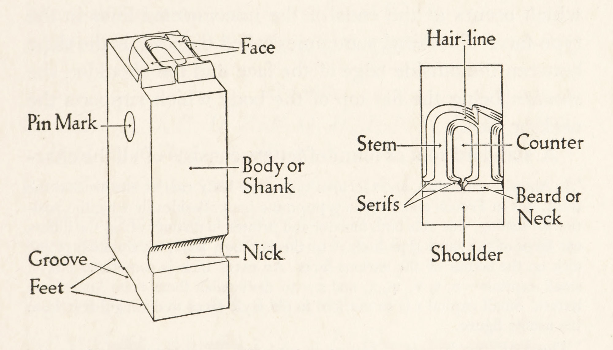
2. Diagram of Type (left) and 3. Plan of its Face (right)
Drawn by Rudolph Ruzicka
The accompanying diagram of a piece of type (fig. 2) shows its face, body, nick, groove, feet, and pin-mark; and the plan of the face (fig. 3) shows the stem, hair-line, serif, counter, beard, and shoulder.
The body (or shank) of a piece of type is the metal between the shoulder and the feet (described later), and the term “body” is also used to denote the size or thickness of types, leads, etc. The pin-mark is an indentation on the upper part of the body, made by the pin in casting. The nick is the groove across the lower part of the body of the type, and is a guide to the position in which it is to be set up.1 The feet are the projections on each side of the groove on which the type stands. The groove being the hollow left between the feet where formerly was the jet.
The face of a type is the letter on its upper end which carries the ink to be impressed upon the paper; the counter is the cavity left by the surrounding lines of the face. The stem is the thick stroke or line of the letter; the hair-line is the thin stroke of the letter. The serif is a short cross-line which occurs at the ends of the unconnected lines on the type-face.2 The beard, sometimes called the neck, is the slope between the outside edge of the face and the shoulder, the shoulder being the flat top of the body which supports the neck or face.
A standard font or fount of letters consists of all the characters usually needed in composition, and is made up of the following sorts:
Roman
- Capitals: A, B, C, D, E, F, G, H, I, J, K, L, M, N, O, P, Q, R, S, T, U, V, W, X, Y, Z, &, Æ, Œ.
- Small capitals:3 a, b, c, d, e, f, g, h, i, j, k, l, m, n, o, p, q, r, s, t, u, v, w, x, y, z, &, æ, œ.
- Lower case: a, b, c, d, e, f, g, h, i, j, k, l, m, n, o, p, q, r, s, t, u, v, w, x, y, z, æ, œ, ff, fi, fl, ffi, ffl.4
- Accented letters: á, à, â, ä, é, è, ê, ë, í, ì, î, ï, ó, ò, ô, ö, ú, ù, û, ü.
- Figures: 1, 2, 3, 4, 5, 6, 7, 8, 9, 0.
- Marks of punctuation: - , ; : . ? ! — ’ [ ] ( ).
- Marks of reference: *, †, ‡, §, ∥, ¶, ☞.5
Italic
- Capitals: A, B, C, D, E, F, G, H, I, J, K, L, M, N, O, P, Q, R, S, T, U, V, W, X, Y, Z, &, Æ, Œ.
- Lower case: a, b, c, d, e, f, g, h, i, j, k, l, m, n, o, p, q, r, s, t, u, v, w, x, y, z, æ, œ, ff, fi, fl, ffi, ffl.
- Accented letters: á, à, â, ä, é, è, ê, ë, í, ì, î, ï, ó, ò, ô, ö, ú, ù, û, ü.
- Figures: 1, 2, 3, 4, 5, 6, 7, 8, 9, 0.
- Marks of punctuation: - , ; : . ? ! — ’ [ ] ( ).
Spaces: en quadrat, and 3 to em, 4 to em, 5 to em, 6 to em, and hair spaces, used to separate words.
Quadrats: em quadrats, and three sizes of large quadrats, viz., 2 em, 3 em, and 4 em, used chiefly. to fill out lines.
Miscellaneous: braces in different lengths, dashes, leaders, fractions, mathematical signs,6 degree marks, commercial signs (such as $, @, ⅌), and so forth.
Occasional Characters: liturgical signs, ℣, , and (for the sign of blessing), characters denoting contractions (such as , q, eo, ď, , zp), unusual fractions, etc.
The characters which make up a complete font of type fall into six classes, which Mr. De Vinne tabulates as:
- Full-bodied Letters, like Q and j, that occupy the entire body of the type;
- Ascending letters, like A, b, d, h, that occupy the upper three-fourths of the body;
Descending letters, like p, y, g, q, that occupy the lower three-fourths of the body;
- Short letters like a, o, that occupy about one-half of the body in the middle part;
- Small capitals, that are sometimes in height more than one-half of the body, but not as high as the ascending letters;
- Irregular characters, like the *, that have no arbitrary height, but do have a definite position.
In a type of “modern” face, the figures all belong to the second class, but in “old style”7 fonts they are variously short, ascending, and descending.
A “sort,” understood in connection with printing, is one of the pieces in a font of type considered in reference to supply or lack. To be “out of sorts” is to order more of the kind in which the font is deficient. The term “out of sorts,” therefore means destitute or without equipment.
The word “ampersand” is a corruption of “& per se = and,” meaning the character & by itself.8 In some italic ampersands the letters e and t are easily distinguished, as in the examples shown, , , , .
The Arabic numerals have an interesting history. The best forms to employ are mentioned on a later page. Arabic figures are not cast in italic except in very modern fonts.
Types have much better appearance when composed in certain languages than in others. Latin is an ideal tongue for type composition, no other language having anything like the same dignity and monumental appearance when well composed in fine type—probably one reason why Latin quotations have so long survived in specimen books. This is due to the many u’s, m’s, and n’s, the lack of y’s, and the paucity of other descending letters. A page composed in Latin and a page composed in English, placed so that the lines of type are perpendicular to the eye, will at once show the difference in effect between them.
It was an early custom to display black-letter types in the words of the Pater Noster or sometimes (as in Radolt’s fifteenth century specimen sheet) of the Ave Maria. Classical quotations were used to show off roman type. No doubt the familiar opening of Cicero’s oration, “Quousque tandem abutere, Catilina,” has had (since Caslon’s time9) considerable influence on the shape of the capital letter Q; for this sentence became so consecrated to type-specimens that most eighteenth century type-founders felt it necessary to employ it, and in order to outdo each other, they elongated the tails of their Q’s more and more. I do not say that Q’s have long tails because Cicero delivered an oration against Catiline; but that the tails of some Q’s would not be as long as they are if the oration had begun with some other word! Ultimately the tail became so long that many capital Q’s with their companion u were cut as logotypes, i.e., Qu.
In casting a font of type, the proportion of its letters varies according to the language for which the type is to be used. Latin and French require more of the c, i, l, m, p, q, s, and v than English. This variation of proportion applies to almost all modern languages in different degrees. It is easy to see that in English many more letters of one sort are needed than of another. Indeed, the arrangement of type-cases is a hint as to the proportion used. This leads us to the consideration of the printer’s case, which has some points of interest. A case is a wooden try divided into various compartments or “boxes” of different areas but of a uniform depth of about an inch, and a printer’s font of type ordinarily requires two of these trays, one placed above the other on frames or sloping desks. The higher tray is called the upper case; the lower try is called the lower case; and it is from these trays and their position that the characters are described as upper-case and lower-case letters, a term which is merely descriptive of the relation of the cases to each other and to the composer (fig. 4).
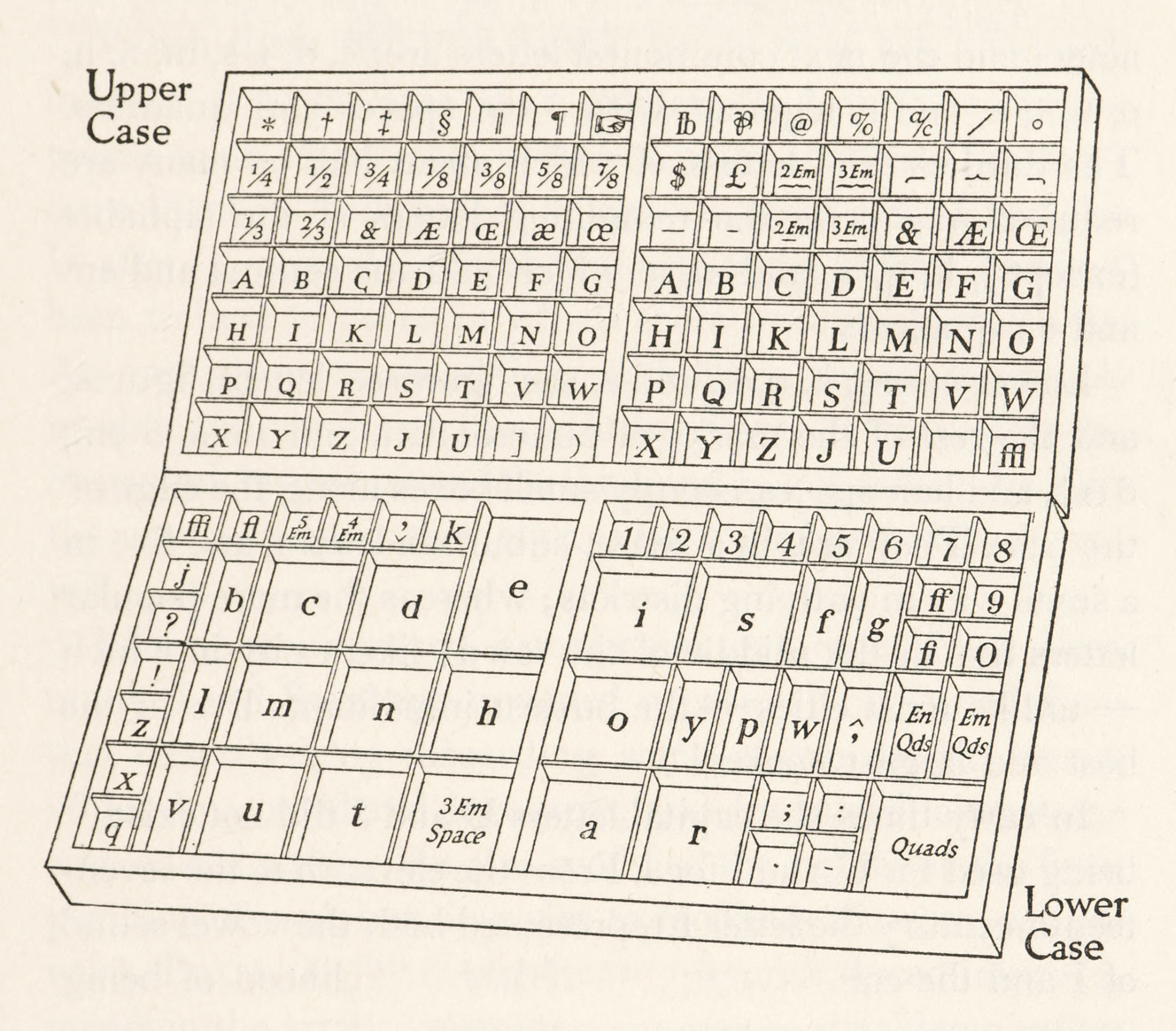
4. A Pair of Printer’s Cases
Drawn by Rudolph Ruzicka
The ordinary upper case has 98 equal-sized boxes and contains capital letters in order from A to Z, except for the omission of J and U, which follow the Z. The remaining boxes on the right hand are occupied by commercial signs, dashes, braces, dipthongs, the ampersand, and the lower case ffl. The left-hand side of the upper case contains small capitals, arranged like capitals on the right-hand side, and the other boxes are filled with fractions (sometimes replaced by accented letters), reference marks, such as the asterisk, dagger, section mark, etc., dipthongs for small capitals and lower case, the small capital ampersand, brackets, and parentheses.
The lower case, which has 54 boxes or compartments, is laid (for that is the term used in speaking of placing type in a case) on the principle of placing the letters most needed nearest the hand of the compositor. Of course, e comes first, having the larges compartment allotted to it of any character; and the next commonest letters are: c, d, i, s, m, n, h, o, u, t, a, and r, together with 4 em spaces and quadrats. The third class of letters, of which about half as many are required, comprise the remaining letters of the alphabet (except j, k, q, x, and z), to which add the comma and em and en quadrats.
Lower-case j, k, q, x, and z, the ligatured letters, figures, and the rest of the marks of punctuation, and 4 em, 5 em, 6 em, and hair spaces, occupy small boxes along the edge of the case. They are, in a sense, suburban letters, and live in a small way in outlying districts; whereas the more popular letters live in the middle of the town; like a city in which—unlike most cities—the busiest inhabitants live in the best and largest houses!10
In early times the capital letters U and J did not exist, V being used for U, and I for J. From the eleventh to the seventeenth sixteenth century the letter I represented both the vowel sound of I and the consonant sound of J.11 Its likelihood of being confounded with one of the strokes of some letter near it led to various efforts in writing to keep the two sounds distinct by a differentiation in the character, and from this effort came the curve of the j, though the dot of the i survived in the lower-case letter when the tail was elongated.
When these two new capital letters were first rendered in type, it is obvious that printers had become accustomed to an upper case arranged without them. To introduce them in proper places, i.e., the J after the I and the U after T, proved an inconvenience to the printer who had been trained to cases in which there were no such letters. At any given moment, it would have caused too much trouble and confusion in a printing-house to make this reform, and by this vis inertiae the J and U still follow the Z in the upper cases, as they always have, and probably always will.
Efforts at improved arrangement of cases have been many. Lord Stanhope invented a case which varied from that described, by discarding some of the double letters, which he considered logotypes, and by introducing some new combinations. He also modified the height of the front partition of each box, in order to facilitate the compositor’s work. But while his invention may have induced improvements in the arrangement of cases, it was considered rather too radical.12
Lefèfre, author of the classical Guide du Compositeur, who was “prote” (or foreman) to Didot, also arranged a case which, by an elaborate series of calculations, he shows would save twenty-three days’ time in a period of three hundred working days.13 In some of his proposals he foreshadowed the present idea of simplification of effort and movement as an important factor in economical production.14
There must be a variation in cases used for foreign languages. In general, European languages employing the Roman letter have cases differing slightly from one another, while cases for Greek and languages employing non-Roman characters have great divergence. Greek cases vary in different establishments; and a model of a Greek case, with the simplifications proposed by Lefèvre, may be consulted with profit.15
The names given to the various sizes of types in current use in England in the seventeenth century were as follows: French canon, two-line English, double pica, great primer, English, pica, long primer, brevier, nonpareil, and pearl; and small pica was also occasionally used. Half a century later, two-line letters of double pica, great primer, and pica were added; and paragon, small pica, bourgeois, and minion were to found in most printing-houses. Pica, equivalent to 12-point, was the standard English and American body and common unit of measurement for types, leads, etc., until the adoption of the point system.
The irregular bodies like small pica and bourgeois originated through the widespread use of Dutch fonts by English printers.
This predilection for Dutch material forced English founders to supply types cast to the Dutch standard. Some of the Dutch body-sizes were almost the same as English regular sizes, and were consequently called by the usual English name, which would thus come to stand for two or more slightly different bodies. But when a new font was imported, or cut by an unskilful English workman, which would not fit any regular English body, it was cast on an irregular body and given a new name.16
The names of the old type-bodies varied in different countries. Although they are practically abandoned to-day, it is useful to know what their original names were—a part of the literary history of type which explains many allusions in early books on printing that would be otherwise unintelligible. At first the name was descriptive of both body and face. Later it was applied to the body only. For instance: English was the name used to describe one size and all faces of black-letter type; and thus some specimen books display black-letter of 14-point size under the heading, “English English.” Indeed, until about the end of the eighteenth century an “English” face was understood to be black-letter. The old names of the chief English, French, German, Dutch, Italian, and Spanish types with their approximate equivalent in points are shown in the accompanying lists.17
| No. Points | English | French | German | Dutch | Italian | Spanish |
|---|---|---|---|---|---|---|
| 48-point | Canon | Double Canon | Kleine Missal | Parys Kanon | Reale | |
| 44-point | 2-line Double Pica | Gros Canon | Grobe Canon | Groote Kanon | Corale | Canon Grande |
| 36-point | 2-line Great Primer | Trismegiste | Kleine Canon | Kanon | Canone | Canon Grande |
| 28-point | 2-line English | Petit Canon | Dippel Mittel | Dubbelde Augustyn | Sopracanoncino | Peticano |
| 24-point | 2-line Pica | Palestine | Roman | Dubbelde Mediaan | Canoncino | |
| 22-point | Double Pica | Gros Parangon | Text or Secunda | Dubbelde Descndiaan (or Ascendonica) | Ascendonica | Misal |
| 20-point | Paragon | Petit Parangon | Parangon | Parangon | Parangone | Paragona |
| 18-point | Great Primer | Gros Romain | Tertia | Text | Testo | Texto |
| 14-point | (Large English) | Gros Texte | Grobe Mittel | Soprasilvio | ||
| English | Sain-Augustin | Kelin Mittel | Augustyn | Silvio | Atanasia | |
| 12-point | Pica | Cicéro | Cicero | Mediaan | Lettura | Lectura |
| 11-point | Small Pica | Philosophie | Brevier | Descendiaan | (Filosofia) | |
| 10-point | Long Primer | Petit Romain | Corpus or Garamond | Garamond | Garamone | Entredos |
| 9-point | Bourgeois | Gailarde | (Borgis) | Burgeois or Galjart | Garamoncino | |
| 8-point | Brevier | Petit Texte | Petit or Jungfer | Brevier | Testino | Breviario |
| 7-point | Minion | Mignone | Colonel | Colonel | Mignona | Glosilla |
| 6-point | Nonpareil | Nonpareille | Nonpareille | Nonparel | Nompariglia | Nompareli |
| 5-point | Pearl | Parisienne or Sedan | Perl | Joly | Parmigianina | |
| Perle | Peerl | |||||
| 4 1-2-point | Diamond | Diamant | Diamant | Roijn | ||
| Diamand |
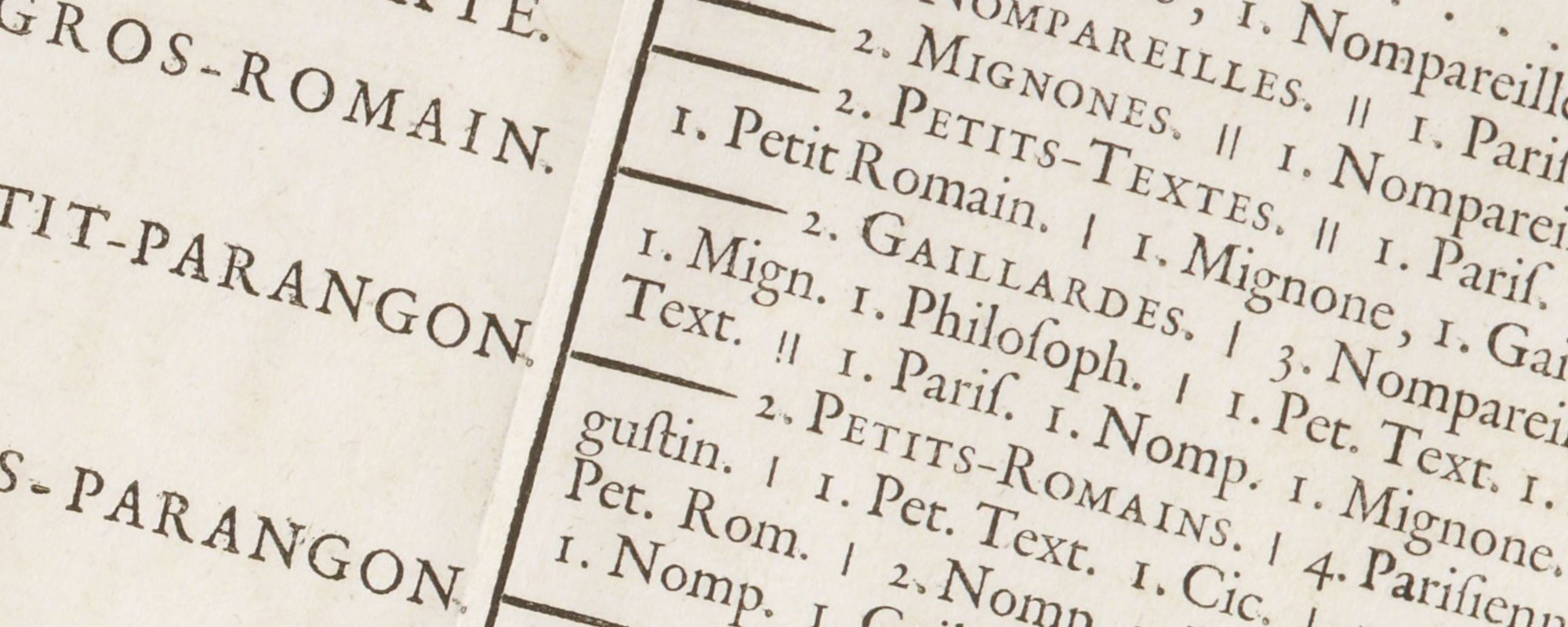
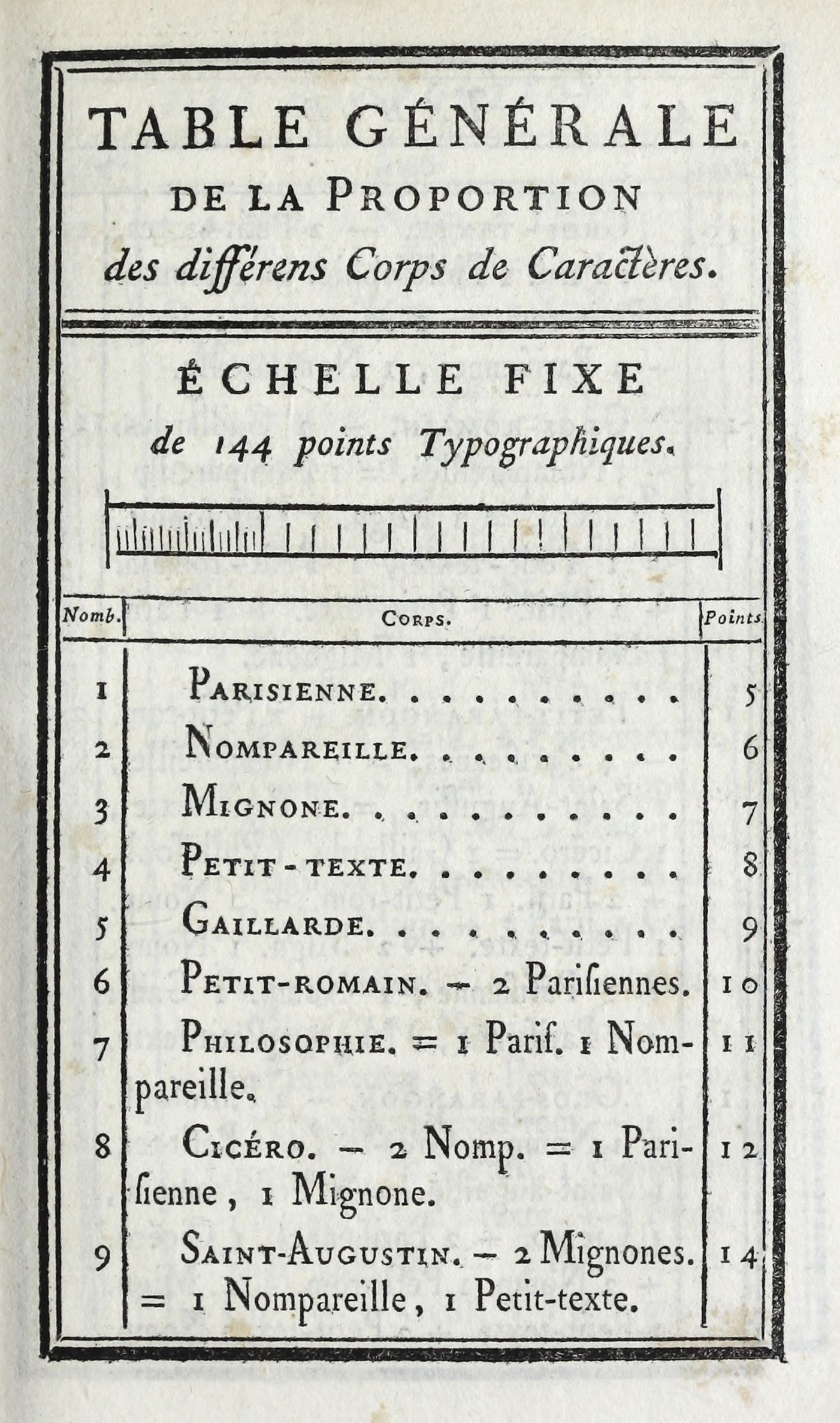
That the sizes of ancient type-bodies were arbitrary was deplored by writers as early as Moxon. In his Mechanick Exercises he gives tables showing the number of squares of a certain body which should make up an English foot. For instance, 184 squares or ems of a pearl body, or 17½ of the great-canon body, were comprised in one English foot. The relation, however, of these types to one another was extremely irregular. Dominique Fertel, of St. Omer, in his Science Pratique de l’Imprimerie, written in 1723, alludes to the lack of precision and uniformity in sizes of type current in his time. It was to remedy this that Pierre Simin Fournier18 formulated his “point system” in the tractate issued at Paris in 1737, entitled Tables des Proportions qu’il faut observer entre les caractères; describing and developing it further in the preface to his Modèles des Caractères de l’Imprimerie of 1742; and finally giving an elaborate description of his perfected scheme of the “typographic point” in his Manuel Typographique of 1764. I do not know how the scheme of proportion of type-bodies proposed in the original formulation of 1737 compares with that proposed in 1742, but the latter is neither as complete nor practical as in the plan finally developed in 1764. In the Modèles Fournier took for his unit of measurement a line of six points, and a 10-point type would therefore be measured as one line and four points—a plan somewhat cumbrous and inconvenient (fig. 5). But in the Manuel of 1764 he did away with the line and took the point as his unit—a much simpler plan, and one which by its practicality commended itself to printers then, as it has done ever since. His description of the first successful endeavour to place the measurements of types on a rational basis is quoted on a later page.
5. Fournier’s Table of Proportions of Bodies of Different Types
From Modèles des Caractères de l’Imprimerie, Paris, 1742
Before Fournier began experiments with the typographic point, there had been already some regulation of the height of French types; and a standard measurement of type-bodies had been proposed as early as 1733. But the standard to which types were to conform was set arbitrarily by some characters which happened to be found in one particular office, and the regulations which were issued at the time, not having any fixed principle of universal application, where useless. The idea was that one type should be equal to the body of two other types, but what the form of those two other bodies was to be was not decided. Of course, so ill-defined a plan ended in nothing.
Fournier describes his invention as something “new and unknown.”19
I give it a place here in order to explain the new proportions which I have applied to type bodies by the fixed measures which I call typographic points,…introducing in this department of typography an orderliness which it has never before had. Through the invention of typographic points, I think I have been fortunate enough to succeed with an exactness and precision which leave nothing to be desired. The typographic point is nothing but the division of the type body into equal and definite degrees which are called Points. By this means any one can know exactly the degree of difference and the relation of type bodies to one another. One may combine them as numerals are combined; two and two make four; add two and you will have six; double this and you get twelve, etc. So a Nonpareille, which is six points, with another Nonpareille would make a Cicéro, which is twelve points. Add still a Nonpareille and you would have eighteen points, or a Gros-Romain. Double this total, which would make thirty-six points, and you have the Trismegiste, and so on with the others, as you will see by the table of proportions.…
To combine the bodies it is sufficient merely to know the number of typographical points in each. To do this, these points or given units should be invariable, so that they will serve as standards in printing-offices, like the pied du roi, the inch, and the line in geometry. To this end I have fixed the exact size which the points should have, in a scale which is at the head of my Table of Proportions, and to insure the invariable exactitude in casting types, I have devised an instrument which I have called a prototype.…
The invention of these points is the first tribute which I rendered into typography in 1737. Obliged since then to start on a long, difficult and laborious career by engraving all the punches necessary to the establishment of my foundry, I found no rule to guide me in fixing the body of the characters which I was obliged to make. I was therefore forced to formulate my own principles, which i have done, and which I have rendered comprehensible by the following table (portions shown by figs. 6 and 7).
6. Fournier’s perfected Table of Proportions for his Point System
From Fournier’s Manuel Typographique, Paris, 1764
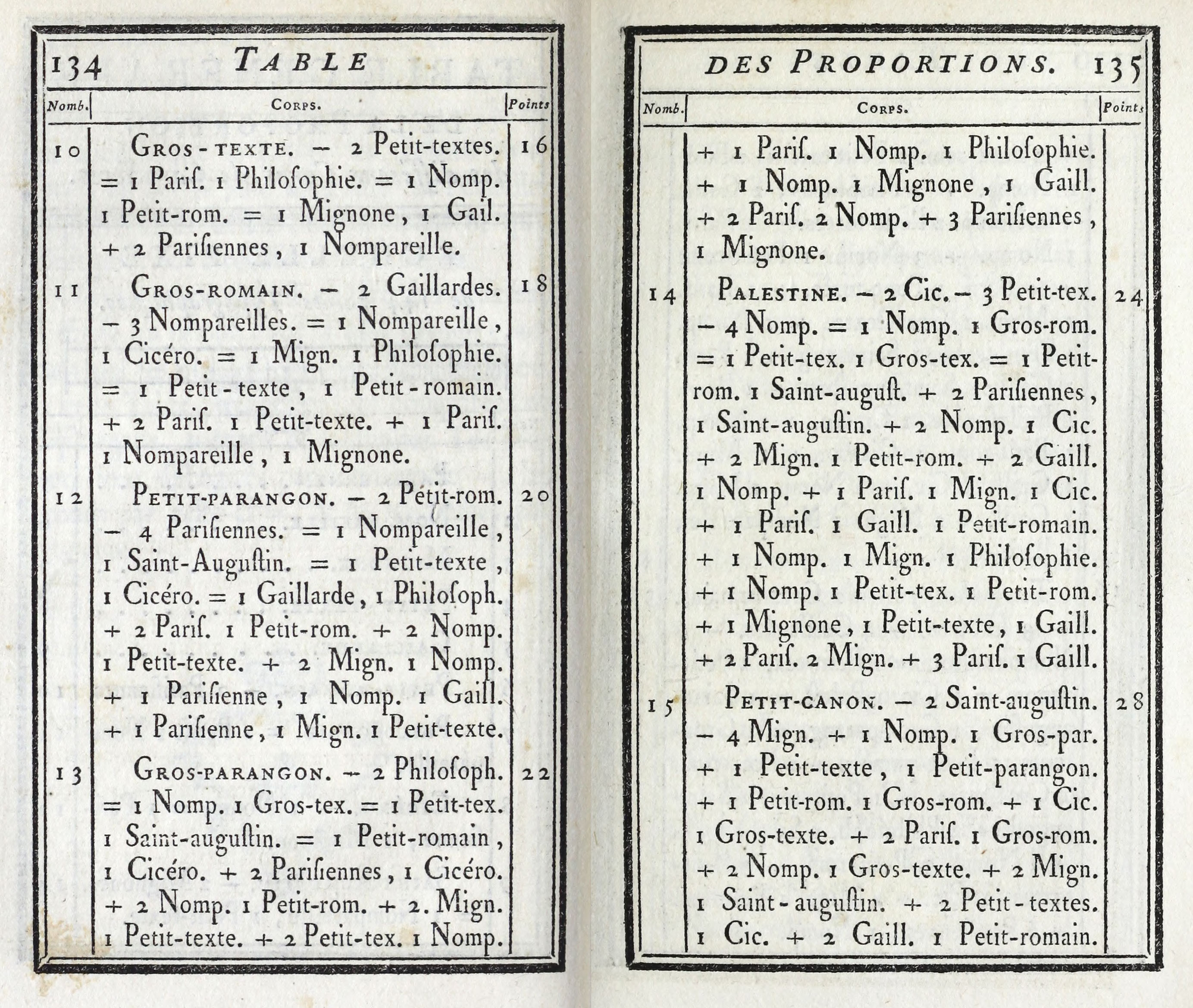
7. Fournier’s perfected Table of Proportions for his Point System (continued)
From Fournier’s Manuel Typographique, Paris, 1764
At the head of the table is a fixed and standard scale which I have divided into two inches, the inch into 12 lines, the line into 6 of these typographic points, making 144 points in all. The first little divisions are of two points, which is exactly the distance between the body of the Petit-texte and the body of the Petit-romain, or from this last size to the body of the Cicéro, etc. The number of points which I have assigned to each of the bodies must be measured by this scale. If these measures are carefully taken for each body and verified by the prototype, this will establish the general relation between all bodies of types, as will be shown by the following combinations.
This scale contains in its totality twelve bodies of Cicéro. After printing this same table, which I published in 1737, I perceived that the paper in drying had shrunk the proper dimensions of the scale a little, and in the present table I have forestalled this fault by adding what should be allowed for the shrinkage of the paper.
Fournier’s general table of proportions of the different bodies of characters is interesting. His idea of correcting the lack of system in casting types was excellent, but in the exact plan which he was proposing it was risky to make merely a rough and ready allowance for shrinkage of the paper on which his table as printed, if he intended to arrive at any exact result. Books at that period were printed on wet paper, and its shrinkage was very variable. It is perfectly possible, therefore, that the elaborately introduced scale, with its 144 points, varied by at least a point in different copies of Fournier’s Manuel. His prototype was of metal, a large measure of 240 points, something like a composing-stick, and was intended to correct this fault; but the prototype itself was probably subject to slight variations in manufacture, and was in no sense an instrument of precision.
In the succeeding steps by which the present point system was arrived at, the next advance was made by François Ambroise Didot, of the celebrated French family of typographers. Realizing the weakness of Fournier’s basis of measurement, he adopted as his standard the authoritative pied du roi, containing 12 French or 12.7892 American inches. He preserved Fournier’s subdivisions, making 72 points to the French inch. Nor did he find it difficult to adjust the smaller sizes of type to his new system. With large bodies, Didot was less fortunate. Cicéro, which was, like our 12-point or pica, the standard for determining sizes, he changed from twelve to eleven points, which proved rather disastrous in its working out. The traditional names of types he threw over, substituting for them (with French lucidity) the number of points which the type-body covered, as we do to-day; and this was perhaps the valuable feature of Didot’s performance. At the loss of a certain historical and picturesque nomenclature, it placed type sizes upon a basis comprehensible to the meanest intelligence. the introduction of the Didot system of points was not made without confusion, however; for many printers, especially in the French provinces, persisted in using the system of Fournier—a persistence continued into late into the last century. The Didot point is used in most of the foundries of Austria, Asia Minor, Belgium, Brazil, Denmark, Germany, Hungary, Rumania, Serbia, Sweden, Switzerland, and Turkey. Fournier’s point is scarcely used nowadays, except in Belgium.
At the time that the Didot system was introduced the French metric system had not been adopted, and it is only fair to say that until a type specimen is formulated which is in full and regular accordance with the metric system, perfection will not be attained. But the advance made has been very great and has infinitely simplified type-setting, the facility with which the numerical nomenclature dictates the sizes of types as compared with one another, being a by-product of a still greater mechanical advantage.
In this country, George Bruce of New York formulated, in the first quarter of the nineteenth century, a plan based on the theory that bodies of types should increase by arithmetical progression—that small pica should be made as much larger than long primer as bourgeois was larger than brevier. This system, which De Vinne calls ingenious and scientific, was not adopted except in Bruce’s own foundry.
Further advances were made, in which western type-founders took the lead. Marder, Luse & Co. of the Chicago Type Foundry began to produce types on point bodies about 1878. Influenced by this, in 1886 the United States Type Founders’ Association named a committee to consider the point system. It was found to accord (irregularly) with the metric system, 83 picas being equal to 35 centimetres. The unit was gained by dividing the pica into 12 equal parts, each part being called a point. As in France, the old names were discarded, great primer becoming 18-point, pica becoming 12-point, long primer, 10-point. This was very much the system of Fournier and of Didot; the only difference being that the pica selected was of a slightly different body from their standard body. It is known as the American point system, and many American printers proudly suppose that it is called so from having been wholly invented here!
The common measure for all bodies of type was decided by the Type Founders’ Association to be 35 centimetres or 83 picas in length. To gain a standard for determining the height of type it was proposed that this same standard of 35 centimetres should be chosen, and 15 type-heights were to build up the 35 centimetres. There is a slight difference here between the old standard of \(\frac{11}{12}\) of an inch and the new standard. The difference amounts to only about \(\frac{1}{500}\) part of an inch, but this is sufficient to make it impossible to use types of the old heights in combination with those of the new.
The Type Founders’ Association also considered the advisability of adopting the Didot point; but this, which had a great advantage in permitting the interchange of types between France and America, would have involved too much of a departure by American founders, and was thought impracticable.
It is not fair to expect from the adoption of the American point system that all difficulties will be overcome. Trouble in types may still be caused by defective moulds, by the overheating of the metal, or by careless dressing; and types of the same bodies from different foundries cannot always be used together with safety. There is still the great obstacle of a lack of uniformity in the height of the types themselves.20 But in spite of all this, typographical practice has been enormously simplified by the “point” system. It was adopted in England in 1898, though it had been in use by her nearest continental neighbour for well over a hundred and fifty years!
The adjustments to units of the width or set of types, as well as their height-to-paper and their body, has also been considered. In 1883 Mr. Linn B. Benton took out a patent for types made to units both in body and width—called “self-spacing” type. In 1894 a western firm introduced this system of self-spacing types, every type in their entire output being placed on a body the width of which was equal to an even division of the standard “pica em.” Later the more logical unit of a point was adopted—hence the term “point-set.” This was to result theoretically, as indeed it did practically, in each line ending evenly, and for the workman trouble in spacing was avoided; but the shapes of letters and the space around them were arbitrarily rearranged by such a method. Types have definite shapes already determined. The bodies on which they are cast cannot be widened or narrowed merely to aid mechanical convenience, with successful typographical results. In comparing fonts cast according to the old system of irregular sets and those cast on the point-set system, we find that the older font had more than ninety different sets, while the latter has but from thirteen to twenty. Something suffers when ninety different adjustments are reduced to from thirteen to twenty, and the “something” that suffers is the effect of the type.
Point-line—another so-called improvement—was introduced by the same western house in 1894; and has been so generally adopted by American and English foundries that it is now known as the Standard Lining system. There are mechanical advantages inherent in this scheme, but they are attained at the expense of the correct proportion of certain letters. The convenience of being able to align different sizes of type by the use of 1-point leads or their multiples is no doubt appreciated by the compositor; but to make this possible, types below 18-point are arranged, so far as “line” is concerned, but in three groups: in the first are 5 and 6-point types; in the second, 7 to 10-point types; and in the third, 11 to 16-point. Taking the second group for illustration, the “descenders” of g, j, p, q, and y can be no longer in a 10-point than a 7-point face; and as they are none too long in 7-point they become too short in 10-point. This disregard for proportionate length of descenders of types of different sizes pervades the whole scheme; and consequently no size of type (excepting possibly 7-point and 11-point) which is cast on Standard Line can have descenders of adequate length; while in some sizes they are so “chopped off” as to produce real deformity. It is fair to say, however, that a few series of roman and italic types have been arranged on Standard Script Line, which permits descenders of proper length in all except small sizes.
The shortened descender is objectionable from two points of view. In the first place, if the type in mass (especially in larger sizes, and when leaded) is not to present a squat and rolling appearance, the ascenders and descenders must be of adequate length to counteract this tendency. And in English, especially, the slanting and vertical lines of descenders are particularly required to offset the preponderance of round, short letters. With the descenders shortened the page loses that texture or “woven” look which is an integral part of elegance in typography. It is objectionable, secondly, because the legibility of a letter has a direct connection with its form; and to disregard this, for mechanical or any other reasons, makes type less “friendly to the eye.”
One convenience of the lining system is that all faces of a given size, whatever their character, line with one another. This enables the compositor to give emphasis to a certain word in the body of a page by using a heavy-faced type, without the necessity of “justification.” A good typographer seldom, if ever, wishes to give emphasis to a word in the middle of a sentence by setting it in heavy type; nevertheless there are cases, especially in catalogue work, where it is necessary to use some heavy-faced type to pick out a title or some salient feature akin to it. But a so-called advantage which offers facilities for wretched typography is that any italic will line with any roman—which has hitherto been difficult and “would to God were impossible!”
In these point-set and lining types (offered to the printer on the ground of labour-saving and economic advantages) care about distortion of the shape of letters, ill-fit to bodies or mixture of faces, or the effect which all this results in, was cast to the winds. Instead of being combated by larger foundries, both point-set and lining schemes were at once followed for business reasons. But the lining system was not adopted without some objection from printers, which is now making itself distinctly felt, and type-founders are again offering fonts with long descenders—a movement that has extended to the makers of type-setting machines.
Shortened descenders are nothing new. Italian printers used such deformed types in the fifteenth century, but they had no lasting vogue. The Elzevirs used them in the seventeenth century,—one reason why Elzevir books as reading editions are now failures,—but they did not survive. In the eighteenth century Caslon showed them as variants to his famous fonts, and Fournier possessed such types; but they went the way of all flesh. The shortened descender tried in our day is again going out of use; for no type-founder or machine-maker can permanently “buck” the proper proportions of letters.
A lining system which mutilates descenders, and self-spacing or point-set schemes which involve either lateral distortion of letters or too much space between them, may for the moment seem clever, convenient, lasting, and money-saving “improvements,” but they are merely unintelligent, temporary, and inartistic expedients. The reason that such schemes met at first with instant success is attributable to that lack of standard on the printers’ part to which I have alluded before. Their waning vogue has come from a little study and education. Men must show their faith by their works; and it is of little use to admire early typography when one is willing for money-making reasons to destroy, or permit the destruction of, the elements which made it admirable. But apart from all this, the fundamental trouble with these schemes is, that they make types hard to read.
- In American English, and German types, the body carries the nick on the front, but in French and Belgian type on the back. Besides showing the position for setting, this aids both founder and printer in distinguishing the different faces of the type-body—by the number, kind, or situation of the nick on the bodies of the various faces. An extra nick is sometimes cut on small capitals—o, s, v, w, x, and z—to distinguish them from lower-case letters. Small capital i is so marked in old style faces to distinguish it from the arabic figure.
- The serif is an important feature in type-design and usually varies by the style of its attachment to the body strokes, according to the face of the type. In old style lower-case letters it is a sort of blunt spur; in many modern French and Italian types it is a delicate hair-line; in modern “Scotch-face” it is curved or bracketing on the inside where it meets the main line. But the design of types is not absolutely determined by the shape of the serif. The stems of letters in great type-families, and particularly the swellings and depressions in the forms of their lower-case letters, are also important to the design of a type-face and yet independent of the shape of the serif. Serifs, taken by themselves, may resemble each other in quite different type-faces.
- There are seldom any italic small capitals.
-
A greater number of ligatured letters occur in Caslon’s fonts, viz.: ct, long ſ in its combinations ſb, ſh, ſi, ſk, ſl, ſſ, ſt, ſſi, ſſl, both in roman and italic. Some other old faces or their reproductions—i.e., the Garamond italic—show as, is, us, ct, fr, ll, sp, st, tt.
- Note references, except in rare instances, are the same for roman and italic.
- As far as is known, the mathematical signs + and − were first used by Wildmann in a book published at Leipsic in 1489, though he does not speak of them as if they were a novelty. Robert Recorde first employed them in an English book. In The Whetstone of Witte (1557) Recorde employed = as the sign of equality (chosen because “noe two thynges can be moar equalle” than two parallel straight lines), though this sign had long before appeared in mediaeval manuscripts to represent the word est. William Oughtred showed the × or sign of multiplication in his Clavis Mathematica, issued in 1631. See Franz Steffens’s Paléographie Latine. 125 Fac-similés en photoptypie acompagnés de transcriptions et d’explications, avec un exposé systématique de l’histoire de l’écriture latine. Trèves and Paris, 1910. Edited by Remi Coulon and translated into French from the second German edition of Lateinische Paleographie, p. xl.
- To understand the terms “old style,” “modern face,” and “modelled” letter it must be remembered that the earliest roman and italic types were of much more uniform line throughout than now. In time they began to show increasing differentiations of weight between the stem and the connecting lines. The earlier form of the letter, with slighter differences in contrasting weight of stroke, we now call “old style;” the much later form, exhibiting great contrasts of thick and thin lines, constitutes a “modern face” letter. And the greater the variation of weight of line in the design of a letter, the more it may be called “modelled.”
- The per se was used with A, O, and I, to indicate that the letter, standing by itself, made a word. This led to the term a per se, to denote what we should call now, A No. 1. For instance, “London, thowe arte of townes A per se.”
- Caslon appears to have been the first letter-founder to employ this quotation.
- The cases described are intended for book work. For job work—that is, for circulars, advertisements, etc.—a different case is required. This “job case” is a single case somewhat varied in its arrangement from that used for book composition.
-
The lower-case i and j were first differentiated in Spain, where (when printing was introduced) j was used for the consonant and i for the vowel. At first the capital I stood for both I and J, as it now does in German type, and should in all black-letter—although some vary strange J’s have been made by modern type-founders to supply a black-letter variant. The capital J appeared in Spanish before 1600. Louis Elzevir, who worked at Leyden between 1595 and 1616, is supposed to be the first printer who made the distinction of u and v, i, and j, lower case.
The capital letters U and V began to be differentiated by printers in Italy as early as 1524. In England, although various attempts were made in the sixteenth century to introduce u and j, their use was by no means general until 1630. At first V continued its double function as a capital, but subsequently u was adopted,—derived from its uncial form of V dating from the third or fourth century. This kind of capital u was employed up to the end of the seventeenth century, when it gave way to the present form. The modern English use of U u for the vowel V v for the consonant dates from about 1700; but their interchangeable use survived until well into the nineteenth century. Words beginning with U are still entered under V in the catalogue of the British Museum. In Chambers’ Encyclopedia of 1786, words beginning with U and W are placed under V.
- For illustrations of Lord Stanhope’s proposed cases, logotypes, etc., see Savage’s Dictionary of the Art of Printing, London, 1841, p. 102.
- Lefèfre’s Guide Pratique du Compositeur, Paris, 1883, p. 556, and facing plate.
- Of late years much has been said in regard to “scientific management,” and much unused or wasted energy has been liberated or saved by it. But the effects of scientific management, pushed to an extreme, on the trade in which elements of fine art or personal taste are factors, would often lead to artistic inefficiency.
- Lefèvre, p. 242; for plans of cases for various languages, see plates in the same work.
-
Rowe Mores says,
To confess the truth, the irregular bodies owe their origin to the unskilfulness of workmen, who when they had cut a fount which happened to vary from the intended standard gave it the name of a beauty, and palmed it upon the printers as a purposed novelty—such are Paragon, Nonpareil, Pearl, Minion, Robyn and Diamond.
Dissertation upon English Typographical Founders and Foundries, London, 1788, p. 20.
- For names of types in French, English, German, Spanish, Dutch, Italian, and Magyar, see lists in Vocabulaire Technique de l’Éditeur en Sept Langues, Berne, 1913, p. 303. The derivations of these names are of considerable interest, and are treated at length in Reed’s Old English Letter Foundries, pp. 35–40; also in De Vinne’s Plain Printing Types, pp. 62–68.
- Commonly called Fournier le jeune. He sometimes styled himself S. P. Fournier, as in the Table des Proportions produced on a later page.
- Manuel Typographique, Utile aux Gens de Lettres, & à ceux qui exercent les différentes parties de l’Art de l’Imprimerie. Par Fournier le jeune. Paris, 1764. Tome I, pp. 125 et seq.
- The dimension of a type as to height is measured from the face to the foot, and is termed “height-to-paper.” The standard height-to-paper is 0.918 inch. Types exceeding or falling short of this measurement are termed respectively “high-to-paper” and “low-to-paper.”