Chapter XV
Types of The Netherlands: 1500–1800
Though Netherlands printing never equalled the exquisite work of the best French printers between 1500 and 1550, by the middle of the sixteenth century the primacy in printing had begun to pass from France to Holland. This was chiefly because the Roman Church, and especially the theologians of the Sorbonne, were discouraging French scholarship, forbidding Hebrew studies, fearing the study of Greek, and, by thus impeding scholarship, impeding the career of that fine figure, the French scholar-printer. The palm for printing passed to Holland also, largely because of two great names; and the books one naturally first thinks of in considering the Netherlands press are the ample sixteenth century volumes by Christopher Plantin, and the “tight,” business-like little editions printed by various Elzevirs in the seventeenth century. We first consider the work of these two presses, and then some sixteenth, seventeenth, and eighteenth century books by other Netherlands printers.
I. The Work of the Plantin Press
Plantin was a Frenchman. He was born at Saint Avertin, near the city of Tours, about the year 1520, and after various wanderings in his own country he came to Antwerp, where he engaged in book-binding and working in leather. Incapacitated through an accident from continuing his trade, he became a printer—a métier with which he was already familiar. The books which he printed show his Gallic training and taste. Partly through the political situation of the Netherlands—still under Spanish rule—and partly through his eminence as a scholarly typographer, he came to have extended relations with many notable men. He began to print at Antwerp in 1555, and established a foundry in connection with his press in 1563, where a certain Sabon—whose name was given to a size of German type—was employed.
At first Plantin apparently purchased current and local material; later he began to import matrices of foreign fonts or to have his types cut for him. Though he made Antwerp a centre of printing, this printing was characteristic not so much of the Netherlands as of France. This was not solely because Plantin was a Frenchman, but because he so constantly procured and used French products. François Guyot of Antwerp, a type-cutter and founder, who was one of the earliest fournisseurs to the Plantin press, was a Frenchman of Parisian origin. With Robert Granjon of Lyons—who for a time lived at Antwerp—Plantin had continuous dealings. Sanlecque supplied some of Plantin’s fonts; at the Garamond sale he acquired certain important “strikes” and types; and Guillaume Le Bé I and Hutin supplied part of his equipment. Some delightful roman and italic fonts came, apparently, from the office of Simon de Colines. Granjon supplied some of Plantin’s civilité, and also cut the Greek and Syriac type for his Polyglot Bible—the Hebrew being from Le Bé. This famous Polyglot in eight volumes (printed by Plantin under the patronage of Philip II of Spain, and edited by Benito Arias Montano, Philip’s chaplain) was his masterpiece and also almost his ruin. Thomas Fuller in his Holy State,
Learning hath gained most by those book by which the Printers have lost, Christopher Plantine [sic] by printing of his curious interlineary Bible in Antwerp [sic] through the unreasonable exactions of the King’s officers, sunk and almost ruined his estate.
The Spanish Crown later granted the Plantin press special privileges for printing service-books for the Spanish Church. This was a monopoly retained for a long time by Plantin’s descendants, and (as we shall see) proved an obstacle to the progress of liturgical printing in Spain. Between 1568 and 1570, Plantin bought the Netherlands “rights” of the new Breviary of Pius V; for the new Missal he purchased of Germany. These privileges assured the press of a stable product which was a veritable gold mine to him and his descendants.
Plantin, after the death of Guyot and the cessation of his relations with Granjon, appears to have taken up with a Ghent type-founder, Henric van der Keere the younger, or, as he preferred to call himself, Henri du Tour; and between the years 1570 and 1580 Plantin’s own foundry apparently was closed—Du Tour supplying everything. He, too, seems to have been French origin—indeed, Fournier speaks of him in living at Paris. The music fonts in Plantin’s office were of remarkable magnificence, and some of his books of Masses, especially those by Georges de la Hèle, are strikingly handsome (fig. 193). Of these music types some of the best were cut by Du Tour. In 1580, the year of Du Tour’s death, he was, according to Rooses,1 the only type-founder in the country. There were also Netherlands founders from whom Plantin purchased types, whose names have come down to us, but the greater part of his equipment was by French hands.
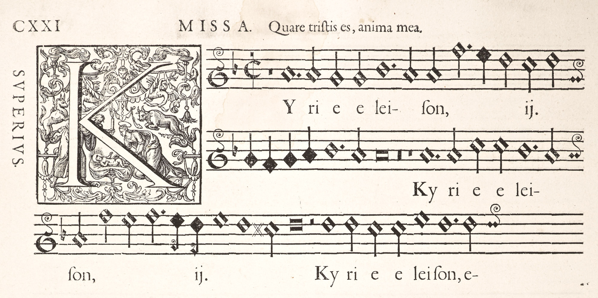
193. Music Types employed in De La Hèle’s Masses: Plantin, Antwerp, 1578
From Rooses’ Christophe Plantin, Antwerp, 1896 (facsimile), Octo Missae (scan)
The following letter to Moretus, written from Paris, December 12, 1598, tells something of the relations between Garamond and Plantin, as well as Plantin’s dealings with Guillaume Le Bé I, whose son, Guillaume Le Bé II, writes it.
I have long had a great desire to write you, understanding you to be sone-in-law of the late M. Plantin (whom may God absolve), who during his lifetime was a great friend of my lates father’s, which has caused me, through the kindness with which your nephew, M. de Varennes, has addressed me, to take up my pen, in order that thereby I may make overtures toward renewing between us the acquaintance which existed between our fathers—which is the first reason moving me to write; the second being, that as I know you have the matrices and punches which M. Plantin had and likewise punches of the petit texte cut by Garamond, I would pray and beg you to accommodate me with a set of these matrices (without justifying them, as long as they are struck on copper of good quality and are deeply sunk), and as a “trade.” I have Garamond’s other punches which my late father purchased from Garamond’s widow, of which I will accommodate you with any, in even exchange, such as the parangon romain, the gros romain, the canon and the petit romain. It was my late father who sold M. Plantin the said punches of petit texte and those of the Saint-Augustin which I know you have, for my father bought all these from Garamond, and then, at the desire of Monsieur your father, he sold him these two kinds, although my father retained for himself a set of matrices of each. But in selling a large assortment to a merchant, he had to dispose of his petit texte because this customer wanted so much to have it; and that is why, not possessing it, I desire to secure it. I have also several fine fonts of Hebrew letters—for text as well as notes—with which to print rabbinical commentaries, as is done in the great Bible printed at Venice; I think you have several kinds of Hebrew letters, for my father cut them and sold them to M. Plantin, your father. If it is agreeable to you to accommodate me with a set of matrices of the aforesaid petit texte of Garamond’s on the above named conditions, I beg you to send me a reply. I am named conditions, I beg you to send me a reply. I am living at rue Saint Jehan de Beauvais, au clos Bruneau, and am a dealer in paper, and master type-founder. By doing this you will impel me with all my heart o render you service wherever it may please you to command it; praying God that He may preserve you, and remaining, Sir, your servant and friend,
Guillaume Le Bé.
I send you an impression of the letter I call petit texte, which I wish to procure.
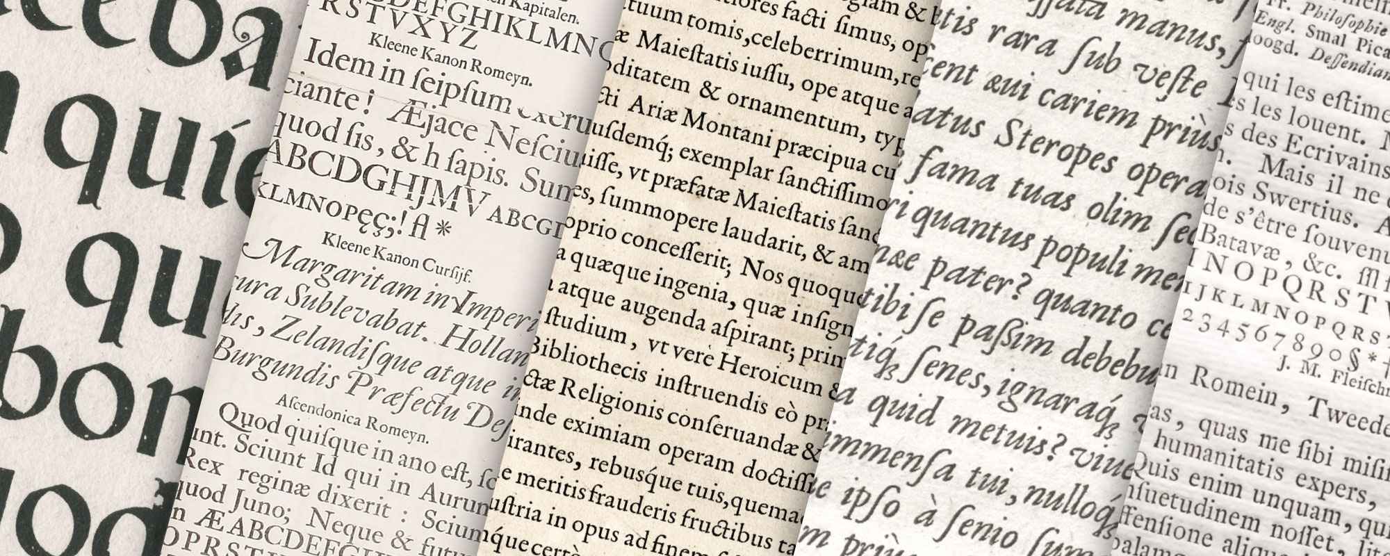
Some of Plantin’s fonts are shown in his specimen of 1567.
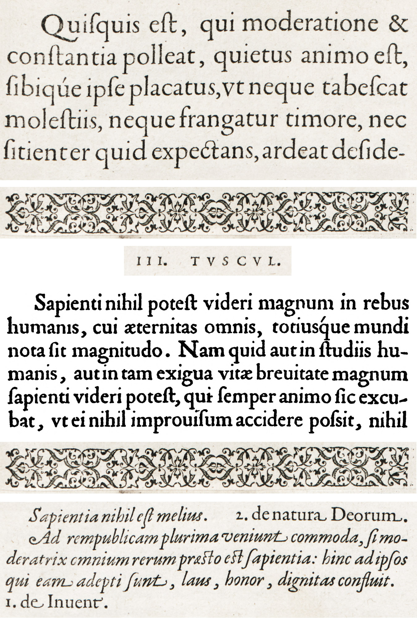
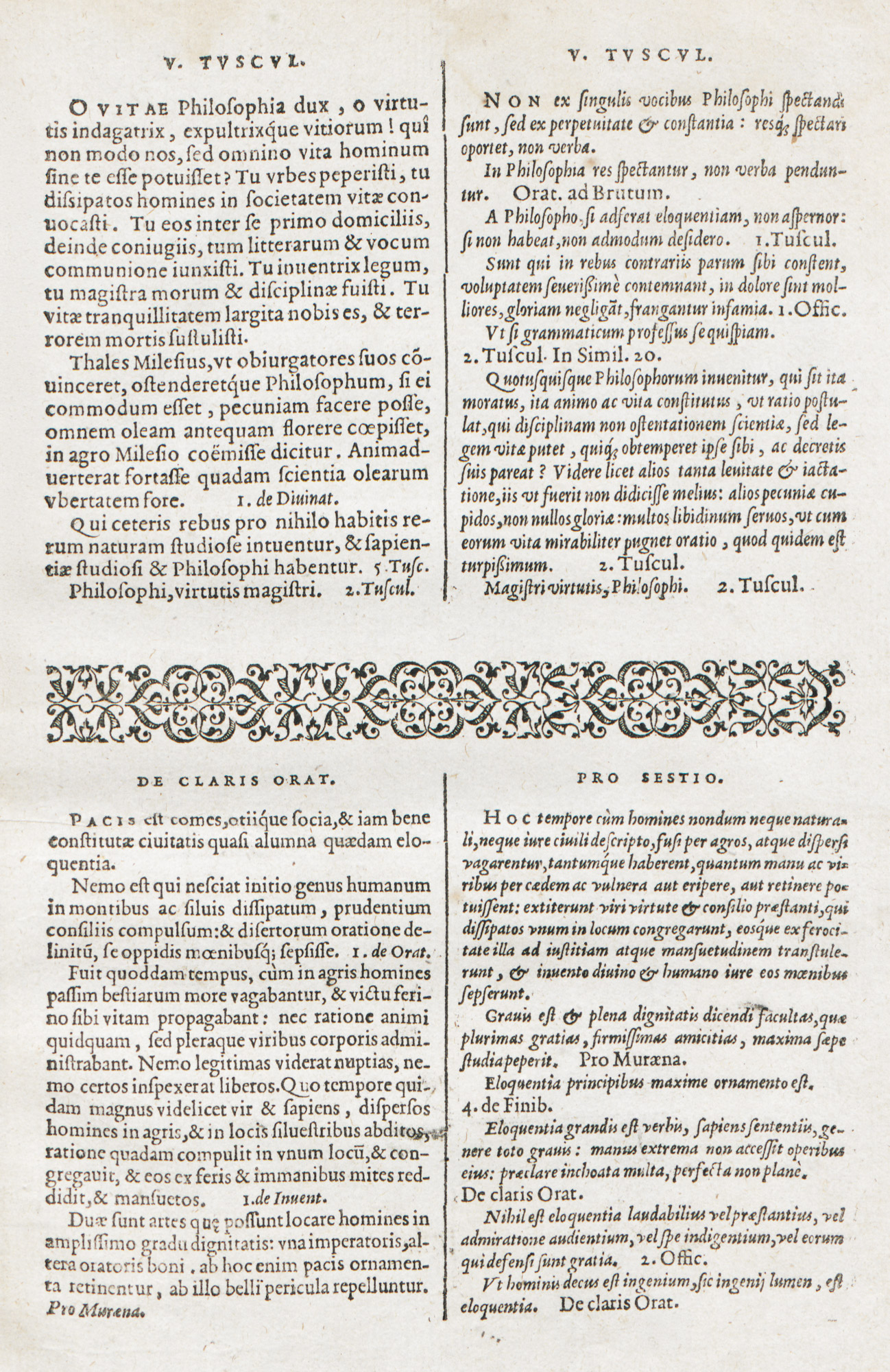
This Index, sive Specimen Characterum Christophori Plantini showed forty-one specimens—seven Hebrew, six Greek, twelve roman, ten italic, three cursive, and three gothic types. Rooses shows but six roman, four italic, and three cursive fonts.2 I hesitate to give these types attributions, though the larger sizes of roman and italic appear very French in style (fig. 194). Those headed De Claris Orat. and Pro Sestio appear to be from the office of De Colines (fig. 195).
194. Roman and Italic Types: Plantin Specimen, Antwerp, 1567
From Rooses’ Christophe Plantin (facsimile), Index, sive Specimen Characterum Christophori Plantini (scan 1 text and ornaments, facsimile scan 2)
195. Roman and Italic Types: Plantin Specimen, Antwerp, 1567
From Rooses’ Christophe Plantin (facsimile), Index, sive Specimen Characterum Christophori Plantini (scan)
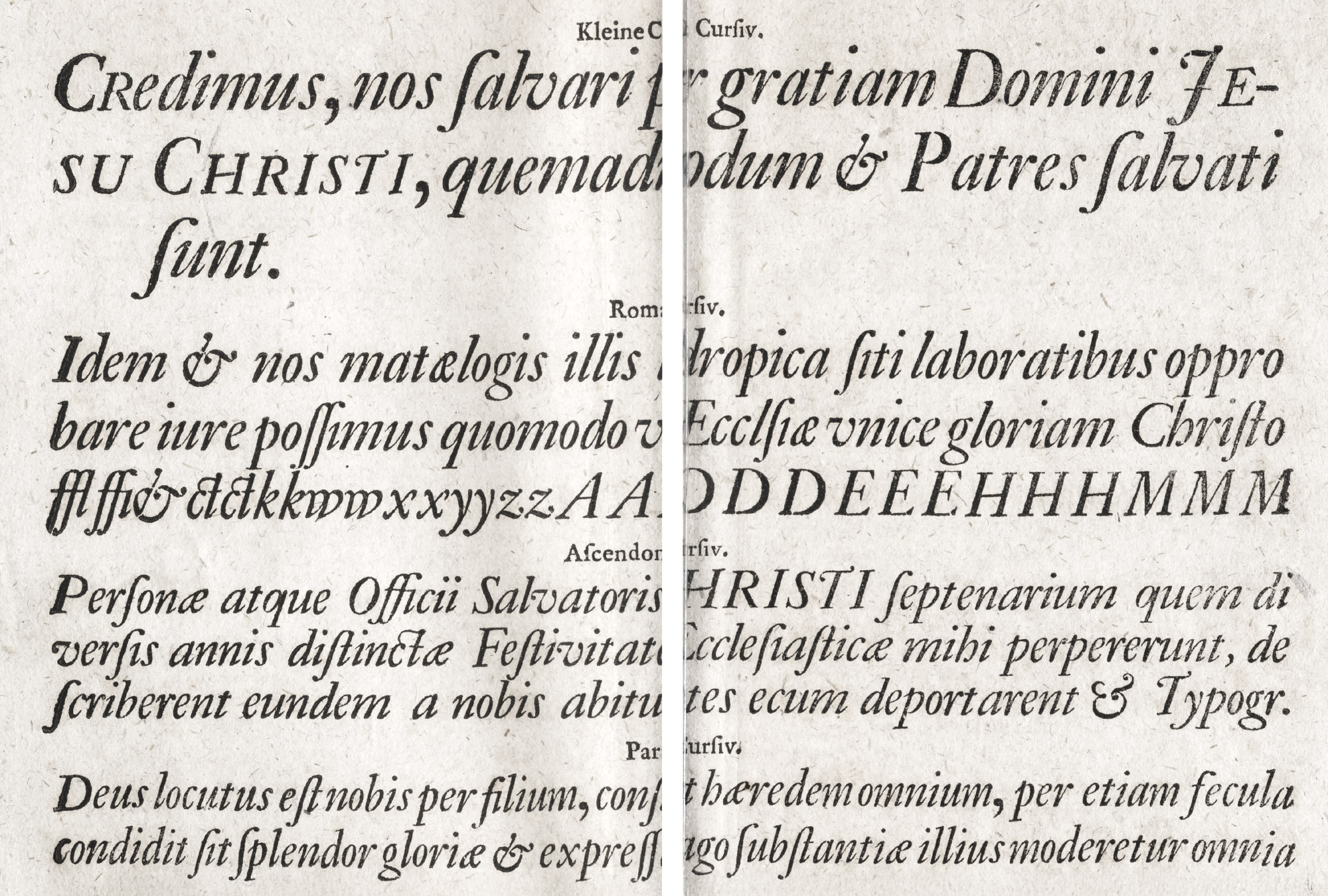
The cursives headed Pro Flacco and I Offic. are the work of Granjon, whom Plantin frequently employed (fig. 196). The cursive type headed III De Legib. is attributed to another type-cutter. Various forms of cursive type are displayed in Plantin’s Polyglot Bible,3 and the Plantin office at Leyden possessed fine fonts of it.4 A peculiarity of all these fonts is that lower-case letters to be used in the middle of a word often differ entirely from those to be employed as final letters.
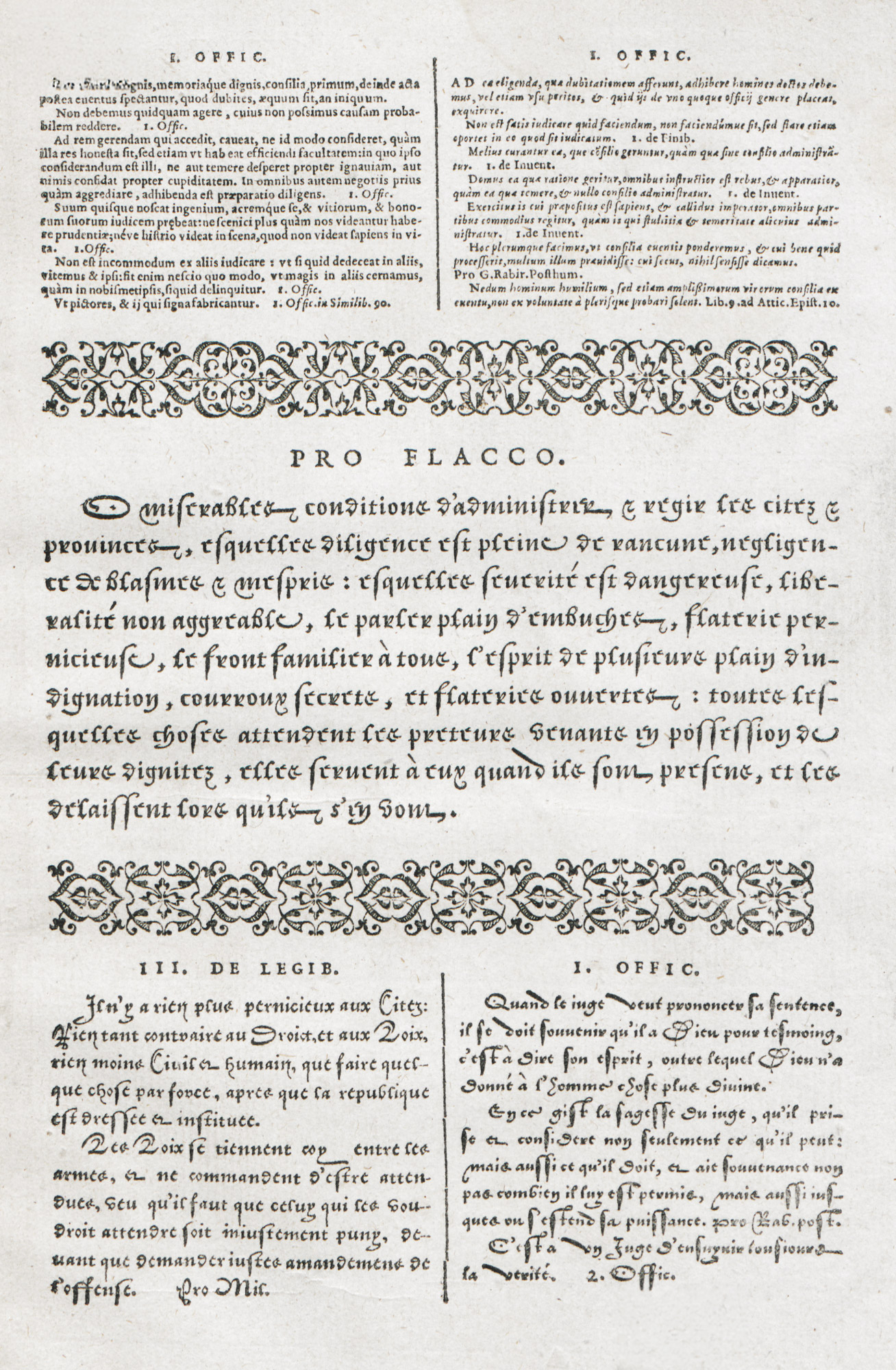
196. Roman, Italic, and Cursive Types: Plantin Specimen, Antwerp, 1567
From Rooses’ Christophe Plantin (facsimile), Index, sive Specimen Characterum Christophori Plantini (scan)
But the Dutch vernacular types, which reproduced typographically writing then current in the Netherlands,—the only “national” character given by the Low Countries to typography,—we owe to Ameet Tavernier and Henric van der Keere. Tavernier, who, no doubt, had seen Granjon’s types, produced a similar character in Flemish style about 1559, which, because it was native, and not (like Granjon’s) foreign, had a great success, and was used by Plantin. Van der Keere (already mentioned as supplying Plantin with material) also made an essay of a letter façon d’écriture about 1575; his font comprising 110 characters. Specimens of these types exist in the Enschedé collection.5 Though not germane to our investigation, they are of considerable interest.6
Another “document” on Plantin’s types is the publication of the Plantin-Moretus Museum entitled Specimen de Caractères employés dans l’Imprimerie Plantinienne, issued in 1905. Forty-eight characters used by Plantin are displayed, although the basis on which the selection was made is not indicated. The monumental canon d’Espagne—a large, round gothic letter intended for liturgical books, and, I believe, cut for a Spanish Antiphonary ordered by the King of Spain but never printed—is a very good example of the black-letter peculiar to Spain at that period (fig. 197). Certain fonts similar to it were used in Italy. The moyen canon romain and its italic appear to me French, as does the petit canon romain with its italic; but the moyen canon flamand is a characteristic Netherlands black-letter. The roman and italic types are, of course, old style, most of them heavy in cut. The ascendonica cursive is an interesting, lively italic in which two forms of double s should be noted, as well as the lower case g’s, the ligatured sp, the ampersand, and the capital Q—characters closely allied to handwriting. On the other hand, the gros texte italique, the augustin italique (1st), and the cicéro italique remind one (in general grayness of effect when printed) of the light italic which came into use in France in the late eighteenth century. In smaller types of this specimen there seem to be two sorts of fonts:
- traditional old style with its interesting italic, and
- lighter roman and italic, more even in cut, more monotonous in colour, and much less attractive.
The beautiful type from the De Colines office, called Colineus romain and Colineus italique, I have spoken of. The type-specimen ends with a page each of Greek and Hebrew—one of the latter from De Colines’ office—and then follow music types and borders, some of which are familiar. A vast quantity of ornamental alphabets, many of which are of great magnificence, do not come properly under our survey. Two classes of these, however, may be noted—the calligraphic letters (fig. 198), probably derived from the ornamental lettering of contemporary writing-masters, and meant to be used with civilité types, or with music; and the class of alphabet represented by the famous historiated letters numbered 6 and 14, from the first of which a letter is shown in the plate from De la Hèle’s Mass (fig. 193).
197. Canon d’Espagne from Plantin Office
From Specimen des Caractères employés dans l’Imprimerie Plantinienne, Antwerp, 1905 (facsimile), Specimen characterum (scan)
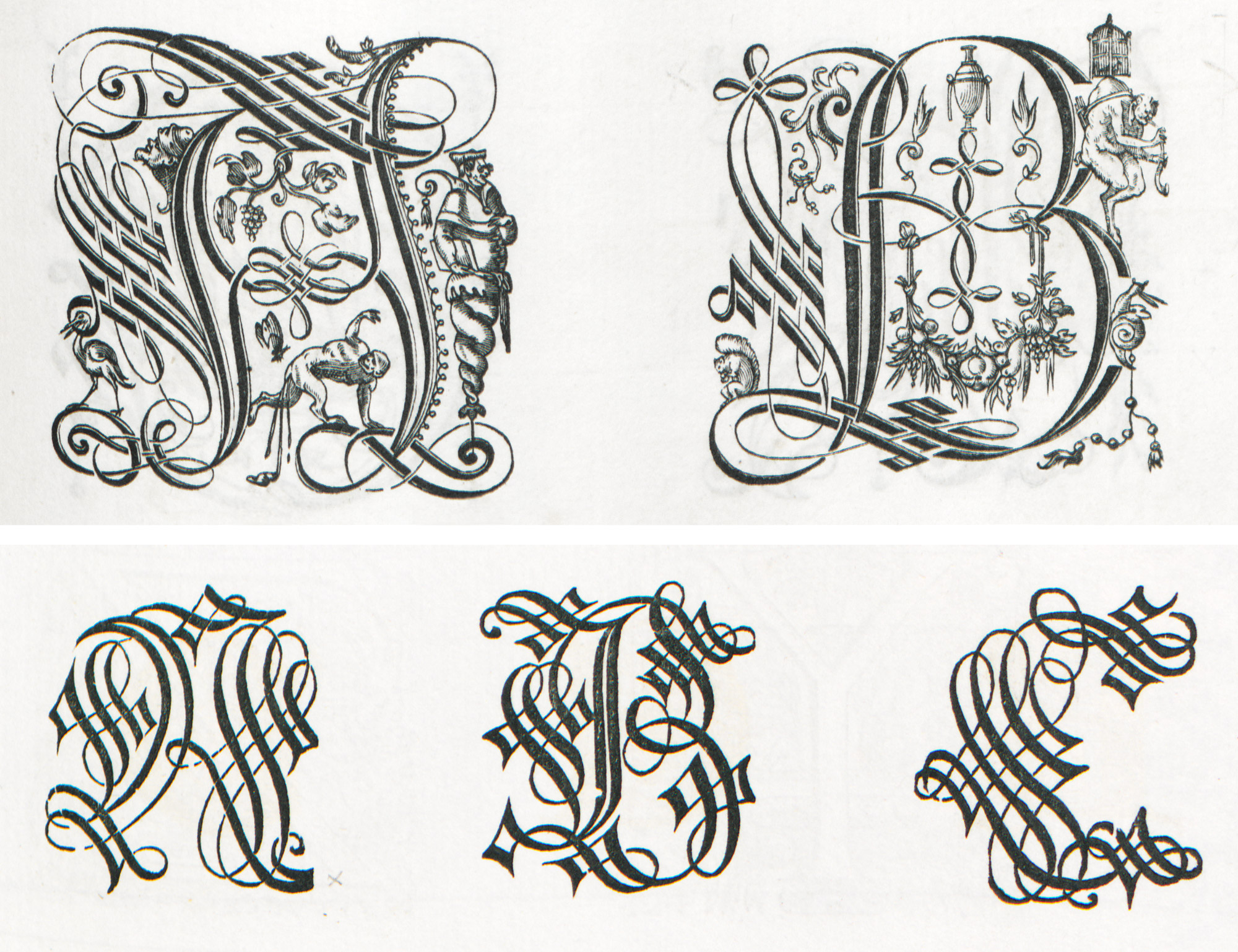
198. Calligraphic Initials from Plantin Office
From Rooses’ Christophe Plantin (facsimile 1, facsimile 2)
How such types look in pages may be seen by consulting Plantin’s books—particularly the monumental Polyglot Bible (1572), the prefatory matter to the first volume being a magnificent display of his noble fonts (fig. 199). This work is generally to be found in any large library. For those who desire an easy ascent to Parnassus (though they will not get very far up the mountain), the plates of text-pages in Rooses’ life of Plantin will be found convenient; or, better still, the few but telling facsimiles in Druckschriften des XV bis XVIII Jahrhunderts.7 But Plantin’s books themselves are the only satisfactory exhibition of his types.
199. Page from Biblia Polyglotta: Plantin, Antwerp, 1572
From Druckschriften des XV bis XVIII Jahrhunderts (facsimile), Biblia Sacra Hebraice, Chaldaice, Graece Et Latine (1569 scan)
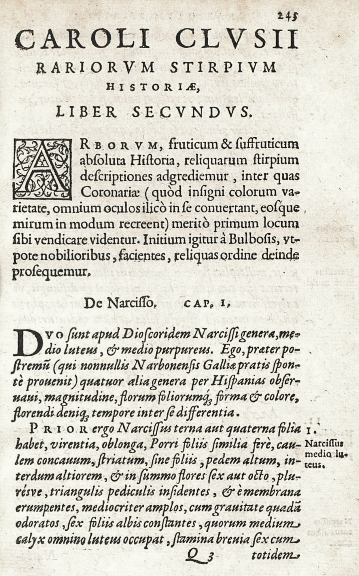
Plantin’s earlier printing is more delicate than his later work. A good example of his first manner is an “emblem book” published in 1567—an edition of Claude Paradin’s Symbola Heroica, translated from French into Latin, and printing in 32mo form. The text of this delightful little book is set in a delicate italic which harmonizes agreeably with the spirited rendering of the designs. Displayed lines, employed in connection with the italic text, are, however, set in roman, and the prefatory matter is almost entirely printed in it (fig. 200). Very reserved in style, the book reminds one of editions from the Lyons press. A 12mo herbal, Rariorum Stirpium Hispaniæ Historia, by Charles de l’Écluse (Clusius), printed by Plantin in 1576,—also set almost entirely in italic,—resembles French or Italian work. Simple in arrangement, and with charming woodcuts of plants, it is another example of his earlier and more intimate manner8 (fig. 201). This book deals with heliotrope, thyme, and other godless vegetation, and on the last page a Canon of Antwerp Cathedral attests that it contains nothing contrary to faith or morals. Since then we have learned that the marriage customs of plants would bring to the cheek “the blush that is now peculiar to the middle-aged.”
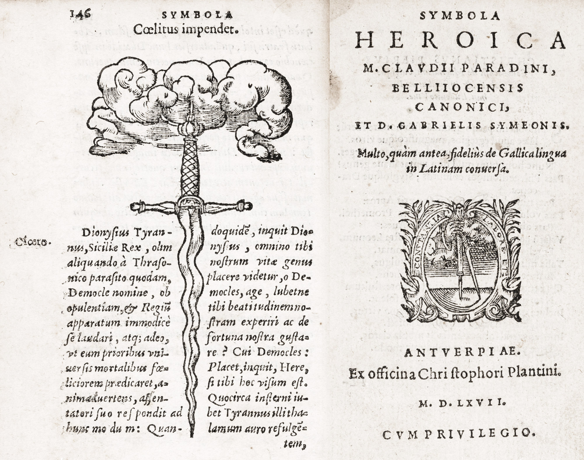
200. Text-page and Title in Plantin’s early manner, Antwerp, 1567
201. Page from Rariorum Stirpium Hispaniæ Historia: Plantin, Antwerp, 1576
From a copy in Harvard College Library (facsimile), Biblioteca Digital Real Jardín Botánico (scan, p. 245)
The later Plantin fonts needed great space around them when in mass; and this they have in that splendid Atlas by Abraham Ortel9—Theatrum Orbis Terrarum—first published in 1570. In a copy of the edition of 1584 in the Library of Harvard College, the elaborate copper-plate title-page is made gorgeous by colour, and the portrait of Ortel is surrounded with a complicated framework which is a mass of illumination. The maps are gaily coloured, too, and their decorative cartouches are specially brilliant. The typography (in roman and italic fonts) stands up well under the strain of its coloured decoration. The prefatory type-matter is magnificent, especially the page of spaced capitals, arranged in a dedication to Philip II. The alphabetically index of maps, in spaced capital letters, the compliments to Ortel in Latin and Greek, and the tabular arrangement of type (in the Nomoneclator Ptolemaicus generally bound with the Atlas), are all most distinguished. The final “privilege” in civilité, and directions to the binder, etc., on the last page, close a book in which a difficult problem is met with courage and solved with gusto. As the size of type used in each page is dictated by a desire to fill it, and the matter varies in amount, the volume is a sort of specimen-book of Plantin’s fonts.
Plantin’s folio Opera of Tacitus, annotated by Lipsius, printed in 1585 (a third issue of this work) is also a beautiful book. It is very simply arranged. The annals and History occupy a section by themselves, and Lipsius’ commentary to the former, and notes to the latter, occupy divisions marked by separate title-pages. This fine, lively piece of printing employs for its preliminary matter many of Plantin’s mellowest and most beautiful types. The opening addresses, composed in noble fonts of roman, or in an italic full of swing and movement, show the Gallic touch. In the body of the work the type used is a smaller size of excellent roman; but the pages are so large, there are such masses of it, and it is so closely set, that the effect is a bit overpowering. Lipsius’ commentaries at the end show that sad mixture of roman and italic, spaced capitals, and Greek quotations, dear to the learned at that date. Yet in the main, the Tacitus is a fine piece of printing.
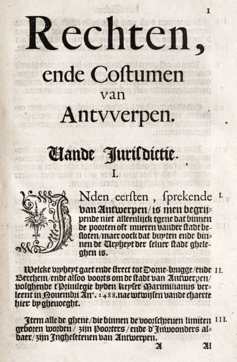
Plantin also printed books in the Flemish black-letter current at that day. An example of this is the Rechten, ende Costumen van Antwerpen, printed at the expense of that city, in 1582. It is not by any means a “pure” black-letter book, for (as in some sixteenth century English books) roman was used as a display letter to a “norm” of black-letter—exactly reversing our present-day use of black-letter and roman. Its title, preface, and some displayed matter employ italic. A letter quoted in the black-letter “Confirmation of Privileges” is set in roman type; and passages in roman here and there occur. But the txt, which runs to nearly four hundred quarto pages, is composed in a superb Flemish lettre de forme, massive and very fine. Some passages in civilité are interesting, and so are the decorated initials. This book is supplemented by a sort of “order of procedure” for meetings of city officers. Would that “municipal printing” to-day had such dignity! (fig. 202).
202. Page of Rechten, end Costumen van Antwerpen, Plantin, 1582
From a copy in Harvard College Library (facsimile), Google Books (scan)
In addition to the Polyglot and other Bibles, and missals, breviaries, and such-like liturgical books, I recommend the student of Plantin’s work to examine the botanical books by L’Obel, Dodoens, and Charles de l’Écluse; the atlases by Abraham Ortel; Luigi Guicciardini’s Description of the Low Countries in various languages; the works of Arias Montano and Justus Lipsius; the music of G. de la Hèle, Cornet, and others; the emblem books of Junius, Alciati, Sambucus, etc., and the poetry of Houwaert.
Plantin died in 1589. He was buried in Antwerp Cathedral, and on his tomb was inscribed:
christophorus situs hic plantinus, regis iberi
typographus, sed rex typographûm ipse fuit
Plantin’s two daughters were married to printers—the elder to Raphelengius, associated for many years with Plantin, and who previously taught Latin and Greek at Cambridge, and afterwards accepted the chair of Hebrew at Leyden. To this University he was also printer—as was Plantin himself for a brief period. The other daughter married Moretus, who, after Plantin’s death in 1589, in association with his widow, carried on the press—the Plantin-Moretus Office, as it was usually called. Its work, at its best, preserved much of the later Plantin style. Two examples of it must suffice. The first is Rembert Dodoen’s Stirpium Historia, printed by Plantin’s grandson, Johan Moretus, in 1616—a revised Latin edition of the book earlier issued by Plantin. The preliminary matter is set in Plantin’s superb roman and italic fonts (fig. 203). The actual book, most agreeably illustrated with brilliantly printed woodcuts of plants, is composed in a small size of roman type of great mellowness and beauty. Simple two-line initial letters start each chapter, the title of which is set in a small italic. It is a charming piece of work—except that the chapter-heads are too much crowded into the text—and a fine example of “the Plantin manner”; perhaps too much of a survival to be typical of Moretus. An odd feature is the final table of names of the plants described, in different languages. Arabic names, etc., are set in italic; Italian, Spanish, and French, in roman; but German, Bohemian, English, etc., equivalents are arranged in black-letter. Dodoens was among the great botanists of his day, and Plantin printed a number of his books.
203. Page of Italic from Rembert Dodoen’s Stirpium Historia: Plantin Office, Antwerp, 1616
From a copy in Harvard College Library (facsimile), Internet Archive (scan)
Another seventeenth century book from the Plantin office is the Jesuit Hugo’s Obsidio Bredana. This interesting folio gives an account of the siege of Breda—familiar still through Velasquez’ great picture of its surrender. Its printing retains much of Plantin’s later manner. It is composed entirely in an ample roman type. It was issued in 1626 and is a very dignified piece of work.
The Officina Plantiniana—more a palace than a printing-house—in the Marché du Vendredi at Atwerp, has long been, and still is (as the Musée Plantin), one of the sights of Europe. It is probably the most beautiful building—both inside and out—dedicated to the uses of printing, in the world; nor is there any other establishment which gives such an accurate idea of an early printing-house. The presses, type, and materials of Plantin, Moretus, and their successors have all been preserved, as well as their account-books and correspondence. Not the least valuable part of the collection is the original plates and blocks of ornaments, and designs drawn for the press by Rubens and other artists. To the student the most interesting of the rooms are the type-cutters’ work-shop, the letter-foundry, the press-room, and the proofreaders’ room, which are kept much in their primitive condition. The building and its contents were in the possession of successive members of the Moretus family until 1875, when it was ceded to the city of Antwerp by Edouard Moretus, the last proprietor, who died at Antwerp in 1880. The place is full of charm, and its sunny vine-clad courtyard a haunt of ancient peace.
II. The Elzevir Editions
Elzevir, the other great name in the history of printing in the Netherlands, belongs properly to the seventeenth century. The founder of the family, Louis Elzevir, a bookseller and bookbinder at Louvain, removed to Leyden for religious reaons—the Elzevirs were Protestants—in 1580, and began to publish books there three years later. Five of his sons carried on the Elzevir activities. Utrecht, Leyden, Amsterdam, all had members of the family at work there, and for nearly a century and a half they were the best known printers of the Low Countries. The great figures in the family were Bonaventure and a nephew Abraham—partners from the year 1625—who published editions of the classics in convenient format. As Aldis says,
In the Elzevirs, we have parted company with the texts which they presented to the learned world. We have, instead, intelligent printer-publishers, excellent men of business, anxious to produce books that both textually and typographically should sustain their credit for good work. To secure correctness they employed scholars to edit their publications and see them through the press.
The Elzevirs are popularly remembered nowadays by their little editions in 32mo, with engraved title-pages, narrow margins, and compact pages of a solid, monotonous type which is Dutch and looks so. These are the volumes which romantic novelists—who are seldom good bibliographers—like to call “priceless Elzevirs,” though they were then, and are now, cheap books. These and other Elzevir editions had the merit of handy form, good editing, and eminently common-sense qualities. But even this scarcely accounts for their tremendous popularity. The Abbé de Fontenai, writing in 1776, says that the Elzevirs,
have made Holland celebrated for printing, through an elegance of type which the most famous printers of Europe have never been able to attain, either before or since. This charm consists in the clearness, delicacy, and perfect uniformity of the letters, and in their very close fitting to each other…the taste of young people for literature very often shows itself by a great fondness for these little Dutch editions, which give so much pleasure to the eye.
John Evelyn, who was in Leyden a hundred and twenty-five years earlier, was of the same mind, and speaks of visiting the printing-house and shop of the famous Elzevir, “renowned, for the politeness of the characters and editions of what he has published, through Europe.”10
As publishers, the Elzevirs held somewhat the relative position to the work of their time that Aldus did in his day. They were pioneers in the popularization of books through convenient format and low price. How modern in ideas as publishers the Elzevirs were, is shown by their series of travel-books called “The Republics”—little historical and geographical descriptions of European countries by various authors, put together by a judicious use of scissors and paste-pot. The Helvetiorum Respublica, devoted to Switzerland; Respublica, sive Status Regni Scotiæ et Hiberniæ (fig. 204), a similar volume on Scotland and Ireland—both issued in 1627; and a like book on France—Gallia, by J. de Laet—published in 1629, formed parts of this pocket series.
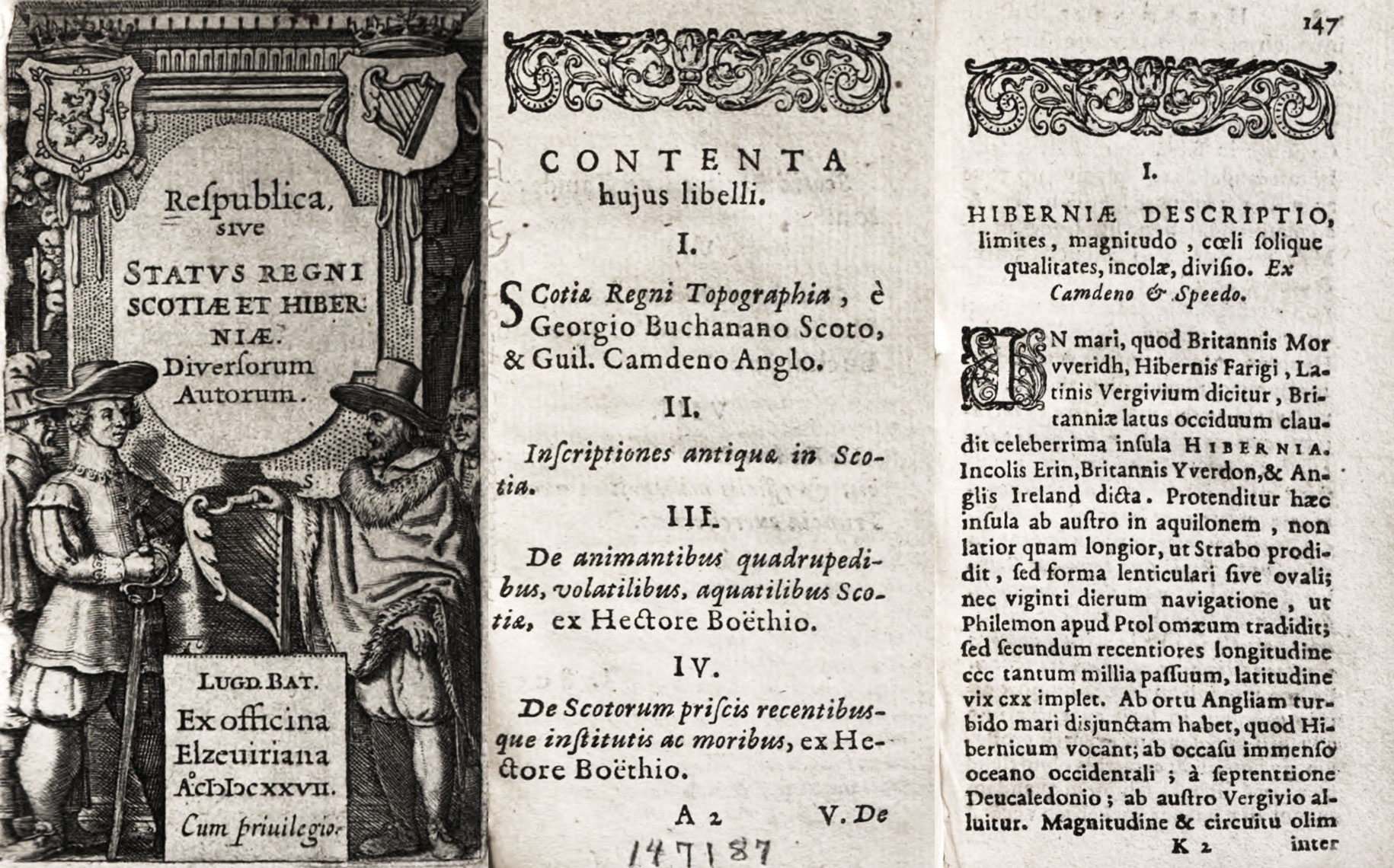
204. Title-page, Contents, and Text-page of one of Elzevir’s Republics, Leyden, 1627
Of the celebrated Elzevir editions of the classics in small format (styled in-12, but what we should call 32mo), the Caesar of 1635 is considered one of the best. This was published in Leyden. Its engraved title-page, a preface set in italic, its neat little maps, its tight little head-pieces,11 and compact, monotonous type are very like all Elzevirs. These editions were all very much alike. Each division of a book generally started with title and chapter heads set in capitals and small capitals, very much spaced; the subject of the chapter (if any) being set in tiny italic. The running-title was in capitals and small capitals, also space, and page after page in book after book was set in this style. To have seen one Elzevir volume in prose and another in poetry, in this format, is to have seen all—or certainly as many as one wishes to see! How any one ever read with comfort pages so solidly set in such monotonous old style type passes understanding—or at least mine. Elzevir editions were generally unannotated, and if notes occurred, they were usually placed at the end of the book.
The Pliny of 1635 and Virgil of 1636 stand on parity with the Caesar in the estimation of bibliophiles. The Leyden Terence of 1635 is also one of the most esteemed 32mo editions, and is easier to read because in Latin verse. The Leyden Florus of 1638, though of the same format, is more attractive. In 1642, the Elzevirs printed the Opera of Cicero in ten volumes, 32mo, and this, as Elzevirs go, is an attractive edition. The engraved title-page is handsome, the portrait of Cicero not bad, the prefatory matter well arranged, and the rest of the work made up of the solid pages characteristic of the house (fig. 205). Daniel Elzevir’s Amsterdam edition of 1675 of St. Augustine’s Confessions, in 32mo, is also considered among the best of the Elzevir editions; and perhaps it is—though not beautiful. The Institutes of Justinian, an edition of which was printed by the same house in the next year, plentifully supplied with rubrication, is a book which was thought charming in its time. Still other editions which the student may look at are the Amsterdam Decameron of 1665 and the Virgil of 1676. Though considered so remarkable in their day, these editions now appear merely “well-enough” little books for the pocket. But they were largely copied by other Dutch publishers, and by publishers throughout Europe—the same rugged little types were employed, the same style of composition was repeated, and the same effect produced, except that it was not so good. The Elzevir 32mo editions had a series of decorations peculiar to themselves, which were as “air-tight” in effect as pages which they adorned.

205. Pages of Cicero: Elzevir, Leyden, 1642
From a copy in Harvard College Library (facsimiles), Opera (scans)
The Elzevirs also printed editions of the classics in octavo—less typical in one sense, but better, because the type, being larger, was handsomer, and being more leaded, was easier to read. The typographic style, however, was much the same. These editions were annotated, and the very full notes were set in double column at the foot of each page. The octavo edition of Caesar of 1661 is a good instance of this format (fig. 206).
206. Page of Caesar (octavo): Elzevir, Amsterdam, 1661
From a copy in Harvard College Library, C. Iulii Caesaris quae extant (scan)
If a 32mo Elzevir edition were inflated until it became a folio, you would have a very good likeness to the second revised edition of Philip Cluverius’s Germania Antiqua, printed at Elzevirs’ Leyden house in 1631, for the formula used in making it is about the same. Except for the condensed italic of the reprinted introduction to the first edition—quite a new note in italic type—the fonts used are larger versions of those in smaller books. Type well set and displayed by good presswork gives a general effect that is excellent, and the masses of Greek quotations make it look very learned. The same author’s Sicilia Antiqua (sometimes included as a supplement to the Italia Antiqua of 1624), printed by the Elzevir office in folio in 1619, is less conventional in style. Both books have engraved titles and maps, and the Germania a good many copper-plate illustrations. The Historia Naturalis Brasiliæ of Piso and Marcgravius, issued in 1648 with the Amsterdam imprint of Louis Elzevir, a good example of an Elzevir folio. The text is printed in a handsome but rather too regular roman, which is very Elzevirian indeed.
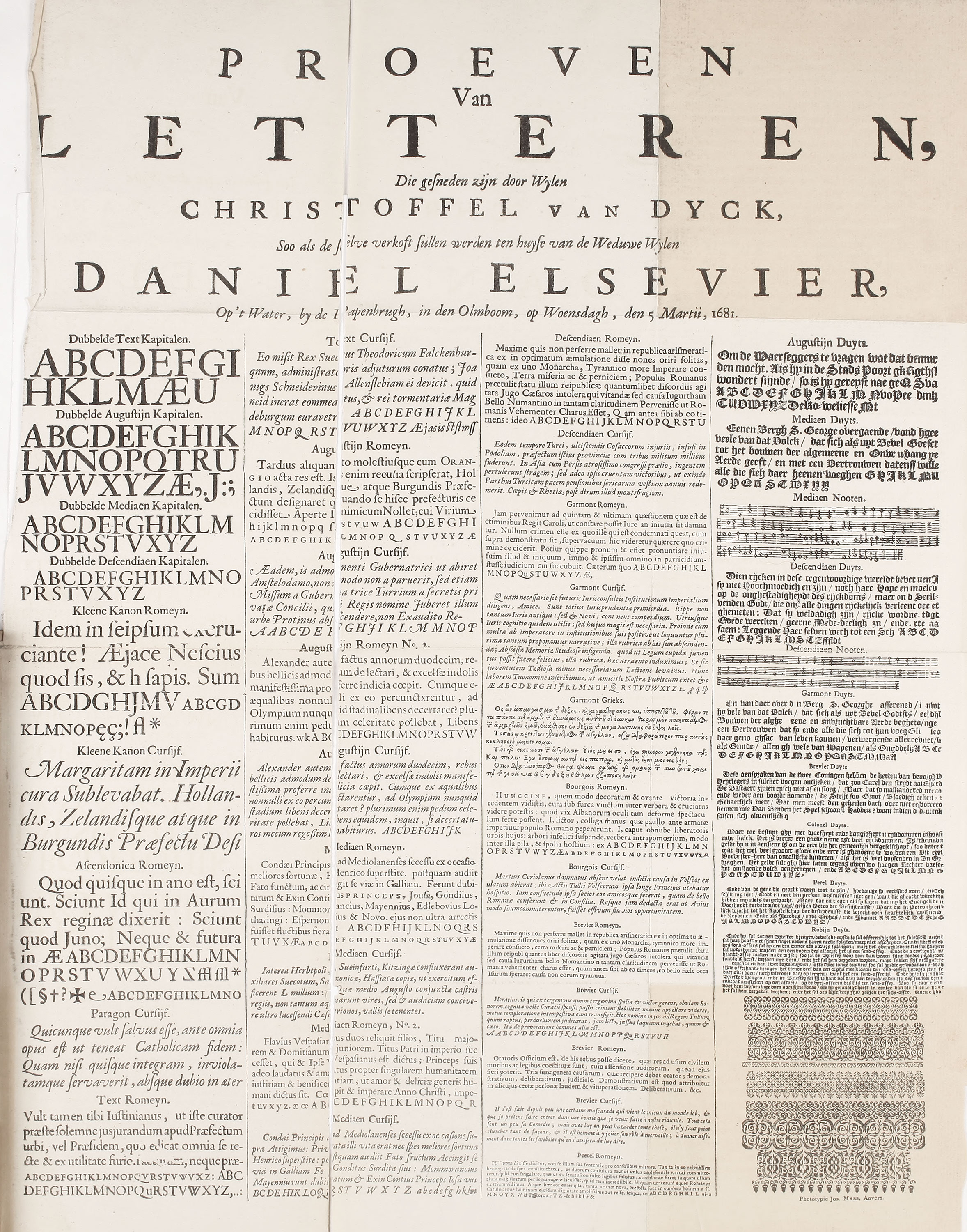
In a letter written from Amsterdam in 1681 by the widow of Daniel Elzevir to the widow of Moretus, at Antwerp, we learn that the writer wished to dispose of part of the type-foundry inherited from her husband, Daniel Elzevir, which had descended in turn from Louis Elzevir. Some of its material was the work of Chirstoffel van Dyck, the great Dutch designer and type-cutter. She writes,
Not feeling myself competent to manage everything, I have decided to sell my type-foundry. It consists of twenty-seven sets of punches of fifty sets of matrices, which are the work of Christoffel van Dijk, the best master of his time, and of our own. This foundry is, consequently, the most famous which has ever existed. I have desired to inform you of the intended sale, and to send you specimens and catalogue so that, if agreeable to your plans, you can seize the occasion and profit by it.
With this letter she sent a broadside specimen-sheet which is reproduced, and the heading of which reads:
Proofs of types cut by the late Christoffel van Dyck such as will be sold at the residence of the widow of the late Daniel Elsevier, on the Canal, near the Papen-bridge, at the Elm, Wednesday, March 5, 1681. (fig. 207)
207. Sale-Specimen of Elzevir Types: Amsterdam, 1681
From facsimile in Willem’s Les Elzevier (facsimile, 1880)
This broadside shows forty sorts of characters, if we include two music fonts. There are four kinds of capital letters, thirteen roman, twelve italic (the “pearl” not having any italic of its own), eight black-letter, one Greek, and two music fonts. Most of these types are recognizable as Dutch by their sturdy qualities of workmanship, and, particularly in the smaller sizes of roman and italic, by a tiresome evenness of design. Their closely fitted, large face on a small body was preëminently practical, and adapted them for the small formats of the Elzevir publications. In a table given by Enschedé in his Fonderies de Caractères, he attributes but twenty-eight of these characters to Van Dyck.12 The forms of all the types call for little attention; the Augustijn Romeyn and the Augustijn Cursijf (that the second column) have certain swash letters which, in the roman, remind one of Plantin’s fonts. Some of the swash letters in the Kleene Kanon Cursijf (sixth in the first column) and the capital Q’s in the Paragon Cursijf (next to the last in the first column) are interesting. It was from Dutch swash letters—so much admired by Moxon13—that the variant capitals in Caslon’s fonts were no doubt partly derived. In these old fonts, too, there were more unusual and tied letters than are now common.
The black-letter shown in the specimen is heavy in its larger sizes, and the capitals are awkward and overcharged—like Flemish sixteenth century fonts too much elaborated. In the medium sizes, the types seem better. The Greek characters would to-day be obscure because of the number of ligatures. The two fonts of music type are those known as the “Music of the Huguenots.” The specimen ends with many good type “flowers.” The last three still hold their own, not merely because they are attractive in design, but because they print so well. This is due to the cross-hatching of the designs, which gives a pleasant tone and variety of colour to the ornament, and was intentionally employed to help the presswork.
Mr. De Vinne, who attributed all these types to Van Dyck,—in the light of which his words should be read,—says,14 that
Liberal allowance should be made for the worn types and the bad printing of the original specimen-sheet, as well as for some falling-off, even from this low standard, in a facsimile… Yet the good form and fitting-up of the Flemish Black Letters are but slightly obscured;…any punch-cutter might be justly proud of them. The smaller sizes of roman and italic make a creditable appearance, but all of the larger sizes are not so good: some are really bad. Letters more uncouth than those of the capitals of the “Dubbelde Augustijn Kapitalen”…were probably never shown by any reputable type-founder. Moxon’s tracings of Van Dijck roman letter,15 although rudely done, showing undue sharpening of the lower serifs, give a clearer idea of its peculiarities of style and its real merit than can be had from the study of Elzevir specimen-sheet. The general effect of this letter is shown to the best advantage in the larger types of some of the octavos of Daniel Elzevir. The smaller types of the duodecimos are too small to clearly show the peculiarities of cut. Van Dijck seems to have designed letters, with intent to have them resist the wear of the press. The body-marks were firm, and the counters of good width, not easily choked with ink. Hair lines were few and of positive thickness. The serifs were not noticeably short, but they were stubby, or so fairly bracketed to the body-mark that they could not be readily gapped or broken down. When printed, as much of the Elzevir printing was done, with strong impression and abundance of ink, the types were almost as bold and black as the style now known as Old Style Antique. This firmness of face explains the popularity of the so-called Elzevir letter. It may not be comely, but it is legible. The letters may be stuffy, but they have no useless lines; they were not made to show the punch-cutter’s skill in truthful curves and slender lines, but to be read easily and to wear well.
Mr. De Vinne appears oblivious of what seems to self-evident to some French writers—that Van Dyck slavishly copied the design of Garamond’s fonts. Dutch authorities think differently.
The punches and matrices of the types shown on the specimen-sheet were offered for sale in 1681, and were bought by a Spanish Jew named Athias—a Rabbi as well as a type-founder. Some twenty years earlier he had employed Van Dyck to cut Hebrew fonts which were used in a Hebrew Bible, for which Athias was given a medal and a golden chain by the States of Holland and West Friesland. In 1683, the following notice appeared in the Gazette de Haarlem:
The attention of the public is called to the fact that the excellent and celebrated type-foundry of the late Christoffel van Dyck, sold by the heirs of the late D. Elzevir, together with other excellent matrices, Greek as well as Roman, brought together in the lifetime of the said Elzevir, has been reorganized at Amsterdam. Address Jan Bus in the house of Sr. Joseph Athias, where he is at work throughout the day. The price of the types is the same as in the time of Van Dyck and Elzevir.
A broadside specimen16 which must have been brought out about the same time shows, according to Blades, five fonts of titling, sixteen of roman an italic, eight of black-letter, and two of music.17
Upon Athias’s death the foundry passed to a printer named Schipper; then to the Amsterdam founder Jan Roman. One-half of Roman’s collection was sold in 1767 to Enschedé of Haarlem; the other half to the brothers Ploos van Amstel of Amsterdam. Later their portion was brought by Enschedé, so that practically all Van Dyck’s work went to the Haarlem foundry. Unfortunately, the Enschedés’ unbounded admiration for the tasteless German type-cutter Fleishman threw Van Dyck’s types into the shade, and their untoward end is described on another page.
III. Other Examples of Netherlands Printing
The work of the Dutch press, outside that of the Elzevirs and Plantin, was not of great interest. There were three features, however, to which attention should be called:
- The magnificent maps and atlases printed during the sixteenth and seventeenth centuries by Mercator, Ortel, Waghenaer, Hondius, and Blaeus, which, quite apart from their engraved plates, are imposing in their typography.
- The books printed in French and other languages during the seventeenth and eighteenth centuries. Some of these were works, now famous, issued in Holland in order to escape the restrictions placed on the press elsewhere—restrictions that proved most advantageous to the Netherlands book-trade.18
- The illustrated volumes published in the early eighteenth century by Bernard Picart and others—ambitious pieces of type-setting, which, though heavy in effect, were magnificent for the period.19
§1. XVI Century
During the first half of the sixteenth century, printers in the Netherlands employed a great deal of gothic type of a square, heavy, monotonous cut. A few books were printed in a lettre batarde, but the black-letter fonts that were most used were of the lettre de forme family. A few of these fatter, “blockier” gothic types furnished an unfortunate historical precedent for the corpulent “blacks” which disfigured English printing in the early nineteenth century. Along with these gothic types, roman types were used—a Dutch variant of Italian roman types, with the same squarish quality in design which marked their black-letter companions. The italic employed resembled the Aldine character, and with it small roman capitals were used according to Venetian tradition. The general effect of type at this period was reminiscent of the fifteenth century; indeed the same general forms persisted in Dutch typography for a long time after 1600. Early Netherlands books were often decorated with woodcuts, occasionally effective, though usually coarse in design and execution; and title-pages often bore elaborate and overcharged borders. Such types, square in shape, closely set, monotonous, and arranged without much sense of style, made books which can be readily recognized on the shelves of a library; volumes too thick for their height, in folio, quarto, and diminutive 32mo, mostly bound in vellum, which are as unappetizing in their outward appearance as the typography within.
A general idea of Netherlands printing from 1500 to 1540 may conveniently be had by consulting the reproductions of titles and text-pages given in Nijhoff’s L’Art Typographique dans les Pays-Bas,20 and I indicate a series of plates from it which cover the different classes of types. The square, heavy lettre de forme is exemplified in some of the work of the Antwerp printer Willem Vorsterman, whose product is of a high average—for instance, the title-pages of both Old and New Testaments in his Dutch Bible, issued respectively in 1528 and 1529. These plates show, too, the borders used in such books—although these are much above the ordinary in design.21 The same sort of type, but larger and finer in execution, was employed by Jan Seversz. in his title-page of Die Cronycke van Hollandt, etc., of 1517.22 Yet another book that shows Dutch printing of the first order is the Delft edition of a Latin Psalter printed in 1530 by Cornelis Henriczoon Lettersnijder—who certainly knew his business.23 His black-letter is very impressive and beautiful, though of a massive kind that betokens Dutch provenance.24 These show Dutch lettre de forme at its best. Scarcely less good—and more characteristic—are the types of Jan Lettersnijder of Antwerp as he used in Hoveken van devocien (c. 1500).25 Still more characteristic, and much less good, are the pages from Nicolas de Grave’s 1520 and 1529 editions of J. Boutillier’s Somme Ruyrael, the Segelijn van Jeruzalem (1517), and Leven van St. Bernard (1515).26
Roman type of this period is finely displayed in the opening page of a book printed by Thierry Martens of Alost at Louvain in 1517—Summæ s. argumenta Legum Romanorum of P. Aegidius27—in which the entire title is set in roman capitals of classical form. A title-page showing capital and lower-case letters appears in the Antwerp edition of Erasmus’ De Contemptu Mundi, printed by Van Hoochstraten.28 Fonts of heavier roman were used in some other books printed by Thierry Martens—such as the Condemnatio Doctrinæ M. Lutheri of 1520, or Fischer’s Eversio Munitionis, printed about 1518,29 or the somewhat better roman types used by Paffraet at Deventer in 1521 and 1525.30 Examples of italic are to be found in a Leyden edition of Erasmus’ De vitando pernitioso aspectu of 1538, printed by Pieter Claeszoon von Balen,31 and in the pages Antonio de Nebrija’s Lexicon Juris Civilis of 1527, printed at Antwerp by Grapheus.32 These examples give a fair idea of the kind of roman and italic types generally employed in the Netherlands from 1500 to 1550.
Two books in folio by Hubert Goltz (Goltzius) of about this date are interesting. The first is his Vivæ Omnium fere Imperatorum Imagines, printed at Antwerp in 1557, and in its illustrations showing, says an authority, “the first use of the copper plate in connection with blocks engraved for chiaroscuro printing and also the first appearance in any form of the chiaroscuro as book illustration.”33 Typographically it is noteworthy for its display of italic types; especially imposing the largest size,34 which resembles some used by John Day. The prefatory and final matter is arranged with great distinction—in capital letters mingled with an italic recalling Fell’s types. The second book is C. Julius Cæsar sive Historiæ Imperatorum Cæsarunmque Romanorum ex Antiquis Numismatibus Restitutæ. It was printed at Bruges in 1563, and is a fine example of the sober use of some monumental roman types of a style much earlier than the date of the book. It is illustrated with copper-plates and its engraved title-page and colophon are most distinguished.
Luigi Guicciardini’s Descrittione de Tutti i Paesi Bassi was issued in folio at Antwerp, in 1567, by G. Silvius, royal printer. The roman type in which it is chiefly printed and the italic used in its prefatory verse are not unlike Plantin’s fonts, and the book is interesting because it suggests that Plantin’s style was not so peculiar to him as we are apt to think. Except for a copper-plate map and view of the Hôtel de Ville at Antwerp, the book is illustrated with large wood-engravings. The title-page and its two following leaves of dedication, engraved on wood, are fine, and so are the double-page plates: those of Ypres, Malines, and Louvain in particular being worth looking at. These blocks were ultimately bought of Silvius by Plantin, and are now in the Musée Plantin at Antwerp. On Silvius’ death at Leydon (where he was printer to the States of Holland and the University), his widow sold his material to Plantin.
§2. XVII Century
J. Hondius, the well-known Amsterdam publisher, brought out in 1611 a Latin history of that city by Pontanus—Rerum et Urbis Amstelodamensium Historia. It is printed entirely in roman and italic types—the latter the better of the two—which have the worthy but uninspired appearance of Elzevir fonts. There are engraved illustrations and woodcut initials—the latter rough but attractive. The same publisher about this date printed a Dutch edition of this book, set in double column, in a spirited cut of lettre de forme with the usual italic and roman interspersed. The copper-plate illustrations—unintentionally diverting—of the Latin edition are used in the Dutch version. The two editions are interesting to compare.
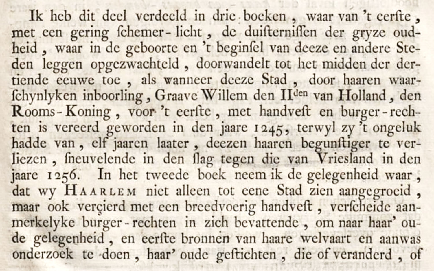
Samuel Ampzing’s Beschryvinge ende lof der Stad Haerlem in Holland (Description and Praise of the City of Haarlem), and Pieter Schrijver’s (Scriverius) Laure-Crans voor Laurens Coster van Haerlem, Eerste Vinder vande Boeck-Druckery, were printed together in a stout quarto at Haarlem by Adriaen Rooman in 1628, in a mixture of roman, italic, black-letter, and cursive letter, in various sizes. I do not attempt to describe it except as an unbelievable jumble of types not in themselves bad. Of the two unusual cursives, the smaller is well displayed on pp. 246–256 in the first book named, and the larger in the Voor Reden to the second. This last work,—“Laurel Wreath for Laurenz Coster,”—although issued separately, was added, in enlarged form, to Ampzing’s book to support his championship of Coster as the inventor of printing. Plates of Coster’s ill-favoured countenance and of his printing-office enliven the treatise.
The three-volume folio Atlas Novis sive Descriptio geographica Totius Orbis Terrarum, by Mercator and Hondius, published at Amsterdam by J. Jansson and H. Hondius in 1638, and apparently printed by Hondius, is handsome typographically, apart from its maps. The text is printed in double column from old style roman and italic fonts; and woodcut ornaments and initials are often employed. But it lacks the sense of style of Plantin’s edition of the Atlas by Ortel. Although the text is printed on the back of the engraved maps, the paper is so thick and good that it does not matter.
Willem and Joan Blaeu’s Novus Atlas, in six enormous “atlas folios,” is another able performance. In an edition in German, printed at Amsterdam in 1676, the text is set in fraktur, with—alas!—proper names in roman, and quotations in italic letter. But it is a very wonderful achievement, all the same. Evelyn, when on a tour in 1641 which seems to have been more or less bibliographical, visited (besides the establishment of “that indefatigable person” Hondius, mentioned above) Joan Janszoon Blaeu’s shop in Amsterdam to buy maps and atlases. This was Blaeu the younger, son of the better-known Willem Janszoon Blaeu (1571–1638), inventor in 1620 of an improved style of printing-press which had considerable success in the Netherlands and in England. The elder Blaeu had earlier been associated with Tycho Brahe, the Danish astronomer, from whom he got the idea of making globes and maps. Blaeu’s new press was intended to surmount difficulties in perfecting this work, for which the shop became famous.
A contemporary account, describing the establishment much as Evelyn must have seen it, tells us that
on the Blumengracht, near the third bridge, and the third alley, may be found the greatly renowned printing-house of John Blaeu, Counsellor and Magistrate, of this city. It is furnished with nine type-presses, named after the nine Muses, six presses for copper-plate printing, and type-foundry. The entire establishment on the canal, with the adjoining house, in which the proprietor lives, is 75 feet in breadth, and stretches along the east side of a cross street 135 feet, or with the attached house 150 feet. Fronting on the canal is a room with cases in which the copper-plates are kept, from which the Atlases, the Book of the Cities of the Netherlands and of foreign countries, also the Mariners’ Atlases and other choice books are printed, and which must have cost a ton of gold. Next to this first room is a press-room used for plate printing, and opening upon the cross street referred to above is a place where the types, from which impressions have been made, are washed; then follows in order the room for book-printing, which resembles a long hall with numerous windows on either side. In the extreme rear is a room in which the type and certain other materials used in printing are stored. Opposite this store-room is a stairway leading to a small room above which is set apart for the use of the proofreaders, where first and second impressions are carefully looked over, and the errors corrected which have been made by the typesetters. In front of this last designated room is a long table or bench on which the final prints are placed as soon as they are brought from the press, and where they are left for a considerable time. In the story above is a table for the same purpose just indicated, at the extreme end of which, and over the room occupied by the proofreaders, is the type-foundry wherein the letters used in the printing of the various languages are moulded.
The foundation of this splendid building was laid in the year 1636, by John Blaeu’s oldest son, Willem Blaeu, and on the 13th of the Fall month of the following year the printing establishment was here set in order. The original founder of the printing-house, who died in the following year, was John Blaeu’s art-loving father Willem, who, for a considerable time, had been a pupil of the great astronomer Tycho Brahe, whom he zealously followed, constructing many instruments for the advancement of astronomical studies, for the promotion of the art of navigation, and of other sciences of like character, an interest in all of which he revived and furthered while at the same time he made new discoveries, as has become widely known from the publications which have issued from this printing-house.35
P. and J. Blaeu printed at Amsterdam in 1698 a French edition of Gerard Brandt’s Life of Admiral de Ruyter—La Vie de Michel de Ruiter—a more or less commonplace performance of seven hundred folio pages. The book is composed in a light variety of old style roman, with the numerous quoted documents arranged in italic. It is illustrated with large copper-plates—which, unlike the text, leave nothing to be desired as to incident and movement.
§3. XVIII Century
The name of Westein, the eminent Amsterdam printer-publisher, appears (with others) on the title page of Hooft’s Nederlandsche Historien, printed in 1703. Its types are characteristic Dutch fonts of the eighteenth century, but more lively than those in most contemporary work. The italic used has some delightful characters. Except for copper-plates, the volume has no decorations save for some nine-line Dutch “bloomers,” used at the beginning of each of the thirteen books into which the History is divided. They “bloom” energetically!
Peter the Great, on his last stay in Holland, from 1716 to 1717, was fired with the idea of improving printing in Russia, and he made various endeavours to this end. The history of the only effort that succeeded—and that but partially—is a curious incident in the annals of Dutch printing. There had been at the beginning of the seventeenth century a Dutch Bible printed at the command of the States-General of the United Provinces, and taking this for a basis, the Czar ordered a Bible arranged in double column; the Dutch text (entirely in capital letters) on the right, the other column being left blank for a Slav translation of the Dutch text—to be printed later in Russia from Slavic types, cut and cast for this purpose by Clark and Voskens, the Amsterdam type-founders. The New Testament, in two folio volumes, was printed at The Hague in 1717, and the Old Testament, in four volumes, at Amsterdam. It appears that the greater part of the edition sent to Russia was lost, and that only a few copies of the New Testament ever were completed by the addition of the Slav text. Only four copies are now known.36
The quarto edition of Brieven…den Johan de Witt, issued by H. Scheurleer at The Hague in 1723, has a congested red and black title-page, and apart from this is a perfectly straightforward quarto, set from heavy, awkward old style types, moderately well printed, on moderately good paper, perfectly respectable, and as uninteresting as all this sounds. Wetstein and Luchtmans—both good names in Dutch printing and publishing—brought out at Amsterdam and Leyden in 1738 a quarto Livy in seven volumes—a monumental work, and, like most monuments, depressing. The type of the text is a very square cut of old style, the notes a colourless variety of Elzevir types. The crowded title, the allegorical frontispiece, the author’s portrait, the preface in enormous italic, and page after page of crowded text, make these two volumes of something over one thousand pages each, a very sleepy affair.
Bernard Picart, a French engraver and seller of prints who resided at Amsterdam after 1710, contributed a decorative note to early eighteenth century Dutch printing. An example of his work is the Œuvres Diverses de M. de Fontenelle, published in 1728 at the Hague by Gosse and Neaulme. The book is full of Picart’s exquisite engraved decorations, and is (except for the tiresome type border on every page) printed from old style types more French than Dutch in effect. Another imposing and more familiar “Picart” book is the folio Temple des Muses, published at Amsterdam by Zacharie Chatelain in 1733, the year of Picart’s death. Apart from the engravings and the series of fine frameworks around them—so good that they have been often utilized by later printers and decorators—the typography is extremely handsome. The fonts used—of a bold, massive sort—are impressive in effect; and the composition, too, is adequate, and very much in the key of the pretentious plates (fig. 208). Such books were, I suppose, bought for their pictures, and were intended as luxurious pieces of book-making. Still another illustrated Picart work is the Cérémonies et Coutues Religieuses des Nations de touts les Peuples du Monde in eleven volumes, begun in 1723, of which an English edition was published.
208. Dutch Type used in Temple des Muses, Amsterdam, 1733
From Gallica (scan)
Johannes Enschedé and Jan Bosch of Haarlem very appropriately printed G. w. van Oosten de Bruyn’s De Stad Haarlem en haare Geschiedenissen in 1765. It is not much of a performance. The dull, light, roman and italic types have lost all colour and spirit (fig. 209). Some black-letter (possibly Fleischman’s) is here and there used for verse. Then, too, the composition of displayed and prefatory matter is tasteless and pretentious. As a whole, the book,—a folio,—weak as it is in its types, is yet interesting, because showing new tendencies in printing.
209. Type used in De Stad Haarlem en haare Geschiedenissen: Enschedé and Bosch, Haarlem, 1765
From a copy in Harvard College Library (facsimile), Google Books (scan)
The eighteenth century Dutch press brought out a great many famous books which were prohibited or in danger of suppression in France. These are often good examples of current Dutch typography, though the student may easily be misled by Dutch imprints on work produced elsewhere, as in the first edition of Voltaire’s Henriade.37 Books actually printed in Holland were the first edition of Voltaire’s Elémens de la Philosophie de Neuton, Amsterdam, 1738,38 and La Bible enfin Expliquée (dated London, 1776);39 l’Abbé Prévost’s Manon Lescaut, 1731 and 1753;40 Montesquieu’s Causes de la Grandeur des Romains et de leur Decadence, 1734;41 Rousseau’s La Nouvelle Héloïse, 1761, and the Émile and Contrast Social of 1762.42 All of these are respectable pieces of printing from old style types; neither better nor worse than the average typography of the time.
IV. Netherlands Foundries and Specimens
Fournier le jeune, in speaking of contemporary Dutch foundries, says that
Holland, having made printing one of the principal features of its commerce, erected with care and expense several celebrated foundries. At Amsterdam, Dirk Voskens, the celebrated engraver and founder of that city, set up a type-foundry at the end of the last century.
His types are round in form, in the manner of our great masters, and very well engraved. This foundry has passed to his widow and to their Sieur Zonen.43 Another celebrated foundry at Amsterdam was established by Christophe van Dyck, also an engraver, and has now fallen into the hands of M. Jean Bus. A third foundry established in the same town, not less excellent than the two preceding, is that of Isaac van der Putte. All three are well stocked with characters of different kinds, particularly with the Flemish character, which has been very much used in the Netherlands but which is now being abandoned. At Haarlem, M. Rudolph Wetstein, printer at Amsterdam and learned in types, having inherited some punches of Greek characters which G. Wetstein, his father, hat cut for him at Geneva, added types to his foundry engraved by Sr. J. M. Fleischman, a very clever type-cutter. After the death of M. Wetsteign, which occurred in 1742, Messieurs Isaac and Jean Enschedé, brothers, bought this foundry in 1743 and took it to Haarlem to form a complete typographical establishment in conjunction with the printing-house they had there. This foundry has received very considerable accessions through the work and talent of Sr. Fleischman, mentioned above, who is in their employ. At The Hague, Sieurs R. C. Alberts and H. Vytwerf established, about 1730, a foundry for which a part of the types were cut by J. M. Schmidt, a talented type-cutter. At Atwerp there is an old foundry which has been celebrated for a long time. It was set up by Christophe Plantin, the accomplished printer, about 1561. He went to France, to buy types at the administrator’s sale of the Garamond foundry. Guillaume Le Bé also sold types to him, and he had other types cut by Henri du Tour,44 of Ghent, then living in Paris. Moretus, Plantin’s son-in-law, having inherited it, it came through his descendants to M. Moretus, the type-founder and printer, who owns it to-day. This foundry has greatly lost prestige through lack of employment, or by the ignorance of some of those through whose hands it has passed. Another Antwerp foundry belonged to M. Balthazar von Wolffchaten. In Holland there still exists the Athias foundry, called the Jewish foundry; and at Leyden that of Blockmar, and one at [belonging to?] Blaeu.
Plantin’s types and Van Dyck’s characters, both mentioned by Fournier, have been discussed. The first still remain at the Plantin Museum. The second were finally acquired by the Enschedés. The Enschedé foundry at Haalem is one of the most interesting establishments in Europe, and is a “descendant” of the oldest foundries in Holland and of ancient foundries in Basle and Geneva. Begun in 1703, and flourishing to-day, it possesses probably the best collection of ancient types, in private hands, in the world. Besides portions of the Athias and Wetstein foundries, it includes material from those of Dirk Voskens, Blaeu, Van der Putte, Ploos van Amstel, Elzevir, and others—almost every establishment mentioned by Fournier. Some of its types date from the fifteenth century. Had not many of Van Dyck’s matrices been destroyed, it could have reproduced in type any Dutch book from the fifteenth century to our own. Its proprietors have been, from the first, learned men, and adepts in their work.
Fleischman, a German, was employed by the Enschedés in the eighteenth century to cut types for their foundry, and his signature is found beneath many fonts shown in their specimen-books. In his hands their output was somewhat changed, though not much bettered. His types are singularly devoid of style, and usually show a drift toward the thinner, weaker typography which was coming in Holland as everywhere else. But Fleischman’s work was much the fashion in the eighteenth century, and it made such excellent fonts as Van Dyck’s appear hopelessly obsolete. In 1810, when Didot type was the mode, Van Dyck’s matrices and types were, without much thought, thrown into the melting-pot—a “gesture” no doubt regretted by later members of the Enschedé family.
Various books and broadside specimens of types and ornaments were published by the Enschedés. One of the earliest books was the Épreuve des Caractères, qui se fondent dans la Nouvelle Fonderie de Lettres d’Isaac et Jean Enschedé à Haarlem. Augmentée & perfectionée jusqu’à l’An 1744. The preface alludes to the abilities of Rudolph Wetstein as a printer and type-founder, and mentions that the Enschedés bought his foundry in 1743; Wetstein having died the year before. The Greek types are mentioned with special pride; and the deep cutting of counters, and the solid way in which the types are constructed to escape wear, are emphasized. The roman and italic types shown are all old style. In 1768, the Enschedés published an elaborate specimen called Proef van Letteren, Welke gegooten worden in the Nieuwe Haerlemsche Lettergietery van J. Enschedé, prefaced by a portrait of Enschedé and other engravings. An introduction, dated Haarlem, 1768, and signed by J. Enschedé, is printed in a very ugly cursive script letter (fig. 210)—a fearful decline from the splendid cursive fonts in use a hundred and fifty years earlier. This followed by a portrait of J. M. Fleischman, their type-cutter. Then begins a series of types—capital letters in roman and italic of a very Dutch and ugly cut, a series of shaded capital letters, and a great variety of faces of roman and italic types, in some of which the size of the body of lower-case letters is unduly large in proportion to the capitals. Many of the types that we come upon which look more “modern” (some of them being as we should now say “condensed”) were cut by Fleischman—whose name appears beneath them. He uniformly extracted all interest from his fonts, partly through lightening the cut, which gave monotony of colour, and partly by his large, round lower-case letters, made more rolling in effect by shortening the descenders in a very modern way (fig. 211). The smaller types are extremely dull in colour, through here and there we find fonts with a good deal of movement, cut by Van Dyck. Fleischman’s black-letter (fig. 212) is tortured and fanciful, and does not stand comparison with Van Dyck’s simpler and finder black-letter, still less with early Flemish gothic fonts. Fleischman’s music, both in round notes and square, is also shown. The caractère de finance, an unattractive script, was cut by Rosart. Beyond these faded-looking characters comes a page of fine old civilité (fig. 213). There is an interesting collection of Greek fonts, and the assortment of ligatured characters which supplement them should be examined. There are Arabic, Hebrew, Armenian, and other exotic types by various hands, and the specimen closes with ornaments which are mostly flat renderings of current English and French designs. Every page in the book is surrounded by type borders, many of them ingeniously contrived. A supplement shows newer fonts added to the foundry between 1768 and 1773, which are not important. Two pages of splendid old Dutch black-letter fonts (figs. 45 and 46) and a folding view of the Enschedé foundry at Haarlem close a representative eighteenth century Dutch specimen.
210. Script Type: Enschedé’s Proef van Letteren, Haarlem, 1768
From Noord-Hollands Archief (scan)
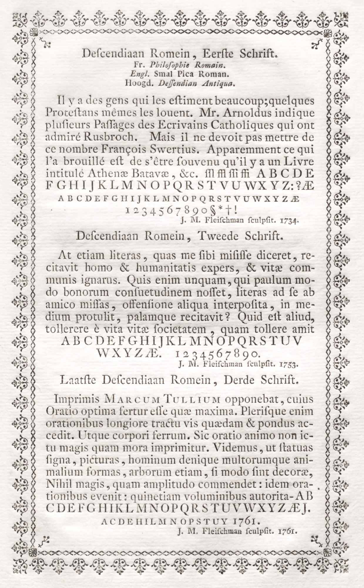
211. Fleischman’s Roman Types cut in 1734, 1753, and 1761: Enschedé’s Proef van Letteren, Haarlem, 1768
From Noord-Hollands Archief (scan)
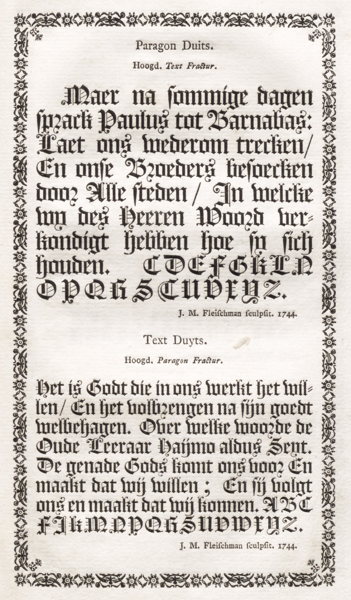
212. Fleischman’s Black-letter: Enschedé’s Proef van Letteren, Haarlem, 1768
From Noord-Hollands Archief (scan)

213. Seventeenth Century Civilité: Enschedé’s Proef van Letteren, Haarlem, 1768
From Noord-Hollands Archief (scan)
Charles Enschedé’s Fonderies de Caractères et leur Matériel dans les Pays-Bas du XVe au XIXe Siècle contains everything in the early Enschedé specimen-books and reproduces interesting types from the Rosart, Decellier, and many other foundries. No other book on Dutch types is so is so valuable, and so complete. In illustrating it, the author had the enormous advantage of his own collection of types, and many of the examples are printed from them. He shows not only pages of type in mass, but also alphabets of capitals and lower-case letters, and the unusual “sorts,” of which there were many in Dutch fonts. For instance, in the civilité cut by Van der Keer, which was purchased by Enschedés from Ploos van Amstel in 1799, the type is first displayed as it appears in Van Hout’s specimen. In an analysis of this font, its capital letters, lower-case letters for the middle of words, and letters to be used at the ends of words, or phrases, are exhibited; together with double letters, punctuation, numerals, and ligatures initials and medials, and final ligatures, with six ligatured forms of en, et, and in. This gives some idea of how thoroughly the work is done. Ornamental initials, decorations, and typographical borders are treated with equal fullness and completeness, and illustrated by a marvellous series of reproductions. No one who does not know this book can know much about Dutch printing from 1500 to 1800.
A final specimen-book to be discussed is that of a certain Jacques François Rosart (1714–1777), a native of Namur. He seems to have been self-taught, and to have established himself at Haarlem as type-founder in a small way, when about twenty years old. The establishment of the Enschedé foundry there was a blow to him, although he cut many fonts for Enschedé and so gained valuable experience. He thought, rightly or wrongly, that the Enschedés treated him shabbily and unduly favoured his rival, Fleischman.
The dedication of Rosart’s specimen is printed in one of his disagreeable script fonts, somewhat like that used for the introduction of the Enschedé specimen. In an address “to amateurs of the art of printing,” Rosart observes in a somewhat acid manner that he does not praise the hardness of his type-metal, nor the depth of his counters, as some claimants do, who wish to make a great deal out of nothing. For printers whom he, Rosart, has had the honour to serve, know very well the quality of his types! And he adds that he cannot conceil his surprise that the Enschedés in praising Fleischman have forgotten to name the Artist who has brought honour to their foundry by supplying it with a number of types—calling Fleischman the foremost type-cutter of the century, to the prejudice of persons whose talents are not yet much known, but who (it is to be hoped) will shortly make them so.
There is something pathetic about Rosart’s book. It is not very well executed. The capital letters with which it starts out are a little extreme in the delicacy of their serifs and in the thickness and thinness of contrasting lines. Three alphabets of flowered letters (detestably displayed) were cut by Fournier le jeune of Paris! Of the upper and lower-case types, not much is to be said. They are of the Dutch taste of the day; but the italics are more elegant than most of those of the period. As the types become smaller, the bodies seem out of proportion to the height of the capital letters, and in these smaller sizes there are certainly many bad fonts. His music characters and plain-song notation are both shown. The caractère de finance (fig. 214), Rosart tells us, he engraved in 1753 to be printed with the music types which he offered to the public in 1750,45 “as,” he adds, “the whole city of Haarlem can certify” (fig. 215). Some black-letter, some Greek, and a beautiful cut of civilité engraved by “the late Grandjant [Granjon] at Paris” complete the specimen of types, and then come pages of ornaments (fig. 216), among which the unpleasant marrow-bones, scythes, skills, and crossed spaces—which appear, too, in other contemporary “specimens”—leave no doubt about the kind of notification they were to decorate! Some of the simpler ornaments are pretty, but I think were inspired by Fournier.
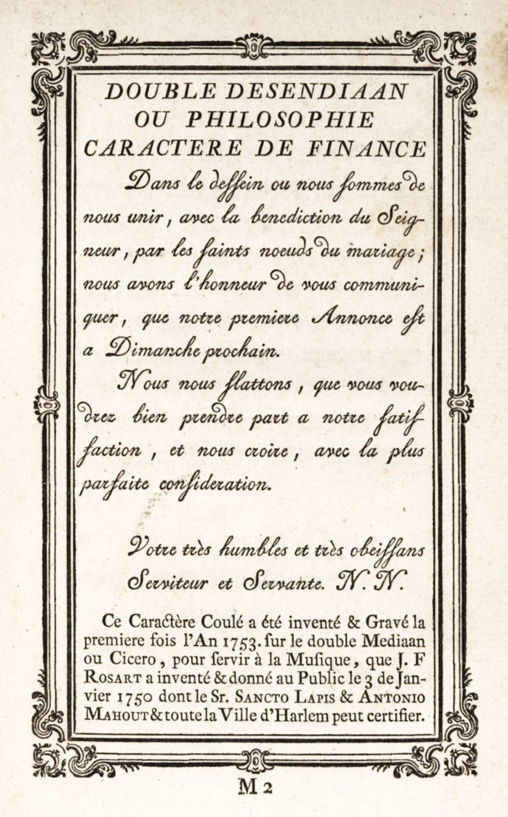
214. Rosart’s Caractère de Finance, from his Épreuve, Brussels (after 1760)
From Google Books (scan)
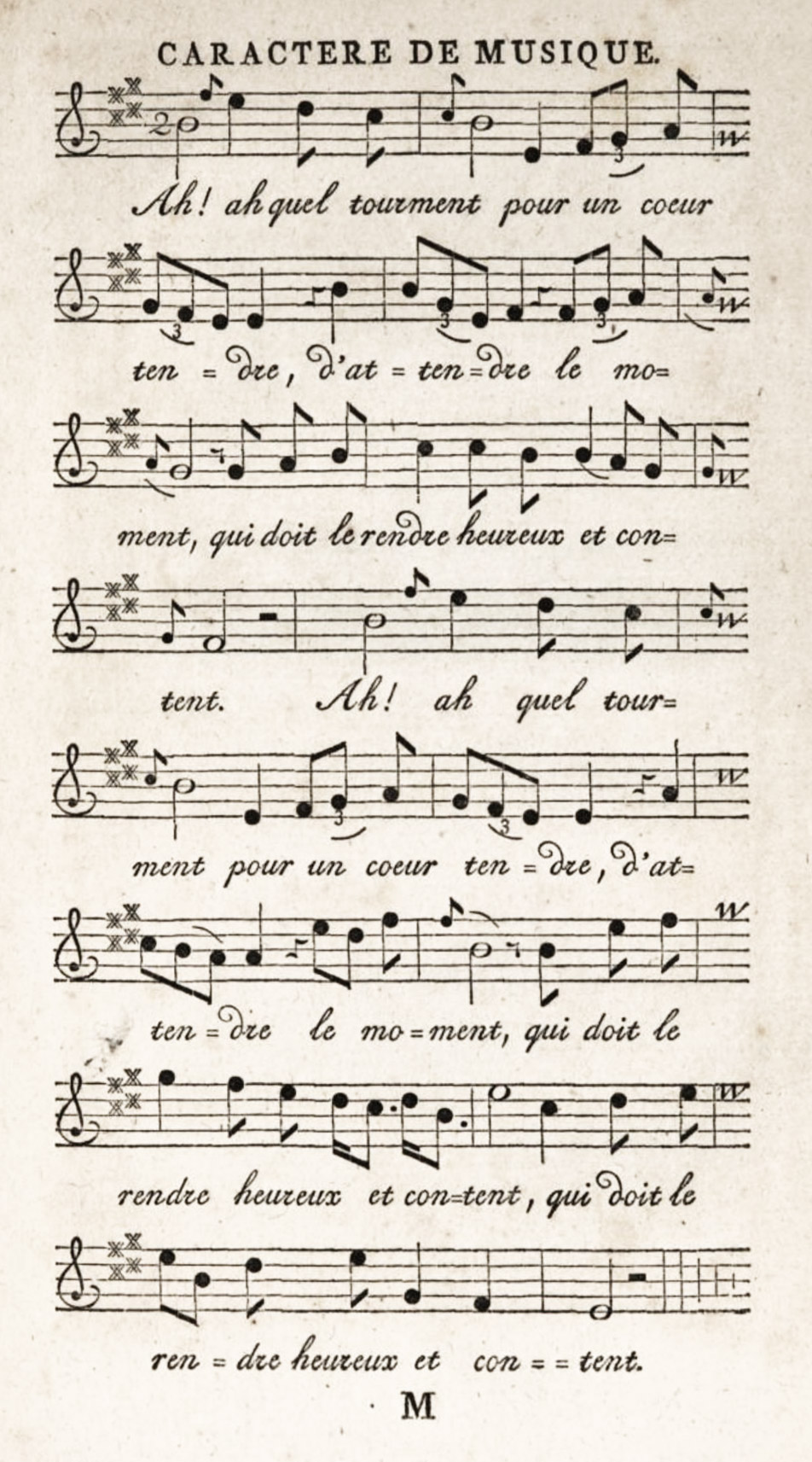
215. Rosart’s Music Types, from his Épreuve, Brussels (after 1760)
From Google Books (scan)
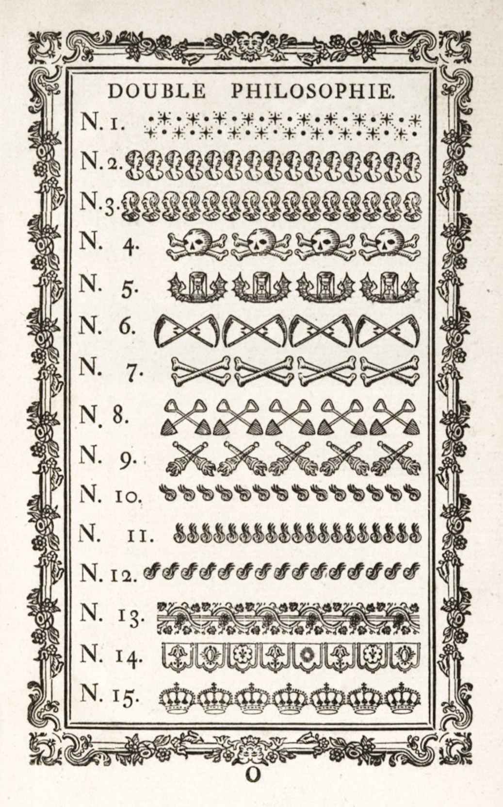
216. Rosart’s Ornaments, from his Épreuve, Brussels (after 1760)
From Google Books (scan)
In 1759, Rosart left for Brussels, where, under the patronage of the Duke of Lorraine, he established a foundry. He died May 26, 1777, at the age of sixty-two, leaving several children.
A son, who was also a reputable type-cutter, did not succeed to his father’s foundry. In 1779, Rosart’s music characters, matrices, and punches were sold with the rest of his collection, and were acquired by a widow named Decellier, of Brussels.46 Rosart’s priority in adapting the design of engraved music notes to typography will always give him a modest immortality.
To round out properly the subject of eighteenth century Dutch types, consult the specimen issued by the brothers Ploos van Amstel of Amsterdam, of 1784, and its supplement issued about 1790; the specimen of J. de Groot, published at The Hague in 1791 1781, which contains some of the Rosart material, and that issued by Harmsen & Co. at Amsterdam at about the same period—“necessary where they may be had.” The most interesting of these types and ornaments, however, are beautifully reproduced in Enschedé’s monumental Fonderies des Caractères. Those who are curious about the declension of excellence in late eighteenth century Dutch types may refer to that remarkable book.
M. Enschedé, speaking of this period, says that
the taste of the public changed, and in a manner which one could not approve of. The art of the type-founder retrograded from all points of view.… The French Revolution, which overturned so entirely the old order of things, brought nothing better in place of it to our art, and as the assortment of types by Fleischman…became, as if by enchantment, old-fashioned, after the foundation of the Batavian Republic, and had to give place to characters of a more modern cut.… The name of Fournier, formerly so well-known among us, had already been eclipsed at this period by that of Didot. What Fleischman had formerly been [to Dutch type-founding] Didot was at that epoch.47
There was not a single foundry which did not try to advertise itself by Didot types or copies of them, and this was the case not only in Holland, but in Germany, and indeed throughout Europe. Those who recall the end of the chapter on German types will remember how true this was of the output of Unger. So too, the eighteenth century in Dutch typography closes under the influence of the faults and merits of the great French founder.
England was largely supplied with Dutch printing types in the seventeenth century, as we know from the James correspondence quoted in Rowe Mores’ A Dissertation upon English Typographical Founders and Founderies, and from letters about Bishop Fell’s gift of types to the University Press, Oxford. The Fell types were procured in Holland about 1693, through the intervention of Rev. Thomas Marshall, preacher to the English merchants in Holland and afterwards Dean of Gloucester; and negotiations consumed some four years, largely because Marshall did not know a punch from a matrix! Moxon, the first English writer on type-founding, says that the “common consent of Book-men assign the Garland to the Dutch-Letters,” and he himself greatly admired them. In the second paper of his Exercises he gives a very oft-quoted description of them, which I spare the reader.48 Moxon particularly praised Van Dyck’s types and engraved plates of them, enlarged, shown in his Mechanick Exercises, have already been alluded to. Dutch types were also in vogue in Germany at the end of the seventeenth century, and were imported in large quantities. Some roman and italic Dutch types of this date were shown in connection with Breitkopf’s specimen in Gessner’s Buchdruckerkunst und Schriftgiessery, Leipsic, 1740. These came from a Leipsick foundry which Fournier considered second only to Breitkopf’s—that of Hr. Erhardt. A head-line (omitted in our reproduction) reads: “Real Dutch types, and a great number of other characters, which are to be found in Erhardt foundry here.” These fonts resemble those given by Fell to the Oxford Press, and in cut belong to the seventeenth century. Their provenance I do not know.
Although heavy, they retain considerable vivacity of line, and have great capabilities when used with taste. Our illustrations (figs. 217 and 218) show the larger sizes of both roman and italic—the latter being the better of the two.
217. Dutch Roman Types: Erhardt Foundry Specimen, Leipsick, c. 1739
From Gessner’s Buchdruckerkunst un Schriftgiessery (facsimile), Schrift-Probe (scan)
218. Dutch Italic Types: Erhardt Foundry Specimen, Leipsick, c. 1739
From Gessner’s Buchdruckerkunst un Schriftgiessery (facsimile), Schrift-Probe (scan)
The types which the Dutch supplied to England at the commencement of the eighteenth century are shown in the specimen printed at the beginning of Watson’s History of the Art of Printing,49 of 1713 (fig. 261). They had begun to assume a general uncouthness which helped the English to abandon their purchase for those more comfortable and “cheerful” roman letters designed by William Caslon about 1720.
- Max Rooses, Christophe Plantin, Imprimeur Aversois, 2ème Édition. Antwerp, 1896.
- Rooses’ Plantin, after page 232. His reproduction, from which our plates are taken, is slightly reduced.
- Druckschriften, pls. 8 and 30.
- Enschedé’s Fonderies de Caractères e leur Matériel dans les Pays-Bas, du XVe au XIXe Siècle, pp. 44–47.
- Enschedé, pp. 40, 41, 47, 48, 49.
- For a valuable survey of these types see Les Caractères de Civilité de Robert Granjon et les Imprimeurs Flamands, Antwerp, 1921, by Maurtis Sabbe (of the Musée Plantin) and Marius Audin. It contains twelve reproductions of civilité fonts by Granjon, Tavernier, etc.
- Druckschriften, pls. 7, 8, 16, 30, 87. Plate 7 shows a beautiful old style type, very beautifully set (our fig. 199). Plate 8 shows Dutch civilité type, with its semi-calligraphic initial. Notice the “written” look of the capital letters in the first seven lines. Plate 16 shows an italic type. Notice the ampersands in the third, fourth, and seventeenth lines. Plate 30 shows a small size of civilité. Plate 87 exhibits a massive old style roman font, in which observe the final n’s, e’s, and t’s.
- For other examples of Plantin’s earlier way of working, see title-pages reproduced in Rooses’ Plantin, pp. 58, 60, 84.
- Commonly known as Ortelius.
- Evelyn also records that at Antwerp at “the shop of Plantine I bought some books for the namesake only of that famous printer.”
- The printers’ marks, head-pieces, and ornaments of the Leyden and Amsterdam establishments, with a collection of similar material from different seventeenth century Dutch printing-houses, may be seen in Rahir’s Catalogue d’une Collection unique de Volumes imprimés par les Elzevier et divers Typographes Hollandais du XVIIe Siècle, etc. Paris: Morgand, 1896.
- In the first column of the specimen, the first, fifth, sixth, seventh, and ninth types shown are his. In the second column, the first three, and the capitals of the Augustijn and Cursijf. In the third column, the first, third, sixth, seventh, eighth, and ninth, and the last one; and all the types in the fourth column.
- Moxon’s Mechanick Exercises, or the Doctrine of Handy-Works applied to the Art of Printing, pl. 15.
- Historic Printing Types, New York, 1886, p. 43.
- Moxon’s Mechanick Exercises, pls. 11 and 12.
- Proeven van Lettern die gesneden zijn door Wylen Christoffel van Dijck, welke gegoten werden by Jan Bus, ten huyse van Sr. Joseph Athias, etc. Bus had a reputation in his day as a clever workman.
- Blades’s Early Type Specimen Books, pp. 14, 15.
- The small format of some editions of proscribed books was probably to adapt them to convenient transportation to the public they commanded outside Holland.
- Title-pages, etc., of books issued in the Netherlands during the sixteenth and seventeenth centuries (as well as manuscripts and incunabula) are reproduced in J. ten Brink’s Geschiedenis der Nederlandsche Letterkunde, Amsterdam, 1897. See also Stockum’s La Librairie, l’Imprimerie et la Presse en Hollande à travers Quartre Siècles. Documents pour servir à l’Histoire de leurs Relations Internationales. La Haye, 1910. This gives reproductions of title-pages, etc., of works of foreign authors printed in Holland. For a guide to some of the best Dutch printing, consult the Catalogue of the Exhibition of Old and New Book-Making in the Netherlands, held at The Hague and Amsterdam in 1920 under the auspices of the Joan Blaeu Society (Catalogus van de Tentoonstelling van Oude en Nieuwe Boekkunst in de Nederlanden: Vereeniging Joan Blaeu). The catalogue includes 378 items, and is valuable for titles of interesting sixteenth, seventeenth, and eighteenth century books, of well-printed volumes issued in the nineteenth century, and of those reflecting modern tendencies in type-cutting and book-making issued in recent years.
-
Wouter Nijhoff, L’Art Typographique dans les Pays-Bas (1500–1540). Reproduction en Facsimile des Caractères Typographiques, des Marques d’Imprimeurs, des Gravures sur Bois et autres Ornements employés dans les Pays-Bas entre les Années MD et MDXL. Avec Notices Critiques et Biographiques. La Haye, 1902. In the references to this work which follow, the numbers of the Livraisons in which the loose facsimiles were originally issued are given, but if the plates have been collated and bound, these numbers can be disregarded.
- Nijhoff: Anvers, Willem Vorsterman, IV, No. 10 (Livraison 3), and V, No. 11 (Livraison 4).
- Nijhoff, Leiden, Jan Seversz., III, No. 8 (Livraison 3).
- In connection with this man’s work, the cursive character used in his edition of the New Testament in Dutch, printed at Delft in 1524, is sufficiently unusual to reward attention. See Nijhoff: Delft, Cornelus Henriczoon Lettersnijder, Nos. 7 and 9 (Livraison 11).
- Nijhoff, Delft, Cornelis Henriczoon Lettersnijder, V. No. 15 (Livraison 17).
- Nijhoff, Anvers, Jan Lettersnijder, I, Nos. 1–3 (Livraison 8).
- Nijhoff, Anvers, Nicolas de Grave, III, Nos. 6–9 (Livraison 10).
- Nijhoff, Louvain, Theodoricus Martinus Alostensis, V, No. 19 (Livraison 13).
- Nijhoff, Anvers, Michiel Hillen van Hoochstraten, XIV, No. 51 (Livraison 15).
- Nijhoff, Louvain, Theodoricus Martinus Alostensis, II, Nos. 6, 7, 8 (Livraison 2).
- Nijhoff, Deventer, Albert Paffraet, IV, Nos. 16, 18, 19 (Livraison 2).
- Nijhoff, Leiden, Pieter Claeszoon von Balen, I, Nos. 3, 4, (Livraison 15).
- Nijhoff, Anvers, J. Grapheus, II, Nos. 4, 5 (Livraison 5).
- Rudolph Ruzicka.
- Facing pls. xli, xlii, etc.
- Filips von Zesen’s Beschreibung der Stadt Amsterdam, 1664, pp. 215, 216; quoted in E. L. Stevenson’s Willem Janszoon Blaeu, Hispanic Society, New York, 1914. For a list of the principal geographical works of the elder Blaeu, see Bibliography in the latter book.
- Stockum’s La Librairie, l’Imprimerie et la Presse en Hollande à travers Quatre Siècles, facs. 153, 154.
- Stockum, fac. 161.
- Stockum, fac. 163.
- Stockum, fac. 164.
- Stockum, facs. 171, 172.
- Stockum, fac. 174.
- Stockum, facs. 195–198.
- i.e., and her sons. Fournier mistook the Dutch word “zonen” for a proper name.
- Van der Keere the younger.
- These music types were the earliest typographic rendering of the round music notes which, up to that time, had appeared only in engraved music. Fournier, Breitkopf, and Enschedé produced music types of like design, with mechanical improvements of varying degree, respectively in 1754, 1756, and 1764. For a discussion of the rival claims to priority of production, see Ch. Eschedé’s Fonderies de Caractères et leur Matériel, etc., pp. 241–245.
- The Rosart specimen described was probably put out by J. F. Rosart at Brussels about 1761. Madame Decellier in 1779 issued a specimen entitled Épreuve des Caractères de la Fonderie de la Veuve Decellier, successeur de Jacques-François Rosart. Troisième édition augmentée. À Bruxelles, Rue ditte Vickt, près du Marché aux Grains.
- Enschedé’s Fonderies de Caractères, etc., pp. 382–386.
- Moxon’s Mechanick Exercises, or the Doctrine of Handy-Works applied to the Art of Printing, Numb. II, ¶2, Of Letter; also pls. 11–17.
- Specimen of Types in the Printing-House of James Watson, Edinburgh, 1713, pp. i–xlviii.
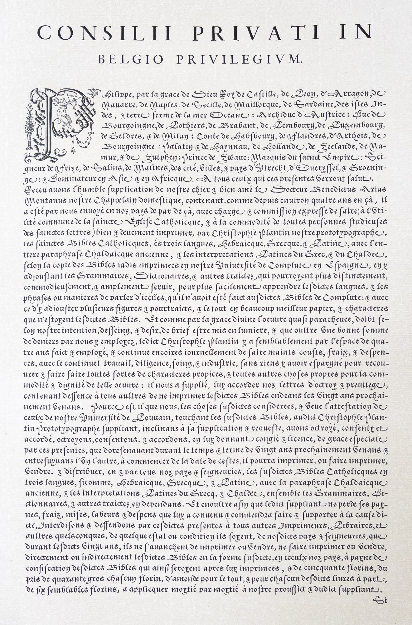
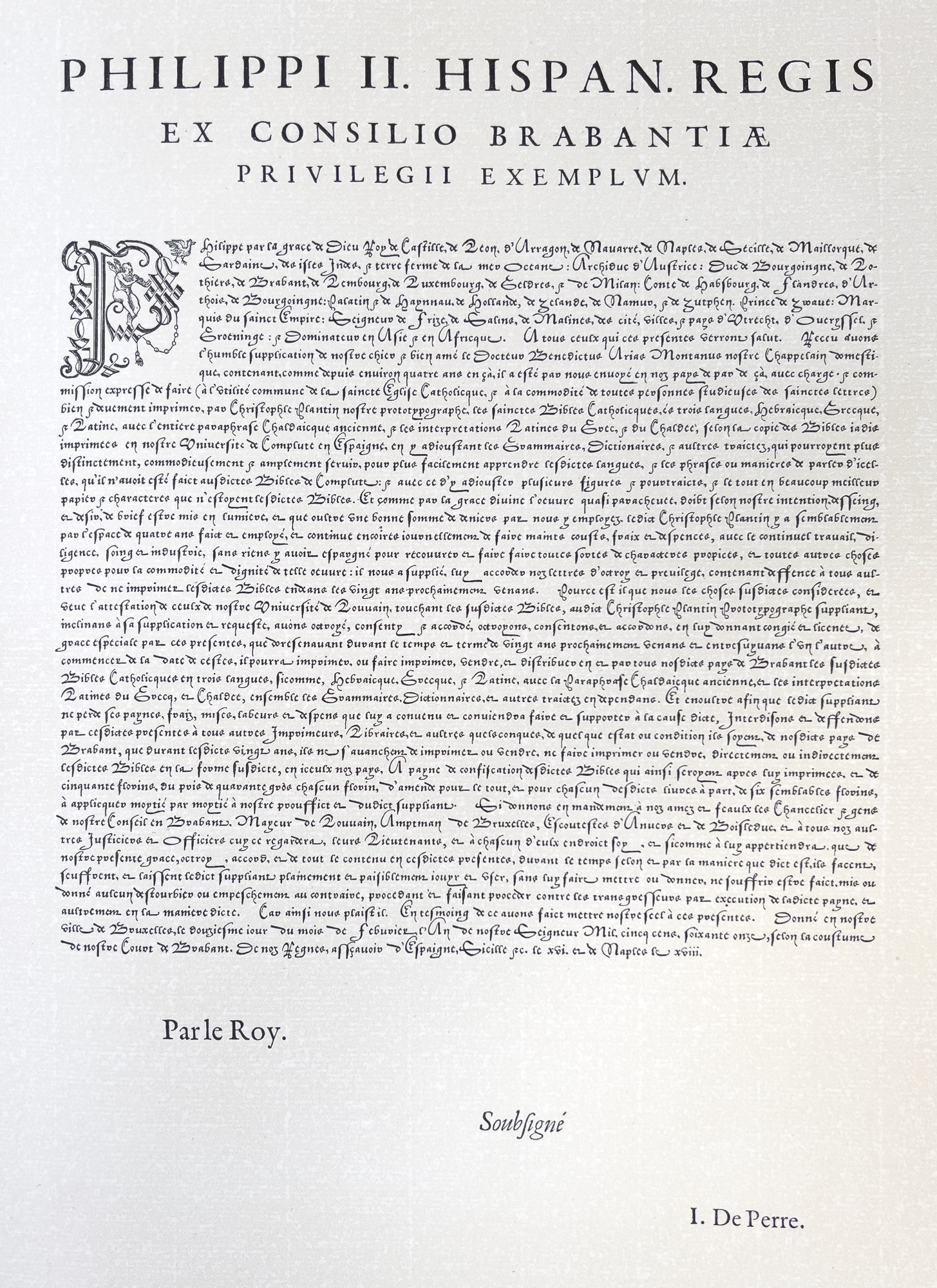
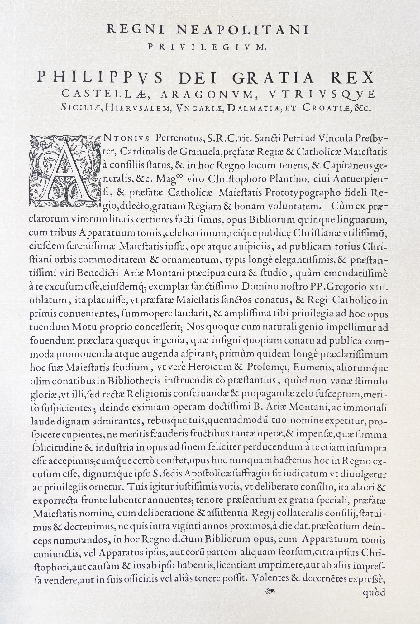