Chapter XXI
Revivals of Caslon and Fell Types
Revivals of type-forms are periodical. They are usually brought about by dissatisfaction caused by too intimate knowledge of the disadvantages of types in use, and ignorance of disadvantages which may arise in the use of types revived. In other words, one set of types falls into neglect through certain inherent drawbacks; and it is not revived until the difficulties known to those who formerly employed it are forgotten and only the advantages appear. A constant factor also is a natural love of variety and change.
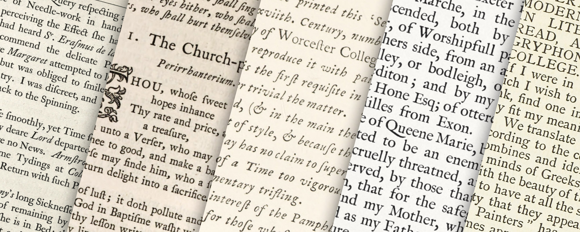
The best early work of the nineteenth century was the result of a sincere effort toward the betterment of printing, according to the standards of that day; but before the mid-century, English typography, except here and there, had again fallen behind. The fine editions printed by Bulmer and Bensley were things of the past. Bulmer was dead in 1830—Bansley in 1833. Several other publishers brought out well-printed books, but they were without the distinction of those issued some years earlier. There was, however, an exception in the work done by the two Charles Whittinghams—uncle and nephew—at the Chiswick Press, founded in 1789, though established at Chiswick in 1810. This press is famous in the annals of English typography, the soundest traditions of which it has upheld for over a century. Its best books were printed by the younger Whittingham for the publisher Pickering. In 1844, Pickering and Whittingham proposed to issue an edition of Juvenal (in contemplation since 1841), and requested the Caslon foundry to cast some of the original Caslon types which they wanted for it. This Latin edition of the Satires of Juvenal and Persius, in quarto (a handsome book except for its red borders), was delayed, however, and not published until 1845. So the great primer “old face” Caslon font intended for it, appeared first in 1844 in The Diary of Lady Willoughby. For this fictitious journal of a seventeenth century lady of quality, old style type was thought appropriate. The Diary was a success, artistically and commercially. Though its typography does not seem much of an achievement now, it came as a novelty and relief to printers who had long since abandoned good earlier type-face in favour of the fonts of the school of Thorne (fig. 339). This was the beginning of the revival of original popular revival of Caslon fonts, and a very sound revival it was.
From that time to this, Caslon type has had the popularity it merits. In fact, the chief typographic event of the mid-nineteenth century was this revival of the earliest Caslon types in the competent hands of Pickering and Whittingham. United States founders reintroduced these fonts about 1860, but they did not become popular until some thirty years later.
339. Caslon Type as revived in Lady Willoughby’s Diary by Whittingham, London, 1844
From HathiTrust (scan)
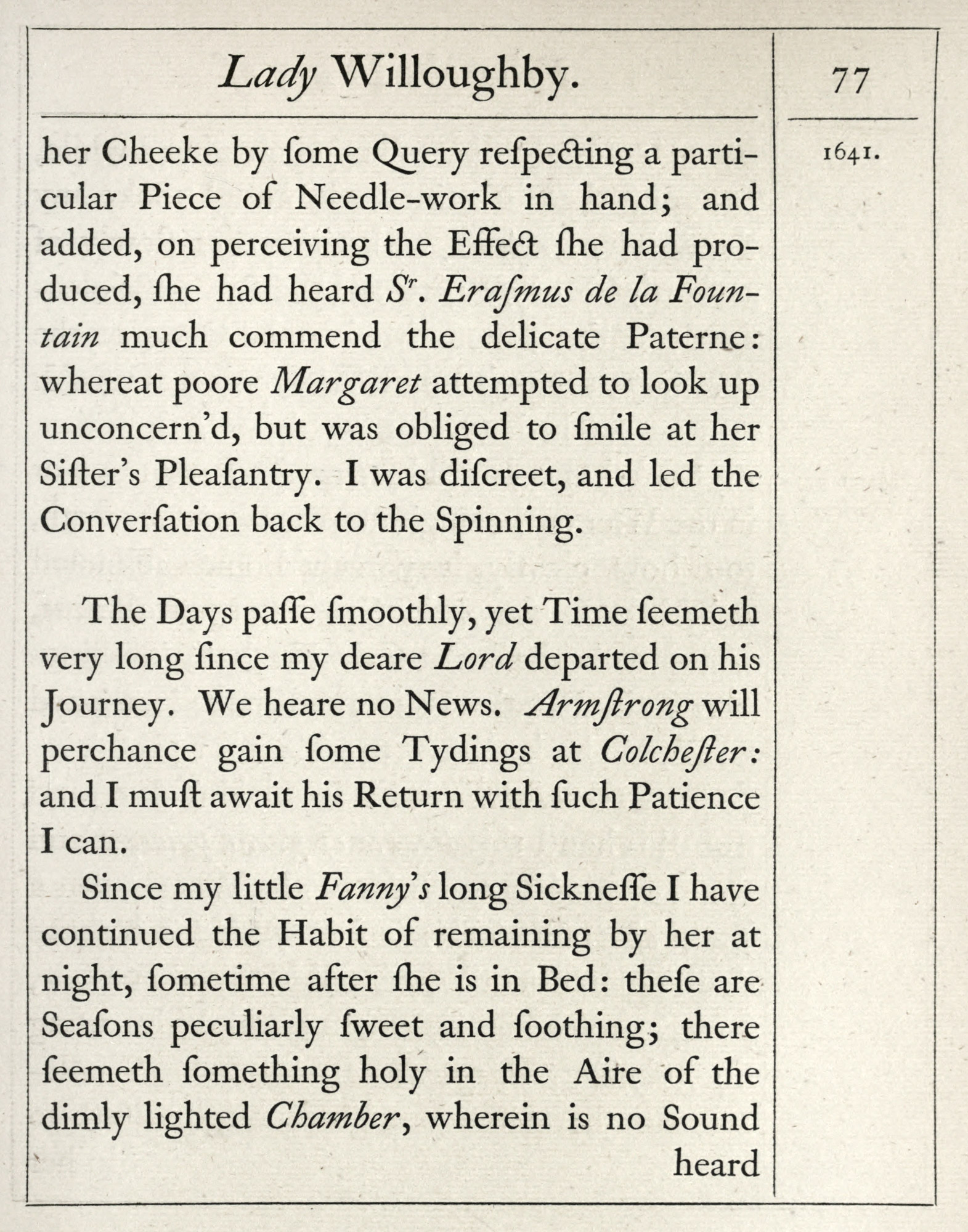
The Aldine Poets, Walton’s Complete Angler, the beautiful Latin Opera of Sallust (in the type of the Juvenal and Lady Willoughby), an octavo edition of Milton and Herbert, and the famous series of folio black-letter Prayer Books are among the best of Pickering’s publications. But the series of 16mo volumes, which for beauty and utility have not been surpassed in modern times, are what is particularly meant by a “Pickering edition” (fig. 340). All these were printed at the Chiswick Press, as well as many other beautiful books for publishers, book-clubs, and individuals—among them the Bannatyne Club’s Breviarum Aberdonense and Henry Shaw’s books on mediaeval alphabets ornament. The Chiswick Press still holds preëminent rank—the present establishment at Tooks Court, Chancery Lane, London, being conducted by Charles Whittingham and Griggs, Ltd.
340. Caslon Type used in “Pickering edition” of The Temple, by George Herbert: Whittingham, London, 1850
From HathiTrust (scan)
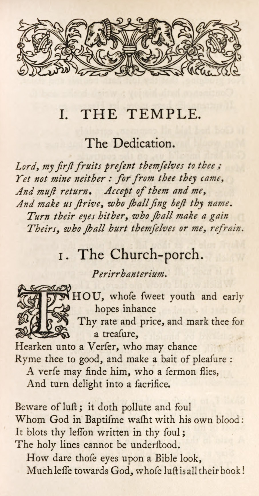
The use of the Fell types, which had lain for many years neglected at the Oxford University Press, was revived by a little press (first started at Frome in 1845, and continued at Oxford) which was a private venture of the Rev. C. H. O. Daniel, late Provost of Worcester College. Dr. Daniel had the taste to recognize the possibilities dormant in Fell’s fonts, and after 1877 he used them in his rare little issues with delightful discrimination (figs. 341 and 342). The Daniel books were printed in both roman and black-letter, and in connection with the former type many pleasant old ornaments were revived.
The publications of this press were continued until 1919.1 The Fell types are now the pride—or one of the “prides”—of the Clarendon Press. Their revival was of real importance in modern printing. The Oxford Book of English Verse, the volumes in the Tudor and Stuart Library, the Trecentale Bodleianum of 1913 (fig. 343), and the Catalogue of the Shakespeare Exhibition held in the Bodleian Library to commemorate the Death of Shakespeare (Oxford, 1916) are familiar examples of their admirable and effective modern use.
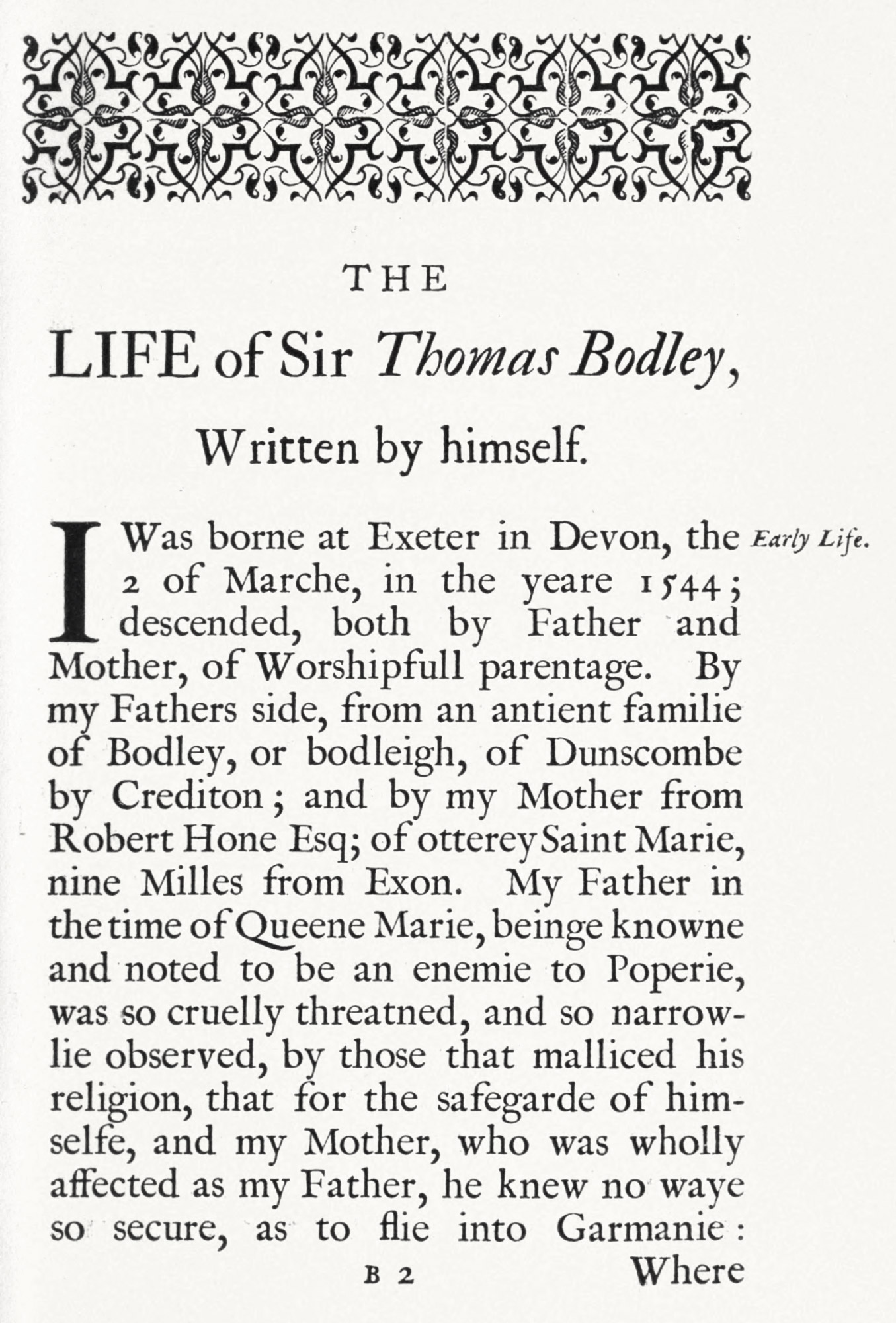
341. First use of Fell Types by the Daniel Press, Oxford, 1877
From A New Sermon of the Newest Fashion
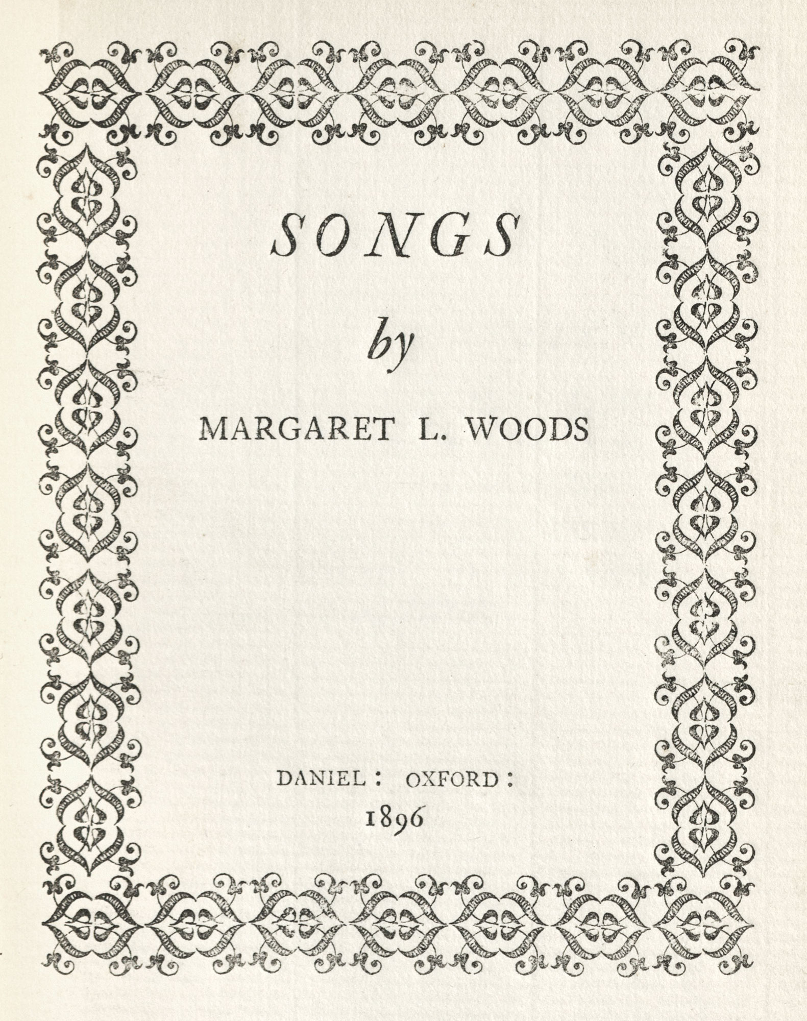
342. Fell Types as used in Songs by Margaret L. Woods: Daniel Press, Oxford, 1896
From a copy in the Newberry Library (scan)
343. Fell Types as used in Trecentale Bodleianum: Oxford University Press, 1913
From HathiTrust (scan)
The Ballantyne Press of Edinburgh, founded at Kelso by James Ballantyne in 1796, later, at Sir Walter Scott’s suggestion, coming to Edinburgh, and known under the name of Ballantyne, Hanson & Company, has done delightful work for many years past. The business has been acquired by Messrs. Spottiswoode & Company of London, and has been removed from Edinburgh. This form, that of Messrs. R. & R. Clark, and the establishment of T. & A. Constable of Edinburgh, have been more constant to types of Scotch letter-founders, and for many years have successfully used “revived old style” and also characters of the modern face family.2 Constable employed an interesting Scotch modern face for David Nutt’s distinguished series of Tudor Translations. The fine revived old style or (as I should prefer to call them) modernized old style fonts were used by the same printer in the three volumes of Bibliographica [vols. 1, 2, 3] (1895); and Mr. J. P. Morgan’s monumental Catalogue of Manuscripts and Early Printed Books from the Libraries of Morris, Benett, etc. (1907), is a magnificent example of the skilful use of these types by the Chiswick Press. In smaller sizes this type was delightfully employed by the same press in their reprint of Sir Henry Wotton’s Elements of Architecture, issued by Longmans in 1903 (fig. 344).
344. Modernized Old Style Fonts as used in Wotton’s Elements of Architecture: Chiswick Press, London, 1903
From a copy in the Newberry Library (scans)
But the early and “classic” use of this type was in Herbert Horne’s periodical, The Century Guild Hobby Horse (1886–92). Its later volumes (beginning in 1888), printed in a large size of the “modernized old style” character, with delightful decorations drawn by Mr. Horne, are most distinguished pieces of typography (fig. 345). Of The Hobby Horse not many volumes were issued, but they will always hold a place in the annals of the revival printing at the end of the last century.
345. Type used in The Hobby Horse: Chiswick Press, London, 1890
From Internet Archive (scan)
In Mr. Horne’s typographical venture, William Morris had a hand; but as Morris rode a very Gothic hobby-horse of his own, and Mr. Horne’s charger was much more Italian than Gothic in its behavior, it is easy to see why Morris soon turned his attention to printing in a way more to his mind. His endeavours, their results, and the influence they had on modern printing have now to be considered.
- See The Daniel Press. Memorials of C. H. O. Daniel, with a Bibliography of the Press, 1845–1919. Oxford, Printed on the Daniel Press in the Bodleian Library, 1921—“the first book printed within the walls of the Bodleian,” where the third Daniel press, on which it was printed, is deposited. It is illustrated with portrait, facsimiles, etc.
- In England Caslon types are called “old face”; what we call “modernized old style” is there termed “revival old style”—a type designed about 1850.