Chapter VI
Types and Type-Forms of the Fifteenth Century in France
Paris was the first place in France in which printing, as we know it to-day, was practised. But before any press was set up there, essays in typography had already been made at Avignon, as early as 1444, by Waldofghel, a Bohemian goldsmith of Prague. He had some secret process which he called the art of writing artificially. He declared under oath upon the Gospels and before witnesses, that the said method of writing artificially was real, easy, and possible, and useful to those who wished to work in it. In association with a watchmaker, or locksmith, who came from Treves, and with the help of others who supplied money for the project, he set up some sort of printing establishment, the material of which consisted of two steel alphabets, two iron forms, a steel instrument called a vise, and other accessories. He also made an alphabet of twenty-seven Hebrew letters, with a so-called engine and accompanying instruments of wood, tin, and iron. It is possible that Waldfoghel had earlier been associated with men who were, in turn, connected with Gutenberg, at Strassburg or Mainz. At the latter place there were men who were experimenting in the art of printing besides Gutenberg. Waldfoghel, though lacking means fully to develop his ideas, seems to have arrived at something much like Gutenberg’s process. However that may be, his experiments did not continue after 1446. Eleven years later, Fust and Schoffer’s Latin Psalter of 1456 appeared at Mainz—the first dated book printed from movable types.
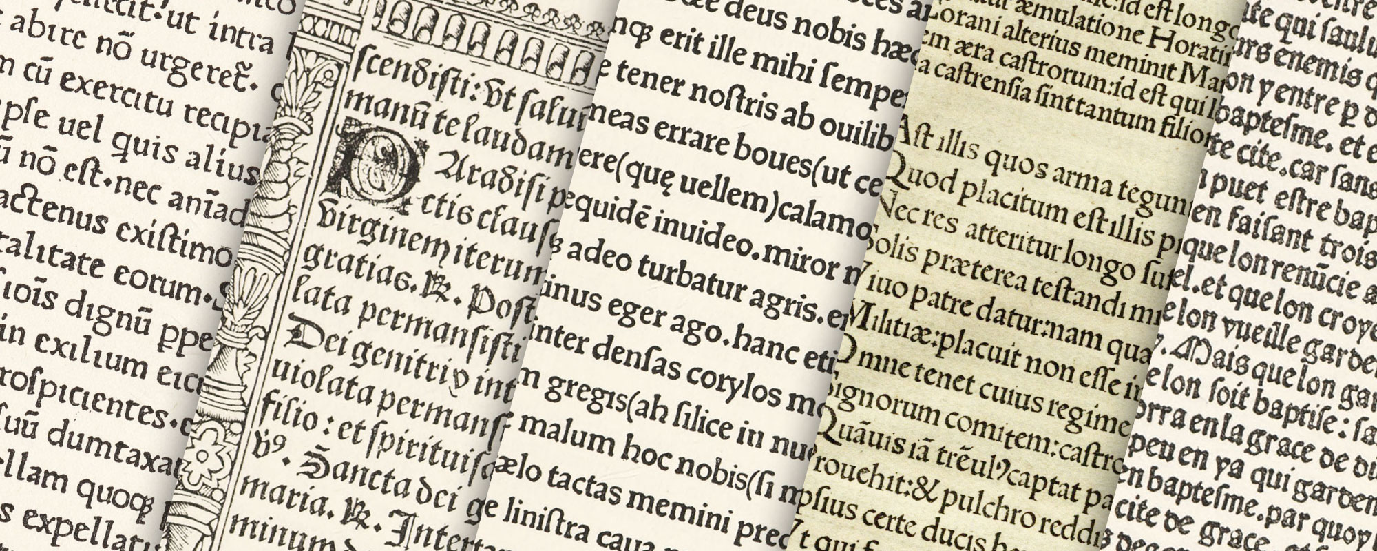
In Paris, printing was begun in 1470 under the auspices of two men whose origin casts some light on the personnel of the printing-house (really “a private press for the benefit of public studies”) which they established. One was Johann Heynlin, called de la Pierre, from his birthplace, Stein, in the Duchy of Baden. He had been prior and rector of the Sorbonne. He was a booklover, and, coming from the banks of the Rhine, was in relation with Mainz printers. Worried by the carelessness of copyists, he succeeded in interesting Fischet, professor of belles-lettres and rhetoric at the Sorbonne, in a scheme to import printers to Paris, so that learned works could be more correctly printed—a plan which arised considerable opposition among the powerful associations of writers and copyists. The printers for whom he sent were three—Frieburger, a man of education, an old friend of Heynlin, and a former fellow student at the University of Basle; and two others, Ulrich Gering and Martin Kranz, both workmen of the higher class. These men reached Paris in the early months of 1470. Before printing anything, they were obliged to manufacture the tools of their trade, to set up a press, and to fit up their trade, to set up a press, and to fit up their workroom. Last, but not least, they were obliged to cut their type—a roman font for which Heynlin furnished a model from the types of an edition of Caesar’s Commentaries, which was printed at Rome in 1469 by Sweynheym and Pannartz. As the prior (who was to correct the proofs of the books to be printed) was near-sighted a large roman character, which did not tire the eye, was preferred to the Gothic manuscript-letter, at that time generally used in France. The type was awkward in cut, but readable (fig. 32).
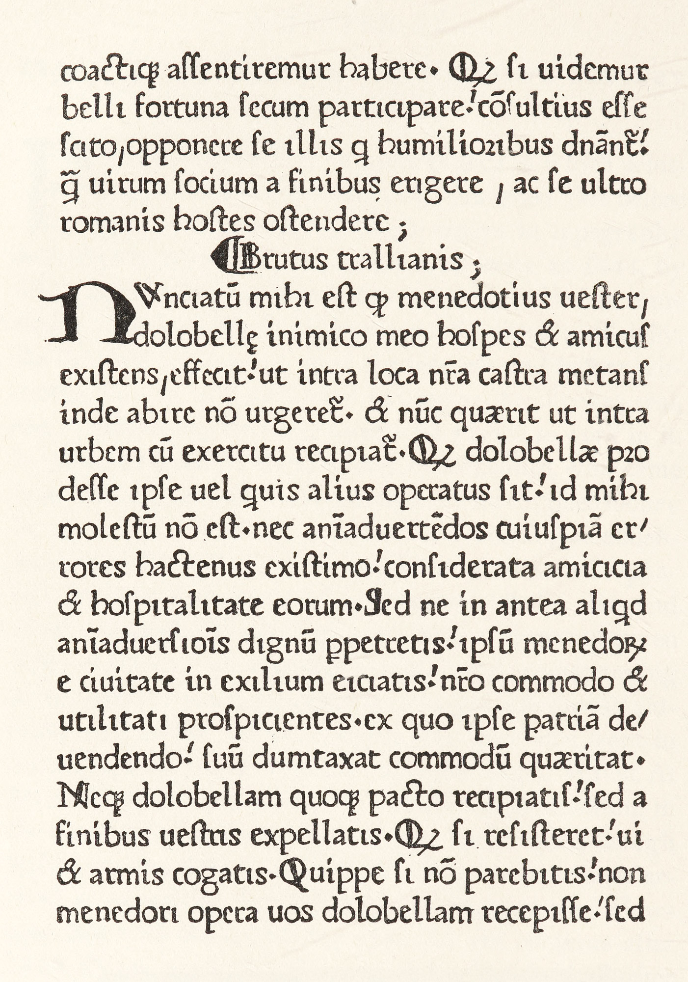
32. First Roman Type used in France: Freiburger, Gering and Kranz, Paris, 1470
From a copy of Phalaridis Epistulæ in the Annmary Brown Memorial Library, Providence
The first book printed in this font was Gasparini Epistolæ,1 a collection of letters by Gasparino Barzizi of Bergamo, which was considered an example of an excellent Latin style. A second book, Gasparini Orthographia,—a treatise by the same author on the orthography of Latin words,—was printed in the same type. With a copy of it which Fichet sent as a present to a former pupil, Robert Gaguin, he despatched a letter in which is this paragraph:
The printers say here to whoever is willing to listen to them, that it is a man named John, called Gutenberg, who first invented in the neighborhood of Mainz the art of printing, by the means of which books can now be made, not with the aid of the reed, as in old times, nor by the pen as in our days, but with the letters of metal, quickly, correctly, and well.… Bacchus and Ceres were made divinities for having taught humanity the use of wine and bread, but Gutenberg’s invention is of a higher and diviner order, for it furnishes characters by the aid of which all that is said or thought can be written, transmitted, and preserved to the memory of posterity.
A Sallust and other books followed, always printed in this same font. This press, as primarily founded, ended its work in 1472. In the next year, Fichet having left or Italy, and Heynlin no longer taking an active oversight of its production, the printers decided, or were obliged, to leave the Sorbonne and set up their workroom outside it. It has been said that, as an institution, the Sorbonne was active in procuring the services of these printers, but this is untrue; it was merely by the initiative of two men connected with that institution that the printers came to Paris. The press itself, however, was undoubtedly under the roof of the Sorbonne, for such a printing-office, but with one kind of type and a small daily production, took up very little space.
The printers then installed themselves at the Sign of the Golden Sun in the Rue St. Jacques, a street consecrated for centuries to the commerce of the book—as indeed it still is. Their next type (employed for a manual for the clergy, called Manipulus Curatorum, issued in 1473) was a gothic font of transitional character, more roman, however, than the like types of Schoeffer. This was the first gothic type used in France. In this book it was set in double-column, with the initial letters and paragraph marks put in by hand (fig. 33).2
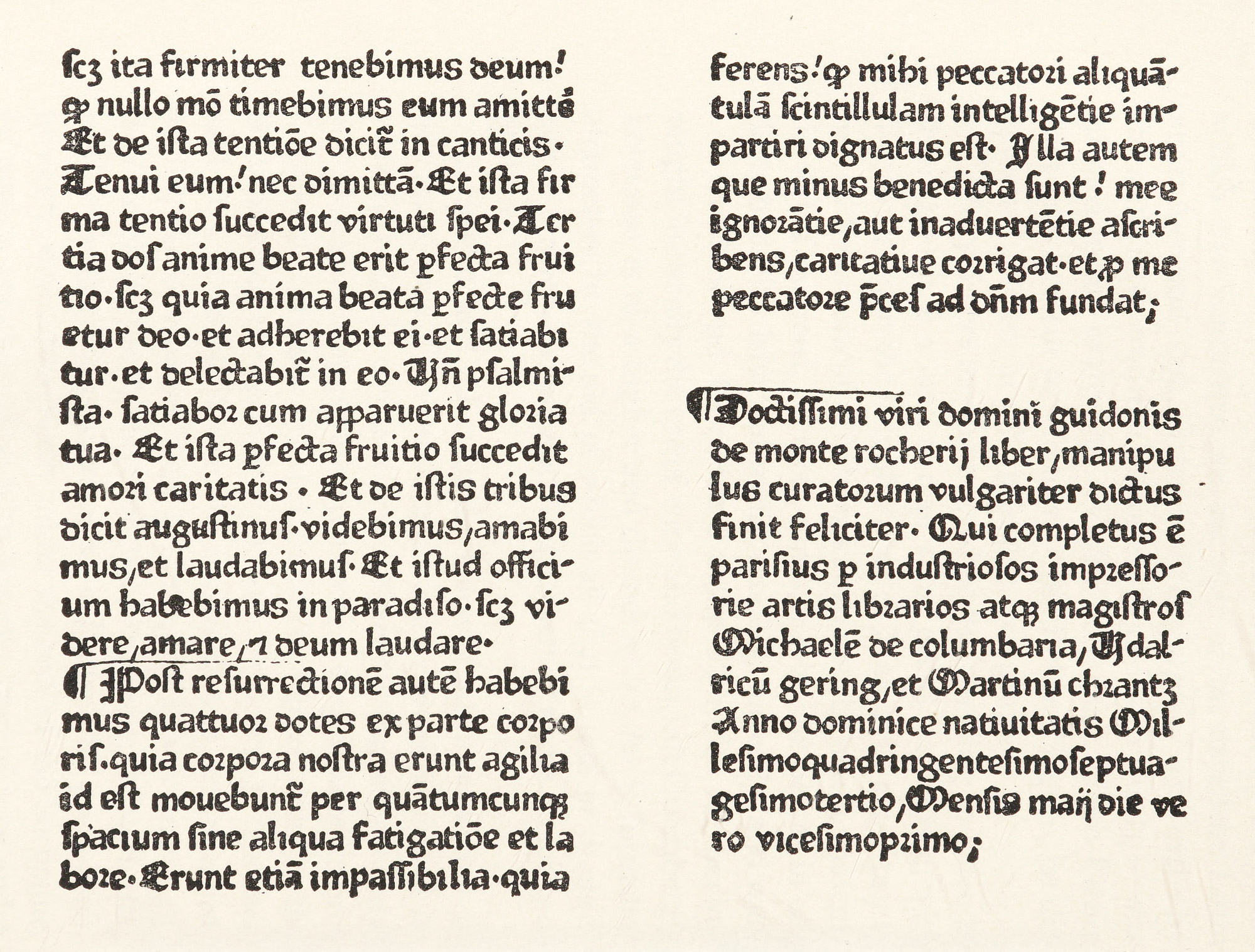
33. First Gothic Type used in France: Frieburger, Gering, and Kranz, Paris, 1473
From a copy of Manipulus Curatorum in the Annmary Brown Memorial Library, Providence
A new font, of letters larger in size than any of these previous types, was cut for the imposing Bible which they issued in 1476—the first Bible printed in France. The type is a heavy, rounded gothic, but capitals are roman, a feature not so inharmonious in effects as would be expected (fig. 34). The small type used in this Bible was the same as that employed in the first book printed after they left the Sorbonne.3
34. Type used for first Bible printed in France: Frieburger, Gering, and Kranz, Paris, 1476
From Claudin’s Histoire de l’Imprimerie en France au XVe et au XVIe Siècle
In 1477 Kranz and Freiburger returned to Germany, leaving Gering alone. Laying gothic fonts aside, Gering cut for himself two new types, both pure roman, though heavy in effect. In comparing these with the Bible type, they appear to be only an evolution of some elements clearly discernible in the earlier gothic character. The throwing back of the dot on the i is a feature to be noticed. In the larger, editions of Virgil (fig. 35) and of Sallus. After 1484 there seems to have been a cessation in his activities, but meanwhile other printers had taken up work in Paris, and had procured new fonts of gothic and roman letter. Later, in association with Berthold Rembolt, a native of Strassburg, he employed in the Bréviaire de Paris of 1492 a delicate gothic type. It was cut by Wolf, a printer, who during an interim in Gering’s management took charge of the press.4 They used also two other gothic fonts.5 In the Paris Missal, which was printed by Gering and Rembolt for Simon Vostre in 1497, some fine woodcuts were introduced;6 and the initials used by them are also of considerable decorative value.7 In the last year of the century this office was still effective and prosperous. Ulrich Gering has always been popularly considered the patriarch of Parisian typography.
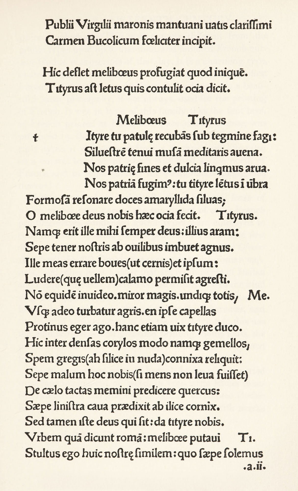
35. Roman Type used in Virgil by Gering, Paris, 1478
From Claudin’s Histoire de l’Imprimerie en France au XVe et au XVIe Siècle
Now that the history of the first Paris press has been traced, I shall keep more closely to the types themselves. The first French types were, as we know, roman. These were transitioner roman letters, but after a few years they gave way to gothic, for the popular taste was entirely for gothic forms such as were used in the Missale Parisiense printed by Jean du Pré in 1479.8 A few fonts of roman letters, modelled on the Italian letter, appeared in French publications at the very end of the fifteenth century. For the more stately liturgical books gothic type was of a pointed character—the real lettre de forme.9 For other books the lettre de somme was employed. But the characteristic form of French gothic letter used by French printers up to 1500 was the lettre batarde,10 first brought out by Pasquier Bonhomme. This was entirely different from the gothic types used up to that time, and imitated French cursive Gothic manuscripts of that day. It is a charming type, characteristically French—nervous and spirited. At first introduced in rather a crude form, it developed into a beautiful letter, principally, if not always, used for the printing of French. It was in type of this family that the first book in French printed at Paris, viz., Croniques de France, was produced by Bonhomme about 1477 (fig. 36). Like other early types it was derived from a literary hand, founded on a cursive legal script which was used in the north of France and in some parts of the Netherlands contiguous thereto.11
36. Lettre Batarde used in the first book printed in French: Bonhomme, Paris, c. 1477
From Claudin’s Histoire de l’Imprimerie en France au XVe et au XVIe Siècle
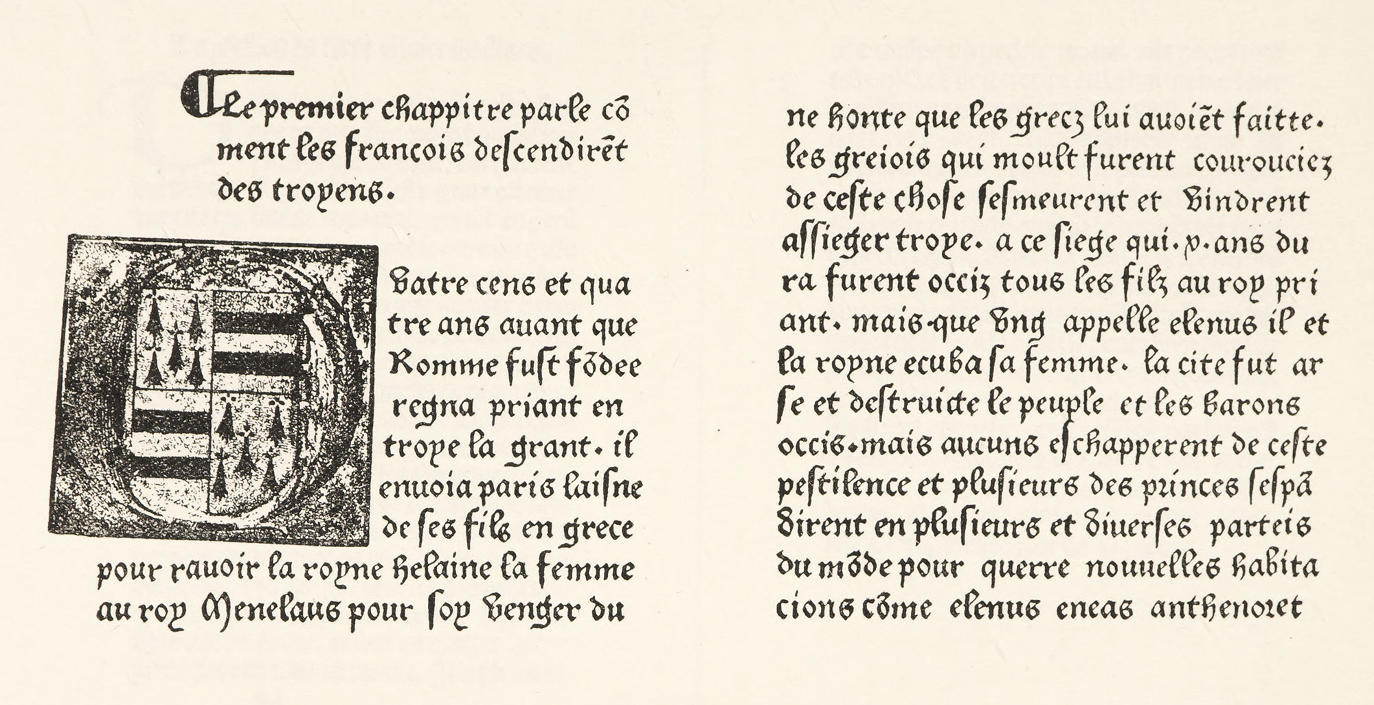
Besides these characteristically French types, fonts of which to-day form part of the equipment of some French printing-offices, condensed gothic types were employed in certain books in small format printed at Paris. The first of these appeared in 1481—La Confession de frère Olivier Maillard (fig. 37). Gothic type was used with roman capitals,12 and other fonts appear that are reminiscent of Italian and Flemish models. There was also a difference in the kind of gothic type employed for Latin and French books, the former being printed in the pointed gothic character, and the latter in various forms of batarde—following in this use the manuscripts which preceded printing. Some fonts, the provenance of which is puzzling, we find were imported from Basle, from Nuremberg, or elsewhere.
37. Condensed Gothic Type used by Bötticher, Paris, 1481
From Claudin’s Histoire de l’Imprimerie en France au XVe et au XVIe Siècle
Placed on the first page of French books of this period were inscriptions, cut on wood, in very large letters (usually imitative of calligraphy), of a round or pointed Gothic form. These and calligraphic initials, adorned with masks or grotesque heads—such as that used in the well known Mer des Hystoires of 148713—were characteristic of popular French book-making. A particular feature of the French press of the fifteenth century was the exquisite manner in which type and decorations were harmonized and combined. The work produced by Le Rouge, Pigouchet, Vérard, Du Pré, Vostre, and Tory shows a delicacy of execution and refinement of taste not hitherto apparent. It was in the Books of Hours produced by this group of men, says Pollard,
that the genius of French printers first strikingly evinced itself. For more than a century the decoration of manuscript Horæ had invited all the skill of the finest illuminators of Europe, and it was in France alone that the attempt was successfully made to rival the glories of the scribe and painter by those of the printer and engraver. The names of Antoine Vérard, Philippe Pigouchet, and Simon Vostre, as printers and publishers, are inseparably connected with these Books of Hours, which for some quarter of a century from 1488 onward constitute the chief glories of the French press. More than 300 editions were issued altogether, in which some forty different printers had a share, Jean du Pré at the beginning of the series, and Geoffroy Tory, as late as 1525, being the most important after the three already named (fig. 38).
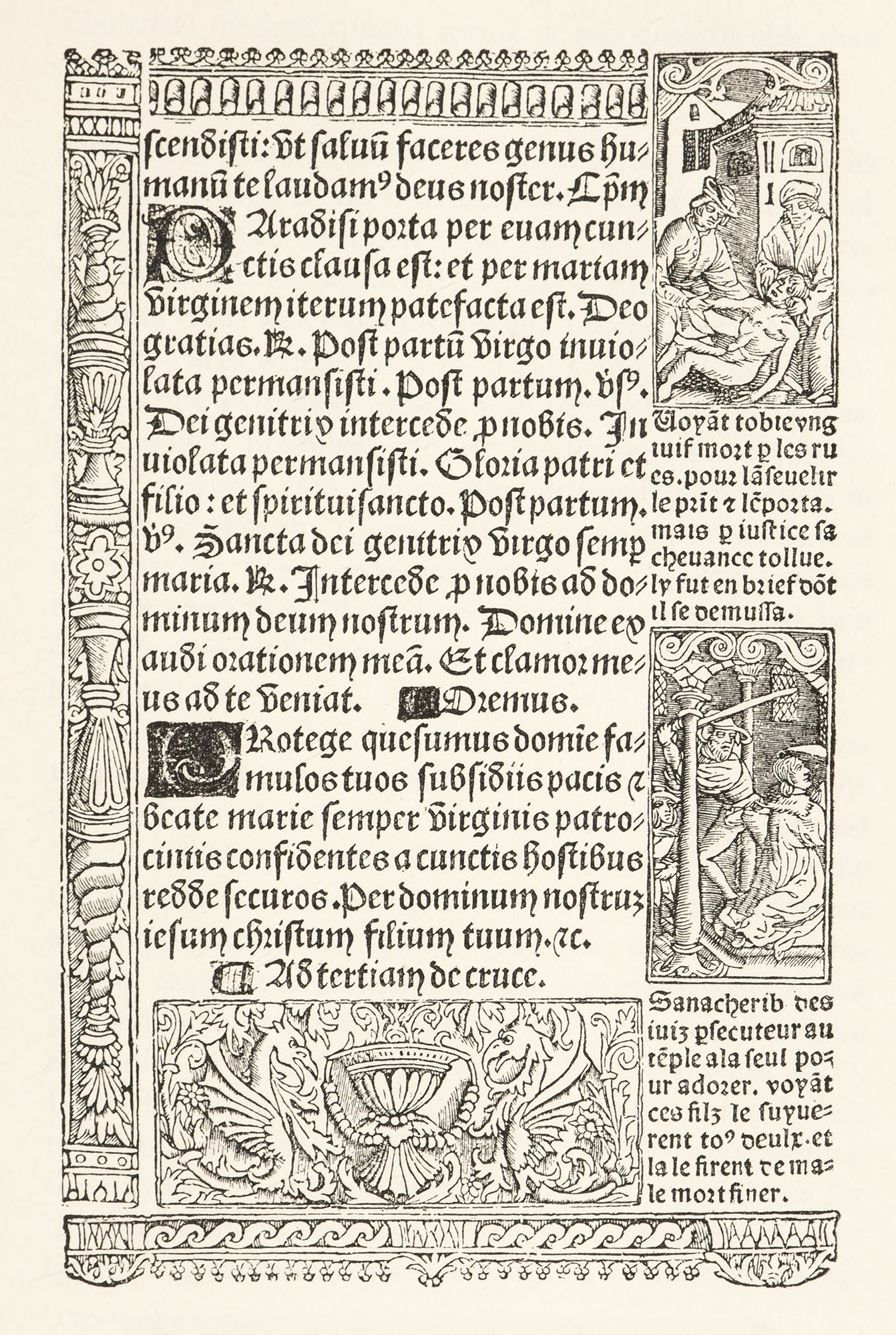
38. Page from Book of Hours in Transitional style
The use of roman type in the French printing-houses of the fifteenth century was slight, after the first essay in it by the Sorbonne press. It is only toward the very end of the century that the roman letter is again employed, generally in editions of the classics, though Kerver and Tory later used it for Books of Hours. With roman lower-types, roman capital letters, floriated and ornamented, were combined—as in the work of the second Paris press of César and Stoll. The effect of their quaint forms is less disagreeable than one would suppose.14
Lyons was scarcely inferior to Paris in the number of its printing-houses. By its situation it was one of the centres of fifteenth century commerce, and fairs were held there frequented by purchasers from all parts of Europe. The Lyons printing trade was more prosperous, because less restricted, than in Paris, where the theological censorship in particular became extremely active. The products of the Lyons press, which produced popular literature—poetry, histories of chivalry, etc.—show some interesting variations in French typography. In general the same types are used as at Paris, but the type-setting seems rougher and perhaps freer in execution. Many Lyons books were executed in a lettre de forme which recalls the products of nearly Netherlands printers.
Guillaume Le Roy was the first Lyons printer. His patron was Barthélemy Buyer, to whom he held somewhat the same relation that the first Paris printers did to Fichet and Heynlin. Le Roy’s first book, the Compendium Breve of the Cardinal-Deacon Lothaire, issued in 1473, was executed in a heavy, roughly cast gothic type, just mentioned as recalling that of the Netherlands. He also employed a round gothic font, identical with that used by Wendelin de Spire at Venice in 1473, for his Miroir de Vie Humaine of 1477. Lyons had the credit of producing the first illustrated book printed in France, Le Mirouer de la Rédemption, printed there in 1478 by Martin Husz or Huss.15 The woodcuts for this book came from Basle, and so, in point of fact, did the types. If Lyons printing seems puzzling because of the frequent resemblance of its types to those of other countries, the reason is, that types of other countries were so often employed! Some Lyons fonts can be traced to Nuremberg, others to Basle,16 to Vienna, and to Venice,17 for Venetian types had begun to have wide vogue. Besides these fonts, the foreign origin of which is known, there are others evidently of Italian origin or design.18
One of the finest Lyons books produced in lettres de forme was the Missale secundum usum Lugduni of Neumeister, of 1487.19 Neumeister employed magnificent pointed gothic types, and his Lyons Missal recalls in many ways Gutenberg’s work; quite apart from the fact that he actually came from Mainz to France by the invitation of Cardinal Amboise, and was traditionally Gutenberg’s pupil and companion. This Missal was almost equalled by that printed by Hongre in 1500, in a most Italian and also most imposing character, though not especially typical of the French Press.20
Besides pointed gothic or lettre de forme, there were in use at Lyons, as we have just seen, some round gothic fonts. When Lyons printers wished to employ such type, they seem to have turned to the Italian form of gothic letter for their models, or else they actually procured in from Italy. Proctor believes that there existed in the fifteenth century, independent of Venetian printers, some Venetian type-foundries, where types not only could be bought, but also could be hired. The transfer of the types of one country to the workshops of another, by purchase or otherwise, is a puzzling feature in any attempt to identify types geographically.
The lettre batarde, the characteristic French gothic letter used in Paris, was also common in Lyons, but, as a rule, in a rougher and less attractive form. Examples of the use of this heavier form of it may be seen in the work of Mathieu Husz and of Du Pré. The latter’s Lyons edition of La Mer des Hystoires shows pages in this massive character which are splendid in effect,21 especially when used in connection with such sumptuous woodcuts as those of the Baptism of Clovis and the Battle of Tolbiac.22 A very decorative pillar which appears in the centre of this plate forms an ingenious division between its two subjects.23
Many of these Lyons books were arranged with a line of large, round, Italian gothic type at the head of the page; types several sizes smaller forming the text. Large calligraphic initials were also features of the Lyons press; and square initials engraved on wood, with black backgrounds (such as were used by Le Masson and his associates), added brilliancy to somewhat heavy typography.24 As the end of the century approached, the popularity of Venetial types increased more and more—a fact which foreshadowed some of the tribulations of Aldus, who, in the next century, found no more unscrupulous imitators of his italic type than Lyons printers. Roman characters were not used in Lyons until 1490, Jean du Pré employing them in his annotated Latin text of the Satires of Juvenal, issued in the last month of that year. Proctor thinks these types have a Gothic look. They appear to be a very fine form of transitional roman character (fig. 39).
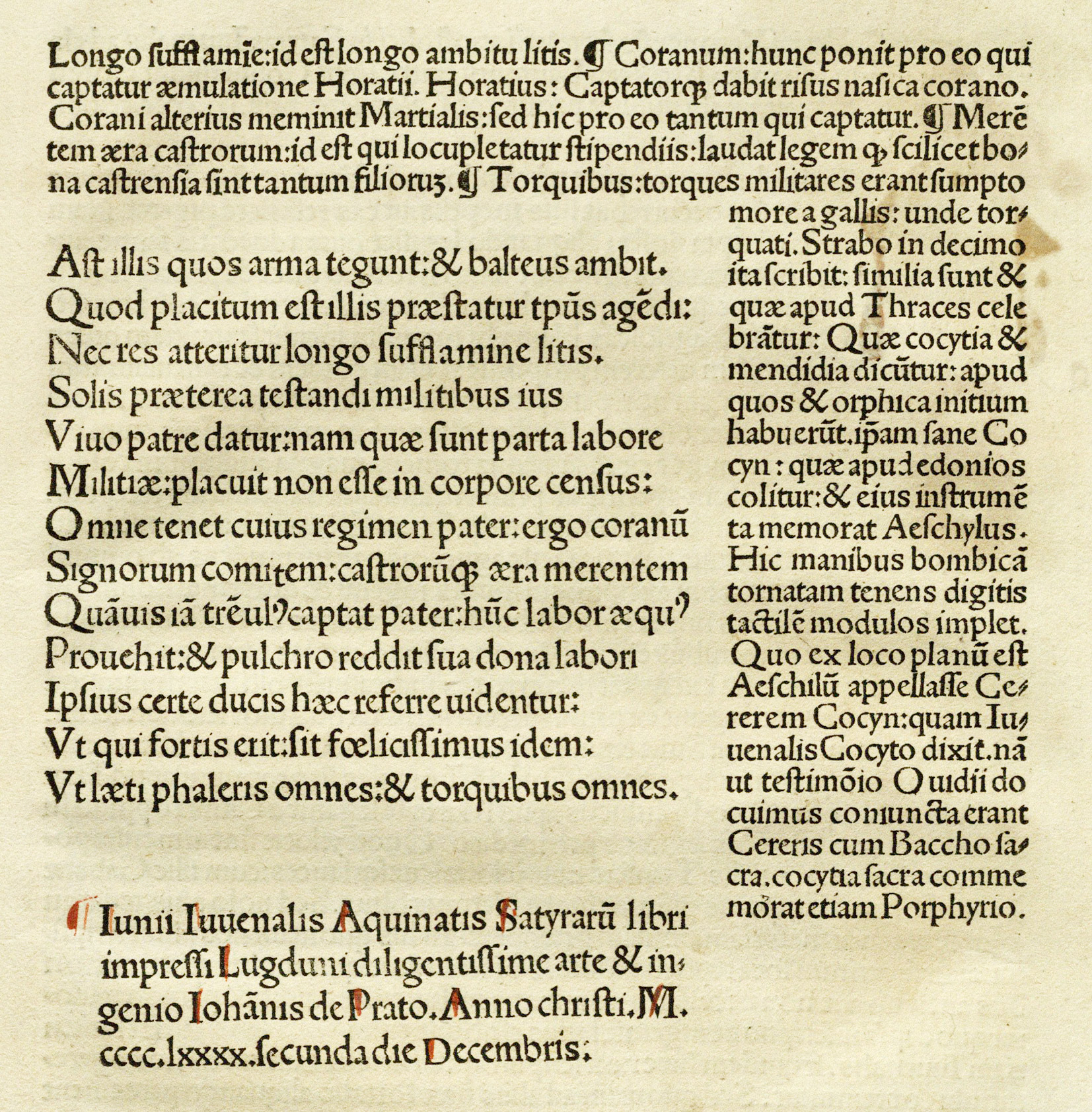
39. First Roman type used in Lyons: Du Pré, 1490
From Claudin’s Histoire de l’Imprimerie en France au XVe et au XVIe Siècle (facsimile), Juuenalis cum commento Domitii Calderini (scan)
French fifteenth century types may be roughly classed as:
- transitional roman;
- pure roman on Italian models;
- pointed gothic or lettre de forme;
- round gothic or lettre de somme;
- contemporary manuscript gothic letter or lettre batarde;
- gothic fonts showing foreign influence, sometimes of foreign source.
Of all these French gothic types, the characteristically national or vernacular letter was the lettre batarde, derived from contemporary French manuscripts. Other gothic types employed are sometimes akin to those of other countries, but the lettre batarde is distinctly French. In fineness of cut and spirited delicacy of design—when at its best—it produces a beautiful effect, especially when used with the decorations so cleverly designed to accompany it.
As a whole, French printing was more delicate and distinguished, and less virile, then that of Germany or Italy. The Gallic feeling shows itself in the best fifteenth century French books, in a certain brilliance and elegance which is purely French. Less archaic than the German, less monumental than the Italian, the work of the best early French printers, like so much else that is French, is charming.25
-
Claudin’s Histoire de l’Imrimerie en France au XVe et au XVIe siècle, Paris, 1900–14, 4 vols., Vol. I, p. 23.
See also the same author’s First Paris Press. An Account of the Books printed for G. Fichet and J. Heynlin in the Sorbonne, 1470–1472. (Bibliographical Society’s Monographs, No. VI, 1898.) Consult facs., pp. 91–100.
- Claudin, I, p. 63, for full page, rubricated.
- Claudin, I, p. 77, for full page, rubricated.
- Claudin, I, p. 98.
- Claudin, I, pp. 99–102.
- Claudin, I, pp. 105–107.
- Claudin, I, pp. 112–117.
- Claudin, I, p. 211.
- In writing de forme each letter was formed separately and complete. This was the writing to be taken as a model or form; or, according to the sixteenth century expression used by Geofroy Tory, as “canon.” Mores says, “The curious Mons. Torin (Tory)…divides typographical letter into la lettre de forme and la lettre bastarde; the former of which he tells us was called Canon. The inference is that the former were cut secundum normam, the latter by no rule at all.” Mores’s Disseration, etc., p. 21.
- Batarde—called bastardella or bastarda in Spain, and anciently called in France escritura italienne bastarda à la française—was named so because it was composed of elements of various sorts of writing. It is really derived from the Italian chancery-hand, and the writing-books of Palatino and others show its various forms.
- Thompson, fac. 196.
- Claudin, I, pl. facing p. 200.
- Claudin, I, pl. facing p. 459.
- Claudin, I, pp. 124, 131.
- Claudin, III, pp. 159–164.
- Claudin, III, pp. 166, 167.
- Claudin, III, facing p. 194, and pp. 195, 196, 215.
- Claudin, III, p. 219.
- Claudin, III, p. 360 and facing plate, p. 361, plates between pp. 366 and 367, and plate facing p. 368.
- Claudin, III, pp. 344, 345.
- Claudin, III, pp. 495, 496.
- Claudin, III, p. 498.
- For a comparison of Le Rouge’s Paris edition of this same book, see Claudin, I, pp. 459–463.
- Claudin, III, pp. 232, 233.
- For a survey of early French types, I recommend the student to the facsimiles in Thierry-Poux’s Premiers Monuments de l’Imprimerie en France au XVe Siècle. Paris, 1890.