Chapter IV
Types and Type-Forms of the Fifteenth Century in Germany
The next step in the study of type is to learn to recognize the various forms or “tribes” of type and the subtle differentiations between varieties of the same general form of type-face. These differences are very slight; often to the casual observer no differences appear. There is no way to learn to recognize them except by training the eye. There is no better way to train the eye than to familiarize it with the type-forms common to the fifteenth century in the countries where printing was then practised, and to follow this by an examination of the type-forms of these same countries from the sixteenth to the eighteenth century. By the time the end of the eighteenth century is arrived at, one will be fitted to consider intelligently the nineteenth and twentieth century types in use to-day. For unless we know the history of early type-forms, we cannot choose, or have adequate reasons for choosing, the good types which should equip a modern composing-room. This is true, because much type to-day which seems desirable to the novice, to a trained eye is merely a corrupt version of older and better types; and also because unless we know something of the historical and literary associations connected with certain type-forms, we shall not have a sense of fitness of things in their use—that sense which prevents a man from printing the Marseillaise in German fraktur, or the Ode to a Grecian Urn in French black-letter. Then, too, we must learn to know where modern type-forms stand in reference to earlier type-forms, if we are not to give undue importance to various modern types; just as we must know where the earliest types stand in relation to the manuscripts which preceded them.1 It was Benjamin Franklin who said: “A Calf is a Big Beast, until you see a Cow!”
This detailed historical study of type-forms is of such practical value, that I do not hesitate to inflict it upon the reader, although, before he has finished, he will no doubt wonder where is “coming out;” and wonder, too, if there be no shorter way of arriving at this knowledge.
Less than thirty-five years—from 1454 to 1487—covered the spread of printing, as we now know the process, throughout Europe. The dates at which it was introduced into the various countries were as follows: about the year not later than 1454 in Germany; in 1465 in Italy; in 1468 in Switzerland; in 1470 in France; in 1473 in Holland—if we except the Speculum and “Costeriana,” which were executed before that time; in Belgium in 1473; Austria-Hungary, 1473; Spain, 1474; England, 1477 1476; Denmark, 1482; Sweden, 1483; and Portugal, 1487.
The type-forms used in the fifteenth century fall into two classes: Gothic (a corrupt national following of the Carolingian minuscule), which was used earliest, and Roman (a fairly faithful return to the Carolingian minuscule), which came in later. By Gothic, the mediaeval text or black-letter is always meant.2
Fifteenth century Gothic type-forms may be roughly subdivided into Pointed, sometimes called Lettre de forme; Round, sometimes called lettre de somme, and a vernacular Cursive black-letter, like the French lettre batarde. Although our examples are the English lettre de forme (fig. 8), and the French lettre de somme (fig. 9) and lettre batarde (fig. 10), they show the characteristics of these types sufficiently for our purpose. These three type-forms sufficiently for our purpose. These three type-forms were the black-letter equivalents of the formal, less formal, and cursive manuscript-hands of the Roman period. Between the members of the Gothic type-families of the fifteenth century there is the same likeness that appears in the manuscripts of the period immediately before the invention of printing; and, too, much the same divergencies.
Roman forms of type of this period may be divided into Transitional (from Gothic to Roman) and pure Roman, the precursor of the types we now commonly use.
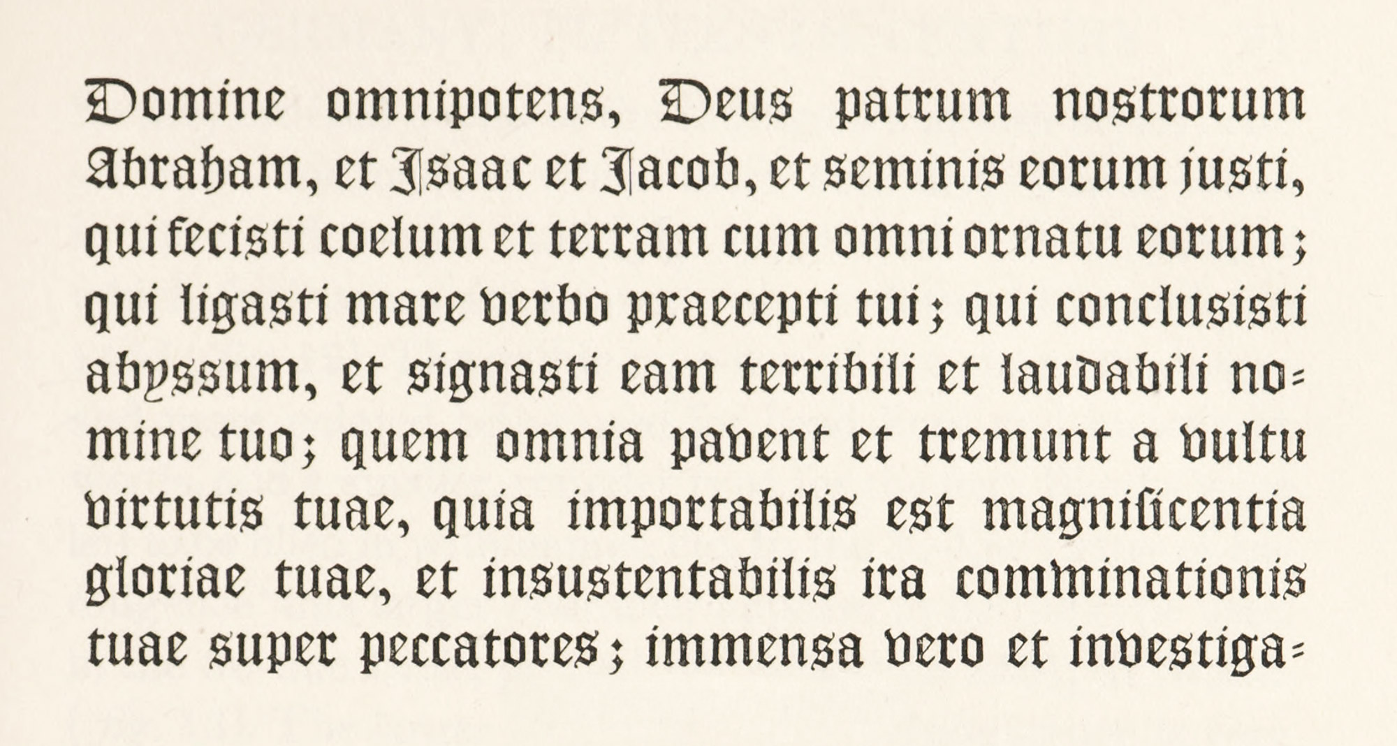
8. Lettre de Forme
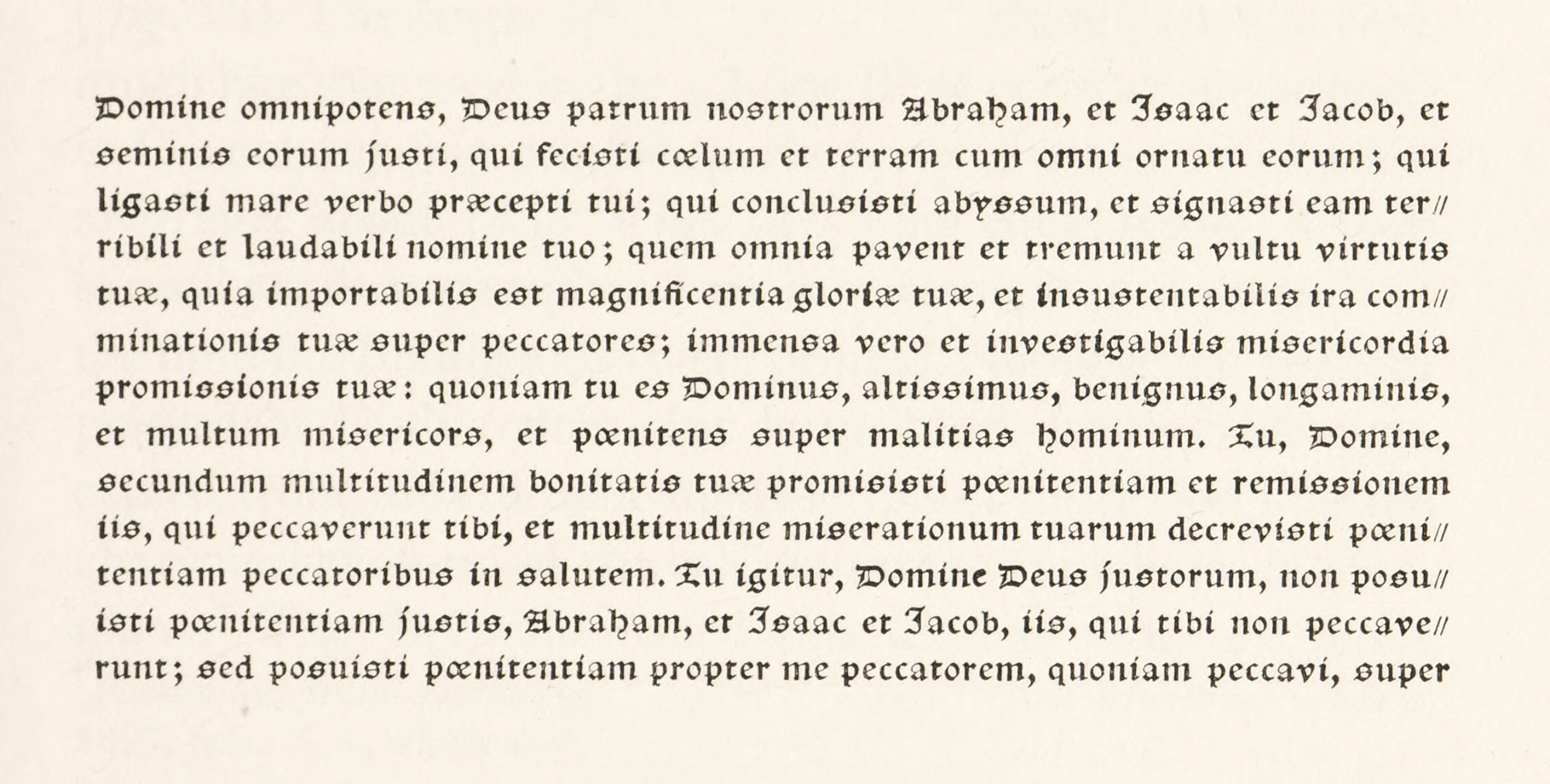
9. Lettre de Somme
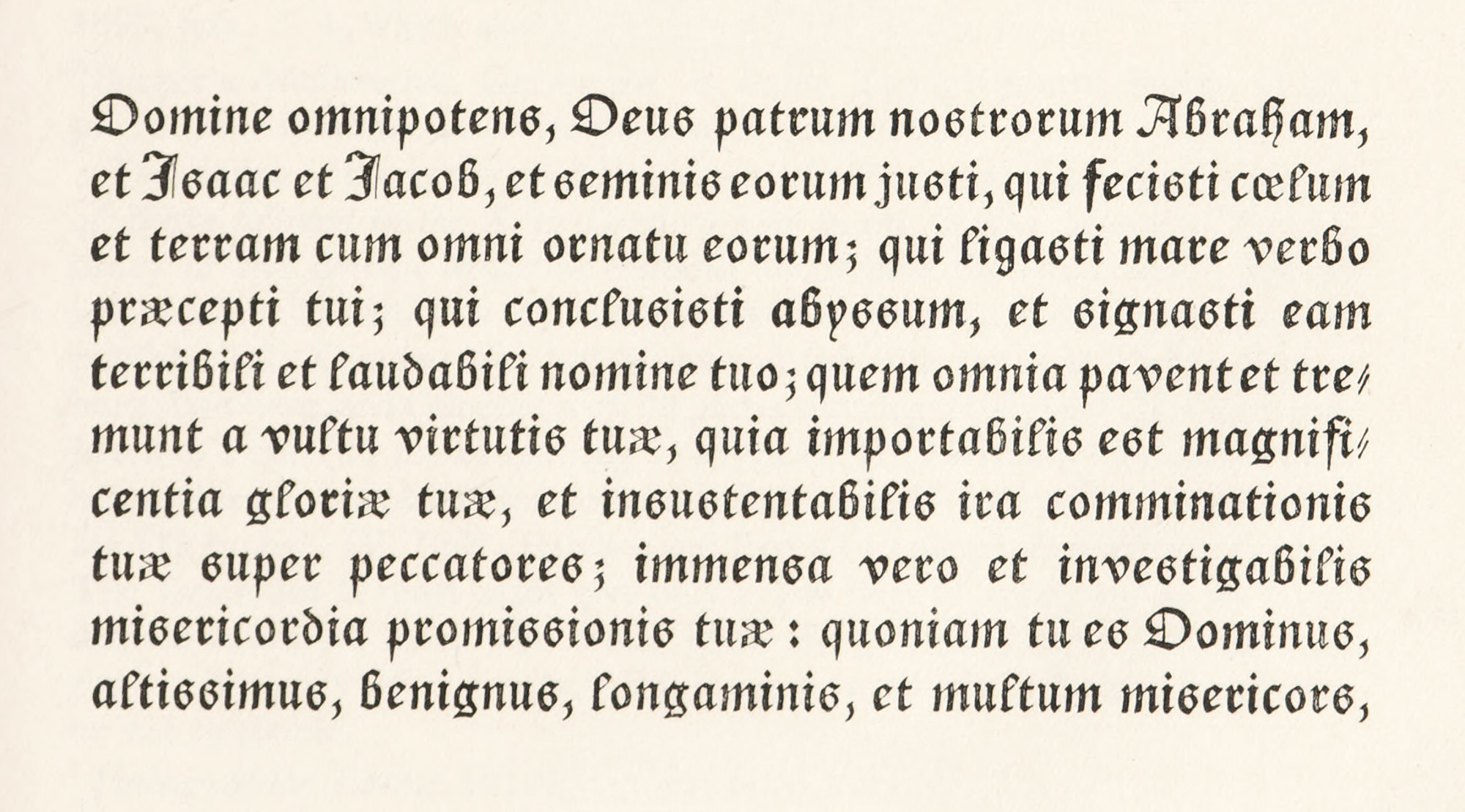
10. Lettre Batarde
The first type employed in Germany was a gothic or black-letter character. The earliest dated piece of printing from German gothic type known is the Letters of Indulgence, issued at Mainz in 1454. This indulgence was granted by Pope Nicholas V to all Christians who, during three years preceding, had given money to help on the war against the Turks. The agents who sold manuscript copies, which were brought out in the early months of the same year (1454), apparently had heard, meanwhile, of printing, and recognized its utility for producing leaflets of this sort in quantity. So they ordered copies of the Indulgence in two styles one set in 30-line form, of which there were three issues—one in 1454 and two in 1455 (fig. 11), the other in 31 lines, of which four issues are known—three dated 1454 and one 1455 (fig. 12). The gothic type was of two sizes: the larger and more pointed being used for head-lines and important words, and a smaller, rounder type for the text. Blanks were left to be fill ed in with names, etc. In the 30-line Letter of Indulgence3 this larger character appears to be the type used in the 36-line Bible, printed not later than 1461, at Mainz (fig. 13). The larger type in the 31-line Indulgence is very much like that used in the 42-line Bible commonly ascribed to Gutenberg, but printed, perhaps, by Fust and Schoeffer at Mainz about 14554 (fig. 14). This book, which it took several years to complete, was in process, it is supposed, at the time the Indulgences were printed. Nothing can be more pointed or Gothic than this large black-letter Bible type copied from the German manuscripts of the period. It is the characteristic form of the earliest gothic type-letter of Germany.5 The Germans called this kind of lettre de forme “textur”—because the effect of a page set in it was like a tissue or weave. It afterward was simplified into the type called “fraktur.” The smaller type of the Indulgences, which is a rounder black-letter, has certain peculiarities later found in “schwabacher” fonts (figs. 11 and 12).

11. Portion of 30-line Letters of Indulgence, Mainz, 1455
From Catalogue of XVth Century Books in the British Museum (record) and Uniuersis Cristifidelib[us] p[o]ntes l[itte]ras inspecturis Paulinus Chappe Consiliari[us] (scan)
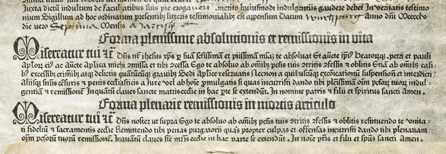
12. Portion of 31-line Letters of Indulgence, Mainz, 1455
From Catalogue of XVth Century Books in the British Museum (record) and Vniuersis Cristifidelib[us] p[o]ntes litteras inspecturis Paulinus Chappe Consiliari[us] (scan)
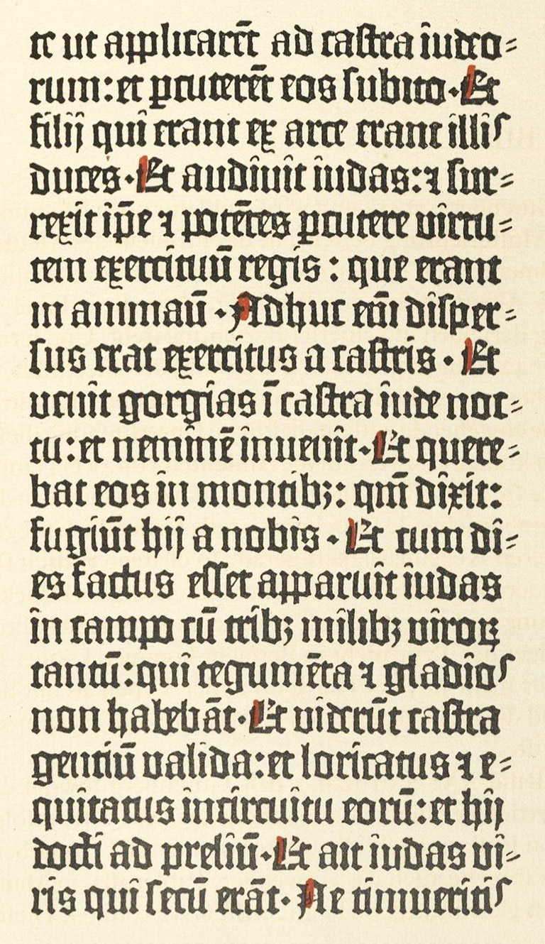
13. Type of 36-line Bible, Mainz, not later than 1461
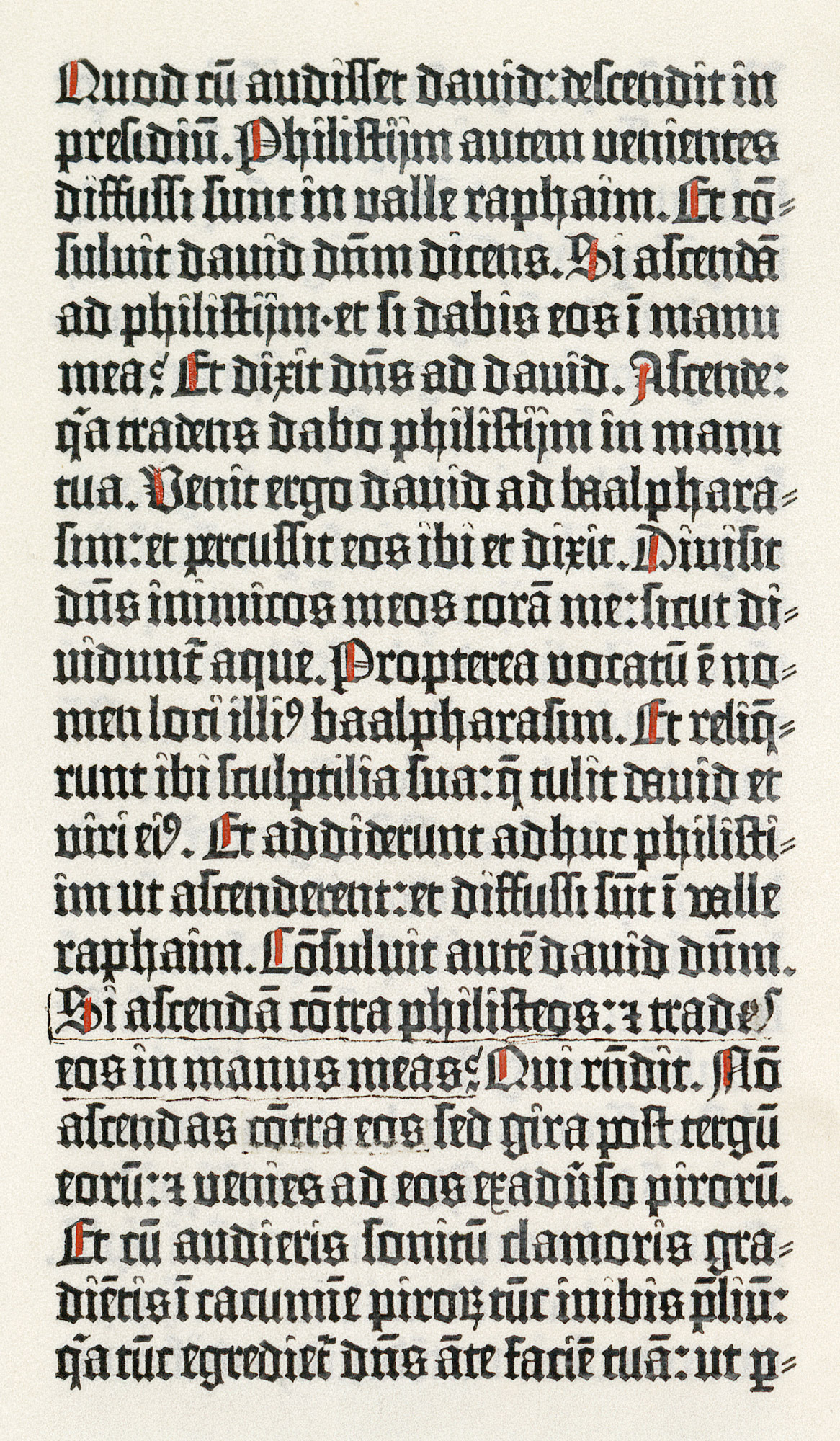
14. Type of 42-line Bible, Mainz, c. 1455
From a copy in the Library of Mr. J. Pierpont Morgan, New York (facsimile), Biblia latina (scan)
A book which shows clearly the form of the early gothic types of Germany is the famous Latin Psalter printed by Fust and Schoeffer at Mainz, August 14, 1457—the first book to which the printers put their names and date of publication. This monumental volume shows a larger letter than the 42-line Bible, but of much the same pointed Gothic form6 (fig. 15). The famous decorated initials were probably stamped in after the pages were printed, one stamping being used for the blue and the other for the red impression.
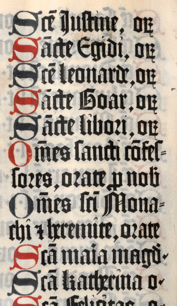
15. Type used in Latin Psalter: Fust Schoeffer, Mainz, 1457
From Druckschriften des XV bis XVIII Jahrhunderts (facsimile), Psalms (scan, p. 290)
The same sort of letter is shown in a Missal printed at Bamberg by Sensenschmid in 1488, in type a size between that of Mainz Psalter and the 42-line Bible.7 There are other examples much like it, much as the Missale Salisburgense printed at Nuremberg by Stuchs in 1492,8 and the Mainz printer Neumeister’s edition of Turrecremata’s Meditationes of 1479.9 These all show the pointed, angular black-letter of Germany, the earliest form of type used there. The larger types of this kind were generally intended for folio volumes used in the offices of the Church; some of the characters which appear in the Bamberg Missal of 148110 being almost three-quarters an inch high. Such volumes are rough in execution compared with manuscripts, yet nevertheless magnificent in effect.
Koberger of Nuremberg used, about 1480, a type less than the first gothic types, reminding one a little of the early black-letter types of Italy and Spain. The reproduction here shown (fig. 16) is interesting not only for its type but because it is an example of one of the earliest advertising circulars. In the fifteenth century, printers and booksellers who did business in a large way put agents “on the road” with a stock of their books, and circulars for distribution. This particular sheet advertised a theological work by Antoninus, Archbishop of Florence, and its writer, after praising literature in general, says that, theology being the crown of all sciences, the author wrote this monumental Summa Theologia; that until then, readers could not afford to buy the expensive manuscripts of the work, and printers, owing to its enormous length, and had been afraid to publish it. But at last its printing has been accomplished by Koberger and the “long-felt went” (sacred to advertisements) had been filled! Quite in the modern manner, it is stated that the advertisement is printed in the same type as the book, and that if any one wishes to buy the volume, he can do so at a certain inn, where the agent has lodgings. So it would appear that travelling salesmen and book canvassers are no new thing!11
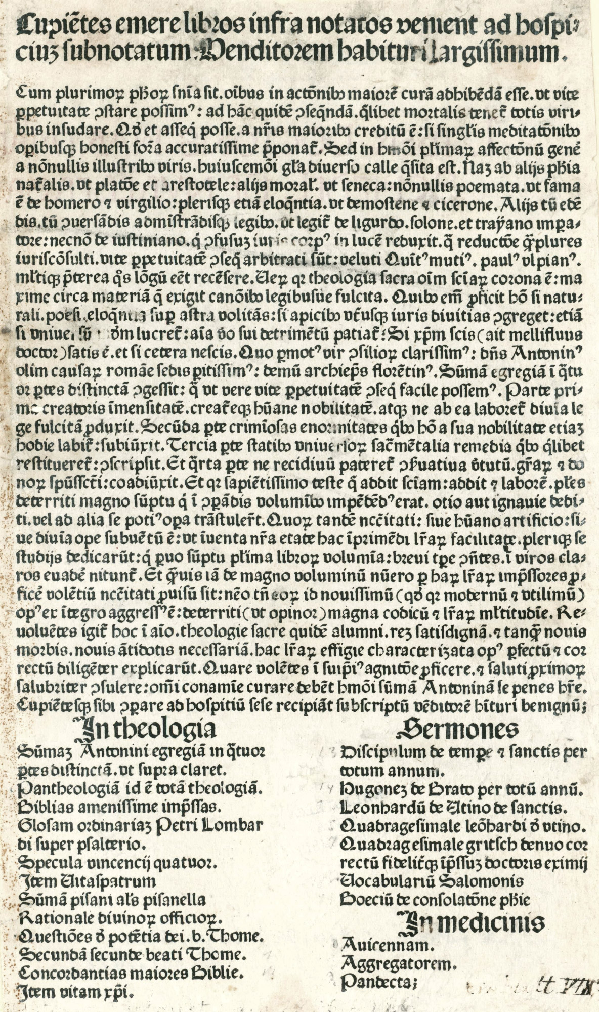
16. Advertisement issued by Koberger, Nuremberg, c. 1480
From Facsimiles from Early Printed Books in the British Museum (facsimile) Munich Digitization Center (scan)
Besides the pointed gothic type, or lettre de forme, used in Germany, there was a rounder gothic type known as lettre de somme.12 Examples are to be seen in the Mainz Catholicon, printed probably by Gutenberg, in 1460 (fig. 17), and in the Rationale Divinorum Officiorum by Durandus, printed by Fust and Schoeffer in 1459.13 The lettre de somme was copied from less studied and formal book-hands, and was less massive in effect than the pointed lettre de forme. For convenience it may be called a “round gothic type.” In a sense this letter-form was transitional, for by extending its design a little further toward modern ideas of clearness, a resemblance exists between this round gothic type of the Catholicon and the gothicized roman invented by those German printers who became influence by Italian models.
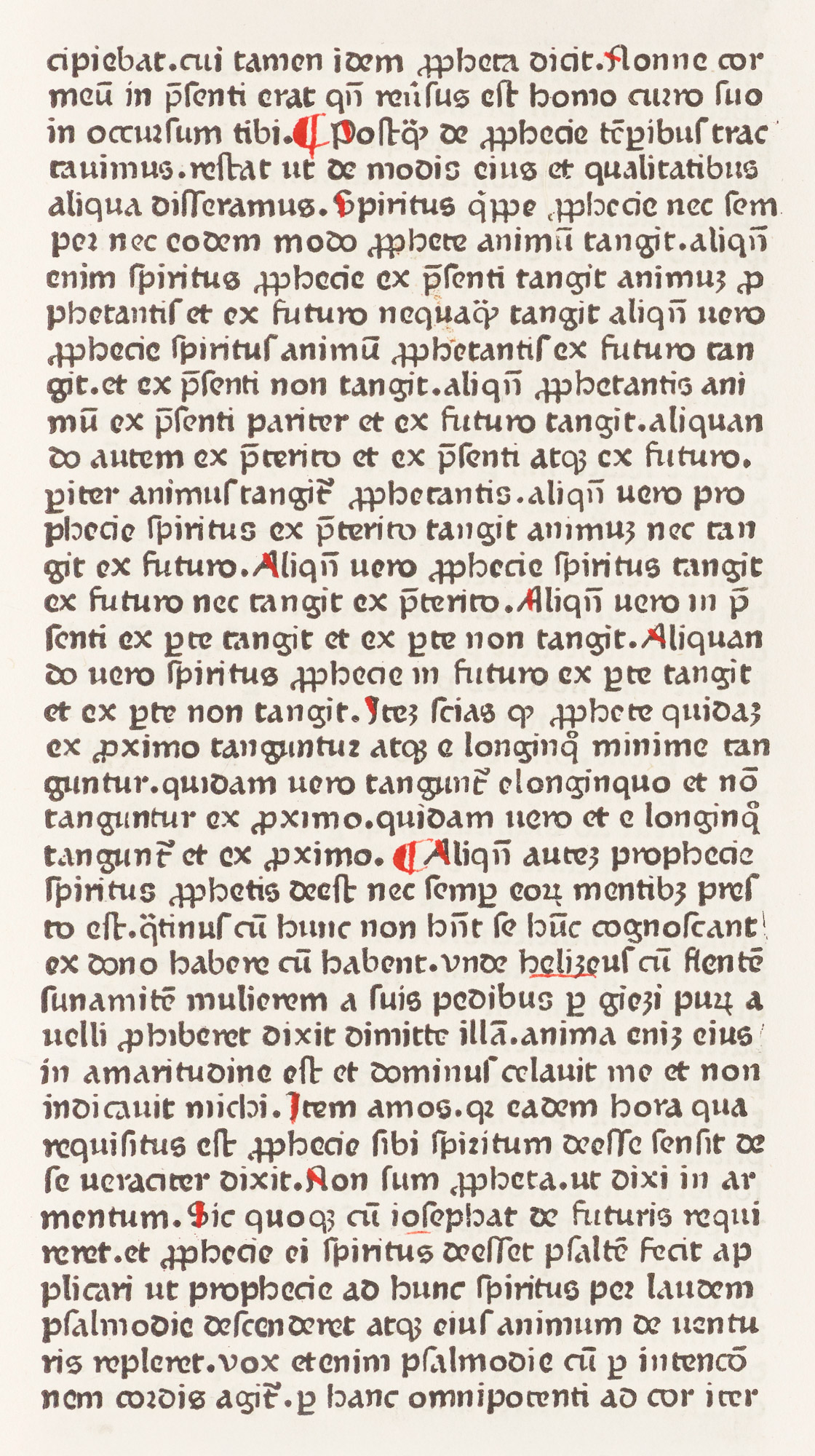
17. Round Gothic Type of Catholicon: Gutenberg, Mainz, 1460
From a copy in the John Carter Brown Library, Providence, Rhode Island (facsimile), Catholicon (scan, p. 583)
In addition to pointed and round black-letter types, German printers had a vernacular type—intended primarily for printing books in German—later commonly known as “schwabacher.” Some elements of this type may be seen in Koberger’s German Bible printed at Nuremberg in 1483, in which we find the looped b, d, h, l, the tailed f and s, etc., characteristic of schwabcher fonts.14 We may see it employed in a form which is clearly different from the pointed fraktur, in Peter Schoeffer’s Hortus Sanitatis (fig. 18), printed at Mainz in 1485. It flowered into the type now recognizable as schwabacher in the last decade of the fifteenth century. Although intended for books in German, it was used for many Latin books as well.
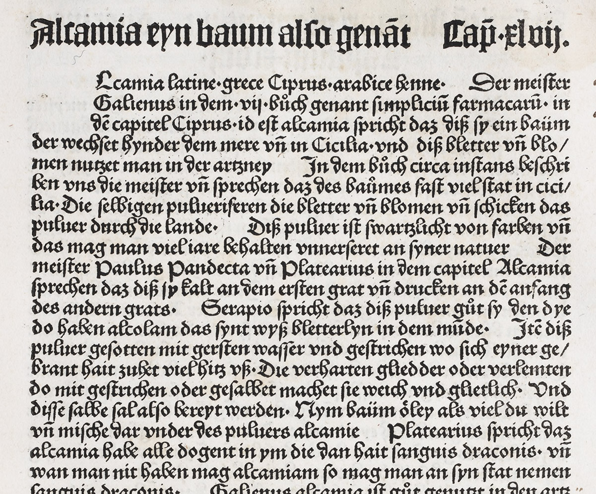
18. Type prefiguring Schwabacher, used in Hortus Sanitatis: Peter Schoeffer, Mainz, 1485
From a copy in the library of Mrs. J. Montgomery Sears, Boston (facsimile), [O]fft vnd vil habe ich by mir selbst betracht die wu[n]dersam werck des schepfers der natuer wie er am anbeginde dem hymel hait beschaffen vnd gezterer mit schonen leüchtenden sternen den er zů inflüssen in alles das vnder dem hymel ist krafft vnd macht geben hait. (scan)
Thus in the fifteenth century there was a tendency in German gothic types toward the forms of letter which we associate with German text of to-day—a tendency showing itself in German manuscripts very early and persistently. Andreae’s Baum der Gesippschaft, issued at Augsurg by Johann Baemler in 1474, was printed in a pointed letter which shows a form distinctly German as we now understand the term (fig. 19). This is markedly known, too, in the rounder type-forms employed in Koberger’s German Bible just mentioned, or in his Nuremberg Chronicle of 1493,15 which are easily recognized as German in feeling (fig. 20). By the end of the fifteenth century and through the sixteenth century, two thoroughly German forms of text letter had developed from the earlier and purer German black-letter characters.
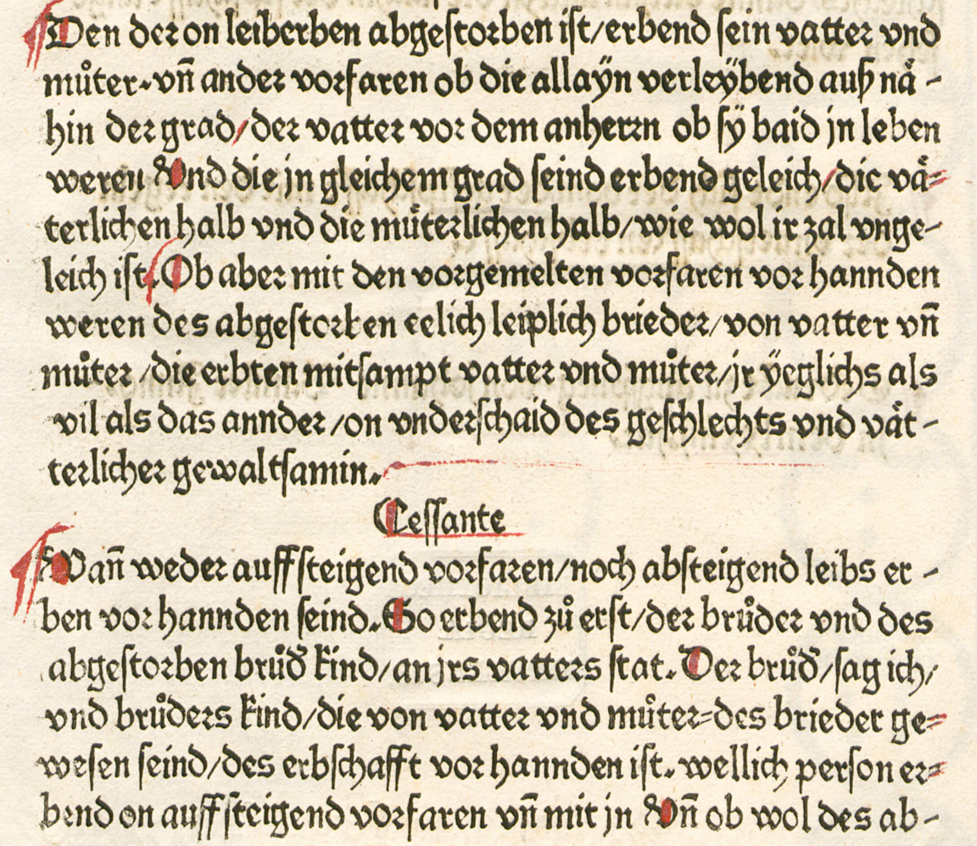
19. Pointed Gothic Type: Baemler, Augsburg, 1474
From Berger’s Monumenta Germaniæ et Italiæ Typographica (facsimile), Bom der gesipten früntschafft (scan)
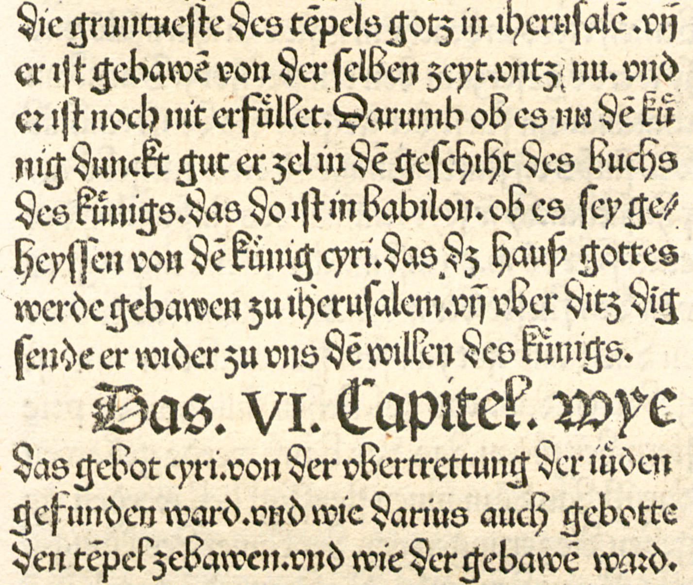
20 (a). Gothic Types used by Koberger at Nuremberg in Bible of 1483
From Koberger Bible
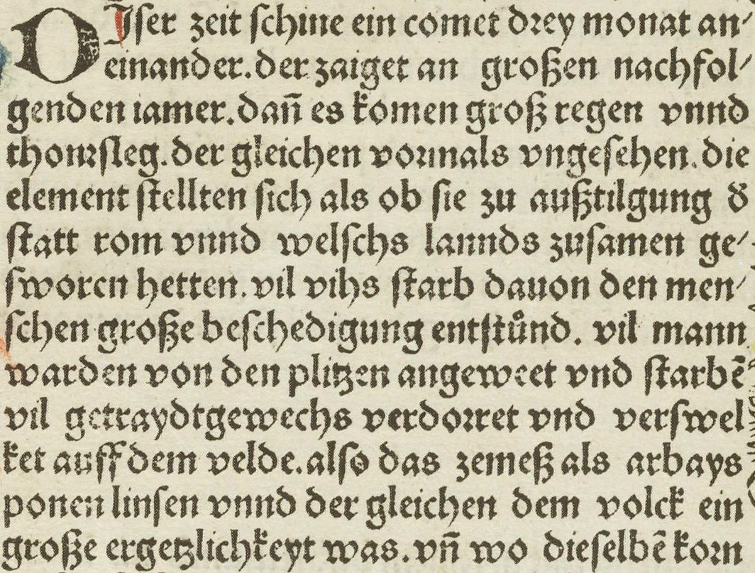
20 (b). Gothic Types used by Koberger at Nuremberg in Nuremberg Chronicle of 1493
But all the type used in Germany was not of Gothic form. Fonts of roman character were employed there by a few printers. Mentelin, the first Strassburg printer, used a gothic type which pointed towards roman in his Biblia Latina, finished in 1460 (fig. 21). But the font of the “R Bizarre,” as it is often called, was the first roman letter used in Germany (fig. 22). This ungainly roman type was used by Adolph Rusch of Ingweiden (“the R Printer”), who printed in it an edition of the Rationale of Durandus, at Strassburg, as early as 1464. Rusch married a daughter of John Mentelin, and to his business he later succeeded. Other roman types of early date were used in a Speculum Historiale printed about 1473 by Mentelin,16 and at Augsburg in 1471 by Zainer, in his Lateinischer Einblattkalendar for 1472,17 who is said to have brought this font from Italy. The Zainer type was a fairly pure roman character, as we now understand the term, although the fitting of the type on its body is rather uncertain in effect. Pollard says that but ten fonts of roman were known to him as employed in Germany before 1480. Its use was revived in the last years of the century, when the accumulation of standard ancient literature (chiefly by foreign authors and formerly available only through manuscripts) had been pretty well exhausted by printers. Then the contemporary author began to appear, and roman type began to be used for these modern books as well as for editions of the classics. In Germany roman type is still called “Antiqua” in allusion to its classical origin.
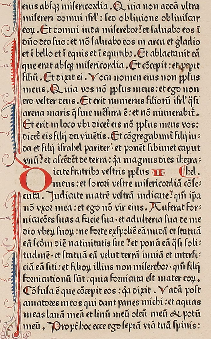
21. Semi-Gothic Type: Mentelin, Strassburg, 1460
From Burger’s Monumenta Germaniæ et Italiæ Typograhica (facsimile), Biblia Latina (scan)
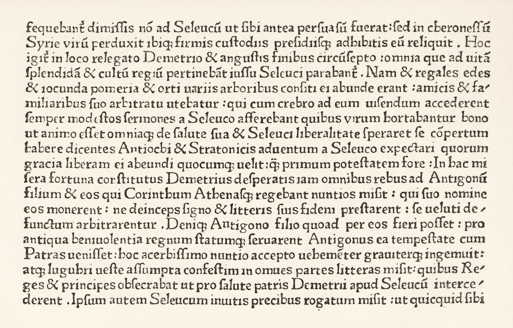
22. First Roman Type used in Germany: Rusch, Strassburg, c. 1464
There were also semi-gothic types like that used by Mentelin, and puzzling transitional roman-gothic fonts, of which an interesting example is that used by Holle at Ulm in 1482 in his first dated book—the Cosmographia of Ptolemy (fig. 23).
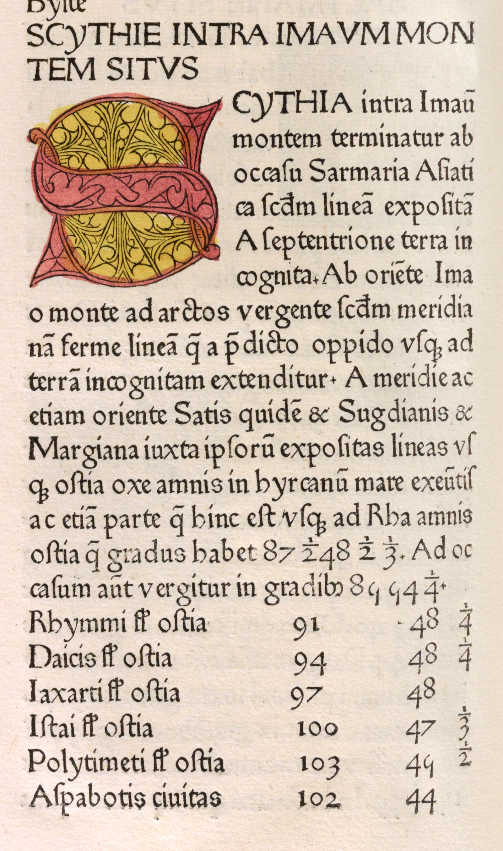
23. Transitional Roman-Gothic: Holle, Ulm, 1482
From a copy in the John Carter Brown Library, Providence (facsimile), Cosmographia (scan)
The German fifteenth century press was conspicuous for its fine editions of law books and its liturgical printing, in both of which departments Fust and Schoeffer stood first. Pictorial and decorative capital letters were used by many of the best printers, and some of the page-borders used in books were fine, though they were not very commonly employed. Large sizes of type were cut, no doubt, mainly to save the expense of printing in two colours in lines needing to be “displayed”—as in the Indulgences. Printers who used roman fonts got over this difficulty by picking out “features” of their books in lines or masses of roman capital letters; but massed capitals of black-letter—the type chiefly employed in Germany—were almost unreadable. This was possibly a second reason for large sizes of types, which for purposes of convenience were ordinarily made double the size of the text types with which they were used. One reason that the books of the earliest Mainz printers had such an immediate success was that they were such good imitations of the manuscripts with which they had to compete. If German scribes and illuminators had been as clever as those of France or Italy, the divergence between books and manuscripts would have offered an obstacle to their sale. But this was not so; and by a happy accident the German manuscripts of that day lent themselves very well to typographic rendering.
The sack of Mainz in 1462 influenced the spread of typography, for it wiped out commerce there, and the consequent lack of money led printers, who were established in a kind of industrial group, to scatter widely. This accounts for the German names we find among the earliest printers in other countries throughout Europe. Where these men continued to work in Germany, their difficulties were slight, and this was true where they were invited to set up their presses in some foreign place, and financial support was assured them. But in many cases the wandering printer had to take his chances as to where h might find employment, and to travel into a far country whose language was unfamiliar to him, before he reached an apparently favourable spot for his enterprise. As books were printed, at first, page by page,18 and galley proofs were unknown, if he desired to produce a large book with any speed, a number of presses would be required, and there was the cost of other materials to be counted. So a good deal of courage, ingenuity, and financial ability to see the undertaking through what was needed, if he was to succeed. Even then it was very easy to make mistakes in the choice of books, or in the way they were printed, and either error might lead to disaster. For these men were obliged to be not merely printers, but publishers; they had not alone to make their books, but to sell them.
Such printers found their chief customers in churches, monastic libraries, the clergy, teachers and their students, lawyers, doctors, and professors of philosophy; and there were, too, general readers and educated lovers of literature. For monastic libraries printers often supplied books which may be classed among those volumes “which no gentleman’s library should be without,” and which so few gentlemen ever read! Both in France and Germany, many printed service books were required, although in Italy manuscripts for some time held their own as the more orthodox form of liturgical book. “Helps for the clergy,” skeletons of sermons, etc., appealed to parish priests, and law-books, school-books, and medical treatises also had their market. Then, too, there were editions of the classics which were, however, mostly produced in Italy for the rest of Europe.
As we have to do chiefly with type, the kind of types which these printers made most interests us. Mr. Pollard, in the illuminating paper on Early Printers with which he prefaces the catalogue of the Annmary Brown Memorial library,19 tells us that “At first there were special church types for service-books and Bibles, but these were soon reserved for the large service-books for use in choir, in which the type was necessarily massive and clear, both to avoid mistakes in reading and sometimes also to enable the book to be shared by several singers. Save for a few experiments, roman types in Italy and gothic in Germany were at first used for books of all kinds, but the tendency was to regard roman as specially appropriate to editions of the classics, to use upright and rather plain gothic for other Latin books, and a more sloping gothic for books in the vernaculars.… Besides these subject-divisions of types the local schools of handwriting had great influence on the forms of letters, more especially in the delay days of printing, and this accounts for the great variety in the founts used before 1480. After about that date, types of the same general character and often indistinguishable in nearly every detail were in use in places long distances apart, in some cases because the later printers found it was easier to imitate an already existing type than to adopt written characters to their needs in others, in all probability, owing to the sale of punches or matrices.
While great care had to be taken in choosing a good design for a type, a single fount often served an early printer for several years. There were no title-pages in these first days, and the printer’s business was only to print the text of his book, leaving headings and headlines, as well as ornamental capitals, to be supplied by hand to suit purchasers’ tastes. As the cry for cheapness grew louder printers found it necessary to leave less and less to be done by the scribes, whose bill for rubricating a book must have added very materially to its cost to the buyer. Special types were then cast for use in headings and headlines and on the title-pages, and many printers provided themselves with fine sets of woodcut capitals.
Thus we see that the printer’s choice of types was almost entirely governed by the kind of manuscript popular in the particular locality of the country in which he found himself. The design of his type was also dependent on the kind of book to be printed; as various classes of books—I speak of black-letter books—employed particular forms of black-letter books—employed particular forms of black-letter.
In closing, it may be noted that Mainz printers went to Italy; none of them, apparently, to Holland. Perhaps this was because they knew that the art of printing, in rudimentary form, was already practiced there.
- As a study in “comparative typography,” it is useful to see how the same book was printed at different periods, and any student who will select an early and famous book, like the Inferno or Decameron, in a first edition, and compare successive editions with it, will find that the different editions furnish almost a history of typography. The more characteristically national the book, the better it is for purposes of comparison of styles in the national typography which it represents. Bu tin comparing the printing of various countries, it is better for the student to choose a classic which belongs to the literature of them all—like the texts of Horace, Virgil, or Cicero. In this way one may study typography both “perpendicularly” and “horizontally”—perpendicularly, where we take a given book of an early date and trace its progress chronologically; and horizontally, where we look at its editions in various countries at the same epoch. The special collections of the works of a particular author, found in most large libraries, are very illuminating when used in this way.
- What is called “gothic” by type-founders has no relation to any Gothic style; and is purely an arbitrary name—unless it hints at the artistic abilities of its inventors. It is nothing but a diagram of a letter—all qualities of design having been left out.
- Facsimiles from Early Printed Books in the British Museum, London, 1897, facs. 3, 4, which show Indulgences in complete form.
-
Burger’s Monumenta Germaniæ et Italiæ Typographica, Berlin, 1913, pl. 137, for facsimile of entire page with rubrication.
Facsimiles of the types used in incunabula are contained in the Catalogue of Books printed in the XVth Century now in the British Museum. The Library of the British Museum contains about nine thousand books printed before 1500. The work is to be completed in six part, and four parts are now published:
- Xylographica and books printed with types at Mainz, Strassburg, Bamberg, and Cologne (with 29 plates showing 240 types).
- Germany: Eltvil to Trier (30 plates showing 254 types).
- Germany: Leipzig-Pforzheim, German-speaking Switzerland and Austria-Hungary (18 plates showing 175 types).
- Italy: Subiaco and Rome (13 plates showing 110 types).
The facsimiles in most cases give only a few lines of type; so, as its introduction admits, “those who would know the glories of early printing must consult Burger’s Monumenta.” But it can be used where Burger is deficient or not available.
- Paléographie Latine, 1910, pls. 104, 111.
- Druckschriften des XV bis XVIII Jahrhunderts, Berlin, Reichsdruckerei, 1884–87, pls. 61, 62, 63.
- Druckschriften, pl. 25.
- Burger, pl. 117.
- Burger, pl. 76.
- Burger, pl. 105. The right-hand plate shows a reproduction of part of the Canon of the Mass. Its ordinary pages are printed in type much more Italian or Spanish than German in character, and of different design.
- For reproductions of similar early advertisements, see Burger’s Bucchändleranzeigen des 15. Jahrhunderts. Leipsic, 1907. The earliest printed book advertisement known is that of Heinrich Eggestein of Strassburg, issued 1466.
- The lettre de somme is said (without much authority) to derive its name from the Summa of St. Thomas Aquinas, for which, as well as for other scholastic works, it was early employed.
- Druckschriften, pl. 41; or Burger, pl. 73.
- Burger, pl. 20.
- Also Burger, pl. 258. For further examples see Druckschriften des XV bis XVIII Jahrhunderts, pls. 72, 53, 35, and 26, of books dated respectively 1474, 1485, 1492, and 1494.
- Druckschriften, pl. 93; or Burger, pl. 91.
- Burger, pl. 1.
- It was not until between 1470 and 1480 that two pages were printed at the same moment.
- Catalogue of Books mostly from the Presses of the First Printers showing the Progress of Printing with Movable Metal Types through the second half of the Fifteenth Century. Collected by Rush C. Hawkins, catalogued by Alfred W. Pollard, and deposited in Annmary Brown Memorial at Providence, Rhode Island. Oxford, 1910. The Printers, pages xix, et seq. The early printer has been treated with great charm by Mr. Pollard, and I commend his paper in its entirety as indispensable to a clear idea of the subject we are considering.
