Chapter V
Types and Type-Forms of the Fifteenth Century in Italy
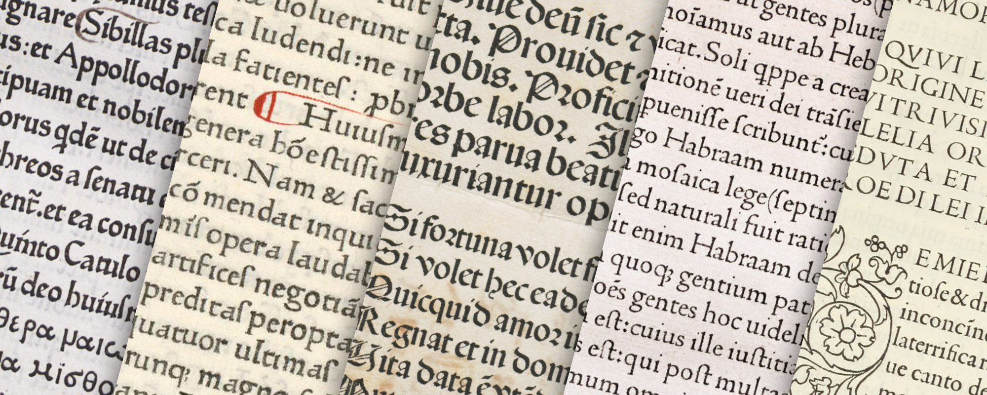
The popularity of the roman Roman character in Italian manuscripts was due to the Renaissance revival of classical learning, and it has already been briefly shown to what sources this letter was traceable. Italy being the seat of the Renaissance, printing in roman types very naturally became general there earlier than in any other European country. The best roman types are to be found in Italian books printed before 1500. These, as has also been said, were modelled on Humanistic characters, which were in their turn revivals of the Carolingian book-hands. To see how closely these two forms of writing agreed in general effect, it is only necessary to compare Carolingian manuscripts of the ninth with Italian manuscripts of the fifteenth century. “At the period of the early Renaissance,” says Walter Crane,
two streams met, as it were, and mingled, with very beautiful results: the freedom, the romance, the naturalism of the later Gothic, with the newly awakened Classical feeling, with its grace of line and mythological lore. The rich and delicate arabesques in which Italian designers delighted, and which so frequently decorated, as we have seen, the borders of the early printer, owe also something to Oriental influence, as indeed their name indicates. The decorative beauty of these early Renaissance books was really, therefore, the outcome of a very remarkable fusion of ideas and styles. Printing, as an art, and book decoration attained a perfection it has not since reached. The genius of the greatest designers of the time was associated with the new invention, and expressed itself with unparalleled vigour in the woodcut; while the type-founder, being still under the influence of a fine traditional style in handwriting, was in perfect harmony with the book decorator or illustrator.1
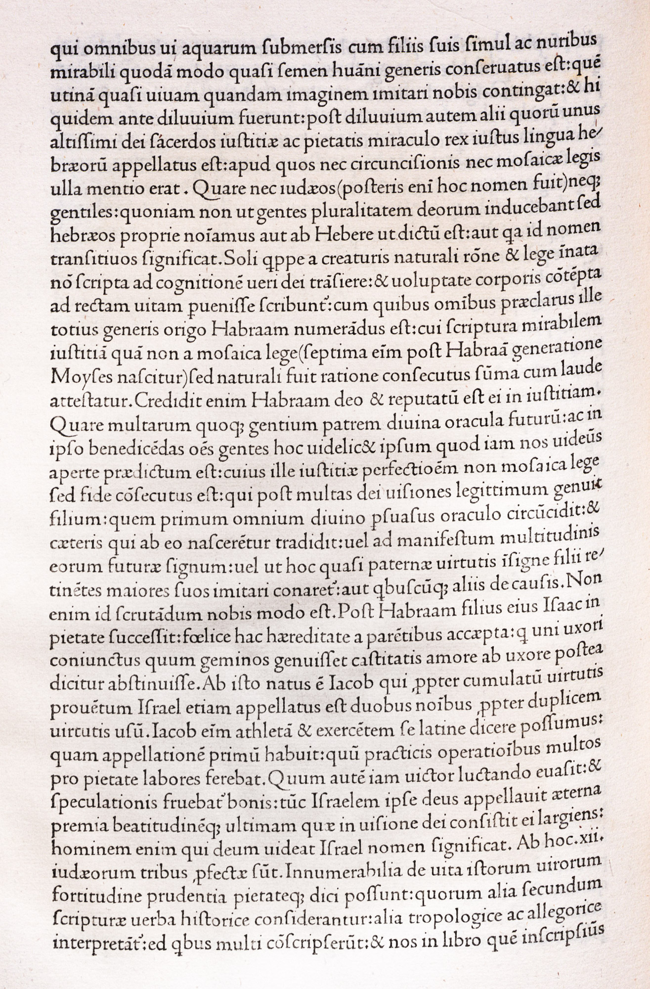
The first press in Italy was set up at the Benedictine Monastery of Subiaco, near Rome. Some Germans were members of this community, and perhaps that was one reason why the German printers, Conrad Sweynheym and Arnold Pannartz, were welcomed by its abbot, Cardinal Turrecremata. Sweynheym, a clerk of the diocese of Mainz, was possibly one of Fust and Schoeffer’s workmen. Pannartz belong to the diocese of Cologne. The theory that both men were refugees from Mainz in 1462, that Nicolas Jenson accompanied them in their flight, and that he cut the font used by them at Subiaco, as well as that subsequently employed at Rome, has been advanced by reputable authorities.2 Be that as it may, a very beautiful type was produced at Subiaco, which appears to us gothic, but which they probably considered roman; for these printers, accustomed to gothic types, found themselves in a country where manuscripts in the Humanistic character were the fashion. So, while their type has many details of Gothic design in it, it has roman capitals, and lower-case letters very roman in structure—though their thickness of line gives, in mass, the effect of gothic type. There is, too, a certain amount of white between the lines of type, which results in a clearness usually characteristic of books printed in roman fonts.3 While not a roman type as we should now understand the term, it is, in spite of its general effect, a font on the way thereto. Three books were printed at Subiaco—Cicero’s De Oratore (which, though undated, is generally considered the first one), appearing either at the end of 1464 or the beginning of 1465; the Opera of Lactanius, printed in 1465; and the De Civitate Dei of St. Augustine, finished in 1467 (fig. 24 [Not illustrated in fig. 24]). Possibly earlier than all of these was a Donatus, of which no copy exists, but of which there is a record.
24. First Type used in Italy: Sweynheym and Pannartz, Subiaco, 1465
From a copy of Lactantius of 1465 in the Annmary Brown Memorial Library, Providence (facsimile), Lactantius, Lucius Caecilius Firmianus: Divinae institutiones (scan)
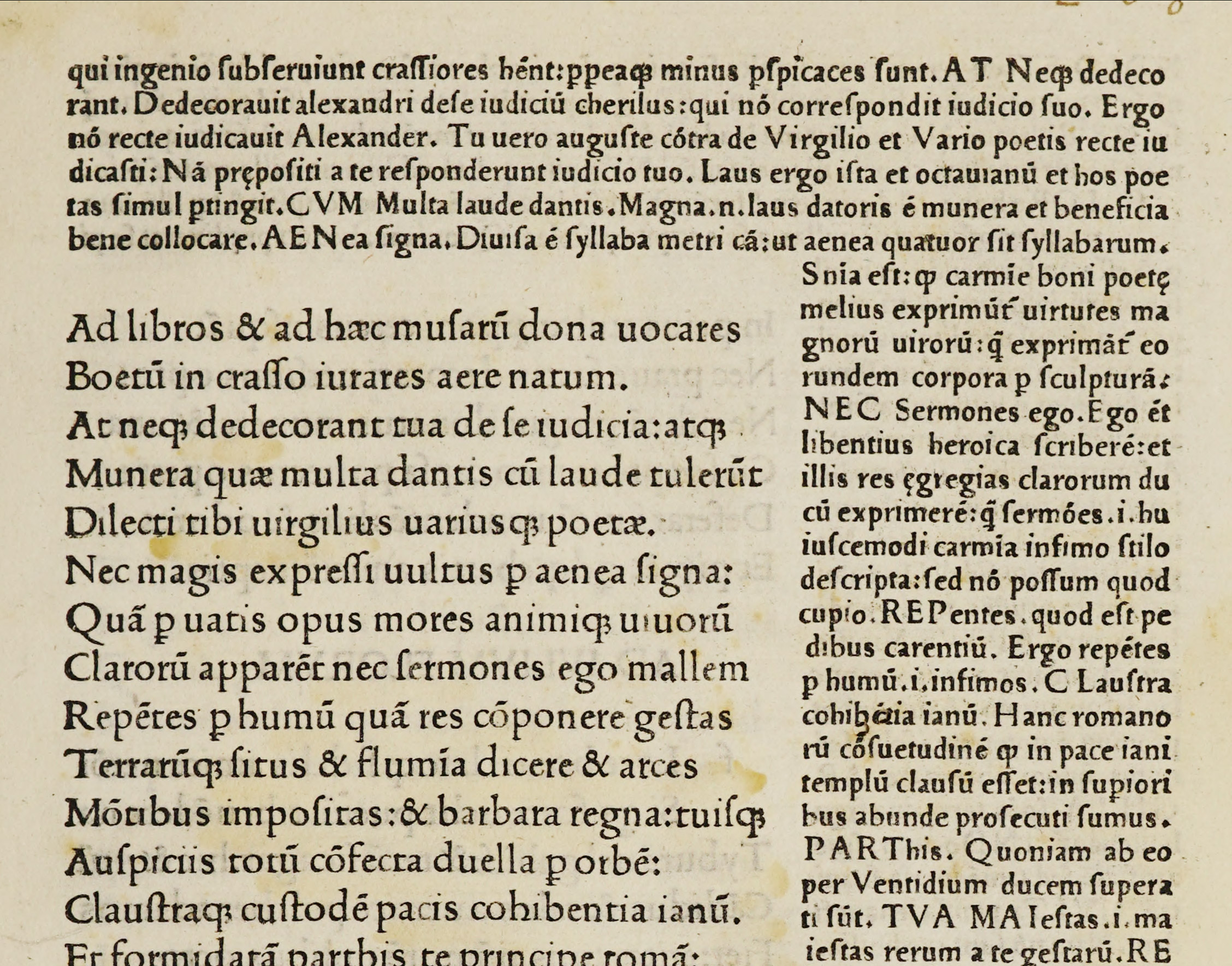
The end of the year 1467 finds Sweynheym and Pannartz in Rome, where they set up a press in the palace of the De’ Massimi family. Their first book printed in Rome was Cicero’s Epistulæ ad Familiares of 1467, followed by the Lactantius of 1468. These were set in a new font which, though far less attractive than the Subiaco letter, was a much more roman type (fig. 25). Besides the books at Subiaco (four, if we count the Donatus) they printed about fifty at Rome, where they worked together until 1473. A roman type was also produced at Rome in 1468 by Ulrich Han for editions of Cicero’s De Oratore and Tusculanæ Quæstiones, but whether it was a roman letter under Gothic influence, or a gothic letter under Roman influence, it is hard to say. In general effect it was certainly greatly inferior to the Sweynheym and Pannartz types.4 In all three fonts, whatever the form of lower-case letter, the capitals were distinctly roman. Many roman types of varying degrees of purity and attractiveness were used by Italian printers of this period. It was reserved for John and Wendelin de Spire to show a roman type which to-day appears roman to us. In the font used in the Venice editions of Cicero’s Epistulæ ad Familiares and Pliny’s Historia Naturalis of John de Spire, printed in 1469, and the De Civitate Dei printed in the next year by John and Wendelin de Spire (fig. 26), this very modern quality can be clearly recognized.
Nicolas Jenson, whose celebrated roman types are now to be considered, was a Frenchman, a native of Sommevoire, Haute-Marne, and for some time was a mint-master at tours. The legend is, that Charles VII of France sent Jenson, in 1458, to Mainz, to inform himself on the subject of the new art of printing and to acquire sufficient knowledge to work in it on his return. But if Jenson ever went to Mainz, he never returned to France, and we find him in 1468 at Venice. The first roman characters, which were used by John de Spire, and for which De Spire obtained an exclusive privilege for five years, have been sometimes attributed to Jenson. In any case, De Spire’s death 1470 lifted the restrictions on roman types from other Venetian printing-houses, and Jenson produced in that year his famous roman letter (fig. 27). The tractate De Præparatione Evangelica of Eusebius is generally considered his first book. If we look at the best Humanistic manuscripts of the period, it is readily seen whence he derived his inspiration.
25. Second Type of Sweynheym and Pannartz, Rome, 1467
From the Speculum Humanæ Vitæ of 1468 in the Annmary Brown Memorial Library, Providence (facsimile), Castilla-La Mancha (scan)
26. John and Wendelin de Spire’s Roman Type, Venice, 1469 1470
From De Civitate Dei of 1470 in Harvard College Library (facsimile), Munich Digitization Center (scan)
27. Jenson’s Roman Type used in Eusebius, De Præparatione Evangelica, Venice, 1470
From a copy in the collection of Dr. Charles L. Nichols, Worcester, Massachusetts (facsimile), Eusebius, Caesariensis: Praeparatio evangelica (scan)
The characteristics of Jenson’s font were its readability, its mellowness of form, and the evenness of colour in mass. Analyzed closely, his letter-forms were not very perfect; had they been so, their effect would not have been so good; for, as an authority has said, “a type too ideal in its perfection is not an ideal type.” The eye becomes tired when each character is absolutely perfect. Thus the good effect of type in mass depends somewhat upon the variations in, and consequent “movement” of, its integral parts. Jenson’s roman types have been the accepted models for roman letters ever since he made them, and, repeatedly copied in our own day, have never been equalled. There were other printers in Italy whose types rivalled his, but no other man produced quite so fine a font, or had better taste in the composition of a page and its imposition upon paper.5 The presswork of his volumes is perhaps their weakest point. Apparently a lighter ink was used for his roman than for his gothic types—for Jenson also used gothic letter.6 He printed about a hundred and fifty books in some ten years, and as he prospered in the enterprise we may draw from his history the unexpected moral that if only a man does a thing well enough, it will reward him—in reputation, or in money—perhaps in both. For Jenson in his own day had a great reputation, both as a publisher and printer. He died in Rome, in 1480, whither he went at the invitation of Pope Sixtus IV. Jenson’s material passed into the hands of Torresano of Venis, father-in-law of Aldus, who, after the latter’s death, carried on the Aldine printing-house.
At the head of a broadside advertisement of various classes of books,7 printed (in bold gothic type) by Jenson and his associate and successor, Herbort, and brought out by the latter not many months, it is believed, after Jenson’s death, there are some prefatory remarks which were perhaps written by a theologian of a Humanistic turn of mind. We quote them as a testimony to the esteem that Jenson’s work enjoyed in its own day: even allowing for the exaggeration incident to advertising. After an invocation to Christ the Illuminator of the World, it reads:
It has appeared to me to be an undertaking which would redound to the common advantage of all men, that I should in this little discourse of mine set forth to every people the extreme usefulness of the works printed in the famous city of Venice, especially of those which are from the excellent workshop of Master Nicolas Jenson the Frenchman. And in order that what is maimed and imperfect be not bought and prized as the equal of the best, and that bad printing be not so praised as to cause men to neglect and not purchase what has been printed with the utmost care and painstaking, I made up my mind to communicate this letter to the public. For the excellent Master Nicolas Jenson employs proofreaders who are skilled in both languages, and he seeks out the most famous men of learning and greater numbers of them, with the result that works published by him have the power of illuminating the entire world, and contain neither too much nor too little, as you will well understand if you will read through his books with the most heedful attention. Furthermore, they contain discussions, on this side and that, by the most competent men, in order that the truth may through the variety of arguments be revealed. For, as Cicero says in the Paradoxes, “there is nothing so rough and unkempt that it cannot be glorified by the proper treatment.” But the quality and value of the types that he uses is another marvel to relate, for it ought to be ascribed rather to divine inspiration than to human wit, so that all may say and truly, that Master Nicolas easily surpasses all his rivals; so that men might justly venture to repeat the saying of Virgil in the Bucolics—“but she bears her head as high among all other cities as any cypress will do among trailing hedgerow shoots.” For his books are no hindrance to a man, nor do they produce weariness, but rather give delight by their exactness and precision; they do not harm one’s eyes, but rather help the and do them good. Moreover the characters themselves are so methodically and carefully finished by that famous man that the letters are not smaller or larger or thicker than reason demands or than may afford pleasure: which he could not have done unless filled by some divine inspiration. Hence our debt to that excellent man Master Nicolas Jenson is great indeed: for through his diligence and toil all peoples, barbarous as well as Latin, have in their hands works which before could scarcely be procured: now they have these works printed with correct texts in most excellent, beautiful and agreeable books, so that they deserve praise and reverence in the highest degree. I have already said, for the common advantage of all men: on which we ought to insist much more than upon our own advantage: lest men, when they buy, should buy and possess the false instead of the true, the ugly instead of the beautiful, the incorrect instead of the most accurate.
Five or six roman fonts were cut for the great Venetian printer-publisher, Aldus Manutius. His first roman letter, in which Bembo’s Ætna appeared, was not particularly successful, but the third roman font, designed by the celebrated Francesco da Bologna (Griffi), who afterward cut the Aldine italic character, was excellent. This roman type was used in that famous book, Colonna’s Hypnerotomachia Poliphili, or “The Strive of Love in a Dream,” printed by Aldus in the last year of the century. It is remarkable for its delightful illustrations, drawn in a line which harmonizes with the tone of the pages of roman letter. From one of these decorations the famous Aldine printer’s mark of dolphin and anchor was derived; although the original of this design is to be found on a coin which Erasmus says was sent to Aldus by the Renaissance scholar, Bembo. A specimen of this Aldine roman font is shown in the facsimile from a page of the Hypnerotomachia (fig. 28). It is distinctly inferior to Jenson’s roman characters, and perhaps to those of the Venetian printer, Ratdolt. Besides roman types, Aldus possessed fonts of his celebrated italic character in two sizes, and several fonts of Greek type. Aldus died in 1515, and when he lay in state his books were grouped about him. He directed in his will that punches begun by a certain cutter should on no account be completed by an inferior hand.
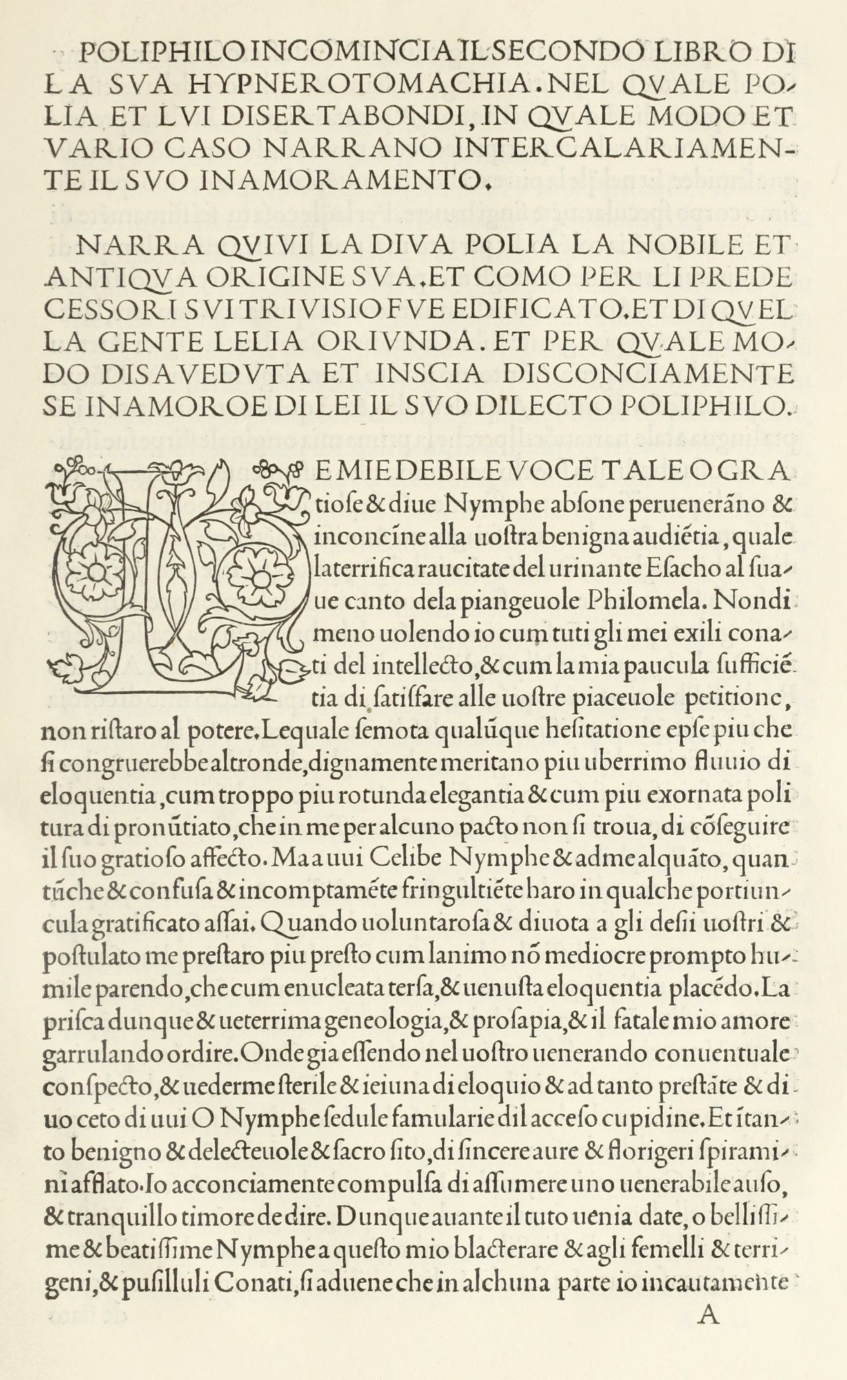
28. Page of Hypnerotomachia Poliphili: Aldus, Venice, 1499
From a copy in Harvard College Library, Internet Archive (scan)
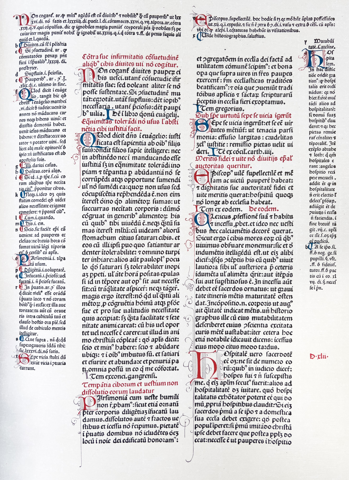
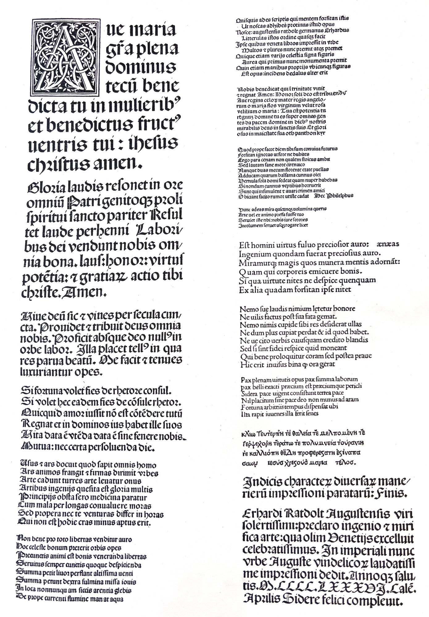
One other Venetian printer (and type-cutter) should not be forgotten—Erhard Ratdolt, who came from Augsburg, and began to print at Venice in 1476. His books are the first with decorative title-pages, and he also employed extremely fine borders and initial letters.8 He issued his beautiful type specimen-sheet in 1486.9 It is dated Augsburg, April 1, 1486, but was probably printed at Venice, just before Ratdolt left for Augsburg, and was to be used there. In this, the earliest specimen-sheet known, the Ave Maria, in its older form (which begins it with a charming initial A), is printed in a large gothic letter, derived from fourteenth century Italian manuscripts.10 The sheet exhibits ten sizes of excellent gothic letter, four of which are here reproduced (fig. 29). There are three sizes of roman—all good—and a specimen of Greek letter of excellent early form (fig. 30). Ratdolt’s books were among the most distinguished of the Venetian press. Indeed, by the sixteenth century, Venice was a centre for printing, and had some hundred and fifty printing-houses; and over four thousand books, of remarkable excellence in workmanship, came from its presses. The work of Venetian printers and type-founders was considered a model for the rest of Europe. Publishers wishing to commend their books announced that they were printed in the carattere Veneto.
29. Ratdolt’s Gothic Type, from his Specimen of 1486
From Burger’s Monumenta Germaniæ et Italiæ Typographica (facsimile), Index characterum diversarum manerierum impressioni paratarum (scan)
30. Ratdolt’s Roman and Greek Type, from his Specimen of 1486
From Burger’s Monumenta Germaniæ et Italiæ Typographica (facsimile), Index characterum diversarum manerierum impressioni paratarum (scan)
The attempts of the first Italian printers, Sweynheym and Pannartz, to print semi-roman types, have led us naturally to consider first the development of these types into pure roman letter; but gothic types were also used in Italy by Jenson, as has been said, and by many other printers. A fine specimen of Jenson’s work in gothic fonts is the Codex Decretorum of Gratian, printed in 1474.11 The forms of Italian gothic types, while printed, in the larger sizes were rounder and less compact than the like kinds of German black-letter. In the smaller sizes this attenuated quality is very striking, and makes the character almost a condensed type. A similarly condensed letter was employed in manuscripts of a little earlier date.
For head-lines, a large round gothic letter similar to some Spanish gothic letters was often used; and sometimes roman capitals. Not merely the types, but their arrangement in general, were modelled on manuscripts of the fourteenth and fifteenth centuries. The famous manuscript Virgil, with notes, which belonged to Petrarch (now in the Ambrosian Library at Milan), shows a character of letter and arrangement of text which were closely followed in many subsequent printed editions of Virgil. The manuscript commentary on the Decretals of Gregory IX (1353) in the Vatican Library is also very much like some books printed from Italian gothic fonts.12
The important series of plates of Italian types issued by the Type Facsimile Society (alluded to more fully later) are material to be consulted for the general effect of books printed in gothic letter in the last half of the fifteenth century.13
Italian transitional fonts merged almost imperceptibly from a distinctly gothic into a fairly clear roman type. Starting from the pure gothic types, the first differentiation appears in a wider leading of lines and wider spacing of the type itself.14 The next advance shows gothic fonts with somewhat roman capital letters. This was followed by books in which head-lines and dates were set in pure roman capitals. An increasing clearness in cut and further separation of letters and a constant use of roman capitals finally developed into tentative roman fonts. These changes can be interestingly traced by looking at the earliest type of Sweynheym and Pannartz (fig. 24), and the improvement in the type used by them only a little later in Rome (fig. 25); or, better still, the four types used by Ulrich Han in the same city.15 These transitional types form the “bridge” between Italian gothic and roman types. Italian printers were not always very particular about the unities, and sometimes mixed gothic head-lines with roman text, while some books (although but few) were set in a roman lower-case letter with gothic capitals.
The fonts of Italian roman vary greatly. The finest all have that rich, mellow character which no types before or since have ever had such degree.
While Jenson’s type was undoubtedly the best, it was pushed hard by some other roman fonts, such as those employed at Venice by John and Wendelin de Spire and Ratdolt, by Miscomini at Venice and Florence, by Servius at Rome, and others.
A page like Miscomini’s Florentine Horace of 1482, where notes surround the text, is an admirably practical piece of work. The notes are perhaps a little closely set, but the page is fine and straightforward, and of a pleasant solidity which gives the reader confidence (fig. 31). Almost all Italian roman fonts in the last half of the fifteenth century had an air of “security” and generous ease extremely agreeable to the eye. Indeed, there is nothing better than fine Italian roman type in the whole history of typography.
31. Part of a page of Horace: Miscomini, Florence, 1482
From a copy in Harvard College Library (facsimile), Opera (scan)
It is not fair, however, to take the finest of these and think of it as representative of Italian fifteenth century type. Only by seeing many examples can one get a general idea of that. And for this purpose, the publications of the Type Facsimile Society, issued in England through the influence of Robert Proctor between 1902 and 1909, are admirable. If the reader can divide a set of loose plates into groups of roman and gothic types, and then sort them into groups under each country, in chronological arrangement, he will obtain a conspectus of national type-forms which is invaluable. He has, in fact, but to glance through the gothic and roman Italian types shown in facsimiles thus arranged, to comprehend the general tendency of type-forms in either class of character; and will realize how high an average of excellence, especially in the roman letters, the fifteenth century Italian printers attained. This publication is rare, and this use of it diverts it from the bibliographical purposes for which libraries cherish it—though it does not divert the librarian! But for the student I do not know a more valuable work, nor a more valuable way to use it.
When we compare even the best early printed books with the Italian manuscripts which they copied, we see how far they fell short of their model. Maunde Thompson says,
As compared with other national scripts, the high level of general excellence maintained by the Italian scribes is very striking. And it was this general excellence that place them in the position to take the lead at the crucial moment of the adoption of printing in Europe.… And when the art of printing was established, and after the early type-cutters had selected their first models in the contemporary ms. book-hands of their several countries, it is no wonder that, in the end, the type copied from the Italian script prevailed over all others.16
For the characters employed in the best Humanistic manuscripts are, in their way, among the masterpieces of human endeavour.
- Crane’s Decorative Illustration of Books, p. 125.
- For Claudin’s account of this episode, see his Histoire de l’Imprimerie en France au XVe et au XVIe siècle, Vol. I, pp. 10 et seq.
- Burger, pl. 45.
- Burger, pl. 83.
- Druckschriften, pl. 67.
- Druckschriften, pl. 34.
- Discovered in the library of the Capuchin Cloister at Burghausen, Upper Bavaria, pasted inside three books printed by Jenson in 1478, It is now in the State Library at Munich. For facsimile, etc., see Weigendrucke und Handschriften. Festgabe Konrad Haebler zum 60. Geburtstage. Leipsic, 1919, p. 22.
- De Vinne thinks that Ratdolt’s initials were probably cut in high relief on metal, as it was expensive and not particularly practical to cast these ornamental letters in a mould. In books of the period much that is considered engraving on wood, especially when of a delicate kind, is really engraving on metal. De Vinne’s Plain Printing Types, New York, 1900, p. 84.
- Burger, pl. 5, for entire sheet.
- Thompson, fac. 194.
- Druckschriften, pl. 34.
- Paléographie Latine, pls. 101 and 106.
- Type Facsimile Society. Publications of the Society for the years 1901–09, inclusive.
- Type Facsimile Society, pl. 1903 m.
- Burger, pls. 23, 84, 83 [1], 83 [2], in this order.
- Thompson, p. 464