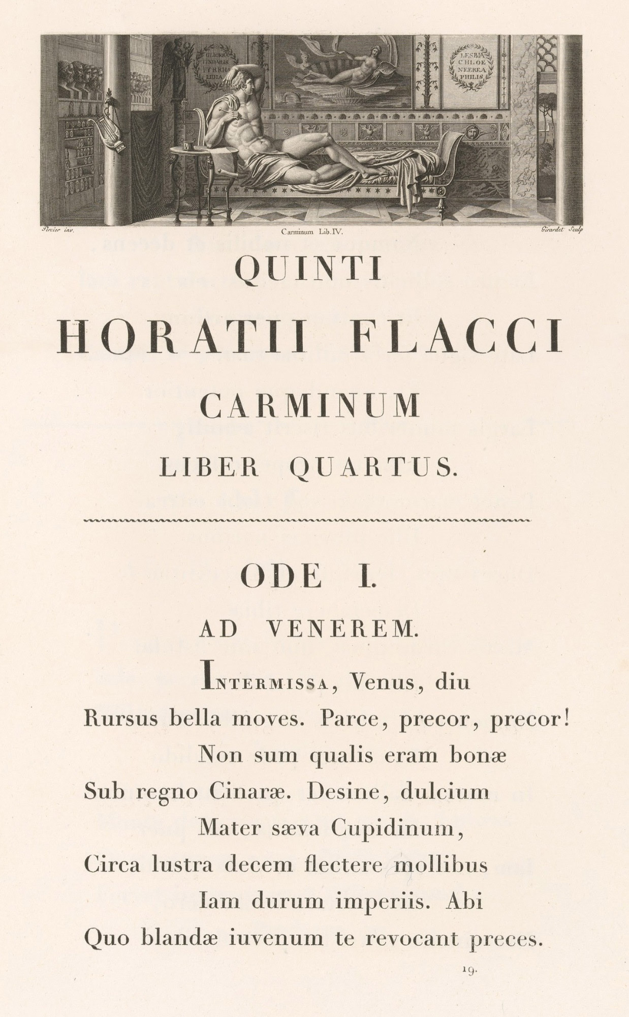
Figures 166 & 167
Page and Types of folio Horace: Pierre Didot, Paris
From The Metropolitan Museum of Art
1799
The type is clear to read, but quite without charm. Variations of light and shade are extreme, and the serifs of capital letters such as M and N are literally hair-lines at right angles to the upright strokes. The decoration to the first ode, designed by Percier and engraved by Girodet, is splendid enough of its kind, but is as hard in feeling and execution as the typography beneath it.