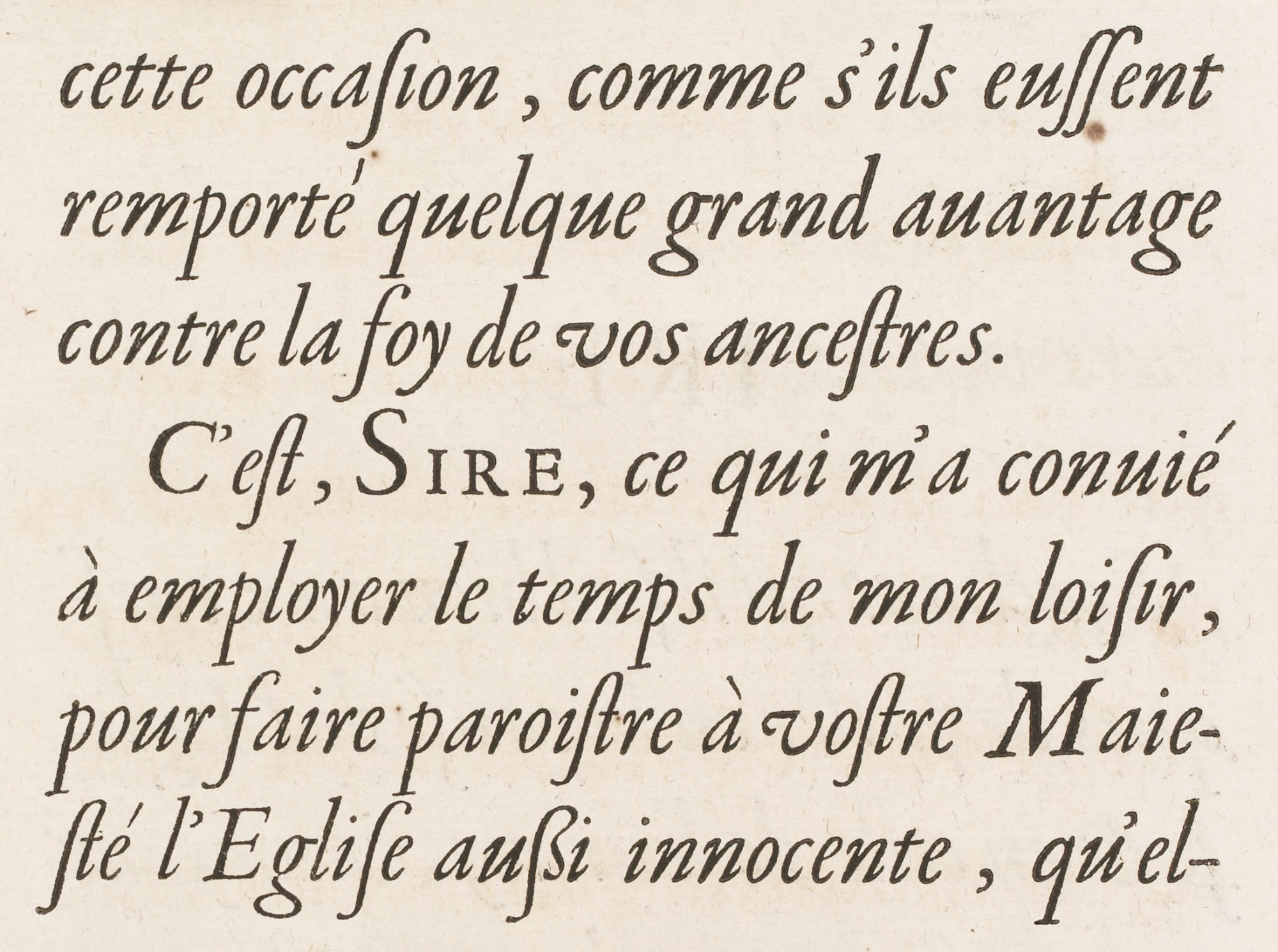
Figure 168
Garamond’s Caractères de l’Université, c. 1540, used in Richelieu’s Les Principaux Poincts de la Foy Catholique Défendus: Imprimerie royale, Paris
From Gallica (scan
1642
Garamond’s roman fonts were wonderfully beautiful—clear and open. The very small loops to the e’s and the narrow a’s are characteristic, as are the capitals that are large relatively to lower-case letters. The italic capitals slope at different angles, and when composed with the lower-case have a restless quality. On the other hand, both fonts, especially the italic, have a delightful unconventionality of design—free and spirited, yet noble; full of contrast and movement, yet with elegance and precision of line that marks them as French.
