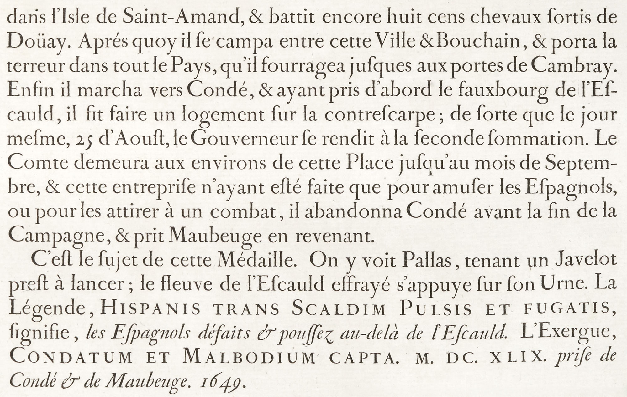
Figure 173
Grandjean’s Romain du Roi used in Médailles sur les Principaux Événements du Règne de Louis le Grand: Imprimerie Royale, Paris
From a copy in the Boston Anthenæum (facsimile), Gallica (scan)
1702
They were marked as “royal” fonts in an odd way—by a little projection on the left shank of the lower-case l at the height of a short lower-case letter. This annoying feature of an otherwise beautiful font has been continued on the l of roman letters cut for the Imprimerie ever since. It has been said that l was selected by order of Louis XIV—who, by the way, esteemed Grandjean’s types so highly that he refused the request of Philip V of Spain for a set of the punches.
