Figure 229
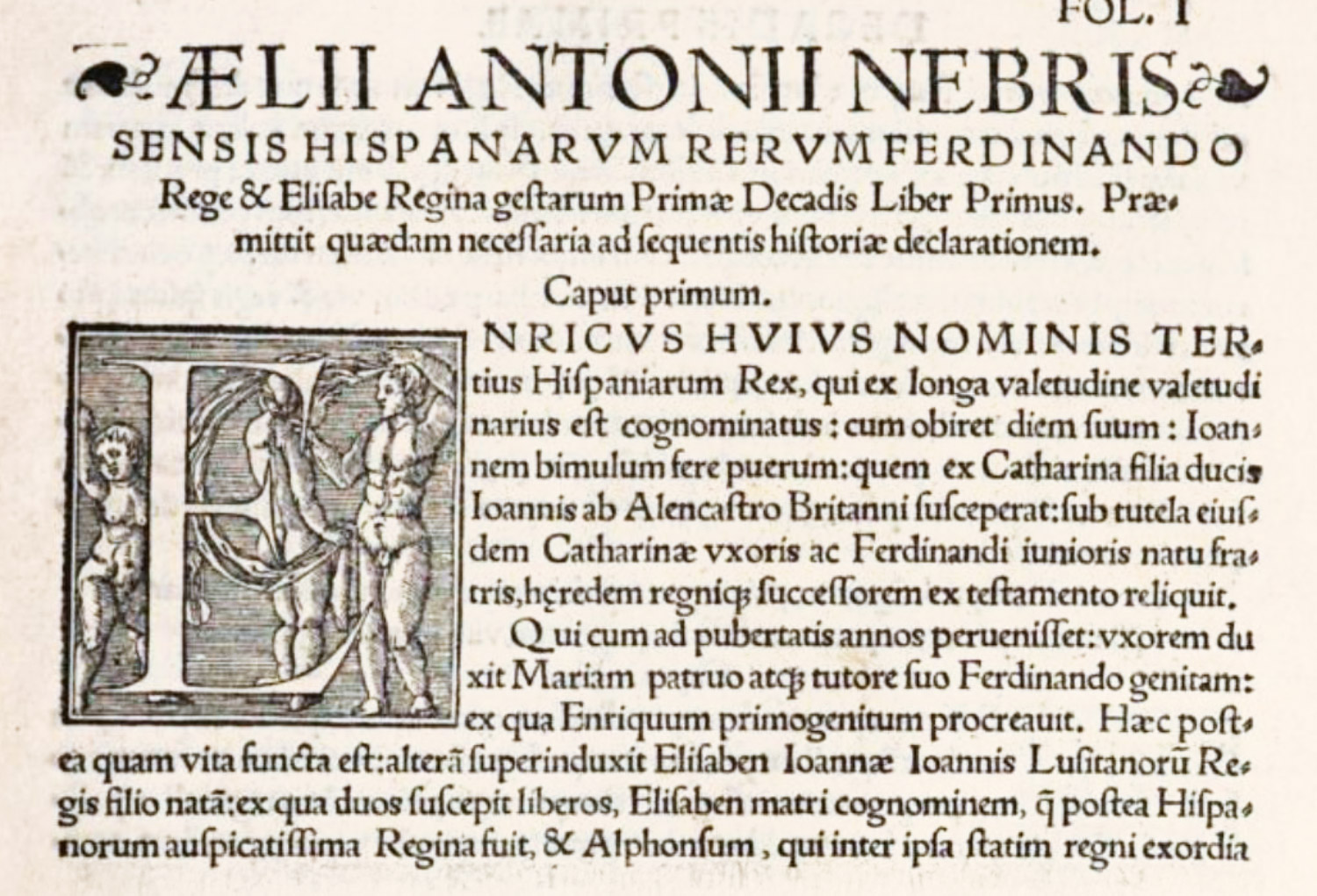
Roman Type used by Sancho de Nebrija, Granada
From a copy in the Boston Public Library (facsimile), Rervm A Fernando & Elisabe Hispaniarũ[m] fœlicissimis Regibus gesta[rum] Decades duas
1545
His Latin translation of Pulgar’s Spanish chronicle of the reign of Ferdinand and Isabella (a fine example of this press) opens with a title-page ornamented with a border in four pieces—meant to be Renaissance—engraved on wood by some one very awkward with this graver and surrounding a brilliant armorial device.… The last two sentences are in the nature of an early copyright. The next page of the book might have been taken bodily from one of Froben’s editions. This is true of all pages with displayed headings, where lines of large capitals, ornamented at each end with florets, descent abruptly in the second line to a much smaller size of capital letter.… At first sight imposing, on examination the typography seems coarse and loosely put together, partly because it is so, but mostly because it recalls better books, with more brilliant decorations and more massive roman types, printed in a like manner.