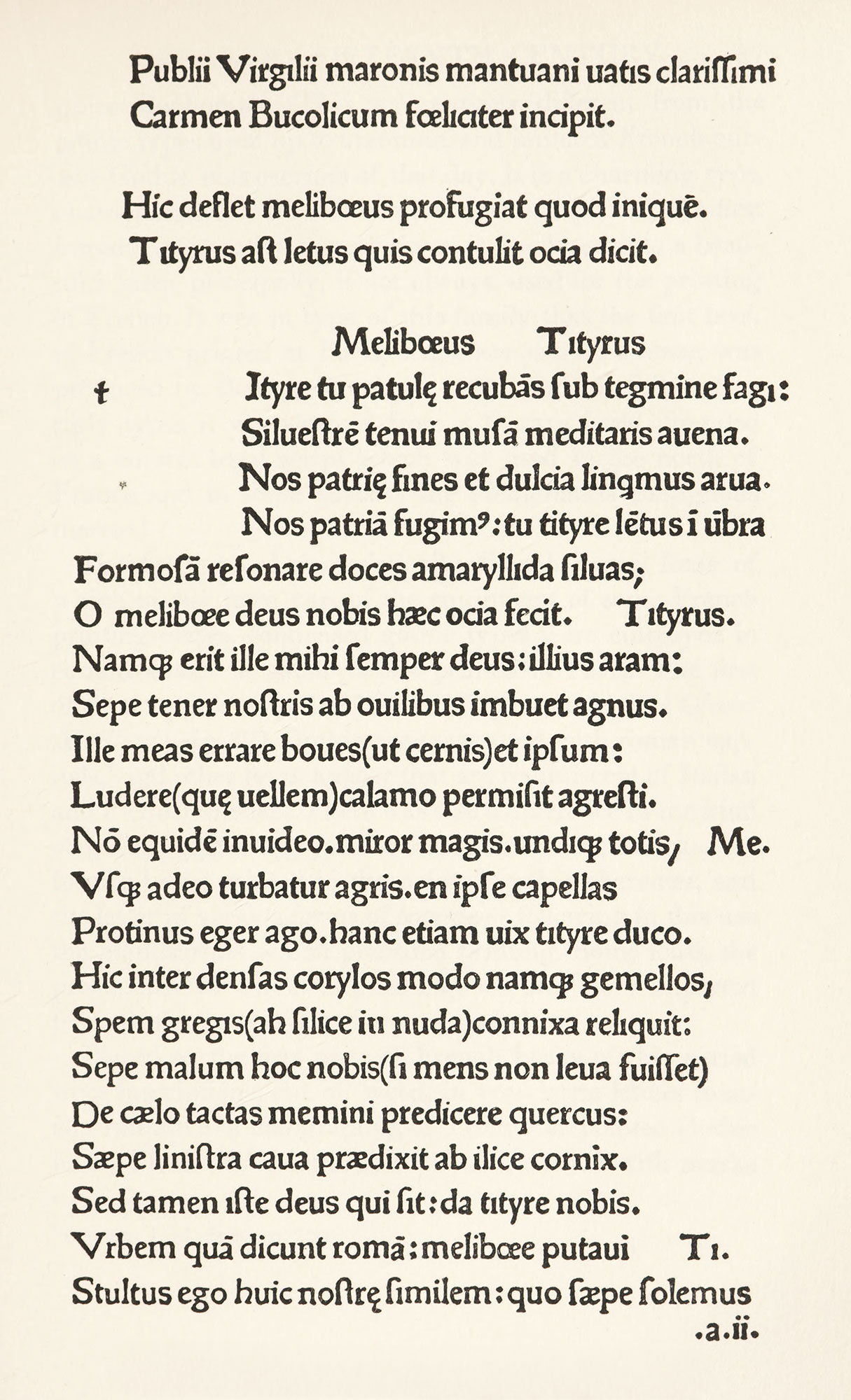
Figure 35
Roman Type used in Virgil by Gering, Paris
From Claudin’s Histoire de l’Imprimerie en France au XVe et au XVIe Siècle
1478
Laying gothic fonts aside, Gering cut for himself two new types, both pure roman, though heavy in effect. In comparing these with the Bible type, they appear to be only an evolution of some elements clearly discernible in the earlier gothic character. The throwing back of the dot on the i is a feature to be noticed. In the larger, editions of Virgil and of Sallus.