Blog posts tagged “Web”
 Making of Printing Types
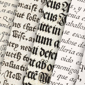
- September 20, 2025
Researching is like treasure hunting—following clue after clue in the hopes of finding something amazing. When I set out to create a digital edition of Daniel Updike’s Printing Types, I had no idea that I was going to spend months hunting down more than 1,200 books spanning more than 450 years but I’m glad I did. This project involved more research than I’ve ever done.
 Making of Clavis Cælestis: A Synopsis of the Universe
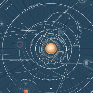
- May 24, 2025
I’ve long loved astronomy. Spending even a few seconds thinking about the wonders in the universe gives me a sense of joy. I marvel at what the scientific community has been able to learn about its inner workings from our tiny blue marble. When I stumbled upon Thomas Wright’s grand poster of his astronomical illustrations from 1742, I was immediately drawn in and thought recreating them would be a fun project.
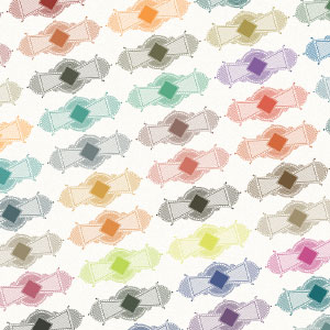
 Making of Lilies & Roses of P.J. Redouté
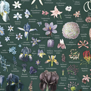
- November 3, 2024
“Patience” was this project’s theme. Breathing new life into Les Liliacées and Les Roses—two of Pierre-Joseph Redouté’s most well known collections—taught me a lot about it during the year I spent on this project.
 Making of Humming-Birds
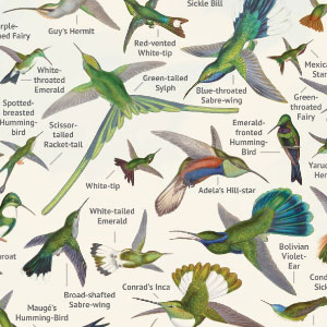
- October 1, 2023
Hummingbirds are the closest living descendants of dinosaurs like the T. rex—one of many fascinating facts I learned while working on the digital edition of A Monograph of the Trochilidæ, or Family of Humming-Birds. Gaining unexpected knowledge has to be one of the best parts about working on a project.
 Metra ticket gallery updates
- August 27, 2023
Fifteen years have passed since the last official update on my Metra Ticket Gallery. An update is long overdue considering the number of tickets has grown dramatically to nearly 1,400. It’s about time I gave a new one about the latest additions and improvements.
 Making of The Color Printer
- March 13, 2023
Unlike previous projects, I designed the poster based on Earhart’s 1892 treatise, The Color Printer before giving much thought to the design of the website. In fact, I wasn’t going to make a full digital edition but completing the poster made it so much more approachable and enjoyable.
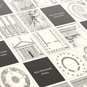 Making of The Four Books of Architecture
- January 8, 2023
Architecture has grabbed my attention repeatedly since I was young—from studying it in high school and making buildings in video games to designing websites for firms winning architectural awards. It’s fitting that my interest is piqued once again for a digital edition of one of the oldest and most well known architectural publications: Palladio’s treatise, The Four Books of Architecture.
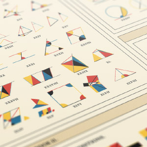
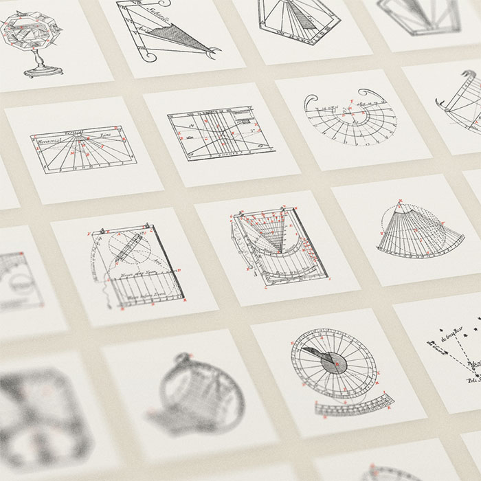 Making of Mathematical Instruments
- September 18, 2022
I work best with existing material—whether that be images, ideas, spreadsheets, documentation, books, etc. That existing material defines the boundaries I need to create something more. When I stumble across a nice chunk of material that has those boundaries (like an old unique book), excitement really sets in. This is what I felt when I found Nicolas Bion’s treatise on mathematical instruments from 1709.
 Making of A Brief Visual Exploration of A Dictionary of Typography
- December 16, 2020
Not many people read a dictionary cover to cover, let alone analyze every word, but I did and found it fascinating. During research phases for my past restoration projects, I often came across a surprising number of antique dictionaries and always overlooked them. For this project, I actively sought out an interesting one to explore and ended up finding two to create A Brief Visual Exploration of A Dictionary of Typography.
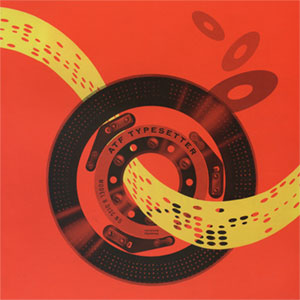 Making of ATF Typesetter Model B
- February 12, 2020
If you’ve ever found a tiny piece of obscure history and had it strike something in you that made you obsess over it for weeks, that’s how I felt when I found the brochure for the ATF Typesetter Model B. This small 16-page brochure from 1963 for an obsolete piece of typographical machinery piqued my interest so much that I wound up converting it into a one-page website as an exercise in design and technology. Plus, it was just plain fun.
 Making of Goethe’s Colours
- January 12, 2020
Figuring out how to put a new face on something old is never easy and devising a new way to look at Goethe’s Theory of Colours was no exception. What started as a relatively simple idea turned out to be more complex that I expected but the process was a good learning experience. The final result is fun too.
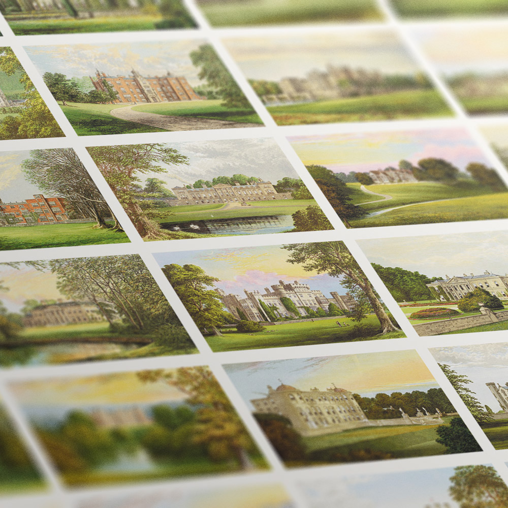 Making of Picturesque Views of Seats of Great Britain and Ireland
- October 13, 2019
Castles and mansions and manors, oh my! The minute I saw Alexander Lydon’s illustrations in A Series of Picturesque Views of Seats of Noblemen and Gentlemen of Great Britain and Ireland, I wanted to create something based on them. Picturesque Views of Seats of Great Britain and Ireland (or simply “Seats” for short) is the result.
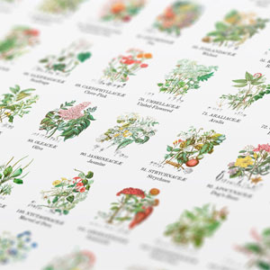 Making of the Illustrations of the Natural Orders of Plants
- July 9, 2019
If someone told me when I was young that I would spend three months of my time tracing nineteenth century botanical illustrations and enjoy it, I would have scoffed, but that’s what I did to reproduce Elizabeth Twining’s Illustrations of the Natural Orders of Plants and I loved every minute.
 Making of Byrne’s Euclid
- December 16, 2018
Creating a faithful online reproduction of a book considered one of the most beautiful and unusual publications ever published is a daunting task. Byrne’s Euclid is my tribute to Oliver Byrne’s most celebrated publication from 1847 that illustrated the geometric principles established in Euclid’s original Elements from 300 BC.
 Making of Lunar Conversations
- March 18, 2018
Finding a new set of data to play with is exciting. Figuring out what to do with it is a roller coaster ride of emotions ranging from amazement and intrigue to frustration and head-scratching. The transcript from the Apollo 11 mission was all of these and more for me.
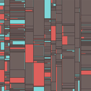
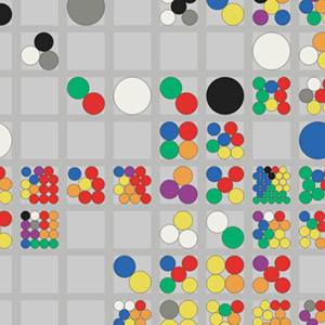
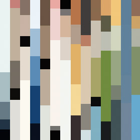 Making of Color Palettes of The New Yorker
- March 26, 2017
Generating color palettes of more than 4,600 covers of The New Yorker was a challenging task but when I get an idea stuck in my head I stubbornly like to see it through. What follows is a breakdown of how I made my Color Palettes of The New Yorker project including early ideas, methodologies, and technical details.
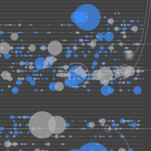
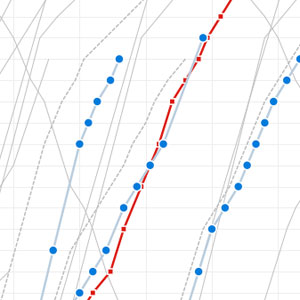 Visualizing Metra
- August 14, 2011
When I heard that Metra was planning to cut 46 trains from its service in 2012 to make up for high operating costs, I wanted to see just how much of an impact that would have on their schedules—using a technique from 1885. How the final result came about was a mixture of curiosity and fun with a pinch of obsession.
 Why I block ads
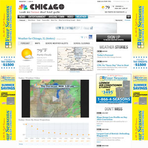
- August 18, 2010
Ever since I found out I could block ads, I have. I've even gone out of my way to download Firefox extensions like Stylish to let me write my own styles that block ads not caught by AdBlock. I popped over to NBC Chicago's weather page to see the forecast for tonight and was painfully reminded that I had forgotten to re-enable AdBlock after disabling it for another project.
 Fast Flip? Fast Flop.
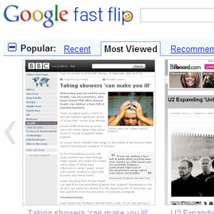
- September 14, 2009
Google's new Fast Flip, released Monday, is a way to visually browse the news in a new zippy way. Sure, it may be speedy but useful? Not quite.
 Metra's new site: a review
- September 10, 2009
Metra launched a new website this week and since I'm a commuter, designer, and collector, I felt compelled to share my reaction. Any change would have been an improvement to their old site, but while there were welcomed enhancements, not everything lived up to the hype.